8. List Widgets
All the input widgets we have seen so far (buttons, numeric widgets, and text widgets) accept single, atomic values. List widgets, by contrast, let the user work with lists of values. Qt provides several widgets for displaying and managing lists of items, including:
QComboBox- for showing a compact dropdown list,QListWidget- for built-in list item management,QListView- for model-based list mnagement.
8.1 QComboBox
QComboBox combines a button and a line edit with a pop-up list, which makes it useful for displaying a list in a constrained space. It can be populated using its item manipulation methods:
addItem()- appends an item,addItems()- appends a list of items,insertItem()- insert an item at the given index,insertItems()- inserts a list of items at the given index,removeItem()- removes the item at the given index.
Comb obox items can have text, icons, and additional user data. As QComboBox is a part of the Qt’s model/view framework, you can supply its data using one of the Qt model classes instead of managing items manually.
QComboBox provides several signals:
| Signal | Description |
|---|---|
activated(index) |
User chooses an item from the list |
currentIndexChanged(index) |
Current index changes (user or programmatic) |
currentTextChanged(text) |
Current text changes |
editTextChanged(text) |
Text edited in editable combobox |
highlighted(index) |
Item in the popup list highlighted |
textActivated(text) |
User chooses an item |
textHighlighted(text) |
Item in the popup list highlighted |
Combobox items are indexed, starting from zero. Its line edit widget can be accessed with QComboBox.lineEdit() and it can be made editable with setEditable().
 |
You need to enable the user to select a payee from a list of payees, and also add new payees for future transfers. When a payee is selected, all other users need to be notified. |
To use a combobox in your application:
 1 # The QComboBox widget is a combined button and popup list.
 2
 3 import sys
 4 from PySide6.QtCore import Slot
 5 from PySide6.QtWidgets import (QApplication,
 6     QWidget, QVBoxLayout, QComboBox, QLabel)
 7
 8
 9 class Window(QWidget):
10
11     def __init__(self):
12
13         super().__init__()
14         self.resize(240, 80)
15         layout = QVBoxLayout()
16         self.setLayout(layout)
17
18         # 1. Create the combo box and add items to it
19
20         self.combo_box = QComboBox()
21
22         self.combo_box.addItems([
23             'Landlord',
24             'Electric company',
25             'Internet provider',
26             'Auto insurance'])
27
28         # 2. Enable the user to add items
29
30         self.combo_box.model().sort(0)
31         self.combo_box.setCurrentIndex(0)
32         self.combo_box.setEditable(True)
33         self.combo_box.setInsertPolicy(
34             QComboBox.InsertPolicy.InsertAlphabetically)
35
36         self.label_activated = QLabel()
37
38         layout.addWidget(self.combo_box)
39         layout.addWidget(self.label_activated)
40
41         self.combo_box.activated.connect(self.on_activated)
42
43     # 3. Create the slot
44
45     @Slot(int)
46     def on_activated(self, index):
47         item_text = self.combo_box.currentText()
48         self.label_activated.setText(f'Selected: {item_text}')
49
50
51 if __name__ == '__main__':
52
53     app = QApplication(sys.argv)
54     main_window = Window()
55     main_window.show()
56     sys.exit(app.exec())
Create a
QComboBoxobject and add items to it. Sort the combobox items and set the first item as the current item.Enable the user to add items.
QComboBoxes are read-only by default so set theeditable()property toTrue. IseQComboBox.InsertAlphabeticallyto insert new items in alphabetical order.Create a slot to notify users when an item is selected. Connect it to the combobox’s
activated()signal. The slot is executed when the user selects an item or adds a new one to the list.

8.2 QListWidget
The QlistWidget class is an item-based list widget. This means its items are instances of the QListWidgetItem class, and you add them to the list widget using methods such as:
addItem(item),addItem(label)oraddItems(labels).
QListWidget also provides methods to insert items at specific positions, retrieve an item at a given row, and remove an item (takeItem(row)).
QListWidgetItem, its accompanying class, can hold several pieces of information, such as text, icons, or tooltips. It can also store custom user-defined data.
Common QListWidgets signals include:
| Signal | Description |
|---|---|
currentItemChanged(current, previous) |
Emitted when the current item changes. |
currentRowChanged(currentRow) |
Emitted when the current row changes. |
currentTextChanged(currentText) |
Emitted when the text of the current item changes. |
itemActivated(item) |
Emitted when an item is activated (double-click or Enter/Space while selected). |
itemChanged(item) |
Emitted when an item’s data is modified by the user. |
itemClicked(item) |
Emitted on any mouse click on an item. |
itemDoubleClicked(item) |
Emitted specifically on double-click. |
itemSelectionChanged() |
Emitted when the selection changes. |
|
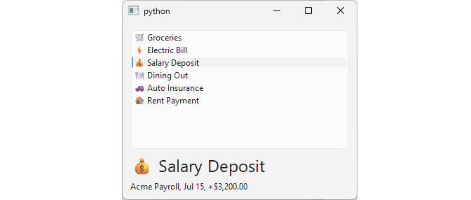
You need to display a list of recent transactions. When the user selects one, you need show additional details about it (merchant, date, and its impact on the running balance). |
To use a list widget in your application:
 1 # The QListWidget class provides
 2 # an item-based list widget
 3
 4 import sys
 5 from PySide6.QtCore import Slot, Qt
 6 from PySide6.QtWidgets import (QApplication,
 7     QWidget, QVBoxLayout, QListWidget, QLabel,
 8     QListWidgetItem)
 9
10
11 class Window(QWidget):
12
13     def __init__(self):
14
15         super().__init__()
16
17         layout = QVBoxLayout()
18         self.setLayout(layout)
19
20         transactions = [
21             ('🛒 Groceries', 'Whole Foods, Jul 21, -$84.32'),
22             ('⚡ Electric Bill', 'City Power, Jul 18, -$112.50'),
23             ('💰 Salary Deposit', 'Acme Payroll, Jul 15, +$3,200.00'),
24             ('🍽️ Dining Out', 'The Copper Pot, Jul 20, -$46.75'),
25             ('🚗 Auto Insurance', 'Safe Insurance, Jul 12, -$98.00'),
26             ('🏠 Rent Payment', 'Acme Properties, Jul 1, -$1,450.00'),
27         ]
28
29         # 1. Create a list widget and add items to it.
30
31         self.transaction_list = QListWidget()
32
33         for description, details in transactions:
34             item = QListWidgetItem(description)
35             item.setData(Qt.ItemDataRole.UserRole, details)
36             self.transaction_list.addItem(item)
37
38         self.selected_label = QLabel()
39         self.details_label = QLabel()
40         self.selected_label.setStyleSheet("font-size: 24px;")
41
42         layout.addWidget(self.transaction_list)
43         layout.addWidget(self.selected_label)
44         layout.addWidget(self.details_label)
45
46         # 3. Connect the signal to the slot.
47
48         self.transaction_list.currentItemChanged.connect(
49             self.select_transaction)
50         self.transaction_list.setCurrentRow(0)
51
52     # 3. Create the slot.
53
54     @Slot(QListWidgetItem, QListWidgetItem)
55     def select_transaction(self, current, previous):
56
57         transaction = current.data(Qt.ItemDataRole.DisplayRole)
58         details = current.data(Qt.ItemDataRole.UserRole)
59         self.selected_label.setText(transaction)
60         self.details_label.setText(details)
61
62
63 if __name__ == '__main__':
64
65     app = QApplication(sys.argv)
66     main_window = Window()
67     main_window.show()
68     sys.exit(app.exec())
Create a
QListWidgetobject and add items to it. First, create a list of tuples, where each tuple’s first element is the transaction description and the second element is its details (merchant, date, balance impact). Iterate over the list, and for each tuple, create aQListWidgetItem, setting the transaction details as custom user data. Add each item to the list widget. Also create two labels for displaying the information.Implement a slot to display the transaction description and details when the current item changes. Get the transaction description using the
DisplayRoleitem data role, and the details using theUserRoleitem data role.Connect the signal to the slot. The
currentItemChanged()signal is emitted whenever the current item changes. It provides both the current and the previousQListWidgetItemobjects to the slot, though we use only the current item in this example.
8.3 QListView
A QListView presents items stored in a model, either as a list or a collection of icons. It is part of Qt’s model/view framework, which separates data (models) from its visual representation (views). This allows one model to be shared across multiple views.
|
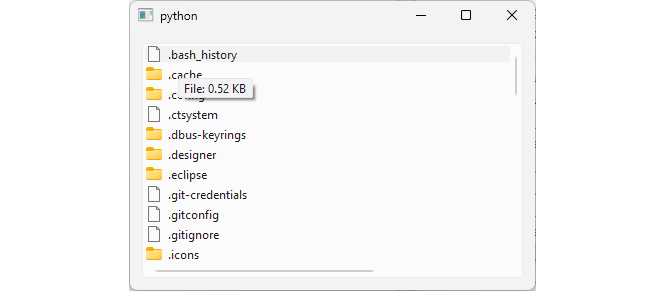
Your finance app lets users export monthly reports to a local folder. Provide a read-only list view of the exports folder, decorating each item with an appropriate icon for its file type. When the user hovers over a file, display a tooltip showing its size in KB. |
To use a list view in your application:
 1 # QListView presents items stored in a model.
 2 # ie. it uses the QT model/view architecture
 3 # Models contain data and views display it
 4 # so one model can be used with multiple views.
 5
 6 import sys
 7 from pathlib import Path
 8 from PySide6.QtCore import Qt
 9 from PySide6.QtGui import QStandardItemModel, QStandardItem
10 from PySide6.QtWidgets import (QApplication, QWidget,
11     QVBoxLayout, QListView, QAbstractItemView, QStyle)
12
13
14 class Window(QWidget):
15
16     def __init__(self, parent=None):
17
18         super().__init__(parent)
19
20         layout = QVBoxLayout()
21         self.setLayout(layout)
22
23         # 1. Create the view
24
25         self.list_view = QListView()
26         self.list_view.setEditTriggers(
27             QAbstractItemView.EditTrigger.NoEditTriggers)
28
29         # 2. Create the model and populate it with data
30
31         self.model = QStandardItemModel()
32
33         home = Path.home()
34         fs_entries = home.iterdir()
35
36         for entry in fs_entries:
37             item = QStandardItem(entry.name)
38             icon = self.get_icon(entry)
39             item.setIcon(icon)
40             tooltip = self.get_tooltip_data(entry)
41             item.setData(tooltip, Qt.ItemDataRole.ToolTipRole)
42             self.model.appendRow(item)
43
44         # 3. Set the view's model
45
46         self.list_view.setModel(self.model)
47
48         layout.addWidget(self.list_view)
49
50     def get_icon(self, path):
51         if path.is_dir():
52             return self.style().standardIcon(
53                 QStyle.StandardPixmap.SP_DirIcon)
54         else:
55             return self.style().standardIcon(
56                 QStyle.StandardPixmap.SP_FileIcon)
57
58     def get_tooltip_data(self, path):
59         if path.is_dir():
60             return 'Directory'
61         elif path.is_file():
62             size = round(path.stat().st_size / 1024, 2)
63             return f'File: {size} KB'
64         else:
65             return 'File System Entry'
66
67
68 if __name__ == '__main__':
69
70     app = QApplication(sys.argv)
71     main_window = Window()
72     main_window.show()
73     sys.exit(app.exec())
Create the view. Instantiate a
QListViewobject and disable its edit triggers usingNoEditTriggerswhich prevents actions like double-click editing.Create the model and populate it with data. Use a
QStandardItemModelobject to store the folder’s contents. For each entry in the exports folder create aQStandardItem, initialize it with the entry name, and set its icon based on the type (file or directory). If the entry is a file, set its tooltip text to the file size in a human-readable format. Finally, append the item to the model.Set the view’s model to the
QStandardItemModelobject.
We use Python’s pathlib.Path to access filesystem data for the model. In the get_icon() method, we return the Qt’s standard icons for files and directories to avoid using external resources. When initializing a QStandardItem with a file or folder name, the name is assigned to the DisplayRole by default. To assign data to its tooltip, use the ToolTipRole when setting the data.
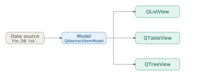
Qt’s model/view framework decouples data from its GUI representation using standardized interfaces. Models, inheriting from QAbstractItemModel,communicate with data sources and implement a set of methods for manipulating that data. Views use these methods to display the data. This architecture enables multiple views to use a single model.
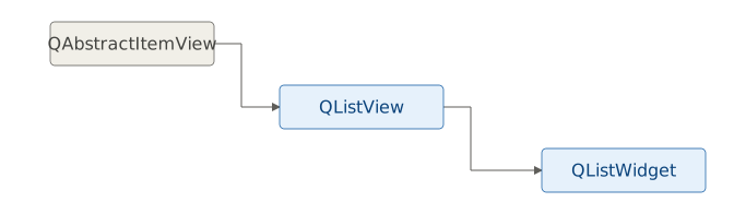
QListWidget is a convenience subclass of QListView that provides an item-based interface for adding and managing list items.Similarly, QTableWidget and QTreeWidget are convenience subclasses of QTableView and QTreeView, respectively. These widget classes are designed for ease of use, while their parent view classes (QListView, QTableView, QTreeView) are intended for use with the Model/View framework when greater flexibility is needed.
QComboBox is different from the other two. Rather than presenting a sequence of items, it lets you select a single value from an enum - the same thinh an exclusive group of QRadioButtons does (see Chapter 5). You can think of it as a space-efficient alternative to a radio group.
| Widget | Produces | Data |
|---|---|---|
QComboBox |
A single enum value | One value from a fixed set of options |
QListWidget |
A collection of values | Items may have different data type |
QListView |
A collection of values | Items data type is defined by the model |
The model/view pair can technically hold items of mixed data types, but it isn’t practical to do so: QListWidget already gives you varied items for free through QListWidgetItem, while a model’s real advantage is defining a single item data type once and letting every row conform to it.