5. Qt Widgets Buttons
Non-interactive display widgets like QLabel show text or images to the user but cannot accept input. Buttons, on the other hand, can accept user input, which is typically binary (checked or unchecked, on or off). Not all buttons are checkable by default (e.g., QPushButton requires explicit configuration), while QCheckBox supports an optional tri-state mode with three states: checked, unchecked, and partially checked.
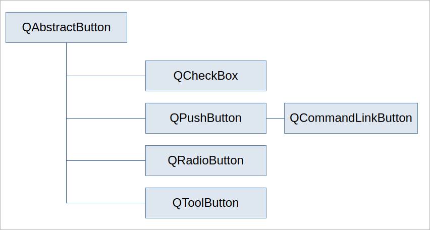
Qt provides several button classes, all inheriting from QAbstractButton:
| Qt Button Class | Purpose |
|---|---|
QPushButton |
Lets the user send a command to the application. Supports text, icons, and optional toggling. |
QCheckBox |
Used for non-mutually exclusive options (e.g., preferences). Supports binary or tri-state. |
QRadioButton |
Mutually exclusive choices within a group. Automatically deselects other radio buttons in the group. |
QToolButton |
For use in toolbars (e.g., “Save” icon). Supports popups for sub-menus. |
QCommandLinkButton |
Mimics Windows Vista command link style. |
All button classes share these signals:
| Signal | Emitted |
|---|---|
clicked(bool checked=False) |
When the button is clicked. |
pressed() |
When the button is pressed down. |
released() |
When the button is released. |
toggled(bool checked) |
When a checkable button changes its check state. |
toggled() is only emitted for buttons where setCheckable(True) has been called. clicked() is emitted for both checkable and non-checkable buttons.
You can optionally add text, an icon, a shortcut, and a tooltip to a button using these methods:
| Method |
|---|
setText(text) |
setIcon(icon) |
setShortcut(shortcut) |
setToolTip(text) |
5.1 QPushButton
QPushButton is a common GUI element that lets the user send a command to the application. toggled() is useful only if you set the QPushButton.checkable property to True, which effectively turns it into a toggle button: once pressed, it stays pressed until pressed again.
 |
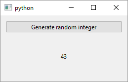
You are given a task to show a random integer in a label when a button is clicked. |
To do this:
Create a
QPushButtonobject, setting the text to be displayed on the button.Create the method to be used as the slot - this is the method that will be called when the button is clicked. In the example, the method is named
on_button_clicked()and sets a label’s text to a random integer. Note that the label is added toWindowas an instance variable so we can access it from the slot.Connect the button’s
clicked()signal with the slot.
After running the application and clicking the button you should see a window like this:
5.2 QCheckBox
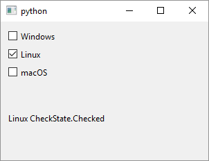
QCheckBox is a widget that consists of a graphical check box and a label. it can be checked, unchecked and - if you set its tristate property to True - partially checked. Checkboxes are used to represent options that are not mutually exclusive - more than one checkbox in a group can be checked at the same time.
|
Your task is to allow the user to select one or more operating systems. |
To do this:
Create a
QCheckBoxobject and set its display text. We create three checkboxes and add them to the window’s layout. We also set each checkboxobjectNameproperty. SettingobjectNamecan be useful in debugging or when you need to find a widget usingQObject.findChild().-
Create the slot to process checkboxes’
checkStateChangedsignals. The documentation suggests that you mark it with theSlot()decorator but if you do you also need to import theQtclass fromPySide6.QtCore. If you don’t, you get the following error:TypeError: Cannot call meta function “void on_state_changed(Qt::CheckState)” because parameter 0 of type “Qt::CheckState” cannot be converted.
This is because the
stateargument is of typeQt.CheckStateandQt.CheckState, like many other Qt enums, resides inPySide6.QtCore.Qtso you’ll often need to import it. So, in this case, either importQtor leave out theSlot()decorator.The slot sets the label’s text to the signal sender’s object name.
Finally, connect each checkbox
checkStateChangedsignal to the created slot.
5.3 QRadioButton
QRadioButton is a widget that presents the user with a set of mutually exclusive options. When you select (check) a radio button all other radio buttons that have the same parent widget are automatically unselected.
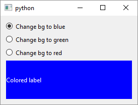
|
You want to let the user select a label’s background color. |
To do this:
Create the radio button objects and add them to the parent widget. In this example all three radio buttons have the same parent widget - the
Windowobject which is also the top level widget.Create the slot to handle the radio buttons
toggled()signal. In this case the slot has an argument thattoggleddoes not provide namedcolor.colorholds a string containing a color name and each radio button provides an appropriate color to the slot using a lambda. Qt offers its own version of CSS (cascading style sheets), called QSS2 which you can apply to widgets usingQWidget.setStyleSheet(). This is how we change the label’s background and foreground colors when a raio button is toggled.Connect the signals and the slot. In this case lambdas are needed to pass the extra argument to the slot.
Radio buttons form a group of mutually exclusive states based on their common parent widget but you can customize this behavior using QButtonGroup3.