6. Numeric Widgets
Qt offers several widgets designed for numeric input:
QSpinBox- integer valuesQDoubleSpinBox- floating-point (decimal) valuesQSlider- linear selection with a sliding handleQDial- selection with a circular dial
These widgets form two distinct inheritance trees. QDoubleSpinBox and QSpinBox are inherited from QAbstractSpinBox, while QSlider and QDial are inherited from QAbstractSlider:

All of them are bounded (they have configurable minimum and maximum values) and emit the valueChanged() when the user modifies the value.
6.1 QSpinBox
A QSpinBox allows the user select an integer either by clicking the up/down arrows, pressing the keyboard arrows or typing directly.
 |
Your task is to let the user set the monthly budget limit for a spending category, in thousand-dollar increments. |
To use a spin box in your application:
1 # The QSpinBox class provides a spin box widget.
2 # Access the current value using its value property
3
4 import sys
5 from PySide6.QtCore import Slot
6 from PySide6.QtWidgets import (QApplication,
7 QWidget, QVBoxLayout, QSpinBox, QLabel)
8
9
10 class Window(QWidget):
11
12 LABEL_STYLE = '''
13 font-size: 18px;
14 font-weight: bold;
15 '''
16
17 def __init__(self):
18
19 super().__init__()
20 self.resize(400, 250)
21 layout = QVBoxLayout()
22 self.setLayout(layout)
23
24 # 1 - Create the spinbox and set its properties
25
26 self.spinbox = QSpinBox()
27
28 # Set valid limit sizes: from $0
29 # to $100,000 in steps of $1,000.
30
31 self.spinbox.setRange(0, 100000)
32 self.spinbox.setSingleStep(1000)
33 self.spinbox.setValue(1000) # initial value
34 self.spinbox.setPrefix('$ ') # visual unit
35
36 layout.addWidget(self.spinbox)
37
38 self.label = QLabel()
39 self.label.setText(f'Monthly budget limit: $1,000')
40 self.label.setStyleSheet(Window.LABEL_STYLE)
41 layout.addWidget(self.label)
42
43 # 3. Connect the valueChanged signal with the slot
44
45 self.spinbox.valueChanged.connect(self.set_limit)
46
47 # 2. Create the slot. The value passed
48 # from the signal is an integer.
49
50 @Slot(int)
51 def set_limit(self, value):
52 self.label.setText(f'Monthly budget limit: ${value:,}')
53
54
55 if __name__ == '__main__':
56
57 app = QApplication(sys.argv)
58 main_window = Window()
59 main_window.show()
60 sys.exit(app.exec())
Create the
QSpinBoxinstance and configure it. The default spinbox range is 0-99, but in this example we restrict it to (arbitrary) budget limit sizes ($0-$100,000), set the step size $1,000, the initial value to $1,000, and prefix the unit withsetPrefix('$ '). Note that we set the initial value after setting the range so that it doesn’t get clamped to 99, the default maximum value.Define a slot that receives the new value and decorate it with
@Slot(int). The slot name isset_limit()and it sets a label’s text to the spinbox value.Connect the
valueChangedsignal to the slot. The slot receives the spinbox value as its argument.
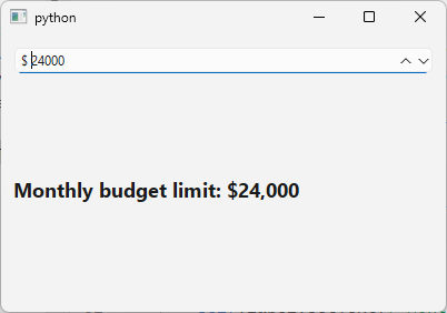
The running application should look like this:
6.2 QDoubleSpinBox
QDoubleSpinBox lets the user select a floating-point (float) value. In this example we use it to drive a calculation where a small change in the decimal value produces a genuinely different result.
|
You are building a savings account calculator. The user needs to enter the account’s annual interest rate (APR) to two-decimal precision, and see the projected first-year earning on a fixed balance recalculated live as they adjust the rate. |
To use a QDoubleSpinBox in your application:
1 # QDoubleSpinBox provides a
2 # spin box widget that takes doubles.
3
4 import sys
5 from PySide6.QtCore import Slot, Qt
6 from PySide6.QtWidgets import (QApplication, QWidget,
7 QVBoxLayout, QDoubleSpinBox, QLabel)
8
9
10 class Window(QWidget):
11
12 PRINCIPAL = 10000
13
14 LABEL_STYLE = '''
15 font-size: 18px;
16 font-weight: bold;
17 '''
18
19 def __init__(self):
20
21 super().__init__()
22 self.resize(400, 250)
23 layout = QVBoxLayout()
24 self.setLayout(layout)
25
26 # 1. Create the spinbox and set its properties
27
28 self.spinbox = QDoubleSpinBox()
29 self.spinbox.setRange(0, 15)
30 self.spinbox.setDecimals(2)
31 self.spinbox.setSingleStep(0.05)
32 self.spinbox.setSuffix(' %')
33 self.spinbox.setValue(4.50)
34
35 # 3. Connect the valueChanged signal with the slot
36
37 self.spinbox.valueChanged.connect(self.calculate_earnings)
38
39 self.label = QLabel()
40 self.label.setAlignment(Qt.AlignmentFlag.AlignCenter)
41 self.label.setStyleSheet(Window.LABEL_STYLE)
42
43 layout.addWidget(self.spinbox)
44 layout.addWidget(self.label)
45
46 self.calculate_earnings(self.spinbox.value())
47
48 # 2. Create a slot to handle its valueChanged signals.
49
50 @Slot(float)
51 def calculate_earnings(self, value):
52 earnings = Window.PRINCIPAL * (value / 100)
53 self.label.setText(
54 f'First year earnings on ${Window.PRINCIPAL:,.2f}:\n'
55 f' ${earnings:,.2f}')
56
57
58 if __name__ == '__main__':
59
60 app = QApplication(sys.argv)
61 main_window = Window()
62 main_window.show()
63 sys.exit(app.exec())
Create the spinbox and configure its properties. We set the range to 0.00-15.00, choose a single step of 0.05, append the unit with
setSuffix(' %'), and set an initial value of 4.50.Create a slot to react to the
valueChanged()signal. The slotcalculate_projected_earnings()receives the new rate as afloat, applies it to a fixed principal balance (e.g. $10,000), and updates a label with the projected first-year interest, formatted as currency.Connect the signal to the slot, then call `calculate_projected_earnings() once directly with the spinbox’s initial value so the label shows a projection before the user makes any changes..
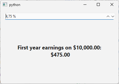
When you run the application, it should show a warning banner with adjustable opacity:
6.3 QSlider
QSlider provides a vertical or horizontal slider that lets the user select an integer value by dragging a handle. Its main signals are:
| Signal | Description |
|---|---|
valueChanged(int) |
Emitted when the slider value changes (by user or programmatically) |
sliderPressed() |
Emitted when the user starts dragging the handle |
sliderMoved(int) |
Emitted when the slider is dragged by the user (not on setVBalue()
|
sliderReleased() |
Emitted when the user releases the handle |
|
You are given the task to let the user how prominent an overdue-payment alert banner appears on screen. |
To use a slider in your application:
1 # QSlider provides a vertical or horizontal slider.
2
3 import sys
4 from PySide6.QtCore import Slot, Qt
5 from PySide6.QtWidgets import (QApplication,
6 QWidget, QVBoxLayout, QSlider, QLabel)
7
8
9 class Window(QWidget):
10
11 # A constant for the stylesheet template
12 LABEL_STYLE = '''
13 background-color: rgba(255, 74, 0, {});
14 font-size: 18px;
15 font-weight: bold;
16 '''
17
18 def __init__(self):
19
20 super().__init__()
21 self.resize(400, 250)
22 layout = QVBoxLayout()
23 self.setLayout(layout)
24
25 # 1. Create a slider and set its properties
26
27 self.slider = QSlider()
28 self.slider.setRange(0, 255)
29 self.slider.setValue(255)
30 self.slider.setPageStep(10)
31 self.slider.setTickPosition(QSlider.TickPosition.TicksBelow)
32 self.slider.setTickInterval(32)
33 self.slider.setOrientation(Qt.Orientation.Horizontal)
34
35 # 3. Connect signal
36
37 self.slider.valueChanged.connect(self.change_opacity)
38
39 self.label = QLabel('ALERT: Overdue payment!')
40 self.label.setAlignment(Qt.AlignmentFlag.AlignCenter)
41 self.label.setStyleSheet(Window.LABEL_STYLE.format(255))
42
43 layout.addWidget(self.slider)
44 layout.addWidget(self.label)
45
46 # 2. Slot that receives the new opacity value.
47
48 @Slot(int)
49 def change_opacity(self, value):
50 self.label.setStyleSheet(Window.LABEL_STYLE.format(value))
51
52
53 if __name__ == '__main__':
54
55 app = QApplication(sys.argv)
56 main_window = Window()
57 main_window.show()
58 sys.exit(app.exec())
Create and configure the slider. Set the range with
setRange(min, max)In this example we use 0-255 because we want to control the alpha channel of the overdue-payment banner’s background color in a stylesheet (rgba(0, 128, 0, alpha)). We start at 255 (fully opaque - maximum urgency) and make the slider horizontal.Create a slot to react to value changes. The slot receives an
int. Here we dynamically update the alert banner’s stylesheet, inserting the slider value as the alpha component of thergba()color.Connect the signal to the slot.
The running application should look like this:
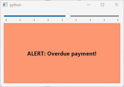
Unlike the low-balance warning from the previous section, the alert text itself stays fully legible here - only the background’s urgency color fades.
6.4 QDial
The QDial class provides a rounded range control. Unlike the QSlider, which is linear, QDial lets the user “turn” a value by dragging around a circular widget.
|
You are building a “what-if” retirement calculator. Users should be able to spin through hypotetical average annual return rates and watch a projected retirement balance respond without typing an exact figure. |
To use a dial in your application:
1 # The QDial class provides a rounded range control
2
3 import sys
4 from PySide6.QtCore import Slot, Qt
5 from PySide6.QtWidgets import (QApplication, QLabel,
6 QWidget, QVBoxLayout, QDial, QProgressBar)
7
8
9 class Window(QWidget):
10
11 PRINCIPAL = 10000
12 YEARS = 20
13 LABEL_STYLE = '''
14 font-size: 18px;
15 font-weight: bold;
16 '''
17
18 def __init__(self):
19
20 super().__init__()
21 self.resize(400, 250)
22 layout = QVBoxLayout()
23 self.setLayout(layout)
24
25 # 1 - Create the dial
26
27 self.dial = QDial()
28 self.dial.setRange(-5, 15)
29 self.dial.setValue(7)
30 self.dial.setNotchesVisible(True)
31 self.dial.setFixedSize(150, 150)
32
33 self.progress = QProgressBar()
34 self.progress.setRange(0, 165000)
35 self.progress.setTextVisible(False)
36
37 self.label = QLabel()
38 self.label.setStyleSheet(Window.LABEL_STYLE)
39 self.label.setAlignment(Qt.AlignmentFlag.AlignHCenter)
40
41 layout.addWidget(self.dial,
42 alignment=Qt.AlignmentFlag.AlignHCenter)
43 layout.addWidget(self.progress)
44 layout.addWidget(self.label)
45
46 # 3. Connect the signal the slot
47
48 self.dial.valueChanged.connect(self.update_projection)
49 self.update_projection(self.dial.value())
50
51 # 2.Create the slot.
52
53 @Slot(int)
54 def update_projection(self, value):
55
56 growth_factor = 1 + value / 100
57 balance = Window.PRINCIPAL * (growth_factor ** Window.YEARS)
58
59 self.progress.setValue(int(balance))
60 self.label.setText(
61 f'Annual Rate: {value}%\n\n'
62 f'Initial Investment: ${Window.PRINCIPAL:,.2f}\n'
63 f'After {Window.YEARS} years:\n'
64 f'${balance:,.2f}')
65
66
67 if __name__ == '__main__':
68
69 app = QApplication(sys.argv)
70 main_window = Window()
71 main_window.show()
72 sys.exit(app.exec())
Create and configure the dial.
Create a slot to respond to the dial value changes.
Connect the signal to the slot.
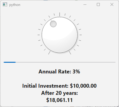
In the example, turning the QDial updates a QProgressBar in real time:
Which of the four numeric widgets you choose depends on the data type and precision you need, and their visual appearance:
| Widget | Data type | Precision |
|---|---|---|
QSpinBox |
int |
Precise |
QDoubleSpinBox |
float |
Precise |
QSlider |
int |
Imprecise |
QDial |
int |
Imprecise and value change slightly awkward |
QSpinBox and QDoubleSpinBox values are meant to be exact. QSlider and QDial value changes are imprecise, and QDial is also somewhat awkward to handle with a mouse, and is a good fit mostly for specialized applications like audio mixers and studio equipment where users expect that appearance.