25. Model-View Programming - Delegates
In Qt’s model-view architecture, a delegate sits between the view and the model and is responsible for:
- Rendering each item in the view,
- Providing an editor widget when the user wants to edit that item.
By default, Qt uses QStyledItemDelegate, which handles common data types automatically. You can subclass to take full control over painting and editing behavior. Both the default QStyledItemDelegate and its custom subclasses rely on QItemEditorFactory to create editor widgets. The factory maps data types to the appropriate editor. You can register editors globally or on per-delegate bases, or you can bypass the factory entirely by overriding createEditor() in the delegate subclass.
You have several options for changing how model data is displayed and edited. The first three options work directly with the default QStyledItemDelegate:
Use item data roles with the default
QStyledItemDelegateto adjust an item’s appearance. For example, change its background color withBackgroundRole, or add an image withDecorationRole.Register a standard widget for a data type with
QItemEditorFactory. For example, replace the default spin box for integers with a line edit.Register a custom widget for a data type with
QItemEditorFactory. For example, use a custom widget made of a pair of radio buttons to edit boolean values.Subclass
QStyledItemDelegateto control display.Subclass
QStyledItemDelegateto control editing.Subclass
QStyledItemDelegateto handle both display and editing.
| Approach | Subclassing Required | Custom Display | Custom Editing | When to Use |
|---|---|---|---|---|
| Item Data Roles | No | Limited | No | Simple appearance tweaks (color, icon, alignment, font) |
| Register Standard Widget | No | No | Yes | Replace default editor for built-in types |
| Register Custom Widget | No | No | Yes | Need a small custom widget (e.g., Yes/No radio buttons) |
| Subclass for Display only | Yes | Full | No | Complex painting (LEDs, progress bars, custom shapes) |
| Subclass for Editing only | Yes | No | Full | Complex editor logic or validation |
| Subclass for Both | Yes | Full | Full | Complete control over look and behavior |
25.1 Using Item Data Roles to Customize Display
Each item in a model can return different data depending on which role the view is asking about. The table below lists the available roles and the data types they accept:
| Role | Accepted Types |
|---|---|
| BackgroundRole | QBrush |
| CheckStateRole | CheckState |
| DecorationRole | QIcon, QPixmap, QImage, QColor |
| DisplayRole | QString and types with a string representation |
| FontRole | QFont |
| SizeHintRole | QSize |
| TextAlignmentRole | Alignment |
| ForegroundRole | QBrush |
By returning the appropriate value for each role in your model’s data() method, you can control how items look.
 |
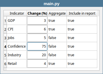
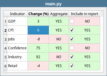
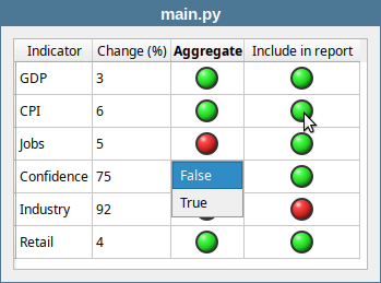
You are developing an application that displays a table of economic indicators. Use item data roles in your model to customize the display: apply green background to positive values and red to negative, right-align and italicize negative entries, render the Aggregate column boolean values as YES/NO text, and show the ‘Include in report’ column as a checkbox. |
To use item data roles to customize how the model data is displayed:
1 from PySide6.QtCore import QAbstractTableModel, QModelIndex, Qt
2 from PySide6.QtGui import QFont, QBrush, QColor
3
4
5 # 1. Create the model class.
6
7 class CsvModel(QAbstractTableModel):
8
9 def __init__(self, parent=None):
10
11 super().__init__(parent)
12 self.header = ['Indicator', 'Change (%)',
13 'Aggregate', 'Include in report']
14 self.csv_data = [
15 ['GDP', 3, True, True],
16 ['CPI', 6, True, True],
17 ['Jobs', 5, False, True],
18 ['Confidence', 75, False, True],
19 ['Industry', 92, False, True],
20 ['Retail', 4, True, True],
21 ]
22
23 self.plus_brush = QBrush(QColor("#d9fdd3"))
24 self.minus_brush = QBrush(QColor("#fce4e4"))
25
26 def rowCount(self, parent=QModelIndex()):
27 if parent.isValid():
28 return 0
29 return len(self.csv_data)
30
31 def columnCount(self, parent=QModelIndex()):
32 if parent.isValid():
33 return 0
34 return len(self.header)
35
36 # 2. Customize the data() method.
37
38 def data(self, index, role):
39
40 if not index.isValid():
41 return None
42
43 row, col = index.row(), index.column()
44 value = self.csv_data[row][col]
45
46 if role == Qt.ItemDataRole.DisplayRole:
47 if col in (2, 3):
48 return 'YES' if value else 'NO'
49 return value
50
51 if role == Qt.ItemDataRole.EditRole:
52 return value
53
54 if role == Qt.ItemDataRole.CheckStateRole:
55 if col == 3:
56 if value:
57 return Qt.CheckState.Checked
58 else:
59 return Qt.CheckState.Unchecked
60 return None
61
62 if role == Qt.ItemDataRole.BackgroundRole:
63 if col == 1:
64 if value >= 0:
65 return self.plus_brush
66 else:
67 return self.minus_brush
68 if col in (2, 3):
69 if value:
70 return self.plus_brush
71 else:
72 return self.minus_brush
73
74 if role == Qt.ItemDataRole.FontRole:
75 font = QFont()
76 if ((col == 1 and value <= 0)
77 or (col in (2, 3) and not value)):
78 font.setItalic(True)
79 return font
80
81 if role == Qt.ItemDataRole.TextAlignmentRole:
82 if col in (1, 2, 3):
83 return Qt.AlignmentFlag.AlignCenter
84
85 return None
86
87 # 3. Customize setData().
88
89 def setData(self, index, value, role):
90
91 if not index.isValid():
92 return False
93
94 row, col = index.row(), index.column()
95
96 if role == Qt.ItemDataRole.EditRole:
97 if self.csv_data[row][col] != value:
98 self.csv_data[row][col] = value
99 self.dataChanged.emit(index, index)
100 return True
101 return False
102
103 if role == Qt.ItemDataRole.CheckStateRole:
104 if col == 3:
105 checked = bool(value)
106 if self.csv_data[row][col] != checked:
107 self.csv_data[row][col] = checked
108 self.dataChanged.emit(index, index)
109 return True
110 return False
111
112 # 4. Customize flags().
113
114 def flags(self, index) -> Qt.ItemFlags:
115 if not index.isValid():
116 return Qt.ItemFlags()
117 flags = super().flags(index)
118 if index.column() in (1, 2):
119 flags |= Qt.ItemFlags.ItemIsEditable
120 if index.column() == 3: # checkbox lives here
121 flags |= Qt.ItemFlags.ItemIsUserCheckable
122 return flags
123
124 def headerData(self, section, orientation, role):
125 if (orientation == Qt.Orientation.Horizontal
126 and role == Qt.ItemDataRole.DisplayRole):
127 return self.header[section]
128 return super().headerData(section, orientation, role)
Create the model. Subclass
QAbstractTableModeland name itCsvModel. Initialize the table data directly in__init__()for simplicity. Also declare the column headers and twoQBrushfields (one green and one red) to be used for background colors.-
Customize
data(). Handle each role as follows:DisplayRole- for the boolean columns (2 and 3), return ‘YES’ forTrueand ‘NO’ for `False’ values.CheckStateRole- for column 3 only, returnCheckedforTrueandUncheckedforFalsevalues.BackgroundRole- return the green brush if the value isTrueor greater than zero; return the red brush otherwise.FontRole- return an italic font forFalsevalues and for numeric values less than zero.TextAlignmentRole- returnAlignCenterfor columns 1, 2, and 3.
-
Customize
setData(). The model needs to handle two kinds of edits:EditRole- for regular editable columns (1 and 2), store the new value directly and emitdataChangedto notify the view.CheckStateRole- for column 3, the view passes aCheckStateenum value. convert it to a plainboolbefore storing, then emitdataChanged.
Customize
flags(). For column 3 to display a checkbox, its items must be user-checkable. Return the standard flags plusItemIsUserCheckablefor that column.
1 import sys
2 from PySide6.QtWidgets import (QApplication,
3 QWidget, QTableView, QVBoxLayout)
4 from PySide6.QtTest import QAbstractItemModelTester
5 from models import CsvModel
6
7
8 class Window(QWidget):
9
10 def __init__(self):
11
12 super().__init__()
13
14 layout = QVBoxLayout()
15 self.setLayout(layout)
16
17 model = CsvModel()
18 QAbstractItemModelTester(model,
19 QAbstractItemModelTester.FailureReportingMode.Warning)
20 view = QTableView()
21 view.setModel(model)
22 view.resizeColumnsToContents()
23 layout.addWidget(view)
24
25 model.dataChanged.connect(self.on_data_changed)
26
27 def on_data_changed(self, topLeft, bottomRight, roles):
28 for row in topLeft.model().csv_data:
29 print(row)
30
31
32 if __name__ == '__main__':
33
34 app = QApplication(sys.argv)
35 main_window = Window()
36 main_window.show()
37 sys.exit(app.exec())
Now, when you run the application you should see a window like this:
25.2 Registering Standard Widgets with QItemEditorFactory
When a user clicks to edit an item, the delegate is responsible for showing an editor widget. The delegate does not create those editors itself - it uses a QItemEditorFactory to create editors for it.
A factory maps data types to editor widgets. For each type, it holds an item editor creator, a small helper that produces the right editor widget for that type.
Qt provides a default factory that all delegates share. The table below shows the default editor widget for each supported type:
| Type | Editor Widget |
|---|---|
| bool | QComboBox |
| double | QDoubleSpinBox |
| int | QSpinBox |
| unsigned int | QSpinBox |
| QDate | QDateEdit |
| QDateTime | QDateTimeEdit |
| QPixmap | QLabel |
| QString | QLineEdit |
| QTime | QTimeEdit |
|
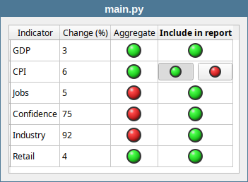
You are building a banking application that displays a table of economic indicators. The |
To replace the default editor widget for a data type with another standard widget:
1 from PySide6.QtCore import Qt
2 from PySide6.QtGui import QIntValidator
3 from PySide6.QtWidgets import QItemEditorCreatorBase, QLineEdit
4
5
6 # 1. Create an item editor creator.
7
8 class NumericLineEditCreator(QItemEditorCreatorBase):
9
10 def __init__(self, min_val=-100, max_val=100):
11 super().__init__()
12 self.min_val = min_val
13 self.max_val = max_val
14
15 def createWidget(self, parent):
16 editor = QLineEdit(parent)
17 editor.setAutoFillBackground(True)
18 validator = QIntValidator(self.min_val, self.max_val, editor)
19 editor.setValidator(validator)
20 editor.setAlignment(Qt.AlignmentFlag.AlignCenter)
21
22 # If we don't implement valuePropertyName()
23 # the widget's user property is used
24 # (in this case 'text')
25 print(editor.metaObject().userProperty().name())
26
27 return editor
-
Create an editor creator. Subclass
QItemEditorCreatorBaseand name itNumericLineEditCreator. Reimplement itscreateWidget()method to:- Create a
QLineEditobject. - Call
setAutoFillBackground(True)so the editor fully covers the table cell. - Create a
QIntValideatorand set it as the line edit’s validator. Note that the editor is constructed with theparentargument and that the creator does not keep a reference to the editor - deleting the editor isparents responsibility.
In the main window:
1 import sys
2 from PySide6.QtCore import QMetaType
3 from PySide6.QtWidgets import (QApplication, QWidget,
4 QTableView, QVBoxLayout, QItemEditorFactory,
5 QStyledItemDelegate)
6 from PySide6.QtTest import QAbstractItemModelTester
7 from models import CsvModel
8 from editorcreators import NumericLineEditCreator
9
10
11 class Window(QWidget):
12
13 def __init__(self):
14
15 super().__init__()
16
17 layout = QVBoxLayout()
18 self.setLayout(layout)
19
20 model = CsvModel()
21 QAbstractItemModelTester(model,
22 QAbstractItemModelTester.FailureReportingMode.Warning)
23
24 # 2. Create a QItemEditorFactory object
25 # and register the custom editor with it.
26
27 factory = QItemEditorFactory()
28 factory.registerEditor(
29 QMetaType.Type.Int, NumericLineEditCreator())
30
31 # 3. Create a styled item delegate
32 # and and set factory as its editor factory.
33
34 delegate = QStyledItemDelegate()
35 delegate.setItemEditorFactory(factory)
36
37 view = QTableView()
38 view.setModel(model)
39
40 # 4. Set delegate as the item delegate
41 # for the appropriate column.
42
43 view.setItemDelegateForColumn(1, delegate)
44
45 view.resizeColumnsToContents()
46 layout.addWidget(view)
47 model.dataChanged.connect(self.on_data_changed)
48
49 def on_data_changed(self, topLeft, bottomRight, roles):
50 for row in topLeft.model().csv_data:
51 print(row)
52
53 if __name__ == '__main__':
54
55 app = QApplication(sys.argv)
56 main_window = Window()
57 main_window.show()
58 sys.exit(app.exec())
Create a factory and register the custom creator. Instantiate a
QItemEditorFactoryand useregisterEditor()to associate aNumericLineEditCreatorwith theinttype. All other types keep their default editors.Create a delegate and assign
factoryto it. Instantiate aQStyledItemDelegateand usesetItemEditorFactory()to give it the factory you just created.-
Assign the delegate to the target column. Call
view.setItemDelegateForColumn(1, delegate)to apply the custom editor only to the ‘Change’ column.This is the most targeted option when using a custom view editor:
setItemDelegateForColumn()affects one column of one view.setItemDelegate()affects the entire viewQItemEditorFactory.setsDefaultFactory()affects all delegates in the entire application.
The model class is the same CsvModel from the previous section, without any custom formatting:
1 from PySide6.QtCore import QAbstractTableModel, QModelIndex, Qt
2
3
4 class CsvModel(QAbstractTableModel):
5
6 def __init__(self, parent=None):
7
8 super().__init__(parent)
9
10 self.header = ['Indicator', 'Change (%)',
11 'Aggregate', 'Include in report']
12 self.csv_data = [
13 ['GDP', 3, True, True],
14 ['CPI', 6, True, True],
15 ['Jobs', 5, False, True],
16 ['Confidence', 75, False, True],
17 ['Industry', 92, False, True],
18 ['Retail', 4, True, True],
19 ]
20
21 def rowCount(self, parent=QModelIndex()):
22 if parent.isValid():
23 return 0
24 return len(self.csv_data)
25
26 def columnCount(self, parent=QModelIndex()):
27 if parent.isValid():
28 return 0
29 return len(self.header)
30
31 def data(self, index, role):
32 value = self.csv_data[index.row()][index.column()]
33 if role == Qt.ItemDataRole.DisplayRole:
34 return value
35 if role == Qt.ItemDataRole.EditRole:
36 return value
37
38 def setData(self, index, value, role):
39 if role == Qt.ItemDataRole.EditRole:
40 row, col = index.row(), index.column()
41 if col == 1:
42 try:
43 value = int(value)
44 except (ValueError, TypeError):
45 return False
46 if self.csv_data[row][col] != value:
47 self.csv_data[row][col] = value
48 self.dataChanged.emit(index, index)
49 return True
50 return False
51 return False
52
53 def flags(self, index) -> Qt.ItemFlag:
54 if not index.isValid():
55 return Qt.ItemFlags()
56 return (super().flags(index) |
57 Qt.ItemFlag.ItemIsEditable)
58
59 def headerData(self, section, orientation, role):
60 if orientation == Qt.Orientation.Horizontal:
61 if role == Qt.ItemDataRole.DisplayRole:
62 return self.header[section]
25.3 Registering Custom Widgets with QItemEditorFactory
You are not limited to Qt’s built-in widgets when providing editors - you can use your own custom widgets just as easily.
|
You are extending the banking application’s indicator table. The ‘Aggregate’ and Include in report’ columns hold boolean values that users need to edit. Use |
To register a custom widget as an editor:
1 from PySide6.QtCore import Property, Slot
2 from PySide6.QtWidgets import (QWidget, QRadioButton,
3 QHBoxLayout)
4
5
6 # 1. Create the custom editor widget.
7
8 class SwitchWidget(QWidget):
9
10 def __init__(self, parent=None):
11
12 super().__init__(parent)
13
14 self.setAutoFillBackground(True)
15 self._value = False
16
17 self.true_radio = QRadioButton('Yes')
18 self.false_radio = QRadioButton('No')
19 self.true_radio.toggled.connect(self.on_toggled)
20
21 layout = QHBoxLayout()
22 layout.addWidget(self.true_radio)
23 layout.addWidget(self.false_radio)
24 layout.setContentsMargins(0, 0, 0, 0)
25 self.setLayout(layout)
26 self.setMinimumHeight(self.sizeHint().height())
27
28 @Slot(bool)
29 def on_toggled(self, checked):
30 self.setValue(checked)
31
32 def getValue(self):
33 return self._value
34
35 def setValue(self, value):
36 if value != self._value:
37 self._value = value
38 if value:
39 self.true_radio.setChecked(True)
40 else:
41 self.false_radio.setChecked(True)
42
43 value = Property(bool, getValue, setValue, user=True)
- Create the custom editor widget. Subclass
QWidgetand lay out two radio buttons horizontally, one forTrue(‘Yes’) and one forFalse(‘No’). Add avalueproperty, with a getter and setter, and mark it as the user property withuser=True. This is the property that the delegate uses as the bridge to the model: it populates the editor by writing tovaluewhen the editor opens, and readsvalueback to store the result when the editor closes. If you want to bind a different property to the model, reimplementQItemEditorCreatorBase.valuePropertyName()in your creator class.
1 from PySide6.QtWidgets import QItemEditorCreatorBase
2 from switchwidget import SwitchWidget
3
4 # 2. Create an editor creator.
5
6 class SwitchCreator(QItemEditorCreatorBase):
7
8 def createWidget(self, parent):
9 return SwitchWidget(parent)
- Create an editor creator. Subclass
QItemEditorCreatorBaseand reimplementcreateWidget(). Since all the widget logic lives in the widget class itself, the creator is minimal - it just returns a new instance of your widget.
1 import sys
2 from PySide6.QtCore import QMetaType
3 from PySide6.QtWidgets import (QApplication, QWidget,
4 QTableView, QVBoxLayout, QItemEditorFactory,
5 QStyledItemDelegate)
6 from PySide6.QtTest import QAbstractItemModelTester
7 from models import CsvModel
8 from switchcreator import SwitchCreator
9
10
11 class Window(QWidget):
12
13 def __init__(self):
14
15 super().__init__()
16
17 layout = QVBoxLayout()
18 self.setLayout(layout)
19
20 model = CsvModel()
21 QAbstractItemModelTester(model,
22 QAbstractItemModelTester.FailureReportingMode.Warning)
23
24 # 3. Create a factory and register the editor.
25 # Create a delegate, and assign the factory to it.
26 # Assign the delegate to the target columns.
27
28 factory = QItemEditorFactory()
29 factory.registerEditor(
30 QMetaType.Type.Bool, SwitchCreator())
31
32 delegate = QStyledItemDelegate()
33 delegate.setItemEditorFactory(factory)
34
35 view = QTableView()
36 view.setModel(model)
37
38 view.setItemDelegateForColumn(2, delegate)
39 view.setItemDelegateForColumn(3, delegate)
40
41 view.resizeColumnsToContents()
42 layout.addWidget(view)
43 model.dataChanged.connect(self.on_data_changed)
44
45 def on_data_changed(self, topLeft, bottomRight, roles):
46 for row in topLeft.model().csv_data:
47 print(row)
48
49 if __name__ == '__main__':
50
51 app = QApplication(sys.argv)
52 main_window = Window()
53 main_window.show()
54 sys.exit(app.exec())
-
Put everything together,following the same steps as in the previous section:
- Create a
QItemEditorFactoryand callregisterEditor()to associate your creator with thebooltype. - Instantiate a
QStyledItemDelegateand assign the factory to it withsetItemEditorFactory(). - Call
view.setItemDelegateForColumn()for each target column.
The model class remains the same as in the previous section.
25.4 Custom Display in QStyledItemDelegate
The QStyledItemDelegate.paint() method is called by the view whenever an item needs to be drawn. Its signature is:
1 `QStyledItemDelegate.paint(painter, option, index)`
where:
painteris aQPainter, that performs the actual drawing.optionis aQStyleOptionViewItem, a snapshot of the drawing parameters for this item, including the available drawing area, palette and font.indexis a `QModelIndex, which is used to locate the item’s data in the model.
You can subclass QStyledItemDelegate and reimplement paint() to take full control over how an item looks in the view.
|
You are extending the banking application’s indicator table. Subclass |
To customize how items are displayed:
1 from PySide6.QtCore import Qt, QRect
2 from PySide6.QtGui import QPainter, QBrush, QRadialGradient, QColor
3 from PySide6.QtWidgets import QStyledItemDelegate
4
5
6 # 1. Subclass QStyledItemDelegate
7
8 class LedDelegate(QStyledItemDelegate):
9
10 def paint(self, painter, option, index):
11
12 value = index.data(Qt.ItemDataRole.EditRole)
13 self.draw_led(painter, option.rect, value)
14 super().paint(painter, option, index)
15
16 # 2. Draw the delegate
17
18 def draw_led(self, painter, rect, value):
19
20 diameter = min(rect.width(), rect.height()) - 8
21 diameter = min(diameter, 24)
22 x = rect.x() + (rect.width() - diameter) // 2
23 y = rect.y() + (rect.height() - diameter) // 2
24 led_rect = QRect(x, y, diameter, diameter)
25
26 base_color = QColor('#22cc22') if value else QColor('#cc2222')
27 dark_color = QColor('#116611') if value else QColor('#661111')
28
29 gradient = QRadialGradient(
30 led_rect.x() + diameter * 0.35,
31 led_rect.y() + diameter * 0.30,
32 diameter * 0.65
33 )
34 gradient.setColorAt(0.0, QColor(255, 255, 255, 220))
35 gradient.setColorAt(0.25, base_color.lighter(140))
36 gradient.setColorAt(0.7, base_color)
37 gradient.setColorAt(1.0, dark_color)
38
39 painter.save()
40 painter.setRenderHint(QPainter.RenderHint.Antialiasing)
41
42 painter.setBrush(QBrush(QColor('#333333')))
43 painter.setPen(Qt.PenStyle.NoPen)
44 painter.drawEllipse(led_rect)
45
46 dome_rect = led_rect.adjusted(2, 2, -2, -2)
47 painter.setBrush(QBrush(gradient))
48 painter.drawEllipse(dome_rect)
49
50 painter.restore()
-
Subclass
QStyledItemDelegate. Create a subclass namedLedDelegateand reimplementpaint(). Inpaint():- Retrieve the item’s value from the model via
index.data(). - Call
draw_led()to paint the LED in the item’s cell. - Call
super.paint()to let the base class draw selection highlighting and fill the cell background when its editor is opened.
-
Paint the LED. Extract the drawing logic into a helper method named
draw_led(). In this method:- Use
option.rectto calculate the drawing area. Cap the diameter and add padding. - Define two colors, green for
Truevalues and red forFalse. - Create a
QGradialRadientto give the LED somewhat realistic appearance. - Call
drawEllipse()twice, once for the dark outer ring, and once for the gradient-filled dome on top.
1 import sys
2 from PySide6.QtWidgets import QApplication, QTableView, QWidget, QVBoxLayout
3 from PySide6.QtTest import QAbstractItemModelTester
4 from models import CsvModel
5 from delegates import LedDelegate
6
7
8 class Window(QWidget):
9
10 def __init__(self):
11
12 super().__init__()
13
14 layout = QVBoxLayout()
15 self.setLayout(layout)
16
17 model = CsvModel()
18 QAbstractItemModelTester(model,
19 QAbstractItemModelTester.FailureReportingMode.Warning)
20
21 view = QTableView()
22 view.setModel(model)
23
24 # 3. Create the custom delegate object.
25
26 delegate = LedDelegate()
27
28 # 4. Set the delegate for the appropriate columns.
29
30 view.setItemDelegateForColumn(2, delegate)
31 view.setItemDelegateForColumn(3, delegate)
32
33 view.resizeColumnsToContents()
34 layout.addWidget(view)
35
36 model.dataChanged.connect(self.on_data_changed)
37
38 def on_data_changed(self, topLeft, bottomRight, roles):
39 for row in topLeft.model().csv_data:
40 print(row)
41
42
43 if __name__ == '__main__':
44
45 app = QApplication(sys.argv)
46 main_window = Window()
47 main_window.show()
48 sys.exit(app.exec())
Create the delegate. In the main window instantiate
LedDelegate().Assign the delegate to the target columns. Call
setItemDelegateForColumn()for columns 2 and 3, which hold the boolean values.
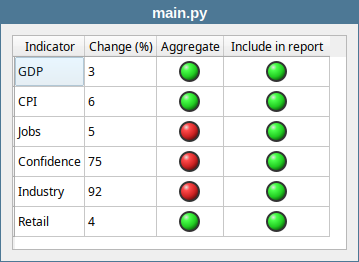
When you run the application, both boolean columns display green LEDs for True values and red LEDs for False. Double-clicking a cell still opens the default combobox editor for booleans- custom painting does not affect editing behavior.
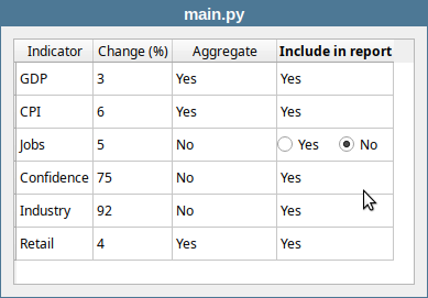
25.5 Custom Editors in QStyledItemDelegate
In the previous section we customized how items are displayed by reimplementing paint(). To also provide a custom editor, you need to reimplement three additional methods:
createEditor(parent, option, index), which creates and returns the editor widget for the item.setEditorData(editor, index), which populates the editor with the item’s current value from the model.setModelData(editor, model, index), which reads the value from the editor and stores it in the model.
|
You are extending the banking application’s indicator table. Subclass |
To provide a custom editor:
1 from PySide6.QtCore import QRect, Qt
2 from PySide6.QtGui import QColor, QRadialGradient, QPainter, QBrush
3
4 # 1. Extract the drawing logic into a standalone function.
5
6 def draw_led(painter, rect, value):
7
8 diameter = min(rect.width(), rect.height()) - 8
9 diameter = min(diameter, 24)
10 x = rect.x() + (rect.width() - diameter) // 2
11 y = rect.y() + (rect.height() - diameter) // 2
12 led_rect = QRect(x, y, diameter, diameter)
13
14 base_color = QColor('#22cc22') if value else QColor('#cc2222')
15 dark_color = QColor('#116611') if value else QColor('#661111')
16
17 gradient = QRadialGradient(
18 led_rect.x() + diameter * 0.35,
19 led_rect.y() + diameter * 0.30,
20 diameter * 0.65
21 )
22 gradient.setColorAt(0.0, QColor(255, 255, 255, 220))
23 gradient.setColorAt(0.25, base_color.lighter(140))
24 gradient.setColorAt(0.7, base_color)
25 gradient.setColorAt(1.0, dark_color)
26
27 painter.save()
28 painter.setRenderHint(QPainter.RenderHint.Antialiasing)
29
30 painter.setBrush(QBrush(QColor('#333333')))
31 painter.setPen(Qt.PenStyle.NoPen)
32 painter.drawEllipse(led_rect)
33
34 dome_rect = led_rect.adjusted(2, 2, -2, -2)
35 painter.setBrush(QBrush(gradient))
36 painter.drawEllipse(dome_rect)
37 painter.restore()
- Extract the LED drawing logic into a standalone function. Both the delegate’s
paint()method and the editor widget’s button need to draw LEDs.
1 from PySide6.QtCore import Qt, Property, Slot
2 from PySide6.QtGui import QPainter, QKeyEvent
3 from PySide6.QtWidgets import QWidget, QPushButton, QHBoxLayout
4 from ledpainter import draw_led
5
6
7 class LedButton(QPushButton):
8
9 def __init__(self, led_value, parent=None):
10 super().__init__(parent)
11 self.led_value = led_value
12 self.setFocusPolicy(Qt.FocusPolicy.StrongFocus)
13
14 def paintEvent(self, event):
15 super().paintEvent(event)
16 painter = QPainter(self)
17 painter.setRenderHint(QPainter.RenderHint.Antialiasing)
18 rect = self.rect()
19 draw_led(painter, rect, self.led_value)
20
21 # 2. Create the custom editor widget.
22
23 class LedWidget(QWidget):
24
25 def __init__(self, parent=None):
26
27 super().__init__(parent)
28
29 self.setAutoFillBackground(True)
30 self._value = False
31
32 self.true_button = LedButton(True)
33 self.true_button.setCheckable(True)
34 self.true_button.setAutoExclusive(True)
35
36 self.false_button = LedButton(False)
37 self.false_button.setCheckable(True)
38 self.false_button.setAutoExclusive(True)
39 self.true_button.toggled.connect(self.on_toggled)
40
41 layout = QHBoxLayout()
42 layout.addWidget(self.true_button)
43 layout.addWidget(self.false_button)
44 layout.setContentsMargins(0, 0, 0, 0)
45 self.setLayout(layout)
46 self.setMinimumHeight(self.sizeHint().height())
47
48 @Slot(bool)
49 def on_toggled(self, checked):
50 self.setValue(checked)
51
52 def getValue(self):
53 return self._value
54
55 def setValue(self, value):
56 if value != self._value:
57 self._value = value
58 if value:
59 self.true_button.setChecked(True)
60 else:
61 self.false_button.setChecked(True)
62
63 value = Property(bool, getValue, setValue, user=True)
64
65 def keyPressEvent(self, event: QKeyEvent):
66 if event.key() in (Qt.Key.Key_Left, Qt.Key.Key_Right):
67 self.setValue(not self._value)
68 event.accept()
69 return
70 super().keyPressEvent(event)
- Create the custom editor widget. The editor widget consists of two buttons laid out horizontally, each displaying a LED - green for
Trueon the left, red forFalseon the right. First create aQPushButtonsubclass that reimplementspaintEvent()to draw a LED usingdraw_led()instead of showing text. Also create aQWidgetsubclass that holds twoLedButtons in a horizontal layout. Add avalueproperty with a getter and setter, and reimplementkeyPressEvent()so the user can toggle the value by pressing the left or right arrow keys.
1 from PySide6.QtCore import Qt
2 from PySide6.QtWidgets import QStyledItemDelegate
3 from widgets import LedWidget
4 from ledpainter import draw_led
5
6 # 3. Create the QStyledItemDelegate subclass
7 # and reimplement createEditor(), setEditorData()
8 # and setModelData()
9
10 class LedDelegate(QStyledItemDelegate):
11
12 def createEditor(self, parent, option, index):
13 editor = LedWidget(parent)
14 return editor
15
16 def setEditorData(self, editor, index):
17 editor.setValue(index.data(Qt.ItemDataRole.EditRole))
18
19 def setModelData(self, editor, model, index):
20 model.setData(index, editor.getValue(),
21 Qt.ItemDataRole.EditRole)
22
23 def paint(self, painter, option, index):
24 value = index.data(Qt.ItemDataRole.EditRole)
25 draw_led(painter, option.rect, value)
26 super().paint(painter, option, index)
-
Subclass
QStyledItemDelegate. CreateLedDelegateand reimplement the four methods:paint()drows the LED in the cell, as in the previous section.createEditor()simply creates and returns aLedWidget.setEditorData()writes the item’s current value toLedWidget.value.setModelData()readsLedWidget.valueand writes it back to the model viasetData().
1 import sys
2 from PySide6.QtWidgets import QApplication, QTableView, QWidget, QVBoxLayout
3 from PySide6.QtTest import QAbstractItemModelTester
4 from models import CsvModel
5 from delegates import LedDelegate
6
7
8 class Window(QWidget):
9
10 def __init__(self):
11
12 super().__init__()
13
14 layout = QVBoxLayout()
15 self.setLayout(layout)
16
17 model = CsvModel()
18 QAbstractItemModelTester(model,
19 QAbstractItemModelTester.FailureReportingMode.Warning)
20
21 delegate = LedDelegate()
22
23 view = QTableView()
24 view.setModel(model)
25
26 view.setItemDelegateForColumn(2, delegate)
27 view.setItemDelegateForColumn(3, delegate)
28
29 view.resizeColumnsToContents()
30 view.setCurrentIndex(model.index(0, 2))
31 view.setEditTriggers(
32 QTableView.EditTrigger.EditKeyPressed |
33 QTableView.EditTrigger.DoubleClicked)
34
35 view.setFocus()
36 layout.addWidget(view)
37
38 model.dataChanged.connect(self.on_data_changed)
39
40 def on_data_changed(self, topLeft, bottomRight, roles):
41 for row in topLeft.model().csv_data:
42 print(row)
43
44
45 if __name__ == '__main__':
46
47 app = QApplication(sys.argv)
48 main_window = Window()
49 main_window.show()
50 sys.exit(app.exec())
In the main window, create the model, view and delegate and assign the delegate to columns 2 and 3, as in the previous sections.
Now, when you run the application and double-click a boolean cell, the custom editor opens in place.
25.6 Combining Display and Editing in Delegates
The previous section showed how to provide both custom display and a custom editor widget. For boolean values, however, opening an editor on double-click is more ceremony that necessary - a single click or keystroke is enough to toggle the value. Qt supports this through editorEvent(), a method the delegate receives mouse and key events through even when no editor is opened.
|
You are extending the banking application’s indicator table. Create a delegate that paints LED indicators for boolean columns and handles editing without creating any editor widget. |
To combine display and editing in a delegate without an editor widget:
1 from PySide6.QtCore import Qt, QEvent
2 from PySide6.QtWidgets import QStyledItemDelegate
3 from ledpainter import draw_led
4
5
6 class LedDelegate(QStyledItemDelegate):
7
8 # 1. Return None from createEditor.
9
10 def createEditor(self, parent, option, index):
11 return None
12
13 # 2. Reimplement paint()
14
15 def paint(self, painter, option, index):
16 value = index.data(Qt.ItemDataRole.EditRole)
17 draw_led(painter, option.rect, value)
18 super().paint(painter, option, index)
19
20 # 3. Reimplement editorEvent()
21
22 def editorEvent(self, event, model, option, index):
23
24 if event.type() == QEvent.Type.MouseButtonRelease:
25 if event.button() == Qt.MouseButton.LeftButton:
26 if option.rect.contains(event.pos()):
27 current = model.data(index, Qt.ItemDataRole.EditRole)
28 model.setData(index, not current,
29 Qt.ItemDataRole.EditRole)
30 return True
31
32 if event.type() == QEvent.Type.KeyPress:
33 if event.key() == Qt.Key.Key_Space:
34 current = model.data(index, Qt.ItemDataRole.EditRole)
35 model.setData(index, not current,
36 Qt.ItemDataRole.EditRole)
37 return True
38
39 return super().editorEvent(event, model, option, index)
Reimplement
createEditor()to returnNone. This suppresses the default editor - double-clicking a cell does nothing.Reimplement
paint()to draw LEDs, as in the previous sections.-
Reimplement
editorEvent():- For a
MouseButtonReleaseevent: if the left mouse button was released inside the cell (option.rect.contains(event.pos())), read the current value from the model, toggle it, and write it back. - For a
KeyPressevent: if the key isSpace, read the current value from the model, toggle it, and write it back. - For all other events, call the base class implementation.
When you run the application, boolean cells can be toggled with a single left click or by pressing Space.
25.7 Persistent Editors in Views
In all previous sections, editors appeared only while the user was actively editing, opening on double-click or keypress and closing when done. A persistent editor stays visible in the cell at all times, with no click required to activate it. This is useful when you want certain fields to be immediatelly editable without any extra interaction.
Persistent editors are opened by calling view.openPersistentEditor() for each cell that should have one. The view than keeps the editor widget visible for the lifetime of that cell.
|
You are extending the banking application’s indicator table. Make the |
To open persistent editors on a column:
1 from PySide6.QtCore import Qt
2 from PySide6.QtGui import QIntValidator
3 from PySide6.QtWidgets import QItemEditorCreatorBase, QLineEdit
4
5
6 class StrictIntValidator(QIntValidator):
7 def validate(self, input_, pos):
8 state, input_, pos = super().validate(input_, pos)
9 if state == QIntValidator.State.Intermediate:
10 try:
11 if int(input_) not in range(self.bottom(), self.top() + 1):
12 state = QIntValidator.State.Invalid
13 except ValueError:
14 pass
15 return state, input_, pos
16
17
18 # 1. Create the editor creator class.
19
20 class NumericLineEditCreator(QItemEditorCreatorBase):
21
22 def createWidget(self, parent):
23 editor = QLineEdit(parent)
24 editor.setAutoFillBackground(True)
25 editor.setValidator(StrictIntValidator(-100, 100, editor))
26 editor.setAlignment(Qt.AlignmentFlag.AlignRight)
27 return editor
28
29 def valuePropertyName(self):
30 return 'text'
-
Create the
NumericLineEditCreatorclass:- Reimplement
createWidget()to create aQLineEditas the editor and install a custom int validator on it. - Reimplement
valuePropertyName()to return'text'instead of relying on a user property. This tells the delegate to read and write the line edit’stextproperty when transferring data to and from the model.
1 from PySide6.QtCore import QAbstractTableModel, QModelIndex, Qt
2
3
4 class CsvModel(QAbstractTableModel):
5
6 def __init__(self, parent=None):
7 super().__init__(parent)
8 self.header = ['Indicator', 'Change (%)',
9 'Aggregate', 'Include in report']
10 self.csv_data = [
11 ['GDP', 3, True, True],
12 ['CPI', 6, True, True],
13 ['Jobs', 5, False, True],
14 ['Confidence', 75, False, True],
15 ['Industry', 92, False, True],
16 ['Retail', 4, True, True],
17 ]
18
19 def rowCount(self, parent=QModelIndex()):
20 if parent.isValid():
21 return 0
22 return len(self.csv_data)
23
24 def columnCount(self, parent=QModelIndex()):
25 if parent.isValid():
26 return 0
27 return len(self.header)
28
29 def data(self, index, role):
30
31 if not index.isValid():
32 return None
33
34 if role in (Qt.ItemDataRole.DisplayRole,
35 Qt.ItemDataRole.EditRole):
36 row, col = index.row(), index.column()
37 value = self.csv_data[row][col]
38 return value
39
40 # 2. Convert the value from string to integer
41 # and store it.
42
43 def setData(self, index, value, role):
44 if not index.isValid():
45 return False
46
47 row, col = index.row(), index.column()
48
49 if role == Qt.ItemDataRole.EditRole:
50 print(value)
51 if col == 1:
52 try:
53 value = int(value)
54 except (ValueError, TypeError):
55 print(value)
56 return False
57
58 if self.csv_data[row][col] != value:
59 self.csv_data[row][col] = value
60 self.dataChanged.emit(index, index)
61 return True
62 return False
63
64 def flags(self, index):
65 if not index.isValid():
66 return Qt.ItemFlags()
67 flags = super().flags(index)
68 flags |= Qt.ItemFlags.ItemIsEditable
69 return flags
70
71 def headerData(self, section, orientation, role):
72 if (orientation == Qt.Orientation.Horizontal
73 and role == Qt.ItemDataRole.DisplayRole):
74 return self.header[section]
75 return super().headerData(section, orientation, role)
76
- In the model’s
setData()then convert the string back tointbefore storing it.
1 import sys
2 from PySide6.QtCore import QMetaType
3 from PySide6.QtWidgets import (QApplication, QTableView,
4 QWidget, QVBoxLayout, QItemEditorFactory, QStyledItemDelegate)
5 from PySide6.QtTest import QAbstractItemModelTester
6 from models import CsvModel
7 from editorcreators import NumericLineEditCreator
8
9
10 class Window(QWidget):
11 def __init__(self):
12 super().__init__()
13 layout = QVBoxLayout()
14 self.setLayout(layout)
15
16 model = CsvModel()
17 QAbstractItemModelTester(model,
18 QAbstractItemModelTester.FailureReportingMode.Warning)
19
20 view = QTableView()
21 view.setModel(model)
22 view.resizeColumnsToContents()
23
24 # 3. Set up the factory and the delegate.
25
26 factory = QItemEditorFactory()
27 factory.registerEditor(QMetaType.Type.Int, NumericLineEditCreator())
28 delegate = QStyledItemDelegate()
29 delegate.setItemEditorFactory(factory)
30 view.setItemDelegateForColumn(1, delegate)
31
32 # 4. Open a persistent editor for each cell in column 1.
33
34 for row in range(model.rowCount()):
35 index = model.index(row, 1)
36 view.openPersistentEditor(index)
37
38 layout.addWidget(view)
39
40 model.dataChanged.connect(self.on_data_changed)
41
42 def on_data_changed(self, topLeft, bottomRight, roles):
43 for row in topLeft.model().csv_data:
44 print(row)
45
46 if __name__ == '__main__':
47 app = QApplication(sys.argv)
48 main_window = Window()
49 main_window.show()
50 sys.exit(app.exec())
Set up the factory and the delegate, as in section 25.2. Register
NumericLineEditorCreatorfor theinttype and assign the delegate to column 1.Open a persistent editor for each cell in the column. After the model and view are set up, loop over the row and call
view.openPersistentEditor()for each index in column 1. The view immediately instantiates the editor widget for each cell. Users can edit values directly without double-clicking.