11. Containers
Qt container widgets are visual elements used for organizing and grouping widgets into more complex applications. This chapter covers five container widgets: QGroupBox, QToolBox, QTabWidget, and QSplitter.
11.1 QGroupBox
QGroupBox is a widget that draws a frame with a title along its top edge. It is commonly used to visually group related widgets, especially checkboxes or radio buttons, although it can hold any type of child widget. QGroupBox does not lay out its children automatically - you must assign a layout to it, using one of the Qt layout classes. You can make a QGroupBox checkable, which allows the user enable or disable all of its children at once using a single checkbox.
 |
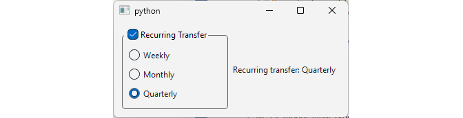
You are extending the finance application with a recurring transfer feature. The user picks a frequency (weekly, monthly, or quarterly) using radio buttons, and enable/disable the entire recurring transfer with one checkbox. |
To create a checkable group of mutually exclusive options:
 1 # A group box provides a frame, a title on top
 2 # and displays various other widgets inside itself.
 3
 4 import sys
 5 from PySide6.QtCore import Slot
 6 from PySide6.QtWidgets import (QApplication,
 7     QWidget, QHBoxLayout, QVBoxLayout,
 8     QGroupBox, QRadioButton, QLabel)
 9
10
11 class Window(QWidget):
12
13     def __init__(self):
14
15         super().__init__()
16         self.resize(340, 140)
17         layout = QHBoxLayout()
18
19         self.label = QLabel()
20
21         # 1. Create the group box and add a layout to it.
22         #   You can't add widgets directly to the group box,
23         #   you have to use a layout.
24
25         self.groupbox = QGroupBox()
26         self.groupbox.setCheckable(True)
27         self.groupbox.setChecked(True)
28         self.groupbox.setTitle('Recurring Transfer')
29
30         groupbox_layout = QVBoxLayout()
31         self.groupbox.setLayout(groupbox_layout)
32
33         # 2 - Add widgets to the layout.
34
35         self.weekly_radio = QRadioButton('Weekly')
36         self.monthly_radio = QRadioButton('Monthly')
37         self.quarterly_radio = QRadioButton('Quarterly')
38
39         groupbox_layout.addWidget(self.weekly_radio)
40         groupbox_layout.addWidget(self.monthly_radio)
41         groupbox_layout.addWidget(self.quarterly_radio)
42
43         # 4- Connect the signals with the slot.
44
45         self.groupbox.toggled.connect(self.set_frequency)
46         self.weekly_radio.toggled.connect(self.set_frequency)
47         self.monthly_radio.toggled.connect(self.set_frequency)
48         self.quarterly_radio.toggled.connect(self.set_frequency)
49
50         layout.addWidget(self.groupbox)
51         layout.addWidget(self.label)
52
53         self.monthly_radio.setChecked(True)
54
55         self.setLayout(layout)
56
57     # 3 - Add the slot method.
58
59     @Slot()
60     def set_frequency(self):
61
62         if not self.groupbox.isChecked():
63             self.label.setText('Recurring transfer: Disabled')
64             return
65
66         if self.weekly_radio.isChecked():
67             self.label.setText('Recurring transfer: Weekly')
68         elif self.monthly_radio.isChecked():
69             self.label.setText('Recurring transfer: Monthly')
70         elif self.quarterly_radio.isChecked():
71             self.label.setText('Recurring transfer: Quarterly')
72
73
74 if __name__ == '__main__':
75
76     app = QApplication(sys.argv)
77     main_window = Window()
78     main_window.show()
79     sys.exit(app.exec())
Create a
QGroupBoxand add a layout to it. In the example, we use aQVBoxLayout.Create a
QRadioButtonfor each frequency option and add them to the group box’s layout. ‘Monthly’ is checked by default.Implement the slot
set_frequency()that reads both the group box’s checked state and the selected radion button, then updates the status label.Connect the
QGroupBox.toggledsignal and eachQRadioButton.toggledsignal to the slot.
When you run the application you are able to enable or disable the feature and select the transfer frequency.
11.2 QScrollArea
When a QScrollArea’s child widget exceeds the area’s size, the scroll area adds scrollbars so the whole child widget can still be reached.
|
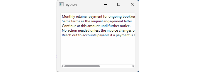
You are adding a memo field to the wire transfer dialog. Users can attach a free-text note to a transfer, but the dialog itself has limited vertical space. |
To use a scroll area in a constrained space:
 1 # The QScrollArea class provides a
 2 # scrolling view onto another widget
 3
 4 import sys
 5
 6 from PySide6.QtGui import QTextOption
 7 from PySide6.QtWidgets import (QApplication,
 8     QWidget, QVBoxLayout, QScrollArea, QPlainTextEdit)
 9
10
11 MEMO_TEXT = (
12     'Monthly retainer payment for ongoing bookkeeping services.\n'
13     'Same terms as the original engagement letter.\n'
14     'Continue at this amount until further notice.\n'
15     'No action needed unless the invoice changes '
16     'or the vendor updates their banking details.\n'
17     'Reach out to accounts payable if a payment is ever skipped.')
18
19
20 class Window(QWidget):
21
22     def __init__(self):
23
24         super().__init__()
25
26         layout = QVBoxLayout()
27         self.setLayout(layout)
28
29         # 1. Create the scroll area.
30
31         scroll_area = QScrollArea()
32
33         # 2. Create the widget that needs to be scrolled.
34
35         memo_field = QPlainTextEdit()
36         memo_field.setWordWrapMode(QTextOption.WrapMode.NoWrap)
37         memo_field.setPlainText(MEMO_TEXT)
38
39         # 3. Add the widget to the scroll area.
40
41         scroll_area.setWidget(memo_field)
42         scroll_area.setWidgetResizable(True)
43
44         layout.addWidget(scroll_area)
45
46
47 if __name__ == '__main__':
48
49     app = QApplication(sys.argv)
50     main_window = Window()
51     main_window.show()
52     sys.exit(app.exec())
Create a
QScrollAreaobject.Create the child widget. Use a
QPlainTextEditfor the transfer memo and set its wrap mode toWrapMode.NoWrap, so a long line expands the text horizontally instead of wrapping.Set the memo editor as the scroll area’s content with
QScrollArea.setWidget(). Also setwidgetResizabletoTrueso the editor resizes along with the scroll area.
Now, if the user enters a long line of text in the memo field, the scroll area shows a horizontal scrollbar, and if they enter several lines instead, it shows a vertical one.
11.3 QToolBox
QToolBox provides a column of tabbed widget items. This doesn’t really tell you much - it behaves like the familiar accordion widget that lets you pack multiple widgets into a small space and expand or collapse them as needed. QToolBox pages are called items in the documentation.
|
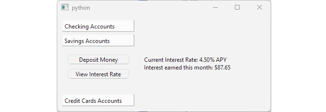
You need a compact account toolbox for the finance application’s sidebar. Accounts are grouped into three categories (checking, savings, and credit cards) and, given the limited space, only one category should be visible at a time. |
To add a collapsible set of options within a small space:
 1 # The QToolBox class provides a column of tabbed widget items.
 2
 3 import sys
 4 from PySide6.QtCore import Slot
 5 from PySide6.QtWidgets import (QApplication, QWidget,
 6     QHBoxLayout, QVBoxLayout, QToolBox, QPushButton, QLabel)
 7
 8
 9 class Window(QWidget):
10
11     def __init__(self):
12
13         super().__init__()
14         self.resize(440, 200)
15         layout = QHBoxLayout()
16         layout.setSpacing(20)
17         self.setLayout(layout)
18
19         # 1. Create the toolbox
20
21         toolbox = QToolBox()
22
23         # 2. Create the widgets.
24
25         checking_widget = QWidget()
26         checking_widget.setLayout(QVBoxLayout())
27         recent_transactions_btn = QPushButton('Recent Transactions')
28         recent_transactions_btn.clicked.connect(
29             self.show_recent_transactions)
30         checking_widget.layout().addWidget(recent_transactions_btn)
31         checking_widget.layout().addStretch()
32
33         savings_widget = QWidget()
34         savings_widget.setLayout(QVBoxLayout())
35
36         deposit_money_btn = QPushButton('Deposit Money')
37         deposit_money_btn.clicked.connect(self.deposit_money)
38         savings_widget.layout().addWidget(deposit_money_btn)
39
40         view_rate_btn = QPushButton('View Interest Rate')
41         view_rate_btn.clicked.connect(self.view_rate)
42         savings_widget.layout().addWidget(view_rate_btn)
43         savings_widget.layout().addStretch()
44
45         credit_card_widget = QWidget()
46         credit_card_widget.setLayout(QVBoxLayout())
47         make_payment_btn = QPushButton('Make Payment')
48         make_payment_btn.clicked.connect(self.make_payment)
49         credit_card_widget.layout().addWidget(make_payment_btn)
50         credit_card_widget.layout().addStretch()
51
52
53         # 3. Add widgets to the toolbox.
54
55         toolbox.addItem(checking_widget, 'Checking Accounts')
56         toolbox.addItem(savings_widget, 'Savings Accounts')
57         toolbox.addItem(credit_card_widget, 'Credit Cards Accounts')
58
59
60         self.label = QLabel()
61         self.label.setMinimumWidth(250)
62
63         layout.addWidget(toolbox)
64         layout.addWidget(self.label)
65
66     @Slot()
67     def show_recent_transactions(self):
68         self.label.setText(
69             'UA - Business Class - $1,189.50 - Jul 27, 2026\n'
70             'Salary Deposit - $3,250.00 - Jul 25, 2026\n'
71             'Consulting Invoice - $2,450.00 - Jul 24, 2026'
72     )
73
74     @Slot()
75     def deposit_money(self):
76         self.label.setText(
77             'Successfully deposited $15,000.00 into Savings')
78
79     @Slot()
80     def view_rate(self):
81         self.label.setText(
82             'Current Interest Rate: 4.50% APY\n'
83             'Interest earned this month: $87.65')
84
85     @Slot()
86     def make_payment(self):
87         self.label.setText('$10,000.00 paid')
88
89
90 if __name__ == '__main__':
91
92     app = QApplication(sys.argv)
93     main_window = Window()
94     main_window.show()
95     sys.exit(app.exec())
Create a
QToolBoxobject and the main layout. We create a horizontal layout for the main window and instantiate aQToolBox.-
Create the content widgets for each category. We create three
QWidgets, one for each account type and give each widget a vertical layout. We then add appropriate buttons to each category:- Checking Accounts: ‘Recent Transactions’ button.
- Savings Account: ‘Deposit Money’ and ‘View Interest Rate’ buttons.
- Credit Cards: ‘Make Payment’ button. We also connect each button’s
clickedsignal to its corresponding slot method
Add the widgets to the toolbox using
QToolBox.addItem(). The second argument is the title that appears on the heading for that section.
A QLabel shows the result of button clicks.
11.4 QTabWidget
QTabWidget is a tabbed container widget - when you click on a tab its associated page is shown.
|
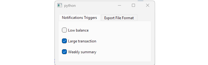
You need to provide two independent sets of options for your finance application’s export settings: which events should trigger a notification, and which file format a statement should export to. |
To use a QTabWidget in a space-constrained panel:
 1 # The QTabWidget class provides a stack of tabbed widgets.
 2
 3 import sys
 4 from PySide6.QtWidgets import (QApplication, QWidget,
 5     QVBoxLayout, QTabWidget, QRadioButton, QCheckBox)
 6
 7
 8 class Window(QWidget):
 9
10     def __init__(self):
11
12         super().__init__()
13
14         layout = QVBoxLayout()
15         self.setLayout(layout)
16
17         # 1. Create the tab widget.
18
19         self.tab_widget = QTabWidget()
20
21         # 2. Create the widgets.
22
23         notifications_widget = QWidget()
24         notifications_layout = QVBoxLayout()
25         notifications_layout.addWidget(QCheckBox('Low balance'))
26         notifications_layout.addWidget(QCheckBox('Large transaction'))
27         notifications_layout.addWidget(QCheckBox('Weekly summary'))
28         notifications_widget.setLayout(notifications_layout)
29
30         format_widget = QWidget()
31         format_layout = QVBoxLayout()
32         format_layout.addWidget(QRadioButton('PDF'))
33         format_layout.addWidget(QRadioButton('CSV'))
34         format_layout.addWidget(QRadioButton('OFX'))
35         format_widget.setLayout(format_layout)
36
37         # 3. Add tabs to the tab widget.
38
39         self.tab_widget.addTab(
40             notifications_widget, 'Notifications Triggers')
41         self.tab_widget.addTab(format_widget, 'Export File Format')
42
43         layout.addWidget(self.tab_widget)
44
45
46 if __name__ == '__main__':
47
48     app = QApplication(sys.argv)
49     main_window = Window()
50     main_window.show()
51     sys.exit(app.exec())
Create a
QTabWidgetobject.Create its child widgets, one
QWidgetper page. ‘Notifications’ holds treeQCheckBoxes (‘Low balance’, ‘Large transaction’, ‘Weekly summary’). ‘Format’ holds threeQRadioButtons (‘PDF’, ‘CSV’, ‘OFX’). Each page’s widgets are arranged in their own layout, so aQTabWidgetcan pack multiple children just like any other container.Use
QTabWidget.addTab()to add both page widgets, labeling them ‘Notifications’ and ‘Format’.
Tab indexes start at zero so ‘Notifications’ has index 0 and ‘Format’ has index 1. You can change the tab position (North, South, West, East) and shape (Rounded, Triangular) to fit your application’s style.
11.5 QSplitter
QSplitter lets the user resize its child widgets by dragging the mouse.
|
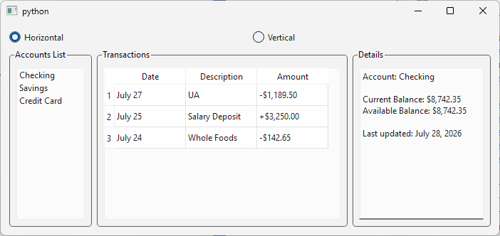
You are building a three-pane dashboard for the finance application: an accounts list on the left, a transaction table in the middle, and a details panel on the right. Users should be able to drag the boundaries between panes to resize them, and switch the whole dashboard between a horizontal and a vertical layout. |
To create a resizable panes witha toggleable orientation:
 1 # A splitter lets the user control the size of
 2 # child widgets by dragging the boundary between them.
 3
 4 import sys
 5 from PySide6.QtCore import Qt
 6 from PySide6.QtWidgets import (QApplication, QWidget, QHBoxLayout,
 7     QVBoxLayout, QSplitter, QGroupBox, QRadioButton, QListWidget,
 8     QTableWidget, QTableWidgetItem, QTextEdit)
 9
10
11 class Window(QWidget):
12
13     def __init__(self):
14
15         super().__init__()
16         self.resize(700, 300)
17         layout = QVBoxLayout()
18         self.setLayout(layout)
19
20         self.horizontal_radio = QRadioButton('Horizontal')
21         self.horizontal_radio.setChecked(True)
22         self.vertical_radio = QRadioButton('Vertical')
23         self.horizontal_radio.toggled.connect(self.on_toggled)
24         self.vertical_radio.toggled.connect(self.on_toggled)
25
26         orientation_layout = QHBoxLayout()
27         orientation_layout.addWidget(self.horizontal_radio)
28         orientation_layout.addWidget(self.vertical_radio)
29         layout.addLayout(orientation_layout)
30
31         # 1. Create the splitter object.
32
33         self.splitter = QSplitter()
34
35         # 2. Create the child widgets.
36
37         accounts_groupbox = QGroupBox('Accounts List')
38         accounts_groupbox.setLayout(QVBoxLayout())
39
40         self.accounts_list = QListWidget()
41         self.accounts_list.addItems([
42             'Checking', 'Savings', 'Credit Card'])
43         accounts_groupbox.layout().addWidget(self.accounts_list)
44
45         transactions_groupbox = QGroupBox('Transactions')
46         transactions_groupbox.setLayout(QVBoxLayout())
47         self.transactions_table = QTableWidget(3, 3)
48         self.transactions_table.setHorizontalHeaderLabels(["Date", "Description", "Amount"])
49         data = [
50             ('July 27', 'UA', '-$1,189.50'),
51             ('July 25', 'Salary Deposit', '+$3,250.00'),
52             ('July 24', 'Whole Foods', '-$142.65')]
53
54         for row, (date, desc, amount) in enumerate(data):
55             self.transactions_table.setItem(row, 0, QTableWidgetItem(date))
56             self.transactions_table.setItem(row, 1, QTableWidgetItem(desc))
57             self.transactions_table.setItem(row, 2, QTableWidgetItem(amount))
58
59         transactions_groupbox.layout().addWidget(self.transactions_table)
60
61         details_groupbox = QGroupBox('Details')
62         details_groupbox.setLayout(QVBoxLayout())
63         self.details_text = QTextEdit()
64         self.details_text.setReadOnly(True)
65         self.details_text.setPlainText(
66             'Account: Checking\n\n'
67             'Current Balance: $8,742.35\n'
68             'Available Balance: $8,742.35\n\n'
69             'Last updated: July 28, 2026')
70         details_groupbox.layout().addWidget(self.details_text)
71
72         # 3. Add the widgets to the splitter.
73
74         self.splitter.addWidget(accounts_groupbox)
75         self.splitter.addWidget(transactions_groupbox)
76         self.splitter.addWidget(details_groupbox)
77         self.splitter.setSizes([120, 360, 200])
78
79         layout.addWidget(self.splitter)
80
81     def on_toggled(self):
82         if self.horizontal_radio.isChecked():
83             self.splitter.setOrientation(Qt.Orientation.Horizontal)
84         else:
85             self.splitter.setOrientation(Qt.Orientation.Vertical)
86
87
88 if __name__ == '__main__':
89
90     app = QApplication(sys.argv)
91     main_window = Window()
92     main_window.show()
93     sys.exit(app.exec())
Create the
QSplitterobject. It lays its children horizontally by default. You can useQSplitter.setOrientation()to change the orientation.Create the child widgets. In the example we create three
QGroupBoxobjects (‘Accounts’, ‘Transactions’, and ‘Details’). We also add two radio buttons - selecting one of them changes theQSplitterorientation dynamically.Add the three groupboxes to the splitter with
addWidget().
11.6 Choosing a Container
The five containers in this chapter group related widgets in different ways. Some keep every child visible at all times. Others show a single page and hide the rest. QSplitter lets the user resize its children by hand.
| Container | Children visible | Children user-resizable |
|---|---|---|
QGroupBox |
All at once | No |
QScrollArea |
All at once, via scrolling | No |
QToolBox |
One page at a time | No |
QTabWidget |
One page at a time | No |
QSplitter |
All at once | Yes |
The five containers also differ in how you give them children. QGroupBox is the only one that requires you to attach a QLayout yourself before you can add anything - the other four manage their own internal arrangement and expose a widget-adding method directly. QScrollArea is different in a second way: it’s limited to a single child, where the rest accept as many as you add.
| Container | Adding a child | How many | Requires you to set a QLayout
|
|---|---|---|---|
QGroupBox |
layout.addWidget() |
Many | Yes |
QScrollArea |
setWidget() |
One | No |
QToolBox |
addItem() |
Many | No |
QTabWidget |
addTab() |
Many | No |
QSplitter |
addWidget() |
Many | No |
This is also why a couple of the sections above needed an extra layout inside the child widget itself: whenever a single slot in one of these containers has to hold more than one widget, that widget needs its own layout to arrange them.