5. Buttons and Option Widgets
Non-interactive display widgets like QLabel can show text or images but cannot accept any user input. Buttons, on the other hand, are input widgets that can accept input from the user, and that input is one of two types:
None(sometimes calledUnit) - the button signals that it was clicked with no additional data attached.- Boolean - the button caries a checked or unchecked state (
TrueorFalse, on or off).
Not all buttons are checkable by default. QPushButton, for instance, behaves as a None-type button unless you explicitly call setCheckable(True). QCheckBox is always boolean, and additionally supports an optional tri-state mode with a third partially-checked state.
Qt provides several button classes, all inheriting from QAbstractButton:
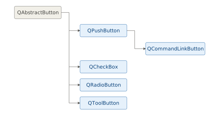
| Qt Button Class | Purpose |
|---|---|
QPushButton |
Lets the user send a command to the application. Supports text, icons, and optional toggling. |
QCheckBox |
Used for non-mutually exclusive options (e.g., preferences). Supports binary or tri-state. |
QRadioButton |
Mutually exclusive choices within a group. Automatically deselects other radio buttons in the group. |
QToolButton |
For use in toolbars (e.g., “Save” icon). Supports popups for sub-menus. |
QCommandLinkButton |
Mimics Windows Vista command link style. |
5.1 QPushButton - Triggering an Action
QPushButton lets the user trigger an action in a Qt application.
 |
You are building a report generation panel for a finance application. Your task is to add a button that, when clicked, stamps a label with the current date and time to record when the report was last generated. |
To use a QPushButton in your application:

Create the the slot
set_timestamp()- this method that will be called when the button is clicked. It reads the current date and time and updates the label’s text. The label is stored asself.labelso it is accessible from outside__init__().Create a
QPushButtonand set the text to be shown on it.Connect the button’s
clicked()signal to the slot.
After running the application and clicking the button you should see a window like this:

5.2 Checkable QPushButton - Persistent On/Off State
A QPushButton becomes a toggle button when you call setCheckable(True) on it. Unlike a regular push button, a checkable button retains its state after being clicked: once you press it, it stays pressed until you press it again.
|
You are building an account view for a finance application. Your task is to add a button that switches a label between displaying a transaction amount in dollars and the equivalent in euros. |
To use a checkable QPushButton in your application:
Create the slot
display_transaction(). It accepts acheckedargument and updates both the label text and the button text to reflect the current currency. The button is stored asself.buttonso that the slot can update its text alongside the label.Create the button and make it checkable with
setCheckable(True).Connect the
toggledsignal to the slot, then calldisplay_transaction()directly with the button’s initial state to populate the label before the user interacts with the UI.

5.3 QCheckBox - Independent Options
A QCheckBox consists of a graphical check box and a label. it can be checked, unchecked, or (if you set its tristate property to True) partially checked. Checkboxes are used to represent options that are not mutually exclusive - more than one checkbox in a group can be checked at the same time.
|
You are building a transaction filter panel for a finance application. Your task is to add checkboxes that let the user control which transaction types (Income, Expenses, Transfers) are visible, updating a label to reflect the current selection. |
To use QCheckBoxes in your application:
Create the slot
update_filter(). It checks the state of each checkbox and builds the label text from whichever are currently checked. It is also called once at the end of__init__()to initialize the label before the user interacts with anything.Create the checkboxes and add them to the layout.
Connect each checkbox’s
checkStateChangedsignal toupdate_filter(). The signal is emitted whenever a checkbox is checked or unchecked.

Note that enum arguments in signals need Qt imported from PySide6.QtCore if your slot receives them. The checkStateChanged signal sends a Qt.CheckState value as an argument. PySide6 passes that value to your slot if the slot declares a parameter for it. If your slot looks like def update_filter(self) you don’t need to import Qt. If the slot looks like def update_filter(self, state), you do:
1 from PySide6.QtCore import Qt
Otherwise, when the signal fires you’ll get this error:
1 TypeError: Cannot call meta function "slot (Qt::CheckState)" because parameter 0 of type "Qt::CheckState" cannot be converted.
The update_filter()above avoids the issue by ignoring the state argument entirely and calling .isChecked() on each checkbox instead. If you change it to accept state, remember to add the Qt import.
5.4 QRadioButton - Mutually Exclusive Choices
QRadioButton is a widget that presents the user with a set of mutually exclusive options. When you check a radio button all other radio buttons with the same parent widget are automatically unchecked.
|
You are building a reporting panel for a finance application. Your task is to add radio buttons that let the user select a reporting period (‘This Week’, ‘This Month’, or ‘This Year’) and update a label to show the active selection. |
To use QRadioButtons in your application:
Create the
set_reporting_period()method. It accepts two arguments:checked, the new checked state of the radio button, andperiod, a string containing the selected reporting period. IfcheckedisTruethe label is updated.Create the radio buttons and add them to the layout.
Connect each radio button’s
toggledsignal to a lambda that passes the checked state and the period string toset_reporting_period(). Thetoggledsignal is emitted twice on every click (once for the button being checked and once for the button being unchecked), so theif checkedguard in the slot ensures the label is only updated for the active selection.

Radio buttons automatically form a an exclusive group based on their common parent widget. If you need more control (for example, multiple independent exclusive groups within the same parent, or exclusive behavior across different parents) you can use QButtonGroup[^3], introduced in the next section.
5.5 QButtonGroup - Managing Groups Explicitly
QButtonGroup provides a non-visual container for organizing checkable buttons and managing their states. A button group is exclusive by default: when a button is checked, all other buttons in the groups are unchecked automatically. To simplify the representation of enum values in a user interface, each button can be mapped to an integer ID.
QButtonGroup does not check any button by default. It is your responsability to set an intial checked state, otherwise the group starts with no button selected.
QButtonGroup provides a set of signals that let you respond to interactions with its member buttons:
| Signal | Emitted |
|---|---|
buttonClicked |
When a button is clicked |
buttonPressed |
When a button is pressed down |
buttonReleased |
When a button is released |
buttonToggled |
When a button’s checked state changes |
idClicked |
When a button is clicked, emitting its ID |
idPressed |
When a button is pressed down, emitting its ID |
idReleased |
When a button is released, emitting its ID |
idToggled |
When a button’s checked state changes, emitting its ID |
|
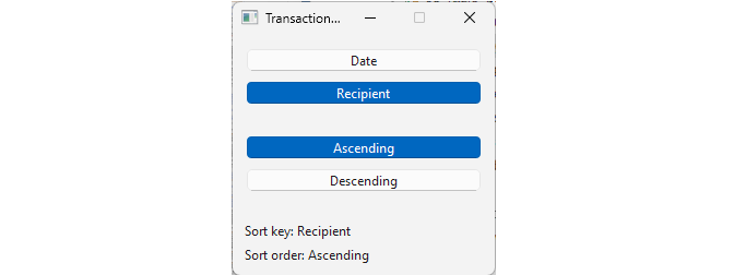
You are building a toolbar for sorting the transaction list in your finance application. Your task is to add two groups of sort buttons, one for sort key (Date, Recipient) and one for the sort order (Ascending, Descending), where selecting a button in each group deselects the other, with labels showing the current sort settings. |
To use a QButtonGroup in your application:
Create the slots
set_sort_key()andset_sort_order(). Each slot accepts abutton_idand acheckedargument - the ID and new checked state of the toggled button. IfcheckedisTrue, the corresponding label is updated to reflect the current sort setting.Create the buttons and make them checkable with
setCheckable(True).Create two button groups and add the buttons with
addButton(), passing a numeric ID alongside each button. The ID is used in the slots to identify which button was toggled without needing a reference to the button itself.Connect each group’s
idToggledsignal to its slot.idToggledis emitted with the button’s ID and its new checked state whenever a button in the group is toggled.
In the previous section we saw that adding radio buttons to the same parent widget them mutually exclusive. This is in some ways similiar to grouping buttons with a QButtonGroup, so let’s compare the two approaches:
| Layout | QButtonGroup |
|
|---|---|---|
| Purpose | Arrange widgets visually | Manage exclusive selection |
| Visual | Yes | No |
| Automatic exclusivity | For QRadioButtons within the same parent |
For any checkable button |
| Signals | None |
idToggled, buttonToggled, idClicked, buttonClicked
|
| Widget can belong to two | No - silently reparented | No - undefined behavior |
| Can span multiple parents | No | Yes |
It is not the layout that makes the radio buttons exclusive - it is a combination of two properties:
autoExclusive, which is True for radio buttons by default, and checkable, which allows a button to retain its checked or unchecked state. Adding radio buttons to the same layout gives them the same parent widget, which is enough to trigger the auto-exclusive berhavior: only one can be checked at a time.
QButtonGroup makes the enum mapping explicit - each button is assigned a numeric ID, and the group’s signals emit that ID when the selection changes. As the Qt documentation notes, the purpose of this mechanism is to simplify the representation of enum values in a user interface.
This brings us to the full data type progression for this chapter:
| Widget | Data type |
|---|---|
QPushButton (non-checkable) |
None |
QPushButton (checkable), QCheckBox
|
bool |
Group of QCheckBoxes, non-exclusive QButtonGroup
|
QFlags / bitmask |
Group of QRadioButtons, exclusive QButtonGroup
|
enum |
The underlying principle is that the data type is determined by the exclusivity rule, not the widget type. A group of checkboxes and a non-exclusive QButtonGroup both produce flags. A group of radio buttons and an exclusive QButtonGroup both produce an enum value. The choice between them depends on what type of data your UI is collecting.