15. Qt Style Sheets - QSS
Qt Style Sheets is a feature that lets you customize the appearance of widgets using the familiar Cascading Style Sheets (CSS) syntax adapted to Qt Widgets. QSS can be set on the whole application using QApplication.setStyleSheet() or on a specific widget using QWidget.setStyleSheet(). Qt derives the effective style sheet from all the style sheets set at different levels. This mechanism is called cascading. Behind the scenes, Qt instantiates an internal QStyle subclass called QStyleSheetStyle, which wraps the native application style and applies the QSS rules.
A style sheet consists of a sequence of style rules. A rule has a selector that specifies which widgets are affected by the rule, and a declaration that specifies which properties should be set on the selected widget(s):
 1 Selector1 {
 2     property-name1: value;
 3     property-name2: value;
 4     . . .
 5 }
 6
 7 Selector2 {
 8     property-name1: value;
 9     property-name2: value;
10     . . .
11 }
12
13 . . .
14
15 SelectorN {
16     property-name1: value;
17     property-name2: value;
18     . . .
19 }
15.1 Selector Types
Qt Style Sheets supports these selector types:
| Selector | Example | Explanation |
|---|---|---|
| Universal Selector | * |
Matches all widgets. |
| Type Selector | QPushButton |
Matches all instances of QPushButton and of its subclasses (QCommandLinkButton). |
| Property Selector | QPushButton[property="value"] |
Matches instances of QPushButton where property has the specified value. |
| Class Selector | .QPushButton |
Matches instances of QPushButton, but not of its subclasses. |
| ID Selector | QPushButton#okButton |
Matches all QPushButton instances whose object name is okButton. |
| Descendant Selector | QDialog QPushButton |
Matches all instances of QPushButton that are descendants (children, grandchildren, etc.) of a QDialog. |
| Child Selector | QDialog > QPushButton |
Matches all instances of QPushButton that are direct children of a QDialog. |
This example illustrates the use of the different selector types.
 1 import sys
 2 from PySide6.QtWidgets import (QApplication, QGroupBox,
 3     QWidget, QPushButton, QVBoxLayout, QLineEdit, QLabel,
 4     QFrame, QComboBox, QStyle)
 5
 6
 7 STYLES = {
 8     'No QSS' : '',
 9     'Universal selector' : '* { background: orange; }',
10     'Type selector' : 'QPushButton { background: orange; }',
11     'Property selector':
12         'QPushButton[orange="true"] { background: orange; }',
13     'Class selector' : '.QPushButton { background: orange; }',
14     'ID selector' : '#headingLabel { background: orange; }',
15     'Descendant selector' : 'QGroupBox QLabel { background: orange; }',
16     'Child selector' : 'QGroupBox > QPushButton { background: orange; }'
17     }
18
19
20 class IconButton(QPushButton):
21
22     def __init__(self, text='', parent=None):
23         super().__init__(parent)
24         icon = self.style().standardIcon(
25             QStyle.StandardPixmap.SP_MessageBoxCritical)
26         self.setText(text)
27         self.setIcon(icon)
28
29
30 class Window(QWidget):
31
32     def __init__(self, parent=None):
33
34         super().__init__(parent)
35         self.setMinimumWidth(400)
36         layout = QVBoxLayout()
37         self.setLayout(layout)
38
39         self.groupbox = QGroupBox('Widget gallery')
40         groupbox_layout = QVBoxLayout()
41         self.groupbox.setLayout(groupbox_layout)
42         layout.addWidget(self.groupbox)
43
44         heading_label = QLabel('Heading label')
45         heading_label.setObjectName('headingLabel')
46         groupbox_layout.addWidget(heading_label)
47
48         save_button = QPushButton('Save')
49         groupbox_layout.addWidget(save_button)
50
51         delete_button = IconButton('Delete')
52         groupbox_layout.addWidget(delete_button)
53
54         flat_button = QPushButton('Flat button')
55         flat_button.setProperty('orange', 'true')
56         groupbox_layout.addWidget(flat_button)
57
58         panel_frame = QFrame()
59         panel_frame.setFrameStyle(QFrame.Shape.StyledPanel)
60         panel_layout = QVBoxLayout()
61         panel_frame.setLayout(panel_layout)
62
63         nested_label = QLabel('Nested label')
64         panel_layout.addWidget(nested_label)
65
66         nested_edit = QLineEdit()
67         nested_edit.setPlaceholderText('Nested line edit')
68         panel_layout.addWidget(nested_edit)
69
70         nested_button = QPushButton('Nested button')
71         panel_layout.addWidget(nested_button)
72
73         groupbox_layout.addWidget(panel_frame)
74
75         self.selector_combo = QComboBox()
76
77         for selector, qss in STYLES.items():
78             self.selector_combo.addItem(selector, qss)
79
80         self.selector_combo.currentIndexChanged.connect(self.set_style)
81         layout.addWidget(self.selector_combo)
82
83         self.qss_label = QLabel()
84         layout.addWidget(self.qss_label)
85
86
87     def set_style(self, idx):
88         qss = self.selector_combo.itemData(idx)
89         self.groupbox.setStyleSheet(qss)
90         self.qss_label.setText(qss)
91
92
93 if __name__ == '__main__':
94
95     app = QApplication(sys.argv)
96     main_window = Window()
97     main_window.show()
98     sys.exit(app.exec())
The application’s main window contains a groupbox with the following descendants:
1 QGroupBox              [groupbox]
2     QLabel             [heading_label, objectName="headingLabel"]
3     QPushButton        [save_button]
4     IconButton         [delete_button]
5     QPushButton        [flat_button]
6     QFrame             [panel_frame]
7         QLabel         [nested_label]
8         QLineEdit      [nested_edit]
9         QPushButton    [nested_button]
One of the widgets is an IconButton, a custom QPushButton subclass that adds an icon to its text. We also add a combobox (selector_combo) that lets the user select a QSS style from the STYLES dictionary, and a label that shows the currently applied style sheet.
STYLES contains an example of each of the selector types listed in the table above. Each rule sets the background of the selected widget(s) to orange:
The first entry (
'No QSS') lets you clear custom QSS rules by setting the groupbox’sstyleSheetto an empty string.The universal selector (
*) selects the groupbox and all the widgets inside it.
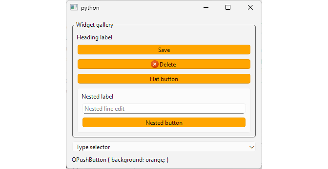
The type selector (
QPushButton) selects allQPushButtonobjects that are descendants of the groupbox. Consequentlysave_buttonandflat_buttonare selected as its direct children.delete_buttonis also selected becauseIconButtonis a subclass ofQPushButton.nested_buttonis selected as well, because it is an indirect descendant ofgroupbox.The property selector (
QPushButton[orange="true"]) selects onlyflat_button, which is the soleQPushButtonthat has the customorangeproperty set to"true".The class selector (
.QPushButton) selectssave_button,flat_button, andnested_button, but notdelete_button, because the latter has a different class (IconButton).The ID selector (
#headingLabel) selectsheading_labelbased on its object name.The descendant selector (
QGroupBox QLabel) selects bothheading_label(a direct child of the groupbox) andnested_label(an indirect descendant).The child selector (
QGroupBox > QPushButton) selectssave_button,delete_button, andflat_buttonas direct children of the groupbox, but notnested_button.
15.2 Properties
QSS supports a fixed set of properties, each restricted to a specific value type. The table below lists the some of the commonly used types:
| Type | Syntax | Description | Example |
|---|---|---|---|
| Border | { Border Style | Length | Brush }* |
Shorthand border property. | border: 2px solid #555; |
| Brush | Color | Gradient | PaletteRole | Specifies a Color, a Gradient, or an entry in the widget’s palette. | background-color: #FFE4B5; |
| Color |
rgb(r, g, b) | rgba(r, g, b, a) | hsv(h, s, v) | hsva(h, s, v, a) | hsl(h, s, l) | hsla(h, s, l, a) | #rrggbb | Color Name |
Specifies a color as RGB, RGBA, HSV, HSVA, HSL, HSLA, or a named color. | color: orange; |
| Font |
(Font Style | Font Weight){0,2} Font Size String |
Shorthand font property. | font: bold italic 18px "Segoe UI"; |
| Length | Number (px | pt | em | ex)?
|
A number followed by a measurement unit. Qt requires the unit to be specified explicitly. | padding: 12px; |
| Radius | Length{1, 2} |
One or two occurrences of Length, giving the horizontal and (optionally) vertical corner radius. | border-radius: 12px; |
This section’s main window contains a single line edit and a combobox that lets you select which of its properties will be styled:
 1 import sys
 2 from PySide6.QtWidgets import (QApplication, QGroupBox,
 3     QComboBox, QWidget, QLineEdit, QVBoxLayout, QLabel)
 4
 5
 6 STYLES = {
 7     'No QSS': '',
 8     'Color':
 9         'QLineEdit { color: orange; }',
10     'Background color':
11         'QLineEdit { background-color: #FFA500; }',
12     'Font size + Padding':
13         'QLineEdit { font-size: 22px; padding: 12px; }',
14     'Font':
15         'QLineEdit { font: bold italic 18px Arial ; }',
16     'Alignment':
17         'QLineEdit { qproperty-alignment: AlignRight; }',
18     'Border + Radius':
19         'QLineEdit { border: 2px solid #555; '
20         'border-radius: 12px; padding: 8px; }',
21     'Gradient background':
22         'QLineEdit { background: qlineargradient('
23         'x1:0, y1:0, x2:0, y2:1, '
24         'stop:0 #FFF8E1, stop:1 #FFBB33); }'
25 }
26
27
28 class Window(QWidget):
29
30     def __init__(self, parent=None):
31
32         super().__init__(parent)
33         self.setMinimumWidth(400)
34
35         layout = QVBoxLayout()
36         self.setLayout(layout)
37
38         self.groupbox = QGroupBox('Widget gallery')
39         groupbox_layout = QVBoxLayout()
40         self.groupbox.setLayout(groupbox_layout)
41         layout.addWidget(self.groupbox)
42
43         self.line_edit = QLineEdit()
44         self.line_edit.setMinimumHeight(80)
45         font = self.line_edit.font()
46         font.setPixelSize(18)
47         self.line_edit.setFont(font)
48         self.line_edit.setText('Styling properties with QSS')
49         groupbox_layout.addWidget(self.line_edit)
50
51         self.selector_combo = QComboBox()
52         self.selector_combo.setEditable(False)
53
54         for selector, qss in STYLES.items():
55             self.selector_combo.addItem(selector, qss)
56
57         self.selector_combo.currentIndexChanged.connect(self.set_style)
58         layout.addWidget(self.selector_combo)
59
60         self.qss_label = QLabel()
61         layout.addWidget(self.qss_label)
62
63
64     def set_style(self, idx):
65         qss = self.selector_combo.itemData(idx)
66         self.groupbox.setStyleSheet(qss)
67         self.qss_label.setText(qss)
68
69
70 if __name__ == '__main__':
71
72     app = QApplication(sys.argv)
73     main_window = Window()
74     main_window.show()
75     sys.exit(app.exec())
The
colorproperty sets the line edit’s text to orange using its SVG color keyword name.The
background-colorproperty sets the line edit’s background color to orange using its hex value (#FFA500). Bothbackground-colorandcoloraccept values of the typeColor.The
font-sizeproperty is of theFont Sizewhich accepts values inpxandptunits.The
paddingproperty is aLengthwhich accepts values inpx,pt,em, andexunits. In the example, bothfont-sizeandpaddingare set in pixels.
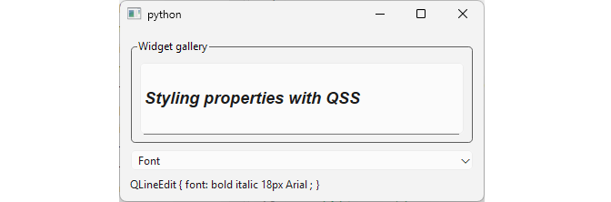
-
fontis ofFonttype, which is a shorthand property for setting the text’s font, equivalent to settingfont-styleand/orfont-weight,font-family, andfont-size, egfont: bold italic 18px;.Order is fixed and family must come last: [
style], [weight]sizefamily. Style and weight are optional and can change places (0, 1, or 2 of them, in either order), but everything after that is just assigned to size, then family. Putting family first breaks both. This is the same as the original CSS syntax but with a smaller vocabulary. The
qproperty-alignmentproperty works differently. Theqproperty-prefix works directly with Qt properties exposed through the widget’s meta-object system. The example setsQLineEdit’salignmentproperty, which expects aQt.Alignmentenum member (AlignRight). This only works if the target property has a write accessor - a read-only@Propertycannot be set this way.The
borderandborder-radiusproperties are set together to give the line edit a solid rounded frame.borderis of typeBorder, a shorthand accepting aBorder Style, aLength, and aBrushin one declaration.border-radiusis of typeRadius, taking one or twoLengthvalues for the horizontal and (optionally) vertical corner radius. A single value like12pxapplies uniformly to all four corners.
15.3 Pseudo-States
QSS selectors may contain pseudo-states that restrict the application of the rule based on the widget’s state. Pseudo-states appear at the end of the selector, with a colon (:) in between.
Many QSS pseudo-states also have CSS counterparts:
| Pseudo-State | Description |
|---|---|
:active |
The widget resides in an active window. |
:checked |
The item is checked. |
:disabled |
The item is disabled. |
:enabled |
The item is enabled. |
:focus |
The item has input focus. |
:hover |
The mouse is hovering over the item. |
:indeterminate |
The item has indeterminate state. |
:read-only |
The item is marked read only or non-editable. |
While others are QSS specific:
| Pseudo-State | Description |
|---|---|
:bottom |
The item is positioned at the bottom. |
:closable |
The items can be closed. |
:closed |
The item is in the closed state. |
:editable |
The QComboBox is editable. |
:exclusive |
The item is part of an exclusive item group. |
:floatable |
The items can be floated. |
:has-children |
The item has children |
The example demonstrates six pseudo-states of a QCheckBox. Reaching each one requires manual interaction with the checkbox or the ‘Disable the checkbox’ button.
 1 import sys
 2 from PySide6.QtWidgets import (QApplication, QGroupBox,
 3     QComboBox, QWidget, QCheckBox, QVBoxLayout, QLabel,
 4     QPushButton)
 5
 6
 7 STYLES = {
 8     'No QSS' : '',
 9     'Hover' : 'QCheckBox:hover { background: orange; }',
10     'Pressed' : 'QCheckBox:pressed { background: orange; }',
11     'Checked' : 'QCheckBox:checked { background: orange; }',
12     'Indeterminate' : 'QCheckBox:indeterminate { background: orange; }',
13     'Focus' : 'QCheckBox:focus { background: orange; }',
14     'Disabled' : 'QCheckBox:disabled { background: orange; }',
15 }
16
17
18 class Window(QWidget):
19
20     def __init__(self, parent=None):
21
22         super().__init__(parent)
23         self.setMinimumWidth(400)
24
25         layout = QVBoxLayout()
26         self.setLayout(layout)
27
28         self.groupbox = QGroupBox('Widget gallery')
29         groupbox_layout = QVBoxLayout()
30         self.groupbox.setLayout(groupbox_layout)
31         layout.addWidget(self.groupbox)
32
33         self.test_checkbox = QCheckBox('CheckBox')
34         self.test_checkbox.setMinimumHeight(60)
35         self.test_checkbox.setTristate(True)
36         groupbox_layout.addWidget(self.test_checkbox)
37
38         self.disable_button = QPushButton('Disable the checkbox')
39         self.disable_button.setCheckable(True)
40         self.disable_button.clicked.connect(self.toggle_checkbox_enabled)
41         groupbox_layout.addWidget(self.disable_button)
42
43         self.selector_combo = QComboBox()
44         self.selector_combo.setEditable(False)
45
46         for selector, qss in STYLES.items():
47             self.selector_combo.addItem(selector, qss)
48
49         self.selector_combo.currentIndexChanged.connect(self.set_style)
50         layout.addWidget(self.selector_combo)
51
52         self.qss_label = QLabel()
53         layout.addWidget(self.qss_label)
54
55         self.test_checkbox.setStyleSheet('border: 1px solid red;')
56
57
58     def set_style(self, idx):
59         qss = self.selector_combo.itemData(idx)
60         self.groupbox.setStyleSheet(qss)
61         self.qss_label.setText(qss)
62
63     def toggle_checkbox_enabled(self):
64         if self.disable_button.isChecked():
65             self.test_checkbox.setEnabled(False)
66         else:
67             self.test_checkbox.setEnabled(True)
68
69
70 if __name__ == '__main__':
71
72     app = QApplication(sys.argv)
73     main_window = Window()
74     main_window.show()
75     sys.exit(app.exec())
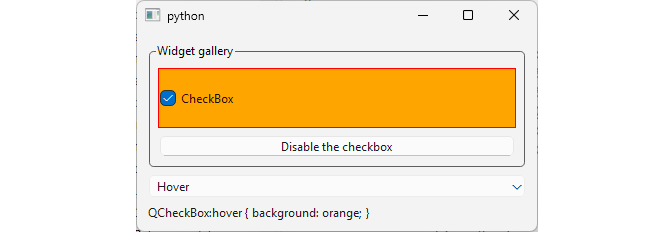
- The
:hoverpseudo-state highlights the checkbox while the mouse pointer is over it.
The
:pressedpseudo-state highlights the checkbox while the mouse button is held down on it.The
:checkedpseudo-state highlights the checkbox once it has been clicked into the checked state.:indeterminateonly applies becausesetTristate(True)was called ontest_checkbox. Clicking cycles the checkbox through its three states and the rule takse effect when it is partially checked.:focushighlights the checkbox once it holds keyboard focus. Selecting ‘Focus’ from the combo box does not automatically move the focus to the checkbox. The effects is shown when you click (or tab) to the checkbox.
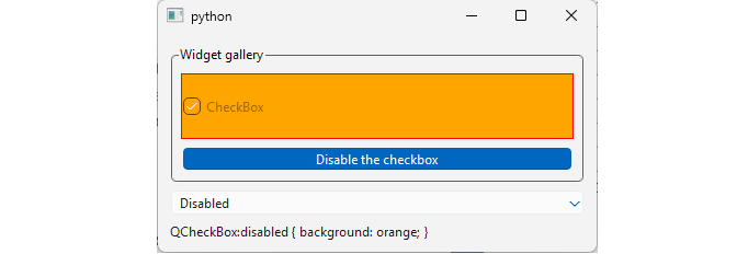
:disabledis the only one not driven by the checkbox directly. Selecting ‘Disabled’ from the combo box applies the rule, but the checkbox itself is enabled and disabled independently, via the togglabledisable_buttonbelow it.
Notice that hovering over the checkbox only triggers the :hover background across the checkbox’s actual content (the indicator and the text). QCheckBox paints its QSS background and border across its entire widget geometry (whatever the layout stretched it to), but determines mouse interaction (both the :hover state and whether a click actually toggles the box) against a separate rectangle sized just to fit the indicator and text. You only notice this when the widget is stretched wider or taller by its layout.
15.4 Subcontrols
QSS lets you style a complex widget’s components, such as the drop-down button of a QComboBox or the up and down arrows of a QSpinBox. Selectors may contain subcontrols that make it possible to restrict the application of a rule to specific subcontrols.
Some of the commonly used subcontrols:
| Sub-Control | Description |
|---|---|
::indicator |
The indicator of a QCheckBox, QRadioButton, a checkable menu item, or an item view. |
::handle |
The handle (slider) of a QSlider, QScrollBar, or QSplitter. |
::groove |
The groove of a QSlider. |
::drop-down |
The drop-down button of a QComboBox. |
::down-arrow |
The down arrow of a QComboBox, QSpinBox, QScrollBar, or a QHeaderView sort indicator. |
::tab |
A tab of a QTabBar or QToolBox. |
::title |
The title of a QGroupBox or QDockWidget. |
::chunk |
The progress chunk of a QProgressBar. |
::item |
An item of a QAbstractItemView, QMenuBar, QMenu, or QStatusBar. |
 1 import sys
 2 from PySide6.QtCore import Qt
 3 from PySide6.QtWidgets import (QApplication, QGroupBox, QComboBox,
 4     QWidget, QSlider, QTabBar, QCheckBox, QVBoxLayout, QLabel)
 5
 6
 7 STYLES = {
 8     'No QSS' : '',
 9     'Slider groove' : 'QSlider::groove { background: orange; } ',
10     'Slider handle' : 'QSlider::handle { background: orange; }',
11     'Tabbar tab' : 'QTabBar::tab { background: orange; }',
12     'Tabbar tear' : 'QTabBar::tear { background: orange; }',
13     'Checkbox indicator' : 'QCheckBox::indicator { background: orange; }'
14         'QCheckBox::indicator:checked { background: green; }',
15     'Combobox dropdown' : 'QComboBox::drop-down { background: orange; }'
16         'QComboBox::down-arrow { background: green; }',
17     'Groupbox title': 'QGroupBox::title { background: orange; }'
18     }
19
20
21 class Window(QWidget):
22
23     def __init__(self, parent=None):
24
25         super().__init__(parent)
26         self.setMinimumWidth(400)
27
28         layout = QVBoxLayout()
29         self.setLayout(layout)
30
31         self.groupbox = QGroupBox('Widget gallery')
32         groupbox_layout = QVBoxLayout()
33         self.groupbox.setLayout(groupbox_layout)
34         layout.addWidget(self.groupbox)
35
36         self.slider = QSlider()
37         self.slider.setValue(50)
38         self.slider.setOrientation(Qt.Orientation.Horizontal)
39         groupbox_layout.addWidget(self.slider)
40
41         self.tabbar = QTabBar()
42         self.tabbar.setMaximumWidth(380)
43         self.tabbar.setUsesScrollButtons(True)
44         self.tabbar.setElideMode(Qt.TextElideMode.ElideNone)
45         for i in range(1, 10):
46             self.tabbar.addTab(f'Tab {i}')
47         self.tabbar.setCurrentIndex(8)
48         groupbox_layout.addWidget(self.tabbar)
49
50         self.checkbox = QCheckBox('checkbox')
51         groupbox_layout.addWidget(self.checkbox)
52
53         self.combobox = QComboBox()
54         self.combobox.addItems(['Item 1', 'Item 2', 'Item 3'])
55         groupbox_layout.addWidget(self.combobox)
56
57         self.selector_combo = QComboBox()
58         self.selector_combo.setEditable(False)
59
60         for selector, qss in STYLES.items():
61             self.selector_combo.addItem(selector, qss)
62
63         self.selector_combo.currentIndexChanged.connect(self.set_style)
64         layout.addWidget(self.selector_combo)
65
66         self.qss_label = QLabel()
67         layout.addWidget(self.qss_label)
68
69
70     def set_style(self, idx):
71         qss = self.selector_combo.itemData(idx)
72         self.groupbox.setStyleSheet(qss)
73         self.qss_label.setText(qss)
74
75
76 if __name__ == '__main__':
77
78     app = QApplication(sys.argv)
79     main_window = Window()
80     main_window.show()
81     sys.exit(app.exec())
This section’s main window contains a QSlider, a QTabBar with nine tabs, a QCheckBox, and a QComboBox inside a groupbox. A combobox lets you select which subcontrol rule is applied.
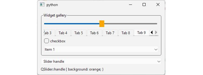
- The
QSlider::handlerule colors only the slider’s handle. THe groove is left natively rendered.
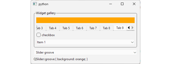
QSlider::groove, by contrast, makes the handle invisible. Styling a slider’s groove on its own causes the handle to stop rendering.QTabBar::tabcolors every tab in the bar.QTabBar::tearcolors the tear indicator (the small torn-edge marker Qt draws when there isn’t enough room to show every tab).QCheckBox::indicatorcolors the checkbox’s indicator orange in its unchecked state and green once checked, leaving the checkbox’s text label unaffected.QComboBox::drop-downcolors the button area on the right side of the combobox. The arrow inside it is a separate subcontrolQGroupBox::titlecolors the background behind the groupbox’s own title text.
15.5 The Box Model
QSS implements the same box model as CSS: margin, border, padding, and content, nested inside each other.
 1 import sys
 2 from PySide6.QtWidgets import (QApplication, QGroupBox,
 3     QWidget, QLabel, QVBoxLayout, QHBoxLayout, QSpinBox)
 4
 5
 6 STYLE = '''
 7 QGroupBox {
 8     background-color: white;
 9 }
10
11 QLabel {
12     border: 1px solid orange;
13     background-color: #BFBFBF;
14 }
15
16 #controlLabel {
17     margin-top: 10px;
18 }
19 '''
20
21
22 class Window(QWidget):
23
24     def __init__(self):
25
26         super().__init__()
27         self.resize(400, 400)
28
29         layout = QVBoxLayout()
30         self.setLayout(layout)
31
32         self.groupbox = QGroupBox()
33         self.groupbox.setStyleSheet(STYLE)
34         self.groupbox.setFlat(True)
35         groupbox_layout = QVBoxLayout()
36         self.groupbox.setLayout(groupbox_layout)
37         layout.addWidget(self.groupbox)
38
39         self.styled_label = QLabel('Styled Label')
40         groupbox_layout.addWidget(self.styled_label)
41
42         self.control_label = QLabel('Control Label')
43         self.control_label.setObjectName('controlLabel')
44         groupbox_layout.addWidget(self.control_label)
45
46         self.margin_spin = QSpinBox()
47         self.margin_spin.setRange(0, 200)
48         self.margin_spin.valueChanged.connect(self.update_style)
49         margin_layout = QHBoxLayout()
50         margin_layout.addWidget(QLabel('Margin'))
51         margin_layout.addWidget(self.margin_spin)
52         layout.addLayout(margin_layout)
53
54         self.border_spin = QSpinBox()
55         self.border_spin.setRange(0, 200)
56         self.border_spin.valueChanged.connect(self.update_style)
57         border_layout = QHBoxLayout()
58         border_layout.addWidget(QLabel('Border'))
59         border_layout.addWidget(self.border_spin)
60         layout.addLayout(border_layout)
61
62         self.padding_spin = QSpinBox()
63         self.padding_spin.setRange(0, 200)
64         self.padding_spin.valueChanged.connect(self.update_style)
65         padding_layout = QHBoxLayout()
66         padding_layout.addWidget(QLabel('Padding'))
67         padding_layout.addWidget(self.padding_spin)
68         layout.addLayout(padding_layout)
69
70         self.update_style()
71
72     def update_style(self):
73         user_style = f'''
74             QLabel {{
75                 margin: {self.margin_spin.value()}px;
76                 border: {self.border_spin.value()}px solid orange;
77                 padding: {self.padding_spin.value()}px;
78             }}
79         '''
80         self.styled_label.setStyleSheet(user_style)
81
82
83 if __name__ == '__main__':
84
85     app = QApplication(sys.argv)
86     main_window = Window()
87     main_window.show()
88     sys.exit(app.exec())
In the example, we have two labels: styled_label, whose box model rectangles can be adjusted with the three spinboxes below the groupbox, and control_label, given a fixed top margin once via the #controlLabel ID selector, and otherwise left untouched as a reference point. The border is the one layer actually visible as a distinct shape. Padding and margin have no visual representation of their own.
Increasing
paddinggrows the space between the label’s text and its border without moving the border itself.Increasing
borderthickens the visible ring, pushing the padding and content further inward.Increasing
marginpushesstyled_labelaway from its neighbors.
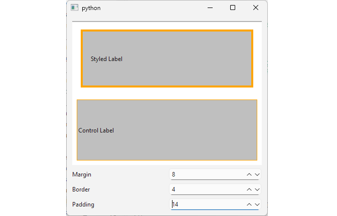
Notice that, at first, groupbox_layout absorbs the growing styled_label by pushing control_label further down. Past a certain point, though, the layout’s minimum size hint exceeds the window’s current size altogether, and Qt grows the window to accomodate it.