11. Principles of Efficient Experience (Usability)
Universal usability is more a function of keeping all of the people and all of the situations in mind and trying to create a product which is as flexible as commercially practical, so that it can accommodate the different users and situations.
– Gregg Vanderheiden
Efficient16 use or usability17. To my way of thinking both terms mean the same thing, and, in reality, we are going to be talking about usability. However, you should be thinking of usability in more general terms, the more general terms of efficient use. This is because the concept of usability is much broader than the narrow confines of ‘Task Completion Time’. Which is often associated with usability [9241-100:2011, 2011], in the context of UX, seems to be simple but, in reality, can be quite taxing. Complex computerised systems and interfaces are becoming increasingly widespread in everyday usage, components of computerised systems are embedded into many commercial appliances. Indeed, the miniaturisation of computerised systems, often found in mobile telephones and personal digital assistants, is on the increase.
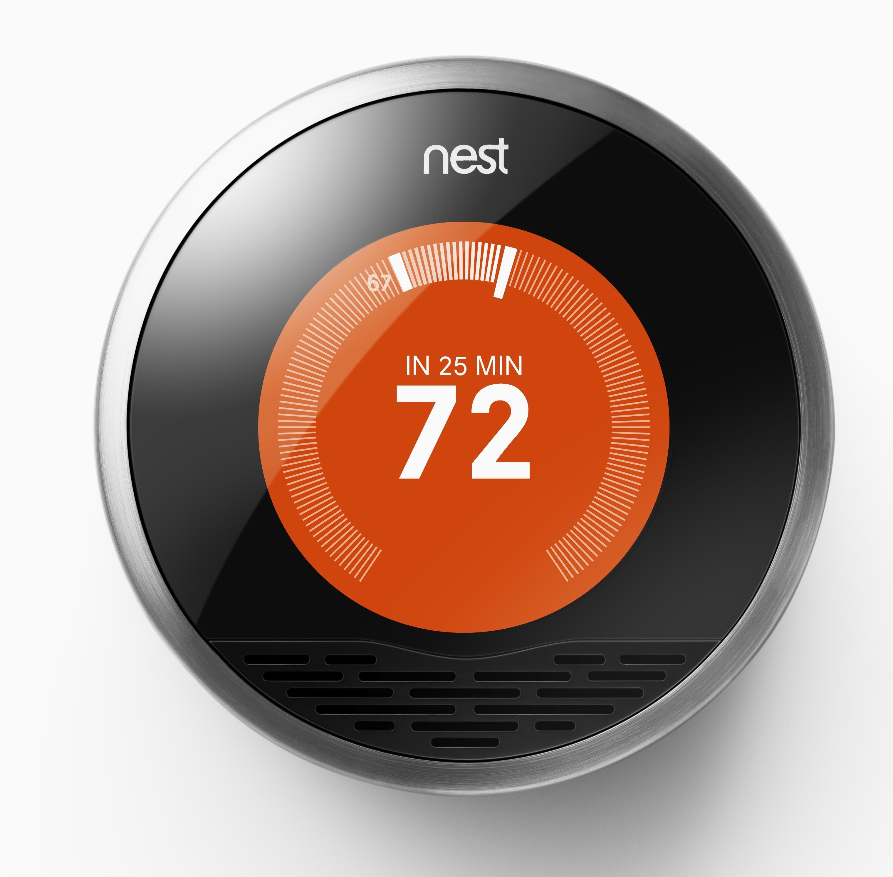
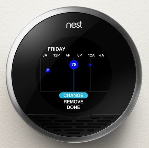
Let us take a case in point, the ‘Nest Learning Thermostat’ (see Figure: Nest Learning Thermostat) learns about the user and their home to balance comfort and conservation, without the hassle of programming or constant re-adjustments. Nest programs itself based on the temperatures the user sets, thereby learning the users personal schedule – in a week – and starts automatically turning down heating or cooling – to save energy – when that user is away18. Nest keeps refining its schedule over time and takes input by user rotation of the outer ring to adjust the temperature. The display turns blue when cooling and red when heating, push down opens the very simple menu to enable temperature changes deletion and other fine control (see Figure: Nest Thermostat Control).
As we can see, this interface is easy to understand and operate, it uses a familiar modality – in that it works similar to a turnable knob – and removes what has become a complicated interaction19 into a very simple one.
(see Figure: Modern Thermostat)
This occurs because the complexity of the program functionality has been removed from the end user and into the system itself. This, obviously, makes the software more difficult to develop, but it removes the complexity from the user and places the onus on the software engineer and UX’er. This is important in a world where information and the requirement for its manipulation is increasing at an alarming rate, requiring the user to respond to this information and placing a premium on easy interactivity. Often, however, these informational resources are centralised and, therefore, need to be tailored to the target audience at the time that they are delivered. Complexity, centralisation, and the need to enhance the performance of the user means that the usability of the system, or interface, has become increasingly important.

The human facing aspects of the system are based on an understanding of the interactive needs of the user and the way their psychology and cognition affect their interaction. This, in general, manifests itself as the ability to perform tasks and actions required by the interface in ways that are also easy for the user to comprehend and execute. Indeed, this is one of the primary driving forces of the graphical user interface and the mouse and keyboard. Often the usability of the system is measured by the performance, the time to execute a task, of a user enacting jobs over the system. As we shall see the rationale is if the task is completed faster than it was before the interactive component was either altered or created when the interface design must be better as an enhancement has occurred. Common performance measures include: the time required by the user to complete a task; the time spent navigating the interface; the number of incorrect choices or errors created; the number of jobs completed, either correctly or incorrectly; the number of observations of user frustration; and finally the frequency of interface components or behaviour that is never used.
The user centred design paradigm was created to assist in the construction of these usable interfaces. In this regard, part of the design process is driven by users who are conscripted on to the design team. In this way, it is hoped that user-friendly systems can be built and the usability of systems increased. Unfortunately, it is often difficult to solicit a representative cross-section of the possible user group, and so usability for all is often missed. This has led to the popularity of universal usability especially within the information society. In this case, universal usability refers to the design of information and communications products and services that are usable for every citizen; discussed to some extent and expanded upon later.
In reality, there is little consensus regarding the relationship of UX, ergonomics, or human factors to usability. Indeed, some think of usability
“… as the software specialisation of the larger topic of ergonomics. Others view these topics as tangential, with ergonomics focusing on physiological matters (e.g., turning a door handle) and usability focusing on psychological matters (e.g., recognising that a door can be opened by turning its handle).”
However, many experts have written separate, but overlapping, frameworks for aspects of usability which should be taken into account when designing and building systems interfaces (we’ll discuss these further). However, before we start on these comparisons let’s look at work that gave rise to some of the earliest principles by which we should design interfaces.
11.1 The Xerox ‘Star’
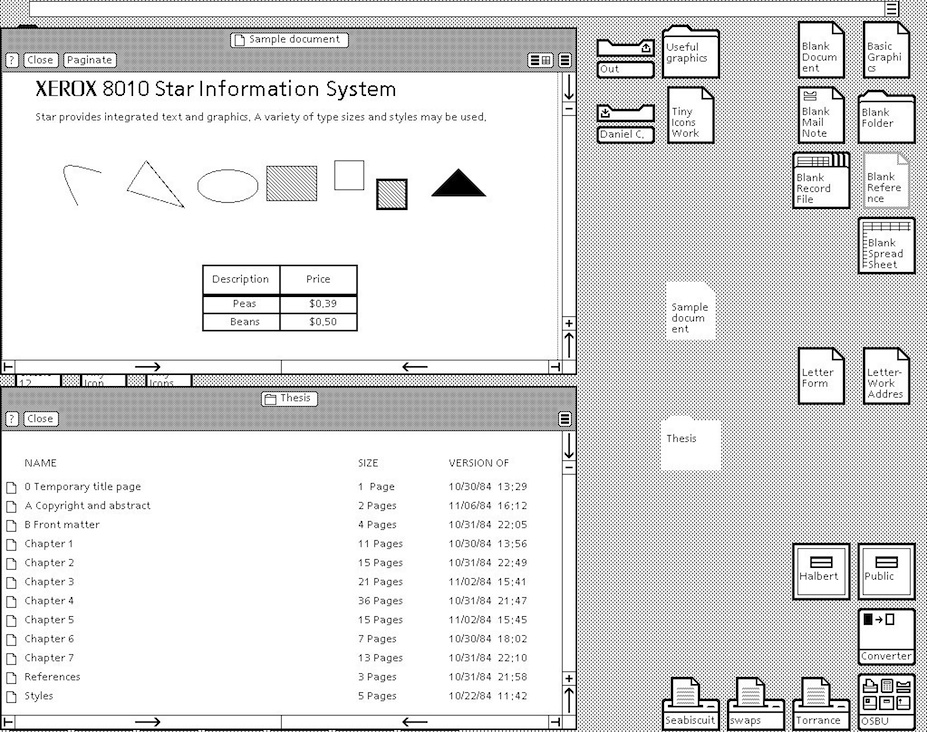
The Xerox ‘Star’ was a commercial version of the prototypical Xerox Alto – if one thousand fully working systems, used internally at ‘PARC’ day-in-day-out over seven years, can be said to be prototypical20. While the system itself is an interesting development in computer science, the interface and the mode of user interaction is truly visionary. Star, adopted novel technologies such as the mouse (the Alto had both a mouse and a portrait monitor), operationalised developments such as the graphical user interface, and created novel technologies such as the desktop (see Figure: Xerox Star Desktop). However, as UX’ers, we are more interested in the design methodology they used and the principles derived from the team’s experiences designing and developing the interface and interactivity of the implementations. These are some of the first usability principles to be mentioned in common computer literature – dating back to the early 1970s – and are still applicable today. First of all, let us look at the design methodology adopted by the Xerox Star team – it needs no further discussion from me, and so I reproduce it verbatim:
“One of the most troublesome and least understood aspects of interactive systems is the user interface. In the design of user interfaces, we are concerned with several issues: the provision of languages by which users can express their commands to the computer; the design of display representations that show the state of the system to the user; and other more abstract issues that affect the user’s understanding of the system’s behaviour. Many of these issues are highly subjective and are therefore often addressed in an ad hoc fashion. We believe, however, that more rigorous approaches to user interface design can be developed…”
“These design methodologies are all unsatisfactory for the same basic reason: they all omit an essential step that must precede the design of any successful user interface, namely task analysis. By this, we mean the analysis of the task performed by the user, or users, before introducing the proposed computer system. Task analysis involves establishing who the users are, what their goals are in performing the task, what information they use in performing it, what information they generate, and what methods they employ. The descriptions of input and output information should include an analysis of the various objects, or individual types of information entity, employed by the user…”
“The purpose of task analysis is to simplify the remaining stages in user interface design. The current task description, with its breakdown of the information objects and methods presently employed, offers a starting point for the definition of a corresponding set of objects and methods to be provided by the computer system. The idea behind this phase of design is to build up a new task environment for the user, in which he can work to accomplish the same goals as before, surrounded now by a different set of objects, and employing new methods.”*
As the prototyping proceeded the team evolved some principles: familiar user’s conceptual model; seeing and pointing versus remembering and typing; what you see is what you get; universal commands; consistency; simplicity; modeless interaction; and user tailor-ability. We have already seen that the Nest Thermostat exhibits ‘familiar user’s conceptual model’ in the use of the turning and pressing knob, both ‘consistency’ and ‘simplicity’ of operation in the movement of complexity from the user-domain, and ‘tailor-ability’ in the learning algorithms of the underlying programme logic. We’ll further expand upon the core Star principles next with the exception of ‘seeing and pointing…’, ‘what you see is…’, and ‘modeless interaction’ as these three can be taken for granted by the modern UX’er – their integration into the operating system being complete and ‘invisible’:
- ‘Familiar Conceptual Models’ – Star equates familiar conceptual models specifically with the idea of the desktop and the items that you might find on it. It exemplifies e-mail and suggests that because e-mail is similar to postal mail than icons that describe e-mail in the form of in-baskets and out-baskets – letter icons being added to each to represent the incoming and outgoing mail. Also, Star tailors these to the users familiar conceptual models by sending both text and files. This was a very new departure, previous files were sent using FTP – or some other transfer protocol – but this separation is not the case in the real world. So in reality, Star takes familiar real world concepts and maps them to the virtual world.
- ‘Universal Commands’ – Star also proposes the idea of universal commands. Previously each application defined its set of commands, and shortcuts to those commands, and expected the user to remember the specific operations without reference to those already present on the system. Star does away with all this by defining a set of universal commands such as ‘
move’, ‘copy’, ‘delete’ and the like; having the same action and being controlled by the same shortcuts, as every other program within the operating system. This may seem obvious and normal to us now, but it wasn’t in 1980. Now, universal commands are present in the standard operating system but there is sometimes a tendency to change these commands in the application, or define a new set of commands when an application is going to be written once had distributed to different platforms (different platforms having different universal commands). In this case, you should think very hard about the rationale of breaking universality; if you are writing for many platforms, think about defining a set of commands to be used at runtime based on the kind of platform the application is being run upon. - ‘Consistency’ – Consistency, or pragmatic consistency as the Star Team suggest is best, is another important principle for usability. By making sure that consistent actions occur across the programme functionality we can assist the user in learning the correct outcomes for the same action over different applications, reinforce the users understanding of what these outcomes will be, match a user’s expectations with real-world actions, and dovetail into the familiarity of actions in the user’s conceptual model. Consistency should also be considered specifically concerning the dominance of real-world physical metaphors when compared to virtual ones, and the pragmatics of maintaining consistency even when that might go against the users understanding of what should happen. In should, you need to think very carefully about how to maintain consistency within your applications.
- ‘Simplicity’ – Simplicity is incredibly important, but it’s not a clear-cut principle; we can make a simple interface, but it may not fill the desired outcomes required by the user. What is simple to one user might be verbose and tedious to another user, especially when the first user might be a novice while the second, an expert. We can overcome some of these problems of simplicity by enabling expert access to system complexity. Similar to the Nest Thermostat, we can choose to use the technique of progressive disclosure. Or we can separate out novice and expert interfaces such that shortcuts and accelerated behaviours are accessible by experts while slower more progressively disclosed interactions that support learnability and familiarity are available for the novice user.
- ‘User Tailor-ability’ – Usability is all about customisation, personalisation, and system adaptation; this means flexibility. We have briefly discussed the principle of flexibility already. The Star system is reasonably straightforward in its customizability, and individualisation (as it is known in the ISO standard), but this level of adaptability was unheard of at the time and pointed the way to a deeper acknowledgement that all individuals are different.
It is my opinion that these five principles are so important and timeless that their formulation and practical application as part of the Xerox Star user interface was without a doubt revolutionary. Without this interface, there would be no Apple Mac, or Microsoft Windows – well at least not as we know them. However not everything is down to the Star team, some of the knowledge (particularly regarding human cognition and behaviour) even pre–dates its development, and now exist as user models to be applied before development; in an attempt to uncover the usability of an as yet unknown system.
11.2 Universal Design and Design for All!
“The Star system is reasonably straightforward in its customizability, and individualisation (as it is known in the ISO standard), but this level of adaptability was unheard of at the time and pointed the way to a deeper acknowledgement that all individuals are different.”
This is what Star implies in its discussion of ‘User Tailor-ability’… ‘individuals are different’. The concept of universal design, or design for all, was created to address this very idea of individual differences; and, in reality, means universal usability, the design aspect being applied to signify that this universality must be thought of from the design stage through to inception. Universal design can mean many things to many people. Some discuss it in terms of the society at large, by making reference to socio-economics, ethics, and issues of general discrimination. Others see design-for-all as a technological issue and a problem to be solved. Still others link design-for-all to a way of thought that should encompass everyone. In the context of computing and software development, many suggest that technology must focus on designing products so that they are usable by the widest range of people. In reality, every person is a unique individual, and so this view may not be sustainable or achievable because, to create universal usability by designing for all, involves making generalisations about users, and it is these exact generalisations that were the impetus for Universality in the first place.
However, ‘Universality’ suggests to most UXers and engineers that the solutions they come up with must best fit most of the population most of the time. Many organisations follow the viewpoint that universal usability means design-for-all; the argument often following thus:
“A focus on designing products so that they are usable by the widest range of people operating in the widest range of situations as is commercially practical”. Paradoxically, they also come up with a pointer to a workable solution: “As one might imagine, there are no universally usable products. There simply is too great a range of human abilities and too great a range of situations or limitations that an individual may find themselves in”.
But unfortunately, do not take it: “Thus, universal usability is more a function of keeping all of the people and all of the situations in mind and trying to create a product which is as flexible as commercially practical, so that it can accommodate the different users and situations.” [Vanderheiden, 2000]
While Universal Usability seems reasonable on the first inspection, it may not be supportable in practice. By trying to address all user needs in one design, the technologist is apt to address none. Making software usable is not just about a utilitarian view of software use, it is also about the personal choice of the user (we have already touched on this). Too often designs are implemented based on knowledge and aesthetics of the designers and engineers, but not on those held by the user. Consider the example of a spreadsheet application, in which a visually impaired user may have difficulty in choosing cells and accessing spreadsheet functions because the user interface (in this case a GUI display) does not support their needs. Another example concerns how to notify a deaf person working in a communal office that the application they are using has sound (which may be set too high).
When mainstream computer systems were initially developed, the overriding aim was focused on the creation of a computing resource, and not on the interaction of humans with that resource. Engineers and Systems Architects thought that they had overcome so many problems in the creation of computing resources that users would be thankful just for the computational ability; and they were. However, as systems became more complex and machines spread to the desktop to be operated by non-technical users, interaction with these machines became more of a concern. Some solutions, collectively known as User Interface Management Systems, were suggested. These mainly focused on interface generation for large bespoke embedded systems (aircraft avionics and the like) which met with little success when moved to off-the-peg software development.
I think that system flexibility is the only way to overcome the constraints placed on users by the need to service the perceived interaction requirements of all users. Design-for-all is only needed if that design is trying to fulfil all the gaps in technology provision created by an inappropriate user interface. We need a way to make the user interface bespoke to the individual user, and I think that universal access to software applications does not truly exist because the user interface and the system application logic are con- joined. Further, a stable and usable interface specification between these parts does not exist, and this means that separation cannot occur. Interaction design Heuristics that support a separation between the user interface and the code that implements the functionality of the application are ably demonstrated in the Mozilla User Interface (XUL) implementation. XUL allows a different ‘Look and Feel’ to be used for different applications and operating systems (also see ‘Skins’). By this separation, universal access to applications can be accommodated because the interface can adapt to the task without the need to change any part of the other functionality. We can see that this kind of design thinking supports the utilitarian user requirement, user activity, and users personal choice. It provides a halfway-house ‘coarse’ grained interface and a method of fine tuning to a specific user. Even though the rendering is still visual, Mozilla points the way to component separation, and, therefore, interface adaptability.
In his article ‘Bridging the Digital Divide with Universal Usability’ [Shneiderman, 2001], Ben Shneiderman asks the question ‘Can you design a text-only interface that conveys the contents and experience of an animated Flash presentation?’ It is an interesting problem, but one that cannot be solved by designing one all-encompassing solution. Indeed, there can only be a solution if the information in question provides the opportunity for universal access. Once the opportunity is provided, interfaces can be developed to access that information in the most appropriate way to the user and not to the information itself. For instance, if an audio file is created without the opportunity of both a graphical or textual expression, then a driver interacting by audio only could not access that information source.
My point is, you should think of Universal Design, Design for All, or Universal Usability less concerning creating a physical design to be captured in programme logic, but more about providing the opportunity for universality. The way to provide this opportunity is to support ‘openness’ and ‘consistency’ of the data and API, and tailor-ability of the interface. Now it would be wrong to suggest there is no reason to provide an interface beyond an open API; we have to interface with the system at some point, but adding this separation of interface and programme logic will help you focus on supporting the users experience. Further, understanding the user, and the usability of your system will also help you build a flexible, but the coarse-grained interface, while understanding which aspects most require the ability to be personalised.
11.3 Usability Models
Models of the user have existed for many years. Some of the first were developed by Miller in an attempt to apply information theory to the human. Information theory is a branch of applied mathematics and electrical engineering involving the quantification of information. Historically, information theory was developed, by Shannon, to find fundamental limits on signal processing operations such as compressing data and on reliably storing and communicating data. Miller extended this model into the psychology domain by defining a model of the bandwidth that people could cope with, calling it a channel. This lead to the historic, and still quoted, 1955 work ‘The Magical Number Seven, Plus or Minus Two - Some Limits on Our Capacity for Processing Information’ – as we have already seen). Extending this idea of modelling the user, Card et al.’s famous 1983 work ‘The Psychology of Human-Computer Interaction’ [Card et al., 1983] proposed the Human Processor Model which is also still referred to today. User models are in continued development with many active researchers trying to add knowledge and principles to the field.
You’re likely to see these models variously described as User Models, Cognitive Models, or User Simulators; I’ve listed them here as Usability Models, because in reality that is just what they are. They see the users as a very one-dimensional entity – analogizing them to a processor or processing entities. These models say nothing of the non-task related traits such as effective use, emotion, or pleasure – but see the best outcome only as measurable and efficient. Keep this in mind when you are applying them because they are by no means complete, or rich enough to do a human, full justice. However, they can be very useful for predicting usability.
In reality you’re unlikely to come across these kinds of user models in your UX work, they are used more widely in research and at the very edges of development. This said you may come across them in some unlikely cases, and it may also be useful for you to have a brief understanding of the key points of their application, just in case…
11.3.1 The Human Processor Model
The Human Processor Model is a cognitive modelling method used to calculate how long it takes to perform a certain task. This method uses experimental times to calculate cognitive and motor processing time. The value of the human processor model is that it allows a system designer to predict the performance concerning the time it takes a person to complete a task without performing experiments directly. In reality, this means that empirical work already undertaken is captured as a set of principles that are so general that they can be applied to any usability problem within their scope and domain. This removes the onus on software engineers and UX specialists to run their experiments, instead asserting conformance by applying the user model to their development. The model uses the cognitive, perceptual, and motor processors along with the visual image, working memory, and long-term memory stores. Each processor has a cycle time, and each memory has a decay time. Therefore by following input pathways and combining them with the associated cycle or decay times, the time it takes a user to perform a certain task can be calculated. Card et al define the method for determining processes as the following steps: (1) write out main steps based on: a working prototype, simulation, step by step walk-through of all steps; (2) clearly identify the specific task and method to accomplish that task; (3) for each final step identify sub-levels down to a basic process; (4) convert into pseudo code; (5) list all assumptions; (6) determine time of each operation; (7) determine if operation times should be adjusted; (8) sum up execution times; and finally (9) iterate as needed and check with prototyping.
11.3.2 GOMS
Goals, Operators, Methods, and Selection rules (GOMS) was also proposed in the same book as the Human Processor Model. It reduces a user’s interaction with a computer to their primary actions. Using these primary actions as a framework, an interface can be studied. There are several different GOMS variations that allow for different aspects of an interface to be studied and predicted. Goals are what the user intends to accomplish. Operators are actions that are performed to get to the goal. And methods are sequences of operators that accomplish a goal. There can be more than one method available to accomplish a single goal, if this is the case, then selection rules are used to describe when a user would select a certain method over the others. The GOMS method is not necessarily the most accurate of all the usability measurement methods, but it does have certain advantages. An estimate of a particular interaction can be calculated with minimal effort in a short amount of time. With a careful investigation into all of the detailed steps necessary for a user to successfully interact with an interface, the time measurement of how long it will take a user to interact with that interface is a simple calculation. The main drawback of GOMS is that it expects users to follow logical routines and is not resilient to user unpredictability, and all of the techniques work under the assumption that a user will know what to do at any given point. This aspect of user interaction are commonplace and are often what makes UX so challenging and interesting.
11.3.3 KLM or KLM-GOMS
Keystroke Level Modelling, sometimes referred to as KLM or KLM-GOMS, is an eleven step method that can be used by software engineers seeking ways to estimate the time it takes to complete simple data input tasks using a computer and mouse. By using KLM, individuals often find more efficient or better ways to complete a task simply by analysing the steps required in the process and rearranging or eliminating unneeded steps thus, (1) obtain a working prototype of computer interface or a step by step operational description of a task; (2) identify the goals or the desired outcome of work; (3) for each of these goals, find subgoals or tasks that achieve the main goals; (4) identify methods to main goals and all subgoals; (5) convert description of methods to pseudo-code; (6) state any and all assumptions used in the making of pseudo-code and goals; (7) determine appropriate mental or keystroke operators for each step; (8) assign time values to mental or keystroke operators; (9) add up execution times for operators; (10) adjust total time of task to be sensitive by age of expected, this step was initially implied but is explicit as a later extension; and finally, (11) verify the validity of the results. The method is designed to be much easier than GOMS and especially useful in the evaluation of time specific tasks that require, on average, less than 5 minutes to complete.
11.4 Collated Usability Principles, Guidelines, and Rules
The first thing to notice about usability principles is that there are many of them, and many different ones are proposed by many different usability luminaries21. This is different in some regard to those previously proposed where there is broad agreement among experts and a smaller set of principles at work. However, usability has been a major topic in the understanding of user experience for a much longer period than has accessibility. In this case, it is appropriate to collate the different usability principles along with their proponents to identify the overlap that exist between them.
You will notice in ‘Table: Collated Usability Principles’ that the left column describes the principle, guideline, or rule (these are sometimes used interchangeably between the different experts)22; while on the right side the experts are listed along with a footnote pointing to the text from which the principle is derived. In collating these principles, I have not followed slavishly the nomenclature proposed by each author but have instead placed them in categories that I believe have the same conceptual value, even if the naming of that principle does not follow from its source.
Table: Collated Usability Principles. Usability Principles Collated by Source.
| Principle | Appears in Source |
|---|---|
| Closure (Dialog Yields) | Shneiderman23 |
| Consistency / Standards | Xerox-Star24; Shneiderman; Norman25; Nielsen26; ISO 9241-11027; Dix, Finally, Abowd & Beale28; Raskin29. |
| Constraints (Exploit) | Norman. |
| Control & Freedom (Support) | Shneiderman; ISO 9241-110; Nielsen. |
| Error Handling (Simple) | Shneiderman; Norman; ISO 9241-110; Nielsen. |
| Familiarity & Metaphor | Xerox-Star; Norman; Dix, Finally, Abowd & Beale; Raskin. |
| Feedback (Informative) | Shneiderman. |
| Help & Documentation | Nielsen. |
| Interrupts (Resumption) | Raskin. |
| Describing (Self) | ISO 9241-110. |
| Heuristic Evaluation | Nielsen. |
| Learnability | Dix, Finally, Abowd & Beale, ISO 9241-110; Sharp, Rogers and Preece30. |
| Mappings (Real-Virtual) | Norman; Nielsen; Dix, Finally, Abowd & Beale. |
| Memory Load (Reduce) | Shneiderman; Sharp, Rogers and Preece. |
| Navigation & Freedom (Support) | Raskin. |
| Reversal of Actions (Easy) | Shneiderman; Nielsen; Dix, Finally, Abowd & Beale. |
| Safety | Sharp, Rogers and Preece. |
| Shortcuts (Provide) | Shneiderman. |
| Simplicity | Xerox-Star; Norman; Brooks31. |
| Singularity of Focus (Attention) | Raskin. |
| Task Suitability & Conformance | Dix, Finally, Abowd & Beale; ISO 9241-110. |
| Tailor-ability / Flexibility | Xerox-Star; Nielsen; ISO 9241-110; Dix, Finally, Abowd & Beale. |
| Universal Commands | Xerox-Star; Dix, Finally, Abowd & Beale; Raskin. |
| Utility | Sharp, Rogers and Preece. |
| Visibility (Make Things) | Norman; Nielsen. |
From a cursory view of ‘Table: Collated Usability Principles’ we can see that there are many principles that deserve greater investigation. These include learnability, is it easy to learn, or work out, how the system operates. Efficiency, how fast can tasks be accomplished. Memorability (memory load), is it easy to remember how the system operates. Errors, how many errors are made and can they easily be recovered. And satisfaction, do users like the overall feel the system. Also, I would add the following: information flow; is feedback fast, appropriate and not too detailed, but detailed enough. Granularity is the interface sectioned enough so that progressive disclosure of the interface can occur. And egocentricity, is their user specific feedback and guidance (but we will get to these later). For now, however, consider ‘Table: Collated Usability Principles’ in more detail, and I will try to explain my rationale for the grouping and discarding of the principles within it, to form a smaller aggregate set.
So I’m going to discard some of these principles because I think they are very niche because I don’t agree with them, because I don’t think they are helpful, or because there seems to be little consensus in the community.*
- First, I’m going to discard Shneiderman’s ‘Closure (Dialog Yields)’, I think this is pretty obvious and is now a well-understood software engineering practice; you wouldn’t normally have a dialog that opens another, further in some cases such as a wizard this principle isn’t helpful.
- Next I’ll discard Nielsen’s ‘Heuristic Evaluation’, not because there is anything wrong with it, but because I’m going to cover this in more detail later.
- Next, Preece, Rogers and Sharp’s ‘Safety’ is for the chop, while safety at the interface level may be useful, I think it is a little too niche to be included in a general set of UX principles.
- Now I think ‘Task Suitability & Conformance’ – proposed by Dix, Finally, Abowd & Beale, and ISO 9241-110 – can be referred to earlier, it has already been addressed as part of the UCD aspect of the design.
- Finally, I’m discarding Preece, Rogers and Sharp’s ‘Utility’. Utility is obviously important - but if you’ve gone to the trouble of starting the development I’d imagine you expect the software to have some utility, and if the utility is about the interface under construction, well that can only be assessed after evaluation.
Now the ‘carnage’ is over, let’s look at the principles that will stay and/or be amalgamated:
- ‘Consistency / Standards’ + ‘Universal Commands’. This seems pretty obvious to me - in that universality is directly related to standards to provide consistency.
- ‘Constraints (Exploit)’ + ‘Memory Load (Reduce)’ + ‘Simplicity’. Again I think this is straightforward, in that the constraint reduces complexity, which reduces the load on short-term memory and assists in interface simplicity.
- ‘Control & Freedom (Support)’ + ‘Shortcuts (Provide)’ + ‘Tailor-ability / Flexibility’. Supporting user control, and user freedom, all contribute towards Flexibility (Tailor-ability), providing shortcuts is one additional way of providing the control we envisage. Now I’m not expanding on this one further in this chapter, but instead, I’m going to refer back.
- ‘Error Handling (Simple)’ + ‘Feedback (Informative)’ + ‘Singularity of Focus (Attention)’ + ‘Visibility (Make Things)’ + ‘Navigation & Freedom (Support)’. Now we don’t talk about it here, but these four principles can all be subsumed to assist in ‘Situational Awareness’. Situational awareness involves a perception of the environment critical to making decisions in complex and dynamic situations. Indeed, situation awareness “involves being aware of what is happening in the vicinity to understand how information, events, and one’s own actions will impact goals and objectives, both immediately and in the near future”. I contend that simple error’s, informative feedback, visible components and interactions, coupled with a singularity of focus, all go towards creating an environment that enhances situational awareness.
- ‘Familiarity & Metaphor’ + ‘Mappings (Real-Virtual)’. By ensuring there is a cognitive mapping from real to virtual we can assist in the side goal of interactive *familiarity.
- ‘Help & Documentation’ + ‘Describing (Self)’. It is my opinion that self-description is the principle to which good help and good documentation contribute.
- ‘Interrupts (Resumption)’ + ‘Reversal of Actions (Easy)’ . Reversal and resumption of actions and interactions seem to be related to me. This also feeds into the user control, but these are a little more specific and seem to me to me mainly about ‘interaction stability’.
- ‘Learnability’; we’ll get to this later on.
Before moving on to a discussion of our principles, consider for a moment the usability requirements of the novice and expert user. The usability principles as described in this section are not straightforwardly applicable because there is some conflict between the requirements of different users; at a coarse-grained level, these can be classed as the novice and the expert. The thing to remember with all these principles is that you need to make provision for slow, simplistic and constrained novice use; provision for fast, complex and unconstrained expert use; and some learnability path that enables novices to become experts in the shortest amount of time possible. This last requirement is most difficult because understanding if learnability is effective and efficient, can only be done with longitudinal studies; in the real world, it is very unlikely you will have the budget for this. This said it is up to you, the UX usability specialist, to keep these concepts of the novice, expert, and the transition between the two, in your mind at all times.
As is the case for all user experience it can be difficult to validate the effectiveness and efficiency of the usability principles you design into your system. It is often easier to see that a usability principle is not present that to see if a usability principle is present.
11.5 Potted Principles of Efficient User Experience
Interaction design focuses on improving technologies that provide interaction with the user [9241-110:2006, 2006]. This is normally led by the UX interaction developers, who are responsible for engineering software that shapes the user interface. Technologies mainly include Windowing Toolkits, Graphical User Interfaces, and System operations, etc. Use of these technologies affects how people interact with the system both as creators and consumers of information. Therefore in any effort to support the user, it is crucial that the features and limitations of these technologies are clearly understood. For the UX’er, current core principles that should run through all aspects of the development can be summarised as follows.
11.5.1 Facilitate Consistency
Consistency is a key factor in usability; and two major ways of attaining consistency is to follow standards, and to develop systems that apply the same command, control, and interface structures universally across the development. While standards and universality are two key elements of consistency, the concept of consistency can exist upon its own, and you should also think at all stages of development ‘Am I developing a consistent interface, are the interactions consistent across the platform and development?’
The use of standardised components is a major aspect when designing for the user. In this way, the developer can be assured that look and feel of the software will be harmonious with the best practice of the operating system and dovetail into the guidelines of the underlying environment. This is often difficult if the design is to be accomplished on different platforms because the look and feel changes (for instance there is a significant difference between the operating modality and look and feel of Microsoft Windows and Apple Mac OS X). However, there are some ways to address the problems of standardisation across the interface. The developer can design for the interpreter platform, or by choosing a cross-platform system such as Java or Qt, which adapts to the base operating system environment. In this way, the development cost is removed from the developer to the language or framework engine. Besides, the developer may wish to use techniques such as Model-View-Controller (MVC) to separate the presentation from the programme logic and use a window toolkit to enable a more harmonious distribution across different platforms. In either case standardisation to the underlying environment is critical to maintaining the usability of the development, and to reduce the additional cognitive overload on the user in switching between operating modalities.
Besides, there are many pan-system standards which should also be followed when building user-centric software. These guidelines and standards have been created so as to encapsulate knowledge and best practice into a format that can be easily applied by engineers who do not have an in-depth knowledge of human factors or ergonomics. The standards have been designed by both operating system manufacturers and international standards bodies, and by following these standards the developer can be assured that their system will be usable by the most number of people.
Questions to think about as you design your prototype:
- Am I developing a consistent interface?
- Are the interactions consistent across the platform and development?
- Is my command and event structure universal across the development and platform?
- Am I following standards and best practice?
- Am I following the platform design guide32?
11.5.2 Facilitate Familiarity
Familiarity (including via Metaphor) is a key principle for enhancing usability. As we have already seen from the Xerox Star team, and from many usability experts, dovetailing into a user’s learned behaviour is the primary way of enhancing familiarity with a system, which they are as yet unfamiliar with. You can do this in many ways, from mapping real world to virtual world concepts, using common terms and jargon, by making the look and feel of the new system similar to that of an old system – or an old manual way of doing things (such as forms that look similar). However, you decide to implement familiarity or enhance that familiarity within your system, always make sure you think if your concept of familiarity is likely to be the same as your users. Remember the development is not for you, but for your target users.
Questions to think about as you design your prototype:
- Does your system map real world concepts to the virtual world?
- Does your system use terms the user is familiar with (including Jargon)?
- Does the system work in familiar ways, regarding itself and other comparable applications?
- Do you assuage ‘intuition’ for familiarity?
- Does your system use easily understandable (and, therefore, familiar) messages?
11.5.3 Interaction Stability
You won’t find the principle of interaction stability in many other texts, but it seems it is a reasonable summary of some of the aggregated principles and guidelines that other usability experts purport. When we are thinking of interaction stability we are trying to make sure that interactions are stable, that they can be resumed if they break, that data will not be lost, that the place someone is at, in an interaction (the stage for the step), can be returned to in the event of a failure. For example, a web form that times-out after one hour and does not save the existing contents of that form does not exhibit interaction stability; however a form that times-out, saves the data, and allows the user to commence from this saved point, does exhibit interaction stability.
One further way of enhancing interaction stability is ‘preview’. A lack of preview of upcoming information is one of the major issues to be addressed when building interfaces and considering interaction stability. Consequently, the preview is considered to be a primary component of good interaction stability. This preview can be manually achieved by try operations and awaiting desired or undesired outcomes from the environment. In an interface context, the lack of previews of both the outcomes of specific actions and information relating to navigation of the interface itself suggests that some degree of ‘foreknowledge’ should be implemented so that a limited preview can be obtained. In this case, a good interface design will remove the onus on the user by providing outcomes and descriptions of what will occur if a specific action is performed, as well as suggesting paths to certain information of functional outcomes.
Questions to think about as you design your prototype:
- Are you able to resume interrupted actions?
- Are you able easily reverse an action, incorrectly taken?
- Are you able to understand your location in the interaction?
- Does your system recover well from an unexpected event?
- Do your interactions (including dialogs) exhibit stable non-cyclical behaviour and closure?
11.5.4 Facilitate Learnability
Learnability is a key aspect for interface design. Indeed, this is why large computer systems and operating environments often come with a series of rules and best practices for software development that describe the standard ways of interacting on that specific system. Application menus that normally have ‘file’, and ‘edit’, to the left and ‘help’ to the far right all the way through to common dialogues for picking colours or interacting with files systems, all try to enhance learnability. I have not yet met a user who has read the user manual for any large system. In reality, users prefer to investigate and orientate themselves to the system. Therefore, interface development should assist the user in self-directed learning of the interface components as opposed to relying on the reading of the user manual or help text. It is only by helping make your system easily learnable that you will be able to reduce the amount of support required by the user and, therefore, reduce long-term costs while enhancing user satisfaction.
Questions to think about as you design your prototype:
- Is your system behaviour predictable?
- Can users easily transit from novice to expert?
- Can you understand the system behaviour without recourse to manuals of help systems?
- How easy is it to learn any bespoke system functionality?
- Does your system facilitate self-learning and functionality investigation?
11.5.5 Facilitate Robustness
As with all aspects of a computer system, speed of service balanced with the robustness of the system is critical for the user. In most cases, users prefer systems to be more robust because the effect of a faster service speed balanced against a system that crashes frequently. This scenario costs more time in the long run and introduces a lack of trust in the user’s perception of the interface and therefore the quality of the end product. Obviously, robustness is a systemwide concern, however, because the interface elements are often developed as one of the last things in the development lifecycle, robustness is sometimes sacrificed for a speedy development that ends on time.
Questions to think about as you design your prototype:
- Does your system recover well from an unexpected event?
- Are errors easily dealt with?
- Are incorrect user actions easily recoverable?
- Is the user-state saved between sessions in the event of a system failure?
- How does your system handle abnormal input?
11.5.6 Facilitate Progressive Disclosure
Progressive disclosure is a tricky concept to discuss. It was previously thought that usability was enhanced when the number of selections required of a user was reduced to the bare minimum. This created interfaces that were very complex having as much functionality as possible on the screen at the same time. In reality, quantitative measures showed that this decreased performance because it took the user longer to make a decision about what to select, as opposed to the actual selections themselves. Progressive disclosure is an antidote to this kind of information and operation overload and suggests that a hierarchy of operations moving through simple selectable steps is faster and easier for the user to understand than counting the selections required to achieve a specific action. Of course, progressive disclosure can lead to problems because there may be multiple levels of disclosure, in which case the functionality can be hidden in the depths of the computer system such that it is never used. The interface developer, therefore, needs to understand these complexities and try to mitigate them by providing progressive disclosure but limiting the hierarchical nesting of the activities that are being disclosed to a minimum.
Questions to think about as you design your prototype:
- Does your interface look overly complex? If so, simplify.
- Are there a lot of components displayed at one time? If so, clean it.
- Is there a multitude of possible actions available to the user? If so, focus on building one action for one interface element.
- Is there a tight logical hierarchy of actions?
- Is the user-led along the interactive path?
11.5.7 Facilitate Scalability
Again, scalability is not a principle you will find in most usability texts. However, it is important in the real world. If your system is not able to scale concerning the way it displays data, or the way interactions progress, in a system that is being progressively overloaded, then the efficiency of that system, its usability, is drastically reduced. For example, I once worked on a system that displayed data in interactive bubbles, this worked well with small amounts of data – and also looked supercool. However, as the amount of data was increased the interface was not scalable and so it became unusable, the number of interactive bubbles expanding exponentially – making the visual search very difficult. The solution was to define the point whereby the display became unusable and then adapt the data back into a more traditional tabular format that was far easier to search and could efficiently display much more data than the interactive bubble format – although it didn’t look as cool.
Questions to think about as you design your prototype:
- Does your interface scale to handle larger datasets then envisaged etc.?
- Does your system handle data and interaction within an acceptable time?
- Do complex actions scale up regarding data and user requirements?
- Do your interfaces remain simple when information is being dynamically added?
- Can new functionality be added to your system without negatively impacting on its current interactions and interfaces?
11.5.8 Facilitate Self-Description
The principle of self-description is one which is pointed to by some usability experts, and is implicit in other usability principles; such as those which espouse good help and good documentation. The difference with self-description is that in the best possible circumstance the user should not need to refer to help or the documentation. This is because it is very unlikely – indeed normally only in extremes – that a user will ever consult the manual. One thing you should consider is that self-description is not necessarily only about explicit textual descriptions. Implicit descriptions based on the visual rendering – the way something looks – dovetailing into familiarity and simplicity, are also important in the self-description principle. By visually suggesting a path the user should take you enhance the self-description of that particular interface and interaction.
Questions to think about as you design your prototype:
- Is your system well documented?
- Is help present and informative?
- Is it possible to understand the program functionality without recourse to the manual?
- Is it possible to understand the interface, widgets, and interactivity without recourse to the manual?
- Is it possible to fully understand all dialogs, messages, and status’?
11.5.9 Facilitate Simplicity
Simplicity is a commonly espoused usability principle; indeed, many usability experts list this as a key principle to be followed. However, from work that my team and I have conducted, building in simplicity treads a very fine line, because it impacts on aesthetics, pleasure, and emotion. An interface that is too simplistic will be seen as boring, or only utilitarian, one that is too complex will be perceived as being overly complicated and aesthetically displeasing. The simplicity of the interaction, on the other hand, is a useful trait to develop, and this can be done by hiding complex system functionality from the user (often the novice user), thereby presenting them with a constrained set of choices while still enabling the complexity to be accessed by expert users.
Questions to think about as you design your prototype:
- Is your system presented simply?
- Are the interactive elements simple to understand and use?
- Can you understand the system behaviour without recourse to manuals of help systems?
- Does your system exploit natural interactive constraints?
- Is complexity hidden from the novice user?
11.5.10 Facilitate Situational Awareness
Again, situational awareness is not a principle you will commonly come across in many usability texts. However, I think it is a good way of describing certain aspects of a usable design. Let us recap: Situational awareness involves a perception of the environment critical to making decisions in complex and dynamic situations. Indeed, situational awareness “involves being aware of what is happening in the vicinity, understanding how information, events, and one’s own actions will impact goals and objectives, both immediately and in the near future”. Can increasing our awareness of the situation and then building a model integrating aspects that are common within the usability literature help. Aspects such as the desire for simple errors, informative feedback, visible components and interactions, coupled with a singularity of focus, all go towards creating an environment that enhances situational awareness. But situational awareness is much more than this; let us take a brief look at a model of situational awareness (see Figure: Endsley’s Model of Situation Awareness).
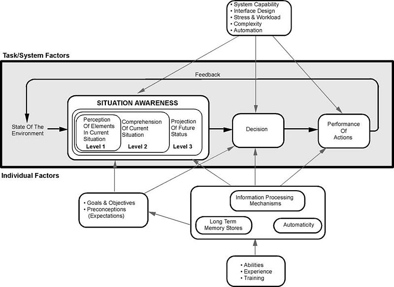
Endsley’s Model espouses a good perception of the elements in the current situation, a comprehension of that situation, and an understanding of the future status. All of these factors: enable you to make a decision as to the interaction; perform these interactions that then alter the state of the environment – in this case the interface or the interaction; which then affects the perception of elements… so on. We can see that this kind of view is directly related to good usability. Understanding the interface and its abilities are all part of the perception of interface elements, a comprehension of the current interactive situation including your location in the interaction. This is known as the user orientation or ‘where-ness’ (detecting cyclic behaviour, direction and distance) and is important in interface design as it enables users to navigate with some degree of accuracy. The environment, however, must be updated such that cues are provided in an appropriate manner, giving explicit orientation information such that navigational information can be detected. The similarities between real-world movement and that surrounding the interface suggest that the provision of some form of explicit and appropriate orientation method are an advantage when navigating the interface. This would mean that a user can make a choice as to whether they want to be at the current location and if not aid them in deciding how to navigate best to their perceived destination. Finally, situational awareness rests upon our ability to predict our future status (this may be including familiarity as well as an understanding of how the system works). As an example, think of the last time you completed a credit card transaction or order from the likes of ‘Amazon’. In this case, you are led through a sequence of events; each step is given in graphical overview at the top of the page, and as each step is accomplished so the colour is changed to highlight a stage has been satisfactorily completed (see Figure: Amazon Check Out). This is all about enhancing your situation awareness by providing you with a stepwise overview of the current situation and an understanding of what will happen in the future.

Questions to think about as you design your prototype:
- Does your system facilitate orientation both within the interface and within the interaction?
- Is orientation and navigation, around and through the interface (and interaction), easy?
- Is error handling simple? Is feedback informative?
- Are all components, needed for the interaction, visible?
- Do you maintain a single focus of interactive attention, without distractors?
By understanding and following these simple design principles any software developer can begin to create user-centric applications that will be implicitly friendly to users. By applying these principles through requirements elicitation, analysis, user modelling, and interface development, user facing components can be enhanced, and best practice can be implicitly included within the development.
Remember… these are just the next ten of our total principles - for the next batch you can skip ahead). But just because you can, maybe you shouldn’t… take your time to read the rest!
11.6 Summary
We can see that designing and building usable and efficient interfaces are by no means a trivial task. Even with the wealth of toolkits and accessibility API’s currently available the software engineer and UX specialist should not underestimate the amount of work and testing required for a comprehensive interactive development. Fortunately, there are a number principles to assist in this process, as well as the basic elements of the graphical user interface which can be assembled into a form that directly supports usability.
Some researchers see the ubiquity of the graphical user interface as being detrimental to the HCI field in general. They claim that focusing only on this kind of interaction means that there has been no novel work undertaken in the HCI domain since the heady days of Parc Xerox. I have some sympathy for this view but in reality, it is not completely correct. With the development of gesture-based interfaces and the upcoming use of haptics, the interactive elements of interface design are alive and well. I would agree, however, that the interactive displays used in these systems are stagnating to some degree. But in the context of development, building and designing interactive components that are tailored to the users need is difficult enough. By leveraging the principles already undertaken and the toolkits that provide well understood and consistent components and metaphors the software engineer can be reasonably assured that the interface design will be very familiar to the user and in this way assist usability in a practical manner.
Before we finish, a word of warning – as always from Dix – who suggests we may often ignore our fields previous work and start to reinvent the wheel:
“When one builds the justification of why something should work, the argument will not be watertight in the way that a mathematical argument can be. The data on which we build our justification has been obtained under particular circumstances that may be different from our own, we may be bringing things together in new ways and making uncertain extrapolations or deductions. Some parts of our argument may be strong, and we would be very surprised if actual use showed otherwise, but some parts of the argument may involve more uncertain data, a greater degree of extrapolation or even pure guesswork.
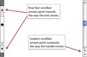
These weaker parts of the argument are the ideal candidates for focusing our efforts in an evaluation. Why waste effort on the things we know anyway; instead use those precious empirical resources (our own time and that of our participants) to examine the things we understand least well. This was precisely the approach taken by the designers of the Xerox Star. There were many design decisions, too many to test individually, let alone in combinations. Only when aspects of the design were problematic, or unclear, did they perform targeted user studies. One example of this was the direction of scroll buttons: should pressing the ‘up’ button make the text go up (moving the page), or the text go down (moving the view)?
If there were only one interpretation it would not be a problem, but because there was not a clear justification this was one of the places where the Star team did empirical evaluation… it is a pity that the wrong answer was used in subsequent Apple Lisa design and carried forward to this day.” (see Figure: Scrollbar Miss-Design).
Indeed, in conversations with David Smith at CHI98 Dix described how in the first version of the design documents for the Star
“the scrollbar arrows pointed outwards as they do in modern interfaces. However, unsure of the correct orientation, the Star design team performed user studies with both orientations. Whereas the software designers were quite happy with the outwards form, the non-computing users were uniformly confused by this direction of arrows. Hence the inwards pointing arrows were adopted for the final Star design.
Unfortunately when the Star design documents were passed on to the later design teams for the Lisa and Macintosh, the initial, wrong version of the scrollbar designs was used! Hence, we came by our current scrollbar arrow direction by accident, and it is precisely the opposite of what was found to be easy to use” 33.
11.6.1 Optional Further Reading / Resources
- [S. K. Card,] T. P. Moran, and A. Newell. The psychology of human-computer interaction. L. Erlbaum Associates, Hillsdale, N.J., 1983.
- [J. Johnson.] GUI bloopers 2.0: common user interface design don’ts and dos. Elsevier/Morgan Kaufmann Publishers, Amsterdam, updated and rev., edition, 2008.
- [S. Mestel] How bad ballot design can sway the result of an election. The Guardian. (2019, November 19). Retrieved August 10, 2022, from https://www.theguardian.com/us-news/2019/nov/19/bad-ballot-design-2020-democracy-america
- [J. Nielsen.] Usability engineering. Academic Press, Boston, 1993.
- [H. Sharp,] Y. Rogers, and J. Preece. Interaction design: beyond human-computer interaction. Wiley, Chichester, 2nd ed edition, 2007.
- [B. Shneiderman] and C. Plaisant. Designing the user interface: strategies for effective human-computer interaction. Addison-Wesley, Boston, 5th ed edition, 2010.
11.6.2 International Standards
- [ISO/TR 9241-100:2011.] Ergonomics of human-system interaction – part 100: Introduction to standards related to software ergonomics. TC/SC: TC 159/SC 4 ICS 13.180; 35.180, International Organisation for Standardisation (ISO), Geneva, Switzerland, 2011.
- [ISO/TR 9241-110:2006.] Ergonomics of human-system interaction – part 110: Dialogue principles. TC/SC: TC 159/SC 4 ICS 13.180, International Organisation for Standardisation (ISO), Geneva, Switzerland, 2006.