12. Principles of Affective Experience (Emotion)
If you want a golden rule that will fit everybody, this is it: have nothing in your house that you do not know to be useful, or believe to be beautiful.
– Donald A. Norman
Affective34 use, or emotional35 use/design, both mean the same thing, and, in reality, we are going to be using both terms interchangeably. However, you should be thinking of emotional use in more specific terms; a more specialised term of affective use. This is because the concept of emotional design is much broader than we need to address at the interface / interactive level. What we are trying to get to is ‘emotional engagement’ and to begin with, let me ask you a question…
What makes a person display a bumper (or fender) sticker on their car, which espouses their love for Microsoft’s new Metro User Interface (see Figure: Metro Bumper Sticker)?

Indeed, we might ask a further question, ‘what is it that makes the Microsoft Metro User Interface an example of good design?’ (see Figure: Microsoft’s Metro UI, and as applied to a Windows 7 Mobile Phone – Figure: Metro on a Windows Phone). It is this concept of goodness that is more difficult to explain especially concerning technologists who see goodness as effective and efficient; both readily measurable, and tangible.
Microsoft tells us that: “The Metro design language was designed specifically to consolidate groups of common tasks to speed up usage. This is accomplished by excluding superfluous graphics and instead relying on the actual content to also function as the main UI. The resulting interfaces favour larger hubs over smaller buttons and often feature laterally scrolling full bleed canvases. Page titles are usually large and consequently, also take advantage of lateral scrolling. Animation plays a large part, with transitions, and user interactions such as presses or swipes recommended always to be acknowledged by some form of natural animation or motion. This is intended to give the user the impression that the UI is ‘alive’ and responsive, with ‘an added sense of depth’.”
When I first saw the Metro interface I immediately loved it; it was clean, clear, stylish and with just enough elegance for me to perceive that using it would be a pleasant interactive experience. But this isn’t the case of everyone:
“If the Windows environment comes to revolve around a kiddish interface with big colourful buttons that are limited to only presenting content to the user, I can imagine the whole Vista mess repeating itself all over with a huge lack of essential developer support and mocked in Apple advertisement’s” or “Man oh man, it is days like this when I miss the simplicity of DOS.” —Various Forums
And here lies the problem with designing for collective emotional experience, it is certainly not readily applicable to all users. Indeed, when we address easily quantifiable aspects such as usability or accessibility we get very consistent results, with affective computing, this is not necessarily the case. We see far more individualistic results, far more outliers, and far more variance within the data that we gather. In this case, you might be wondering why affective use is so important if it isn’t quantifiable. There are three reasons, firstly, attractive things work better, their attractiveness produces positive emotions that cause mental processes to be more creative and more tolerant of minor difficulties or faults; secondly, emotional attachment is natural to us as humans, and I would venture, initially much more powerful than an efficient experience (the often quoted ‘function follows form’ is still applicable because the people who subscribe to this view, see function as an aesthetic quality); finally, just because something is not easily quantifiable doesn’t mean to say that we cannot try to understand it, or that it is not of any use or significance to us in the UX domain.

12.1 Visceral, Behavioural, and Reflective
In his book, ‘Emotional Design’ [Norman, 2004], Donald A. Norman proposes three levels (or dimensions) when designing with emotional response in mind, these are:
- Visceral: is equated with appearance, and ties into how we have evolved within our environment, which drives our perceptions of aesthetic and pleasure at an internal and unconscious level;
- Behavioural: relates to the pleasure and effectiveness of use, we have seen this previously, however, Norman contends that there is pleasure in efficiency (we’re back to form following function again); and
- Reflective: is more complicated and coupled with self-image, personal satisfaction, and memories, it is about the message, culture, and the meaning of a product.
To us the most important is visceral and the reflective; we might think of this as determining if the interface looks ‘cool’ and if we have an overall positive impression. Indeed, reflective design is all about determining this overall impression of the product – in our case the interface; thinking back to the interface, reflecting upon its total appeal including the experience of using it. Many factors come into play and the weaknesses in one aspect can be outweighed by the strengths in another. Minor difficulties might be overlooked in the overall assessment, or blown out of all proportion. The overall impact of a product comes with reflection, retrospective memory, and reassessment.

Norman touches on many aspects of design, and indeed, he is not focused specifically on software engineering, software artefacts, or the user interface. However, some of his thoughts and concepts are universally applicable and this is one reason ‘emotional design’, more than his other books, has influenced the user experience domain.
Norman also has something to say about design by committee; which we have come across before). This can be summarised as ‘appropriate use’, in that Norman is a proponent of user centred design by which he believes behavioural aspects of the product can be tested with many users – iteratively refined over many users and evaluation. However, he also agrees with Henry Lieberman regarding the design of a visceral or reflective experience by committee:
”The brilliant conceptual artist Vitaly Komar and Alex Melamaid conducted surveys asking people questions like, what’s your favourite colour? Then they produced exhibitions of perfectly ‘user centred art.’ The results were profoundly disturbing.
The works were completely lacking in innovation or finesse of craftsmanship, disliked even by the very same survey respondents. Good art is not an optimal point in a multi-dimensional space; that was, of course, their point. Perfectly ‘user-centred design’ would be disturbing as well precisely because it would like that artistry.”
Norman espouses user centred design for behavioural aspects only and feels that a single cohesive individual vision is required for emotional design based on visceral and reflective outcomes. This ties in with Lieberman in that removing behavioural from the truly emotional aspects of the design means that the entire design is not ‘perfectly’ user centred.
In this chapter more than any other, I would not advise a user-centred approach to the design of the affective user experience. This should be an individual vision, as the UX’er, it is your job to select the best person to fulfil that vision based on your clients brief; and this is best done individually, without a committee.
Finally, Norman seems to come to a conclusion that we are all designers, from the personalisations we make to our houses, to the cars we drive chosen as representations of a personality, even down to the way we organise our desks – these are all design issues. Norman logically concludes that personalisation and customisation are key aspects of the emotional design process, mainly because we are all predisposed to make these personalisations ourselves anyway. This is how we become more emotionally attached to the item; by modification. Only in this way can we move from emotional design and affective use to the much more important emotional value.
Norman suggests that it is impossible to build a mass produce item that fits every individual precisely. But that there are five ways to deal with this problem: the first is just to live with a personalised item; the second is to customise, the third is to customise mass production items, the fourth is to design our products, and the fifth is to modify purchased products. Either way, it seems that Norman suggests the value of emotional design can be captured in its ability to tailor itself to you viscerally, behaviourally and reflectively.
Norman opens and closes his book with a quote from William Morris: “If you want a golden rule that will fit everybody, this is it: have nothing in your house that you do not know to be useful, or believe to be beautiful.”
We’ve looked at what it means to be useful, now let us look at what it means to be beautiful.
12.1.1 Beauty
The visual appearance of interactive systems tends to convey more information than we imagine [Fishwick, 2006]. Contact points that users first make to perceive such a system affect the rest of the interaction process. Studies show that distinct layout, smart captions and interesting pictures can transform a wall of dry text into a presentation that users will approach enthusiastically. In this way, two components of visual beauty, visual complexity and visual aesthetics, are so closely related that it is necessary to discuss both.
12.1.2 Visual Complexity
Complexity can be defined as ‘the degree of difficulty in providing a verbal description of an image’ (how easy is it to describe Figure: Windows Phone 7.5?). Textures with repetitive and uniform oriented patterns are less complex than disorganised ones. A visual pattern is also described as complex if its parts are difficult to identify and separate from each other. Perception of image complexity depends on the extent to which objects are grouped, the quantity of the parts an observer perceives in the scene, familiarity with the scene and existing knowledge of objects inside the scene. Visual complexity is mainly represented by the perceptual dimensions of quantity of objects, clutter, openness, symmetry, organisation, and variety of colour. Studies also report a positive relation between visual complexity with the computer-generated bitmap size that is measured by its compressed file size as well as with the emotional and psychophysiological effect of the image. Besides, Tuch et al. demonstrate that the visual complexity of websites has multiple effects on human cognition and emotion, including experienced pleasure and arousal, facial expression, autonomic nervous system activation, task performance, and memory.

Further, visual perception is affected by cognition, content and form. Human cognition affects how a user retrieves and uses information in an interface. Content, interface components, and the amount of information that is available affect complexity since they can cause information overload. The form of the interaction on the user interface, navigation, and structure is a further factor that affects complexity. Indeed, studies try to identify interface design metrics that predict whether an interface is highly rated concerning complexity. These studies relate design guidelines with complexity explaining that the way an interface is presented depends on the way the interface itself is designed and what elements (metrics) are used. Others propose cognition, content and form as the three major factors that impact the complexity of an interface.
Concerning the Web, Ivory et al. perform a quantitative analysis of Web page attributes (e.g. number of fonts, images, and words) using a large collection of sites. These sites were judged based on content, structure and navigation, visual design, functionality, interactivity, and overall experience and were selected from categories such as financial, educational, community, health, service and living. They found that ‘Web pages and sites differ from each other on many dimensions, such as layout quality, screen coverage and information quality’. In the same study, metrics concerning page composition, such as word and link count, page formatting, such as emphasised text and text positioning along with overall page characteristics, such as page size, help to predict (with 63% accuracy) whether a page can be ordered similar to that of human judges. Using the first study and the same characteristics of the page-level elements, they developed profiles of the Web pages based on the overall ratings that distinguished between good and bad pages about design and usability.
These studies were part of a project that tried to develop techniques to investigate empirically all aspects of Web site design but did not attempt to define and investigate visual complexity. However, I would suggest that the visual complexity of an interface depends on the presentation of the interface’s components and by the density and diversity of the components that are presented, and that these aspects also overlap with visual aesthetics.
12.1.3 Visual Aesthetics and Design
Aesthetics is commonly defined as the appreciation of the beautiful or pleasing but the terminology is still controversial [Lavie and Tractinsky, 2004]. Visual aesthetics is ‘the science of how things are known via the senses’ which refers to user perception and cognition. Current findings suggest that good visual aesthetics enhances positive feelings toward applications. Several studies have established that aesthetic opinions about interfaces are formed quite quickly, and do not wane immediately; this suggests that aesthetic considerations should be seen as an important aspect of any application life cycle.
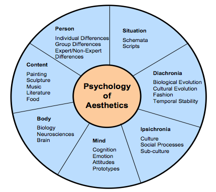
Since several factors influence aesthetic preference, Jacobsen argues for a multi-disciplinary approach to the study of aesthetic preference in experimental psychology. He proposes a seven-fold framework that incorporates these different perspectives to understand how aesthetic opinions are processed. These different facets may also inter-relate (see Figure: Jacobsen’s Framework for Psychology of Aesthetics), and include:
- Diachronia: Aesthetic preferences may change with time;
- Ipsichronia: Social/cultural processes may shape a person’s aesthetic opinions;
- Mind: An individual’s mental model of the visual stimulus or emotions could influence aesthetic judgements;
- Body: Brain activities could affect aesthetic evaluation processes;
- Content: The stimulus being evaluated could influence aesthetic processing;
- Person: The evaluator’s background may play a role in aesthetic preference; and
- Situation: The surrounding circumstances (this includes time and place) could influence aesthetic choices.
Empirical studies on visual aesthetics have followed one of two directions. There are those studies that have concentrated on replicating experiments to validate visual aesthetic theories. In such studies, interfaces are used as visual stimuli in place of works of art and geometrical shapes which served as test beds in the early days of experimental aesthetics. One popular aesthetic theory that has been investigated is Berlyne’s arousal theory. Berlyne’s theory holds that people love to experience aesthetic pleasure at moderate levels. There are also studies that have focused more on investigating the relationship between visual aesthetics and different aspects of user experience. Some of the aspects of user experience investigated so far include usability, credibility, desirability, complexity and accessibility.
The use of visual aesthetics can alter the perceptions of the viewer by manipulating visual components such as colours, text style and size, images and animations. In this way, the user is unknowingly or unconsciously involved with the message of the software artefact. The visual appeal of an interface can be assessed within 50 milliseconds in which time users make their impression about the software. Studies, have established that a positive relationship exists between visual aesthetics and usability when beautiful interfaces were perceived to be easier to use (as we have discussed in the introduction). Users’ judgement about software credibility is also shown to be formed within the first few seconds where an interface with high aesthetic treatment was judged as having higher credibility. The consistency of these aesthetic impressions were evaluated and it was established that these impressions did not wane immediately. That is, an interface that was perceived to be visually pleasing at first exposure, continued to remain attractive to the user for longer durations of exposure.
Visual clarity and richness were shown to be two of the most important aesthetic dimensions that strongly influence software users. Visual clarity refers to ‘classical’ aesthetic qualities pointing to clean, clear, and symmetric designs. Visual richness refers to ‘expressive’ aesthetics such as creativity, originality of the interface’s aspects and designers’ finesse and ability to ‘break design conventions’. Karvonen also reports a case where ‘design quality’ emerged as one of the six factors that enhanced ‘on-line trust’, suggesting that users would more readily transact with beautiful software.
12.2 Narrative Art and Visual Aesthetics
The purpose of art and design is to alter the perceptions of the viewer by manipulating visual components. The main way to accomplish this is to create a narrative that the work refers to, or a narrative that is created by moving in sequence through the visual components of the work. Narrative art, art that tells a story, can be found as far back as the Palaeolithic period. Palaeolithic peoples were nomadic hunters and gatherers who lived by sheltering in caves, using fire, and fashioning stone tools. By the Upper Palaeolithic, there is evidence of communal hunting, constructed shelters, and belief systems centring on magic and the supernatural. Palaeolithic Art, produced from about 32,000 to 11,000 years ago, falls into two main categories: Portable Pieces (small figurines or decorated components carved out of bone, stone, or modelled in clay), and Cave Art; reaching their peak in the Magdalenian culture of Cro-Magnon man. Of the cave art currently discovered a majority seems to have narrative features such as the examples at Chauvet, Altamira, Pech Merle, and Lascaux. These narratives depict spiritual and ritualistic activities, hunting and mapping (see Figure: Hunters with Elephants), and animals of veneration. In these cases, the artist is conveying a narrative to the observer, which may be centred on aspects such as good hunting grounds, what animals the observer can expect to find, the kind of predators that are in the area, and the spiritual nature, and offerings required, for good luck. The sequence of the visual components which form the overall narrative is as important, or more important, than the aesthetic alone.

Most art, especial Western art is narrative in nature, depicting stories from religion, myth and legend, history and literature; with audiences being assumed to be familiar with the stories in question. In modern art, however, formalist ideas have resulted in narrative being frowned upon. However, the visual narrative is still present in the coded references to political or social issues, or to events in the artist’s life. Such works are effectively modern allegories, and require information about the artist to be fully understood. This can be clearly seen in Figure: St. Simon’s Church; in which the artist takes the observer through a sequence of visual components which raise questions as the story is ‘built’. In this case, the observer is first directed to the church (central, large, imposing) then by the placement / framing of the small slivers of buildings to the left and right, down the street to the right and out into the landscape. The observer then focuses on the smaller detail including the people in the front of the picture moving back (again down the street to the right). Indeed, the placement of the people, lamp-post, and street orientation draws a diagonal line from bottom left to mid right along which the eye follows, and by which the visual narrative is conveyed; this also means that the figure at far-mid-left is ‘hidden’.
The principles of the visual narrative are all captured and used by the graphic, and specifically the UX designer. Trained in the visual medium, and the core principles contained within this medium, designers use colour, text style and size, images and animations to alter the perceptions of the viewer taking them on a narrative journey through an interface. In this way the user is unknowingly or unconsciously involved with the message of the software artefact, ergo the narrative, via serialisation of the visual components. In the visual aesthetics survey of Hoffman and Krauss, the authors point to studies that try to determine user’s perceptions of the aesthetic qualities of interfaces. These studies showed that visual clarity (clean, clear, and symmetric designs) and visual richness (creativity and originality) are two of the most important aesthetic dimensions. Both are important to users in unconsciously understanding the visual narrative.

We can see that the affective component of the user experience is to some extent determined by the arrangement of elements or details. It is the ‘creative art of executing aesthetic or functional design and it is clear that both interface and interaction design can either facilitate or impede a user through the available functionality.
12.3 Visual Attention
As we have seen, interface design is determined by the arrangement of elements or details on the canvas that can either facilitate or impede a user through the available functionality. This is because the amount of information on the canvas that reaches our eyes is far greater than our brain can process, and it is for this reason that visual attention is key to good design. Selective visual attention is a complex action composed of conscious and subconscious processes in the brain that are used to find and focus on relevant information quickly and efficiently. There are two general visual attention processes, bottom-up and top-down, which determine where humans next locate their attention.
Bottom-up models of visual attention suggest that low-level salient features, such as contrast, size, shape, colour, and brightness correlate well with visual interest. For example, a red apple (a source of nutrition) is more visually salient, and, therefore, attractive, than the green leaves surrounding it. Top-down models, on the other hand, explain visual search driven by semantics, or knowledge about the environment: when asked to describe the emotion of a person in a picture, for instance, people will automatically look to the person’s face.
Both forms of visual attention inevitably play a part in helping people to orientate, navigate and understand interfaces. Bottom-up processing allows people to detect quickly items such as bold text and images, which help to explain how the content is organised. It also helps people to group the information into ‘sections’, such as blocks of text, headings, and menus. Top-down processing enables people to interpret the information using prior knowledge and heuristics.
It can be seen from eye-tracking studies that users focus attention sequentially on different parts of the page, and that computational models have been successfully employed in computer graphics to segment images into regions that the user is most likely to focus upon. These models are based upon a knowledge of human visual behaviour and an understanding of the image in question. Indeed, studies exist which record user’s eye movements during specific browsing tasks, to find out those features on a Web-page that were visited, in which order and where ‘gaze hotspots’ were found. In these data we can see an association between the interface components and eye-gaze, but not one as simple as ‘the user looked at the most visually obvious interface features’. Indeed, sometimes a headline next to an attention grabbing feature, such as an image, was fixated upon. However, we can deduce that, for instance, the information in some text may not itself draw a users attention but ideally has some feature nearby which do. This idea is supported by other studies that try to create interface design metrics that predict whether a site is visually complex or not. These studies relate to interface design with complexity explaining that the way an interface is perceived depends on the way the interface itself is designed and what components are used.
By our understanding of visual attention, we can see that there are levels of granularity associated with visual design. This granularity allows us to understand a large visual rendering by segmentation into smaller more manageable pieces; components of components. Our attention moves between these components based on how our visual attention relates to them, and it is this knowledge of visual attention, captured as design best practice, which allows designers to build interfaces that users find interesting and easy to access. The serial narrative the designer builds for the observer is implicitly created by the visual appearance (and, therefore, attraction) of each visual component (dovetailing into our understanding of attention).
12.4 Collated Affective Concepts and Touch-points
As with other collated material, the first thing to notice about affective concepts is that there are many of them and many different ones are proposed in many different sources. However there are differences from usability principles, in that these are concepts and not principles - mainly because most work still sits in the psychology literature and not the nascent user experience domain. Indeed, this is why I’m calling them concepts (at this point) and not principles - it would be difficult to build testable principles from the concepts listed in ‘Table: Collated Affective Concepts’ without some additional processing. And therein lays the issue, for the most part, the concepts coming up (even when I turn them into principles) are not likely to be directly testable – in fact, it is accepted within the domain that we probably won’t be able to check that a principle is present, but we may be able to check that the expected affect is absent.
As with ‘Table: Collated Usability Principles’, you will notice in ‘Table: Collated Affective Concepts’ that the left column describes the concept (these are sometimes used interchangeably between the different authors)36; while on the right side the authors are listed along with a footnote pointing to the text from which the concept is derived. In collating these concepts, I have not followed slavishly the nomenclature proposed by each author but have instead placed them in categories that I believe have the same conceptual value even if the naming of that concept does not follow that in the source.
Table: Collated Affective Concepts. Affective Concepts Collated by Source.
| Concepts | Appears in Source |
|---|---|
| Aesthetic | Sharp, Rogers and Preece37; Nielsen38; Norman39. |
| Emotionally Fulfilling | Sharp, Rogers and Preece; Khaslavsky & Shedroff40. |
| Enjoyable | Sharp, Rogers and Preece. |
| Entertaining | Sharp, Rogers and Preece. |
| Enticing | Khaslavsky & Shedroff. |
| Facilitate Touch-points | Reeves & Nass41; Fogg42; Jordan43. |
| Flow (Enhance) | Csikszentmihalyi44. |
| Form Relationship | Khaslavsky & Shedroff. |
| Fun | Sharp, Rogers and Preece; Norman. |
| Helpful | Sharp, Rogers and Preece. |
| Memory (Evocation) | Norman. |
| Minimalist Design | Nielsen. |
| Motivating | Sharp, Rogers and Preece. |
| Personalisation & Customisation | Norman. |
| Pleasing | Jordan; Norman. |
| Rewarding | Sharp, Rogers and Preece. |
| Satisfying | Sharp, Rogers and Preece; Norman. |
| Self-Image | Norman. |
| Supports Creativity | Sharp, Rogers and Preece. |
You’ll also notice that I mention ‘Touch-points’ in Table: Collated Affective Concepts, and by these I mean various human traits you should be aware of when designing for emotional experience. These considerations mainly focus on the kinds of pleasure or dynamics we need to induce in the human for successful emotional engagement. Jordan [Jordan, 2003] (and to some extent Norman [Norman, 1988] – who also provides a nice interpretation) see these as:
- Physio-Pleasure: Anything perceptible by the senses - and includes movement – for UX the main points here are visual appearance and auditory output - maybe haptics at the very edge of development;
- Socio-Pleasure: Good interaction with other – again for UX this can be translated into the software domain, we are more engaged if we can good clear and worthwhile communication;
- Psycho-Pleasure: Reactions to the system, how it interacts with the user and how the user feels about those interactions; and
- Ideo-Pleasure: How does the user see the software and their interaction with it. How do they perceive the interface and how does that feed into their self-image and positive memories.
Further, Khaslavsky and Shedroff [Khaslavsky and Shedroff, 1999] tell us that: “The seductive power of the design of certain material and virtual objects can transcend issues of price and performance the buyers and users alike. Too many an engineer’s dismay, the appearance of a product can sometimes make or break the product’s market reaction. What they have in common is the ability to create an emotional bond with their audience…” and come up with:
- Enticement: The interface should be enticing before any interaction even commences – there is a food related quote that we ‘eat with our eyes before our mouth’ – this is the same but for the user experience – we perceive a quality interactive experience before we embark on it;
- Relationship: We envisage a relationship, both before it occurs, and then while it is forming; and
- Fulfilment: Are our expectations fulfilled, if not then we have a problem at the UX level as an unfulfilled implied promise can often create more negative memories than the same bad experience but without the enticement.
Finally, Fogg [Fogg, 2003] elaborates on Reeves and Nass [Reeves and Nass, 1996], by suggesting five primary social Touch-points that people use to infer sociability with a device with which they are interacting:
- Physical: Again, perceptible by the senses - and again includes movement;
- Physiological: Personal feelings, emotions, and thoughts;
- Language: Spoken and written language;
- Social Dynamics: Cooperation, turn taking, collaborative activity; and
- Social Roles: The type of role, our authority, the interaction is occurring with – gives context to the interaction.
We can see that there are plenty of overlaps here, which you should be aware of. Now, as previously, I’m going to discard some of these concepts and touch-points because I think they are very niche because I don’t agree with them, because I don’t think they are helpful, or because there seems to be little consensus.
- First I’m combining ‘Enjoyable’ and ‘Entertaining’ and addressing those later.
- Now I think that ‘Forming Relationships’ is a great idea but I think to move this into a tangle principle, as is just too ambiguous.
- ‘Fun’, well we all like to have fun but I think this belongs in the next chapter.
- I think we have already covered ‘Helpful’.
- Again, ‘Memory (Evocation)’ has been covered.
- Next I’m removing ‘Motivating’ as this is a part of ‘gamification’ (Don’t Panic – we’ll look at this later).
- ‘Personalisation’ and ‘Customisation’ has been extensively covered.
- ‘Self-Image’ is a deep concept and asking the software to enhance self-image is just a little too much.
- Finally, ‘Supports Creativity’ is not generally applicable - not all software should do this and it is not appropriate in most situations.
Now the ‘carnage’ is over, let’s look at the concepts and touch-points that will stay and be amalgamated:
- ‘Pleasing’ + ‘Enticing’. Ensure that the system is pleasing and enticing, not just concerning the usability of the experience but concerning how the user anticipates and enjoys the system from an emotional standpoint.
- ‘Flow’ [Csikszentmihalyi, 1990]] + ‘Facilitate Touch-points’. The flow and touch-points seem related in that touch-points in some way define the direction of the flow. In this case, we should plan to enhance the interactive flow to increase positive emotional responses.
- ‘Aesthetic’ + ‘Minimalist Design’. Both are related with minimalism being the servant of aesthetics. In this case, we need to make sure the design is aesthetically pleasing with a reduction in complexity by adopting a minimalist design.
- Satisfying’ + ‘Rewarding’ + ‘Emotionally Fulfilling’. These three concepts all seem to be related to me. This means the interface, and its interactivity, should be satisfying and fulfilling - you should find your interactive experience to be rewarding at the end and after the interaction has finished.
Before we move on to turn these concepts and touch-points into principles (with a whole heap of caveats) lets first discuss ‘affective computing’, and then briefly discuss ‘trust’.
12.4.1 A Note on Affective Computing
In the future, you may come across the term ‘affective computing’, and begin to ask yourself what is its relationship to the user’s affective experience. ‘Affective computing’ is a term originally coined by Rosalind Picard at MIT in the mid-1990s and is used to describe a set of computing technologies that centre around: the detection of emotion, the ability for computers to express emotion, and in some cases the ability of computers to have emotions (in some form). You can see that this kind of emotional computation is very different from that of the emotional user experience we are studying. However, a part that is interesting to us is that centred around the detection of emotions.
As we shall see, this is because one of the only ways in which we can confirm emotional responses is by detecting them in the user. Simply, we can validate that our ‘effective’ principles are present and correctly captured in software because our users should be able to use the system. We can test our efficient principles are captured in software because we can measure task completion times. And we can test that our affective principles are captured in software if we can detect emotion. You’ll notice that I say ‘if’, as the detection of emotion is by no means trivial or absolute, and has still not moved fully into development or the practitioner domain. However, we will investigate two possibly useful emotion detection methods, being galvanic skin response (GSR), and facial expression recognition. It is unlikely that in real-world situations you will have access to GSR or facial expression recognition software. However, it is useful to understand these now because they may become more prevalent in the future.
In reality, it is far more likely that we will be able to understand if the user has had a positive emotional experience by looking for clues as to how they relate their experiences in a social setting (by using systems that allow social feedback such as ‘Star’ and ‘like’ ratings). However, in all cases, you should realise that you will not be able to test the presence of each principle individually. As an emotional response to a system is a combinatorial construct it will be difficult to say whether a minimal aesthetic design is more useful, or gives a more emotional response in your system, than say, our satisfying and rewarding concept. What you will be able to discover is if there is little, or negative, emotional response that will suggest that somewhere, one or more of these principles has not been correctly captured.
12.4.2 A Note on Trust
Trust is one additional aspect to consider when engaged in emotional design. You should realise that aesthetics defines how an interface looks and how it emotionally dovetails into a user’s concept of trust. This is very important for most user interfaces, especially web-based ones. In the world that seems to be becoming more untrustworthy and remote (about social connection), trustworthiness is a key concept and that concept can be reinforced by applying emotional design techniques to enhance the trust a user feels for a system.
Many empirical studies found that users’ perceived information obtained from a Website with good visual aesthetics to be more credible than that obtained from a Website with poor visual aesthetics, even if the two Websites in question had the same content. This was observed upon short exposure to the Websites. Consequently, Robins and Holmes argue that visual aesthetics is seen as an important aspect of interaction design as it plays more significant roles than a mere ‘decorative’ one.
Remember, trust is mainly formed as an emotion based on many imperceptible and intangible cues. Of course, trust can also be misplaced and indeed ‘social engineering’ is a technique used by unsavoury characters to explore to manipulate our trust for their gain.
12.5 Potted Principles of Affective User Experience
Understanding the affective user experience, and building systems that capture it is complicated, error-prone, and prone to misinterpretation. Emotion is all about subjectivity, and this subjectivity occurs temporally, culturally, and psychologically. Indeed, if we look back at responses from Law 2009 (see Table: Twenty-three Statements About UX) we see statements such as:
- Fleeting and more stable aspects of a person’s internal state (e.g.. needs. motivations) affect a person’s experience of something;
- UX occurs in, and is dependent on the context in which the artefact is experienced;
- Prior exposure to an artefact shapes subsequent UX;
- We cannot design UX, but we can design for UX;
- UX is highly dynamic – it constantly changes while interacting with a product;
- UX can change even after a person has stopped interacting with the artefact; and
- UX is based on how a person perceives the characteristics of an artefact, but not on the characteristics per se.
…all get a high-level of agreement from UX professionals. Further, if we look back at ‘Figure: Time Spans of User Experience’, we will notice that the user experience extends both before and after the actual usage, this allows a user to anticipate and reflect upon their user experience, and this is also significantly important in forming their desire to use that system, or return to using the system.
So when considering these upcoming principles you must remember: that their presence cannot be individually or directly tested; that you are far more likely to be able to understand if they are not present, than if they are present; they contain a number of subjective words (such as Good) which make them difficult to quantify; and the emotional experiences to which they relate are likely to be subjective, temporal, cultural, and based in the user’s own psychology.
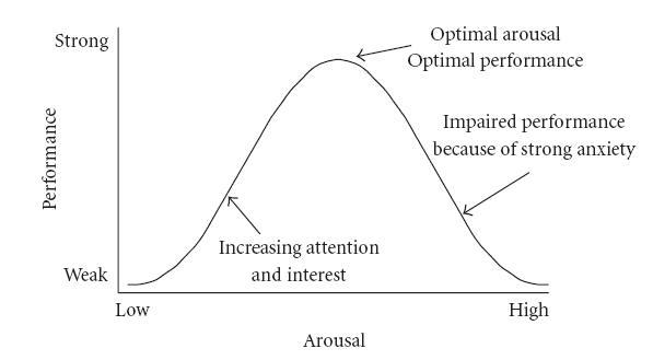
One final thing to remember, the emotional responses recorded from users varies based on the task and how emotionally engaged in that task a user is. Performance increases with physiological or mental arousal, but only up to a point, when levels of arousal become too high, performance decreases (see Figure: Yerkes-Dodson Curve). So when I use the terms ‘good’, ‘reduce’, ‘maximise’, etc., what I mean is, dead centre of the ‘Hebbian version’ of the ‘Yerkes-Dodson’.
12.5.1 Facilitate Quality
Quality is always going to be a difficult principle to apply, or, at least, test for. As with most principles in this section, understanding whether quality is present, and how to include it within your interface design will mainly come with experience. It’s difficult to define quality, but often we know it when we see it.
I think that most people understand quality from their own perspective, they understand if they are rushing work or that their work is not performed to the kinds of standards they might apply in other situations. The intangibility of the concept of quality means that the only way of knowing if the quality is being applied is your feeling and perception as a trained UX specialist. If you feel you do not have the ability to assess the quality of the application of the various emotional principles in this section, then you should make sure your choices of the graphic designer, web designer, or product designer is good. Remember, you will not be on your own, but part of a team, you will mainly be interested in the overall architecture of the UX project but other team members who deal with graphics and design should also be present. Errors only normally occur in quality because it is intangible, and so its importance in creating emotional engagement is often overlooked.
Questions to think about as you design your prototype:
- Do you feel that the interface exhibits current best practice?
- Is the interface design fit-for-purpose for each stakeholder?
- Did the best people for each job work on the interface and it’s interactions?
- Is the underlaying code cleanly built?
- Has quality been maintained at every level?
12.5.2 Facilitate Aesthetics
We have already discussed, what it means, and the views of different experts around the subject. As we are already aware, there are no easy ways to understand aesthetics directly, or if the principle is captured as part of the design. Of course, it is testable in the long run because you can ask users survey questions to understand if they feel that the design is aesthetically pleasing or beautiful. Remember, an attractive interface has knock-on usability and efficiency benefits. This is because when we judge something to be aesthetically pleasing we are basing this judgement on our biological and cognitive evolution. Things that we judge to be aesthetic are pleasing precisely because we can use them more efficiently or easily. In this case, if you, or more likely your graphic designers, think that a website is aesthetically pleasing – because this is a shared concept, the interface is far more likely to be aesthetic as opposed to purely functional. As with quality, errors in applying this principle only mainly occur because a stakeholder (or a usability specialist) does not understand the importance of an aesthetically pleasing design.
Questions to think about as you design your prototype:
- Is the design beautiful?
- Does the design maximise enticement?
- Does the visual design reduce complexity and is the design, minimalist?
- Will the user perceive aesthetic quality?
- Is the design current and does it convey the desired ‘image’?
12.5.3 Facilitate Flow
Flow is a difficult concept to convey – and we’ll be looking at it in more detail – however, for this chapter, and in the context of the user experience, you should be striving to include some of the more ‘mechanical’ aspects of flow45 within your design. Flow is all about providing the user with an optimal experience that they will find rewarding. This is difficult to do at the principal level. However, there are some aspects that can help flow be achieved. Perhaps one of the most important is to encourage your users to participate in structured tasks that have clear goals and feedback, you should also cut down on the amount of extraneous information which is not part of the current flow activity so that the user can concentrate on the task at hand, and so that a users actions and their awareness of those actions become merged. These are difficult to accomplish, and it is, even more, difficult to understand if they are occurring. However, there are two ways in which you may be able to validate this principle in the future. The first is to see whether the user loses their self-consciousness when completing a flow task; the second, is to investigate if the users experience a transformation in time, such that their perception of their task completion time – which may have taken them five minutes – may actually be much less then reality – maybe only one minute or a few seconds.
Questions to think about as you design your prototype:
- Does the visual flow support the interactive flow?
- Do real world and virtual world touch-points drive the flow?
- Is there a defined beginning and end?
- Is there a narrative flow (people remember narratives better than instructions)?
- Is there an absence of cyclic or repetitious flow?
12.5.4 Facilitate Pleasantness
In my egocentric view, the principle of pleasure and enticement, occur as a prefix to, and as part of the main use of the interface or interaction. We derive pleasure from anticipating the experience and progressing through a good experience. In reality, the terms you use do not matter and here I’m using the terms pleasurable and enticing as a hat-rack to hang the assertion that you must make sure that a user’s anticipation and use of the system are emotionally satisfied.
Questions to think about as you design your prototype:
- Do you expect this design to fulfil and please the user?
- Will the expected emotions support positive anticipation?
- Will they be satisfied as they progress through the interactivity?
- Do you dovetail into their perceived satisfaction?
- If nothing else will, the emotional responses here be positive?
12.5.5 Facilitate Satisfaction
Again I use satisfying, fulfilling and rewarding as a hat-rack to convey the idea that at the end of the interaction we should feel rewarded from an accurate execution of that experience; and that on reflection we should feel satisfaction and fulfilment from that rewarding experience. If we look back, satisfaction and reward should occur.
Questions to think about as you design your prototype:
- Will the user find the interactions rewarding?
- Will the expected emotions support positive remembrances?
- Will the user remember a pleasing experience, if the system is work based?
- Are there any tangible rewards?
- Have you allowed them to register satisfaction (or not) by using, say, a ‘star’ rating?
Remember, these are just the next five of our total principles - for the next batch you can skip ahead. But just because you can, maybe you shouldn’t take your time to read the rest!
Caveat
‘Ling’s Cars’46 is a tricky site to pigeon hole into these principles (see Figure: Ling’s Cars). If our principles and rationale are correct - no-one should go to this site, and no-one should like it; but they do go to the site, and they do like it – much to the consternation of the user experience Illuminati.
Why is this and what makes Ling’s Cars a high traffic site – discounting people like me who are just there to look at the spectacle, or design – ‘car crash’, whichever phrase you prefer? There seems to be no real answer to this, the site itself breaks most of the principles of good design, usability, and accessibility. If I had to audit this site, I would imagine that most users would not want to interact with it, that most users would find it too complicated, and that most users would find it aesthetically displeasing. However, for some unknown reason, it seems to attract many users, who then go on to buy the cars Ling is selling, so what’s the reason? Well this is the main question that has been on the lips of most use UX people the world over, but there still seems to be little agreement.
I think that this site is all about Ling, to such an extent that the site has become a meme. This may be because it seems to be a window onto Ling’s personality, that you get the feeling that Ling is in control of everything (even if those things are bad) and that she is present – all the time – behind the scenes with her tweeting and forum updates. Further, you may think that in these times of present economic unrest, where trusted organisations have become untrustworthy, this personal touch seems very attractive. It may be due to the current situation, the current zeitgeist of its users, its egocentricity, it may be an outlier, the one in a thousand which proves the experts wrong, and succeed when it should not.
However, let’s consider this again, it’s egocentric, it has Ling’s presence, Ling is very much in control, it is her vision, and not that of a focus group, in short it has her personality. For good or for bad it has a personality, and that personality has more emotional value and emotional engagement, and then any of the other five principles listed above, this made me think there is one principle that is superior to the rest.

12.5.6 Facilitate Personality
This principle is the most superior in this section, possibly of all the principles listed in this text. If your interface can exude personality, such that it seems to be a meme – or an avatar – of who you are, a direct window into your personality, then this principle is superior to the rest.
If your interface has personality, good or bad aesthetics, quality, flow, satisfaction, or fulfilment are not important; I’d probably even go as far as saying that usability is not important either. Personality trumps all the rest because it is the only one that can give the user an emotionally valuable engagement with the software engineering artefact. There are no questions for this principle, if it has a personality you’ll know it!
12.6 Summary
As does Norman, let us finish with a quote: “If you want a golden rule that will fit everybody, this is it: have nothing in your house that you do not know to be useful, or believe to be beautiful.” Here, Morris ‘hits the mark’ we can know things to be useful, but we can only assert belief that a thing is beautiful. In our case, this relates to our set of affective principles and how they exhibit: Quality; Aesthetics; Flow; Pleasantness; Satisfaction; and Personality. Remember, building systems that capture emotional concepts, is complicated, error-prone, and prone to misinterpretation. Emotion is all about subjectivity, and this subjectivity occurs temporally, culturally, and psychologically. When you think of subjective terms such as ‘good’, ‘reduce’, ‘maximise’, etc., then you should recall the Yerkes-Dodson Law; in this case, what you should mean is, dead centre of the ‘Hebbian version’ of the ‘Yerkes-Dodson Curve’.
Also, remember that if you are unsure of how to proceed, choose good co-workers with more experience in the area that you are trying to address - such as illustration, or graphic design (i.e., ‘Creatives’) - but keep track that they conform to the brief.
Finally, even though personality is king, pleasing, attractive sites work better and are more usable because they reflect the biological origins of the brain. Pleasing interactions and attractive interfaces produce positive emotions causing mental processes to be more creative and more tolerant of minor difficulties and faults within the interface design or the interactive experience. In short attractiveness affects human behaviour that therefore makes it a critical component of the design and implementation of the user experience.
12.6.1 Optional Further Reading
- [M. Csikszentmihalyi.] Flow: the psychology of optimal experience. Harper & Row, New York, 1st ed edition, 1990.
- [P. A. Fishwick.] Aesthetic computing. Leonardo. MIT Press, Cambridge, Mass., 2006.
- [B. J. Fogg.] Persuasive technology: using computers to change what we think and do. Morgan Kaufmann Publishers, Amsterdam, 2003.
- [P. W. Jordan.] Designing pleasurable products: an introduction to the new human factors. Taylor & Francis e–Library, London, 2003.
- [D. A. Norman.] Emotional design: why we love (or hate) everyday things. Basic Books, New York, 2004.
- [B. Reeves] and C. I. Nass. The media equation: how people treat computers, television, and new media like real people and places. CSLI Publications, Stanford, Calif., 1996.
- [A Miniukovich] and A De Angeli. “Computation of Interface Aesthetics.” Proceedings of the 33rd Annual ACM Conference on Human Factors in Computing Systems, 2015. doi:10.1145/2702123.2702575.