Part III: Building the User Experience
8. Developing for UX
Happy developers are productive developers; productive developers produce beautiful code as well as beautiful interfaces.
– Anon.
User Experience is an umbrella term used to describe all the factors that contribute to the quality of experience a person has when interacting with a specific technical artefact, or system. It focuses on the practice of requirements gathering and specification, design, creation, and testing, integrating best practice, heuristics, and ‘prior-art’ whereby the outcomes can be qualitatively evaluated using small numbers of users, placing humans firmly in the loop.
In my opinion, the user experience process starts with the ‘User Experience Engineer’ as end-user. By this I mean that the user experience of the UX engineer is often ignored; as is the user experience of software engineers who may also assist in the creation of the artefact. But it is critical not to miss out aspects of the software engineering process. Start with the right tools that fit both the development and the developer. This rationale extends to the methodology/lifecycle used, and the ethos of the development in general [Martin, 2011; 9241-100:2011, 2011].
8.1 UX Development
User Experience departments look different in different organisations and corporations. In some, the UX engineer is responsible mainly for the interactions with the users before the development begins. Also in the requirements gathering phase, and after the development is ‘finished’, in the testing and evaluation stage. However, in some departments the separation may be more flexible, and you may also be tasked with building parts (or mock-ups) of the interface and interactivity yourself.
If you are lucky, you may be part of a ‘Skunkworks’ team or an organisational research department. Where you will be part of a small and loosely structured group of people who research and develop a project primarily for the sake of novel innovation1. The skills-set you will be required to use in each of these situations are different. However, your training should allow you to undertake any2.
Of these three scenarios, the one that requires the most careful navigation and communication is the first. Here you are responsible just for the human facing aspects of the work and are seen as the liaison between the users and the software engineers. This requires good communication skills and the ability to understand complex technical issues while translating these to more simple concepts for user dissemination.
In this scenario, where you are not allowed to develop the software yourself, it is difficult to overstate the importance of the general software engineers. Those who are building the system functionality and by implication, your interface and interactivity. If these technical staff are not ‘on your side’, then your project is likely to fail. The difference between a good software engineering and bad software engineering is critical. Even more critical for a good user experience we would expect much of the complexity of the interface to be removed to the underlying software functionality. Or generate underlying software functionality to enable a more complete and interesting user interaction.
Let me illustrate with an example, in this case, the development of the Apple Newton in the early 1990s. This system was widely seen at the time as having an excellent interface (see Figure: Apple Newton UI). But the main reason this interface was so powerful was because all applications could share data between them. This meant that writing a name in your calendar would automatically link to that name in your contacts list and bring through relevant information on addresses and telephone numbers etc. into the calendar application. This was possible because of the farsightedness of the underlying software engineering in which data was stored as ‘soups’. Soups are a very simple flat database in which the specification of the data is stored with that data. In this case, all applications can delve into the different soups created by different applications, using their data at will; termed ‘cross soup compatibility’. Without this underlying, but often invisible, mechanism the user experience would have been much reduced.
The point I’m trying to make is that the underlying functionality is as much a part of the user experience as the interface (either virtual or physical) itself. The software engineer can bring this level of innovation to a UX project, but this takes good communication, good involvement, and often the opportunity for the engineer to build elegance3 into the code base [Oram and Wilson, 2007].
Finally, it is not my intention to describe the kinds of tools a developer should use, these are often personal choices or defined by the organisation in which they work. A developer’s choice of tool often makes more sense to the developer than to anyone else. Indeed, I have witnessed many arguments between developers as to the relative benefits of code generation using; say, the Eclipse Framework as opposed to NetBeans (see Figure: Netbeans Debugger), or vice-versa.
What is more important is the development methodology and the development ethos which should support the kind of interactions and feedback naturally provided by users.
8.2 Development Methodologies and Lifecycles
It is often the case that the UX engineer will need to fit into the design methodology and lifecycle that has been created by the project managers. In this case, there is little one can do to alter or modify this decision and all that remains is to understand the advantages and disadvantages of that lifecycle within the context of the UX work. Indeed, the decision as to the methodology and lifecycle chosen is often very personal and may also be based on the experience of the project manager’s previous successful use of that methodology. It may also rest on the desires of the organisation and the needs that they may have concerning maintenance and dissemination within the organisation at a later stage.
In this case, there are a number of models of the development lifecycle accompanied by a number of engineering methodologies that conform to aspects of these models [Sommerville, 2011]. But, these are often more specific about the tools and techniques that are used in the different stages of the underlying model than we may like. I do not suggest that the following descriptions are in any way exhaustive. They should give you an initial understanding of the types of development that are often undertaken. As well as an overview of some of the most popular methodologies that are used in common software engineering practice. Let us start with the four most common models currently in use.
8.2.1 Waterfall
The worldview of the waterfall model is that each aspect of the development lifecycle occurs in a tight and rigidly strict order. Here which each phase must be fully completed before the next can begin (see Figure: Waterfall Methodology). In this case, imagine a series of phases starting from the top left and descended diagonally to the bottom right. Normally we would start in the top left with requirements and finish in the bottom right with maintenance. Usually, there are phases of design, implementation, and verification that make up the remainder of the waterfall development lifecycle. However, these can vary and be extended based on the specific kind of waterfall model that is being used.
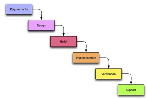
In this way requirements inform design, design informs implementation, implementation informs verification, and finally, verification informs maintenance. In some cases, there is a feedback that runs from the last phase such as maintenance or verification directly up to requirements. This is used to show that there is some cyclical behaviour between the elements of the waterfall model. In my personal opinion, this is the worst way of doing human factors work because each part of the human-centric development is confined to each specific lifecycle phase. This means that it is very difficult to feedback and change the requirements of the human facing aspects of the project to fulfil the user needs and their changing requirements. Or indeed redesign to remove any development miss-perceptions of those user requirements. In reality, it is my opinion that the waterfall model is far more suited to rigid software engineering. Whereby the key focus is accomplishing the project plan such that the contract between the commissioner and the developers is filled on time and to budget. The user requirements are only valuable in that they are met as part of the formal development specification regardless of their applicability to the end user. It is my opinion then that the waterfall model is far more targeted to contractual fulfilment than system usability. I would also suggest it is very difficult to ad-hoc modify the waterfall methodology to suit the requirements of the user experience ‘process’ - try not to use this model if at all possible. If you have no choice, try to iterate requirements and design as much as your organisation will allow - and suggest from the outset that they link verification to implementation; it will be a tough sell!
8.2.2 Spiral
The spiral model is different to the waterfall model in that it splits up each task into some tasks that are iteratively undertaken. In this way, the worldview of the spiral model is that each aspect of the development lifecycle requires multiple iterations before proceeding to the next phase. Each phase requires the determination of objectives, the identification and resolution of risks, development and testing, and finally planning for the next iteration. The spiral model is named because the development track can be drawn as a spiral emanating from a central point. To visualise this, imagine that a piece of paper is divided into quarters with a central point being the start of the development lifecycle (see Figure: Spiral Methodology). The spiral tracks through each quarter starting from the top left in a clockwise manner represent each of the four stages of the iteration phase (objectives, risks, development, plan).
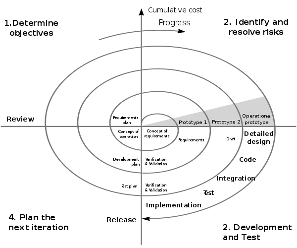
As the development tracks spirals out it is annotated with the larger aspects of the development lifecycle. These are aspects that will be required at the time such as requirements, design, development, validation and testing, and maintenance, similar to the waterfall model. However, the iterations are tighter at the centre when designers are gathering the requirements and designing the system and become longer as they spiral out towards the edge where we arrive at detailed design coding and implementation. In the context of UX development, this is a better model than the waterfall model described previously. This is mainly because it acknowledges that some iterations will be required for each of the phases. And it also acknowledges that these phases may need to be redeveloped based on new information uncovered in different parts of the evolving development. Not perfect for the UX process but acceptable without much ad-hoc modification!
8.2.3 Iterative
The worldview of the iterative model is different than the waterfall or the spiral models. This is because it sees software development as a circular process comprising requirements, analysis and design, implementation, testing, evaluation, and then planning for the next iteration. This means that it sees the software engineering lifecycle as iterative and cyclical as opposed to a rigid sequence of phases that have no impact on each other once the development is underway (see Figure: Iterative Methodology).
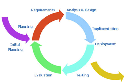
The iterative system is very easy to understand. All the user needs to do is imagine a circular process running in a clockwise direction with each of the main phases of the development equally spaced. An initial planning phase feeds into the initial entry point before the requirements elicitation is undertaken, and an exit point is available after implementation and signifies deployment. In reality, the deployment exit could be linked to the initial planning entrance to signify the continual maintenance the system will undergo. For UX development, this is my second most favourite model because it takes into account the impact that the user testing will have on the next iteration of development and planning. It supports the view that, from a user perspective, we cannot understand all aspects of the user experience before some development, even prototypical development, has been undertaken. In this case software that is far more suited to the user is created and modifications can be made to refine the design on subsequent iterations. The major drawback of the iterative approach is that the endpoint can sometimes become lost in the focus on an ever more refined software artefact. In this case, the software development manager must make sure that they have some understanding of the number of iterations they expect to occur for any specific development. Making sure to plan time for an extra one or two iterations to account for unforeseen circumstances. A good choice for the UX process which can progress without ad-hoc modifications.
The two key models that have been left out of this general discussion is the Agile Method and Cowboy Coding. This is because these are my two preferred methods for user-facing development. I want to talk about them in more detail later and within the context of research and development in the human factors domain.
In addition to these three overarching models of the software development lifecycle, there are a number of well-known methodologies. These make specific recommendations as to the kind of practical processes, tools, and techniques used for requirements gathering, design, and development. Five of the most common are covered in more detail next.
8.2.4 Structured Systems Analysis and Design Method
SSADM is the first methodology I learned when initially training to become a software engineer. It is based on the waterfall model however it has one notable difference, being that there is far more time devoted to the initial requirements engineering process. Indeed, in the standard design there is a feasibility study, an investigation of the current environment, an understanding of the business organisation and systems, and finally a requirement specification phase. This means that the system is very top-heavy when it comes to modelling the user. In most cases, this is a good way of understanding the context of the development as well as the real system aspects that are required by the organisation commissioning that development. Although in some cases, commissioning organisations start to become uneasy at the amount of time which elapses between starting a project and seeing some tangible technical developments. But, if you have no choice but to use a waterfall type model then SSADM would be the one I would think of first because of its heavy user involvement from the start.
8.2.5 Rational Unified Process
RUP is a methodology that you will probably encounter at some point in your career because it is so commonly used. The Rational software company, who originated this process, were bought by IBM and so the tools and techniques to support this process have been created because it is IBM’s preferred development method. One of the main advantages of RUP is the fact that the process is flexible, in this way it can be tailored and modified to suit the development being undertaken with various aspects being included or left out. In general, there are four phases in the lifecycle being the: inception, elaboration, construction, and transition phases. The only real phase to discuss in more detail is the transition phase the others being reasonably similar across all methodologies. In reality, the transition phase is about deployment and the move from the development into a production setting; making it available and understood by the end user. While RUP is based on an iterative lifecycle, its support for the user-facing aspects of the system is less well-defined than those dealing with project management and software creation. If I had a choice, I would not use RUP directly but would look for an agile variant such as the Agile Unified Process.
8.2.6 Scrum
Scrum is again an agile and iterative methodology that is focused on managing the software development lifecycle in a rapid iterative fashion. Scrum development has two types of roles, the pigs, are the people who are performing the software development process, and the chickens, who are the people for which the development is being created. Understanding that chickens are a first-class citizen within the development cycle is very encouraging for the UX engineer. Scrum accomplishes its iterative releases using sprint’s which are broken down into 30 days or 24-hour cycles. Projects are initially broken down into things that need to be accomplished. There is then a plan developed for how these things are to be created. A sprint occurs such that an entire ‘plan of accomplishment’ can be realised as an incremental development after a 30-day period. In this way, chunks of the system are created piece-by-piece as opposed to a more waterfall like separation of concerns in which the cycle is longer because the project resources are divided into different development teams. This is a useful way to go about UX development because it enables aspects of the software to be released to the user in a fast incremental manner. Indeed, use and testing can already start before the software is near completion. Therefore, changes requested by the chickens can be integrated by the pigs in the next sprint.
8.2.7 Rapid Application Development
RAD can be thought of in two contexts, the first being as a model and the second being a methodology. In the case of UX work, I favour thinking of it more as a methodology than as a model. In reality, there are many forms of RAD but the main factor that differentiate it for UX work are that it uses minimal planning. RAD is far more about rapid software prototyping with high user input than it is a fixed and delineated software development cycle. In this case rapidly created models of the software are tested with users before the main functionality and interaction design are fixed. In this way, the user has a high input into the system. Once the system is created, there is an implicit knowledge of how it will work and what it will look like, along with the functionality it includes.
8.2.8 eXtreme Programming
XP is one kind of rapid application development which requires developers to work in pairs without a detailed design. The lifecycle is cyclical and involves frequent small (point) releases of the software for consumption by the users. XP asserts that by programming together as a pair more can be achieved than by working alone. And that by frequent releases the users will always be kept involved in the lifecycle as opposed to at a distance. This means that user comments can be accommodated very quickly and that the views of users are taken into account as the implementation proceeds. In reality, this means that the users end up with a finished piece of software which by halfway, or three-quarters of the way, through the project has attained a level of stability. Therefore, additional modifications may not be immediately perceptible to the end user. In this way, the lifecycle minimises the ability to miss undocumented user requirements within the specifications. It also enables changes or errors to be addressed immediately and removes the tendency for users and user testing to be seen as an afterthought to a contractual deadline.
In addition to these methodologies, I can think of at least another twenty which you may come across. However, the five listed above represent the general dichotomy of methodologies and management practices that you should minimally be aware of. SSADN is well-known, mature, and contractually safe. RUP allows flexibility and has a number of tools to aid the development process, however, in using these tools you will be conforming IBMs specific view of the method. Scrum places the user as a first-class citizen, is often used in open source software development, but has a lower uptake in the commercial sector. RAD is characterised by its lack of design and heavy reliance on incremental prototype development which is often seen as suboptimal in the business view of a development lifecycle. Finally, XP adds structure to rapid, agile methods but is intensive and hungry for user time in the development cycle.
8.3 Methodologies More Suited to the UX Process
I find that the more development I do the more I come back to two very different kinds of methodologies for two very different kinds of UX work. In a way these methodologies are very specific to the way I normally do things and in this case you may disagree and have your own preferences. However, I would suggest that when you do not know what you need in the development. Or that the development is purely focused on research, and therefore very little is predictable or known from the outset, Cowboy coding is the only real tangible method of getting started. Once you can begin to predict different aspects of the code development with specific requirements for the software processes cowboy coding is no longer appropriate. Then agile methods become a far more favourable way of creating software that dovetails into business processes and enables a specific timeline to be followed. Indeed, you may wish to use cowboy coding if you are incubating ideas and designs, moving to agile process when you start to align your prototypes with the business requirements of the development.
8.3.1 Don’t Know What You Need… Cowboy Coding
Cowboy coding is used to describe software development whereby the developers have autonomy over the process. There is no project plan or direct timelines, and the schedule, development style, and algorithms are all decided by the individual developer or the development team for the specific project. In the case of research development, it is often very difficult to understand the problems that will be encountered; or a timeline for the solution to be developed. In this case, it is inadvisable to conform to a specific fixed lifecycle methodology because understanding what will be required and how long that will take to develop is not possible. Indeed in some cases the experimental outcome of the research is not a fully working system. Rather, a better understanding of the things that can be done and the things that can’t be done; you find this method in use in many skunkworks or R&D labs.
This is a key difference to the standard commercial view of software development. Here most of the problems will be soluble because many aspects of the system have already been created and are well understood. It is merely a matter of automation that is required. This is not to say that the development process is not a difficult or taxing one, and we can see that there are many examples of this process failing. Indeed, the reason we have so many lifecycle designs is specifically because projects often fail. However these are very separate, and different, concerns than that of research coding. This is because research coding expects the challenges to be so significantly difficult that the research developer will need to rapidly change their algorithms and processes. Complete and whole systems are often not required with just aspects of the software development being tested. Research software does not have to be tested to the same level as commercial developments, and positive project outcomes are still possible even if the software system is not developed in its entirety.
It is for these reasons that cowboy coding is more practical. The development must commence without wasting time on project planning that will - in the end - serve no purpose. In some ways, the research developer expects their development to not ever reach deployment maturity, or that the problems inherent in good research should be so insoluble that a complete development will never really be possible. Cowboy coding is useful for experimental and skunkworks work because the coding team is often one person or a very tight and focused team. In this way, it is difficult to see how maintaining a large and unwieldy methodology, with the added administrative overheads would be in any way useful. This is not the case for commercial developments or developments that are moving out of the prototypical phase, in which a more rigorous methodology is required.
8.3.2 Know What You Need… Agile Development4
The Original Manifesto Signatories are: Kent Beck, Mike Beedle, Arie van Bennekum, Alistair Cockburn, Ward Cunningham, Martin Fowler, James Grenning, Jim Highsmith, Andrew Hunt, Ron Jeffries, Jon Kern, Brian Marick, Robert C. Martin, Stephen J. Mellor, Ken Schwaber, Jeff Sutherland, and Dave Thomas.
It is often easy for the UX’er to remain at a distance from the development lifecycle. This is especially the case where they are from a psychology background as opposed to a computer science - or software engineering - background. Many different opinions exist as to the ‘best’ methodology to use for developing commercial software. However, it is my contention that agile methods are far more useful and flexible concerning the human facing aspects of the development than the others described above. This being the case you should realise that this section on agile methods is my very personal view on performing practical UX work within the context of a larger software development.
“In February 2001, 17 software developers met at the Snowbird, Utah resort, to discuss lightweight development methods. They published the Manifesto for Agile Software Development to define the approach now known as agile software development. Some of the manifesto’s authors formed the Agile Alliance5, a nonprofit organisation that promotes software development according to the manifesto’s principles.”
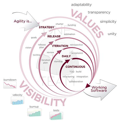
Agile software development [Cockburn, 2002] is based on iterative methodologies where requirements and solutions evolve through collaboration. The teams that implement these solutions are often self-organising and cross-disciplinary or interdisciplinary in nature. Development is not free-form however, and there is still a development lifecycle and project planning effort which accompanies agile development (see Figure: Agile Methodology). However, the time between cycles is often very short such that software can be delivered at weekly or monthly intervals. And indeed time periods within the model are often measured in weeks rather than months or quarters; the work being performed in a highly collaborative manner.
The Agile Manifesto6 aims to ‘uncover better ways of developing software by doing it and helping others do it’ and has four main values:
- Individuals and interactions over processes and tools;
- Working software over comprehensive documentation;
- Customer collaboration over contract negotiation; and
- Responding to change over following a plan.
Stating that ‘while there is value in the items on the right, we value the items on the left more’.
We can see that the agile method’s lifecycle is highly tailored towards the individual user and keeps these users within the system, being integral parts of the deployment process from start to finish. It is for this reason that agile methods represent, in my opinion at least, the best development lifecycle and methodology for human facing developments. By understanding that the user is placed above contracts and project timelines we can be sure that the final version of the software, which in some cases will be used for many years, fulfils the users needs and through its maintenance cycles fulfils their future needs too.
In addition, there are 12 practical principles behind the Manifesto:
- Our highest priority is to satisfy the customer through early and continuous delivery of valuable software;
- Welcome changing requirements, even late in development. Agile processes harness change for the customer’s competitive advantage;
- Deliver working software frequently, from a couple of weeks to a couple of months, with a preference to the shorter timescale;
- Business people and developers must work together daily throughout the project;
- Build projects around motivated individuals. Give them the environment and support they need, and trust them to get the job done;
- The most efficient and effective method of conveying information to and within a development team is face-to-face conversation;
- Working software is the primary measure of progress;
- Agile processes promote sustainable development. The sponsors, developers, and users should be able to maintain a constant pace indefinitely;
- Continuous attention to technical excellence and good design enhances agility;
- Simplicity—the art of maximising the amount of work not done—is essential;
- The best architectures, requirements, and designs emerge from self-organising teams; and
- At regular intervals, the team reflects on how to become more effective, and then tunes and adjusts its behaviour accordingly.
As you will be aware from our previous discussions, there are different forms of agile development and these different forms can be useful in different contexts. There are no de-facto winners when it comes to these methods because the context and the desired user outcomes are different for each specific agile method. In this case, you may decide to choose XP, RAD, or any of the other methods listed above, or indeed those created after this text was written. In any case, the focus should always be that the individual and their interaction requirements should be considered before the needs of the development team.
8.4 Separation of Concerns
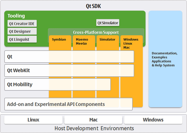
The separation of concerns is a key aspect of software engineering practice in which each logical part of the system is dissected and separated as much as possible from the other parts of the system. The interactions between the system components are well specified and take place through well-defined interfaces. By separating system concerns it is possible for the development of each part of a complex system to be undertaken in relative isolation from the other parts. Complexity often occurs in systems because of the combinatorial nature of the tasks required to be undertaken. By decomposing those tasks and separating them into isolated components, complexity — or the possibility of increased combinatorial complexity — is reduced. This means that developments can occur in parallel, and it also means that complex aspects of the system can be more easily handled. An example of a real-world development system that makes use of these separations is Nokia’s Qt Framework (see Figure: Nokia’s Qt Framework).
For the UX engineer, separating the presentational concerns from the other logical components of the system has a high degree of utility. This is because the interface and the tasks that surround it can then be created in isolation from the other components of the system, only calling on deeper program logic through predefined and well-understood interfaces. Therefore, the interface dialogue components and human aspects of the system can be developed and tested in an agile development cycle until the human-centric parts have been fully tested and evaluated. Finally, the underlying logic can be linked and so the development - even using the Waterfall Methodology - can proceed with the knowledge that the interface components are fit for purpose.
Following this ethos also enables automatic generation of certain aspects of the system. This means that different presentational components can be generated by combining a model of the functional tasks that are required to be undertaken along with a model of the user requirements. In this way, either model can be changed without requiring each presentational aspect to be altered. Small model changes percolate through to the real-world practical deployment without necessitating full systems redevelopments.
Many different systems have evolved out of this desire to separate concerns and to generate aspects of the system automatically for both different platforms and different user types. While the following are not an exhaustive list, they give the reader a general idea of why and how these techniques can be so powerful.
8.4.1 Model View Controller Architecture
The MVC architecture suggests a reasonably simple separation of concerns which isolates aspects of the user input (control), from aspects of the user interface (view), from the underlying description of the programming application logic (model). This means that input is handled by the controller that passes on that input to the model. The model handles this input and updates the underlying data structures and associated output accordingly. Finally, the view queries the model such that changes that have occurred, based on the most recent input in combination with the state of the model before the input, are related back to the user via the interface. Some implementations of the MVC architecture also create a dependency graph that enables only aspects that have changed to be updated through the view. The most complex aspect of this architecture is the model because it handles moving between specifically defined states. This is based on the user input and the previous state of the model. State transition diagrams can be very useful within this context. The view itself is the main focus for the UX engineer. And by abdicating much of the responsibility of the input, event detection, and changes within the model state to other concerned parties within the system, the focus can remain firmly on enhancing user interaction. At the minimum making sure that user’s interaction is not hindered by a badly built interface. Also by correctly modelling a view, many different interaction requirements can be supported without the need to individually code each one.
The Model View Presenter (MVP) architecture is a variation upon the MVC architecture in which the model is the interface defining the data to be displayed or otherwise acted upon. The view displays the data while the presenter acts to both retrieve and format data. There is no consistency between implementations of this architecture and the degree of logic permitted within each view varies. However, all implementations have the aim of facilitating automated unit testing and improve the separation of concerns in the presentation logic.
Finally, the Presentation Abstraction Control (PAC) architecture is similar to the MVC architecture however it occurs in layers. Each layer contains a number of so-called agents, and the agent comprises presentation, abstraction, and control elements. These agents only communicate with each other through the control element and in this way each agent completely isolates both the presentation and abstraction elements. This means that presentation components can be further disconnected from each other with their underlying program logic housed within the same agent. This has some benefits in the UX domain however it also means that additional communication via the control element needs to be undertaken, and consistent abstraction across layers and agents must also be present.
8.4.2 Multilayered Architecture
Multilayered architecture breaks each aspect of the system into a separate layer, running from the user interface layer at the top, through the application layer, through the domain layer, and finally reaching the infrastructure layer. Indeed, it is this domain layer that the model–view–controller architecture uses as the model to drive the generation aspects of the system. Sometimes the domain and application layers are conjoined, as there can often be some overlap between the description of the business rules within the domain and the actual application of those rules within the real software architecture. The infrastructure layer focuses on interactions with the underlying platform and the services that platform provides. In this way, the infrastructure layer can be used to enact network connections, memory handling, and all the other system elements one would expect to find in a modern operating system or platform.
For the UX engineer, the most important aspect of this architecture is the division of the user interface from the other layers. By understanding the flow of data and control in this hierarchical manner, it is sometimes easier for developers to think about interface creation in isolation. The use of layers is common within software engineering, and so it aligns well with the thought processes developers are already familiar with. The separation of concerns can still be maintained in this model because, as long as the application interfaces between the different layers are well defined, isolation between the components is preserved. In this way, the user interface layer can be changed to suit different user requirements without the need to redevelop the other layers, which remain isolated from one another and from the interface layer. However, the ability to change the interface layer based on an abstract description of the system’s presentation and user requirements is limited. This is because multilayered architectures are typically not founded on abstract models of the system that are enacted at runtime; rather, they are designed to facilitate enhanced development. Consequently, the machinery required to generate dynamic, adaptive interfaces is not present directly within the system.
8.4.3 Service Oriented Architecture
SOA is a network architecture that requires a high degree of loose coupling of the services provided and the operating systems on which they run. SOA separates the functionality of the application into distinct uses and isolates that functionality from the operating system. This means that an application running on a desktop can call and interact with different services orchestrating the user interaction and the interface aspects of the system separately from those which are used to enact the program functionality. Therefore, services can be called from different nodes on the network, and in the case of the World Wide Web, across servers such that in some cases the developers do not even need to create the application functionality directly.
This kind of architecture is obviously very powerful for the UX engineer. However, it also comes with the problem of the persistence of the services that are offered and their availability from the supplying organisations. Creating a SOA type architecture by orchestrating local services means that specific computer resources can be used for tasks that they are most suited to. Also, a form of parallelism can be accomplished because different services can run at the same time on different computational resources all orchestrated by a single user from a single application interface.
Therefore, SOA’s preserve the separation of concerns to a high degree, reduce the complexity of combinatorial functionality because services are isolated from each other and are often focused on providing a specific service. Orchestrating the services is the most complex task. However, by maintaining this degree of loose coupling the knock-on problems of testing and debugging can be mitigated against those which arise in a system with a high degree of coupling.
We can, therefore, see that there are many different architectures that could be used by the UX engineer. All have strengths and weaknesses: model-based approaches enable the interface to be directly generated, based on an updated version of the view, very easily although additional functionality and machinery are required for this generation. Layered approaches are very practical and in some ways describe the system as it is developed. However, the separation of concerns is not as high as model-based approaches, and so there is always the possibility of functionality drifted between the different layers. Finally, service-oriented architectures support a separation of concerns by a high degree of loose coupling, to such a degree that these architectures are mainly enacted over entire networks. However, their orchestration is complicated, and if the system developer does not have full control over those services, then their persistence and accuracy cannot be guaranteed.
8.4.4 Microservices (and Devops)
“The term “Microservice Architecture” has sprung up over the last few years to describe a particular way of designing software applications as suites of independently deployable services. While there is no precise definition of this architectural style, there are certain common characteristics around organization around business capability, automated deployment, intelligence in the endpoints, and decentralized control of languages and data.” – Martin Fowler
This is extracted from the best article on Microservices I’ve come across (even though written in 2014 at https://martinfowler.com/articles/microservices.html)
In short, the microservice architectural style is an approach to developing a single application as a suite of small services, each running in its own process and communicating with lightweight mechanisms, often an HTTP resource API.
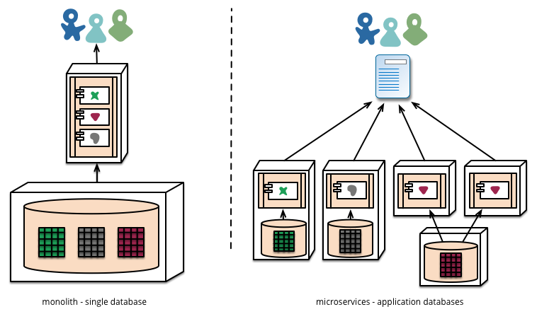
Microservices architectures are currently my preferred way of implementing UX based software. This is mainly because the ability for a piece of software to be created independently of other components and the communication cross facilitated at a later date enables us to separate our concerns not just in the context of development but also in the context of running the system.
As we know, maintenance represents around 70 to 80% of system development effort. And so, building a large monolith means that there are many unintended consequences associated with incorrect maintenance; updates which might very well take down a live system. In the past, this was not a big problem (!) because a release of new software would happen periodically on some sort of hard media and releases would occur infrequently. In this case, we could expect that extensive testing and debugging have been undertaken because the cost of a new release would be substantial. However, in the current climate of centralised systems, which are run over networks connecting to client application endpoints, then the separation of server and client means that systems would be normally expected to be always on. Further, agile’s focus on rapid iteration and deployment means that updates might occur very frequently, indeed up to every two weeks. And so systems which can be independently updated but are cooperating on a single purpose have a huge benefit for the robustness of the user experience.
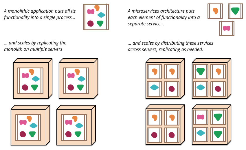
So in reality what is a micro service? And how are they implemented? This is really a question for software engineering textbooks. However, in the context of user experience and the separation of concerns, we can think of a microservice as being a small component of a larger application but the management of data and interfaces are all controlled by that particular component for its specific job. Communication with other components typically occurs via a bus mechanism such that systems may not even be co-present on the same servers and different languages can be used as long as they all are able to communicate on the same bus. This means systems are very much more flexible in the way that they are developed and in the way that they are maintained.
There are, of course, downsides to microservices architectures, mainly in that they are slower to communicate, and if they are on different servers at distance this communication lag will be increased. However, with modern network and hardware technologies, these lags can appear almost imperceptible to a user at a client endpoint. Microservices architectures also lead us on to consider development operations or DevOps:
“DevOps is a set of practices that combines software development (Dev) and IT operations (Ops). It aims to shorten the systems development life cycle and provide continuous delivery with high software quality. DevOps is complementary with Agile software development; several DevOps aspects came from the Agile methodology.” – Wikipedia
DevOps acknowledges the increased need for maintenance of systems and also the agile nature of current development operations such that changes to running systems can be implemented with compartmentalised exposure to bugs and the removal of the possibility of a complete systems failure.
Further, DevOps enables immediate feedback on user needs and requirements so supporting rapid agile development cycles. DevOps is beyond the scope of UX but putting users at the centre of all the systems, including those that are both running and being maintained is obviously a method of development, maintenance, and operations something that we should be supportive of.
8.4.5 Hexagonal Architecture
Hexagonal architecture — formally known as Ports and Adapters — was introduced by Alistair Cockburn to tackle some of the most frustrating structural problems in software design: unwanted dependencies creeping between layers and business logic getting tangled up with infrastructure concerns. It’s since become one of the most influential patterns in modern development, and for good reason.
8.4.5.1 The Basic Idea
At its heart, hexagonal architecture draws a hard line between an application’s core domain logic and everything external to it. The inside is pure logic — what the application actually does. All the technology-specific details (databases, APIs, user interfaces) live on the outside. The two sides talk to each other through ports (abstract interfaces) and adapters (concrete implementations that plug into those ports). Inbound ports handle requests coming in; outbound ports handle the application reaching out to external systems.
The hexagonal shape itself isn’t meaningful — it just gives you room to sketch out multiple ports and adapters without getting boxed in by a traditional layered diagram. What matters is the golden rule: dependencies always point inward. The core knows nothing about the adapters. This means you can rip out PostgreSQL and drop in MongoDB without touching a single line of business logic. It also makes testing far more straightforward, since you can substitute real adapters with lightweight in-memory stand-ins and run fast, reliable tests against the domain without spinning up any infrastructure.
8.4.5.2 Why This Is My Preferred Stack
The combination of microservices, hexagonal architecture, and DevOps is my personal favourite stack for UX development, and it comes down to a few things that I think matter enormously in practice.
First, the strict separation of concerns. Hexagonal architecture enforces a discipline that keeps your domain logic clean and portable. Each microservice becomes its own hexagon, with every other service treated as part of the outside world, isolated behind ports and adapters. This means you can add or remove services without making logic changes to the rest of the system — the core doesn’t care what’s plugged into it, only that something is.
Second, this approach integrates beautifully with DevOps. A modular, loosely coupled architecture supports the kind of autonomous, cross-functional teams that DevOps demands. CI/CD pipelines can run comprehensive test suites using mock adapters, and continuous deployment benefits from the confidence that swapping out infrastructure won’t break domain behaviour. You can fix and ship features quickly because the boundaries are well defined.
8.4.5.3 The Bus Question
Where things get genuinely interesting — and where I still find myself thinking hard — is the message bus. Microservices architectures often favour a common bus (something like RabbitMQ or Kafka) for inter-service communication. It’s elegant in theory, but it introduces real trade-offs. A shared bus can reduce speed, and more critically, it weakens the guarantee that messages have actually been handled by the correct service. You’re trusting the routing, and that trust isn’t always well placed.
But the bus question remains an open and fascinating one, particularly the problem of enforcing a guarantee of receipt. If you could reliably ensure that a message has not only been delivered but correctly received and processed by the intended service, many of the bus’s drawbacks would fall away. It’s a problem worth watching closely, and one I suspect will see significant progress as event-driven patterns and distributed transaction models continue to mature.
8.5 Interface Frameworks and the GUI
Graphical User Interfaces (GUI) are now the standard for user interfaces and will, therefore, be the most familiar to the user. There are other interfaces, such as the command-line interface, which also exist to enable user interaction with the system, however, these are often used by engineering subsections of the user community. The GUI is synonymous with the point and click operating modality of most interfaces today and use various real-world naming conventions to orientate users to different functionalities within the application domain. These GUI systems differ from earlier systems in that they make extensive use of the mouse to select the area of attention. Previously systems often worked on a menu based approach by which options are listed, and selections can occur via sequential keyboard operations. Point-and-click meant that different applications or modalities could be displayed at the same time, and the users’ attention would switch between these modalities based on their intent. Although managing the input and output of these GUIs tended to be complicated, non-standardised, and buggy. However, systems were developed to address these issues both at the operating system level and at the level of the application development.
8.5.1 Window Manager
Windows manages derived from the WIMP concept that stands for window, icon, menu, and pointing device. These four aspects define the style of interaction that the user can expect within the windowing environment. The use of the pointing device in combination with the screen layout is intended to reduce the cognitive load. Thus enabling the user to remember both the actions which are available while at the same time reducing the learning overhead required to understand those actions and tasks. In this case, the windows manager is the generic name used to describe the operating system specific components which control the placement, appearance, and look and feel of the graphical user interface. The windows manager uses a set of real-world analogies that dovetail into the users’ cognitive understanding of what is being presented and tasks that will be required. In most cases the surface of the GUI is called the desktop, applications can be selected by clicking iconic representations or by following an iconic menuing system that allows easy selection of multiple applications at a systems level. This means that the user is not responsible for remembering all of the different applications on the system or how to execute them, but rather lists are presented such that a user can just double-click. Once an application has been initiated it runs in a window. The window analogy is used to reinforce the conceptual format of a view into a working application. Many windows can be open and running at any one time, and each window has a specific menu. Therefore, the commands that are required for each system do not need to be remembered. This list of commands is often found as part of the menu local to the application or in the now commonly known toolbar; that gives graphical representations of the functionality of the application. Few window managers are designed with a clear distinction between the windowing system and the window manager. Every graphical operating system that uses a windows metaphor has some form of window management, however in practice the elements of this functionality vary greatly. Operations usually associated with managers are those which allow the user to open, close, minimise, maximise, move, resize, and keep track of open windows. These facilities exist to provide a degree of consistency between application interfaces with menuing commands such as file, edit and help, etc. These are placed at the same location and following the same conventions across applications and platforms. Finally, most managers also come with additional facilities to help find and control windows and the applications which run on top of them, providing functionality such as docks; application launchers; task bars; and icons.
8.6 Windows Toolkits
Windows Toolkits were created to enable application interfaces to be programmed more swiftly by providing a component-based version of the common interface elements used inside the window manager. These toolkits provide off-the-shelf functionality which enables GUI elements to be speedily assembled and controlled, and also provide for keyboard and pointing interactions. Toolkits also assist development activity because they capture certain principles of interface design, including look and feel, for specific systems and remove the necessity for the developer to reinvent-the-wheel with every interface created. Components within these toolkits are often called widgets. This term is used to denote aspects of the toolkit such as menus, text boxes, scroll bars, spinners, etc. And so a Windows Toolkit can also be called a Widget Toolkit or in some cases a Gadget Toolkit. Another aspect defined within window toolkits is the ability to abstract away from the platform. And enable applications to be created for a specific toolkit (QT for instance) such that native code can be generated to enact that interface on many separate platforms. This cuts down the redevelopment requirements, which are often very heavy concerning interface development, necessary when porting a system from one operating system or platform to another. In many cases, the software engineer will develop code using cross-platform languages and so the application will often be platform neutral; only becoming native once it has been compiled on a specific operating system. However, the interface components often have to be re-implemented using the platforms proprietary Window Manager and toolkit. In this case, the software engineer can write for one multi-platform windowing toolkit that will compile for many platforms. There are problems with this approach, however, in some cases look and feel is not exactly matched to the underlying system and, therefore, the application is cognitively dissimilar to that expected by the user. As an UX engineer, you should only use abstract windowing toolkits if you can guarantee that the resulting native code will always conform to the look and feel of the underlying operating system or platform; as opposed to the specific toolkit itself. If this is not the case, you will end up sacrificing usability for ease of development. Is is an uneconomic model in the long run because the amount of user time will always be far greater than the amount of development time.
8.6.1 Skins
Finally, one of the most basic ways of changing the feel of an interface is to re-skin it. This means that the functionality and the structure of the interface remain unchanged, however, the visual theme and in some cases small aspects of the structure can be manipulated. These minor manipulations enabling users to change an applications look on-the-fly to suit their style of work or preference. Also, the ability to re-skin interfaces means that the application interface itself must be loosely coupled to enable the dynamic changes to occur. Skins may be also associated with themes. And the look and feel of the GUI, in general, can be changed such that these changes percolate through the entire interface including applications built with the native Window Toolkit. An application that is capable of having a skin applied is referred to as being skin-able, and the process of writing or applying such a skin is known as skinning. Some skins make the application more aesthetically pleasing while others can rearrange elements of the interface making the application easier to use. Allowing the interface to be re-skinned is more work for the developer that allows a certain level of personalization for the user, specifically the power user. Indeed in some regard, designing a system to be scalable means that changes in the interface, and personalization of the interface by the user, is supported and encouraged. This means that testing and evaluation with users is likely to show higher levels of satisfaction because the application can change to accommodate individual preferences.
In reality, the interface design has previously been so difficult and non-standard that now the use of windowing toolkits, skins, and Windows managers have become all pervasive. Some argue that this has meant that the research and creativity of interface design have been affected such that different ways of interacting are not now pursued. In this case, you may be wondering why interaction and interface design are even a feature of this chapter. However, we can see that innovations do occur, especially when new devices force changes in the mode of user operations. For example the iPhone (see Figure: iOS Development) and the Android operating system have both changed interaction modalities such that gesture-based interfaces are now becoming more common. Concerning the standard desktop application, interaction design is focused on the placement of user interface components and the associated functionality of those components. So while the interface does not change directly, interface design is really about matching the needs of the underlying program logic with the best way to interact with that logic from a user perspective. Many interface components do the same job, but in different ways, it is, therefore, necessary to choose the most appropriate method and placement.
8.6.2 UXD and Visual Design
Let’s circle back to UXD and Visual Design. In short, we say that UX’ers of the technical/engineering type (you) should not get involved in visual design (although auditory design for conversational interfaces you are as well placed as anyone else). Follow the systems design language, use the development interface design guidelines, and where possible use pre-created toolkits to make sure you match look and feel. Consistency is very important at the interface level, and you should have a really good reason to break that look and feel.
8.7 Summary
This chapter has mainly dealt with enabling the UX engineer to understand the different kinds of development concerns and methodologies that may be applied to a user-centric development within the context of the software engineering process. Having the effect of making an understanding of the timescale, needs, and concerns of the software engineers more self-evident. And should enable the UX’er to become a better team player with the other disciplines that make up the development team.
As Eric S Raymond suggests in ‘The cathedral and the bazaar’ [Raymond, 2001] - and elaborates on in ‘Homesteading the Noosphere’:
“Anyone who watches the busy, tremendously productive world of Internet open-source software for a while is bound to notice an interesting contradiction between what open-source hackers say they believe and the way they actually behave - between the official ideology of the open-source culture and its actual practice. Cultures are adaptive machines. The open-source culture is a response to an identifiable set of drives and pressures. As usual, the culture’s adaptation to its circumstances manifests both as a conscious ideology and as implicit, unconscious or semi-conscious knowledge. And, as is not uncommon, the unconscious adaptations are partly at odds with the conscious ideology.” [Raymond, 1998]
This is a call to flexibility and user focus, if we simply replace ‘open-source’ with ‘UX’ we get a pretty good ethos for UX development.
8.7.1 Optional Further Reading
- [A. Cockburn.] Agile software development. Addison-Wesley, Boston, 2002.
- [A. Davies A] and J. Mueller. Developing Medical Apps and mHealth Interventions. Springer: Cham, Switzerland; 2020.
- [R. C. Martin.] The clean coder: a code of conduct for professional programmers. Prentice Hall, Upper Saddle River, NJ, 2011.
- [A. Oram] and G. Wilson. Beautiful code. O’Reilly, Beijing, 1st. ed edition, 2007.
- [E. S. Raymond.] The cathedral and the bazaar: musings on Linux and Open Source by an accidental revolutionary. O’Reilly, Beijing, rev. ed edition, 2001.
- [I. Sommerville.] Software engineering. Pearson, Boston, 9th ed edition, 2011.
- [The Agile Alliance,] Website http://www.agilealliance.org/.
8.7.2 International Standards
- [ISO/TR 9241-100:2011.] Ergonomics of human-system interaction — part 100: Introduction to standards related to software ergonomics. TC/SC: TC 159/SC 4 ICS 13.180; 35.180, International Organization for Standardization (ISO), Geneva, Switzerland, 2011.
9. Prototyping and Rapid Application Development
“If a picture is worth 1000 words, a prototype is worth 1000 meetings.”
– David & Tom Kelley, Founder, and Partner of renowned Design and Innovation Consultancy IDEO
In this chapter we’re going to be looking at Rapid Application Development (RAD) and Prototyping. By prototyping we simply mean a mock up that can (often) be run. And when we say run we mean this could be a wizard-of-oz kind of run, in that sense, whereby there’s a person behind the screen making it work. Alternatively, it could be actually running to a certain level of accuracy which could be implemented in part and parts that might not be implemented. So it just depends, but run means that things can be looked at by users. And you can work through the steps of how things might work.
In this case, the initial investment is low in terms of time and coding, because it’s really a prototype, it’s not the real thing and so hasn’t taken the development effort required to make everything work. Its job it to just allow the user to get closer to what the system could look like and how it could work without making a high initial investment, and as such it is cheaper in the initial development but also allows a user to make rapid changes over time.
9.1 Prototyping
UX prototyping refers to the process of creating interactive and tangible representations of user experiences. It involves building low-fidelity or high-fidelity prototypes that simulate the functionality, flow, and visual design of a digital product or service. UX prototyping plays a crucial role in the user-centred design process, allowing designers and stakeholders to gather feedback, test concepts, and iterate on designs before the actual development phase.
Key aspects of UX prototyping focus on:
User-Centric Approach: UX prototyping focuses on understanding and addressing user needs and expectations. By creating prototypes, designers can gather user feedback early in the design process and make informed decisions based on user insights.
Interactive Simulations: Prototypes are designed to simulate user interactions and workflows, providing a realistic representation of how the final product will behave. This allows designers to test and refine the user experience before investing in development.
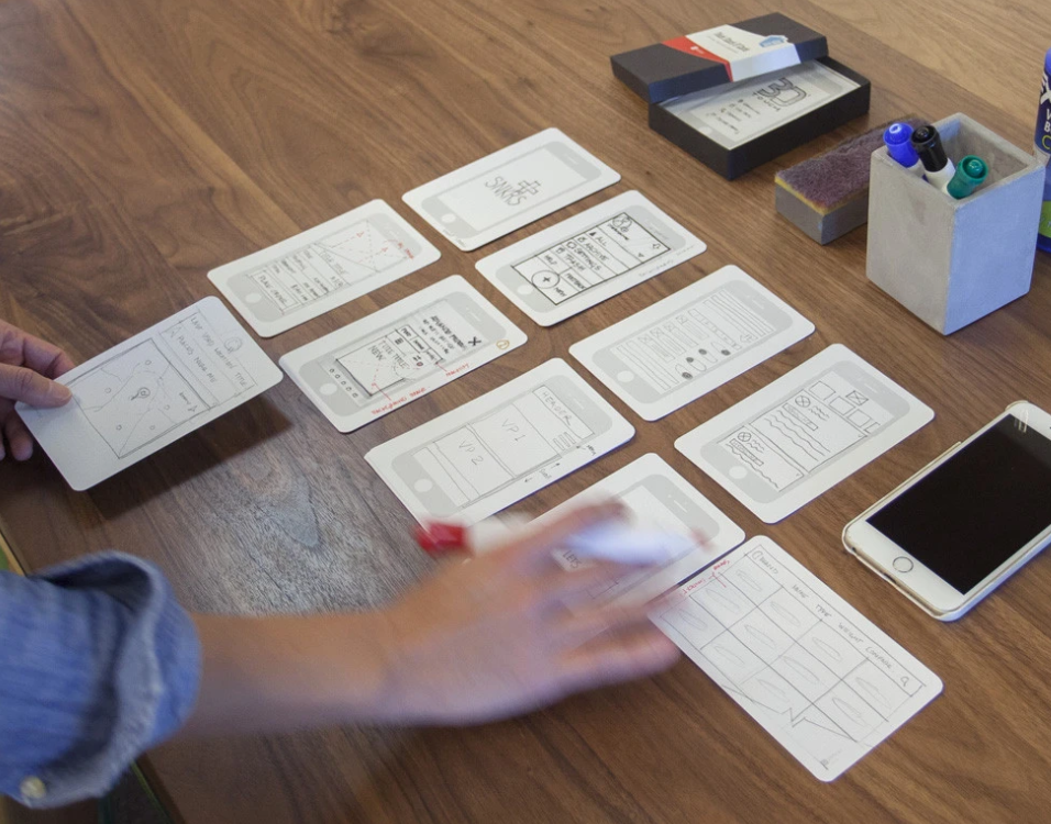
Low-Fidelity Prototypes: Low-fidelity prototypes are quick and simple representations of design concepts, often created using paper sketches or digital wireframes. They are useful for exploring and validating initial ideas, gathering feedback, and making early design decisions.
High-Fidelity Prototypes: High-fidelity prototypes are more detailed and visually polished, closely resembling the final product. They can be interactive, allowing users to navigate through screens, interact with elements, and experience the product’s functionality. High-fidelity prototypes are valuable for user testing, stakeholder presentations, and demonstrating the user experience to clients.
Iterative Design Process: UX prototyping facilitates an iterative design process, enabling designers to make improvements based on user feedback. By testing and refining prototypes, designers can uncover usability issues, identify areas for improvement, and iterate on the design until it meets user and business goals.
Collaboration and Communication: Prototypes serve as a visual and interactive communication tool, enabling designers to effectively communicate their ideas to stakeholders, developers, and other team members. Prototypes bridge the gap between design and development teams, aligning everyone on the project’s vision and goals.
Prototyping Tools: Various prototyping tools are available that aid in creating interactive prototypes, such as Sketch, Adobe XD, Figma, InVision, and Axure RP. These tools offer features like drag-and-drop interfaces, interactions, animations, and the ability to simulate user flows.
Overall, UX prototyping is a powerful technique that empowers designers to iterate, test, and refine their designs based on user feedback. By incorporating prototyping into the design process, teams can create more user-centred and effective digital products and services. We will be focusing on the fidelity spectrum which runs from lo-fidelity at one end, and hi-fidelity at the other.
9.2 The Fidelity Spectrum
What you’ll find is that there are two extremes of prototypes; lo fidelity prototyping and hi fidelity prototyping. And as we move from lo fidelity to hi fidelity there is really a spectrum, and a diversity of change such that lo-fi facilitates big changes which become increasingly small as you move through to hi-fi. This is because there’s more work and more cost involved in the hi-fi. Also, as we’ve seen the closer you get to hi fidelity prototypes, the less likely it is a user will want to make changes because they’ll feel you’ve already put a lot of work into it. So really make sure that the users have been involved on the lo-fidelity prototypes, just so that you can understand any final changes or issues that need to be fixed from a user perspective, realising you are not going to get these to the level of large changes the closer you get to hi-fi prototyping.
Along the spectrum you can increasingly refine the lo-fi prototypes moving from hand drawn prototypes to templates that are still lo-fi but look much more professional, giving a more exact representation of the artefact. We can see that the lo-fidelity prototypes above are mainly freeform and are created so they look like handwritten prototypes, none-professionally drawn drawings. This is a positive thing as people don’t get scared of making changes. But once you want to make it a little more formal you need to factor in the point that people will be more resistant to change.
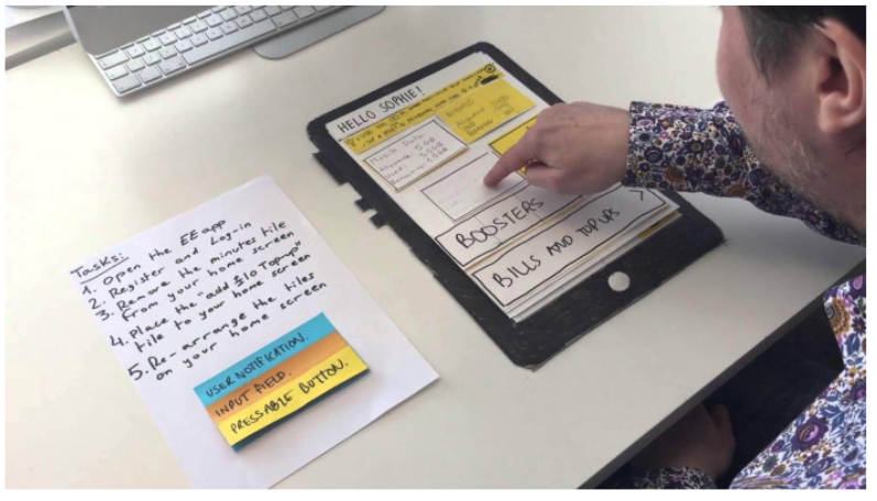
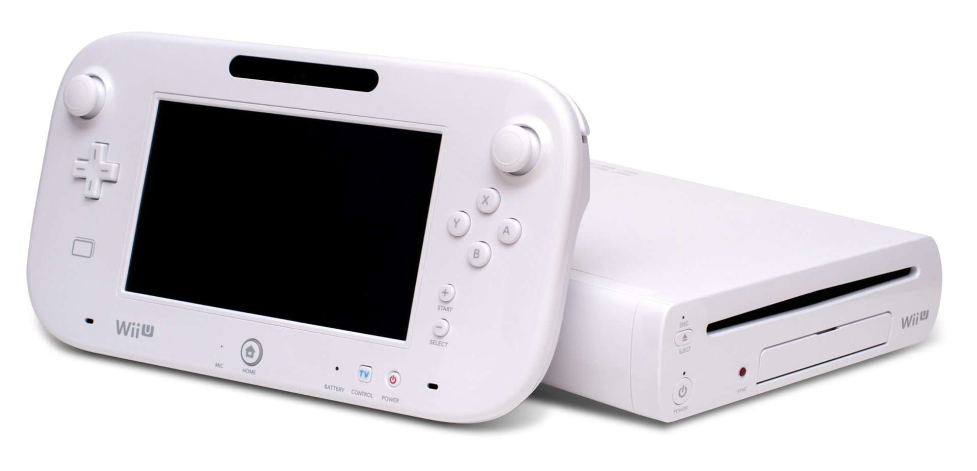
Initially, it’s still a person just drawing with a little linkage here and there. You shouldn’t undervalue this, the value of prototypes, especially of lo-fidelity prototypes is their ability to be changed by anyone (professionals and users alike). And so designers in large companies tend to use lo-fidelity prototyping. One example is the Nintendo Miiverse, one of the original Nintendo designs which utilises a three dimensional box that you hold and pull and push the cards from the top of it. Indeed, designer Kazuyuki Motoyama explains that the only way to actually know what a Miiverse would feel like was to hold it. That’s when he built this prototype out of cardboard.
9.2.1 Nintendo Miiverse
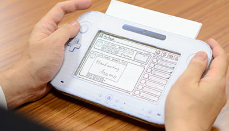
Miiverse was actually modelled on Wii U prototype (which was intended to be one conjoined system) three dimensional box that you hold and pull and push the cards from the top of it. So you can see exactly what will happen when a button is pressed. What’s more, oftentimes, you’re moving to a certain set of tasks so that you don’t get things wrong. So it will tell you what to do. For instance, if you press this button, this will happen. And then you reveal that by removing (or adding) the card. So you are if you like running it yourself, if you like you can get these kinds of index card templates, whereby you have the mobile app on them, and then you can spread them on your desk so that you can show people how things are going to happen, move these templates around, which is quite a nice way of doing it. Once you turn it over, it can tell you the kind of tasks and the things that are expected to be accomplished. And in some cases, it’s got a reverse. So you know, if you click a button you clicked over, and then it’s got the button clicked on the other side. So you can have different forms of this. But it’s all to get this kind of level and feeling of what this thing is going to be like.
9.3 Prototypes in Software Engineering
Being a software engineer, there’s always the desire in a lot of ways to just get moving, to get moving on the actual interface, don’t bother about design, just get moving on it, get something out there. That’s a useful way of doing it when you’re trying to get an idea about what it is that you’re trying to create. When you need to know something about the systems that you’re trying to create and what they’re trying to do. And if you don’t know that yet, then it can be problematic without an initial interface model.
Now, when we talk about cowboy coding, this is what we mean in a prototyping context. Agile presumes that you’ve got some idea about what it is you’re building, if you have no idea about what it is you’re building, then cowboy coding kicks in. We just start making lots of lo-fidelity prototypes out there trying to get people to use them and understand which is the best one, which isn’t without a real clear idea necessarily. But that’s because if you don’t have an idea about what’s required, or what you’re going to build, because it’s so novel, then you’ve got to find some way of doing it.
As we’re seeing, increasing development increases fidelity. Once we have moved along from lo-fidelity then we get into common graphics or flow charting apps, such as sketch, Illustrator and OmniGraffle. And these things can actually also generate some kind of metadata to allow you to better create the screens etc. And then we get to the high fidelity prototype, which is really just to all intents and purposes, a visual designer for a screen but without any data. And then you’re able to create the interface and screens and add dummy plug in data in the back of it.
We’re going to talk about the separation of concerns soon enough, however we can see how this might work in prototyping as the interface is separated from the data on the interface (and this data is the result of programme logic). When we think about separation of concerns, even in high fidelity prototypes, it allows us to create the interface for different targets, might be mobile, might be desktop, different kinds of targets, we create the prototype, we create the interface for that target, but then we need the actual programming logic. And so we can then build the programme logic at the back. And this is where it really is useful to have some kind of RESTful interface decoupling of the programme logic from the interface itself. Or aspects like micro services, whereby you can develop parts independently of the other parts of the system. So you can build it up in that kind of separated way.
People are excluded from hi-fidelity prototypes, because you need more knowledge of how to use tools, whereas lo-fidelity, you just need to know how to use paper and pen. It’s pretty ubiquitous currently. Lo-fidelity prototypes allows you to think with your hands and not be too bothered about what things might look like, and what decisions you’re making, because it’s easily changeable by rubbing out with a pencil with an eraser or scrubbing over a pencil and drawing the lines and that kind of thing. So it’s a lot easier to do. It allows you to to make lots of validation steps of what’s required with users very quickly within in the space of a few days, because you can make the changes very quickly.
| HIGH-FIDELITY PROTOTYPE | LOW-FIDELITY PROTOTYPE | |
|---|---|---|
| Interactivity | ||
| Clickable links and menus | Yes: Many or all are clickable. | No: Targets do not work. |
| Automatic response to user’s actions | Yes: Links in the prototype are made to work via a prototyping tool (e.g., InVision, PowerPoint). | No: Screens are presented to the user in real time by a person playing “the computer.” |
| Visuals | ||
| Realistic visual hierarchy, priority of screen elements, and screen size | Yes: Graphics, spacing, and layout look like a live system would look (even if the prototype is presented on paper). | No: Only some or none of the visual attributes of the final live system are captured (e.g., a black-and-white sketch or wireframe, schematic representation of images and graphics, single sheet of paper for several screenfuls of information). Spacing and element prioritization may or may not be preserved. |
| Content and Navigation Hierarchy | ||
| Content | Yes: The prototype includes all the content that would appear in the final design (e.g., full articles, product-description text and images). | No: The prototype includes only a summary of the content or a stand-in for product images. |
And it allows for ‘user centred design’ whereby the user is actually more part of the process. Because with user centred design, we want the users to be involved in the process, not excluded, and most users won’t have the skills to use SketchUp or OmniGraffle, or even the hi-fidelity generation engines. Further, they’re not as free in their designs if they have to have somebody else do that for them. So even though there might be two people together designing the system, users who wants the designer to make a change in a hi-fidelity prototype is going to be much more reticent because they think it will be more work.
9.4 Users, Commissioners, Engineers!
Prototypes are used with users, with commissioners, and with engineers and typically in that order from lo to hi fidelity. So what would normally happen is that you’d have users who would look at these lo-fidelity prototypes that have been drawn freehand (say) just written on post it notes, so you can move things around quickly, you might then firm that up into something that’s mid range. So it’s more along the lines of an actual computer generated hierarchy using SketchUp, etc, which is something that a lot of designers use in developing designs, and so you can see what’s going on at this stage. Now, remember, everything I’m talking about when it comes to prototypes is visual; I’m not talking about any prototypes for conversational interfaces, or zero UI, or auditory design, because most users don’t think about these aspects in the early stages of the design. So as you’re a UX’er, you’re going to have to think about how to do for non-visual prototyping because there’s no best practice out there.
So commissioners will expect the system to look more professional and they will be expecting to make minimal to no changes, however, it still might not be the final design. But with the engineers, you’re probably going to create something that’s the final thing, you’re probably likely to let the commissioners see that as well at one of the development meetings, but mainly then, with the engineers, you can make the changes and generate out something for the engineers to start work on.
As a UXer, you’re probably going to start work on the low fidelity prototypes and this is typically because you’re going to be working more with the users, once it gets to the visual designers, they’re going to be using mid range SketchUp like applications. So they’ll do the visual design there. Now translating that visual design to the hi, very hi-fidelity prototypes ready to generate out for the engineers might be your job again, because really, you’re translating the visual design into something that can then be created as the basis for code. Or it might be an engineer, or it might be a specialist visual designer.
9.5 Rapid Application Development
Rapid Application Development is really the boundary of these hi-fidelity prototype tools. And now, hi-fidelity prototyping tools have taken over the space of rapid application development. RAD was a 1991 era idea or at least it was expressed in that idea whereby we needed to create applications quickly without any sort of background machinery such that users could see what was going to be there and is heavily reliant on prototyping. And so this is kind of a method of doing the prototyping. In this case, RAD is a software development methodology that prioritizes speed and flexibility in delivering high-quality applications. It emphasizes rapid prototyping and iterative development cycles to quickly build and deploy software solutions. RAD aims to accelerate the development process, reduce time to market, and improve customer satisfaction by involving end-users and stakeholders throughout the development lifecycle. Key characteristics and principles of Rapid Application Development are
- Iterative Approach: RAD follows an iterative development model, where software is developed in small increments or prototypes. Each iteration focuses on specific features or functionalities, allowing for quick feedback and continuous improvement. This is a lot like the newer concept of Agile - which is now tied to UX.
- User-Centric Focus: RAD places a strong emphasis on user involvement. Users and stakeholders are actively engaged throughout the development process to gather requirements, validate prototypes, and provide feedback. This ensures that the final product meets user expectations and addresses their needs effectively.
- Prototyping: RAD heavily relies on prototyping techniques to rapidly build and refine software solutions. Prototypes are created early in the development process to demonstrate the application’s core functionality, interface, and user experience. User feedback is incorporated into subsequent iterations, leading to an evolving and user-centric design. This is the critically important part of RAD for UX and we might even extend this to imply that an initial software framework can be generated from a hi-fidelity prototype.
- Collaboration and Teamwork: RAD promotes close collaboration among developers, users, and stakeholders. Cross-functional teams work together to define requirements, design prototypes, and deliver working software in short development cycles. Effective communication and teamwork are crucial to the success of RAD projects.
- Reusable Components: RAD encourages the reuse of existing software components and modules. By leveraging pre-built components, RAD speeds up development and reduces the effort required to build certain features. This approach enhances productivity and allows developers to focus on unique requirements and functionality.
- Parallel Development: RAD enables parallel development activities by dividing the project into smaller modules or components. Different teams or developers can work on these modules simultaneously, ensuring faster development and integration of various software components.
- Flexibility and Adaptability: RAD emphasizes flexibility and adaptability to changing requirements. The iterative nature of RAD allows for adjustments and refinements based on user feedback and evolving business needs. This enables the software to evolve and align with changing market dynamics.
- Time and Cost Efficiency: By employing rapid prototyping, iterative development, and close collaboration, RAD can significantly reduce development time and costs. The focus on early user involvement and continuous feedback minimizes rework and ensures that the final product meets user expectations.
It’s important to note that RAD is not suitable for all types of projects. It is best suited for projects with well-defined scope, clear business objectives, and actively involved users and stakeholders. RAD is particularly effective in situations where time to market is critical or when requirements are subject to change.
Overall, Rapid Application Development offers a dynamic and flexible approach to software development, enabling faster delivery of high-quality applications while maintaining a user-centric focus. If you’re working in RAD (or at least a close variant), then you also need to make sure that the system you’re using will generate an application that can run and that can be populated with fake data, but that cannot have any real programme logic. For the interface, it will display content which is understandable by a user and it might also then have links to databases in the background and it can become increasingly complex as development and modelling proceeds. RAD is not just about user experience it’s also about any system development via higher level languages and so you can also generate, for instance, a database application via flowcharts via state transition diagrams via UML. So any system development will utilise RAD because it’s a faster transition from the design phase to the application phase.
9.5.1 RAD & Prototype Comparison
RAD and Prototyping are both software development approaches, but they differ in their objectives and the stages of the development process they focus on. However, there is clear linkage in that RAD heavily utilises prototyping and prototyping at the very hi-fidelity often include the ability to generate a working RAP prototype for user involvement and as a kickstart to the initial development effort.
9.5.1.1 Objectives
- Rapid Application Development (RAD): RAD aims to expedite the development process by emphasizing iterative development and quick delivery of functional software. Its focus is on rapid iteration and user feedback to ensure that the final product meets user requirements.
- Hi-Fidelity Prototyping: Hi-Fidelity Prototyping focuses on creating highly detailed and interactive prototypes that closely resemble the final product. The goal is to test and validate the design and user experience before investing significant resources in development.
- Lo-Fidelity Prototyping: Lo-Fidelity Prototyping focuses on creating low-detail, basic prototypes that represent the core functionality of the final product. The goal is to quickly explore design concepts, test ideas, and gather early feedback before investing significant resources in development.
9.5.1.2 Development Process
- Rapid Application Development (RAD): RAD typically follows a cyclic or iterative process, where each iteration involves requirements gathering, prototyping, development, testing, and deployment. The emphasis is on reducing the time between iterations to quickly deliver a working product.
- Hi/Lo-Prototyping: Hi/Lo-Fidelity Prototyping is usually an early stage in the development process. It involves creating detailed prototypes that simulate the functionality and user interactions of the final product. These prototypes are used to gather feedback and validate design decisions before moving to development.
9.5.1.3 Level of Detail
- Rapid Application Development (RAD): RAD focuses on creating functional software quickly, often with a minimalistic user interface and core features. The emphasis is on delivering working software within short timeframes, allowing users to provide feedback and shape the development process.
- Hi-Fidelity Prototyping: Hi-Fidelity Prototypes are highly detailed and aim to closely resemble the final product in terms of user interface, interactions, and visual design. They often include realistic data and simulate real-world scenarios to provide a comprehensive user experience for testing and validation.
- Lo-Fidelity Prototyping: Lo-Fidelity Prototypes are intentionally low in detail, often using simple sketches, wireframes, or basic interactive mockups. They are not intended to replicate the final product’s design or functionality but rather to capture the basic structure and flow of the application.
9.5.1.4 User Feedback
- Rapid Application Development (RAD): RAD encourages frequent user involvement throughout the development process. Users have the opportunity to provide feedback on the working software during each iteration, allowing for continuous improvement and alignment with their requirements.
- Hi-Fidelity Prototyping: Hi-Fidelity Prototypes are primarily used to gather user feedback and validate design decisions. Users can interact with the prototype, provide input, and offer suggestions for improvement before the development phase begins.
- Lo-Fidelity Prototyping: Lo-Fidelity Prototypes are often used to gather early feedback from stakeholders and users. Since they are low in detail, the focus is on validating and refining the overall concept, functionality, and user experience rather than specific design elements.
9.5.1.5 Time and Resource Investment
- Rapid Application Development (RAD): RAD aims to deliver working software quickly, reducing time-to-market and allowing for faster user feedback. It requires a high level of collaboration, skilled development teams, and well-defined requirements to ensure efficient and rapid development.
- Hi-Fidelity Prototyping: Hi-Fidelity Prototyping requires significant upfront time and effort to create detailed and realistic prototypes. However, it can potentially save time and resources in the long run by identifying design flaws and usability issues early, before investing in full-scale development.
- Lo-Fidelity Prototyping: Lo-Fidelity Prototyping is relatively quick and inexpensive compared to other prototyping methods. It allows for rapid exploration of ideas and concepts without investing significant time and resources. However, it may require additional effort to translate the low-fidelity prototype into a high-fidelity design during the development phase.
In summary, RAD focuses on quickly delivering functional software with iterative user feedback, while Fidelity Prototyping emphasizes creating detailed and interactive prototypes for early validation of design decisions. The choice between the two approaches depends on the project requirements, timeline, and the level of detail and user involvement needed at each stage of development.
9.6 Summary
Though low-fidelity prototyping has existed for centuries, it has recently become popular with the spread of agile design methodologies, inspired by several movements including design thinking advocates for ‘thinking with your hands’ as a way to build empathetic solutions. Lean startup relies on early validation and the development of a minimum viable product to iterate on. User-centered design calls for a collaborative design process where users deliver continual feedback based on their reactions to a product’s prototype.
Prototypes are used by application/system users, commissioners, and engineers as part of the initial Design Phase, such that once requirements are collected and you want to convey information to Visual Designers or Software Engineers. As a UX’er you’ll probably mostly work with Low-Fidelity prototypes. Initial low investment of time which makes it very flexible and Iteratively evolves to be more like an app with a higher investment of time and therefore less flexibility. very hi-fidelity prototypes can often be ‘run’, and/or generate, a working framework, and it is at this point that RAD processes can be utalised. RAD demands frequent user interfacing, and is heavily reliant on prototyping.
Finally, remember, ‘A process that is not critically dependent on prototyping is not a UX process.’ — Julian Caraulani, Senior UX Designer at Samsung.
9.6.1 Optional Further Reading
- [Ben Coleman and Dan Goodwin (2017)] — Designing UX: Prototyping. SitePoint. 978-0994347084.
- [Reinhard Sefelin, et al (2003)] — “Paper prototyping - what is it good for?: a comparison of paper- and computer-based low-fidelity prototyping”. CHI ‘03 Extended Abstracts on Human Factors in Computing Systems. ACM: 778–779. doi:10.1145/765891.765986. ISBN 978-1581136371. S2CID 275647
- [Nick Babich (2020-09-25)] — The Magic of Paper Prototyping. Medium. Retrieved 2021-12-13.
- [Steve McConnell (1996)] — Rapid Development: Taming Wild Software Schedules, Microsoft Press Books, ISBN 978-1-55615-900-8
- [James M. Kerr & Richard Hunter (1993)] — Inside RAD: How to Build a Fully Functional System in 90 Days or Less. McGraw-Hill. ISBN 0-07-034223-7.
- [James Martin. (1991)] — Rapid Application Development. Macmillan. ISBN 0-02-376775-8.
10. Principles of Effective Experience (Accessibility)
While pedalling a Boris Bike I start to shuffle in my pocket. Where is that damn iPhone? Finally, I find it. The next challenge is to get it out my pocket whilst still navigating the Humvee of the bike world. Eventually, I give up. I pull over and get my iPhone out. I look up the nearest docking station with spaces and get back on my way.
– LondonCyclist
This is an example of ‘situational impairment’ a barrier to access, the inability to produce or accomplishing the intended effect; in short non-effectual use.
10.1 Effective7, effectual8, accessible9
To my way of thinking these three terms mean the same thing, and, in reality, were going to be talking about accessibility. However, you should be thinking of accessibility in the more general terms of effective or effectual use, because the concept of accessibility is much broader than the narrow confines of disability it is often associated with [9241-129:2010, 2010].
This notion of the situationally-induced impairment, by which they do not mean an actual impairment of the person directly, but indirectly by the computational device or the environment in which it must be used. They point out that non-disabled individuals can be affected by both the environment in which they are working and the activities in which they are engaged, resulting in situationally-induced impairments. For example, an individual’s typing performance may decrease in a cold environment in which one’s finger does not bend easily due to extended exposure at low temperature. Or the similarities between physical usability issues on both small devices, such as a Mobile Telephone, Personal Digital Assistant, or any other hand-held device with a small keyboard and display, and accessible interaction scenarios. This means that by making your interfaces accessible, you can transfer accessibility solutions into the mobile and situational context.
This support for situational impairments, through flexibility, adaptability, and the ability to personalise the user experience, in other words transformable UIs, is important for access in developing regions too. Web use in developing regions is currently characterised by constrained operating modalities. Slow speed, low computational power, reduced bandwidth, compact keyboards, small screens, and limited power, all compound the problem of access and inclusion. In addition, interaction is sometimes without conventional written language and illiteracy is also a barrier to information and services. However, the benefits of technology are so great that the peoples of these regions often adopt resourceful methods of interaction and access sometimes repurposing resources so that they are put to a different use than for which they were intended. The most obvious example was noted when Nokia sent a team to Africa and realised that people were using mobile phones, able to connect to a carrier or not, as a torch (see Figure: Nokia Torch). There is also the well-known use of Pringle tubes to direct a single point of wifi around a village community (see Figure: Pringle Tube Antenna); as well as other novel work which is less high-tech [Zobel, 2013]
So how can we develop effective user experiences? Well openness comes to our rescue – as do Sony Ericsson10, and Little Fluffy Toys Ltd11 – with Sony’s LiveView and Little Fluffy Toys’ Cycle Hire LiveView Gadget (see Figure: LiveView Cycle Gadget) “Using Bluetooth, the Live View gadget connects to your Android phone (2.0 or later). You can then do cool stuff such as check out the latest tweets, SMS messages, Facebook messages, take pictures remotely or, find the nearest Boris Bike docking station.” Problem solved! By taking account of the inability for the cyclist to access data on a conventional device using a conventional computer system, the engineers have created an accessible product; because the key to accessibility and effectual use is a focus on the user, and their personal needs. But to address these needs, needs which you may not understand or have experience with, you must think (like the Sony UX’ers) about extensibility and adaptability, ergo personalisation and openness of both the data, and the APIs to access it. By making sure that the system is open, and that aspects of the interface and human facing system components can be modified, adapted, or interacted with via an API, the developer is making an explicit statement which allows for extensibility. This means that all aspects of the application can be modified and changed once further information comes to light or in the event of processes in the organisational systems of the commissioner changing.
Accessibility aims to help people with disabilities to perceive, understand, navigate, and interact with the computer system or interface. There are millions of people who have disabilities that affect their use of technology12. Currently most systems have accessibility barriers that make it difficult or impossible for many people with disabilities to use their interfaces [Kirkpatrick et al., 2006] Accessibility depends on several different components of development and interaction working together, including software, developers, and users. The International Standards Organisation (ISO) 9241-171:2008 [9241-171:2008, 2010] which covers issues associated with designing accessible software for people with the widest range of physical, sensory and cognitive abilities, including those who are temporarily disabled, and elderly people. There are also other organisations that have produced guidelines, but, the ISO guidelines are more complete and cover the key points of all the others. There are however, no homogeneous set of guidelines that developers can easily follow. Disabled people typically use assistive technologies, hardware and software designed to facilitate the use of computers by people with disabilities, to access interfaces in alternative forms such as audio or Braille.
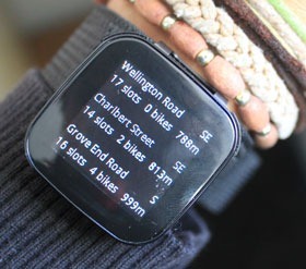
Pre-eminent when discussing accessibility is visual impairment and profound blindness, however, it should be remembered that visual disability is just one aspect of accessibility and technology. Other disabilities also exist which require changes to technology to enable a greater degree of accessibility. Before considering these, though, it is important to consider just what accessibility really means and why it is necessary to think about ‘access’ when building interfaces. Many disabled users consider technology to be a primary source for information, employment and entertainment. Indeed, from questioning and contact with many disabled users we have discovered that the importance of technology cannot be under-estimated.
“For me computer systems are everything. They’re my hi-fi, my source of income, my supermarket, my telephone. They’re my way in.”
This quote, taken from a blind user, sums up the sentiments we experience when talking with many disabled users and drives home the importance of accessibility in the context of independent living. Indeed, by making technology accessible, we help people live more productive lives.
So how does this work in practice? Disabled users, use intermediate technologies to provide access to technology and computer functionality. In general this technology exists to provide access to any generic software on the computer, however this is not always the case for specialist systems. These ‘Assistive Technologies’ form a bridge from the user to the computer, much like a keyboard and monitor, the keyboard provides input, the monitor, output. In the case of say physical disability the input device, the keyboard, is not accessible to the user and so a software keyboard is substituted. This keyboard can then be tailored depending on the physical characteristics of the user. A mouse or joystick may be used to place the cursor, or a simple switch is used to interact with a software keyboard exhibiting a ‘scanning’ behaviour. However, some technology tends to be seen as a special case, this means that in some cases assistive technology exists as a solution just to the unique problems found when interacting with specialist systems as opposed to more general system accessibility [Harper and Yesilada, 2008]. Most assistive technology focuses on output, and so assistive technology for users with input problems, such as profound physical disability, tends to be focused on the computer and software in general and does not normally impact on specialist accessibility domains, such as Web accessibility. This output accessibility is developed independently along two fronts, both as part of interface design along with assistive technology on the user’s computer. However, due to the design effort needed to build interfaces, the focus is primarily on the accessibility of the interaction or the tailoring of the interactive components to a specific audience. Indeed, this latter case tends to be the focus of accessibility for cognitive disability and hearing impairment.
It is my firm belief that internationalisation, also known as I18n, and culture can be barriers to the accessibility of software and so could be addressed under the border category of accessibility. However in most contexts internationalisation along with localisation are mainly seen as technical issues requiring multilingual translation of language components. Indeed, in this regard culture, which can also be a barrier to access, is often not addressed at all. For instance, in the mid-90s some users of the World Wide Web did not want to select the hyperlinks. This was because the links were blue, and blue was seen as a inauspicious colour. So then, internationalisation, in the broader sense, is the design and development of a product, application or interfaces that enables easy localization for target audiences that vary in culture, region, or language. In effect this means enabling the use of Unicode, or ensuring the proper handling of legacy character encodings where appropriate, taking care over the concatenation of strings, avoiding dependence in code of user-interface string values, or adding support for vertical text or other non-Latin typographic features. This also means enabling cultural conventions such as supporting: variance in date and time formats; supporting local calendars; number formats and numeral systems; sorting and presentation of lists; or the customary handling of personal names and forms of address.
In summary, there is no ‘catch–all’ solution to providing accessibility to computer-based resources for disabled users. Each disability requires a different set of base access technologies and the flexibility for those technologies to be personalised by the end–user. To date, the main focus has been on visual impairment. However, there are moves to address accessibility for hearing and cognitive impairments. Effective interaction, with the computer system or interface, requires that firstly the system can be accessed, secondly, that once accessed the system can be used effectively, and thirdly, that once used effectively the experience of usage is pleasurable and familiar. Keeping in mind, these three overriding priorities will enable you to design better interfaces and interactive environments for the user.
10.2 Barriers to Effectual Use
Often, when we start to build interfaces or design systems we can find it helpful to place ourselves at the centre of the process. Designing for ourselves enables us to think more easily about the problems at hand, and the possible cognitive or perceptual aspects that the interface will be required to fulfil [Chisholm, 2008]. While this is perfectly acceptable as a way of creating an initial prototype. Indeed, this is becoming increasingly know as ‘Autobiographical Design’ [Neustaedter and Sengers, 2012, Neustaedter and Sengers, 2012a] – it is not acceptable as the design progresses. This is because there are many different kinds of people and these people have many different types of sensory or physical requirements; indeed, this is where scenarios and personas come in handy. Remember, it is your job to understand these requirements and keep them mind in all aspects of your interface or system designs.
10.2.1 Visual Impairment
Blindness, visual disability, visual impairment, or low vision means that the user will not be able to make adequate use of visual resources. In most cases blindness does not mean that the user can see absolutely nothing, but that aspects of their vision do not work correctly and cannot be corrected with lenses. The World Health Organisation (WHO) defines low vision as visual acuity13 of less than 6/18 (20/60), but equal to or better than 3/60 (20/400), or corresponding visual field loss to less than 20 degrees, in the better eye with best possible correction. Blindness is defined as visual acuity of less than 3/60 (20/400), or corresponding visual field loss to less than 10 degrees, in the better eye with best possible correction. This means that a legally blind individual would have to stand around three metres from an object to see it. According to the most recent estimates of the global burden of visual impairment, more than 161 million are blind. This means that if we are to support users with low vision or blindness we need to make sure that two things can happen when thinking about the interface. The first is that the screen can be magnified and that components which are necessary for interaction can be located in a physically similar location so that, when zoomed, they are usable together. Secondly, the interface should conform to general accessibility guidelines and principles meaning that each visual object has a corresponding textual description, and that the textual description can be accessed.
10.2.2 Cognitive Impairment
Cognitive impairment, also associated with learning difficulties, is one of the most pernicious barriers to human interaction with computers. This is mainly because aspects of cognitive disability not yet well understood and the spectrum of cognitive disability is so widespread that simply following a set of design criteria cannot assist in creating interfaces suitable for users with cognitive and learning impairments. It is therefore difficult to present any accurate figures relating to cognitive impairment as they change so rapidly and the definition is in some cases fluid. In general, users with cognitive impairments may have difficulties with executive function, memory, attention, visual and spatial perception, language, and emotions. Indeed it is more likely, that to a greater or lesser extent, minor aspects across most of these categories may be present. However, studies conducted in the USA, suggest that around 56% of people with cognitive impairment do enter the labour market and of those a fair percentage are employed in the use of computation devices. Therefore, the UX’er must also keep in mind the needs of this type of user when building systems interfaces; paying particular attention to learnability. Indeed, one of the key things to remember when designing interfaces and systems is to try and use as simple a language as possible, and where appropriate, annotate the interface with consistent graphical symbols.
10.2.3 Hearing Impairment
Hearing impairment is a broad term used to describe the loss of hearing in one or both ears. Hearing impairment refers to complete or partial loss of the ability to hear, with the level of impairment being either mild, moderate, severe or profound. Deafness, on the other hand, refers to the complete loss of ability to hear from one or both ears. Of the two types of hearing impairment, Conductive and Sensorineural. Conductive occurs when there is a problem conducting sound waves anywhere along the route through the outer ear, tympanic membrane (eardrum), or middle ear (ossicles). Where Sensorineural is usually permanent, and is caused by excessive noise or ageing, and requires rehabilitation, such as with a hearing aid. According to WHO estimates, 278 million people worldwide have moderate to profound hearing loss in both ears, with many living in low to middle-income countries. Also, the number of people worldwide with all levels of hearing impairment is rising. This is mainly due to a growing global population and longer life expectancies within those populations. In this case there are a number of aspects to consider when thinking about the user interface. Using sound alone to convey status information is inappropriate, indeed, relying solely on audio to convey any information should be avoided. Where possible captioning and text should be used. However, the UX’er should also remember that written or spoken language is not the native language of hearing-impaired users. In this case, sign language has become the accepted form of communication within this community, and indeed sign language is also a cultural requirement for many hearing-impaired or deaf users. Communication then, within the deaf community can be thought of as a combination of internationalisation and culture.
10.2.4 Physical Impairment
Physical Impairment affects a person’s ability to move, and dexterity impairments are those that affect the use of hands and arms. Depending on the physical impairment, there are many challenges that affect users’ interaction such as pointing to a target or clicking on a target. There are two kinds of impairments that affect interactivity: (a) musculoskeletal disorders that arise from loss, injury or disease in the muscle or skeletal system such as losing all or part of a hand or arm; and (b) movement disorders that arise from a damage to the nervous system or neuromuscular system such as Parkinson’s disease which cause slowness of movement. Physical impairment is widespread mainly because many factors can bring on its onset. Indeed, one of the largest surveys conducted in the United Kingdom estimated that 14.3% of the adult population had some mobility impairment that includes locomotion, reaching and stretching and dexterity. You should realise that people with motor impairments use a variety of creative solutions for controlling technology. These include solutions such as alternative keyboards and pointing devices, voice input, keyboard-based pointing methods and pointing based typing methods. Indeed, it can be seen that some of these solutions are also useful for users without a physical impairment, but who may be hindered by the size of their computational device or the environment in which it must be used.
10.2.5 Situational Impairment
Situational Impairment is not actually an impairment of the person directly, but indirectly by the computational device or the environment in which it must be used. Situation impairment is a recent phenomenon, indeed, it was first defined by Sears and Young in 2003. They point out that non-disabled individuals can be affected by both the environment in which they are working and the activities in which they are engaged, resulting in situationally-induced impairments. For example, an individual’s typing performance may decrease in a cold environment in which one’s finger does not bend easily due to extended exposure at low temperature. Anecdotal evidence also suggests that there are strong similarities between physical usability issues in both small-devices, such as a Mobile Telephone, Personal Digital Assistant, or any other hand-held device with a small keyboard and display, and accessible interaction scenarios. Both small-devices and accessible interfaces share the need to support various input techniques; they both benefit from flexible authored and accessible interfaces, and text entry and navigation in both scenarios are slow and error-prone. As a UX specialist, we can assume that different forms of disability have similarities with common situational impairments present in mobile situations. Many factors may, therefore, affect how users interact with mobile interfaces and these must be taken into account when building interfaces for these kinds of interactive scenarios.
10.2.6 Combinatorial Impairment
Population demographics indicate that our populations are ageing across the board. Indeed, the world’s older population is expected to exceed one billion by 2020. Evidence suggests that approximately 50% of the older population suffer from impairments, such as hearing loss, with one in five people over the age of 65 being disabled. As the population ages the financial requirement to work more years is increased, but age-related disability becomes a bar to employment. At present, only 15% of the 65+ age-group use computers, but as the population ages this number will significantly increase. An ageing, but computer literate, population indicates a large market for computer-based services especially when mobility is a problem for the user. In many developed countries, the growth of the knowledge economy and a move away from manual work should improve the prospects of older Web users being able to find employment, providing technology, and specifically computational resources, is accessible to them. The aspects of impairment that define ageing is those of a combinatorial nature. In effect, ageing users have problems found in one or more of the groups listed in this section, but often, these impairments are less severe but more widespread.
Hummmm… In the paragraph above I imply ageing is a barrier and combinatorial disabilities are its cause. But am I right to make such sweeping generalisations, swept along by a prevailing western research mindset14 [Lunn and Harper, 2011]?
Well, my mind drifted back to a paper by Peter G. Fairweather from IBM T.J. Watson called ‘How older and younger adults differ in their approach to problem-solving on a complex website’.
Peter challenges the view that *“Older adults differ from younger ones in the ways they experience the World Wide Web. For example, they tend to move from page to page more slowly, take more time to complete tasks, make more repeated visits to pages, and take more time to select link targets than their younger counterparts. These differences are consistent with the physical and cognitive declines associated with ageing (sic).
The picture that emerges has older adults doing the same sorts of things with websites as younger adults, although less efficiently, less accurately and more slowly.”* He presents new findings that show that *” to accomplish their purposes, older adults may systematically undertake different activities and use different parts of websites than younger adults. We examined how a group of adults 18 to 73 years of age moved through a complex website seeking to solve a specific problem.
We found that the users exhibited strong age-related tendencies to follow particular paths and visit particular zones while in pursuit of a common goal. We also assessed how experience with the web may mediate these tendencies.”* [Fairweather, 2008]
The interesting part is that Peter finds that younger and older people do things differently with older users taking a less risky route, but also that experience, not age, is the defining factor of regarding how to solve the assigned problem using the web. Younger inexperienced users make more mistakes than older experienced users and take longer. So what does this say about our conception of older users having problems found in other disability groups – ageing as disability, ageing as impairment?
I’m beginning to think that ageing, in general, isn’t a barrier to access although combinatorial disability – at whatever age it occurs – may well be. But it is true that low-level combinatorial impairments affect older users more, proportionally than others. However, in all cases, a lack of experience and knowledge are much more significant barriers to access, so education is key. It seems we have got into a habit of using ageing as a proxy term for combinatorial disability, its inaccurate and we should stop it.
10.2.7 Illiteracy
Education is the key to Illiteracy. The United Nations Educational, Scientific and Cultural Organisation (UNESCO) defines literacy as ‘The ability to identify, understand, interpret, create, communicate, compute and use printed and written materials associated with varying contexts. Literacy involves a continuum of learning to enable an individual to achieve his or her goals, to develop his or her knowledge and potential, and to participate fully in the wider society.’ Literacy comprises a number of sub-skills, including phonological awareness, decoding, fluency, comprehension, and vocabulary. Mastering each of these sub-skills is necessary for learners to become proficient readers. However, literacy rates can vary widely from country to country or region to region. This often coincides with the region’s wealth or urbanisation, though many factors play a role, such as social customs and education. As a UX specialist you must be aware that it is possible your software may be used in circumstances where illiteracy is prevalent. Indeed, studies suggest that around 20% of the world’s population are illiterate and so there is a high chance that your software will be used by someone who will have some difficulty in understanding the labels, prompts, textual components, or content of the interface. In this case you should try to anticipate this aspect by adding images and sound, and making the interface as flexible as possible so that it can be more easily adapted to the users needs.
10.2.8 Developing Regions
Computer use in developing regions is currently characterised by constrained operating modalities. Slow speed, low computational power, reduced bandwidth, compact keyboards, small screens, and limited power, all compound the problem of access and inclusion. Also, interaction is sometimes without conventional written language and illiteracy is also a barrier to information and services. However, the benefits of computer technology are so great that the peoples of these regions often adopt resourceful methods of interaction and access sometimes repurposing technical equipment so that it is put to a different use than for which it was intended and sharing access often on a community-wide basis. While computational use in developing regions may not seem directly related to user experience, the interface considerations and its adaptability are important within this context and do indeed speak to the wider human factors domain. In this case, it is useful to keep in mind the possible problems that may be encountered in constrained operating modalities and the possible requirements for interface adaptation.
10.2.9 Exclusion
The opportunities created by digital technologies are not enjoyed by the whole of society, indeed, there is a strong correlation between digital exclusion and social exclusion. There are significant and untapped opportunities to use technology better on behalf of citizens, communities, and digitally disenfranchised groups. However to achieve inclusion, systems must be created seeing the human factor as a part of an integrated solution from the outset, not as an adjunct but also not as a focus. In addition, the multiplicity and ubiquity of devices and their interfaces are key to successful inclusion, and systems must be tailored to what users require and will use; as opposed to what organisations and government require and use.
10.3 Technical Accessibility Issues
As we have already discussed, pre-eminent when discussing accessibility is visual impairment and profound blindness. However, it should be remembered that visual disability is just one aspect of software accessibility. Other disabilities also exist which require changes to the interface to enable a greater degree of accessibility. Since the 1980s, visually impaired people have used computers via screen-readers. During the 1980s, such applications relied on the character representation of the contents of the screen to produce spoken feedback. In the past few years, however, the widespread trend towards the development and use of the GUIs has caused several problems for profoundly blind users. The introduction of GUIs has made it virtually impossible for blind people to use much of the industry’s most popular software and has limited their chances for advancement in the now graphically oriented world. GUIs have left some screen-readers with no means to access graphical information because they do not use a physical display buffer, but instead, employ a pixel-based display buffering system. A significant amount of research and development has been carried out to overcome this problem and provide speech-access to the GUI. Companies are now enhancing screen-readers to work by intercepting low-level graphics commands and constructing a text database that models the display. This database is called an Off-Screen Model (OSM), and is the conceptual basis for GUI screen-readers currently in development.
An OSM is a database reconstruction of both visible and invisible components. A database must manage information resources, provide utilities for managing these resources, and supply utilities to access the database. The resources the OSM must manage are text, off-screen bit maps, icons, and cursors. Text is obviously the largest resource the OSM must maintain. It is arranged in the database relative to its position on the display or to the bit map on which it is drawn. This situation gives the model an appearance like that of the conventional display buffer. Each character must have certain information associated with it: foreground and background colour; font family and typeface name; point size; and font style, such as bold, italic, strike-out, underscore, and width. Merging text by baseline (i.e. position on the display) gives the model a ‘physical-display-buffer’ like appearance with which current screen-readers are accustomed to working. Therefore, to merge associated text in the database, the model combines text in such a way that characters in a particular window have the same baseline. Each string of text in the OSM has an associated bounding rectangle used for model placement, a window handle, and a handle to indicate whether the text is associated with a particular bit map or the display. GUI text is not always placed directly onto the screen. Text can be drawn into memory in bit-map format and then transferred to the screen, or can be clipped from a section of the display and saved in memory for placement back onto the screen later.
In windowing systems, more than one application can be displayed on the screen. However, keyboard input is directed to only one active window at a time, which may contain many child windows; the applications cursor is then placed in at least one of these child windows. The OSM must keep track of a cursor’s window identification (i.e. handle) so that when a window becomes active the screen-readers can determine if it has a cursor and vocalise it. Additionally, the OSM must keep track of the cursor’s screen position, dimensions, the associated text string (i.e. speak-able cursor text), and character string position. If the cursor is a blinking insertion bar, its character position is that of the associated character in the OSM string. In this case, the cursor’s text is the entire string. A wide rectangular cursor is called a selector since it is used to isolate screen text to identify an action. Examples of selector cursors are those used for spreadsheets or drop-down menus. The text that is enclosed within the borders of the selector is the text that the ‘Screen Reader’ would speak.
Modifying current screen-readers to accommodate the new GUI software is no easy task. Unlike DOS, leading GUI software operates in multitasking environments where applications are running concurrently. The screen-reader performs a juggling act as each application gets the user’s input. However, many frameworks and application bridges have been created to help the operating system accomplish this ‘juggling’.
10.3.1 MSAA and UIA
Microsoft Active Accessibility (MSAA) is a developer technology that improves the way programs and the operating system work with accessibility aids. MSAA can help software developers make their programs more compatible with accessibility aids, and accessibility aid developers can make more reliable and robust aids. MSAA is an underlying technology that is invisible to users and provides a standard way for accessibility aids to obtain information regarding user interface elements. This standardisation helps software developers and assistive technology developers alike to ensure their products are compatible mainly on the Windows platform. This standard also gives software developers more flexibility in designing their application interfaces by understanding the needs of assistive technologies. In this way, UX specialists can innovate more freely without sacrificing compatibility and have the confidence that the underlying application logic and interface routines will integrate into the accessibility frameworks used by assistive technology developers. Microsoft UI Automation (UIA) (see Figure: Interaction Schematics for Microsoft’s ‘UI Automation’) is similar to MSAA in that it provides a means for exposing and collecting information about user interface elements and controls to support user interface accessibility and software test automation. However, UIA is a newer technology that provides a much richer object model than MSAA and is compatible with new Microsoft Technologies such as the ‘.NET’ Framework.
10.3.2 IAccessible2
IAccessible2 is a new accessibility API, which complements Microsoft’s earlier work on MSAA which fills critical accessibility API gaps in MSAA by combining it with the UNIX Accessibility ToolKit (ATK). A detailed comparison of MSAA to ATK revealed some missing interfaces, events, roles and states within the MSAA framework and so IAccessible2 was created out of a desire to fill these gaps. Therefore, IAccessible2 is an engineered accessibility interface allowing application developers to use their existing MSAA compliant code while also providing assistive technologies access to rich document applications. IAccessible2’s additional functionality includes support for rich text, tables, spreadsheets, Web 2.0 applications, and other large mainstream applications. In this case the Linux Foundation’s Open Accessibility Workgroup summarises IAccessible2 this as “complementing and augmenting MSAA by responding to new requirements; it was designed to enable cost effective multi-platform development; it supports Web 2.0 (AJAX, DHTML); it is a proven solution; its effectiveness has been demonstrated on both sides of the interface, by large applications like the IBM Workplace Productivity Editors and Firefox and by the leading AT vendors; and finally, it is a royalty free and open standard, free for use by all, open for review and improvement by all.” In this case, it seems more appropriate that software developers think seriously about using IAccessible2 as a means of providing accessibility at the interface level.
10.3.3 Interface Bridges
In an attempt to solve the accessibility problems of assistive technology and platform independent software, Sun Microsystems (Sun – now Oracle) introduced the Java Accessibility API, which was designed as a replacement for the OSM. With a Java application that fully supports the Java Accessibility API, no OSM model is necessary because the aim of the API is to provide all of the information normally contained in an OSM. For existing assistive technologies available on host systems (e.g. Microsoft Windows, OSX, Linux) to provide access to Java applications, they need some way to communicate with the Java Accessibility support in those applications. The Java Accessibility Bridge supports that communication. The Access Bridge (see Figure: JVM, Java Accessibility API and Access Bridge) makes it possible for an OS based assistive technology like JAWS to interact with the Java Accessibility API. The Java Accessibility API is implemented in the Swing user interface components. The Access Bridge is a class that contains ‘native methods’, indeed, part of the code for the class is actually supplied by a dynamically linked library (DLL) on a Windows host system. The assistive technology running on the host communicates with the native portion of the bridge class. This bridge class in turn communicates with the Java Virtual Machine, and from there to the Java Accessibility utility support and on to the Java Accessibility API of the individual user interface objects of the Java application it is providing access to.
The Java Accessibility API defines a contract between individual user-interface components that make up a Java application and an assistive technology that is providing access to that Java application, through the Accessible interface. This interface contains a method to get the AccessibleContext class, which contains the common core set of accessibility information that every user-interface object must provide. If a Java application fully supports the Java Accessibility API, then it should be compatible with assistive technologies such as screen-readers. For example, in order for ‘JAWS to provide access to Java applications running on Microsoft Windows, it would make calls to the Java Accessibility Bridge for Windows. When the user launches a Java application, the bridge would inform JAWS of this fact. Then JAWS would query the bridge and the bridge would in turn forward those queries on to the Java Accessibility Utilities that were loaded into the Java Virtual Machine. When those answers came back to the bridge, the bridge would forward them on to JAWS.
10.3.4 Platform Independent Software
We can see that the problem of platform independent software is easily surmountable by using technologies like the accessibility API and Bridge, but faults persist. The nub of the problem of platform independent developments is the fact that an additional level of indirection is present when compared with native developments. With a native development information regarding text, titles, window, and component status are implicitly accessible by the native OS and so in many cases this information does not need to be explicitly provided. This is not the case with platform independent software. In this case, the bridge component provides an intermediary step by implementing an OS native end along with a conduit to the Java native end. However, the application still cannot correctly resolve accessibility information unless it is made explicit. In summary, the Java Virtual Machine (JVM), Java Accessibility API, and the Java Access Bridge work together with the host system to provide the relevant information to an assistive technology. Because ‘implicit’ hooks are not available, a failure at the programming level to make information explicit can invalidate the entire pipeline and break the accessibility of the application. As we are seeing an increase in platform independent languages, such as ‘Ruby’, ‘Tcl’, ‘Perl6’, and the like, the software engineer and UX’er must be aware of the additional programming and testing required to make the interface accessible.
10.4 Potted Principles of Effectual User Experience
Conforming slavishly to a set of principles or success/conformance criteria – with our brain switched off – is never going to be a good idea. Indeed, it is such a bad idea that heuristic evaluation was created, to catch the errors introduced while trying to conform in the design and build phase. This said principles were useful if applied from a high level, and success criteria at a low level, or a least as cues you should be thinking about as you go through the design and development process. These are useful and will eventually reduce the number of negative user experiences encountered within the testing and validation phase.
There are many different principles and conformance criteria ranging from those described in the common texts to those described in the international standards [9241-20:2008, 2008]. Indeed, standards documents seem to be very in-depth and have many checkpoints and bulleted lists that you must individually assess and validate, common texts seem to specify only high-level principles without the detail covered in the standards documents. In this case there seemed to be no middle path. However, it is my opinion that the high-level principles can be discussed and accompanied with a series of questions the UX’er can keep in mind as the design and development proceeds. In this way, a constant mental questioning-framework is built in the UX’ers psyche which enables flexible critique based on the principles.
In my opinion that the most important considerations for effective and accessible interactions are those of openness, perceivability, operability, understandability, and flexibility. Keeping these five principles in mind – along with the questions accompanying each principal – will enable you to better: conform your designs and developments to acknowledged good practice, maintain your questioning nature, and be able to retrospectively apply these principles when it comes to heuristic evaluation and software audits.
However, you must remember that experience is everything. The way to truly understand these principles, and the questions contained within them, is to apply them in real life, develop them in real life, and test them in real life. Remember, memorising these principles does not make you an expert, applying them many times does.
10.4.1 Facilitate Openness
By making sure that the system is open, and that aspects of the interface and human facing system components can be modified, adapted, or interacted with via an application programming interface (API), the developer is making an explicit statement which allows for extensibility. This means that all aspects of the application can be modified and changed once further information comes to light or in the event of processes in the organisational systems of the commissioner changing (for example see Figure: Durateq ATV).
Open software means that bugs can be more easily fixed by an army of interested parties who may also want to use the software for their own purposes. Additions to the system can also back-flow to the originators work such that an enhanced system can be created without any additional effort on the originators part. Obviously there are problems with systems which the commissioner requires to be closed or which uses proprietary or bespoke data formats and interface specifications. However by leaving the system open to an extension, the developer can ensure a fast turnaround on any recommissioned work.
Questions to think about as you design your prototype:
- If you have provided succinct, meaningful name and label for each interface component – including alternatives for icons, and the like – are these names displayed and available to third-party technology?
- Is your software open such that its information is available to third part systems including conventional assistive technologies?
- Does your software allow input and manipulation by these third party systems?
- If your systems are closed then, does it allow all input and output to pass through to third-party software?
10.4.2 Facilitate Perceivability
Critically, the user interface and human facing aspects of the development should be perceivable by many different types of user (for example see Figure: A Braille Display). It is obvious that the general software engineer cannot account for all aspects of perception and personalisation that may be required by an individual user. However, by ensuring that all information regarding interfaces components, the presence of alternative descriptions for specific widgets or components, and that this text has some semantic meaning, the developer can make sure that tools to translate between a standard interface and one which may require modification can occur much more easily.

Questions to think about as you design your prototype:
- Does your system convey information by colour alone (such as a button turning red) but without an alternate textual description?
- Is there a succinct, meaningful name and label for each interface component – including alternatives for icons, and the like?
- Can the user personalise the interface settings, including different styles and sizes of typography, fore and background colours, and default interface look and feel?
- How easy is it to find and interact interface controls and the shortcuts to them?
- Have you provided keyboard focus and text cursors, and will your system restore its previous state when regaining focus?
10.4.3 Facilitate Operability
As with perceivability, operability is also very important. As a UX’er you should realise there are many different kinds of user requirements when it comes to interfacing with the software. However, most systems which enhance or override standard operability systems use the keyboard buffer as a universal method of input. In this case you should make sure that all aspects of the functionality of the software, including navigation and control of the components, can be controlled via a series of keystrokes. For instance I am currently dictating this section, which means that I must have the Mac OS X accessibility extensions switched on, then the speech software can translate my speech into keystrokes and places those keystrokes within the keyboard buffer. To the application it seems as though someone is typing using the keyboard and therefore all interaction is handled accordingly. By supporting operability, device manufacturers can be assured that your software is operable regardless of the input modality.
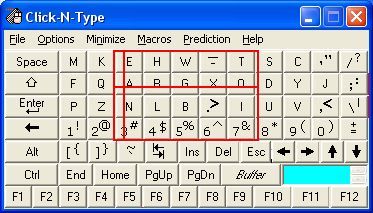
Questions to think about as you design your prototype:
- Can the user control all aspects of an audio - visual presentation (such as a video)?
- Can the user personalise the interaction settings, and change the length of any timed events?
- Are all functions/interface components/interactions able to be controlled via the keyboard?
- Are all functions/interface components/interactions able to be controlled via a mouse-like pointer controller?
- Are all multiple chorded key presses available in a sticky-key sequential form?
- Can the keyboard be remapped?
- Have you provided keyboard focus and text cursors, and will your system restore its previous state when regaining focus?
10.4.4 Facilitate Understandability
Systems need to be understandable. This is especially important when it comes to the interface and the language used within that interface, including error messages, exception handling, and the system help. Using language that is simple to understand and supporting foreknowledge as to the outcomes of various choices the user may be asked to make; will assist in how usable the system becomes and performance increases. In this case, the systems developers should use jargon-free language that can be easily understood by the layperson and that has been tested with people who do not have a direct understanding of the computational aspects of the system. However, there are exceptions to this rule. Consider a bespoke piece of software created for an organisation that has a set of specific institutional abbreviations along with a specific knowledge of what these abbreviations, or linguistic shorthand, means. In this case, it may be appropriate to use terminology that is familiar to organisational users of the system but would be unfamiliar to a wider audience. In reality, interfaces are understandable if computational and developmental jargon is not used and if there is a clear statement as to the outcome is of any actions or decisions that the user is required to make. Further, the concept of ‘affordances’ [Gibson, 1977] – the quality of an object, or an environment, which allows an individual to perform an action (a knob affords twisting, a cord affords pulling) – can also be useful for implicitly/tacitly conveying information.
Questions to think about as you design your prototype:
- Is there a succinct, meaningful name and label for each interface component – including alternatives for icons, and the like?
- Are all interface control and interaction features well documented?
- Do all error or alert messages give consistent information, appear in a consistent place, and facilitate movement to the site of those errors?
- Do you follow the OS keyboard conventions and best practice and style guides?
- Have you tied into the system wide spell checker?
10.4.5 Facilitate Flexibility
We cannot always plan and understand all possible actions and eventualities that will be required by an interface. Users are highly personal and the interactive requirements are different between users and also change over time for individuals. Requirements for the system may also change and requirements for the human facing aspects of the functionality may likewise change as the system becomes more familiar to the user. In this case, it is good practice to try and ensure flexibility within the interface design such that it is possible to highly tailor the operations of the human facing aspects of the system (for example see Figure: Guardian’s Adaptive Website). This flexibility, however, leads to increased complexity within the design and likewise an increased pressure is placed on time and cost. If flexibility cannot be easily achieved in a cost-effective or-time effective manner, then it may be more appropriate for a series of software hooks to be left in the underlying design is such that changes can be made and the system can be modified if required at a later date.
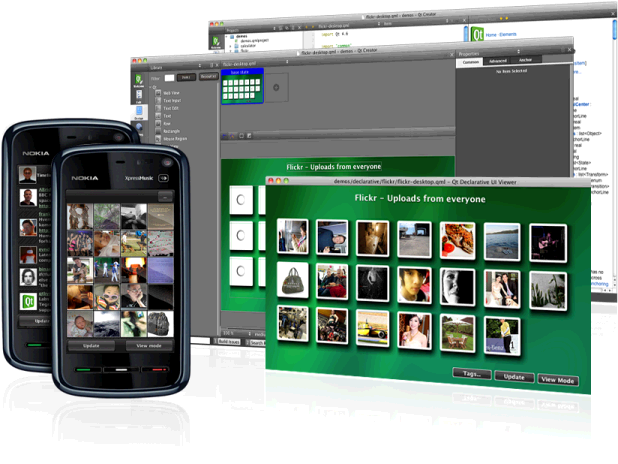
One key aspect of flexibility is the ability to adapt your system on the fly, based on a device description, or to build in the ability to conform to different devices. Remember we talked about ‘Model View Controller Architectures’ way back, well this separation of concerns enables real-world frameworks, such as Nokia’s Qt – in the development cycle, the separation of concerns facilitates flexibility of the interface and, therefore, enables adaption to a target device (for example see Figure: Qt Development).
Questions to think about as you design your prototype:
- Does your system allow users to conform the colour encoding to their preferences?
- Can the user personalise the interaction settings, and change the length of any timed events?
- Can the user personalise the interface settings, including different styles and sizes of typography, fore and background colours, and default interface look and feel?
- Can the keyboard be remapped?
- Do you allow keyboard shortcuts and accelerator keys to be personalised to the user preferences?
Remember… these are just the first five of our total principles - for the next batch you can skip ahead. But just because you can, maybe you shouldn’t… take your time to read the rest!
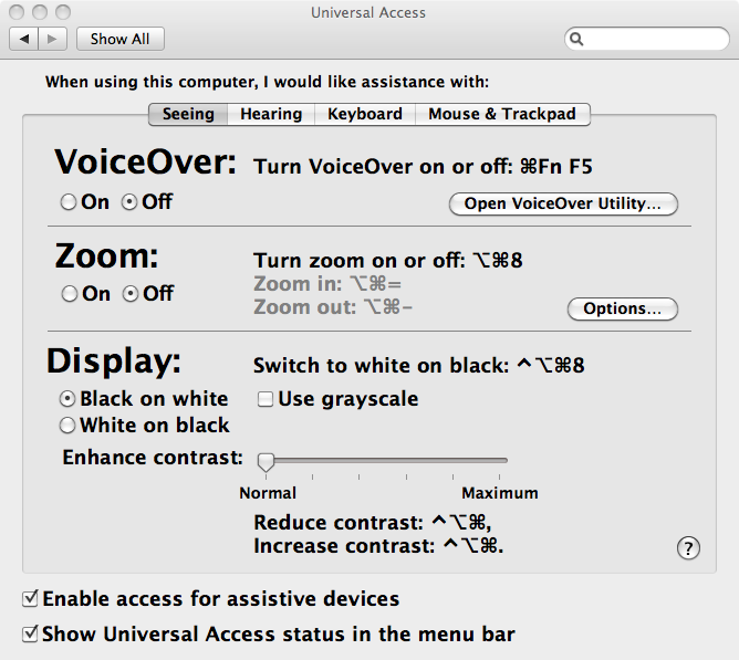
Now I’m presuming you aren’t building an operating system from scratch but are getting one out of the box. In this case, lots of stuff is already done for you (for example see Figure: OSX Accessibility Settings), so I’ve not listed it in the questions attached to each principle – that are all still valid anyhow. Now if you are creating one from scratch, maybe for a bespoke kiosk, auditory driver feedback system in a car, for an embedded system - you must also think about input and output of the OS via the hardware and devices attached to it. How will you set key-repeat intervals for people with tremors, how will you notify hearing impaired users if there is only auditory feedback? There are many more questions to be thought about, and so you should make sure your system is compatible with a modern accessibility bridge, provide ports for Bespoke I/O hardware, and take an in-depth look at ISO 9241-171:2008. What’s more, you’ll find that in some accessibility guidelines, robustness which I cover later – is often included; however I think of this as either part of the ‘utility’ / engineering of the system or as part of its efficient use15.
10.5 Summary
Ask any well-informed developer to rate how important accessibility is, and I’d expect most to rank it high. Ask them why, and I’d expect most to talk about disabled users, altruism, and the law. An enlightened few may talk about the business case, or expand on the many technical advantages of making their software accessible.
It may surprise many designers and developers to know that when they are developing accessible code they are also, more than likely, developing aesthetically pleasing code too. But this shouldn’t be the most basic motivator for accessibility. Indeed, developers should also understand that accessible means mobile.
Designing and building effective systems aren’t just about accessibility, but by being accessible, we can ensure effectual usage. Indeed, accessibility is now not just about making systems accessible to disabled users, but based on the belief that we are all handicapped in some way by the environment or the devices we use. We can see this in our earlier discussions on situational impairment, and in some cases, people have begun to refer to temporal impairment or temporary impairment that is our inability to use effectively our computational systems for short amounts of time-based on some characteristic of ourselves or the environment or the condition of both.
Understanding that interfaces must be transformable also supports users who are conventionally excluded. Currently, the opportunities created by computer technologies are not enjoyed by the whole of society. Indeed, there is a strong correlation between technological exclusion and social exclusion. There are significant and untapped opportunities to use technology better and on behalf of citizens, communities, and digitally disenfranchised groups. However to achieve inclusion, systems must be created seeing the user experience, not as an adjunct, but as a part of an integrated solution from the outset. We know that the multiplicity and ubiquity of devices and their interfaces are key to successful inclusion, households may very well have a games console or digital television, but no general purpose computer system. Being able to deliver content to any device, and support the users needs as opposed to the developers is key to making good interfaces that will be used, and which matter to real people.
Effective use is not just about disability, if anything it is more about a flexibility of mind at every level of the construction process from commissioning, through design and build, and on to evaluation. Effectual use accentuates good design and adaptability which helps future-proof your builds against changes in technologies, standards, and extensions to the design.
I cannot impress on you enough my belief that by understanding disabled user’s interaction we can gain an understanding of all users operating in constrained modalities where the user is handicapped by both environment and technology. UX testing and audit including users with disabilities is a natural preface to wider human facing testing focused on effective use.
10.5.1 Optional Further Reading / Resources
- [M. Burke] How I use technology as a blind person! - Molly Burke (CC). YouTube. (2015, December 18). Retrieved August 10, 2022, from https://www.youtube.com/watch…
- [W. Chisholm.] Universal design for Web applications. O’Reilly Media Inc., Sebastopol, CA, 2008.
- [A. Kirkpatrick] R. Rutter, C. Heilmann, J. Thatcher, and C. Waddell. Web Accessibility: Web Standards and Regulatory Compliance. Friends of ED, July 2006.
- [S. Harper and Y. Yesilada] Web Accessibility: A Foundation for Research, Volume 1 of Human-Computer Interaction Series. Springer, London, 1st edition, September 2008.
- [Y. Yesilada and S. Harper] Web Accessibility: A Foundation for Research, volume 2 of Human-Computer Interaction Series. Springer, London, 2nd edition, 2019.
10.5.2 International Standards
- [ISO 9241-171:2008.] Ergonomics of human-system interaction – part 171: Guidance on software accessibility. TC/SC: TC 159/SC 4 ICS: 13.180 / Stage: 90.20 (2011-07-15), International Organisation for Standardisation (ISO), Geneva, Switzerland, 2010.
- [ISO 9241-20:2008.] Ergonomics of human-system interaction – part 20: Accessibility guidelines for information/communication technology (ict) equipment and service. TC/SC: TC 159/SC 4 ICS: 35.180; 13.180 / Stage: 90.60 (2011-06-17), International Organisation for Standardisation (ISO), Geneva, Switzerland, 2008.
- [ISO 9241-129:2010.] Ergonomics of human-system interaction – part 129: Guidance on software individualisation. TC/SC: TC 159/SC 4 ICS: 35.180; 13.180 / Stage: 60.60 (2010-11-08), International Organisation for Standardisation (ISO), Geneva, Switzerland, 2010.
- [WHA 54.21] International Classification of Functioning, Disability and Health (ICF) - http://www.who.int/lassifications/icf/en/ .
- [UN ESCAP] UN ESCAP Training Manual on Disability Statistics - 2.3 ICF terminology and definitions of disability http://www.unescap.org/stat/disability/manual/Chapter2-Disability-Statistics.asp#2_3 .
11. Principles of Efficient Experience (Usability)
Universal usability is more a function of keeping all of the people and all of the situations in mind and trying to create a product which is as flexible as commercially practical, so that it can accommodate the different users and situations.
– Gregg Vanderheiden
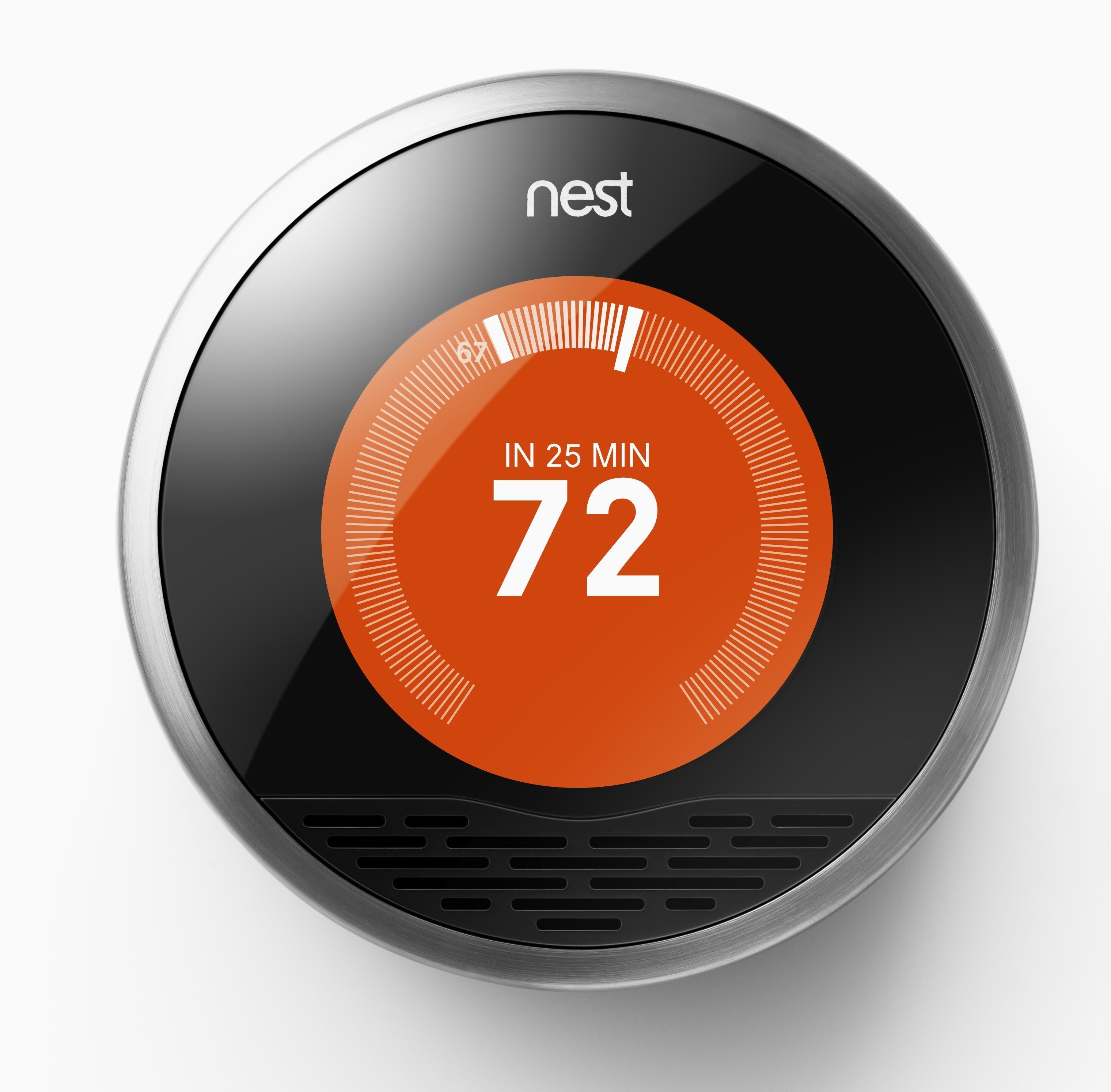
Efficient16 use or usability17. To my way of thinking both terms mean the same thing, and, in reality, we are going to be talking about usability. However, you should be thinking of usability in more general terms, the more general terms of efficient use. This is because the concept of usability is much broader than the narrow confines of ‘Task Completion Time’. Which is often associated with usability [9241-100:2011, 2011], in the context of UX, seems to be simple but, in reality, can be quite taxing. Complex computerised systems and interfaces are becoming increasingly widespread in everyday usage, components of computerised systems are embedded into many commercial appliances. Indeed, the miniaturisation of computerised systems, often found in mobile telephones and personal digital assistants, is on the increase.
Let us take a case in point, the ‘Nest Learning Thermostat’ (see Figure: Nest Learning Thermostat) learns about the user and their home to balance comfort and conservation, without the hassle of programming or constant re-adjustments. Nest programs itself based on the temperatures the user sets, thereby learning the users personal schedule – in a week – and starts automatically turning down heating or cooling – to save energy – when that user is away18. Nest keeps refining its schedule over time and takes input by user rotation of the outer ring to adjust the temperature. The display turns blue when cooling and red when heating, push down opens the very simple menu to enable temperature changes deletion and other fine control (see Figure: Nest Thermostat Control).
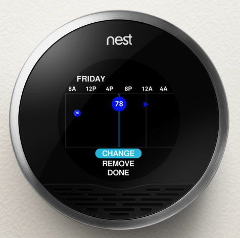
As we can see, this interface is easy to understand and operate, it uses a familiar modality – in that it works similar to a turnable knob – and removes what has become a complicated interaction19 into a very simple one.
(see Figure: Modern Thermostat)
This occurs because the complexity of the program functionality has been removed from the end user and into the system itself. This, obviously, makes the software more difficult to develop, but it removes the complexity from the user and places the onus on the software engineer and UX’er. This is important in a world where information and the requirement for its manipulation is increasing at an alarming rate, requiring the user to respond to this information and placing a premium on easy interactivity. Often, however, these informational resources are centralised and, therefore, need to be tailored to the target audience at the time that they are delivered. Complexity, centralisation, and the need to enhance the performance of the user means that the usability of the system, or interface, has become increasingly important.

The human facing aspects of the system are based on an understanding of the interactive needs of the user and the way their psychology and cognition affect their interaction. This, in general, manifests itself as the ability to perform tasks and actions required by the interface in ways that are also easy for the user to comprehend and execute. Indeed, this is one of the primary driving forces of the graphical user interface and the mouse and keyboard. Often the usability of the system is measured by the performance, the time to execute a task, of a user enacting jobs over the system. As we shall see the rationale is if the task is completed faster than it was before the interactive component was either altered or created when the interface design must be better as an enhancement has occurred. Common performance measures include: the time required by the user to complete a task; the time spent navigating the interface; the number of incorrect choices or errors created; the number of jobs completed, either correctly or incorrectly; the number of observations of user frustration; and finally the frequency of interface components or behaviour that is never used.
The user centred design paradigm was created to assist in the construction of these usable interfaces. In this regard, part of the design process is driven by users who are conscripted on to the design team. In this way, it is hoped that user-friendly systems can be built and the usability of systems increased. Unfortunately, it is often difficult to solicit a representative cross-section of the possible user group, and so usability for all is often missed. This has led to the popularity of universal usability especially within the information society. In this case, universal usability refers to the design of information and communications products and services that are usable for every citizen; discussed to some extent and expanded upon later.
In reality, there is little consensus regarding the relationship of UX, ergonomics, or human factors to usability. Indeed, some think of usability
“… as the software specialisation of the larger topic of ergonomics. Others view these topics as tangential, with ergonomics focusing on physiological matters (e.g., turning a door handle) and usability focusing on psychological matters (e.g., recognising that a door can be opened by turning its handle).”
However, many experts have written separate, but overlapping, frameworks for aspects of usability which should be taken into account when designing and building systems interfaces (we’ll discuss these further). However, before we start on these comparisons let’s look at work that gave rise to some of the earliest principles by which we should design interfaces.
11.1 The Xerox ‘Star’
The Xerox ‘Star’ was a commercial version of the prototypical Xerox Alto – if one thousand fully working systems, used internally at ‘PARC’ day-in-day-out over seven years, can be said to be prototypical20. While the system itself is an interesting development in computer science, the interface and the mode of user interaction is truly visionary. Star, adopted novel technologies such as the mouse (the Alto had both a mouse and a portrait monitor), operationalised developments such as the graphical user interface, and created novel technologies such as the desktop (see Figure: Xerox Star Desktop). However, as UX’ers, we are more interested in the design methodology they used and the principles derived from the team’s experiences designing and developing the interface and interactivity of the implementations. These are some of the first usability principles to be mentioned in common computer literature – dating back to the early 1970s – and are still applicable today. First of all, let us look at the design methodology adopted by the Xerox Star team – it needs no further discussion from me, and so I reproduce it verbatim:
“One of the most troublesome and least understood aspects of interactive systems is the user interface. In the design of user interfaces, we are concerned with several issues: the provision of languages by which users can express their commands to the computer; the design of display representations that show the state of the system to the user; and other more abstract issues that affect the user’s understanding of the system’s behaviour. Many of these issues are highly subjective and are therefore often addressed in an ad hoc fashion. We believe, however, that more rigorous approaches to user interface design can be developed…”
“These design methodologies are all unsatisfactory for the same basic reason: they all omit an essential step that must precede the design of any successful user interface, namely task analysis. By this, we mean the analysis of the task performed by the user, or users, before introducing the proposed computer system. Task analysis involves establishing who the users are, what their goals are in performing the task, what information they use in performing it, what information they generate, and what methods they employ. The descriptions of input and output information should include an analysis of the various objects, or individual types of information entity, employed by the user…”
“The purpose of task analysis is to simplify the remaining stages in user interface design. The current task description, with its breakdown of the information objects and methods presently employed, offers a starting point for the definition of a corresponding set of objects and methods to be provided by the computer system. The idea behind this phase of design is to build up a new task environment for the user, in which he can work to accomplish the same goals as before, surrounded now by a different set of objects, and employing new methods.”*
As the prototyping proceeded the team evolved some principles: familiar user’s conceptual model; seeing and pointing versus remembering and typing; what you see is what you get; universal commands; consistency; simplicity; modeless interaction; and user tailor-ability. We have already seen that the Nest Thermostat exhibits ‘familiar user’s conceptual model’ in the use of the turning and pressing knob, both ‘consistency’ and ‘simplicity’ of operation in the movement of complexity from the user-domain, and ‘tailor-ability’ in the learning algorithms of the underlying programme logic. We’ll further expand upon the core Star principles next with the exception of ‘seeing and pointing…’, ‘what you see is…’, and ‘modeless interaction’ as these three can be taken for granted by the modern UX’er – their integration into the operating system being complete and ‘invisible’:
- ‘Familiar Conceptual Models’ – Star equates familiar conceptual models specifically with the idea of the desktop and the items that you might find on it. It exemplifies e-mail and suggests that because e-mail is similar to postal mail than icons that describe e-mail in the form of in-baskets and out-baskets – letter icons being added to each to represent the incoming and outgoing mail. Also, Star tailors these to the users familiar conceptual models by sending both text and files. This was a very new departure, previous files were sent using FTP – or some other transfer protocol – but this separation is not the case in the real world. So in reality, Star takes familiar real world concepts and maps them to the virtual world.
- ‘Universal Commands’ – Star also proposes the idea of universal commands. Previously each application defined its set of commands, and shortcuts to those commands, and expected the user to remember the specific operations without reference to those already present on the system. Star does away with all this by defining a set of universal commands such as ‘
move’, ‘copy’, ‘delete’ and the like; having the same action and being controlled by the same shortcuts, as every other program within the operating system. This may seem obvious and normal to us now, but it wasn’t in 1980. Now, universal commands are present in the standard operating system but there is sometimes a tendency to change these commands in the application, or define a new set of commands when an application is going to be written once had distributed to different platforms (different platforms having different universal commands). In this case, you should think very hard about the rationale of breaking universality; if you are writing for many platforms, think about defining a set of commands to be used at runtime based on the kind of platform the application is being run upon. - ‘Consistency’ – Consistency, or pragmatic consistency as the Star Team suggest is best, is another important principle for usability. By making sure that consistent actions occur across the programme functionality we can assist the user in learning the correct outcomes for the same action over different applications, reinforce the users understanding of what these outcomes will be, match a user’s expectations with real-world actions, and dovetail into the familiarity of actions in the user’s conceptual model. Consistency should also be considered specifically concerning the dominance of real-world physical metaphors when compared to virtual ones, and the pragmatics of maintaining consistency even when that might go against the users understanding of what should happen. In should, you need to think very carefully about how to maintain consistency within your applications.
- ‘Simplicity’ – Simplicity is incredibly important, but it’s not a clear-cut principle; we can make a simple interface, but it may not fill the desired outcomes required by the user. What is simple to one user might be verbose and tedious to another user, especially when the first user might be a novice while the second, an expert. We can overcome some of these problems of simplicity by enabling expert access to system complexity. Similar to the Nest Thermostat, we can choose to use the technique of progressive disclosure. Or we can separate out novice and expert interfaces such that shortcuts and accelerated behaviours are accessible by experts while slower more progressively disclosed interactions that support learnability and familiarity are available for the novice user.
- ‘User Tailor-ability’ – Usability is all about customisation, personalisation, and system adaptation; this means flexibility. We have briefly discussed the principle of flexibility already. The Star system is reasonably straightforward in its customizability, and individualisation (as it is known in the ISO standard), but this level of adaptability was unheard of at the time and pointed the way to a deeper acknowledgement that all individuals are different.
It is my opinion that these five principles are so important and timeless that their formulation and practical application as part of the Xerox Star user interface was without a doubt revolutionary. Without this interface, there would be no Apple Mac, or Microsoft Windows – well at least not as we know them. However not everything is down to the Star team, some of the knowledge (particularly regarding human cognition and behaviour) even pre–dates its development, and now exist as user models to be applied before development; in an attempt to uncover the usability of an as yet unknown system.
11.2 Universal Design and Design for All!
“The Star system is reasonably straightforward in its customizability, and individualisation (as it is known in the ISO standard), but this level of adaptability was unheard of at the time and pointed the way to a deeper acknowledgement that all individuals are different.”
This is what Star implies in its discussion of ‘User Tailor-ability’… ‘individuals are different’. The concept of universal design, or design for all, was created to address this very idea of individual differences; and, in reality, means universal usability, the design aspect being applied to signify that this universality must be thought of from the design stage through to inception. Universal design can mean many things to many people. Some discuss it in terms of the society at large, by making reference to socio-economics, ethics, and issues of general discrimination. Others see design-for-all as a technological issue and a problem to be solved. Still others link design-for-all to a way of thought that should encompass everyone. In the context of computing and software development, many suggest that technology must focus on designing products so that they are usable by the widest range of people. In reality, every person is a unique individual, and so this view may not be sustainable or achievable because, to create universal usability by designing for all, involves making generalisations about users, and it is these exact generalisations that were the impetus for Universality in the first place.
However, ‘Universality’ suggests to most UXers and engineers that the solutions they come up with must best fit most of the population most of the time. Many organisations follow the viewpoint that universal usability means design-for-all; the argument often following thus:
“A focus on designing products so that they are usable by the widest range of people operating in the widest range of situations as is commercially practical”. Paradoxically, they also come up with a pointer to a workable solution: “As one might imagine, there are no universally usable products. There simply is too great a range of human abilities and too great a range of situations or limitations that an individual may find themselves in”.
But unfortunately, do not take it: “Thus, universal usability is more a function of keeping all of the people and all of the situations in mind and trying to create a product which is as flexible as commercially practical, so that it can accommodate the different users and situations.” [Vanderheiden, 2000]
While Universal Usability seems reasonable on the first inspection, it may not be supportable in practice. By trying to address all user needs in one design, the technologist is apt to address none. Making software usable is not just about a utilitarian view of software use, it is also about the personal choice of the user (we have already touched on this). Too often designs are implemented based on knowledge and aesthetics of the designers and engineers, but not on those held by the user. Consider the example of a spreadsheet application, in which a visually impaired user may have difficulty in choosing cells and accessing spreadsheet functions because the user interface (in this case a GUI display) does not support their needs. Another example concerns how to notify a deaf person working in a communal office that the application they are using has sound (which may be set too high).
When mainstream computer systems were initially developed, the overriding aim was focused on the creation of a computing resource, and not on the interaction of humans with that resource. Engineers and Systems Architects thought that they had overcome so many problems in the creation of computing resources that users would be thankful just for the computational ability; and they were. However, as systems became more complex and machines spread to the desktop to be operated by non-technical users, interaction with these machines became more of a concern. Some solutions, collectively known as User Interface Management Systems, were suggested. These mainly focused on interface generation for large bespoke embedded systems (aircraft avionics and the like) which met with little success when moved to off-the-peg software development.
I think that system flexibility is the only way to overcome the constraints placed on users by the need to service the perceived interaction requirements of all users. Design-for-all is only needed if that design is trying to fulfil all the gaps in technology provision created by an inappropriate user interface. We need a way to make the user interface bespoke to the individual user, and I think that universal access to software applications does not truly exist because the user interface and the system application logic are con- joined. Further, a stable and usable interface specification between these parts does not exist, and this means that separation cannot occur. Interaction design Heuristics that support a separation between the user interface and the code that implements the functionality of the application are ably demonstrated in the Mozilla User Interface (XUL) implementation. XUL allows a different ‘Look and Feel’ to be used for different applications and operating systems (also see ‘Skins’). By this separation, universal access to applications can be accommodated because the interface can adapt to the task without the need to change any part of the other functionality. We can see that this kind of design thinking supports the utilitarian user requirement, user activity, and users personal choice. It provides a halfway-house ‘coarse’ grained interface and a method of fine tuning to a specific user. Even though the rendering is still visual, Mozilla points the way to component separation, and, therefore, interface adaptability.
In his article ‘Bridging the Digital Divide with Universal Usability’ [Shneiderman, 2001], Ben Shneiderman asks the question ‘Can you design a text-only interface that conveys the contents and experience of an animated Flash presentation?’ It is an interesting problem, but one that cannot be solved by designing one all-encompassing solution. Indeed, there can only be a solution if the information in question provides the opportunity for universal access. Once the opportunity is provided, interfaces can be developed to access that information in the most appropriate way to the user and not to the information itself. For instance, if an audio file is created without the opportunity of both a graphical or textual expression, then a driver interacting by audio only could not access that information source.
My point is, you should think of Universal Design, Design for All, or Universal Usability less concerning creating a physical design to be captured in programme logic, but more about providing the opportunity for universality. The way to provide this opportunity is to support ‘openness’ and ‘consistency’ of the data and API, and tailor-ability of the interface. Now it would be wrong to suggest there is no reason to provide an interface beyond an open API; we have to interface with the system at some point, but adding this separation of interface and programme logic will help you focus on supporting the users experience. Further, understanding the user, and the usability of your system will also help you build a flexible, but the coarse-grained interface, while understanding which aspects most require the ability to be personalised.
11.3 Usability Models
Models of the user have existed for many years. Some of the first were developed by Miller in an attempt to apply information theory to the human. Information theory is a branch of applied mathematics and electrical engineering involving the quantification of information. Historically, information theory was developed, by Shannon, to find fundamental limits on signal processing operations such as compressing data and on reliably storing and communicating data. Miller extended this model into the psychology domain by defining a model of the bandwidth that people could cope with, calling it a channel. This lead to the historic, and still quoted, 1955 work ‘The Magical Number Seven, Plus or Minus Two - Some Limits on Our Capacity for Processing Information’ – as we have already seen). Extending this idea of modelling the user, Card et al.’s famous 1983 work ‘The Psychology of Human-Computer Interaction’ [Card et al., 1983] proposed the Human Processor Model which is also still referred to today. User models are in continued development with many active researchers trying to add knowledge and principles to the field.
You’re likely to see these models variously described as User Models, Cognitive Models, or User Simulators; I’ve listed them here as Usability Models, because in reality that is just what they are. They see the users as a very one-dimensional entity – analogizing them to a processor or processing entities. These models say nothing of the non-task related traits such as effective use, emotion, or pleasure – but see the best outcome only as measurable and efficient. Keep this in mind when you are applying them because they are by no means complete, or rich enough to do a human, full justice. However, they can be very useful for predicting usability.
In reality you’re unlikely to come across these kinds of user models in your UX work, they are used more widely in research and at the very edges of development. This said you may come across them in some unlikely cases, and it may also be useful for you to have a brief understanding of the key points of their application, just in case…
11.3.1 The Human Processor Model
The Human Processor Model is a cognitive modelling method used to calculate how long it takes to perform a certain task. This method uses experimental times to calculate cognitive and motor processing time. The value of the human processor model is that it allows a system designer to predict the performance concerning the time it takes a person to complete a task without performing experiments directly. In reality, this means that empirical work already undertaken is captured as a set of principles that are so general that they can be applied to any usability problem within their scope and domain. This removes the onus on software engineers and UX specialists to run their experiments, instead asserting conformance by applying the user model to their development. The model uses the cognitive, perceptual, and motor processors along with the visual image, working memory, and long-term memory stores. Each processor has a cycle time, and each memory has a decay time. Therefore by following input pathways and combining them with the associated cycle or decay times, the time it takes a user to perform a certain task can be calculated. Card et al define the method for determining processes as the following steps: (1) write out main steps based on: a working prototype, simulation, step by step walk-through of all steps; (2) clearly identify the specific task and method to accomplish that task; (3) for each final step identify sub-levels down to a basic process; (4) convert into pseudo code; (5) list all assumptions; (6) determine time of each operation; (7) determine if operation times should be adjusted; (8) sum up execution times; and finally (9) iterate as needed and check with prototyping.
11.3.2 GOMS
Goals, Operators, Methods, and Selection rules (GOMS) was also proposed in the same book as the Human Processor Model. It reduces a user’s interaction with a computer to their primary actions. Using these primary actions as a framework, an interface can be studied. There are several different GOMS variations that allow for different aspects of an interface to be studied and predicted. Goals are what the user intends to accomplish. Operators are actions that are performed to get to the goal. And methods are sequences of operators that accomplish a goal. There can be more than one method available to accomplish a single goal, if this is the case, then selection rules are used to describe when a user would select a certain method over the others. The GOMS method is not necessarily the most accurate of all the usability measurement methods, but it does have certain advantages. An estimate of a particular interaction can be calculated with minimal effort in a short amount of time. With a careful investigation into all of the detailed steps necessary for a user to successfully interact with an interface, the time measurement of how long it will take a user to interact with that interface is a simple calculation. The main drawback of GOMS is that it expects users to follow logical routines and is not resilient to user unpredictability, and all of the techniques work under the assumption that a user will know what to do at any given point. This aspect of user interaction are commonplace and are often what makes UX so challenging and interesting.
11.3.3 KLM or KLM-GOMS
Keystroke Level Modelling, sometimes referred to as KLM or KLM-GOMS, is an eleven step method that can be used by software engineers seeking ways to estimate the time it takes to complete simple data input tasks using a computer and mouse. By using KLM, individuals often find more efficient or better ways to complete a task simply by analysing the steps required in the process and rearranging or eliminating unneeded steps thus, (1) obtain a working prototype of computer interface or a step by step operational description of a task; (2) identify the goals or the desired outcome of work; (3) for each of these goals, find subgoals or tasks that achieve the main goals; (4) identify methods to main goals and all subgoals; (5) convert description of methods to pseudo-code; (6) state any and all assumptions used in the making of pseudo-code and goals; (7) determine appropriate mental or keystroke operators for each step; (8) assign time values to mental or keystroke operators; (9) add up execution times for operators; (10) adjust total time of task to be sensitive by age of expected, this step was initially implied but is explicit as a later extension; and finally, (11) verify the validity of the results. The method is designed to be much easier than GOMS and especially useful in the evaluation of time specific tasks that require, on average, less than 5 minutes to complete.
11.4 Collated Usability Principles, Guidelines, and Rules
The first thing to notice about usability principles is that there are many of them, and many different ones are proposed by many different usability luminaries21. This is different in some regard to those previously proposed where there is broad agreement among experts and a smaller set of principles at work. However, usability has been a major topic in the understanding of user experience for a much longer period than has accessibility. In this case, it is appropriate to collate the different usability principles along with their proponents to identify the overlap that exist between them.
You will notice in ‘Table: Collated Usability Principles’ that the left column describes the principle, guideline, or rule (these are sometimes used interchangeably between the different experts)22; while on the right side the experts are listed along with a footnote pointing to the text from which the principle is derived. In collating these principles, I have not followed slavishly the nomenclature proposed by each author but have instead placed them in categories that I believe have the same conceptual value, even if the naming of that principle does not follow from its source.
Table: Collated Usability Principles. Usability Principles Collated by Source.
| Principle | Appears in Source |
|---|---|
| Closure (Dialog Yields) | Shneiderman23 |
| Consistency / Standards | Xerox-Star24; Shneiderman; Norman25; Nielsen26; ISO 9241-11027; Dix, Finally, Abowd & Beale28; Raskin29. |
| Constraints (Exploit) | Norman. |
| Control & Freedom (Support) | Shneiderman; ISO 9241-110; Nielsen. |
| Error Handling (Simple) | Shneiderman; Norman; ISO 9241-110; Nielsen. |
| Familiarity & Metaphor | Xerox-Star; Norman; Dix, Finally, Abowd & Beale; Raskin. |
| Feedback (Informative) | Shneiderman. |
| Help & Documentation | Nielsen. |
| Interrupts (Resumption) | Raskin. |
| Describing (Self) | ISO 9241-110. |
| Heuristic Evaluation | Nielsen. |
| Learnability | Dix, Finally, Abowd & Beale, ISO 9241-110; Sharp, Rogers and Preece30. |
| Mappings (Real-Virtual) | Norman; Nielsen; Dix, Finally, Abowd & Beale. |
| Memory Load (Reduce) | Shneiderman; Sharp, Rogers and Preece. |
| Navigation & Freedom (Support) | Raskin. |
| Reversal of Actions (Easy) | Shneiderman; Nielsen; Dix, Finally, Abowd & Beale. |
| Safety | Sharp, Rogers and Preece. |
| Shortcuts (Provide) | Shneiderman. |
| Simplicity | Xerox-Star; Norman; Brooks31. |
| Singularity of Focus (Attention) | Raskin. |
| Task Suitability & Conformance | Dix, Finally, Abowd & Beale; ISO 9241-110. |
| Tailor-ability / Flexibility | Xerox-Star; Nielsen; ISO 9241-110; Dix, Finally, Abowd & Beale. |
| Universal Commands | Xerox-Star; Dix, Finally, Abowd & Beale; Raskin. |
| Utility | Sharp, Rogers and Preece. |
| Visibility (Make Things) | Norman; Nielsen. |
From a cursory view of ‘Table: Collated Usability Principles’ we can see that there are many principles that deserve greater investigation. These include learnability, is it easy to learn, or work out, how the system operates. Efficiency, how fast can tasks be accomplished. Memorability (memory load), is it easy to remember how the system operates. Errors, how many errors are made and can they easily be recovered. And satisfaction, do users like the overall feel the system. Also, I would add the following: information flow; is feedback fast, appropriate and not too detailed, but detailed enough. Granularity is the interface sectioned enough so that progressive disclosure of the interface can occur. And egocentricity, is their user specific feedback and guidance (but we will get to these later). For now, however, consider ‘Table: Collated Usability Principles’ in more detail, and I will try to explain my rationale for the grouping and discarding of the principles within it, to form a smaller aggregate set.
So I’m going to discard some of these principles because I think they are very niche because I don’t agree with them, because I don’t think they are helpful, or because there seems to be little consensus in the community.*
- First, I’m going to discard Shneiderman’s ‘Closure (Dialog Yields)’, I think this is pretty obvious and is now a well-understood software engineering practice; you wouldn’t normally have a dialog that opens another, further in some cases such as a wizard this principle isn’t helpful.
- Next I’ll discard Nielsen’s ‘Heuristic Evaluation’, not because there is anything wrong with it, but because I’m going to cover this in more detail later.
- Next, Preece, Rogers and Sharp’s ‘Safety’ is for the chop, while safety at the interface level may be useful, I think it is a little too niche to be included in a general set of UX principles.
- Now I think ‘Task Suitability & Conformance’ – proposed by Dix, Finally, Abowd & Beale, and ISO 9241-110 – can be referred to earlier, it has already been addressed as part of the UCD aspect of the design.
- Finally, I’m discarding Preece, Rogers and Sharp’s ‘Utility’. Utility is obviously important - but if you’ve gone to the trouble of starting the development I’d imagine you expect the software to have some utility, and if the utility is about the interface under construction, well that can only be assessed after evaluation.
Now the ‘carnage’ is over, let’s look at the principles that will stay and/or be amalgamated:
- ‘Consistency / Standards’ + ‘Universal Commands’. This seems pretty obvious to me - in that universality is directly related to standards to provide consistency.
- ‘Constraints (Exploit)’ + ‘Memory Load (Reduce)’ + ‘Simplicity’. Again I think this is straightforward, in that the constraint reduces complexity, which reduces the load on short-term memory and assists in interface simplicity.
- ‘Control & Freedom (Support)’ + ‘Shortcuts (Provide)’ + ‘Tailor-ability / Flexibility’. Supporting user control, and user freedom, all contribute towards Flexibility (Tailor-ability), providing shortcuts is one additional way of providing the control we envisage. Now I’m not expanding on this one further in this chapter, but instead, I’m going to refer back.
- ‘Error Handling (Simple)’ + ‘Feedback (Informative)’ + ‘Singularity of Focus (Attention)’ + ‘Visibility (Make Things)’ + ‘Navigation & Freedom (Support)’. Now we don’t talk about it here, but these four principles can all be subsumed to assist in ‘Situational Awareness’. Situational awareness involves a perception of the environment critical to making decisions in complex and dynamic situations. Indeed, situation awareness “involves being aware of what is happening in the vicinity to understand how information, events, and one’s own actions will impact goals and objectives, both immediately and in the near future”. I contend that simple error’s, informative feedback, visible components and interactions, coupled with a singularity of focus, all go towards creating an environment that enhances situational awareness.
- ‘Familiarity & Metaphor’ + ‘Mappings (Real-Virtual)’. By ensuring there is a cognitive mapping from real to virtual we can assist in the side goal of interactive *familiarity.
- ‘Help & Documentation’ + ‘Describing (Self)’. It is my opinion that self-description is the principle to which good help and good documentation contribute.
- ‘Interrupts (Resumption)’ + ‘Reversal of Actions (Easy)’ . Reversal and resumption of actions and interactions seem to be related to me. This also feeds into the user control, but these are a little more specific and seem to me to me mainly about ‘interaction stability’.
- ‘Learnability’; we’ll get to this later on.
Before moving on to a discussion of our principles, consider for a moment the usability requirements of the novice and expert user. The usability principles as described in this section are not straightforwardly applicable because there is some conflict between the requirements of different users; at a coarse-grained level, these can be classed as the novice and the expert. The thing to remember with all these principles is that you need to make provision for slow, simplistic and constrained novice use; provision for fast, complex and unconstrained expert use; and some learnability path that enables novices to become experts in the shortest amount of time possible. This last requirement is most difficult because understanding if learnability is effective and efficient, can only be done with longitudinal studies; in the real world, it is very unlikely you will have the budget for this. This said it is up to you, the UX usability specialist, to keep these concepts of the novice, expert, and the transition between the two, in your mind at all times.
As is the case for all user experience it can be difficult to validate the effectiveness and efficiency of the usability principles you design into your system. It is often easier to see that a usability principle is not present that to see if a usability principle is present.
11.5 Potted Principles of Efficient User Experience
Interaction design focuses on improving technologies that provide interaction with the user [9241-110:2006, 2006]. This is normally led by the UX interaction developers, who are responsible for engineering software that shapes the user interface. Technologies mainly include Windowing Toolkits, Graphical User Interfaces, and System operations, etc. Use of these technologies affects how people interact with the system both as creators and consumers of information. Therefore in any effort to support the user, it is crucial that the features and limitations of these technologies are clearly understood. For the UX’er, current core principles that should run through all aspects of the development can be summarised as follows.
11.5.1 Facilitate Consistency
Consistency is a key factor in usability; and two major ways of attaining consistency is to follow standards, and to develop systems that apply the same command, control, and interface structures universally across the development. While standards and universality are two key elements of consistency, the concept of consistency can exist upon its own, and you should also think at all stages of development ‘Am I developing a consistent interface, are the interactions consistent across the platform and development?’
The use of standardised components is a major aspect when designing for the user. In this way, the developer can be assured that look and feel of the software will be harmonious with the best practice of the operating system and dovetail into the guidelines of the underlying environment. This is often difficult if the design is to be accomplished on different platforms because the look and feel changes (for instance there is a significant difference between the operating modality and look and feel of Microsoft Windows and Apple Mac OS X). However, there are some ways to address the problems of standardisation across the interface. The developer can design for the interpreter platform, or by choosing a cross-platform system such as Java or Qt, which adapts to the base operating system environment. In this way, the development cost is removed from the developer to the language or framework engine. Besides, the developer may wish to use techniques such as Model-View-Controller (MVC) to separate the presentation from the programme logic and use a window toolkit to enable a more harmonious distribution across different platforms. In either case standardisation to the underlying environment is critical to maintaining the usability of the development, and to reduce the additional cognitive overload on the user in switching between operating modalities.
Besides, there are many pan-system standards which should also be followed when building user-centric software. These guidelines and standards have been created so as to encapsulate knowledge and best practice into a format that can be easily applied by engineers who do not have an in-depth knowledge of human factors or ergonomics. The standards have been designed by both operating system manufacturers and international standards bodies, and by following these standards the developer can be assured that their system will be usable by the most number of people.
Questions to think about as you design your prototype:
- Am I developing a consistent interface?
- Are the interactions consistent across the platform and development?
- Is my command and event structure universal across the development and platform?
- Am I following standards and best practice?
- Am I following the platform design guide32?
11.5.2 Facilitate Familiarity
Familiarity (including via Metaphor) is a key principle for enhancing usability. As we have already seen from the Xerox Star team, and from many usability experts, dovetailing into a user’s learned behaviour is the primary way of enhancing familiarity with a system, which they are as yet unfamiliar with. You can do this in many ways, from mapping real world to virtual world concepts, using common terms and jargon, by making the look and feel of the new system similar to that of an old system – or an old manual way of doing things (such as forms that look similar). However, you decide to implement familiarity or enhance that familiarity within your system, always make sure you think if your concept of familiarity is likely to be the same as your users. Remember the development is not for you, but for your target users.
Questions to think about as you design your prototype:
- Does your system map real world concepts to the virtual world?
- Does your system use terms the user is familiar with (including Jargon)?
- Does the system work in familiar ways, regarding itself and other comparable applications?
- Do you assuage ‘intuition’ for familiarity?
- Does your system use easily understandable (and, therefore, familiar) messages?
11.5.3 Interaction Stability
You won’t find the principle of interaction stability in many other texts, but it seems it is a reasonable summary of some of the aggregated principles and guidelines that other usability experts purport. When we are thinking of interaction stability we are trying to make sure that interactions are stable, that they can be resumed if they break, that data will not be lost, that the place someone is at, in an interaction (the stage for the step), can be returned to in the event of a failure. For example, a web form that times-out after one hour and does not save the existing contents of that form does not exhibit interaction stability; however a form that times-out, saves the data, and allows the user to commence from this saved point, does exhibit interaction stability.
One further way of enhancing interaction stability is ‘preview’. A lack of preview of upcoming information is one of the major issues to be addressed when building interfaces and considering interaction stability. Consequently, the preview is considered to be a primary component of good interaction stability. This preview can be manually achieved by try operations and awaiting desired or undesired outcomes from the environment. In an interface context, the lack of previews of both the outcomes of specific actions and information relating to navigation of the interface itself suggests that some degree of ‘foreknowledge’ should be implemented so that a limited preview can be obtained. In this case, a good interface design will remove the onus on the user by providing outcomes and descriptions of what will occur if a specific action is performed, as well as suggesting paths to certain information of functional outcomes.
Questions to think about as you design your prototype:
- Are you able to resume interrupted actions?
- Are you able easily reverse an action, incorrectly taken?
- Are you able to understand your location in the interaction?
- Does your system recover well from an unexpected event?
- Do your interactions (including dialogs) exhibit stable non-cyclical behaviour and closure?
11.5.4 Facilitate Learnability
Learnability is a key aspect for interface design. Indeed, this is why large computer systems and operating environments often come with a series of rules and best practices for software development that describe the standard ways of interacting on that specific system. Application menus that normally have ‘file’, and ‘edit’, to the left and ‘help’ to the far right all the way through to common dialogues for picking colours or interacting with files systems, all try to enhance learnability. I have not yet met a user who has read the user manual for any large system. In reality, users prefer to investigate and orientate themselves to the system. Therefore, interface development should assist the user in self-directed learning of the interface components as opposed to relying on the reading of the user manual or help text. It is only by helping make your system easily learnable that you will be able to reduce the amount of support required by the user and, therefore, reduce long-term costs while enhancing user satisfaction.
Questions to think about as you design your prototype:
- Is your system behaviour predictable?
- Can users easily transit from novice to expert?
- Can you understand the system behaviour without recourse to manuals of help systems?
- How easy is it to learn any bespoke system functionality?
- Does your system facilitate self-learning and functionality investigation?
11.5.5 Facilitate Robustness
As with all aspects of a computer system, speed of service balanced with the robustness of the system is critical for the user. In most cases, users prefer systems to be more robust because the effect of a faster service speed balanced against a system that crashes frequently. This scenario costs more time in the long run and introduces a lack of trust in the user’s perception of the interface and therefore the quality of the end product. Obviously, robustness is a systemwide concern, however, because the interface elements are often developed as one of the last things in the development lifecycle, robustness is sometimes sacrificed for a speedy development that ends on time.
Questions to think about as you design your prototype:
- Does your system recover well from an unexpected event?
- Are errors easily dealt with?
- Are incorrect user actions easily recoverable?
- Is the user-state saved between sessions in the event of a system failure?
- How does your system handle abnormal input?
11.5.6 Facilitate Progressive Disclosure
Progressive disclosure is a tricky concept to discuss. It was previously thought that usability was enhanced when the number of selections required of a user was reduced to the bare minimum. This created interfaces that were very complex having as much functionality as possible on the screen at the same time. In reality, quantitative measures showed that this decreased performance because it took the user longer to make a decision about what to select, as opposed to the actual selections themselves. Progressive disclosure is an antidote to this kind of information and operation overload and suggests that a hierarchy of operations moving through simple selectable steps is faster and easier for the user to understand than counting the selections required to achieve a specific action. Of course, progressive disclosure can lead to problems because there may be multiple levels of disclosure, in which case the functionality can be hidden in the depths of the computer system such that it is never used. The interface developer, therefore, needs to understand these complexities and try to mitigate them by providing progressive disclosure but limiting the hierarchical nesting of the activities that are being disclosed to a minimum.
Questions to think about as you design your prototype:
- Does your interface look overly complex? If so, simplify.
- Are there a lot of components displayed at one time? If so, clean it.
- Is there a multitude of possible actions available to the user? If so, focus on building one action for one interface element.
- Is there a tight logical hierarchy of actions?
- Is the user-led along the interactive path?
11.5.7 Facilitate Scalability
Again, scalability is not a principle you will find in most usability texts. However, it is important in the real world. If your system is not able to scale concerning the way it displays data, or the way interactions progress, in a system that is being progressively overloaded, then the efficiency of that system, its usability, is drastically reduced. For example, I once worked on a system that displayed data in interactive bubbles, this worked well with small amounts of data – and also looked supercool. However, as the amount of data was increased the interface was not scalable and so it became unusable, the number of interactive bubbles expanding exponentially – making the visual search very difficult. The solution was to define the point whereby the display became unusable and then adapt the data back into a more traditional tabular format that was far easier to search and could efficiently display much more data than the interactive bubble format – although it didn’t look as cool.
Questions to think about as you design your prototype:
- Does your interface scale to handle larger datasets then envisaged etc.?
- Does your system handle data and interaction within an acceptable time?
- Do complex actions scale up regarding data and user requirements?
- Do your interfaces remain simple when information is being dynamically added?
- Can new functionality be added to your system without negatively impacting on its current interactions and interfaces?
11.5.8 Facilitate Self-Description
The principle of self-description is one which is pointed to by some usability experts, and is implicit in other usability principles; such as those which espouse good help and good documentation. The difference with self-description is that in the best possible circumstance the user should not need to refer to help or the documentation. This is because it is very unlikely – indeed normally only in extremes – that a user will ever consult the manual. One thing you should consider is that self-description is not necessarily only about explicit textual descriptions. Implicit descriptions based on the visual rendering – the way something looks – dovetailing into familiarity and simplicity, are also important in the self-description principle. By visually suggesting a path the user should take you enhance the self-description of that particular interface and interaction.
Questions to think about as you design your prototype:
- Is your system well documented?
- Is help present and informative?
- Is it possible to understand the program functionality without recourse to the manual?
- Is it possible to understand the interface, widgets, and interactivity without recourse to the manual?
- Is it possible to fully understand all dialogs, messages, and status’?
11.5.9 Facilitate Simplicity
Simplicity is a commonly espoused usability principle; indeed, many usability experts list this as a key principle to be followed. However, from work that my team and I have conducted, building in simplicity treads a very fine line, because it impacts on aesthetics, pleasure, and emotion. An interface that is too simplistic will be seen as boring, or only utilitarian, one that is too complex will be perceived as being overly complicated and aesthetically displeasing. The simplicity of the interaction, on the other hand, is a useful trait to develop, and this can be done by hiding complex system functionality from the user (often the novice user), thereby presenting them with a constrained set of choices while still enabling the complexity to be accessed by expert users.
Questions to think about as you design your prototype:
- Is your system presented simply?
- Are the interactive elements simple to understand and use?
- Can you understand the system behaviour without recourse to manuals of help systems?
- Does your system exploit natural interactive constraints?
- Is complexity hidden from the novice user?
11.5.10 Facilitate Situational Awareness
Again, situational awareness is not a principle you will commonly come across in many usability texts. However, I think it is a good way of describing certain aspects of a usable design. Let us recap: Situational awareness involves a perception of the environment critical to making decisions in complex and dynamic situations. Indeed, situational awareness “involves being aware of what is happening in the vicinity, understanding how information, events, and one’s own actions will impact goals and objectives, both immediately and in the near future”. Can increasing our awareness of the situation and then building a model integrating aspects that are common within the usability literature help. Aspects such as the desire for simple errors, informative feedback, visible components and interactions, coupled with a singularity of focus, all go towards creating an environment that enhances situational awareness. But situational awareness is much more than this; let us take a brief look at a model of situational awareness (see Figure: Endsley’s Model of Situation Awareness).
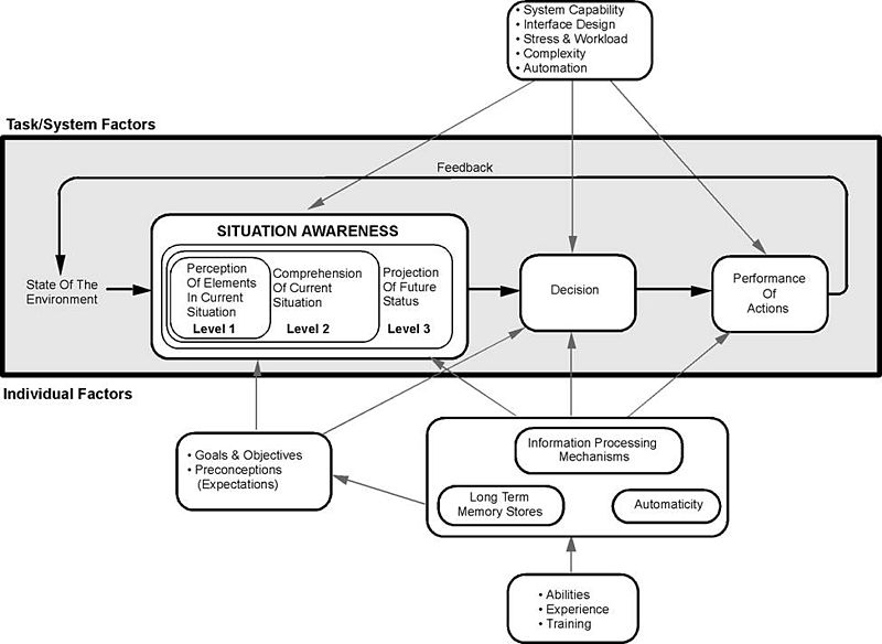
Endsley’s Model espouses a good perception of the elements in the current situation, a comprehension of that situation, and an understanding of the future status. All of these factors: enable you to make a decision as to the interaction; perform these interactions that then alter the state of the environment – in this case the interface or the interaction; which then affects the perception of elements… so on. We can see that this kind of view is directly related to good usability. Understanding the interface and its abilities are all part of the perception of interface elements, a comprehension of the current interactive situation including your location in the interaction. This is known as the user orientation or ‘where-ness’ (detecting cyclic behaviour, direction and distance) and is important in interface design as it enables users to navigate with some degree of accuracy. The environment, however, must be updated such that cues are provided in an appropriate manner, giving explicit orientation information such that navigational information can be detected. The similarities between real-world movement and that surrounding the interface suggest that the provision of some form of explicit and appropriate orientation method are an advantage when navigating the interface. This would mean that a user can make a choice as to whether they want to be at the current location and if not aid them in deciding how to navigate best to their perceived destination. Finally, situational awareness rests upon our ability to predict our future status (this may be including familiarity as well as an understanding of how the system works). As an example, think of the last time you completed a credit card transaction or order from the likes of ‘Amazon’. In this case, you are led through a sequence of events; each step is given in graphical overview at the top of the page, and as each step is accomplished so the colour is changed to highlight a stage has been satisfactorily completed (see Figure: Amazon Check Out). This is all about enhancing your situation awareness by providing you with a stepwise overview of the current situation and an understanding of what will happen in the future.

Questions to think about as you design your prototype:
- Does your system facilitate orientation both within the interface and within the interaction?
- Is orientation and navigation, around and through the interface (and interaction), easy?
- Is error handling simple? Is feedback informative?
- Are all components, needed for the interaction, visible?
- Do you maintain a single focus of interactive attention, without distractors?
By understanding and following these simple design principles any software developer can begin to create user-centric applications that will be implicitly friendly to users. By applying these principles through requirements elicitation, analysis, user modelling, and interface development, user facing components can be enhanced, and best practice can be implicitly included within the development.
Remember… these are just the next ten of our total principles - for the next batch you can skip ahead). But just because you can, maybe you shouldn’t… take your time to read the rest!
11.6 Summary
We can see that designing and building usable and efficient interfaces are by no means a trivial task. Even with the wealth of toolkits and accessibility API’s currently available the software engineer and UX specialist should not underestimate the amount of work and testing required for a comprehensive interactive development. Fortunately, there are a number principles to assist in this process, as well as the basic elements of the graphical user interface which can be assembled into a form that directly supports usability.
Some researchers see the ubiquity of the graphical user interface as being detrimental to the HCI field in general. They claim that focusing only on this kind of interaction means that there has been no novel work undertaken in the HCI domain since the heady days of Parc Xerox. I have some sympathy for this view but in reality, it is not completely correct. With the development of gesture-based interfaces and the upcoming use of haptics, the interactive elements of interface design are alive and well. I would agree, however, that the interactive displays used in these systems are stagnating to some degree. But in the context of development, building and designing interactive components that are tailored to the users need is difficult enough. By leveraging the principles already undertaken and the toolkits that provide well understood and consistent components and metaphors the software engineer can be reasonably assured that the interface design will be very familiar to the user and in this way assist usability in a practical manner.
Before we finish, a word of warning – as always from Dix – who suggests we may often ignore our fields previous work and start to reinvent the wheel:
“When one builds the justification of why something should work, the argument will not be watertight in the way that a mathematical argument can be. The data on which we build our justification has been obtained under particular circumstances that may be different from our own, we may be bringing things together in new ways and making uncertain extrapolations or deductions. Some parts of our argument may be strong, and we would be very surprised if actual use showed otherwise, but some parts of the argument may involve more uncertain data, a greater degree of extrapolation or even pure guesswork.
These weaker parts of the argument are the ideal candidates for focusing our efforts in an evaluation. Why waste effort on the things we know anyway; instead use those precious empirical resources (our own time and that of our participants) to examine the things we understand least well. This was precisely the approach taken by the designers of the Xerox Star. There were many design decisions, too many to test individually, let alone in combinations. Only when aspects of the design were problematic, or unclear, did they perform targeted user studies. One example of this was the direction of scroll buttons: should pressing the ‘up’ button make the text go up (moving the page), or the text go down (moving the view)?
If there were only one interpretation it would not be a problem, but because there was not a clear justification this was one of the places where the Star team did empirical evaluation… it is a pity that the wrong answer was used in subsequent Apple Lisa design and carried forward to this day.” (see Figure: Scrollbar Miss-Design).
Indeed, in conversations with David Smith at CHI98 Dix described how in the first version of the design documents for the Star
“the scrollbar arrows pointed outwards as they do in modern interfaces. However, unsure of the correct orientation, the Star design team performed user studies with both orientations. Whereas the software designers were quite happy with the outwards form, the non-computing users were uniformly confused by this direction of arrows. Hence the inwards pointing arrows were adopted for the final Star design.
Unfortunately when the Star design documents were passed on to the later design teams for the Lisa and Macintosh, the initial, wrong version of the scrollbar designs was used! Hence, we came by our current scrollbar arrow direction by accident, and it is precisely the opposite of what was found to be easy to use” 33.
11.6.1 Optional Further Reading / Resources
- [S. K. Card,] T. P. Moran, and A. Newell. The psychology of human-computer interaction. L. Erlbaum Associates, Hillsdale, N.J., 1983.
- [J. Johnson.] GUI bloopers 2.0: common user interface design don’ts and dos. Elsevier/Morgan Kaufmann Publishers, Amsterdam, updated and rev., edition, 2008.
- [S. Mestel] How bad ballot design can sway the result of an election. The Guardian. (2019, November 19). Retrieved August 10, 2022, from https://www.theguardian.com/us-news/2019/nov/19/bad-ballot-design-2020-democracy-america
- [J. Nielsen.] Usability engineering. Academic Press, Boston, 1993.
- [H. Sharp,] Y. Rogers, and J. Preece. Interaction design: beyond human-computer interaction. Wiley, Chichester, 2nd ed edition, 2007.
- [B. Shneiderman] and C. Plaisant. Designing the user interface: strategies for effective human-computer interaction. Addison-Wesley, Boston, 5th ed edition, 2010.
11.6.2 International Standards
- [ISO/TR 9241-100:2011.] Ergonomics of human-system interaction – part 100: Introduction to standards related to software ergonomics. TC/SC: TC 159/SC 4 ICS 13.180; 35.180, International Organisation for Standardisation (ISO), Geneva, Switzerland, 2011.
- [ISO/TR 9241-110:2006.] Ergonomics of human-system interaction – part 110: Dialogue principles. TC/SC: TC 159/SC 4 ICS 13.180, International Organisation for Standardisation (ISO), Geneva, Switzerland, 2006.
12. Principles of Affective Experience (Emotion)
If you want a golden rule that will fit everybody, this is it: have nothing in your house that you do not know to be useful, or believe to be beautiful.
– Donald A. Norman
Affective34 use, or emotional35 use/design, both mean the same thing, and, in reality, we are going to be using both terms interchangeably. However, you should be thinking of emotional use in more specific terms; a more specialised term of affective use. This is because the concept of emotional design is much broader than we need to address at the interface / interactive level. What we are trying to get to is ‘emotional engagement’ and to begin with, let me ask you a question…
What makes a person display a bumper (or fender) sticker on their car, which espouses their love for Microsoft’s new Metro User Interface (see Figure: Metro Bumper Sticker)?

Indeed, we might ask a further question, ‘what is it that makes the Microsoft Metro User Interface an example of good design?’ (see Figure: Microsoft’s Metro UI, and as applied to a Windows 7 Mobile Phone – Figure: Metro on a Windows Phone). It is this concept of goodness that is more difficult to explain especially concerning technologists who see goodness as effective and efficient; both readily measurable, and tangible.
Microsoft tells us that: “The Metro design language was designed specifically to consolidate groups of common tasks to speed up usage. This is accomplished by excluding superfluous graphics and instead relying on the actual content to also function as the main UI. The resulting interfaces favour larger hubs over smaller buttons and often feature laterally scrolling full bleed canvases. Page titles are usually large and consequently, also take advantage of lateral scrolling. Animation plays a large part, with transitions, and user interactions such as presses or swipes recommended always to be acknowledged by some form of natural animation or motion. This is intended to give the user the impression that the UI is ‘alive’ and responsive, with ‘an added sense of depth’.”
When I first saw the Metro interface I immediately loved it; it was clean, clear, stylish and with just enough elegance for me to perceive that using it would be a pleasant interactive experience. But this isn’t the case of everyone:
“If the Windows environment comes to revolve around a kiddish interface with big colourful buttons that are limited to only presenting content to the user, I can imagine the whole Vista mess repeating itself all over with a huge lack of essential developer support and mocked in Apple advertisement’s” or “Man oh man, it is days like this when I miss the simplicity of DOS.” —Various Forums
And here lies the problem with designing for collective emotional experience, it is certainly not readily applicable to all users. Indeed, when we address easily quantifiable aspects such as usability or accessibility we get very consistent results, with affective computing, this is not necessarily the case. We see far more individualistic results, far more outliers, and far more variance within the data that we gather. In this case, you might be wondering why affective use is so important if it isn’t quantifiable. There are three reasons, firstly, attractive things work better, their attractiveness produces positive emotions that cause mental processes to be more creative and more tolerant of minor difficulties or faults; secondly, emotional attachment is natural to us as humans, and I would venture, initially much more powerful than an efficient experience (the often quoted ‘function follows form’ is still applicable because the people who subscribe to this view, see function as an aesthetic quality); finally, just because something is not easily quantifiable doesn’t mean to say that we cannot try to understand it, or that it is not of any use or significance to us in the UX domain.
12.1 Visceral, Behavioural, and Reflective
In his book, ‘Emotional Design’ [Norman, 2004], Donald A. Norman proposes three levels (or dimensions) when designing with emotional response in mind, these are:
- Visceral: is equated with appearance, and ties into how we have evolved within our environment, which drives our perceptions of aesthetic and pleasure at an internal and unconscious level;
- Behavioural: relates to the pleasure and effectiveness of use, we have seen this previously, however, Norman contends that there is pleasure in efficiency (we’re back to form following function again); and
- Reflective: is more complicated and coupled with self-image, personal satisfaction, and memories, it is about the message, culture, and the meaning of a product.
To us the most important is visceral and the reflective; we might think of this as determining if the interface looks ‘cool’ and if we have an overall positive impression. Indeed, reflective design is all about determining this overall impression of the product – in our case the interface; thinking back to the interface, reflecting upon its total appeal including the experience of using it. Many factors come into play and the weaknesses in one aspect can be outweighed by the strengths in another. Minor difficulties might be overlooked in the overall assessment, or blown out of all proportion. The overall impact of a product comes with reflection, retrospective memory, and reassessment.
Norman touches on many aspects of design, and indeed, he is not focused specifically on software engineering, software artefacts, or the user interface. However, some of his thoughts and concepts are universally applicable and this is one reason ‘emotional design’, more than his other books, has influenced the user experience domain.
Norman also has something to say about design by committee; which we have come across before). This can be summarised as ‘appropriate use’, in that Norman is a proponent of user centred design by which he believes behavioural aspects of the product can be tested with many users – iteratively refined over many users and evaluation. However, he also agrees with Henry Lieberman regarding the design of a visceral or reflective experience by committee:
”The brilliant conceptual artist Vitaly Komar and Alex Melamaid conducted surveys asking people questions like, what’s your favourite colour? Then they produced exhibitions of perfectly ‘user centred art.’ The results were profoundly disturbing.
The works were completely lacking in innovation or finesse of craftsmanship, disliked even by the very same survey respondents. Good art is not an optimal point in a multi-dimensional space; that was, of course, their point. Perfectly ‘user-centred design’ would be disturbing as well precisely because it would like that artistry.”
Norman espouses user centred design for behavioural aspects only and feels that a single cohesive individual vision is required for emotional design based on visceral and reflective outcomes. This ties in with Lieberman in that removing behavioural from the truly emotional aspects of the design means that the entire design is not ‘perfectly’ user centred.
In this chapter more than any other, I would not advise a user-centred approach to the design of the affective user experience. This should be an individual vision, as the UX’er, it is your job to select the best person to fulfil that vision based on your clients brief; and this is best done individually, without a committee.
Finally, Norman seems to come to a conclusion that we are all designers, from the personalisations we make to our houses, to the cars we drive chosen as representations of a personality, even down to the way we organise our desks – these are all design issues. Norman logically concludes that personalisation and customisation are key aspects of the emotional design process, mainly because we are all predisposed to make these personalisations ourselves anyway. This is how we become more emotionally attached to the item; by modification. Only in this way can we move from emotional design and affective use to the much more important emotional value.
Norman suggests that it is impossible to build a mass produce item that fits every individual precisely. But that there are five ways to deal with this problem: the first is just to live with a personalised item; the second is to customise, the third is to customise mass production items, the fourth is to design our products, and the fifth is to modify purchased products. Either way, it seems that Norman suggests the value of emotional design can be captured in its ability to tailor itself to you viscerally, behaviourally and reflectively.
Norman opens and closes his book with a quote from William Morris: “If you want a golden rule that will fit everybody, this is it: have nothing in your house that you do not know to be useful, or believe to be beautiful.”
We’ve looked at what it means to be useful, now let us look at what it means to be beautiful.
12.1.1 Beauty
The visual appearance of interactive systems tends to convey more information than we imagine [Fishwick, 2006]. Contact points that users first make to perceive such a system affect the rest of the interaction process. Studies show that distinct layout, smart captions and interesting pictures can transform a wall of dry text into a presentation that users will approach enthusiastically. In this way, two components of visual beauty, visual complexity and visual aesthetics, are so closely related that it is necessary to discuss both.
12.1.2 Visual Complexity
Complexity can be defined as ‘the degree of difficulty in providing a verbal description of an image’ (how easy is it to describe Figure: Windows Phone 7.5?). Textures with repetitive and uniform oriented patterns are less complex than disorganised ones. A visual pattern is also described as complex if its parts are difficult to identify and separate from each other. Perception of image complexity depends on the extent to which objects are grouped, the quantity of the parts an observer perceives in the scene, familiarity with the scene and existing knowledge of objects inside the scene. Visual complexity is mainly represented by the perceptual dimensions of quantity of objects, clutter, openness, symmetry, organisation, and variety of colour. Studies also report a positive relation between visual complexity with the computer-generated bitmap size that is measured by its compressed file size as well as with the emotional and psychophysiological effect of the image. Besides, Tuch et al. demonstrate that the visual complexity of websites has multiple effects on human cognition and emotion, including experienced pleasure and arousal, facial expression, autonomic nervous system activation, task performance, and memory.

Further, visual perception is affected by cognition, content and form. Human cognition affects how a user retrieves and uses information in an interface. Content, interface components, and the amount of information that is available affect complexity since they can cause information overload. The form of the interaction on the user interface, navigation, and structure is a further factor that affects complexity. Indeed, studies try to identify interface design metrics that predict whether an interface is highly rated concerning complexity. These studies relate design guidelines with complexity explaining that the way an interface is presented depends on the way the interface itself is designed and what elements (metrics) are used. Others propose cognition, content and form as the three major factors that impact the complexity of an interface.
Concerning the Web, Ivory et al. perform a quantitative analysis of Web page attributes (e.g. number of fonts, images, and words) using a large collection of sites. These sites were judged based on content, structure and navigation, visual design, functionality, interactivity, and overall experience and were selected from categories such as financial, educational, community, health, service and living. They found that ‘Web pages and sites differ from each other on many dimensions, such as layout quality, screen coverage and information quality’. In the same study, metrics concerning page composition, such as word and link count, page formatting, such as emphasised text and text positioning along with overall page characteristics, such as page size, help to predict (with 63% accuracy) whether a page can be ordered similar to that of human judges. Using the first study and the same characteristics of the page-level elements, they developed profiles of the Web pages based on the overall ratings that distinguished between good and bad pages about design and usability.
These studies were part of a project that tried to develop techniques to investigate empirically all aspects of Web site design but did not attempt to define and investigate visual complexity. However, I would suggest that the visual complexity of an interface depends on the presentation of the interface’s components and by the density and diversity of the components that are presented, and that these aspects also overlap with visual aesthetics.
12.1.3 Visual Aesthetics and Design
Aesthetics is commonly defined as the appreciation of the beautiful or pleasing but the terminology is still controversial [Lavie and Tractinsky, 2004]. Visual aesthetics is ‘the science of how things are known via the senses’ which refers to user perception and cognition. Current findings suggest that good visual aesthetics enhances positive feelings toward applications. Several studies have established that aesthetic opinions about interfaces are formed quite quickly, and do not wane immediately; this suggests that aesthetic considerations should be seen as an important aspect of any application life cycle.
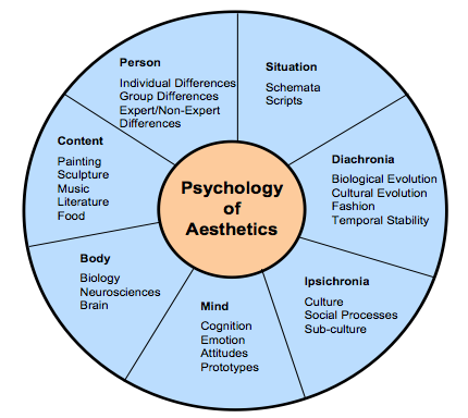
Since several factors influence aesthetic preference, Jacobsen argues for a multi-disciplinary approach to the study of aesthetic preference in experimental psychology. He proposes a seven-fold framework that incorporates these different perspectives to understand how aesthetic opinions are processed. These different facets may also inter-relate (see Figure: Jacobsen’s Framework for Psychology of Aesthetics), and include:
- Diachronia: Aesthetic preferences may change with time;
- Ipsichronia: Social/cultural processes may shape a person’s aesthetic opinions;
- Mind: An individual’s mental model of the visual stimulus or emotions could influence aesthetic judgements;
- Body: Brain activities could affect aesthetic evaluation processes;
- Content: The stimulus being evaluated could influence aesthetic processing;
- Person: The evaluator’s background may play a role in aesthetic preference; and
- Situation: The surrounding circumstances (this includes time and place) could influence aesthetic choices.
Empirical studies on visual aesthetics have followed one of two directions. There are those studies that have concentrated on replicating experiments to validate visual aesthetic theories. In such studies, interfaces are used as visual stimuli in place of works of art and geometrical shapes which served as test beds in the early days of experimental aesthetics. One popular aesthetic theory that has been investigated is Berlyne’s arousal theory. Berlyne’s theory holds that people love to experience aesthetic pleasure at moderate levels. There are also studies that have focused more on investigating the relationship between visual aesthetics and different aspects of user experience. Some of the aspects of user experience investigated so far include usability, credibility, desirability, complexity and accessibility.
The use of visual aesthetics can alter the perceptions of the viewer by manipulating visual components such as colours, text style and size, images and animations. In this way, the user is unknowingly or unconsciously involved with the message of the software artefact. The visual appeal of an interface can be assessed within 50 milliseconds in which time users make their impression about the software. Studies, have established that a positive relationship exists between visual aesthetics and usability when beautiful interfaces were perceived to be easier to use (as we have discussed in the introduction). Users’ judgement about software credibility is also shown to be formed within the first few seconds where an interface with high aesthetic treatment was judged as having higher credibility. The consistency of these aesthetic impressions were evaluated and it was established that these impressions did not wane immediately. That is, an interface that was perceived to be visually pleasing at first exposure, continued to remain attractive to the user for longer durations of exposure.
Visual clarity and richness were shown to be two of the most important aesthetic dimensions that strongly influence software users. Visual clarity refers to ‘classical’ aesthetic qualities pointing to clean, clear, and symmetric designs. Visual richness refers to ‘expressive’ aesthetics such as creativity, originality of the interface’s aspects and designers’ finesse and ability to ‘break design conventions’. Karvonen also reports a case where ‘design quality’ emerged as one of the six factors that enhanced ‘on-line trust’, suggesting that users would more readily transact with beautiful software.
12.2 Narrative Art and Visual Aesthetics
The purpose of art and design is to alter the perceptions of the viewer by manipulating visual components. The main way to accomplish this is to create a narrative that the work refers to, or a narrative that is created by moving in sequence through the visual components of the work. Narrative art, art that tells a story, can be found as far back as the Palaeolithic period. Palaeolithic peoples were nomadic hunters and gatherers who lived by sheltering in caves, using fire, and fashioning stone tools. By the Upper Palaeolithic, there is evidence of communal hunting, constructed shelters, and belief systems centring on magic and the supernatural. Palaeolithic Art, produced from about 32,000 to 11,000 years ago, falls into two main categories: Portable Pieces (small figurines or decorated components carved out of bone, stone, or modelled in clay), and Cave Art; reaching their peak in the Magdalenian culture of Cro-Magnon man. Of the cave art currently discovered a majority seems to have narrative features such as the examples at Chauvet, Altamira, Pech Merle, and Lascaux. These narratives depict spiritual and ritualistic activities, hunting and mapping (see Figure: Hunters with Elephants), and animals of veneration. In these cases, the artist is conveying a narrative to the observer, which may be centred on aspects such as good hunting grounds, what animals the observer can expect to find, the kind of predators that are in the area, and the spiritual nature, and offerings required, for good luck. The sequence of the visual components which form the overall narrative is as important, or more important, than the aesthetic alone.

Most art, especial Western art is narrative in nature, depicting stories from religion, myth and legend, history and literature; with audiences being assumed to be familiar with the stories in question. In modern art, however, formalist ideas have resulted in narrative being frowned upon. However, the visual narrative is still present in the coded references to political or social issues, or to events in the artist’s life. Such works are effectively modern allegories, and require information about the artist to be fully understood. This can be clearly seen in Figure: St. Simon’s Church; in which the artist takes the observer through a sequence of visual components which raise questions as the story is ‘built’. In this case, the observer is first directed to the church (central, large, imposing) then by the placement / framing of the small slivers of buildings to the left and right, down the street to the right and out into the landscape. The observer then focuses on the smaller detail including the people in the front of the picture moving back (again down the street to the right). Indeed, the placement of the people, lamp-post, and street orientation draws a diagonal line from bottom left to mid right along which the eye follows, and by which the visual narrative is conveyed; this also means that the figure at far-mid-left is ‘hidden’.
The principles of the visual narrative are all captured and used by the graphic, and specifically the UX designer. Trained in the visual medium, and the core principles contained within this medium, designers use colour, text style and size, images and animations to alter the perceptions of the viewer taking them on a narrative journey through an interface. In this way the user is unknowingly or unconsciously involved with the message of the software artefact, ergo the narrative, via serialisation of the visual components. In the visual aesthetics survey of Hoffman and Krauss, the authors point to studies that try to determine user’s perceptions of the aesthetic qualities of interfaces. These studies showed that visual clarity (clean, clear, and symmetric designs) and visual richness (creativity and originality) are two of the most important aesthetic dimensions. Both are important to users in unconsciously understanding the visual narrative.

We can see that the affective component of the user experience is to some extent determined by the arrangement of elements or details. It is the ‘creative art of executing aesthetic or functional design and it is clear that both interface and interaction design can either facilitate or impede a user through the available functionality.
12.3 Visual Attention
As we have seen, interface design is determined by the arrangement of elements or details on the canvas that can either facilitate or impede a user through the available functionality. This is because the amount of information on the canvas that reaches our eyes is far greater than our brain can process, and it is for this reason that visual attention is key to good design. Selective visual attention is a complex action composed of conscious and subconscious processes in the brain that are used to find and focus on relevant information quickly and efficiently. There are two general visual attention processes, bottom-up and top-down, which determine where humans next locate their attention.
Bottom-up models of visual attention suggest that low-level salient features, such as contrast, size, shape, colour, and brightness correlate well with visual interest. For example, a red apple (a source of nutrition) is more visually salient, and, therefore, attractive, than the green leaves surrounding it. Top-down models, on the other hand, explain visual search driven by semantics, or knowledge about the environment: when asked to describe the emotion of a person in a picture, for instance, people will automatically look to the person’s face.
Both forms of visual attention inevitably play a part in helping people to orientate, navigate and understand interfaces. Bottom-up processing allows people to detect quickly items such as bold text and images, which help to explain how the content is organised. It also helps people to group the information into ‘sections’, such as blocks of text, headings, and menus. Top-down processing enables people to interpret the information using prior knowledge and heuristics.
It can be seen from eye-tracking studies that users focus attention sequentially on different parts of the page, and that computational models have been successfully employed in computer graphics to segment images into regions that the user is most likely to focus upon. These models are based upon a knowledge of human visual behaviour and an understanding of the image in question. Indeed, studies exist which record user’s eye movements during specific browsing tasks, to find out those features on a Web-page that were visited, in which order and where ‘gaze hotspots’ were found. In these data we can see an association between the interface components and eye-gaze, but not one as simple as ‘the user looked at the most visually obvious interface features’. Indeed, sometimes a headline next to an attention grabbing feature, such as an image, was fixated upon. However, we can deduce that, for instance, the information in some text may not itself draw a users attention but ideally has some feature nearby which do. This idea is supported by other studies that try to create interface design metrics that predict whether a site is visually complex or not. These studies relate to interface design with complexity explaining that the way an interface is perceived depends on the way the interface itself is designed and what components are used.
By our understanding of visual attention, we can see that there are levels of granularity associated with visual design. This granularity allows us to understand a large visual rendering by segmentation into smaller more manageable pieces; components of components. Our attention moves between these components based on how our visual attention relates to them, and it is this knowledge of visual attention, captured as design best practice, which allows designers to build interfaces that users find interesting and easy to access. The serial narrative the designer builds for the observer is implicitly created by the visual appearance (and, therefore, attraction) of each visual component (dovetailing into our understanding of attention).
12.4 Collated Affective Concepts and Touch-points
As with other collated material, the first thing to notice about affective concepts is that there are many of them and many different ones are proposed in many different sources. However there are differences from usability principles, in that these are concepts and not principles - mainly because most work still sits in the psychology literature and not the nascent user experience domain. Indeed, this is why I’m calling them concepts (at this point) and not principles - it would be difficult to build testable principles from the concepts listed in ‘Table: Collated Affective Concepts’ without some additional processing. And therein lays the issue, for the most part, the concepts coming up (even when I turn them into principles) are not likely to be directly testable – in fact, it is accepted within the domain that we probably won’t be able to check that a principle is present, but we may be able to check that the expected affect is absent.
As with ‘Table: Collated Usability Principles’, you will notice in ‘Table: Collated Affective Concepts’ that the left column describes the concept (these are sometimes used interchangeably between the different authors)36; while on the right side the authors are listed along with a footnote pointing to the text from which the concept is derived. In collating these concepts, I have not followed slavishly the nomenclature proposed by each author but have instead placed them in categories that I believe have the same conceptual value even if the naming of that concept does not follow that in the source.
Table: Collated Affective Concepts. Affective Concepts Collated by Source.
| Concepts | Appears in Source |
|---|---|
| Aesthetic | Sharp, Rogers and Preece37; Nielsen38; Norman39. |
| Emotionally Fulfilling | Sharp, Rogers and Preece; Khaslavsky & Shedroff40. |
| Enjoyable | Sharp, Rogers and Preece. |
| Entertaining | Sharp, Rogers and Preece. |
| Enticing | Khaslavsky & Shedroff. |
| Facilitate Touch-points | Reeves & Nass41; Fogg42; Jordan43. |
| Flow (Enhance) | Csikszentmihalyi44. |
| Form Relationship | Khaslavsky & Shedroff. |
| Fun | Sharp, Rogers and Preece; Norman. |
| Helpful | Sharp, Rogers and Preece. |
| Memory (Evocation) | Norman. |
| Minimalist Design | Nielsen. |
| Motivating | Sharp, Rogers and Preece. |
| Personalisation & Customisation | Norman. |
| Pleasing | Jordan; Norman. |
| Rewarding | Sharp, Rogers and Preece. |
| Satisfying | Sharp, Rogers and Preece; Norman. |
| Self-Image | Norman. |
| Supports Creativity | Sharp, Rogers and Preece. |
You’ll also notice that I mention ‘Touch-points’ in Table: Collated Affective Concepts, and by these I mean various human traits you should be aware of when designing for emotional experience. These considerations mainly focus on the kinds of pleasure or dynamics we need to induce in the human for successful emotional engagement. Jordan [Jordan, 2003] (and to some extent Norman [Norman, 1988] – who also provides a nice interpretation) see these as:
- Physio-Pleasure: Anything perceptible by the senses - and includes movement – for UX the main points here are visual appearance and auditory output - maybe haptics at the very edge of development;
- Socio-Pleasure: Good interaction with other – again for UX this can be translated into the software domain, we are more engaged if we can good clear and worthwhile communication;
- Psycho-Pleasure: Reactions to the system, how it interacts with the user and how the user feels about those interactions; and
- Ideo-Pleasure: How does the user see the software and their interaction with it. How do they perceive the interface and how does that feed into their self-image and positive memories.
Further, Khaslavsky and Shedroff [Khaslavsky and Shedroff, 1999] tell us that: “The seductive power of the design of certain material and virtual objects can transcend issues of price and performance the buyers and users alike. Too many an engineer’s dismay, the appearance of a product can sometimes make or break the product’s market reaction. What they have in common is the ability to create an emotional bond with their audience…” and come up with:
- Enticement: The interface should be enticing before any interaction even commences – there is a food related quote that we ‘eat with our eyes before our mouth’ – this is the same but for the user experience – we perceive a quality interactive experience before we embark on it;
- Relationship: We envisage a relationship, both before it occurs, and then while it is forming; and
- Fulfilment: Are our expectations fulfilled, if not then we have a problem at the UX level as an unfulfilled implied promise can often create more negative memories than the same bad experience but without the enticement.
Finally, Fogg [Fogg, 2003] elaborates on Reeves and Nass [Reeves and Nass, 1996], by suggesting five primary social Touch-points that people use to infer sociability with a device with which they are interacting:
- Physical: Again, perceptible by the senses - and again includes movement;
- Physiological: Personal feelings, emotions, and thoughts;
- Language: Spoken and written language;
- Social Dynamics: Cooperation, turn taking, collaborative activity; and
- Social Roles: The type of role, our authority, the interaction is occurring with – gives context to the interaction.
We can see that there are plenty of overlaps here, which you should be aware of. Now, as previously, I’m going to discard some of these concepts and touch-points because I think they are very niche because I don’t agree with them, because I don’t think they are helpful, or because there seems to be little consensus.
- First I’m combining ‘Enjoyable’ and ‘Entertaining’ and addressing those later.
- Now I think that ‘Forming Relationships’ is a great idea but I think to move this into a tangle principle, as is just too ambiguous.
- ‘Fun’, well we all like to have fun but I think this belongs in the next chapter.
- I think we have already covered ‘Helpful’.
- Again, ‘Memory (Evocation)’ has been covered.
- Next I’m removing ‘Motivating’ as this is a part of ‘gamification’ (Don’t Panic – we’ll look at this later).
- ‘Personalisation’ and ‘Customisation’ has been extensively covered.
- ‘Self-Image’ is a deep concept and asking the software to enhance self-image is just a little too much.
- Finally, ‘Supports Creativity’ is not generally applicable - not all software should do this and it is not appropriate in most situations.
Now the ‘carnage’ is over, let’s look at the concepts and touch-points that will stay and be amalgamated:
- ‘Pleasing’ + ‘Enticing’. Ensure that the system is pleasing and enticing, not just concerning the usability of the experience but concerning how the user anticipates and enjoys the system from an emotional standpoint.
- ‘Flow’ [Csikszentmihalyi, 1990]] + ‘Facilitate Touch-points’. The flow and touch-points seem related in that touch-points in some way define the direction of the flow. In this case, we should plan to enhance the interactive flow to increase positive emotional responses.
- ‘Aesthetic’ + ‘Minimalist Design’. Both are related with minimalism being the servant of aesthetics. In this case, we need to make sure the design is aesthetically pleasing with a reduction in complexity by adopting a minimalist design.
- Satisfying’ + ‘Rewarding’ + ‘Emotionally Fulfilling’. These three concepts all seem to be related to me. This means the interface, and its interactivity, should be satisfying and fulfilling - you should find your interactive experience to be rewarding at the end and after the interaction has finished.
Before we move on to turn these concepts and touch-points into principles (with a whole heap of caveats) lets first discuss ‘affective computing’, and then briefly discuss ‘trust’.
12.4.1 A Note on Affective Computing
In the future, you may come across the term ‘affective computing’, and begin to ask yourself what is its relationship to the user’s affective experience. ‘Affective computing’ is a term originally coined by Rosalind Picard at MIT in the mid-1990s and is used to describe a set of computing technologies that centre around: the detection of emotion, the ability for computers to express emotion, and in some cases the ability of computers to have emotions (in some form). You can see that this kind of emotional computation is very different from that of the emotional user experience we are studying. However, a part that is interesting to us is that centred around the detection of emotions.
As we shall see, this is because one of the only ways in which we can confirm emotional responses is by detecting them in the user. Simply, we can validate that our ‘effective’ principles are present and correctly captured in software because our users should be able to use the system. We can test our efficient principles are captured in software because we can measure task completion times. And we can test that our affective principles are captured in software if we can detect emotion. You’ll notice that I say ‘if’, as the detection of emotion is by no means trivial or absolute, and has still not moved fully into development or the practitioner domain. However, we will investigate two possibly useful emotion detection methods, being galvanic skin response (GSR), and facial expression recognition. It is unlikely that in real-world situations you will have access to GSR or facial expression recognition software. However, it is useful to understand these now because they may become more prevalent in the future.
In reality, it is far more likely that we will be able to understand if the user has had a positive emotional experience by looking for clues as to how they relate their experiences in a social setting (by using systems that allow social feedback such as ‘Star’ and ‘like’ ratings). However, in all cases, you should realise that you will not be able to test the presence of each principle individually. As an emotional response to a system is a combinatorial construct it will be difficult to say whether a minimal aesthetic design is more useful, or gives a more emotional response in your system, than say, our satisfying and rewarding concept. What you will be able to discover is if there is little, or negative, emotional response that will suggest that somewhere, one or more of these principles has not been correctly captured.
12.4.2 A Note on Trust
Trust is one additional aspect to consider when engaged in emotional design. You should realise that aesthetics defines how an interface looks and how it emotionally dovetails into a user’s concept of trust. This is very important for most user interfaces, especially web-based ones. In the world that seems to be becoming more untrustworthy and remote (about social connection), trustworthiness is a key concept and that concept can be reinforced by applying emotional design techniques to enhance the trust a user feels for a system.
Many empirical studies found that users’ perceived information obtained from a Website with good visual aesthetics to be more credible than that obtained from a Website with poor visual aesthetics, even if the two Websites in question had the same content. This was observed upon short exposure to the Websites. Consequently, Robins and Holmes argue that visual aesthetics is seen as an important aspect of interaction design as it plays more significant roles than a mere ‘decorative’ one.
Remember, trust is mainly formed as an emotion based on many imperceptible and intangible cues. Of course, trust can also be misplaced and indeed ‘social engineering’ is a technique used by unsavoury characters to explore to manipulate our trust for their gain.
12.5 Potted Principles of Affective User Experience
Understanding the affective user experience, and building systems that capture it is complicated, error-prone, and prone to misinterpretation. Emotion is all about subjectivity, and this subjectivity occurs temporally, culturally, and psychologically. Indeed, if we look back at responses from Law 2009 (see Table: Twenty-three Statements About UX) we see statements such as:
- Fleeting and more stable aspects of a person’s internal state (e.g.. needs. motivations) affect a person’s experience of something;
- UX occurs in, and is dependent on the context in which the artefact is experienced;
- Prior exposure to an artefact shapes subsequent UX;
- We cannot design UX, but we can design for UX;
- UX is highly dynamic – it constantly changes while interacting with a product;
- UX can change even after a person has stopped interacting with the artefact; and
- UX is based on how a person perceives the characteristics of an artefact, but not on the characteristics per se.
…all get a high-level of agreement from UX professionals. Further, if we look back at ‘Figure: Time Spans of User Experience’, we will notice that the user experience extends both before and after the actual usage, this allows a user to anticipate and reflect upon their user experience, and this is also significantly important in forming their desire to use that system, or return to using the system.
So when considering these upcoming principles you must remember: that their presence cannot be individually or directly tested; that you are far more likely to be able to understand if they are not present, than if they are present; they contain a number of subjective words (such as Good) which make them difficult to quantify; and the emotional experiences to which they relate are likely to be subjective, temporal, cultural, and based in the user’s own psychology.
One final thing to remember, the emotional responses recorded from users varies based on the task and how emotionally engaged in that task a user is. Performance increases with physiological or mental arousal, but only up to a point, when levels of arousal become too high, performance decreases (see Figure: Yerkes-Dodson Curve). So when I use the terms ‘good’, ‘reduce’, ‘maximise’, etc., what I mean is, dead centre of the ‘Hebbian version’ of the ‘Yerkes-Dodson’.
12.5.1 Facilitate Quality
Quality is always going to be a difficult principle to apply, or, at least, test for. As with most principles in this section, understanding whether quality is present, and how to include it within your interface design will mainly come with experience. It’s difficult to define quality, but often we know it when we see it.
I think that most people understand quality from their own perspective, they understand if they are rushing work or that their work is not performed to the kinds of standards they might apply in other situations. The intangibility of the concept of quality means that the only way of knowing if the quality is being applied is your feeling and perception as a trained UX specialist. If you feel you do not have the ability to assess the quality of the application of the various emotional principles in this section, then you should make sure your choices of the graphic designer, web designer, or product designer is good. Remember, you will not be on your own, but part of a team, you will mainly be interested in the overall architecture of the UX project but other team members who deal with graphics and design should also be present. Errors only normally occur in quality because it is intangible, and so its importance in creating emotional engagement is often overlooked.
Questions to think about as you design your prototype:
- Do you feel that the interface exhibits current best practice?
- Is the interface design fit-for-purpose for each stakeholder?
- Did the best people for each job work on the interface and it’s interactions?
- Is the underlaying code cleanly built?
- Has quality been maintained at every level?
12.5.2 Facilitate Aesthetics
We have already discussed, what it means, and the views of different experts around the subject. As we are already aware, there are no easy ways to understand aesthetics directly, or if the principle is captured as part of the design. Of course, it is testable in the long run because you can ask users survey questions to understand if they feel that the design is aesthetically pleasing or beautiful. Remember, an attractive interface has knock-on usability and efficiency benefits. This is because when we judge something to be aesthetically pleasing we are basing this judgement on our biological and cognitive evolution. Things that we judge to be aesthetic are pleasing precisely because we can use them more efficiently or easily. In this case, if you, or more likely your graphic designers, think that a website is aesthetically pleasing – because this is a shared concept, the interface is far more likely to be aesthetic as opposed to purely functional. As with quality, errors in applying this principle only mainly occur because a stakeholder (or a usability specialist) does not understand the importance of an aesthetically pleasing design.
Questions to think about as you design your prototype:
- Is the design beautiful?
- Does the design maximise enticement?
- Does the visual design reduce complexity and is the design, minimalist?
- Will the user perceive aesthetic quality?
- Is the design current and does it convey the desired ‘image’?
12.5.3 Facilitate Flow
Flow is a difficult concept to convey – and we’ll be looking at it in more detail – however, for this chapter, and in the context of the user experience, you should be striving to include some of the more ‘mechanical’ aspects of flow45 within your design. Flow is all about providing the user with an optimal experience that they will find rewarding. This is difficult to do at the principal level. However, there are some aspects that can help flow be achieved. Perhaps one of the most important is to encourage your users to participate in structured tasks that have clear goals and feedback, you should also cut down on the amount of extraneous information which is not part of the current flow activity so that the user can concentrate on the task at hand, and so that a users actions and their awareness of those actions become merged. These are difficult to accomplish, and it is, even more, difficult to understand if they are occurring. However, there are two ways in which you may be able to validate this principle in the future. The first is to see whether the user loses their self-consciousness when completing a flow task; the second, is to investigate if the users experience a transformation in time, such that their perception of their task completion time – which may have taken them five minutes – may actually be much less then reality – maybe only one minute or a few seconds.
Questions to think about as you design your prototype:
- Does the visual flow support the interactive flow?
- Do real world and virtual world touch-points drive the flow?
- Is there a defined beginning and end?
- Is there a narrative flow (people remember narratives better than instructions)?
- Is there an absence of cyclic or repetitious flow?
12.5.4 Facilitate Pleasantness
In my egocentric view, the principle of pleasure and enticement, occur as a prefix to, and as part of the main use of the interface or interaction. We derive pleasure from anticipating the experience and progressing through a good experience. In reality, the terms you use do not matter and here I’m using the terms pleasurable and enticing as a hat-rack to hang the assertion that you must make sure that a user’s anticipation and use of the system are emotionally satisfied.
Questions to think about as you design your prototype:
- Do you expect this design to fulfil and please the user?
- Will the expected emotions support positive anticipation?
- Will they be satisfied as they progress through the interactivity?
- Do you dovetail into their perceived satisfaction?
- If nothing else will, the emotional responses here be positive?
12.5.5 Facilitate Satisfaction
Again I use satisfying, fulfilling and rewarding as a hat-rack to convey the idea that at the end of the interaction we should feel rewarded from an accurate execution of that experience; and that on reflection we should feel satisfaction and fulfilment from that rewarding experience. If we look back, satisfaction and reward should occur.
Questions to think about as you design your prototype:
- Will the user find the interactions rewarding?
- Will the expected emotions support positive remembrances?
- Will the user remember a pleasing experience, if the system is work based?
- Are there any tangible rewards?
- Have you allowed them to register satisfaction (or not) by using, say, a ‘star’ rating?
Remember, these are just the next five of our total principles - for the next batch you can skip ahead. But just because you can, maybe you shouldn’t take your time to read the rest!
Caveat
‘Ling’s Cars’46 is a tricky site to pigeon hole into these principles (see Figure: Ling’s Cars). If our principles and rationale are correct - no-one should go to this site, and no-one should like it; but they do go to the site, and they do like it – much to the consternation of the user experience Illuminati.
Why is this and what makes Ling’s Cars a high traffic site – discounting people like me who are just there to look at the spectacle, or design – ‘car crash’, whichever phrase you prefer? There seems to be no real answer to this, the site itself breaks most of the principles of good design, usability, and accessibility. If I had to audit this site, I would imagine that most users would not want to interact with it, that most users would find it too complicated, and that most users would find it aesthetically displeasing. However, for some unknown reason, it seems to attract many users, who then go on to buy the cars Ling is selling, so what’s the reason? Well this is the main question that has been on the lips of most use UX people the world over, but there still seems to be little agreement.
I think that this site is all about Ling, to such an extent that the site has become a meme. This may be because it seems to be a window onto Ling’s personality, that you get the feeling that Ling is in control of everything (even if those things are bad) and that she is present – all the time – behind the scenes with her tweeting and forum updates. Further, you may think that in these times of present economic unrest, where trusted organisations have become untrustworthy, this personal touch seems very attractive. It may be due to the current situation, the current zeitgeist of its users, its egocentricity, it may be an outlier, the one in a thousand which proves the experts wrong, and succeed when it should not.
However, let’s consider this again, it’s egocentric, it has Ling’s presence, Ling is very much in control, it is her vision, and not that of a focus group, in short it has her personality. For good or for bad it has a personality, and that personality has more emotional value and emotional engagement, and then any of the other five principles listed above, this made me think there is one principle that is superior to the rest.

12.5.6 Facilitate Personality
This principle is the most superior in this section, possibly of all the principles listed in this text. If your interface can exude personality, such that it seems to be a meme – or an avatar – of who you are, a direct window into your personality, then this principle is superior to the rest.
If your interface has personality, good or bad aesthetics, quality, flow, satisfaction, or fulfilment are not important; I’d probably even go as far as saying that usability is not important either. Personality trumps all the rest because it is the only one that can give the user an emotionally valuable engagement with the software engineering artefact. There are no questions for this principle, if it has a personality you’ll know it!
12.6 Summary
As does Norman, let us finish with a quote: “If you want a golden rule that will fit everybody, this is it: have nothing in your house that you do not know to be useful, or believe to be beautiful.” Here, Morris ‘hits the mark’ we can know things to be useful, but we can only assert belief that a thing is beautiful. In our case, this relates to our set of affective principles and how they exhibit: Quality; Aesthetics; Flow; Pleasantness; Satisfaction; and Personality. Remember, building systems that capture emotional concepts, is complicated, error-prone, and prone to misinterpretation. Emotion is all about subjectivity, and this subjectivity occurs temporally, culturally, and psychologically. When you think of subjective terms such as ‘good’, ‘reduce’, ‘maximise’, etc., then you should recall the Yerkes-Dodson Law; in this case, what you should mean is, dead centre of the ‘Hebbian version’ of the ‘Yerkes-Dodson Curve’.
Also, remember that if you are unsure of how to proceed, choose good co-workers with more experience in the area that you are trying to address - such as illustration, or graphic design (i.e., ‘Creatives’) - but keep track that they conform to the brief.
Finally, even though personality is king, pleasing, attractive sites work better and are more usable because they reflect the biological origins of the brain. Pleasing interactions and attractive interfaces produce positive emotions causing mental processes to be more creative and more tolerant of minor difficulties and faults within the interface design or the interactive experience. In short attractiveness affects human behaviour that therefore makes it a critical component of the design and implementation of the user experience.
12.6.1 Optional Further Reading
- [M. Csikszentmihalyi.] Flow: the psychology of optimal experience. Harper & Row, New York, 1st ed edition, 1990.
- [P. A. Fishwick.] Aesthetic computing. Leonardo. MIT Press, Cambridge, Mass., 2006.
- [B. J. Fogg.] Persuasive technology: using computers to change what we think and do. Morgan Kaufmann Publishers, Amsterdam, 2003.
- [P. W. Jordan.] Designing pleasurable products: an introduction to the new human factors. Taylor & Francis e–Library, London, 2003.
- [D. A. Norman.] Emotional design: why we love (or hate) everyday things. Basic Books, New York, 2004.
- [B. Reeves] and C. I. Nass. The media equation: how people treat computers, television, and new media like real people and places. CSLI Publications, Stanford, Calif., 1996.
- [A Miniukovich] and A De Angeli. “Computation of Interface Aesthetics.” Proceedings of the 33rd Annual ACM Conference on Human Factors in Computing Systems, 2015. doi:10.1145/2702123.2702575.
13. Principles of Engagement (Digital Umami)
Play has been seen as one of the most important and fundamentally human of activities.
– Johan Huizinga
I intended to call this chapter ‘Digital Umami’47 to convey the concept of something that is imperceptibly delicious. However, after much more reading over the years I decided on ‘Dynamics’ in part from Fogg’s [Fogg, 2003] – elaboration on Reeves and Nass [Reeves and Nass, 1996] – Social Dynamics. But then just last year I realised it should be called ‘Engagement’ and so here we are. The topics we will be looking at here focus on fun, enjoyment, cooperation, collaborative activities, and what has come to be known as ‘gamification’.
Gamification is causing a degree of controversy at the moment, but what is it? Well, Wikipedia tells us that: “The use of game play mechanics for non-game applications… particularly consumer-oriented web and mobile sites, to encourage people to adopt the applications. It also strives to encourage users to engage in desired behaviours in connection with the applications. Gamification works by making technology more engaging, and by encouraging desired behaviours, taking advantage of humans’ psychological predisposition to engage in gaming.
The UX camp, though, is split on its value. Pro-Gamification proponents argue “As the critics point out, some gamified products are just poorly executed. Just because you saw something in a game once doesn’t mean it’ll be fun in your product. But I think that most of the critics of gamification fail to take into account the wide range of execution that’s possible. Gamification can be applied as a superficial afterthought, or as a useful or even fundamental integration.” 48
While critics say: “More specifically, gamification is… invented by consultants as a means to capture the wild, coveted beast that is videogames and to domesticate it for use in the grey, hopeless wasteland of big business… The rhetorical power of the word ‘gamification’ is enormous, and it does precisely what the ‘they’ want: it takes games – a mysterious, magical, powerful medium that has captured the attention of millions of people – and it makes them accessible in the context of contemporary business… Gamification is reassuring. It gives Vice Presidents and Brand Managers comfort: they’re doing everything right, and they can do even better by adding ‘a games strategy’ to their existing products, slathering on ‘gaminess’ like aioli on ciabatta at the consultant’s indulgent sales lunch.” 49.
For a moment, however, let’s just forget all the buzzwords and concentrate on the real concepts that underpin the ideas of ‘gamification’, ‘funology’, and ‘social dynamics’. The key concepts [Anderson, 2011], as I see them, relate to a level of interaction beyond that which would normally be expected from standard interfaces and applications. This additional level may involve collaborations and partnerships with others, competitions, or the pursuit of a tangible prize or reward. But in all cases, a premium this placed upon the enjoyment, fun, and enhanced interactivity; in short ‘engagement’50. What’s more, I would also refer to my original thoughts on the subject – there is a certain added ‘deliciousness’, which seems to be imperceptible; as with Affective,’You’ll know it when you see it’.
13.1 Group Dynamics
Dynamics are discussed variously as ‘Social Dynamics’ [Fogg, 2003], ‘Social Roles’ [Reeves and Nass, 1996], ‘Socio-Pleasure’ [Jordan, 2003], ‘Social Animals’ [Weinschenk, 2011], and ‘Playful Seduction’ [Anderson, 2011]; I’m sure you’ll be able to find plenty more. However you conceive it, group dynamics is trying to ‘firm up’ quite a tricky and ill-defined concept – that of social interaction with other users, or via a more humanistic, naturalistic, or conversational interface. The idea is that adding the energy that is often found in human interactions, to our interactions with the application, will propel us into having better user experiences because they are closer to our expectations of person-to-person interactions.
These more naturalistic interactions are based on our knowledge of human psyche and the human condition (one nice example is the Microsoft Courier Tablet – a prototype – see Figure: Microsoft Courier Imitating a Real World Notebook). We know that in most cases humans are socially motivated and live in groups with a strong tie to people in collaborative situations. Indeed, performing tasks in groups bonds humans to each other, as well as the group; in this case, there is an increased emotional benefit as people are comfortable feeling part of the whole. Further, we also know that people are likely to imitate and to empathise behaviour and body language; and our brains respond differently to people we know personally or don’t know, and situations we know and don’t know. It seems only appropriate then that we should work better in social situations where the interface can imitate some of these social niceties, or we can perform interactive tasks as part of the group, or interactions that make us feel like part of a group. Indeed, people expect online interactions to follow social rules, this is logical in some regard because the application software has been created by a human (who was also following a set of social rules).
Hierarchies often form as part of the social interactions for these groups, and so in the interactive environment, we need to decide whether we feel that the computer is a subservient to the user. Or whether the computer is a master and should be an autonomous guide with the user only consuming information with no regard as to how it was generated. However, from teammate research, the relationship seems to be one that should be a peer relationship. Certainly by creating a peer relationship we get the best of both worlds in that the computer can do much of the work we would not like to do ourselves while also dovetailing into the user’s feeling of enhanced self-image and group membership. The computer is neither subservient, nor master, and this partnership of equals often works better for a task to be accurately accomplished.

In these cases, how may we pursue the dynamics via our interactions with the interface? Without a doubt, this is a difficult one to answer, and there seems to be no definitive idea so far. Most experts discuss this kind of group dynamics in the context of a pre-existing example, but are often very wary of creating practical principles or giving practical advice to developers and UX specialists; again most refer to this using the ‘You’ll know it when you see it’ get-out-of-gaol-free card. However, it seems that you may wish to think about going beyond what you would normally see as being the functional requirements of your interface. By knowing that we are interested in groups, collaborations with peer groups, that we feel more secure and more likely to perform better within groups, you may wish to include functionality that may not seem directly relevant but may increase performance. Here I’m thinking about systems that may link up members of a particular team, allow the team to see the results or the working practices of other teams, or to bond by friendly competition. There may be a facility for online chat or transcripts such that users can be supported within their team by each other. Further, the interface may conform to the social norms expected within the society it is deployed. In this case you may wish to alter your language files, or which profiles, to use common local dialects, colloquialisms, or jargon; we’ll see this a little more detail in the cockney rhyming slang ATM examples next.
There are plenty of places where group dynamics already form an integral part of an application or interaction. These range from game based leaderboards found in an increasing number of online Web applications (such as backcountry.com) to the more subtle interactive group dynamics of the ill-fated Microsoft Courier Tablet (see Figure: Microsoft Courier Exhibits a High Level of Dynamics). From ThinkGeeks OMGWTFUN customer ‘Action Shots’ and ‘Techie Haiku’ to Amazon’s ‘Listmania!’ good group and social dynamics can be captured in most interactive software situations where there is a perceived positive outcome to the user. The main thing to remember, with most attempts at implementing group dynamics, is to be subtle and understated. If it is obvious that group dynamics is being applied with little gain for the user, their implementation is probably not going to be effective or produce the desired beneficial UX.
13.2 Funology
“Play has been seen as one of the most important and fundamentally human of activities. Perhaps the best-known study on the subject of play is Homo Ludens by Johan Huizinga. In it, he argues that play is not only a defining characteristic of the human being but that it is also at the root of all human culture. He claimed that play (in both representation and contest) is the basis of all myth and ritual and therefore behind all the great ‘forces of civilised life’ law, commerce, art, literature, and science.” —Huizinga, 1950
Funology [Blythe, 2003] , is a difficult area to define because the majority of viewpoints are so very certain regarding the theories and frameworks they present, seemingly without any direct scientific support. Indeed, most of these seem to be derived from common sense, anecdotal evidence or, paradoxically, the view of a higher well-regarded source; with the results placed within a fun-o-logical framework. Indeed, even when user case studies are presented, most of the work points towards software and hardware development that does not have any summative user testing and relies solely on the views of a small set of individuals. In this way, it is very akin to the individualist experiences expressed as acceptable in Law 2009.
This may not be a problem for work coming from product design (the main proponents are from a product design background), and indeed, this fits in with the evolution of user experience and the parts of it which emanate from artefact design and marketing; there are very few hard tangible results here, however.
That said I still find the sentiment within this area to be important in that the experience of the user, their enjoyment, their delight, and the deliciousness of the software or application are often forgotten or ignored in a headlong rush to implement effective and efficient interfaces. Indeed, this enjoyment aspect goes into my current thinking on the practice of interface and interaction engineering within the software engineering domain.
But how do we synthesise the useful aspects of mostly anecdotal evidence presented within this area? In this case my method is simple, I have listed all of the pertinent frameworks and well-found theories from each different author, and have then looked for similarities or overlap within the sentiment of these concepts. At the end arriving at a list of principles of enjoyment and experience and are much like those in accessibility or usability, which may be easily remembered within the development process.
- Personalisation and Customisation: ‘relevance’; ‘surpass expectations’; ‘decision-making authority of the user’; ‘appropriateness’; ‘the users needs’; ‘don’t think labels, think expressiveness and identity’; and ‘users interests’.
- Intangible Enjoyment: ‘triviality’, ‘enjoyment of the experience’; ‘users desires’; ‘sensory richness’; ‘don’t think products, think experiences’; ‘don’t think ease of use, I think enjoyment of the experience’; ‘satisfaction’; ‘pleasure’; and ‘appealing-ness’; and ‘emotional thread’.
- Tangible Action: ‘goal and action mode’; ‘manipulation’; ‘don’t hide, don’t represent, show’; ‘hit me, touch me, and I know how you feel’; ‘don’t think of thinking, just do’; ‘don’t think of affordances, think irresistible’; ‘evocation’; ‘sensual thread’; and ‘spectacle and aesthetics’.
- Narrative Aids Interaction: ‘don’t think beauty in appearance, think beauty in interaction’; ‘possibilities to create one’s own story or ritual’; ‘don’t think buttons, think actions’; ‘connection’; ‘interpretation’; ‘reflection’; ‘recounting’; ‘repetition and progression’; ‘anticipation’; and ‘compositional thread’.
- Mimic Metaphor: ‘metaphor does not suck’; ‘instead of representing complexity, trigger it in the mind of the user’; ‘think of meaning, not information’; ‘simulation’; ‘identification’; and ‘evocation’; and ‘spatiotemporal thread’.
- Communal Activity: ‘social opportunities’ in terms of ‘connectivity’ and ‘social cohesion’; ‘variation’; ‘multiple opportunities’; and ‘co-activity’.
- Learning and Skills Acquisition support Memory: ‘repetition and progression’; ‘develop skills’; ‘user control on participation’, with ‘appropriate challenges’; ‘the users skill’; ‘transgression and commitment’; ‘goal and action mode’; and ‘instead of representing complexity, bootstrap off it’.
There are of course many different ways that fun like elements can be applied, and here there can be a blur between funology and gamification. Indeed, it is probably not particularly useful to draw a hard and fast distinction between what will be fun and will be a game, but one of the most common places for a fun component to be introduced into an interaction is by using amusing/unexpected language or concepts. This may be as simplistic as Dropbox’s ‘Grab a Snickers’ when file transfers have a long time left to run (see Figure: Dropbox Snickers), through to HandBrake’s notification to but down the cocktail you’ve been drinking while waiting for the HandBrake queue to complete (see Figure: HandBrake Cocktails).

Of course, how to apply these will be different based on the individual development underway. For instance, ‘Bank Machine’, a cash machine operator, has introduced Cockney rhyming slang to many of its Automated Teller Machines (ATM) in East London. Cockney rhyming slang is a form of phrase construction in the English language and originates in dialectal British English from the East End of London. Slang examples include: ‘dog-and-bone’ = telephone; ‘trouble-and-strife’ = wife; ‘mince pies’ = eyes; and ‘plates of meat’ = feet. In this case, people using the ATM’s can opt to have their prompts and options given to them in rhyming slang (see Figure: Cockney ATM Language Selection); as a result they will be asked to enter their Huckleberry Finn, rather than their Pin (see Figure: Cockney ATM PIN), and will have to select how much sausage and mash (cash) they want (see Figure: Cockney ATM Cash Withdrawal).

It is, however, difficult to understand if this level of ‘fun’ is popular with users. Indeed, in some cases, it may be seen as patronising, or an obvious ploy to curry favour with a section of the community, which may lead to resentment by those other sections of the community not catered for. I would also suggest that testing for the presence of ‘fun’ will be difficult because a fun experience is very individualistic and often intangible. However, it may be easier to look for its absence - or barriers to its realisation - as an appropriate proxy measure of its presence.
13.3 Gamification
“Gamification typically involves applying game design thinking to non-game applications to make them more fun and engaging. Gamification has been called one of the most important trends in technology by several industry experts. Gamification can potentially be applied to any industry and almost anything to create fun and engaging experiences, converting users into players.” —http://gamification.org
Gamification seems to include (I say seems as there are many different takes on this – as with much of this ‘Dynamics’ chapter): adding game-like visual elements or copy (usually visual design or copy driven); wedging in easy-to-add-on game elements, such as badges or adjacent products (usually marketing driven); including more subtle, deeply integrated elements like percentage-complete (usually, interaction design driven); and making the entire offering a game (usually product driven). I’d also suggest that gamification isn’t applicable all over.
It seems most gamification advocates suggest that game elements can be added in stages to a non-game interface. I think these can be separated into ‘Elementary’, ‘Bolt-On’, ‘Ground-up’:
- Elementary (Few Interactions are Gameplay Like): here I mean visual elements, badges, and cute phraseology – in some cases you could think of these elemental gamification points as more funology than gamification – or at least at the intersection of the two;
- Bolt-On: implies a set of game elements that are more deeply related to games and gameplay, but are easy to add to a pre-existing development and which imply progress and reward, such as leaderboards, stages and levels, percentage complete, product configuration (mimicking, build your character), etc.; and
- Ground-up (All Interactions are Gameplay Like): here the game elements were planned from the start and were indivisible from the main development5152, or an existing development has evolved (exhibited emergent behaviour) from the use of the game elements into a system that is gameplay at the heart of its interaction scenarios.

It is difficult to try and describe the kinds of game activities which can be added at different stages, or the tools and techniques available as the area is still pretty new; however an understanding of play [Salen and Zimmerman, 2006] will help. Roughly, you should be thinking of, illustrations, comic elements, realer-than-life 3D renderings, and known badged content if you intend to add elemental gamification to your interaction. In this case, you are just wanting to enhance the visual look and feel of your system by using elements that will be familiar to gamers. You can see this in Boeing’s ‘New Airplane’ site which adds game like animated visuals to display its range of airliners (see Figure: Boeing’s ‘New Airplane’ Site).
Now consider the next step to bolt on gamification, here additional elements are added to a pre-existing piece of software which mimic the structural elements of the game such as those associated with stages levels and leaderboards, etc., or whereby game like elements are added to increase the fun of interacting with your application. In this case consider the bolt-on gamification found in ThinkGeek, in which their reoccurring ‘fun’ character ‘Timmy the Monkey’ will decide the product you should purchase based on an answer to a question (see Figure: ThinkGeeks’s Timmy) – and visually mimicking a ‘Mechanical Turk’. Further, once you receive your purchase, a ‘Timmy’ sticker arrives with exhorting you to place your location on the map, cleverly conjoining the real and virtual worlds and making your virtual interactions in some way feel realer and personal (see Figure: ThinkGeeks’s Timmy Sticker Map).
Finally, we come to ground-up gamification in which the game elements are indivisible from the software system (its interactions, interfaces, and ethos) itself. In honesty, I’ve seen no really good examples of this, which are both game and non-game (if that makes any sense). However as of 2025 I’ve been pointed to two possible instancs by Benjamin Kidd:
- HackTheBox (and similar platforms, TryHackMe, Immersive Labs). These are platforms built to learn ‘hacking’ or, more aptly, computer security concepts. Since this is learning, perhaps you can’t say that its providing a purpose, but its something companies genuinely use day-to-day. If you haven’t experienced it, effectively you have all your normal leaderboard, badges etc, but the whole platform is built about trying individual labs (levels) with different difficulties which give points. Inside each lab your goal is typically to Hack the box (break the system, get admin access, etc) all be experiencing by doing. Nothing is fed to you really, just do it. Sometimes you have clues left behind, and you can start to learn level behaviour after doing a few. For example, a level trying to teach you a specific vulnerability won’t say that, but you may find hidden in the trash a note from security saying ‘we should patch CVE-XXXX’, and you can guess what’s next. A good example in my mind. https://www.hackthebox.com/hacker/hacking-labs.
- Modern Car specification selectors online. When you go to buy a car online (from the actual manufacturer at least), lots of them have changed the way you select your car to be a kind of ‘build/customize your car’ as if its an avitar. While this is just that portion of the game, the entire function is the customize or character, so you could think of it as one of those ‘build a barbie’ style games. My linked example will be Mercedes. https://www.mercedes-benz.co.uk.
Now, you should also know that I’ve had a conversation on twitter about gamification in the context of UX [Zichermann and Cunningham, 2011]. Now I see myself as far more circumspect than most, in that I see gamification as a convenient term to describe ‘digital umami’. The object of gamification is to make non-game software more engaging to users. So I think this is mainly only useful for applications that take relatively little interaction, and for systems that you may use a lot for a time but then stop – let’s call it transient interaction or use. Many gamification aficionados suggest that deeper gamification will have better results – although I’m not convinced how deep this goes; although to argue against myself I could propose that non-game applications that use game interactivity (not just visual design) dovetails more efficiently into the pre-learnt interaction characteristics and expectations already familiar to game-playing users.
Now if we transfer the positive aspects of gamification do we also transfer the negative characteristics too. So what are these? I think games can be loosely characterised as having the following (possibly negative) properties:
- Increasing difficulty of task completion: Games rely on the increasing difficulty – in other words as you increase levels you increase the difficulty to maintain interest. This suggests to me that loss of interest may very well occur in the gamified domains too – yet usability will always want to reduce difficulty not increase it;
- Goal attainment: Once your goal has been attained you mostly stop using the game – goal attainment finally leads to non-use. This may be a real problem in the gamified world unless the outcome can be varied such that it may not be attained on a regular basis – that being the case the ‘Real’ goal must never be the gamified goal – but rather a stop on the path the gamified goal – which is transient, can change, or attainment can fail – while the real goal is always attained;
- Limited scope for different kinds of interaction: Game interaction is limited as indicated by the simplicity of the controller. Complex touch screens as on EPOS systems or Keyboard support for general purpose computing do not exist. This suggests that rich interactivity may not be possible;
- Boredom: Games fail over time as people become bored with the game – once they ‘know’ it, they often leave it;
- Little keyboard input: Keyboard input does not occur much in gaming and so the level of jobs that can be accomplished through gamification may be reduced or be at least inappropriate; and
- Non-use in general: A game is finite.
Consider an investigation I recently performed, comprising two ATMs – one gamified, one not – testing both these systems I found that the non-gamified system took 23 seconds to dispense cash and the gamified on took 36 seconds. You don’t know this until you’ve used them once – but anecdotally, from a quick customer survey, people only choose the gamified one if there is no choice. In short, there may be many more problems for which we need to make accommodations. It seems that gamification may be useful to add a little spice but that without answers to the possible transfer of negative game playing traits the amount of value-added may turn out to be smaller than we imagine.
13.4 Collated Concepts of Engagement
Again, as with other collated material, the first thing to notice about concepts of engagement is that there are many of them and many different ones are proposed in many different sources. However there are differences from usability principles, in that – as with affective interaction – these are concepts and not principles. Remember, for the most part, the concepts coming up (even when I turn them into principles) are not likely to be directly testable. In fact, it is accepted within the domain that we probably won’t be able to check that a principle is present. But – again as with affective interaction – we may be able to check that the expected affect is absent.
Again, you will notice in Table: Collated Dynamic Concept that the left column describes the concept (these are sometimes used interchangeably between the different authors)53; while on the right side the authors are listed along with a footnote pointing to the text from which the concept is derived. In collating these concepts, I have not followed slavishly the nomenclature proposed by each author but have instead placed them in categories that I believe have the same conceptual value even if the naming of that concept does not follow that derived in the source.
Table: Collated Dynamic Concepts. Dynamic Concepts Collated by Source.
| Concepts | Appears in Source |
|---|---|
| Contextual Comms. | Duggan54. |
| Challenge | Anderson55; Csikszentmihalyi56. |
| Delight | Weinschenk57. |
| Drive | Paharia58. |
| Encourage | Paharia; Anderson. |
| Engage | Paharia; Anderson. |
| Enjoyable | Sharp; Rogers and Preece59; Weinschenk; Blythe60. |
| Entertaining | Sharp; Rogers and Preece; Csikszentmihalyi. |
| Enticement | Khaslavsky ** Shedroff61; Crane62. |
| Fun | Sharp; Rogers and Preece; Norman63. |
| Goals | Csikszentmihalyi. |
| Interest | Weinschenk. |
| Learning | Blythe. |
| Look and Feel (Game) | Crane. |
| Metaphor | Blythe. |
| Motivating | Sharp; Rogers and Preece; Crane; Duggan; Weinschenk; Anderson. |
| Narrative | Blythe. |
| Personalisation | Blythe. |
| Progression | Anderson; Csikszentmihalyi. |
| Rewards | Zichermann and Cunningham64; Duggan; Weinschenk; Anderson. |
| Social | Weinschenk; Anderson; Blythe. |
We can see that there are plenty of overlaps here which you should be aware of. Now, I’m going to discard some of these concepts because I think they are very niche because I don’t agree with them, because I don’t think they are helpful, or because there seems to be little consensus.
- ‘Challenge’. While challenge is a necessary component of play and games, it may not be useful in the non-game context, where I would see this as more related to goals, rewards, and motivation.
- ‘Delight’. Delight is difficult to quantify, as with most concepts here, however, it seems that the delight is better expressed in this case as enjoyment.
- ‘Drive’ + ‘Encourage’. Drive and encouragement both seem to fit together, however, I think they are better expressed as part of the motivation, reward, and goals aspects of non-game software.
- ‘Enticement’. We have already covered enticement in our affective principles.
- ‘Engage’. Engagement is, again, better represented in entertainment.
- ‘Interest’. interest, and maintaining that interest, seems to be a concept that arises from a good application of the others, and so trying to design for this may not be appropriate.
- ‘Learning’. We have already covered learing in our efficient principles.
- ‘Look and Feel (Game)’. The aesthetic qualities and the look and feel of the application have already been covered in our affective principles.
- ‘Metaphor’. We have already covered Metaphor in our efficient principles.
- ‘Personalisation’. We have already covered Personalisation in our effective principles.
- ‘Tangible Action’. We have already covered Tangible Action in our efficient principles.
Now the ‘carnage’ is over, let’s look at the concepts that will stay and/or be amalgamated:
- ‘Contextual Communication’. Contextual communication, indeed communications, in general, is important for many aspects of interaction and interactivity, including engagement, and is particularly related to group dynamics and social interaction.
- ‘Fun’ + ‘Enjoyable’ + ‘Entertaining’. These three concepts seem to go together in my opinion and so can be amalgamated into one principle (albeit incredibly difficult to test).
- ‘Motivation’ + ‘Reward’ + ‘Goals’. Again these three concepts are suitable for amalgamation and are mainly focused on dealing with propelling the user forward, based on some possible end-prize even if that prize is in some way intangible (such as an increase in status, etc.).
- ‘Narrative’ + ‘Progression’. Facilitating a user’s progression through interaction is of primary importance for good interactive dynamics. The progression may be reward based, based on fun, based on social and cultural norms, or indeed based on a combination of all three.
- ‘Social’. Social interactions are, again, very important for interaction and interface dynamics. This is because, as we have already seen, they dovetail into our natural social understanding.
13.5 Potted Principles of Dynamic User Experience
As with our previous discussions, when considering these upcoming principles, you must remember: that their presence cannot be individually or directly tested. That you are far more likely to be able to understand if they are not present, than if they are present; they contain many subjective words (such as Good) which make them difficult to quantify. And the engaging experiences to which they relate are likely to be subjective, temporal, cultural, and based in the user’s psychology.
13.5.1 Facilitate Social Dynamics
We’ve already discussed social dynamics, contextual communication, and group dynamics, and so I don’t propose to rehash that information here. Instead, think back to participatory design and your interactions with your user group, the dynamics of the focus groups, and the interaction between users. This kind of feeling is what you’re trying to create in users of your system. It may be that the system facilitates support via automated social methods, or by real social methods such as Microsoft’s ‘AskMSR’. However, in both cases, you should be trying to make sure that users have an understanding that there are other people also interacting with the system, and who are immediately available for support and task collaboration.
You should also not underestimate the effect language can have on an interaction and users emotional engagement with the system. You can support this by adding amusing phrases – or enabling users to add these phrases, ‘in’ jokes or business jargon (understood by the group) are also a good way of making users think of the systems as a ‘person’. In short, including the social aspects will help to tie better the real world to the virtual world in a more tangible way.
Questions to think about as you design your prototype:
- Do you include suitable functionality to facilitate collaboration?
- Are aspects such as social communication accounted for?
- Do you link the real and virtual to facilitate better user engagement?
- Can team or group members interact and support each other?
- Have you used language and terminology that users may find playful?
13.5.2 Facilitate Progression
Think back to all the fun and games that you have ever participated in. The commonality is that they all have a defined endpoint such that a reward can occur, they are based on some form of challenge, and that challenge can be mitigated by different levels (or mode) of ability. And, in most cases you have the ability to move through different phrases such that the challenge becomes increasingly difficult while still being tailored to your capabilities.
It may seem difficult to think about how this may be applied in a non-game like setting. However, it is possible with some judicious use of metaphor. Certainly, you could include the number of times, and the efficiency, a user has participated in a certain interactive task as an indicator of their expertise level. You could also move the user through a staged process, with a certain percentage completeness, to indicate moving to different levels or stages. And, finally, you may be able to display that user’s information once they’ve achieved the final level on some communal leader-board, or some resource that represents status by rewarding that user with a specific designation (such as novice, intermediate, improving, expert) of their user skills.
Indeed, this kind of progression facilitates motivation, but also allows you to harvest data in a way that is more acceptable to the user. It is far easier to harvest information that you might find useful to modify the user experience, from a user who is trying to increase their percentage information complete for a perceived virtual reward (ThinkGeek do this with Monkey Points), than it is just to ask for the information out-right. This kind of motivation also works in the real world, from a user experience point of view, this can be seen when trying to recruit participants for testing interactions. You’ll get very few people who contribute a free 15 minutes of their time, but give them a Snickers bar (which cost you fifty pence) and they will spend an hour telling you everything you ever wanted to know about their experiences with your development. All this works just because you provide motivation by goals or rewards and then facilitate the users progression (in some way) toward those goals and rewards.
Questions to think about as you design your prototype:
- Have you thought about attainment and goals, via stages and levels?
- Do you facilitate motivation and reward?
- Have you included a narrative flow through each interaction?
- Are there opportunities for friendly competition?
- Is progress also social?
13.5.3 Facilitate Play
The deeper aspects of play and gamification are incredibly difficult to define accurately and more work on the play and the translation of games into a non-game environment is required. You can add deeper elements that are specifically game based, but nothing like the normal interaction workflow, but progress the user along that workflow via some means which dovetails into their understanding of what the play is; by mimicking a game. We have already seen that this kind of thing works with ThinkGeeks’ ‘Mechanical Timmy’, ‘Google’ adds elements of fun by its random search, and ‘Ford’ allows you to customise a car in much the same way as you would customise a character in a game.
However you use these elements of play or game, you must make sure that they are in keeping with the interactive style and ethos of the interface and the interactions it facilitates; they should blend, add value, and assist the user does not jar the interactivity into a style other than that which was expected. In all cases this is subjective, and so – as with all of the principles within this section – you need to do thorough user validation before you can assert that your playful engagements are having a positive effect on the user experience.
Questions to think about as you design your prototype:
- Is the look and feel playful and game like?
- Have you included playful, and game like social elements?
- Will users leave with a feeling of fun and enjoyment?
- Are there playful games included, or game elements that make the interaction seem like a game, and not… work?
- Do the elements of play, included, really enhance the user experience?
Caveat
The main thing to remember is that adding engagement such as social or group dynamics, funology, or gamification may just not be the right thing to do for your development. Indeed, without extensive user testing adding these elements may harm the user experience and not enhance it; in some cases one person is ‘playful’ is another person’s ‘frustrating’. This is why one of the first principles we met is very important because by enabling flexibility within the user experience we can account for the subjective and individual desires of the user, allowing game like elements to those who will most benefit.
Likewise, including one or all of the principles listed above, may again not be appropriate. Some parts of each principle – in a mix–n–match fashion – may be appropriate, or indeed, a constrained set of principles (i.e. not all three) may also be more useful in enhancing the user experience. All this is based on your understanding of the application domain, as well is your understanding of how the principles should be applied, and the effects that those principles are having on the users.

Remember that as with all principles that relate to the subjective emotional, fun, and playful elements of development, you must pay specific attention to the target reactions of the users, and remember ‘good’ is not defined as more, but as the dead centre of the ‘Hebbian version’ of the ‘Yerkes Dodson Curve. Indeed, this view is also backed up by work within the emotional literature too.
For instance, Csikszentmihalyi proposes a diagram (see Figure: Csikszentmihalyi’s ‘Flow’ Diagram) which places ‘skills’ against ‘challenge’. Here optimal flow is seen as an appropriate level of skill to an appropriate level of challenge, if there are too high a challenge and too low a skill-set than anxiety occurs; likewise if there is too low a challenge and to high skill-set then boredom occurs. This is similar to how we may think of naive and expert users and the system adaptations that should occur to support each.
In this case, adding too many opportunities for engagement may increase the boredom of the expert user who wishes to continue with their job as quickly as possible; conversely adding too few may make the naive user feel out of their depth. Of course, it may also be that expert users will also have better experiences with fun or playful dynamics as long as the task at hand is not time critical.
13.6 Summary
The benefits that may be derived from adding engaging aspects such as gamification, funology, and collaborative group elements are still very much tentative and anecdotal. However, it does seem clear that these kinds of elements are beneficial about the entire user experience, even if it is sometimes difficult to translate these engagement principles into live interfaces and interactions. While we can see that it may be useful to add elements of fun to the interface, to some extent the jury is still out on gamification. Indeed, you may notice that I have not touched on the wider topic of ‘Ground-up Gamification’ in which all interactions are gameplay like, specifically because its application is still contentious65. While there is much talk of this kind of interaction, and there are one or two (mainly website) instances of its occurrence, for the most part, it is my opinion that gamification from the ground-up equals a game, and is not equal a gamified non-game.
If you are finding it difficult to apply the principles as described in this chapter, I would suggest that you should still keep in mind the overriding design goals and intentions behind them. Think seriously about the fun elements of your design; make sure that you at least consider if game elements may be useful in helping – or encouraging – a user through a more complicated interaction; see if there is scope for collaboration and peer support within the system, and interactions, that you are building; and finally, try to the level of seduction and understanding of the humane aspects of the system which can so very often be ignored in the race for tangible effectiveness and efficiency.
In short, this chapter has been about the search for the intangibles that optimise our experiences and change a dry interface and interaction into one that joyful and is therefore actively sought. As a parting thought - which of these two pictures (Figure: Normal Egg Cup and Figure: Fun Egg Cups) of egg cups makes you smile?
13.6.1 Optional Further Reading
- [S. P. Anderson]. Seductive Interaction design: creating playful, fun, and effective user experiences. New Riders, Berkeley, CA, 2011.
- [M. A. Blythe]. Funology: from usability to enjoyment, volume v. 3. Kluwer Academic Publishers, Dordrecht, 2003.
- [K. Salen] and E. Zimmerman. The game design reader: a Rules of play anthology. MIT Press, Cambridge, Mass., 2006.
- [S. Weinschenk]. 100 things every designer needs to know about people. Voices that matter. New Riders, Berkeley, CA, 2011.
- [G. Zichermann] and C. Cunningham. Gamification by Design: Implementing Game Mechanics in Web and Mobile Apps. 2011.