Multiple Temperature Measurements
This project will measure the temperature at multiple points using DS18B20 sensors. This project will use the waterproof version of the sensors since they have more potential practical applications.
This project is a logical follow on to the Single Temperature Measurement project. The differences being the use of multiple sensors and with a slightly more sophisticated approach to recording and exploring our data. It is still a relatively simple hardware set-up.
Measure
Hardware required
- DS18B20 sensors (the waterproof version)
- 10k Ohm resister
- Jumper cables
- Solder
- Heatshrink
Connect
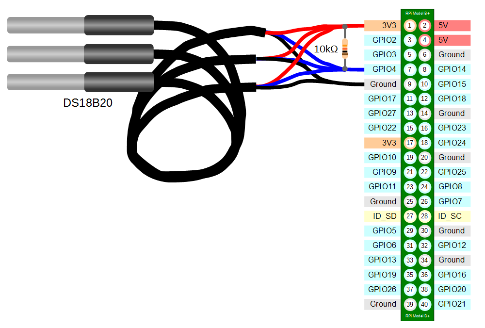
The DS18B20 sensors needs to be connected with the black wires to ground, the red wires to the 3V3 pin and the blue or yellow (some sensors have blue and some have yellow) wires to the GPIO4 pin. A resistor between the value of 4.7k Ohms to 10k Ohms needs to be connected between the 3V3 and GPIO4 pins to act as a ‘pull-up’ resistor.
The Raspbian Operating System image that we are using only supports GPIO4 as a 1-Wire pin, so we need to ensure that this is the pin that we use for connecting our temperature sensor.
The following diagram is a simplified view of the connection.
To connect the sensor practically can be achieved in a number of ways. You could use a Pi Cobbler break out connector mounted on a bread board connected to the GPIO pins. But because the connection is relatively simple we could build a minimal configuration that will plug directly onto the appropriate GPIO pins. The resister is concealed under the heatshrink and indicated with the arrow.
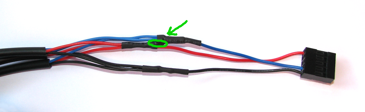
This version uses a recovered header connector from a computers internal USB cable.
Test
Because the Raspberry Pi acts like an embedded platform rather than a regular PC, it doesn’t have a BIOS (Basic Input Output System) that goes through the various pieces of hardware when the Pi boots up and configures everything. Instead it has an optional text file named config.txt. This can be found in the /boot directory. To enable the Pi to use the GPIO pin to communicate with our temperature sensor we need to tell it to configure itself with the w1-gpio Onewire interface module.
We can do this by editing the /boot/congig.txt file using…
…and adding in the line…
dtoverlay=w1-gpio
…at the end of the file
After making this change we need to reboot our Pi to let the changes take effect;
From the terminal as the ‘pi’ user run the command;
modprobe w1-gpio registers the new sensor connected to GPIO4 so that now the Raspberry Pi knows that there is a 1-Wire device connected to the GPIO connector (For more information on the modprobe command check out the Glossary).
Then run the command;
modprobe w1-therm tells the Raspberry Pi to add the ability to measure temperature on the 1-Wire system.
To allow the w1_gpio and w1_therm modules to load automatically at boot we can edit the the /etc/modules file and include both modules there where they will be started when the Pi boots up. To do this edit the /etc/modules file;
Add in the w1_gpio and w1_therm modules so that the file looks like the following;
# /etc/modules: kernel modules to load at boot time.
#
# This file contains the names of kernel modules that should be loaded
# at boot time, one per line. Lines beginning with "#" are ignored.
# Parameters can be specified after the module name.

snd-bcm2835

w1-gpio
w1-therm
Save the file.
Then we change into the /sys/bus/w1/devices directory and list the contents using the following commands;
(For more information on the cd command check out the Glossary here. Or to find out more about the ls command go here)
This should list out the contents of the /sys/bus/w1/devices which should include a number of directories starting 28-. The number of directories should match the number of connected sensors. The portion of the name following the 28- is the unique serial number of each of the sensors.
We then change into one of those directories;
We are then going to view the ‘w1_slave’ file with the cat command using;
The output should look something like the following;
73 01 4b 46 7f ff 0d 10 41 : crc=41 YES
73 01 4b 46 7f ff 0d 10 41 t=23187
At the end of the first line we see a YES for a successful CRC check (CRC stands for Cyclic Redundancy Check, a good sign that things are going well). If we get a response like NO or FALSE or ERROR, it will be an indication that there is some kind of problem that needs addressing. Check the circuit connections and start troubleshooting.
At the end of the second line we can now find the current temperature. The t=23187 is an indication that the temperature is 23.187 degrees Celsius (we need to divide the reported value by 1000).
cd into each of the 28-xxxx directories in turn and run the cat w1_slave command to check that each is operating correctly. It may be useful at this stage to label the individual sensors with their unique serial numbers to make it easy to identify them correctly later.
Record
To record this data we will use a Python program that checks all the sensors and writes the temperature and the sensor name into our MySQL database. At the same time a time stamp will be added automatically.
Our Python program will only write a single group of temperature readings to the database, but unlike the previous single temperature measurement example (which used time.sleep(xx)), this time we will execute the program at a regular interval using a clever feature used in Linux called cron (you can read a description of how to use the crontab (the cron-table) in the Glossary).
Database preparation
First we will set up our database table that will store our data.
Using the phpMyAdmin web interface that we set up, log on using the administrator (root) account and select the ‘measurements’ database that we created as part of the initial set-up.
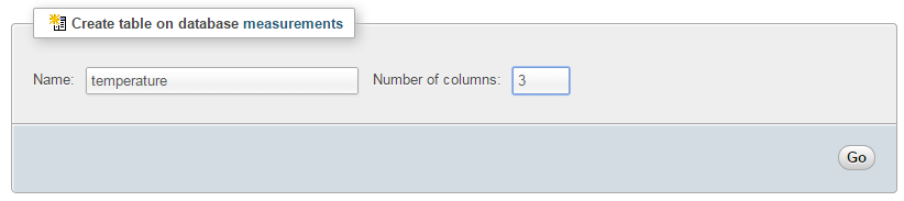
Enter in the name of the table and the number of columns that we are going to use for our measured values. In the screenshot above we can see that the name of the table is ‘temperature’ and the number of columns is ‘3’.
We will use three columns so that we can store a temperature reading, the time it was recorded and the unique ID of the sensor that recorded it.
Once we click on ‘Go’ we are presented with a list of options to configure our table’s columns. Don’t be intimidated by the number of options that are presented, we are going to keep the process as simple as practical.
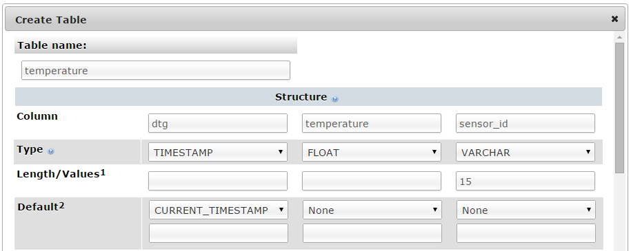
For the first column we can enter the name of the ‘Column’ as ‘dtg’ (short for date time group) the ‘Type’ as ‘TIMESTAMP’ and the ‘Default’ value as ‘CURRENT_TIMESTAMP’. For the second column we will enter the name ‘temperature’ and the ‘Type’ is ‘FLOAT’ (we won’t use a default value). For the third column we will enter the name ‘sensor_id’ and the type is ‘VARCHAR’ with a ‘Length/Values’ of 15.
Scroll down a little and click on the ‘Save’ button and we’re done.

Record the temperature values
The following Python code (which is based on the code that is part of the great temperature sensing tutorial on iot-project) is a script which allows us to check the temperature reading from multiple sensors and write them to our database with a separate entry for each sensor.
The full code can be found in the code samples bundled with this book (m_temp.py).
#!/usr/bin/python
# -*- coding: utf-8 -*-

import os
import fnmatch
import time
import MySQLdb as mdb
import logging

logging.basicConfig(filename='/home/pi/DS18B20_error.log',
  level=logging.DEBUG,
  format='%(asctime)s %(levelname)s %(name)s %(message)s')
logger=logging.getLogger(__name__)

# Load the modules (not required if they are loaded at boot)
# os.system('modprobe w1-gpio')
# os.system('modprobe w1-therm')

# Function for storing readings into MySQL
def insertDB(IDs, temperature):

  try:

    con = mdb.connect('localhost',
                      'pi_insert',
                      'xxxxxxxxxx',
                      'measurements');
    cursor = con.cursor()

    for i in range(0,len(temperature)):
      sql = "INSERT INTO temperature(temperature, sensor_id) \
      VALUES ('%s', '%s')" % \
      ( temperature[i], IDs[i])
      cursor.execute(sql)
      sql = []
      con.commit()

    con.close()

  except mdb.Error, e:
    logger.error(e)

# Get readings from sensors and store them in MySQL

temperature = []
IDs = []

for filename in os.listdir("/sys/bus/w1/devices"):
  if fnmatch.fnmatch(filename, '28-*'):
    with open("/sys/bus/w1/devices/" + filename + "/w1_slave") as f_obj:
      lines = f_obj.readlines()
      if lines[0].find("YES"):
        pok = lines[1].find('=')
        temperature.append(float(lines[1][pok+1:pok+6])/1000)
        IDs.append(filename)
      else:
        logger.error("Error reading sensor with ID: %s" % (filename))

if (len(temperature)>0):
  insertDB(IDs, temperature)
This script can be saved in our home directory (/home/pi) and can be run by typing;
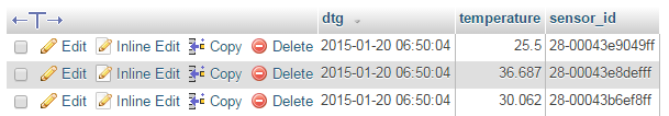
While we won’t see much happening at the command line, if we use our web browser to go to the phpMyAdmin interface and select the ‘measurements’ database and then the ‘temperature’ table we will see a range of temperature measurements for the different sensors and their associated time of reading.
Now you can be forgiven for thinking that this is not going to collect the sort of range of data that will let us ‘Explore’ very much, but let’s do a quick explanation of the Python code first and then we’ll work out how to record a lot more data :-).
Code Explanation
The script starts by importing the modules that it’s going to use for the process of reading and recording the temperature measurements;
import os
import fnmatch
import time
import MySQLdb as mdb
import logging
Then the code sets up the logging module. We are going to use the basicConfig() function to set up the default handler so that any debug messages are written to the file /home/pi/DS18B20_error.log.
logging.basicConfig(filename='/home/pi/DS18B20_error.log',
  level=logging.DEBUG,
  format='%(asctime)s %(levelname)s %(name)s %(message)s')
logger=logging.getLogger(__name__)
Later in the section where we are getting our readings or writing to the database we write to the log file if there is an error.
The program can then issues the modprobe commands that start the interface to the sensor;
# os.system('modprobe w1-gpio')
# os.system('modprobe w1-therm'))
Our code has them commented out since we have already edited the /etc/modules file, but if you didn’t want to start the modules at start-up (for whatever reasons), you can un-comment these.
We then declare the function that will insert the readings into the MySQL database;
def insertDB(IDs, temperature):

  try:

    con = mdb.connect('localhost',
                      'pi_insert',
                      'xxxxxxxxxx',
                      'measurements');
    cursor = con.cursor()

    for i in range(0,len(temperature)):
      sql = "INSERT INTO temperature(temperature, sensor_id) \
      VALUES ('%s', '%s')" % \
      ( temperature[i], IDs[i])
      cursor.execute(sql)
      sql = []
      con.commit()

    con.close()

  except mdb.Error, e:
    logger.error(e)
This is a neat piece of script that uses arrays to recall all the possible temperature and ID values.
Then we have the main body of the script that finds all our possible sensors and reads the IDs and the temperatures;
temperature = []
IDs = []

for filename in os.listdir("/sys/bus/w1/devices"):
  if fnmatch.fnmatch(filename, '28-*'):
    with open("/sys/bus/w1/devices/" + filename + "/w1_slave") as f_obj:
      lines = f_obj.readlines()
      if lines[0].find("YES"):
        pok = lines[1].find('=')
        temperature.append(float(lines[1][pok+1:pok+6])/1000)
        IDs.append(filename)
      else:
        logger.error("Error reading sensor with ID: %s" % (filename))

if (len(temperature)>0):
  insertDB(IDs, temperature)
After declaring our two arrays temperature and IDs we start the for loop that checks all the file names in /sys/bus/w1/devices;
for filename in os.listdir("/sys/bus/w1/devices"):
If it finds a filename that starts with 28- then it processes it;
if fnmatch.fnmatch(filename, '28-*'):
First it opens the w1_slave file in the 28-* directory…
with open("/sys/bus/w1/devices/" + filename + "/w1_slave") as f_obj:
… then it pulls out the lines in the file;
lines = f_obj.readlines()
If it finds the word “YES” in the first line (line 0) of the file…
if lines[0].find("YES"):
…then it uses the position of the equals (=) sign in the second line (line 1)…
pok = lines[1].find('=')
… to pull out the characters following the ‘=’, and manipulate them to form the temperature in
degrees Centigrade;
temperature.append(float(lines[1][pok+1:pok+6])/1000)
We then add the filename to the IDs array;
IDs.append(filename)
If we didn’t find a “yes” in the first line we log the error in the log file
logger.error("Error reading sensor with ID: %s" % (filename))
Then finally if we have been successful in reading at least one temperature value, we push the IDs and temperature array to the insertDB function;
if (len(temperature)>0):
  insertDB(IDs, temperature)
Recording data on a regular basis with cron
As mentioned earlier, while our code is a thing of beauty, it only records a single entry for each sensor every time it is run.
What we need to implement is a schedule so that at a regular time, the program is run. This is achieved using cron via the crontab. While we will cover the requirements for this project here, you can read more about the crontab in the Glossary.
To set up our schedule we need to edit the crontab file. This is is done using the following command;
Once run it will open the crontab in the nano editor. We want to add in an entry at the end of the file that looks like the following;
*/1 * * * * /usr/bin/python /home/pi/m_temp.py
This instructs the computer that every minute of every hour of every day of every month we run the command /usr/bin/python /home/pi/m_temp.py (which if we were at the command line in the pi home directory we would run as python m_temp.py, but since we can’t guarantee where we will be when running the script, we are supplying the full path to the python command and the m_temp.py script.
Save the file and the next time the computer boots up it will run our program on its designated schedule and we will have sensor entries written to our database every minute.
Explore
This section has a working solution for presenting multiple streams of temperature data. This is a slightly more complex use of JavaScript and d3.js specifically but it is a great platform that demonstrates several powerful techniques for manipulating and presenting data.
The final form of the graph should look something like the following (depending on the number of sensors you are using, and the amount of data you have collected)
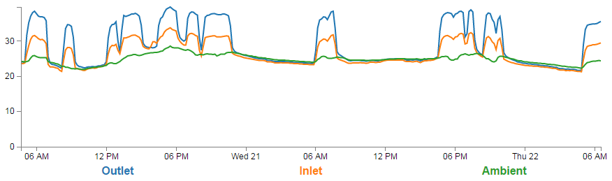
One of the neat things about this presentation is that it ‘builds itself’ in the sense that aside from us deciding what we want to label the specific temperature streams as, the code will organise all the colours and labels for us. Likewise, if the display is getting a bit messy we can click on the legend labels to show / hide the corresponding line.
The Code
The following code is a PHP file that we can place on our Raspberry Pi’s web server (in the /var/www directory) that will allow us to view all of the results that have been recorded in the temperature directory on a graph;
The full code can be found in the code samples bundled with this book (m_temp.php).
<?php

$hostname = 'localhost';
$username = 'pi_select';
$password = 'xxxxxxxxxx';

try {
    $dbh = new PDO("mysql:host=$hostname;dbname=measurements", $username, $pa\
ssword);

    /*** The SQL SELECT statement ***/

    $sth = $dbh->prepare("
       SELECT ROUND(AVG(`temperature`),1) AS temperature,
       TIMESTAMP(CONCAT(LEFT(`dtg`,15),'0')) AS date, sensor_id
       FROM `temperature`
       GROUP BY `sensor_id`,`date`
       ORDER BY `temperature`.`dtg` DESC
       LIMIT 0,900
    ");
    $sth->execute();

    /* Fetch all of the remaining rows in the result set */
    $result = $sth->fetchAll(PDO::FETCH_ASSOC);

    /*** close the database connection ***/
    $dbh = null;

}
catch(PDOException $e)
    {
        echo $e->getMessage();
    }

$json_data = json_encode($result);

?>
<!DOCTYPE html>
<meta charset="utf-8">
<style> /* set the CSS */
body { font: 12px Arial;}
path {
stroke: steelblue;
stroke-width: 2;
fill: none;
}
.axis path,
.axis line {
fill: none;
stroke: grey;
stroke-width: 1;
shape-rendering: crispEdges;
}
.legend {
font-size: 16px;
font-weight: bold;
text-anchor: middle;
}
</style>
<body>
<!-- load the d3.js library -->
<script src="http://d3js.org/d3.v3.min.js"></script>
<script>
// Set the dimensions of the canvas / graph
var margin = {top: 30, right: 20, bottom: 70, left: 50},
width = 900 - margin.left - margin.right,
height = 300 - margin.top - margin.bottom;
// Parse the date / time
var parseDate = d3.time.format("%Y-%m-%d %H:%M:%S").parse;
// Set the ranges
var x = d3.time.scale().range([0, width]);
var y = d3.scale.linear().range([height, 0]);
// Define the axes
var xAxis = d3.svg.axis().scale(x)
.orient("bottom");
var yAxis = d3.svg.axis().scale(y)
.orient("left").ticks(5);
// Define the line
var temperatureline = d3.svg.line()
.x(function(d) { return x(d.date); })
.y(function(d) { return y(d.temperature); });
// Adds the svg canvas
var svg = d3.select("body")
.append("svg")
.attr("width", width + margin.left + margin.right)
.attr("height", height + margin.top + margin.bottom)
.append("g")
.attr("transform",
"translate(" + margin.left + "," + margin.top + ")");
// Get the data
<?php echo "data=".$json_data.";" ?>
data.forEach(function(d) {
d.date = parseDate(d.date);
d.temperature = +d.temperature;
});
// Scale the range of the data
x.domain(d3.extent(data, function(d) { return d.date; }));
y.domain([0, d3.max(data, function(d) { return d.temperature; })]);
// Nest the entries by sensor_id
var dataNest = d3.nest()
.key(function(d) {return d.sensor_id;})
.entries(data);
var color = d3.scale.category10(); // set the colour scale
legendSpace = width/dataNest.length; // spacing for the legend
// Loop through each sensor_id / key
dataNest.forEach(function(d,i) {
svg.append("path")
.attr("class", "line")
.style("stroke", function() { // Add the colours dynamically
return d.color = color(d.key); })
.attr("id", 'tag'+d.key.replace(/\s+/g, '')) // assign ID
.attr("d", temperatureline(d.values));
// Add the Legend
svg.append("text")
.attr("x", (legendSpace/2)+i*legendSpace) // space legend
.attr("y", height + (margin.bottom/2)+ 5)
.attr("class", "legend") // style the legend
.style("fill", function() { // Add the colours dynamically
return d.color = color(d.key); })
.on("click", function(){
// Determine if current line is visible
var active = d.active ? false : true,
newOpacity = active ? 0 : 1;
// Hide or show the elements based on the ID
d3.select("#tag"+d.key.replace(/\s+/g, ''))
.transition().duration(100)
.style("opacity", newOpacity);
// Update whether or not the elements are active
d.active = active;
})
.text(
function() {
if (d.key == '28-00043b6ef8ff') {return "Inlet";}
if (d.key == '28-00043e9049ff') {return "Ambient";}
if (d.key == '28-00043e8defff') {return "Outlet";}
else {return d.key;}
});
});
// Add the X Axis
svg.append("g")
.attr("class", "x axis")
.attr("transform", "translate(0," + height + ")")
.call(xAxis);
// Add the Y Axis
svg.append("g")
.attr("class", "y axis")
.call(yAxis);
</script>
</body>
The graph that will look a little like this (except the data will be different of course).
This is a fairly basic graph (i.e, there is no title or labelling of axis). It will automatically try to collect 900 measurements. So if (as is the case here) we have three sensors, this will result in three lines, each of which has 300 data points.
It does include some cool things though.
- It will automatically include as many lines as we have data for. So if we have 7 sensors, there will be 7 lines.
- Currently the graph is showing the three lines in the legend as ‘Outlet’, ‘Inlet’ and ‘Ambient’. This is because our code specifically assigns a name to a sensor ID. But, if we do not assign a specific label it will automagically use the sensor ID as the label.
- The colours for the lines and the legend will automatically be set as nicely distinct colours.
- We can click on a legend label and it will turn on / off the corresponding line to make it easier to read.
PHP
The PHP block at the start of the code is mostly the same as our example code for our single temperature measurement project. The significant difference however is in the select statement.
       SELECT ROUND(AVG(`temperature`),1) AS temperature,
       TIMESTAMP(CONCAT(LEFT(`dtg`,15),'0')) AS date, sensor_id
       FROM `temperature`
       GROUP BY `sensor_id`,`date`
       ORDER BY `temperature`.`dtg` DESC
       LIMIT 0,900
The difference is that we are now selecting three columns of information. The temperature, the date-time-group and the sensor ID.
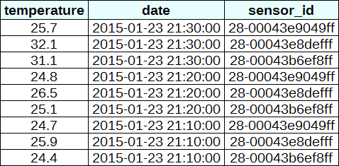
In this project, we are going to need to ‘pivot’ the data that we are retrieving from our database so that it is produced in a multi-column format that the script can deal with easily. This is not always easy in programming, but it can be achieved using the d3 nest function which we will examine. Ultimately we want to be able to use the data in a format that looks a little like this;
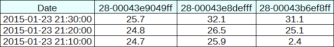
We can see that the information is still the same, but there has been a degree of redundancy removed.
JavaScript
The code is very similar to our single temperature measurement code and comparing both will show us that we are doing the same thing in each graph, but the manipulation of the data into a ‘pivoted’ or ‘nested form is a major deviation.
Nesting the data
The following code nest’s the data
var dataNest = d3.nest()
	.key(function(d) {return d.sensor_id;})
	.entries(data);
We declare our new array’s name as dataNest and we initiate the nest function;
var dataNest = d3.nest()
We assign the key for our new array as sensor_id. A ‘key’ is like a way of saying “This is the thing we will be grouping on”. In other words our resultant array will have a single entry for each unique sensor_id which will itself be an array of dates and values.
.key(function(d) {return d.sensor_id;})
Then we tell the nest function which data array we will be using for our source of data.
}).entries(data);
Then we use the nested data to loop through our sensor IDs and draw the lines and the legend labels;
dataNest.forEach(function(d,i) {

	svg.append("path")
		.attr("class", "line")
		.style("stroke", function() { // Add the colours dynamically
			return d.color = color(d.key); })
		.attr("id", 'tag'+d.key.replace(/\s+/g, '')) // assign ID
		.attr("d", temperatureline(d.values));

	// Add the Legend
	svg.append("text")
		.attr("x", (legendSpace/2)+i*legendSpace)  // space legend
		.attr("y", height + (margin.bottom/2)+ 5)
		.attr("class", "legend")    // style the legend
		.style("fill", function() { // Add the colours dynamically
			return d.color = color(d.key); })
		.on("click", function(){
			// Determine if current line is visible
			var active   = d.active ? false : true,
			newOpacity = active ? 0 : 1;
			// Hide or show the elements based on the ID
			d3.select("#tag"+d.key.replace(/\s+/g, ''))
				.transition().duration(100)
				.style("opacity", newOpacity);
			// Update whether or not the elements are active
			d.active = active;
			})
		.text(
		    function() {
		        if (d.key == '28-00043b6ef8ff') {return "Inlet";}
		        if (d.key == '28-00043e9049ff') {return "Ambient";}
		        if (d.key == '28-00043e8defff') {return "Outlet";}
		        else {return d.key;}
		        });
});
The forEach function being applied to dataNest means that it will take each of the keys that we have just declared with the d3.nest (each sensor ID) and use the values for each sensor ID to append a line using its values.
There is a small and subtle change that might other wise go unnoticed, but is nonetheless significant. We include an i in the forEach function;
dataNest.forEach(function(d,i) {
This might not seem like much of a big deal, but declaring i allows us to access the index of the returned data. This means that each unique key (sensor ID) has a unique number.
Then the code can get on with the task of drawing our lines;
	svg.append("path")
		.attr("class", "line")
		.style("stroke", function() { // Add the colours dynamically
			return d.color = color(d.key); })
		.attr("id", 'tag'+d.key.replace(/\s+/g, '')) // assign ID
		.attr("d", temperatureline(d.values));
Applying the colours
Making sure that the colours that are applied to our lines (and ultimately our legend text) is unique from line to line is actually pretty easy.
The set-up for this is captured in an earlier code snippet.
var color = d3.scale.category10(); // set the colour scale
This declares an ordinal scale for our colours. This is a set of categorical colours (10 of them in this case) that can be invoked which are a nice mix of difference from each other and pleasant on the eye.
We then use the colour scale to assign a unique stroke (line colour) for each unique key (sensor ID) in our dataset.
    .style("stroke", function() {
        return d.color = color(d.key); })
It seems easy when it’s implemented, but in all reality, it is the product of some very clever thinking behind the scenes when designing d3.js and even picking the colours that are used.
Then we need to make sure that we can have a good reference between our lines and our legend labels. To do this we need to add assign an id to each legend text label.
.attr("id", 'tag'+d.key.replace(/\s+/g, ''))
Being able to use our key value as the id means that each label will have a unique identifier. “What’s with adding the 'tag' piece of text to the id?” I hear you ask. Good question. If our key starts with a number we could strike trouble (in fact I’m sure there are plenty of other ways we could strike trouble too, but this was one I came across). As well as that we include a little regular expression goodness to strip any spaces out of the key with .replace(/\s+/g, '').
Adding the legend
If we think about the process of adding a legend to our graph, what we’re trying to achieve is to take every unique data series we have (sensor ID) and add a relevant label showing which colour relates to which sensor. At the same time, we need to arrange the labels in such a way that they are presented in a manner that is not offensive to the eye. In the example I will go through I have chosen to arrange them neatly spaced along the bottom of the graph. so that the final result looks like the following;
Bear in mind that the end result will align the legend completely automatically. If there are three sensors it will be equally spaced, if it is six sensors they will be equally spaced. The following is a reasonable mechanism to facilitate this, but if the labels for the data values are of radically different lengths, the final result will looks ‘odd’ likewise, if there are a LOT of data values, the legend will start to get crowded.
There are three broad categories of changes that we will want to make to our initial simple graph example code to make this possible;
- Declare a style for the legend font
- Change the area and margins for the graph to accommodate the additional text
- Add the text
Declaring the style for the legend text is as easy as making an appropriate entry in the <style> section of the code. For this example we have the following;
.legend {
    font-size: 16px;
    font-weight: bold;
    text-anchor: middle;
}
To change the area and margins of the graph we can make the following small changes to the code.
var margin = {top: 30, right: 20, bottom: 70, left: 50},
    width = 900 - margin.left - margin.right,
    height = 300 - margin.top - margin.bottom;
The bottom margin is now 70 pixels high and the overall space for the area that the graph (including the margins) covers is increased to 300 pixels.
To add the legend text is slightly more work, but only slightly more.
One of the ‘structural’ changes we needed to put in was a piece of code that understood the physical layout of what we are trying to achieve;
legendSpace = width/dataNest.length; // spacing for the legend
This finds the spacing between each legend label by dividing the width of the graph area by the number of sensor IDs (key’s).
The following code can then go ahead and add the legend;
	// Add the Legend
	svg.append("text")
		.attr("x", (legendSpace/2)+i*legendSpace)  // space legend
		.attr("y", height + (margin.bottom/2)+ 5)
		.attr("class", "legend")    // style the legend
		.style("fill", function() { // Add the colours dynamically
			return d.color = color(d.key); })
		.on("click", function(){
			// Determine if current line is visible
			var active   = d.active ? false : true,
			newOpacity = active ? 0 : 1;
			// Hide or show the elements based on the ID
			d3.select("#tag"+d.key.replace(/\s+/g, ''))
				.transition().duration(100)
				.style("opacity", newOpacity);
			// Update whether or not the elements are active
			d.active = active;
			})
		.text(
		    function() {
		        if (d.key == '28-00043b6ef8ff') {return "Inlet";}
		        if (d.key == '28-00043e9049ff') {return "Ambient";}
		        if (d.key == '28-00043e8defff') {return "Outlet";}
		        else {return d.key;}
		        });
There are some slightly complicated things going on in here, so we’ll make sure that they get explained.
Firstly we get all our positioning attributes so that our legend will go into the right place;
		.attr("x", (legendSpace/2)+i*legendSpace)  // space legend
		.attr("y", height + (margin.bottom/2)+ 5)
		.attr("class", "legend")    // style the legend
The horizontal spacing for the labels is achieved by setting each label to the position set by the index associated with the label and the space available on the graph. To make it work out nicely we add half a legendSpace at the start (legendSpace/2) and then add the product of the index (i) and legendSpace (i*legendSpace).
We position the legend vertically so that it is in the middle of the bottom margin (height + (margin.bottom/2)+ 5).
And we apply the same colour function to the text as we did to the lines earlier;
		.style("fill", function() { // Add the colours dynamically
			return d.color = color(d.key); })
Making it interactive
The last significant step we’ll take in this example is to provide ourselves with a bit of control over how the graph looks. Even with the multiple colours, the graph could still be said to be ‘busy’. To clean it up or at least to provide the ability to more clearly display the data that a user wants to see we will add code that will allow us to click on a legend label and this will toggle the corresponding graph line on or off.
		.on("click", function(){
			// Determine if current line is visible
			var active   = d.active ? false : true,
			newOpacity = active ? 0 : 1;
			// Hide or show the elements based on the ID
			d3.select("#tag"+d.key.replace(/\s+/g, ''))
				.transition().duration(100)
				.style("opacity", newOpacity);
			// Update whether or not the elements are active
			d.active = active;
			})
We use the .on("click", function(){ call to carry out some actions on the label if it is clicked on. We toggle the .active descriptor for our element with var active = d.active ? false : true,. Then we set the value of newOpacity to either 0 or 1 depending on whether active is false or true.
From here we can select our label using its unique id and adjust it’s opacity to either 0 (transparent) or 1 (opaque);
			d3.select("#tag"+d.key.replace(/\s+/g, ''))
				.transition().duration(100)
				.style("opacity", newOpacity);
Just because we can, we also add in a transition statement so that the change in transparency doesn’t occur in a flash (100 milli seconds in fact (.duration(100))).
Lastly we update our d.active variable to whatever the active state is so that it can toggle correctly the next time it is clicked on.
Since it’s kind of difficult to represent interactivity in a book, head on over to the live example on bl.ocks.org to see the toggling awesomeness that could be yours!
Printing out custom labels
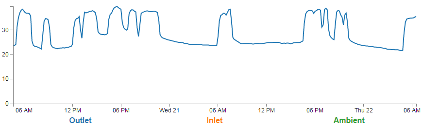
The only thing left to do is to decide what to print for our labels. If we wanted to simply show each sensor ID we could have the following;
.text(d.key);
This would produce the following at the bottom of the graph;

But it makes more sense to put a real-world label in place so the user has a good idea about what they’re looking at. To do this we can use an if statement to match up our sensors with a nice human readable representation of what is going on;
		.text(
		    function() {
		        if (d.key == '28-00043b6ef8ff') {return "Inlet";}
		        if (d.key == '28-00043e9049ff') {return "Ambient";}
		        if (d.key == '28-00043e8defff') {return "Outlet";}
		        else {return d.key;}
		        });
The final result is a neat and tidy legend at the bottom of the graph;