Chapter 1: Working with faces messages
In this chapter, you will see several approaches for combining the rich looking PrimeFaces messages with OmniFaces techniques for obtaining more flexible faces messages and less verbose code. Among others, we will discuss about specifying multiple client ID in the for attribute and about generating a global single message whenever validation fails. Basically, we will exemplify on ERROR type messages.
Faces messages with multiple client IDs in the for attribute
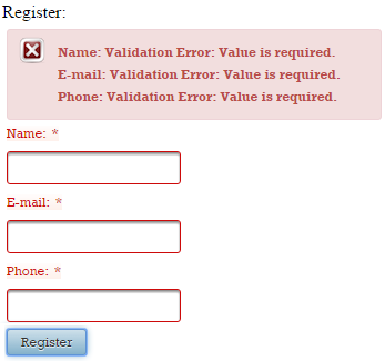
In order to display faces messages, PrimeFaces comes with <p:messages/> and <p:message/>. Typically, when you want to display all messages, you use <p:messages/>, as below (display all error messages):
<h:form>
 <h:panelGrid id="gridId" columns="1" cellpadding="2">

  <p:messages/>

  <p:outputLabel for="nameId" value="Name:" />
  <p:inputText id="nameId" required="true" />

  <p:outputLabel for="emailId" value="E-mail:" />
  <p:inputText id="emailId" required="true" />

  <p:outputLabel for="phoneId" value="Phone:" />
  <p:inputText id="phoneId" required="true" />

 </h:panelGrid>

 <p:commandButton id="submitButtonId" value="Register" update="gridId" />
</h:form>
In the below figure, you can see the error messages caused by the fact that we didn’t fill any of the above inputs (this is the effect of the built-in required validator):
But, if you want to display messages for a certain component or a certain group of components, you use <p:message/> with for attribute, as below (display error messages only for nameId and emailId, but not for phoneId):
<h:form>
 <h:panelGrid id="gridId" columns="1" cellpadding="2">

  <p:message for="nameId" />
  <p:message for="emailId" />

  <p:outputLabel for="nameId" value="Name:" />
  <p:inputText id="nameId" required="true" />

  <p:outputLabel for="emailId" value="E-mail:" />
  <p:inputText id="emailId" required="true" />

  <p:outputLabel for="phoneId" value="Phone:" />
  <p:inputText id="phoneId" required="true" />

 </h:panelGrid>

 <p:commandButton id="submitButtonId" value="Register" update="gridId" />
</h:form>
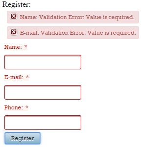
In such a case, we can use OmniFaces, <o:messages/>. Among other features, this component allows multiple client IDs space separated in the for attribute. For example, the above code can be re-written as below (notice that we tried to keep as much as possible from PrimeFaces error messages styles):
<h:form>
 <h:panelGrid id="gridId" columns="1" cellpadding="2">

  <o:messages for="nameId emailId"
              errorClass="ui-message ui-message-error ui-widget ui-corner-all"
              errorStyle="margin:5px;" />

  <p:outputLabel for="nameId" value="Name:" />
  <p:inputText id="nameId" required="true" />

  <p:outputLabel for="emailId" value="E-mail:" />
  <p:inputText id="emailId" required="true" />

  <p:outputLabel for="phoneId" value="Phone:" />
  <p:inputText id="phoneId" required="true" />

 </h:panelGrid>

 <p:commandButton id="submitButtonId" value="Register" update="gridId" />
</h:form>
But, if we want to obtain the same look as in PrimeFaces, we need to exploit another feature of <o:messages/>. This component supports the var attribute which sets the current FacesMessage in the request scope and disables the default table/list rendering. This practically allows us to loop through the faces messages list in a completely stateless fashion (the faces messages list is accessible in the page via, facesContext.messageList) and output them as we want. For example, after we inspect the HTML code of an a PrimeFaces error message, we can do this:
<h:form>
 <h:panelGrid id="gridId" columns="1" cellpadding="2">

  <o:messages for="nameId emailId" var="msgs">
   <div class="ui-message ui-message-error ui-widget ui-corner-all"
        aria-live="polite"
        style="margin:5px;">

    <span class="ui-messages-error-icon" style="height:16px; width:16px;
                 margin-top:0; background-position:0 -96px;" />

    <span class="ui-message-error-detail">#{msgs.detail}</span>
   </div>
  </o:messages>

  <p:outputLabel for="nameId" value="Name:" />
  <p:inputText id="nameId" required="true" />

  <p:outputLabel for="emailId" value="E-mail:" />
  <p:inputText id="emailId" required="true" />

  <p:outputLabel for="phoneId" value="Phone:" />
  <p:inputText id="phoneId" required="true" />

 </h:panelGrid>
 <p:commandButton id="submitButtonId" value="Register" update="gridId" />
</h:form>
The complete application is named, MultipleForComponents.
So, in our hypothetical case with eight inputs, we have:
<o:messages for="input1 input2 input3 input4 input5 input6 input7 input8"
            errorClass="ui-message ui-message-error ui-widget ui-corner-all"
            errorStyle="margin: 5px;">
</o:messages>
or
<o:messages for="input1 input2 input3 input4 input5 input6 input7 input8"
            var="msgs">

 <div class="ui-message ui-message-error ui-widget ui-corner-all"
      aria-live="polite"
      style="margin:5px;">

  <span class="ui-messages-error-icon" style="height:16px; width:16px;
               margin-top:0; background-position:0 -96px;"/>

  <span class="ui-message-error-detail">#{msgs.detail}</span>
 </div>
</o:messages>
You can use <o:messages/> to refer to non-input components, which in turn contain input components. For example:
<h:form>
 <h:panelGrid id="gridId" columns="1" cellpadding="2">

  <o:messages for="inputs"
              errorClass="ui-message ui-message-error ui-widget ui-corner-all"
              errorStyle="margin:5px;"/>

  <p:outputLabel for="nameId" value="Name:" />
  <p:inputText id="nameId" required="true" />

  <h:panelGroup id="inputs">
   <h:panelGrid id="subgridId" columns="1">
    <p:outputLabel for="emailId" value="E-mail:" />
    <p:inputText id="emailId" required="true" />

    <p:outputLabel for="phoneId" value="Phone:" />
    <p:inputText id="phoneId" required="true" />
   </h:panelGrid>
  </h:panelGroup>
 </h:panelGrid>

 <p:commandButton id="submitButtonId" value="Register" update="gridId" />
</h:form>
You can also combine non-input components that contain inputs with other input components:
<h:form>
 <h:panelGrid id="gridId" columns="1" cellpadding="2">

  <o:messages for=" nameId inputs"
              errorClass="ui-message ui-message-error ui-widget ui-corner-all"
              errorStyle="margin:5px;"/>

  <p:outputLabel for="nameId" value="Name:" />
  <p:inputText id="nameId" required="true" />

  <h:panelGroup id="inputs">
   <h:panelGrid id="subgridId" columns="1">
    <p:outputLabel for="emailId" value="E-mail:" />
    <p:inputText id="emailId" required="true" />

    <p:outputLabel for="phoneId" value="Phone:" />
    <p:inputText id="phoneId" required="true" />
   </h:panelGrid>
  </h:panelGroup>
 </h:panelGrid>

 <p:commandButton id="submitButtonId" value="Register" update="gridId" />
</h:form>
Show a single custom global message
Aside from the fact that faces messages are component specific; lets assume that we want to render a custom message that displays Sorry, you have some validation issues!. This intended message would appear, if at least one input component value does not pass the validation phase.
An easy approach consists of using the <o:messages/>. Notice below how we pass the client ID of the form to the for attribute.
<h:form id="formId">
 <h:panelGrid id="gridId" columns="1" cellpadding="2">

  <o:messages for="formId"
              style="color: red;"
              message="Sorry, you have some validation issues !"/>

  <p:outputLabel for="nameId" value="Name:" />
  <p:inputText id="nameId" required="true" />
  <p:message for="nameId"/>

  <p:outputLabel for="emailId" value="E-mail:" />
  <p:inputText id="emailId" required="true" />
  <p:message for="emailId"/>

  <p:outputLabel for="phoneId" value="Phone:" />
  <p:inputText id="phoneId" required="true" />
  <p:message for="phoneId"/>
 </h:panelGrid>

 <p:commandButton id="submitButtonId" value="Register" update="gridId" />
</h:form>
In the below figure you can see how the global error message appears (you can add to it any style that you like). On the left side, you can see the global error message caused by the missing phone number. On the right side, the form was completely filled, so no error messages occured.
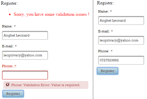
The complete application is named, SingleGlobalCustomMessage.
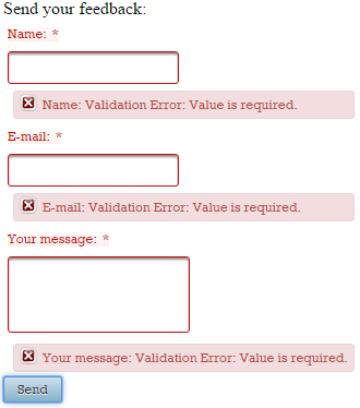
Highlight invalid inputs via custom CSS
When a PrimeFaces form contains invalid inputs we see the corresponding error messages and those fields are highlighted via default PrimeFaces styles:
<h:form id="formId">
 <h:panelGrid id="gridId" columns="1" cellpadding="2">
  <p:outputLabel for="nameId" value="Name:" />
  <p:inputText id="nameId" required="true" />
  <p:message for="nameId"/>

  <p:outputLabel for="emailId" value="E-mail:" />
  <p:inputText id="emailId" required="true" />
  <p:message for="emailId"/>

  <p:outputLabel for="messId" value="Your message:" />
  <p:inputTextarea id="messId" required="true" />

  <p:message for="messId"/>
 </h:panelGrid>

 <p:commandButton id="submitButtonId" value="Send" ajax="false" />
</h:form>
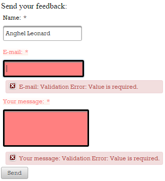
Alter CSS directly
The easiest approach consists of identifying the PrimeFaces CSS used to highlight invalid inputs and alter it accordingly. The below CSS overrides the default one (basically, we override the .ui-state-error which is the PrimeFaces default selector applied to the error messaging container elements):
/* style invalid inputs */
.ui-state-error, .ui-widget-content .ui-state-error,
.ui-widget-header .ui-state-error {
 background-color: #ff8080;
}

/* style labels of invalid inputs */
.ui-outputlabel.ui-state-error{
 border: none;
 background-color: #ffffff;
 color: #ff8080;
}
This approach should work in most cases. The complete application is named, OverridePFInvalidInputsCSS.
Use OmniFaces Highlight component
Another approach consists of adding the OmniFaces Highlight component. OmniFaces provides the Highlight (<o:highlight/>) component which was especially designed for highlighting the invalid UIInputs and the associated labels. Additionally (by default), it also places the focus on the first invalid UIInput component. Basically, all we need to do is to pass our CSS to the <o:highlight/> tag via its optional styleClass attribute. The simple use case implies placing the <o:highlight> somewhere on your page (as long as there’s only one instance of it), like this:
<o:highlight/>
This will use the default CSS class named, error:
 label.error {
  color: #c66;
 }

 input.error, select.error, textarea.error {
  background-color: #fee;
 }
This CSS class is used when you do not specify your class via styleClass attribute, as below:
<o:highlight styleClass="highlight" />
And, the highlight class can be:
 label.highlight {
  color: #ff8080;
 }

 input.highlight, select.highlight, textarea.highlight {
  background-color: #ff8080;
  border:3px solid black;
 }
By default, Highlight will place the focus on the first invalid input component, but you can disable this via the focus attribute:
<o:highlight styleClass="highlight" focus="false" />
<h:form id="formId">
 ...
</h:form>
Of course, you can disable focus and use the default CSS class also:
<o:highlight focus="false" />
<h:form id="formId">
 ...
</h:form>
So, in our use case, we can do this:
<o:highlight styleClass="highlight" />
<h:form id="formId">
...
</h:form>
The complete application is named, HighlightInvalidInputs.
One more thing here (special thanks to Bauke Scholtz (aka BalusC) for contributing to this chapter:
<o:highlight styleClass="highlight" />
<h:form id="formId">
 <p:focus context="formId" />
 ...
 <p:commandButton id="submitButtonId" value="Send" update="@form" />
</h:form>