Using Bootstrap with d3.js
Visualising data on a web page is a noble pursuit in itself, but often there is a need to be able to associate the visualization with other content (I know! It came as a surprise to me as well).
Developing a web page has become an activity that just about anyone can accomplish for better of for worse and I’m not going to claim to demonstrate any mastery of design or artistic flair. However, I have found using Bootstrap is a great way to make structural arrangements to a web page, it’s simple to use and there is a fantastic range of features that can provide additional functionality to your pages and sometimes more importantly, a consistent ‘feel’ across many pages.
Bootstrap can be found here and I thoroughly recommend working your way through the site to discover some of the cool things that it can do.
What is Bootstrap?
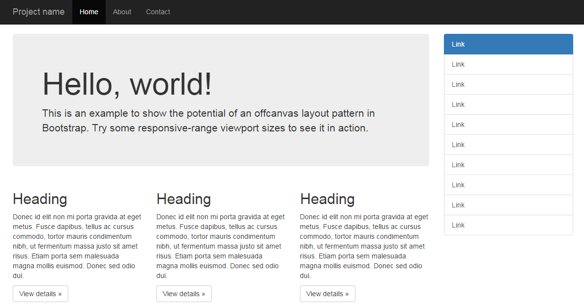
Twitter Bootstrap is a free collection of tools for creating websites and web applications. It contains HTML and CSS based design templates for typography, forms, buttons, charts, navigation and other interface components, as well as optional JavaScript extensions.
Bootstrap was developed by Mark Otto and Jacob Thornton at Twitter as a framework to encourage consistency across internal tools. The word ‘framework’ is probably the best descriptive term, since it’s purpose is to provide structure to content. Perhaps in a similar way that d3.js provides structure to data.
Some of Bootstrap’s most important features include;
- A layout grid
- Interface components
Layout grid
Bootstrap includes 4 standard pixel width grid layout schemas which allow you to quickly arrange a page structure. This allows you to plan and implement what you’re going to place on the page with a minimum of fuss. You can change any of the pre-set options if you wish and you can also implement a ‘fluid’ row option where bootstrap will dynamically size a column’s width using a percentage instead of a fixed pixel value.
It’s this feature that first attracted me to using Bootstrap and while I may be using a complex tool for a simple task, it does that task very well.
Interface components
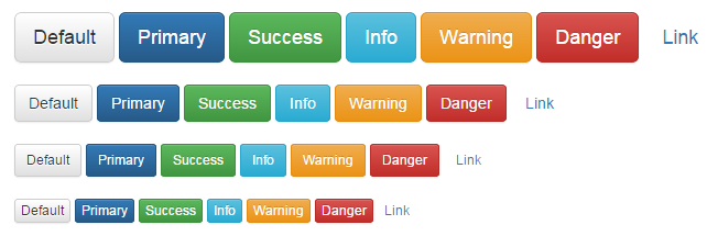
A large number of interface components are also provided. These include standard buttons…
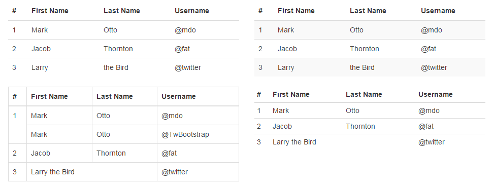
… tables…
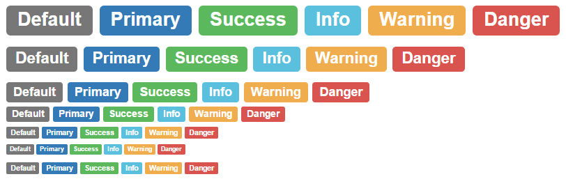
… labels…
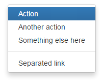
… drop-down menus…
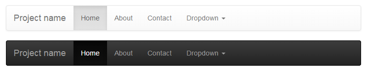
… navigation controls…
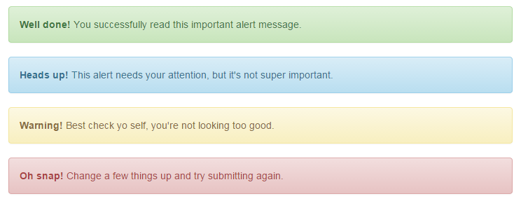
… alerts…
… and to be perfectly honest, the list goes on and on.
There is a dizzying array of options available for web designers and while I encourage you to use them, I can’t promise to explain the nuances of their use, since I’m a humble journeyman in this world :-).
Incorporating Bootstrap into your html code.
Bootstrap is a remarkably flexible product. We could be forgiven for thinking that the process of installing it would be difficult. However, in the spirit of keeping things simple, we’ll make the process crude, but effective.
You could easily just follow along with the instructions on the ‘getting started’ page (and I recommend you do). But the following are important points.
Make sure you remember that you will need to download the appropriate scripts from the ‘getting started’ page.;
You will need to copy the bootstrap.js file (or the minimised version (bootstrap.min.js)) to a place where it can be reached and loaded by your script. While you’re there, you will need to include a line to load the jquery.js file (which is a dependency of Bootstrap (not that it gets talked about much)) The following two lines, included with the line that loads d3.js, would do the job nicely (assuming that you’ve copied the bootstrap.min.js file into the js directory);
<script src="http://code.jquery.com/jquery.js"></script>
<script src="js/bootstrap.min.js"></script>
If we wanted to we could load Bootstrap the same way that we are loading jquery.js (off the Internet each time we load a page). To do this we could use;
<script src="http://code.jquery.com/jquery.js"></script>
<script src=
  "https://maxcdn.bootstrapcdn.com/bootstrap/3.3.2/js/bootstrap.min.js">
</script>
This is the way we will try to form our code in the coming examples to make the scripts as location independent as possible.
You will also need to copy the bootstrap.css (or the minimised version (bootstrap.min.css)) to a place where it can be reached and loaded by your script. The following lines show it being loaded from the css directory with the line that loads the script in the <head> section.
<head>

<link href="css/bootstrap.min.css" rel="stylesheet" media="screen">

</head>
Or again we could load it from the Internet as follows;
<head>

<link rel="stylesheet" href=
 "https://maxcdn.bootstrapcdn.com/bootstrap/3.3.2/css/bootstrap.min.css"
>

</head>
That should be all that’s required! Of course as I mentioned earlier, there are plenty of other plug-in scripts that could be loaded to do fancy things with your web page, but we’re going to try and keep things simple.
Arranging more than one graph on a web page.
We’ll start with the presumption that we want to be able to display two separate graphs on the same web page. The example we will use is clearly contrived, but we should remember that it’s the process we’re interested in this case, not the content.
First make a page with two graphs
This is surprisingly easy. If you start with the simple graph that we initially used as our learning example at the start of the book, and duplicate the section that looks like the following, you are 99% of the way there.
// Adds the svg canvas
var	chart2 = d3.select("body")
	.append("svg")
		.attr("width", width + margin.left + margin.right)
		.attr("height", height + margin.top + margin.bottom)
	.append("g")
		.attr("transform", "translate(" + margin.left + "," + margin.top + ")");

// Get the data
d3.csv("data2.csv", function(error, data) {
	data.forEach(function(d) {
		d.date = parseDate(d.date);
		d.close = +d.close;
	});

	// Scale the range of the data
	x.domain(d3.extent(data, function(d) { return d.date; }));
	y.domain([0, d3.max(data, function(d) { return d.close; })]);

	// Add the valueline path.
	chart2.append("path")
		.attr("class", "line")
		.attr("d", valueline(data));

	// Add the X Axis
	chart2.append("g")
		.attr("class", "x axis")
		.attr("transform", "translate(0," + height + ")")
		.call(xAxis);

	// Add the Y Axis
	chart2.append("g")
		.attr("class", "y axis")
		.call(yAxis);

});
For simplicity, the full code for this graph can also be found on github or in the code samples bundled with this book (two-graphs-one-anchor.html, data-1.csv and data-2.csv). A live example can be found on bl.ocks.org.
The differences from the original simple graph example are;
- The graphs are slightly smaller (to make it easier to display the graphs as they move about).
- I have used *.csv files for the data and there are two different data files so that they look different and we can differentiate between the graphs.
- Most importantly, I have declared the two charts with different variable names (one as
chart1and the other aschart2).
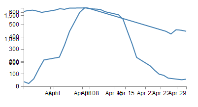
The different variable names are important, because if you leave them with the same identifier, the web page decides that what you’re trying to do is to put all your drawing data into the same space. The end result is two graphs trying to occupy the same space and looks a bit like this…
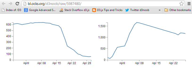
The example with the correct (different) variable labels should look a little like this…
Arrange the graphs with the same anchor
The first thing I want to point out about how the graphs are presented is that they are both ‘attached’ to the same point on our web page. Both of the graphs select the body of the web page and then append a svg element to it;
var chart2 = d3.select("body")
    .append("svg")
This has the effect of appending the graphs to the same anchor point. Interestingly, if we narrow the window of our web browser to less that the width of both of our graphs side by side, the browser will automatically move one of the graphs to a position below the first in much the same way that text will wrap on a page.
For a very simple mechanism of putting two graphs (or any two d3.js generated images) on a single page, this will work, but we don’t have a lot of control over the positioning.
Arrange the graphs with separate anchors
To gain a little more control over where the graphs are placed we will employ ID selectors.
An ID selector is a way of naming an anchor point on an HTML page. They can be defined as “a unique identifier to an element”. This means that we can name a position on our web page and then we can assign our graphs to those positions.
This can be done simply by placing div tags in our html file in an appropriate place (here I’ve put them in between the <style> section and the <body>).
</style>

<div id="area1"></div>
<div id="area2"></div>

<body>
Now all we need to do is to tell each graph to append itself to either of these ID selectors. We do this by replacing the selected section in our JavaScript code with the appropriate ID selector as follows;
var chart1 = d3.select("#area1")
    .append("svg")
… and …
var chart2 = d3.select("#area2")
    .append("svg")
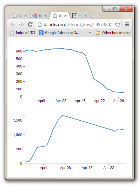
With these divs added, when you browse to the file, you will find that it looks like this;
This looks the same as when the two graphs were wrapping when the browser was narrowed. However, this time the browser is wide enough to support the two side by side, but they won’t position themselves that way. This is because each div divides the web page. The top graph is in the div with the ID selector area1 and the bottom graph is in the div with the ID selector area2. These divs effectively extend for the width of the web page.
The situation that we now find ourselves in is that we have control over where the graphs will be anchored, but we don’t have much flexibility for arranging those anchors. This is where Bootstrap comes in.
How does Bootstrap’s grid layout work
Bootstrap’s grid layout subdivides the page by using rows and columns. A row will extend horizontally and a web page can be thought of as being 12 columns wide. Each column is a place to put horizontally separated content.
In order to make the best use of variable width devices, Bootstrap employs four different types of columns;
- Extra small devices (phones): With a horizontal resolution of less than 768px, Bootstrap reccomends we use
col-xs-. - Small devices (Tablets): With a horizontal resolution of greater than or equal to 768px, Bootstrap reccomends we use
col-sm-. - Medium devices (Desktops):With a horizontal resolution of greater than or equal to 992px, Bootstrap reccomends we use
col-md-. - Large devices (Desktops): With a horizontal resolution of greater than or equal to 1200px, Bootstrap reccomends we use
col-lg-.
The examples we’ll employ will use col-md-, but you should choose based on your anticipated needs.
Each column will have a width designated by a number at the end of our column designator. This will be the width in terms of the number of columns in the row.. For example col-md-4 would be a single column 4 units wide (remember the row is a maximum of 12 possible units wide).
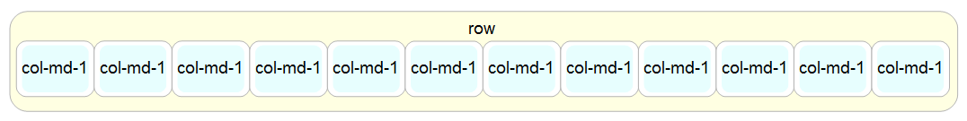
As an example, the picture below shows a single row divided into twelve individual columns.
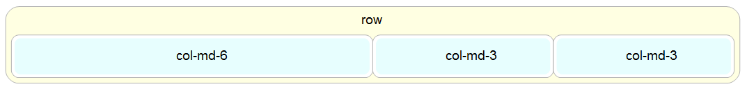
The columns can be combined to create larger spaces for larger content. The example below has a single col-md-6 and two col-md-3’s.
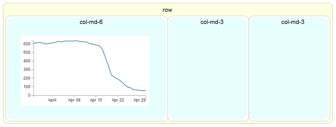
The column’s will change height dynamically to fit their contents. So if there was a larger item in the col-md-6 example given above (perhaps a graph), it would expand like so;
The way to set these rows and columns up is by dividing the screen using divs and assigning them class types that match the grid layout.
For example, to create our example of a single row with a col-md-6 and two col-md-3’s we would use the following html code as our baseline.
<div class="row">
  <div class="col-md-6"></div>
  <div class="col-md-3"></div>
  <div class="col-md-3"></div>
</div>
In this example code we can see the row div is enclosing the three columns. We can extend the comparison by putting the code into our graphic example.
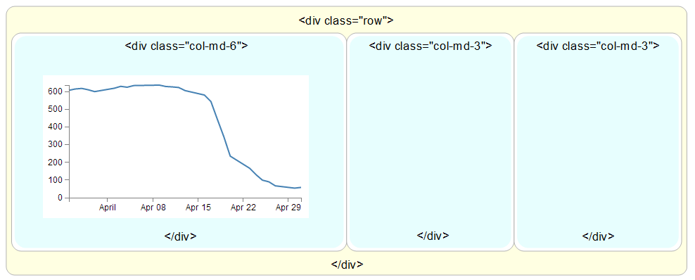
To add content to the structure, all that is needed is to put our web page components between the <div class="col-md-x"> and </div> tags.
Later we will look (briefly) at more complex configurations that might be useful.
Arrange more than one d3.js graph with Bootstrap
In the previous sections we have seen how to assign ID selectors so that we anchor our d3.js graphs to a particular section of our web page. We have also seen how to utilise Bootstrap to divide up our web page into different sections. Now we will bring the two examples together and assign ID selectors to sections set up with Bootstrap.
We will start with our simple two graph example (as seen on bl.ocks.org here).
We will need to make sure we have our bootstrap.min.js and bootstrap.min.css files in the appropriate place.
Then insert the code to use bootstrap.min.css at the start of the file (just before the <style> tag would be good);
<head>

<link rel="stylesheet" href=
 "https://maxcdn.bootstrapcdn.com/bootstrap/3.3.2/css/bootstrap.min.css"
>

</head>
Then include the lines to load the jquery.js and bootstrap.min.js files just after the line that loads the d3.js file.
<script src="http://code.jquery.com/jquery.js"></script>
<script src=
  "https://maxcdn.bootstrapcdn.com/bootstrap/3.3.2/js/bootstrap.min.js">
</script>
What we’ll do to make things simple is to create a Bootstrap layout that is made up of a single row with just two col-md-6 elements in it. The following code will do this nicely and should go after the </style> tag and before the <body> tag.
<div class="row">
  <div class="col-md-6"></div>
  <div class="col-md-6"></div>
</div>
Now we add in our ID selectors in a clever way by incorporating them into the divs that we have just entered. So remembering the code for our original two selectors…
<div id="area1"></div>
<div id="area2"></div>
… we can incorporate these into our row and columns as follows;
<div class="row">
  <div class="col-md-6" id="area1"></div>
  <div class="col-md-6" id="area2"></div>
</div>
The last thing we need to do is to change the d3.select from selecting the body of the web page to selecting our two new ID selectors area1 and area2.
var chart1 = d3.select("#area1")
    .append("svg")
… and …
var chart2 = d3.select("#area2")
    .append("svg")
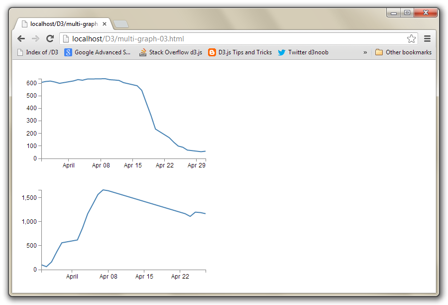
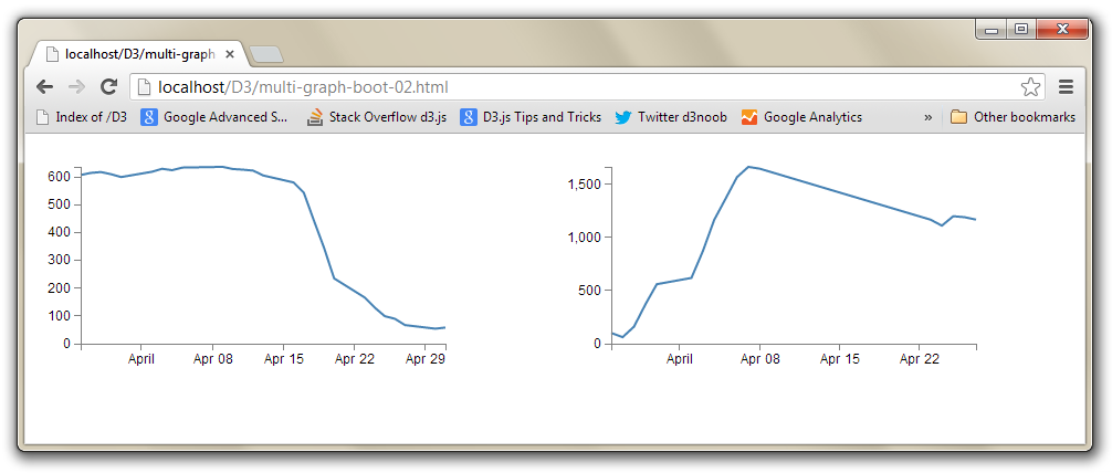
Et viola! Our new web page has two graphs which are settled into their own specific section.
To provide another example of the flexibility of the layout schema, we can take our row / column layout section and adapt it so that our graphs are in two separate sections with a third, smaller, section in the middle describing the graphs.
If we start with our previously entered columns with their ID selectors;
<div class="row">
  <div class="col-md-6" id="area1"></div>
  <div class="col-md-6" id="area2"></div>
</div>
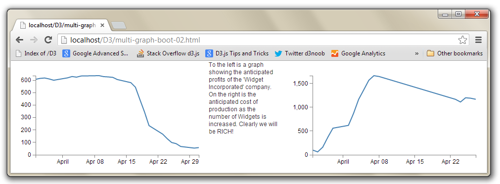
We can change the columns to col-md-5 and add an additional col-md-2 in between with some text (remember, the total number of columns has to add up to 12).
<div class="row">
  <div class="col-md-5" id="area1"></div>
  <div class="col-md-2">
    To the left is a graph showing the anticipated profits
    of the 'Widget Incorporated' company.
    On the right is the anticipated cost of production as
    the number of Widgets is increased.
    Clearly we will be RICH!
  </div>
  <div class="col-md-5" id="area2"></div>
</div>
And the end result is…
Neither of these examples is particularly elegant in terms of its layout. I am relying on you to bring the prettiness!
The full code for this final graph and paragraph combination can also be found on github or in the code samples bundled with this book (two-graphs-bootstrap.html, data-1.csv and data-2.csv). A live example can be found on bl.ocks.org.
A more complicated Bootstrap layout example
As promised earlier, it’s worth looking at a more complex example for a layout with Bootstrap, just to get a feel for how it works or the potential it might have for you.
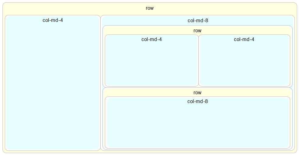
The example code layout we will design will look a bit like this;
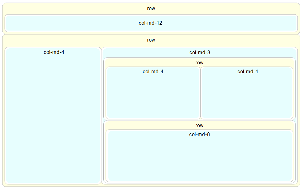
It looks slightly complex with a nesting of columns and rows, and the end result is only 5 separate sections, but it’s really not too hard to put together if you start in the right place and build it up piece by piece.
We’ll start in the middle and work our way out. The first piece to consider is the two side-by-side col-md-4’s.
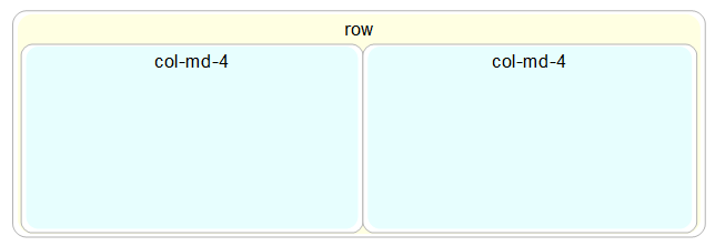
The code for these is just…
<div class="row">
  <div class="col-md-4"></div>
  <div class="col-md-4"></div>
</div>
Directly under that row is another with a single col-md-8.
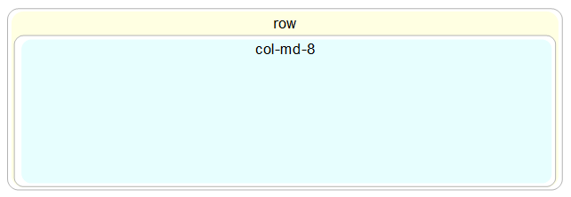
The code for this section is…
<div class="row">
  <div class="col-md-8"></div>
</div>
Both of these rows together look like this;
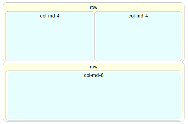
And the code is just one piece after the other.
<div class="row">
  <div class="col-md-n4"></div>
  <div class="col-md-4"></div>
</div>
<div class="row">
  <div class="col-md-8"></div>
</div>
Because this entire block forms part of another (larger) row, we need to enclose it in its own col-md-8 (since this is part is only col-md-8 wide).
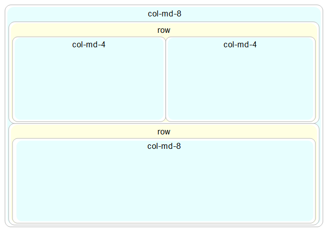
And for the code the new col-md-8 div wraps all the current code we have.
<div class="col-md-8">
  <div class="row">
    <div class="col-md-4"></div>
    <div class="col-md-4"></div>
  </div>
  <div class="row">
    <div class="col-md-8"></div>
  </div>
</div>
The col-md-8 is alongside a large col-md-4 that sits to the left.
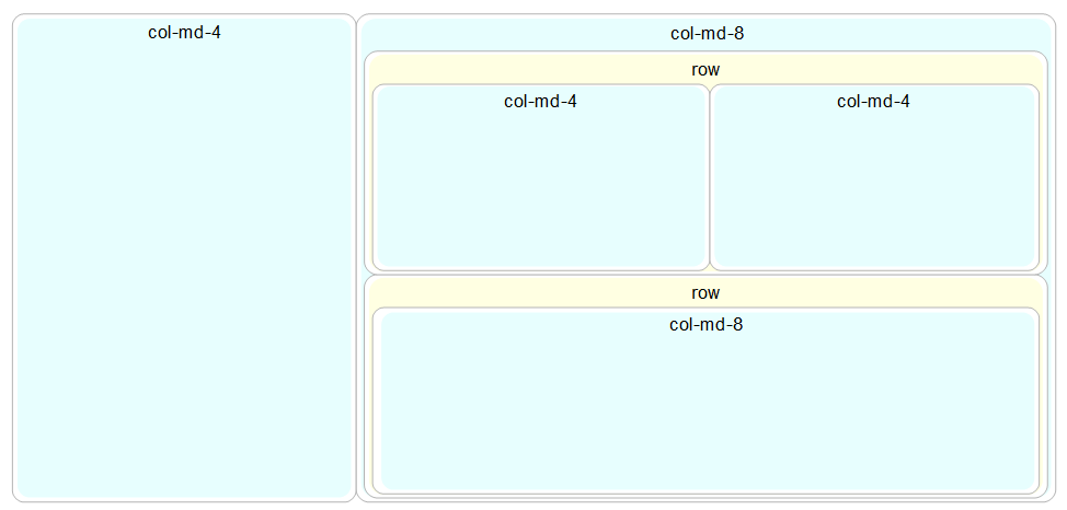
This requires another col-md-4 div to be placed before the col-md-8.
<div class="col-md-4"></div>
<div class="col-md-8">
  <div class="row">
    <div class="col-md-4"></div>
    <div class="col-md-4"></div>
  </div>
  <div class="row">
    <div class="col-md-8"></div>
  </div>
</div>
The col-md-4 and the complex col-md-8 need to be in their own row…
rowSo a row div encloses all the code we have so far.
<div class="row">
  <div class="col-md-4"></div>
  <div class="col-md-8">
    <div class="row">
      <div class="col-md-4"></div>
      <div class="col-md-4"></div>
    </div>
    <div class="row">
      <div class="col-md-8"></div>
    </div>
  </div>
</div>
Finally we need to place another row with a col-md-12 in it above our current work.
Again, we need to place the row and column before our current code so that it appears above the current code on the page.
<div class="row">
  <div class="col-md-12"></div>
</div>
<div class="row">
  <div class="col-md-4"></div>
  <div class="col-md-8">
    <div class="row">
      <div class="col-md-4"></div>
      <div class="col-md-4"></div>
    </div>
    <div class="row">
      <div class="col-md-8"></div>
    </div>
  </div>
</div>
There we have it!
Slightly more complex, but if you needed a heading, a sidebar, a couple of graphs and some explanatory text, that might be exactly what you were looking for :-).