Bar Charts
A bar chart is a visual representation using either horizontal or vertical bars to show comparisons between discrete categories. There are a number of variations of bar charts including stacked, grouped, horizontal and vertical.
There is a wealth of examples of bar charts on the web, but I would recommend a visit to the D3.js gallery maintained by Christophe Viau as a starting point to get some ideas.
We will work through a simple vertical bar chart that uses a value on the y axis and date values on the x axis.
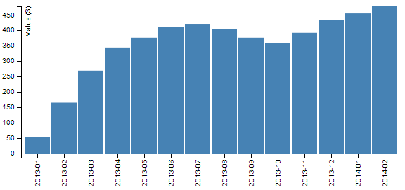
The end result will look like this;
The data
The data for this example will be sourced from an external csv file named bar-data.csv. It consists of a column of dates in year-month format and it’s contents are as follows;
date,value
2013-01,53
2013-02,165
2013-03,269
2013-04,344
2013-05,376
2013-06,410
2013-07,421
2013-08,405
2013-09,376
2013-10,359
2013-11,392
2013-12,433
2014-01,455
2014-02,478
The code
The full code listing for the example we are going to work through is as follows;
<!DOCTYPE html>
<meta charset="utf-8">

<head>
	<style>

	.axis {
	  font: 10px sans-serif;
	}

	.axis path,
	.axis line {
	  fill: none;
	  stroke: #000;
	  shape-rendering: crispEdges;
	}

	</style>
</head>

<body>

<script src="http://d3js.org/d3.v3.min.js"></script>

<script>

var margin = {top: 20, right: 20, bottom: 70, left: 40},
    width = 600 - margin.left - margin.right,
    height = 300 - margin.top - margin.bottom;

// Parse the date / time
var	parseDate = d3.time.format("%Y-%m").parse;

var x = d3.scale.ordinal().rangeRoundBands([0, width], .05);

var y = d3.scale.linear().range([height, 0]);

var xAxis = d3.svg.axis()
    .scale(x)
    .orient("bottom")
    .tickFormat(d3.time.format("%Y-%m"));

var yAxis = d3.svg.axis()
    .scale(y)
    .orient("left")
    .ticks(10);

var svg = d3.select("body").append("svg")
    .attr("width", width + margin.left + margin.right)
    .attr("height", height + margin.top + margin.bottom)
  .append("g")
    .attr("transform",
          "translate(" + margin.left + "," + margin.top + ")");

d3.csv("bar-data.csv", function(error, data) {

    data.forEach(function(d) {
        d.date = parseDate(d.date);
        d.value = +d.value;
    });

  x.domain(data.map(function(d) { return d.date; }));
  y.domain([0, d3.max(data, function(d) { return d.value; })]);

  svg.append("g")
      .attr("class", "x axis")
      .attr("transform", "translate(0," + height + ")")
      .call(xAxis)
    .selectAll("text")
      .style("text-anchor", "end")
      .attr("dx", "-.8em")
      .attr("dy", "-.55em")
      .attr("transform", "rotate(-90)" );

  svg.append("g")
      .attr("class", "y axis")
      .call(yAxis)
    .append("text")
      .attr("transform", "rotate(-90)")
      .attr("y", 6)
      .attr("dy", ".71em")
      .style("text-anchor", "end")
      .text("Value ($)");

  svg.selectAll("bar")
      .data(data)
    .enter().append("rect")
      .style("fill", "steelblue")
      .attr("x", function(d) { return x(d.date); })
      .attr("width", x.rangeBand())
      .attr("y", function(d) { return y(d.value); })
      .attr("height", function(d) { return height - y(d.value); });

});

</script>

</body>
The bar chart explained
In the course of describing the operation of the file I will gloss over the aspects of the structure of an HTML file which have already been described at the start of the book. Likewise, aspects of the JavaScript functions that have already been covered will only be briefly explained.
The start of the file deals with setting up the document’s head and body, loading the d3.js script and setting up the css in the <style> section.
The css section sets styling for the axes. It sizes the font to be used and make sure the lines are formatted appropriately.
	.axis {
	  font: 10px sans-serif;
	}

	.axis path,
	.axis line {
	  fill: none;
	  stroke: #000;
	  shape-rendering: crispEdges;
	}
Then our JavaScript section starts and the first thing that happens is that we set the size of the area that we’re going to use for the chart and the margins;
var margin = {top: 20, right: 20, bottom: 70, left: 40},
    width = 600 - margin.left - margin.right,
    height = 300 - margin.top - margin.bottom;
The next section of our code includes some of the functions that will be called from the main body of the code.
We have a familiar parseDate function with a slight twist. Since our source data for the date is made up of only the year and month, these are the only two portions of the date that need to be recognised;
var parseDate = d3.time.format("%Y-%m").parse;
The next section declares the function to determine positioning in the x domain.
var x = d3.scale.ordinal().rangeRoundBands([0, width], .05);
The ordinal scale is used to describe a range of discrete values. In our case they are a set of monthly values. The rangeRoundBands operator provides the magic that arranges our bars in a graceful way across the x axis. In our example we use it to set the range that our bars will cover (in this case from 0 to the width of the graph) and the amount of padding between the bars (in this case we have selected .05 which equates to approximately (depending on the number of pixels available) 5% of the bar width.
The function to set the scaling in the y domain is the same as most of our other graph examples;
var y = d3.scale.linear().range([height, 0]);
The declarations for our two axes are relatively simple, with the only exception being to force the format of the labels for the x axis into a ‘year-month’ format.
var xAxis = d3.svg.axis()
    .scale(x)
    .orient("bottom")
    .tickFormat(d3.time.format("%Y-%m"));

var yAxis = d3.svg.axis()
    .scale(y)
    .orient("left")
    .ticks(10);
The next block of code selects the body on the web page and appends an svg object to it of the size that we have set up with our width, height and margin’s.
var svg = d3.select("body").append("svg")
    .attr("width", width + margin.left + margin.right)
    .attr("height", height + margin.top + margin.bottom)
  .append("g")
    .attr("transform",
          "translate(" + margin.left + "," + margin.top + ")");
It also adds a g element that provides a reference point for adding our axes.
Then we begin the main body of our JavaScript. We load our csv file and then loop through it making sure that the dates and numerical values are recognised correctly;
d3.csv("bar-data.csv", function(error, data) {

    data.forEach(function(d) {
        d.date = parseDate(d.date);
        d.value = +d.value;
    });
We then then work through our x and y data and ensure that it is scaled to the domains we are working in;
  x.domain(data.map(function(d) { return d.date; }));
  y.domain([0, d3.max(data, function(d) { return d.value; })]);
Following that we append our x axis;
  svg.append("g")
      .attr("class", "x axis")
      .attr("transform", "translate(0," + height + ")")
      .call(xAxis)
    .selectAll("text")
      .style("text-anchor", "end")
      .attr("dx", "-.8em")
      .attr("dy", "-.55em")
      .attr("transform", "rotate(-90)" );
This is placed in the correct position .attr("transform", "translate(0," + height + ")") and the text is positioned (using dx and dy) and rotated (.attr("transform", "rotate(-90)" );) so that it is aligned vertically.
Then we append our y axis in a similar way and append a label (.text("Value ($)"););
  svg.append("g")
      .attr("class", "y axis")
      .call(yAxis)
    .append("text")
      .attr("transform", "rotate(-90)")
      .attr("y", 6)
      .attr("dy", ".71em")
      .style("text-anchor", "end")
      .text("Value ($)");
Lastly we add the bars to our chart;
  svg.selectAll("bar")
      .data(data)
    .enter().append("rect")
      .style("fill", "steelblue")
      .attr("x", function(d) { return x(d.date); })
      .attr("width", x.rangeBand())
      .attr("y", function(d) { return y(d.value); })
      .attr("height", function(d) { return height - y(d.value); });
This block of code creates the bars (selectAll("bar")) and associates each of them with a data set (.data(data)).
We then append a rectangle (.append("rect")) with values for x/y position and height/width as configured in our earlier code.
The end result is our pretty looking bar chart;