Crossfilter, dc.js and d3.js for Data Discovery
The ability to interact with visual data is the third step on the road to data nirvana in my humble opinion.
- Step 1: Raw data
- Step 2: Visualize data
- Step 3: Interact with data
But I think that there might be a 4th step where data is a more fluid construct. Where the influences of interaction have a more profound impact on how information is presented and perceived. I think that the visualization tools that we’re going to explore in this chapter take that 4th step.
- Step 4: Data immersion
The tools we’re going to use are not the only way that we can achieve the effect of immersion, but they are simple enough for me to use and they incorporate d3.js at their core.
Introduction to Crossfilter
Crossfilter is a JavaScript library for exploring large datasets that include many variables in the browser. It supports extremely fast interactions with concurrent views and was built to power analytics for Square Register so that online merchants can slice and dice their payment history fluidly. It was developed for Square by (amongst other people) the ever tireless Mike Bostock and was released under the Apache Licence.
Crossfilter provides a map-reduce function to data using ‘dimensions’ and ‘groups’. Map-reduce is an interesting concept itself and it’s useful to understand it in a basic form to understand crossfilter better.
Map-reduce
Wikipedia tells us that “MapReduce is a programming model for processing large data sets with a parallel, distributed algorithm on a cluster”. Loosely translated into language I can understand, I think of a large data set having one dimension ‘mapped’ or loaded into memory ready to be worked on. In practical terms, this could be an individual column of data from a larger group of information. This column of data has ‘key’ values which we can define as being distinct. In the case of the data below, this could be earthquake magnitudes.
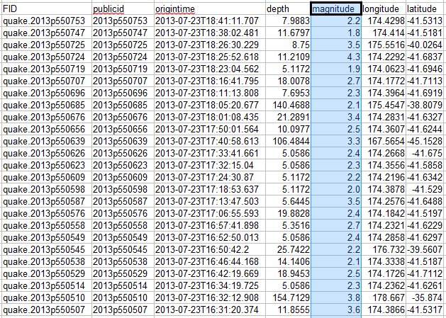
The reduce function then takes that dimension and ‘reduces’ it by grouping it according to a specific aspect. For instance in the example above we may want to group each unique value of magnitude (by counting how many occurrences of each there are) to know how many earthquakes of a specific magnitude have taken place. Leaving us with a very specific subset of our data.
Magnitude Count
2.6       63
2.7       134
2.8       292
2.9       299
3.0       378
3.1       351
3.2       403
3.3       455
3.4       512
3.5       688
What can crossfilter do?
The best way to get a feel for the capabilities of crossfilter is to visit the demo page for crossfilter and to play with their example.
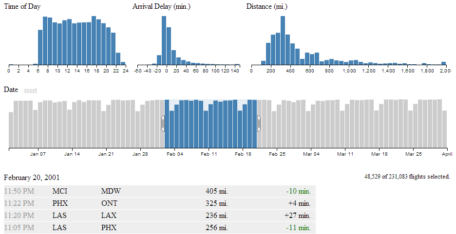
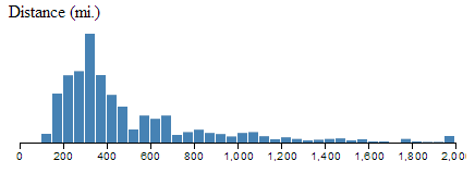
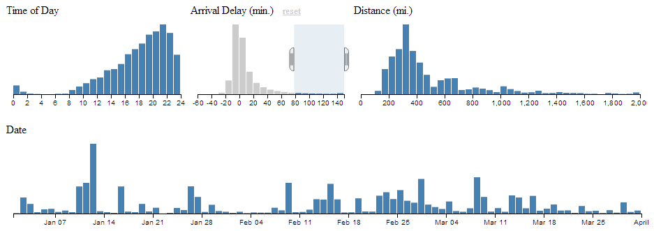
Here we are presented with five separate views of a data set that represents flight records demonstrating airline on-time performance. There are 231,083 flight records in the database being used, so getting that rendered in a web page is no small feat in itself.
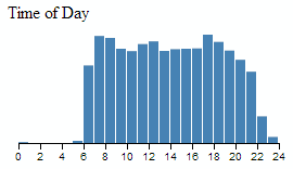
The bottom view is a table showing data for individual flights. The top, left view is of the number of flights that occur at a specific hour of the day.
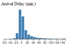
The top, middle graph shows the amount of delay for flights grouped in 10 minute intervals.
The top, right graph shows the distance covered by each flight grouped in 50 mile chunks.
The wider bar graph in the second row shows the number of flights per day.
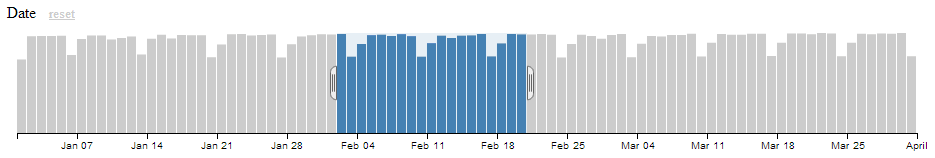
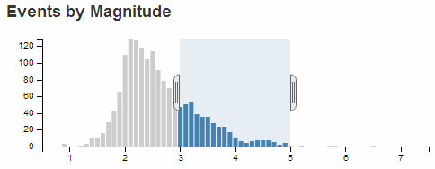
This particular graph is the first to give a hint at how cool this visualization really is, because it includes a section in the middle of the graph which is selected with ‘handles’ on either side of the selection. You can move these handles with a mouse and as a result you will find all the data represented in the other graphs adjusting dynamically to follow your selection.
This same feature is available in all the graphs. So you are able to filter dynamically and have the results presented virtually instantaneously. This is where you can start to have fun and discover things that might not be immediately obvious.
For instance, if we select only the flights that arrived late, we can see a marked skew in the time of day. Does this mean that flights that are delayed will typically be in the late evening?
So this is why tools like crossfilter are cool. All we need to do now is learn how to make them ourselves :-).
Introduction to dc.js
Why, if we’ve just explored the benefits of crossfilter are we now introducing a completely different JavaScript library (dc.js)?
Well, crossfilter isn’t a library that’s designed to draw graphs. It’s designed to manipulate data. D3.js is a library that’s designed to manipulate graphical objects (and more) on a web page. The two of them will work really well together, but the barrier to getting data onto a web page can be slightly daunting because the combination of two non-trivial technologies can be difficult to achieve.
This is where dc.js comes in. It was developed by Nick Qi Zhu and the first version was released on the 7th of July 2012.
Dc.js is designed to be an enabler for both libraries. Taking the power of crossfilter’s data manipulation capabilities and integrating the graphical capabilities of d3.js.
It is designed to provide access to a range of different chart types in a relatively easy to use fashion. It is more limited in the range of options available for graphical design in this respect than d3.js, but the simplicity that it provides for creating pages using crossfiltered data is a real benefit if you’re anything like me and need all the help you can get.
The different (generic) types of chart that dc.js supports are
- Bar Chart
- Pie Chart
- Row Chart
- Line Chart
- Bubble Chart
- Geo Choropleth Chart
- Data Table
All these examples come with a range of options which we will cover in greater depth in later sections.
My initial sources of information for developing the examples here came primarily from;
Bar Chart
This is a standard bar chart.
Pie Chart
This is a standard pie chart. The examples below are from one of Nick Zhu’s dc.js example pages.
Row Chart
The row chart is a horizontal version of a bar chart, but with the ability to represent discrete values and to select them for filtering by clicking on them.
Line Chart
Standard line chart.
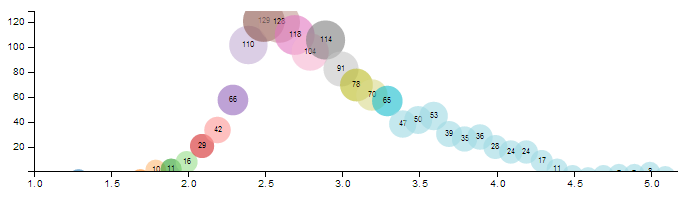
Bubble Chart
The bubble chart is a derivative of a scatter plot with control over x axis position, y axis position, bubble radius and colour.
Geo Choropleth Chart
A Choropleth map is one where areas are shaded or patterned in proportion to the measurement of a variable being displayed on the map, such as population density or per-capita income. The example below is from one of Nick Zhu’s dc.js example pages
Data Table
A data table is a simple table made up of data elements derived from the information loaded.
Bare bones structure for dc.js and crossfilter page
To learn some of the capabilities of dc.js and crossfilter we will start with a rudimentary template and build chart examples as we go.
The template we’ll start with will load d3.js, crossfilter.js, dc.js, jquery.js and bootstrap.js. We will be including bootstrap as it provides lots of nice capabilities for fine tuning layout and styling as laid out in the chapter on using bootstrap. Since bootstrap depends on jquery, we have to load that as well.
We’ll also load cascading style sheets for bootstrap and dc.js.
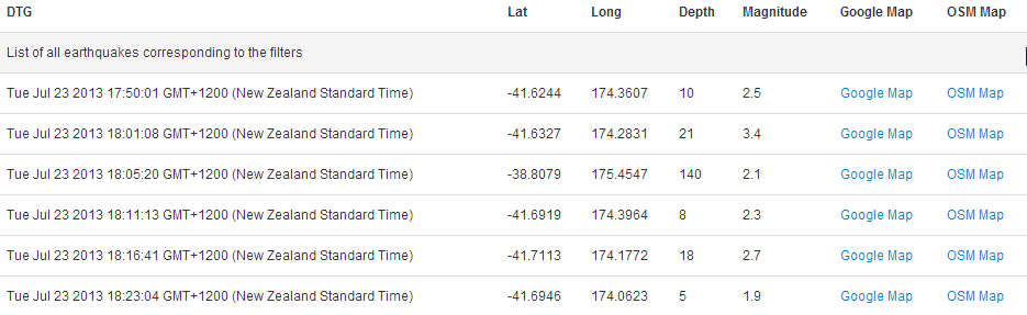
The template will load a csv file with earthquake data sourced from New Zealand’s Geonet site over a date range that covers a period of reasonable activity in July 2013.
In its bare bones form we will present only a data table with some values from the csv file. When we begin to add charts, we will see this table adjust dynamically.
We’ll move through the explanation of the code in a similar process to the other examples in the book. Where there are areas that we have covered before, I will gloss over some details on the understanding that you will have already seen them explained in other sections.
The full code for this example can be found on github or in the code samples bundled with this book (dcjs-examples.html, dc.js, dc.css, crossfilter.js, jquery-1.9.1.min.js, bootstrap.min.js, bootstrap.min.css and quakes.csv). A live example can be found on bl.ocks.org.
<!DOCTYPE html>
<html lang='en'>
<head>
  <meta charset='utf-8'>

  <title>dc.js Experiment</title>

  <script src="http://d3js.org/d3.v3.min.js"></script>
  <script src='crossfilter.js' type='text/javascript'></script>
  <script src='dc.js' type='text/javascript'></script>
  <script src='jquery-1.9.1.min.js' type='text/javascript'></script>
  <script src='bootstrap.min.js' type='text/javascript'></script>

  <link href='bootstrap.min.css' rel='stylesheet' type='text/css'>
  <link href='dc.css' rel='stylesheet' type='text/css'>

  <style type="text/css"></style>
</head>

<body>

<div class='container' style='font: 12px sans-serif;'>
  <div class='row'>
	<div class='span12'>
      <table class='table table-hover' id='dc-table-graph'>
        <thead>
          <tr class='header'>
            <th>DTG</th>
            <th>Lat</th>
            <th>Long</th>
            <th>Depth</th>
            <th>Magnitude</th>
            <th>Google Map</th>
            <th>OSM Map</th>
          </tr>
        </thead>
      </table>
	</div>
  </div>
</div>

<script>

// Create the dc.js chart objects & link to div
var dataTable = dc.dataTable("#dc-table-graph");

// load data from a csv file
d3.csv("quakes.csv", function (data) {

  // format our data
  var dtgFormat = d3.time.format("%Y-%m-%dT%H:%M:%S");

  data.forEach(function(d) {
    d.dtg   = dtgFormat.parse(d.origintime.substr(0,19));
    d.lat   = +d.latitude;
    d.long  = +d.longitude;
    d.mag   = d3.round(+d.magnitude,1);
    d.depth = d3.round(+d.depth,0);
  });

  // Run the data through crossfilter and load our 'facts'
  var facts = crossfilter(data);

  // Create dataTable dimension
  var timeDimension = facts.dimension(function (d) {
    return d.dtg;
  });

  // Setup the charts

  // Table of earthquake data
  dataTable.width(960).height(800)
    .dimension(timeDimension)
	.group(function(d) { return "Earthquake Table"
	 })
	.size(10)
    .columns([
      function(d) { return d.dtg; },
      function(d) { return d.lat; },
      function(d) { return d.long; },
      function(d) { return d.depth; },
      function(d) { return d.mag; },
      function(d) {
          return '<a href=\"http://maps.google.com/maps?z=12&t=m&q=loc:' +
              d.lat + '+' + d.long + "\" target=\"_blank\">Google Map</a>"},
      function(d) {
          return '<a href=\"http://www.openstreetmap.org/?mlat=' +
              d.lat + '&mlon=' + d.long +'&zoom=12'+
              "\" target=\"_blank\"> OSM Map</a>"}
    ])
    .sortBy(function(d){ return d.dtg; })
    .order(d3.ascending);

  // Render the Charts
  dc.renderAll();

});

</script>

</body>
</html>
The first part of the code starts the html file and inside the <head> segment loads our JavaScript and css files
<!DOCTYPE html>
<html lang='en'>
<head>
  <meta charset='utf-8'>

  <title>dc.js Experiment</title>

  <script src="http://d3js.org/d3.v3.min.js"></script>
  <script src='crossfilter.js' type='text/javascript'></script>
  <script src='dc.js' type='text/javascript'></script>
  <script src='jquery-1.9.1.min.js' type='text/javascript'></script>
  <script src='bootstrap.min.js' type='text/javascript'></script>

  <link href='bootstrap.min.css' rel='stylesheet' type='text/css'>
  <link href='dc.css' rel='stylesheet' type='text/css'>

  <style type="text/css"></style>
</head>
From here we move into the section where we set up our page to load our bootstrap grid layout for the table.
<div class='container' style='font: 12px sans-serif;'>
  <div class='row'>
    <div class='span12'>
      <table class='table table-hover' id='dc-table-graph'>
        <thead>
          <tr class='header'>
            <th>DTG</th>
            <th>Lat</th>
            <th>Long</th>
            <th>Depth</th>
            <th>Magnitude</th>
            <th>Google Map</th>
            <th>OSM Map</th>
          </tr>
        </thead>
      </table>
    </div>
  </div>
</div>
It might look a little complicated, but if you have a look through the bootstrap chapter (where we cover using the bootstrap grid layout), you will find it no problem at all.
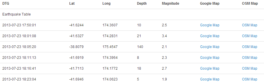
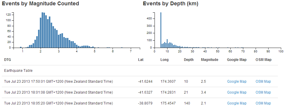
The important features to note are that we have declared an ID selector for our table id='dc-table-graph' and we have set a series of headers for the table; DTG, Lat, Long, Depth, Magnitude, Google Map and OSM Map.
We have also included some bootstrap styling for the table by including the class='table table-hover' portion of the code. With that styling included our table looks like this;
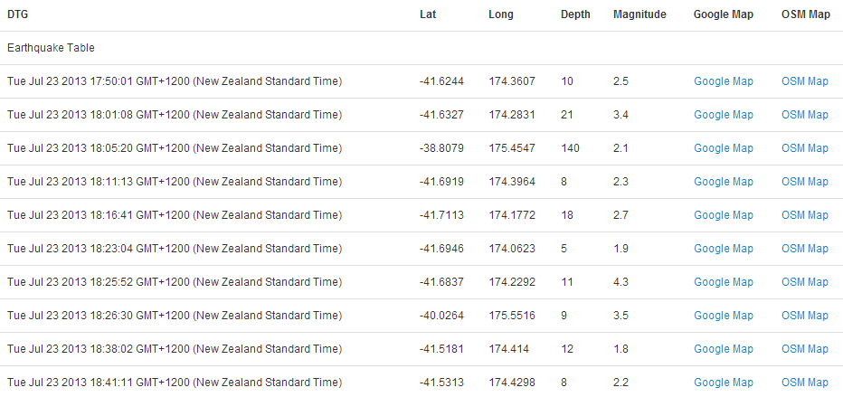
Without the styling it would look like this;
We will be adding to this grid layout section as we add in charts which will want their own allocated space on our page.
The next section of the file starts our JavaScript and declares our variables for our charts.
  // Create the dc.js chart objects & link to div
  var dataTable = dc.dataTable("#dc-table-graph");
The first line assigns the variable dataTable to the dc.js dataTable chart type (var dataTable = dc.dataTable("#dc-table-graph");) and assigns the chart to the ID selector dc-table-graph.
Then we get into the d3.js.
// load data from a csv file
d3.csv("quakes.csv", function (data) {

  // format our data
  var dtgFormat = d3.time.format("%Y-%m-%dT%H:%M:%S");

  data.forEach(function(d) {
    d.dtg   = dtgFormat.parse(d.origintime.substr(0,19));
    d.lat   = +d.latitude;
    d.long  = +d.longitude;
    d.mag   = d3.round(+d.magnitude,1);
    d.depth = d3.round(+d.depth,0);
  });
We load our csv file with the line d3.csv("quakes.csv", function (data) {. I have deliberately left this file in its raw form as received from Geonet. Its format looks a little like this (be warned, the formatting of the book can create word wrap issues where the text will be broken by a backslash () and this is likely to happen with the text below);
FID,publicid,origintime,longitude,latitude,depth,magnitude,magnitudetype,stat\
us,phases,type,agency,updatetime,origin_geom
quake.2013p550753,2013p550753,2013-07-23T18:41:11.707,174.4298,-41.5313,7.988\
3,2.2425,M,automatic,27,,WEL(GNS_Primary),2013-07-23T18:43:15.672,POINT (174.\
42978 -41.531299)
quake.2013p550747,2013p550747,2013-07-23T18:38:02.481,174.414,-41.5181,11.679\
7,1.7892,M,automatic,11,,WEL(GNS_Primary),2013-07-23T18:39:25.37,POINT (174.4\
1398 -41.518114)
quake.2013p550725,2013p550725,2013-07-23T18:26:30.229,175.5516,-40.0264,8.75,\
3.4562,M,automatic,21,,WEL(GNS_Primary),2013-07-23T18:29:46.305,POINT (175.55\
155 -40.026412)
We then declare a small function that will format our time correctly (var dtgFormat = d3.time.format("%Y-%m-%dT%H:%M:%S");). This follows exactly the same procedure we took when creating our very first simple line graph at the start of the book.
While we’re on the subject, observant readers will have noticed that the format of the date / time that appears in the table are (how to put this kindly…….), not what came out of the csv file.
If you want to put this in a different format we can employ the same technique we used when formatting time figures in the section that dealt with tables. All we need to do is to assign a new variable for our ‘correctly’ formatted time in the forEach loop. and then call that variable when displaying the table values.
The following code will create a date / time string in the format yyyy-mm-dd hh:mm:ss with a variable name dtg1 (put this in the forEach loop).
d.dtg1 = d.origintime.substr(0,10) + " " + d.origintime.substr(11,8);
Then, when your code calls the values for the table, instead of the line that says;
function(d) { return d.dtg; },
You rename dtg to dtg1 like so;
function(d) { return d.dtg1; },
The end result will look like this;
As mentioned, the next section goes through each of the records and formats them correctly. The date/time gets formatted, the latitude and longitude are declared as numerical values (if they weren’t already) and the magnitude and depth values are rounded to make the process of grouping them simpler.
  data.forEach(function(d) {
    d.dtg   = dtgFormat.parse(d.origintime.substr(0,19));
    d.lat   = +d.latitude;
    d.long  = +d.longitude;
    d.mag   = d3.round(+d.magnitude,1);
    d.depth = d3.round(+d.depth,0);
  });
The next section in our code sets up the dimensions and groupings for the dc.js chart type and crossfilter functions.
  // Run the data through crossfilter and load our 'facts'
  var facts = crossfilter(data);

  // Create dataTable dimension
  var timeDimension = facts.dimension(function (d) {
    return d.dtg;
  });
We load all of our data into crossfilter (var facts = crossfilter(data);) and give it the name facts.
Then we create a dimension from our data (facts) of the date/time values.
  var timeDimension = facts.dimension(function (d) {
    return d.dtg;
  });
The last major chunk of code is the piece that configures our data table.
  dataTable.width(960).height(800)
    .dimension(timeDimension)
	.group(function(d) { return "Earthquake Table"
	 })
	.size(10)
    .columns([
      function(d) { return d.dtg; },
      function(d) { return d.lat; },
      function(d) { return d.long; },
      function(d) { return d.depth; },
      function(d) { return d.mag; },
      function(d) {
          return '<a href=\"http://maps.google.com/maps?z=12&t=m&q=loc:' +
              d.lat + '+' + d.long +"\" target=\"_blank\">Google Map</a>"},
      function(d) {
          return '<a href=\"http://www.openstreetmap.org/?mlat=' +
              d.lat + '&mlon=' + d.long +
              '&zoom=12'+ "\" target=\"_blank\"> OSM Map</a>"}
    ])
    .sortBy(function(d){ return d.dtg; })
    .order(d3.ascending);
Firstly the width and height are declared (dataTable.width(960).height(800)). Then the dimension of the data that will be used is declared (.dimension(timeDimension)).
The .size(10) line sets the maximum number of lines of the table to be displayed to 10.
Then we have the block of code that sets what data appears in which columns. It should be noted that this matches up with the headers that were declared in the earlier section of the code where the divs for the table were laid out.
The portion of this block that has a ‘little bit of fancy’ are the two columns that set links that allow a user to click on the designation ‘Google Map’ or ‘OSM Map’ and have the browser open a new window containing a Google or Open Street Map (OSM) map with a marker designating the location of the quake. I won’t mention too much about how the links are made up other than to say that they are pretty much a combination of the latitude, longitude and zoom level for both. Please check out the code for more.
Lastly we sort by the date/time value (.sortBy(function(d){ return d.dtg; })) in ascending order (.order(d3.ascending);).
The final part of our JavaScript renders all our charts (dc.renderAll();) and then closes off the initial d3.csv call.
  // Render the Charts
  dc.renderAll();

});
The final part of our code simply closes off the <script>, <body> and <html> tags.
There we have it. The template for starting to play with different crossfiltered dc.js charts.
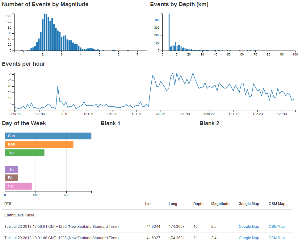
Add a Bar Chart.
The ubiquitous bar chart is a smart choice if you’re starting out with crossfilter and dc.js. It’s pretty easy to implement and gives a certain degree of instant satisfaction.
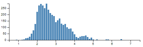
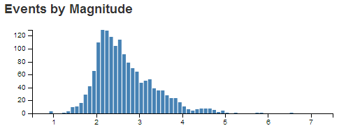
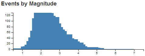
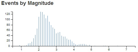
The bar chart that we’ll create will be a representation of the magnitude of the earthquakes that we have in our dataset. In this respect, what we are expecting to see is the magnitude of the events along the x axis and the number of each such event on the y axis.
It should end up looking a bit like this.
We’ll work through adding the chart in stages (and this should work for subsequent charts). Firstly we’ll organise a position for our chart on the page using the bootstrap grid set-up. Then we’ll name our chart and assign it a chart type. Then we’ll create any required dimension and grouping and finally we’ll configure the parameters for the chart. Sounds simple right?
- Position the chart
- Assign type
- Dimension and Group
- Configure chart parameters
Position the bar chart
We are going to position our bar chart above our data table and we’ll actually only make it half the width of our data table so that we can add in another one along side it later.
Just under the line of code that defined the main container for the layout;
<div class='container' style='font: 12px sans-serif;'>
We add in a new row that has two span6’s in it (remembering our total is a span of 12 (see the section on bootstrap layout if it’s a bit unfamiliar)).
  <div class='row'>
    <div class='span6' id='dc-magnitude-chart'>
      <h4>Events by Magnitude</h4>
    </div>
    <div class='span6' id='blank'>
      <h4>Blank</h4>
    </div>
  </div>
We’ve given the first span6 an ID selector of dc-magnitude-chart. So when we we assign our chart that selector, it will automatically appear in that position. We’ve also put a simple title in place (<h4>Events by Magnitude</h4>). The second span6 is set as blank for the time being (we’ll put another bar chart in it later).
Assign the bar chart type
Here we give our chart it’s name (magnitudeChart), assign it with a dc.js chart type (in this case barChart) and assign it to the ID selector (dc-magnitude-chart).
Under the line that assigns the dataTable chart type…
var dataTable = dc.dataTable("#dc-table-graph");
… add in the equivalent for our bar chart.
  var dataTable = dc.dataTable("#dc-table-graph");
  var magnitudeChart = dc.barChart("#dc-magnitude-chart");
All done.
Dimension and group the bar chart data
To set our dimension for magnitude, it’s as simple as following the same format as we had previously done for the data table but in this case using the .mag variable.
This should go just before the portion of the code that created the data table dimension.
  var magValue = facts.dimension(function (d) {
    return d.mag;
  });
This dimension (magValue) has been set and now has, as its index, each unique magnitude that is seen in the database. This is essentially defining the values on the x axis for our bar chart.
Then we want to group the data by counting the number of events of each magnitude.
  var magValueGroupCount = magValue.group()
    .reduceCount(function(d) { return d.mag; }) // counts
This piece of code (which should go directly under the magValue dimension portion), groups (.group()) by counting (.reduceCount) all of the magnitude values (function(d) { return d.mag; })) and assigns it to the magValueGroupCount variable. This has essentially defined the values for the y axis of our bar chart (the number of times each magnitude occurs).
Configure the bar chart parameters
There are lots of parameters that can be configured, and if the truth be told, I haven’t explored all of them or, in some cases, worked out exactly how they work.
However, the best way to learn is by doing, so here is the block of code for configuring the bar chart. This should go just before the block that configures the dataTable.
  magnitudeChart.width(480)
    .height(150)
    .margins({top: 10, right: 10, bottom: 20, left: 40})
    .dimension(magValue)
    .group(magValueGroupCount)
    .transitionDuration(500)
    .centerBar(true)
    .gap(65)
    .filter([3, 5])
    .x(d3.scale.linear().domain([0.5, 7.5]))
    .elasticY(true)
    .xAxis().tickFormat();
That should be it. With the addition of this portion of the code, you should have a functioning visualization that can be filtered dynamically. Just check to make sure that everything is working properly and we’ll go through some of the configuration options to see what they do.
Your web page should look a little like this;
The configuration options start by declaring the name of the chart (magnitudeChart) and setting the height and width of the chart.
  magnitudeChart.width(480)
    .height(150)
In the case of our example I have selected the width based on the default size for a span6 grid segment in bootstrap and adjusted the height to make it look suitable.
Then we have our margins set up.
.margins({top: 10, right: 10, bottom: 20, left: 40})
Nothing too surprising there although the left margin is slightly larger to allow for larger values on the y axis to be represented without them getting clipped.
Then we define which dimension and grouping we will use.
    .dimension(magValue)
    .group(magValueGroupCount)
I like to think of this section as the .dimension declaration being the x axis and the .group declaration being the y axis. This just helps me get the graph straight in my head before it’s plotted.
The .transitionDuration setting defines the length of time that any change takes to be applied to the chart as it adjusts.
.transitionDuration(500)
Then we ensure that the bar for the bar graph is centred on the ticks on the x axis.
.centerBar(true)
Without this (true is not the default), the graph will look slightly odd.
The setting of the gap between the bars is accomplished with the following setting;
.gap(65)
I will admit that I still don’t quite understand how this setting works exactly, but I can get it to do what I want with a little trial and error.
For instance, I would expect that .gap(2) would have the effect of producing a gap of 2 pixels between the bars. But this would be the result for our graph if I have that set.
gap Set to 2If you select a portion of the graph you will see some strange things going on. That appears to be as a result of the bars being too wide for the graph.
Setting the gap for a bar graph is a pretty tricky thing to do (programmatically), and I can see why it would throw some strange results. The way around this and the way to find the ideal .gap setting is to set the .gap value high and then reduce it till it’s right.
For instance, if we set it to 100 (.gap(100)) we will get the following result.
gap Set to 100Then we just keep backing the values off till we reach an acceptable chart on the screen.
In the case of our example, it’s .gap(65).
I have added in the next setting more because I want you to know it exists, rather than wanting to use it in this example.
.filter([3, 5])
Setting the .filter configuration will load the graph with a portion of it pre-selected. If you omit this parameter, the entire graph is selected by default. In most cases that I can think of, that is what I would start with.
We can set the range of values presented in our graph by defining the domain (in the same way as for d3.js).
.x(d3.scale.linear().domain([0.5, 7.5]))
The next parameter sets the y axis to adjust dynamically as the filtered data is returned.
.elasticY(true)
The final parameter that we set is to format the values on the x axis.
.xAxis().tickFormat();
And that’s it! A bar graph added to your visualization with full dynamic control.
Just one more thing…
Just another snippet that could be useful. In the section where we set up our group to count the number of instances of individual magnitudes we had;
  var magValueGroupCount = magValue.group()
    .reduceCount(function(d) { return d.mag; }) // counts
We could have just as easily summed the magnitude values instead of counting them by using .reduceSum instead of .reduceCount. This has the effect of increasing the value on the y axis (as the sum of the magnitudes would have been greater than the count) like so
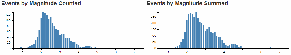
The reason I mention it is that summing the numeric value would be useful in many circumstances (file size or packet size or similar).
Just yet another thing…
When we initially set up our grid layout for the web page we left ourselves a blank position for another graph. If you feel so inclined, try to include another bar graph in this position that will display the depth of the earthquakes.
The example I came up with looks like this;
And the sections I added are as follows;
Position the chart
(more of a change than an addition)
    <div class='span6' id='dc-depth-chart'>
	  <h4>Events by Depth (km)</h4>
    </div>
Assign type
var depthChart = dc.barChart("#dc-depth-chart");
Dimension and Group
  var depthValue = facts.dimension(function (d) {
    return d.depth;
  });
  var depthValueGroup = depthValue.group();
Configure chart parameters
  depthChart.width(480)
    .height(150)
    .margins({top: 10, right: 10, bottom: 20, left: 40})
    .dimension(depthValue)
    .group(depthValueGroup)
    .transitionDuration(500)
    .centerBar(true)
    .gap(1)
    .x(d3.scale.linear().domain([0, 100]))
    .elasticY(true)
    .xAxis().tickFormat(function(v) {return v;});
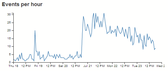
Add a Line Chart.
The line chart is another simple choice for implementation using crossfilter and dc.js.
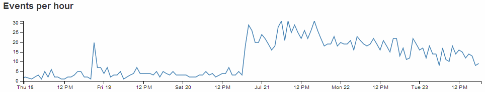
The line chart that we’ll create will be a representation of the frequency of the occurrence of the earthquakes that we have in our dataset. In this respect, what we are expecting to see is the number of events on the y axis and the time-scale on the x axis.
It should end up looking a bit like this.
Just as with the bar chart, we’ll work through adding the chart in the following stages.
- Position the chart
- Assign type
- Dimension and Group
- Configure chart parameters
Position the line chart
We are going to position our line chart above our data table (and below the bar charts) and we’ll make it the full width of our data table so that it looks like it belongs there.
Just under the line of code that defined the containers for the bar graphs;
  <div class='row'>
    <div class='span6' id='dc-magnitude-chart'>
      <h4>Events by Magnitude Counted</h4>
    </div>
    <div class='span6' id='dc-depth-chart'>
	  <h4>Events by Depth (km)</h4>
    </div>
  </div>
We add in a new row that has a single span12.
  <div class='row'>
    <div class='span12' id='dc-time-chart'>
      <h4>Events per hour</h4>
    </div>
  </div>
We’ve given it an ID selector of dc-time-chart. So when we assign our chart that selector, it will automatically appear in that position. We’ve also put another simple title in place (<h4>Events per hour</h4>).
Assign the line chart type
Here we give our chart it’s name (timeChart), assign it with a dc.js chart type (in this case lineChart) and assign it to the ID selector (dc-time-chart).
Under the line that assigns the depthChart chart type…
var depthChart = dc.barChart("#dc-depth-chart");
… add in the equivalent for our line chart.
  var depthChart = dc.barChart("#dc-depth-chart");
  var timeChart = dc.lineChart("#dc-time-chart");
Nice.
Dimension and group the line chart data
We’ll put the code between the dimension and group of the depth chart and the data table dimension (this is just to try and keep the code in the same order as the graphs on the page).
To set our dimension for our time we do something a little different.
  var volumeByHour = facts.dimension(function(d) {
    return d3.time.hour(d.dtg);
  });
This dimension (volumeByHour) uses the same facts data, but when the key values are returned (return d3.time.hour(d.dtg);) we are going to return the information by hours. This is essentially defining the resolution of the values on the x axis for our line chart.
Then we want to group the data by counting the number of events of for each hour.
  var volumeByHourGroup = volumeByHour.group()
    .reduceCount(function(d) { return d.dtg; });
This piece of code (which should go directly under the volumeByHour dimension portion) groups (.group()) by counting (.reduceCount) all of the magnitude values (function(d) { return d.dtg; })) and assigns it to the volumeByHourGroup variable. This has defined the values for the y axis of our line chart (the number of events we see in a given hour).
Configure the line chart parameters
As with the bar chart, there are lots of parameters that can be configured. The best way to learn what they do is by having a play with them. So here is the block of code for configuring the line chart. Once you are happy that it works on your system, take some time and go through the settings in conjunction with the information from the demo page and the api reference.
This should go just before the block that configures the dataTable (again, this is just to try and keep the code in the same order as the graphs on the page).
  // time graph
  timeChart.width(960)
    .height(150)
    .margins({top: 10, right: 10, bottom: 20, left: 40})
    .dimension(volumeByHour)
    .group(volumeByHourGroup)
    .transitionDuration(500)
    .elasticY(true)
    .x(d3.time.scale().domain([new Date(2013, 6, 18), new Date(2013, 6, 24)]))
    .xAxis();
That should be it. With the addition of this portion of the code, you should have a functioning visualization that can be filtered dynamically. Just check to make sure that everything is working properly and we’ll go through some of the configuration options to see what they do.
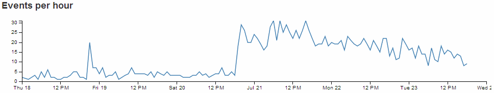
To start with, your page should look something like this;
The configuration options start by declaring the name of the chart (timeChart) and setting the height and width of the chart.
  timeChart.width(960)
    .height(150)
In the case of our example I have selected the width based on the default size for a span12 grid segment in bootstrap and adjusted the height to make it look suitable.
Then we have our margins set up.
.margins({top: 10, right: 10, bottom: 20, left: 40})
Nothing too surprising there although the left margin is slightly larger to allow for larger values on the y axis to be represented without them getting clipped (not strictly for this example, but it’s a handy default).
Then we define which dimension and grouping we will use.
    .dimension(volumeByHour)
    .group(volumeByHourGroup)
Think of the .dimension declaration being the x axis and the .group declaration being the y axis.
The .transitionDuration setting defines the length of time that any change takes to be applied to the chart as it adjusts.
.transitionDuration(500)
We can set the y axis to dynamically adjust when the number of events are filtered by selections on any of the other charts.
.elasticY(true)
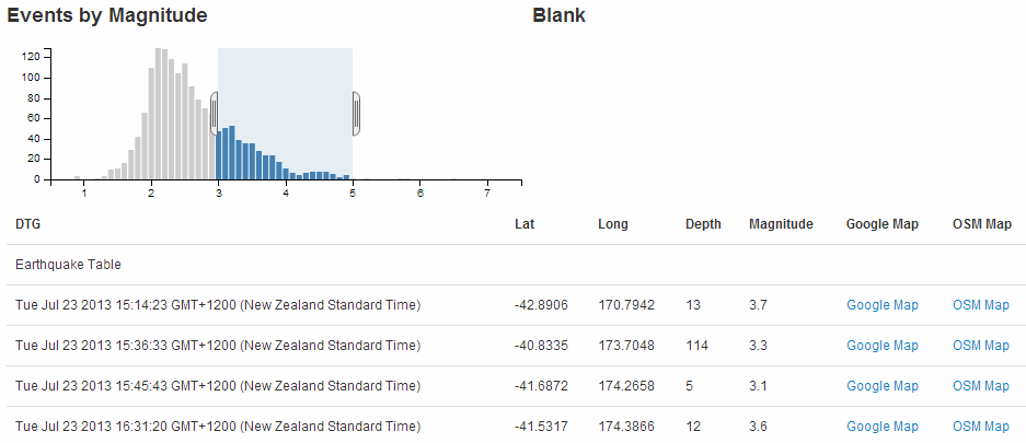
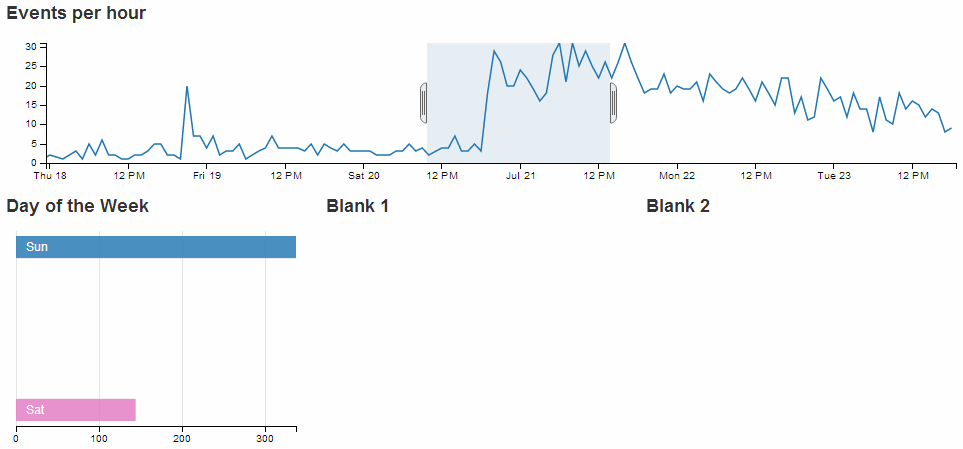
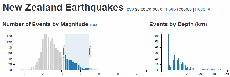
For instance if we select only earthquakes with a magnitude between 4 and 5, our line chart will have a maximum value on the y axis of 7 events;
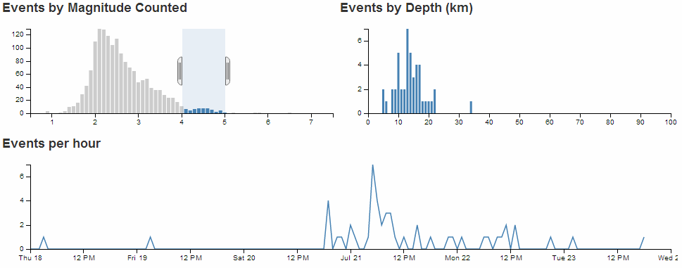
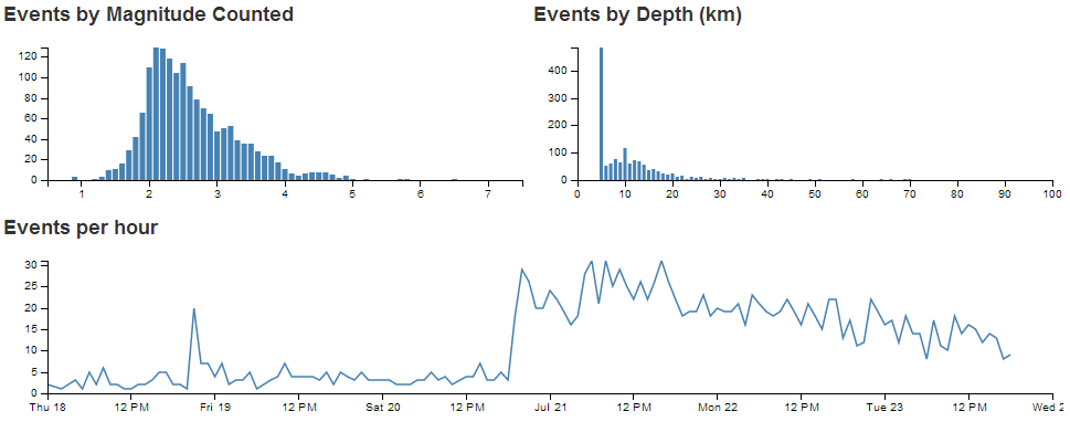
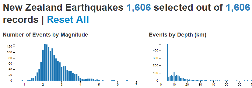
However, if we select all the earthquakes, the y axis will dynamically adjust to over 30.
Since the line chart has an x axis which is made of date/time values, we set our scale and domain using the d3.time.scale declaration.
.x(d3.time.scale().domain([new Date(2013, 6, 18), new Date(2013, 6, 24)]))
This is hard coded for our date range, but a smarter method would be to have the scale adjust to suit your range of date/time values automatically with the following line;
.x(d3.time.scale().domain(d3.extent(data, function(d) { return d.dtg; })))
Using the d3.extent function means that our line graph of time now spans the exact range of our data values on the x axis (note that the time scale now starts just before the 18th and ends when our data ends).
The final parameter that we set is to add the x axis.
.xAxis();
Adding tooltips to a line chart
dc.js has a nice feature for adding tooltips to a line chart.
It utilises the .title function in the configuration of the chart to apply the tooltip, but the downside is that the ability to select the time range needs to be disabled (there are ways to compensate for this which I hope to cover in the future).
If we take our example line chart configuration block of code;
  // time graph
  timeChart.width(960)
    .height(150)
    .margins({top: 10, right: 10, bottom: 20, left: 40})
    .dimension(volumeByHour)
    .group(volumeByHourGroup)
    .transitionDuration(500)
    .elasticY(true)
    .x(d3.time.scale().domain([new Date(2013, 6, 18), new Date(2013, 6, 24)]))
    .xAxis();
We need to turn off the .brushOn feature (.brushOn(false)) that allows for selection and add in the .title function as follows;
  // time graph
  timeChart.width(960)
    .height(150)
    .margins({top: 10, right: 10, bottom: 20, left: 40})
    .dimension(volumeByHour)
    .group(volumeByHourGroup)
    .transitionDuration(500)
    .brushOn(false)
    .title(function(d){
      return d.data.key
      + "\nNumber of Events: " + d.data.value;
      })
    .elasticY(true)
    .x(d3.time.scale().domain([new Date(2013, 6, 18), new Date(2013, 6, 24)]))
    .xAxis();
As we can see, the tooltip is using the default time format for the script from our key value (on the x axis), and as a result, the representation of the date / time is quite long winded. We can adapt this to a format of our choosing by calling a time formatting function similar to the following;
var dtgFormat2 = d3.time.format("%a %e %b %H:%M");
This line could ideally go after the other time formatting function (dtgFormat) that occurs earlier in the script. The formatting it’s introducing can be found in the d3.js wiki, but in short it returns the date / time formatted as abbreviated weekday name, day of the month as a decimal number, abbreviated month name and 24 hour clock hour:minute.
With our function in place, the .title. call from our line chart configuration code would now look like this;
    .title(function(d){
      return dtgFormat2(d.data.key)
      + "\nNumber of Events: " + d.data.value;
      })
And the resulting graph looks like this;
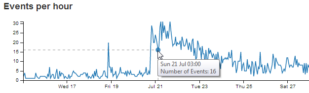
We also add in the number of the events from the y axis (d.data.value), separated with a new line character (\n) and some appropriate text.
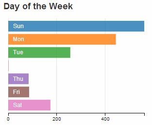
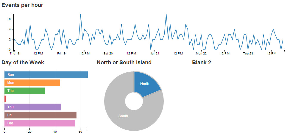
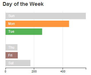
Add a Row Chart.
The row chart provides an excellent mechanism for presenting and filtering on discrete values or identifiers.
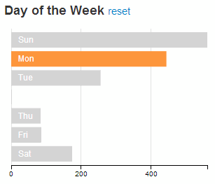
The row chart that we’ll create will be a representation of the number of earthquake events that occur on a particular day of the week. As such it doesn’t represent any logical reason for selecting a Saturday over a Wednesday, and it is used here solely because the data makes a nice row chart :-). In this respect, what we are expecting to see is the number of events on the x axis and the individual days on the y axis.
It should end up looking a bit like this.
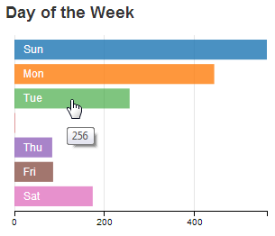
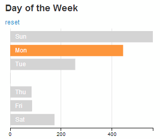
Now for a super cool feature with row charts…
Click on one of the rows…
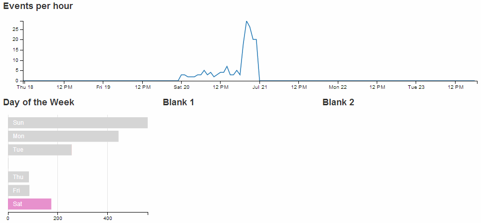
How about that!
You can select an individual row from your chart and all the other rows reflect the selection. Go ahead and select other combinations of more than one row if you want. Welcome to data immersion!
Just as with the previous chart examples, we’ll work through adding the chart in the following stages.
- Position the chart
- Assign type
- Dimension and Group
- Configure chart parameters
Position the row chart
We are going to position our row chart above our data table (and below the line chart) and we’ll divide the row that it sits in into 3 equally spaced spans of span3. The additional two spans we’ll leave blank for future use.
Just under the row of code that defined the containers for the line graph;
  <div class='row'>
    <div class='span12' id='dc-time-chart'>
      <h4>Events per hour</h4>
    </div>
  </div>
We add in a new row that has our three span4’s.
  <div class='row'>
    <div class='span4' id='dc-dayweek-chart'>
      <h4>Day of the Week</h4>
    </div>
    <div class='span4' id='blank1'>
	  <h4>Blank 1</h4>
    </div>
    <div class='span4' id='blank2'>
	  <h4>Blank 2</h4>
    </div>
  </div>
We’ve given it an ID selector of dc-dayweek-chart. So when we assign our chart that selector, it will automatically appear in that position. We’ve also put another simple title in place (<h4>Day of the Week</h4>).
The additional two span4s have been left blank.
Assign the row chart type
Here we give our chart its name (dayOfWeekChart), assign it with a dc.js chart type (in this case rowChart) and assign it to the ID selector (dc-dayweek-chart).
Under the row that assigns the depthChart chart…
var depthChart = dc.barChart("#dc-depth-chart");
… add in the equivalent for our row chart.
var dayOfWeekChart = dc.rowChart("#dc-dayweek-chart");
Dimension and group the row chart data
We’ll put the code between the dimension and group of the line (time) chart and the data table dimension (this is just to try and keep the code in the same order as the graphs on the page).
When adding our dimension for our day of the week we want to provide an appropriate label so our code does something extra.
  var dayOfWeek = facts.dimension(function (d) {
    var day = d.dtg.getDay();
    switch (day) {
      case 0:
        return "0.Sun";
      case 1:
        return "1.Mon";
      case 2:
        return "2.Tue";
      case 3:
        return "3.Wed";
      case 4:
        return "4.Thu";
      case 5:
        return "5.Fri";
      case 6:
        return "6.Sat";
    }
  });
This dimension (dayOfWeek) uses the same facts data, but when we return our key values we are going to return them as a combination of their numerical order (0 = Sunday etc) and their abbreviation (Sun = Sunday etc). This is essentially defining the categories of the values on the y axis for our row chart.
The code snippet looks a little strange, but think of it as extracting the numerical representation of the day of the week from our data (var day = d.dtg.getDay();) and then matching each number with an appropriate label (0 = ‘0.Sun’, 1 = ‘1.Mon’ etc). It’s these labels that are now our key values in our dimension.
Then we want to group the data by using the default action of the .group() function to count the number of events for each day of the week.
var dayOfWeekGroup = dayOfWeek.group();
Configure the row chart parameters
As with the previous charts, there are plenty of parameters that can be configured. The best way to learn what they do is still to have a play with them. So here is the block of code for configuring the row chart. Once you are happy that it works on your system, take some time and go through the settings in conjunction with the information from the demo page and the api reference.
This should go just before the block that configures the dataTable (again, this is just to try and keep the code in the same order as the graphs on the page).
  // row chart day of week
  dayOfWeekChart.width(300)
    .height(220)
    .margins({top: 5, left: 10, right: 10, bottom: 20})
    .dimension(dayOfWeek)
    .group(dayOfWeekGroup)
    .colors(d3.scale.category10())
    .label(function (d){
       return d.key.split(".")[1];
    })
    .title(function(d){return d.value;})
    .elasticX(true)
    .xAxis().ticks(4);
That should get you working. With the addition of this portion of the code, you should have a functioning visualization that can be filtered dynamically by clicking on the appropriate day of the week in your row chart. Just check to make sure that everything is working properly and we’ll go through some of the configuration options to see what they do.
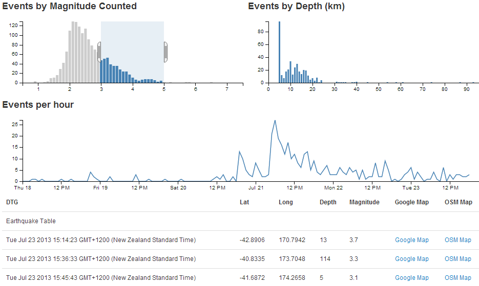
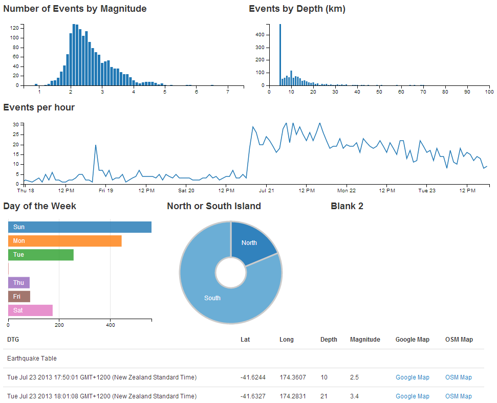
To start with, your page should look something like this;
The configuration options start by declaring the name of the chart (dayOfWeekChart) and setting the height and width of the chart.
  dayOfWeekChart.width(300)
    .height(220)
In the case of our example I have selected the width based on the default size for a span4 grid segment in bootstrap and adjusted the height to make it look suitable.
Then we have our margins set up.
.margins({top: 5, left: 10, right: 10, bottom: 20})
Nothing too surprising there although I did reduce the top margin slightly more than I thought I would need. You can be the judge for your own charts.
Then we define which dimension and grouping we will use.
    .dimension(dayOfWeek)
    .group(dayOfWeekGroup)
For a row chart, think of the .dimension declaration being the y axis and the .group declaration being the x axis (the opposite to the previous charts).
We can set the range of colours to use one of the standard palettes.
.colors(d3.scale.category10())
Then we add the labels to our categories by splitting the key values (remember 0.Sun, 1.Mon etc) at the decimal point and returning the second part of the split value (which is the Sun, Mon part) as the label.
    .label(function (d){
       return d.key.split(".")[1];
     })
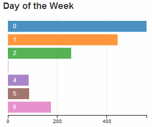
A cool way to prove this is to change the variable that returns the label to use the 1st part of the split value buy using a [0] instead of a [1] with code like this;
    .label(function (d){
       return d.key.split(".")[0];
     })
The end result produces…
The next line in the configuration adds a tool tip to our row chart using the value when the mouse hovers over the appropriate bar.
.title(function(d){return d.value;})
We can set the x axis to dynamically adjust when the number of events are filtered by selections on any of the other charts using the following configuration line.
.elasticX(true)
For instance if we select a subset of the earthquakes using our time / line chart, our row chart will have a corresponding selection of the appropriate days and the x axis will alter accordingly.
Lastly we set up our x axis with 4 ticks.
.xAxis().ticks(4);
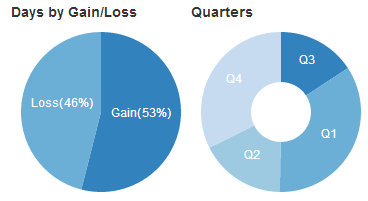
Add a Pie Chart.
The pie chart provides an useful way of presenting and filtering on discrete values or identifiers similar to a row chart.
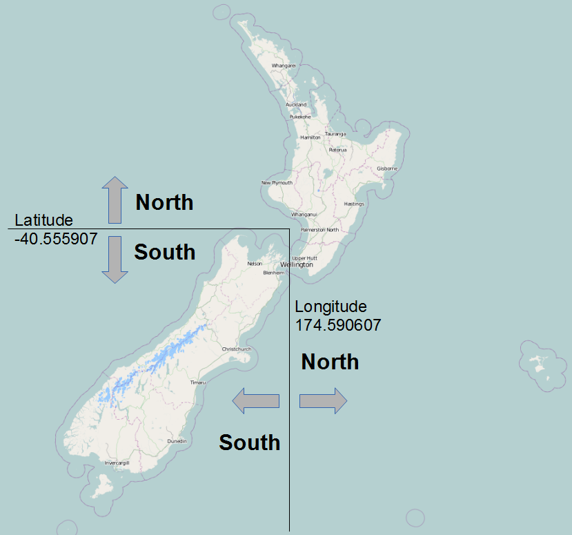
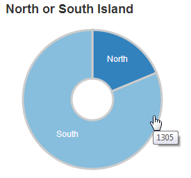
The pie chart that we’ll create will be a representation of which island the earthquakes occurred in. For those of you unfamiliar with the stunning landscape of New Zealand, there are two main islands creatively named North Island and South Island (stunning and practical!). The determination of what constitutes the North and South Island has been decided in a completely unscientific way (by me) by designating any area South of latitude -40.555907 and West of longitude 174.590607 as the South Island and anything else is the North Island.
The pie graph should end up looking a bit like this.
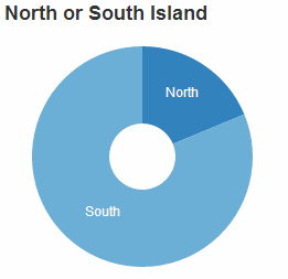
Good news! The pie chart shares the same cool feature as the row chart…
Click on one of the pie segments…
… and everything dynamically reflects the selection.
Just as with the previous chart examples, we’ll work through adding the chart in the following stages.
- Position the chart
- Assign type
- Dimension and Group
- Configure chart parameters
Position the pie chart
We are going to position our pie chart above our data table (and below the line chart) in the same row as the row chart in one of the blank span4’s.
The code that sets up that row should now look like this;
  <div class='row'>
    <div class='span4' id='dc-dayweek-chart'>
      <h4>Day of the Week</h4>
    </div>
    <div class='span4' id='dc-island-chart'>
	  <h4>North or South Island</h4>
    </div>
    <div class='span4' id='blank2'>
	  <h4>Blank 2</h4>
    </div>
  </div>
We’ve given it an ID selector of dc-island-chart. So when we assign our chart that selector, it will automatically appear in that position. We’ve also put another simple title in place (<h4>North or South Island</h4>).
The last span4 is still blank.
Assign the pie chart type
Here we give our chart its name (dayOfWeekChart), assign it with a dc.js chart type (in this case pieChart) and assign it to the ID selector (dc-dayweek-chart).
Under the row that assigns the dayOfWeekChart chart…
var dayOfWeekChart = dc.rowChart("#dc-dayweek-chart");
… add in the equivalent for our pie chart.
var islandChart = dc.pieChart("#dc-island-chart");
Dimension and group the pie chart data
We’ll put the code between the dimension and group of the row chart and the data table dimension (this is just to try and keep the code in the same order as the graphs on the page).
When adding our dimension for our islands we want to provide an appropriate label so our code does the figuring out based on the latitude and longitude that we had established as the boundary between North and South.
  var islands = facts.dimension(function (d) {
    if (d.lat <= -40.555907 && d.long <= 174.590607)
      return "South";
    else
      return "North";
    });
This dimension (islands) uses the same facts data, but when we return our key values we are going to return them as either ‘North’ or ‘South’. To do this we employ a simple if statement with a little logic. These are the only two ‘slices’ for our pie chart.
Then we want to group the data by using the default action of the .group() function to count the number of events for each day of the week.
var islandsGroup = islands.group();
Configure the pie chart parameters
There are fewer parameters that can be configured for pie charts, but we’ll still take the time to go through the options used here.
This code should go just before the block that configures the dataTable (again, this is just to try and keep everything in the same order as the graphs on the page).
  islandChart.width(250)
    .height(220)
    .radius(100)
    .innerRadius(30)
    .dimension(islands)
    .group(islandsGroup)
    .title(function(d){return d.value;});
That should get the chart working. With the addition of this portion of the code, you should have a functioning visualization that can be filtered dynamically by clicking on the appropriate island in your pie chart. Just check to make sure that everything is working properly and we’ll go through some of the configuration options to see what they do.
To start with, your page should look something like this;
The configuration options start by declaring the name of the chart (islandChart) and setting the height and width of the chart.
  islandChart.width(250)
    .height(220)
In the case of our example I have selected the width based on the default size for a span4 grid segment in bootstrap and adjusted the height to make it look suitable alongside the row chart.
Then we set up our inner and outer radii for our pie.
    .radius(100)
    .innerRadius(30)
This is fairly self explanatory, but by all means adjust away to make sure the chart suits your visualization.
Then we define which dimension and grouping we will use.
    .dimension(islands)
    .group(islandsGroup)
For a pie chart, the .dimension declaration is the discrete values that make up each segment of the pie and the .group declaration is the size of the pie.
The final line in the configuration adds a tool tip to our pie chart using the value when the mouse hovers over the appropriate slice.
.title(function(d){return d.value;})
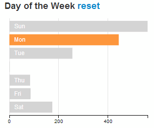
Resetting filters
Once you have made selections on some of your data dimensions, often you will want to reset those selections to return to a stable state.
For example, when selecting different days to display in the row chart, if you have three days selected as so…
… to return to the default setting where all the days are selected can be a bit of a pain.
Instead, we can use a dc.js ‘reset’ feature where a ‘reset’ label is generated to allow us revert to the starting condition.
There is a simple way to enable this feature, but we’ll take an additional few steps to make it look slightly better (and to learn some new tricks).
In the simplest method, this feature simply involves adding in the following code to the section where we add in the rows and spans when setting out our layout.
<a class="reset"
  href="javascript:dayOfWeekChart.filterAll();dc.redrawAll();"
  style="display: none;">
  reset
</a>
In the case of our example row chart, that would then look a bit like this;
<div class='span4' id='dc-dayweek-chart'>
  <h4>Day of the Week</h4>
  <a class="reset"
    href="javascript:dayOfWeekChart.filterAll();dc.redrawAll();"
    style="display: none;">
    reset
  </a>
</div>
The additional code adds in a link (that’s the <a> tags) with a specific class that designates its function (the class="reset" part (this is what will let dc.js know what to do)). The link action (href="javascript:dayOfWeekChart.filterAll();dc.redrawAll();") provides the instructions on what to do when the ‘reset’ link is clicked on (in this case, we remove all the filters and redraw the dayOfWeekChart chart). Then there’s a nice touch to not display the word reset when the page first loads (style="display: none;") before finally printing the word ‘reset’ on the page.
The end result (when a day of the week is selected) looks like this;
You can now click on the ‘reset’ link and the chart will revert to the default setting of all days selected.
Making the reset label a little bit better behaved.
While we now have our reset label working well, it’s a bit poorly behaved the way that it creates a new line to put the label on. We can do better than that.
It would be fair to say that this is as a result of the decision to use the <h4> heading tags to make our chart headings. There are other options that could be employed to avoid using these, but I like them, so I’ll describe how I kept them and kept the reset label on the same line.
None of what we’re about to do is remotely d3.js or dc.js related. It’s more HTML and CSS focussed (which doesn’t mean it’s not worth learning :-)).
The first thing we want to do is to get the ‘reset’ label onto the same line as our ‘Day of the Week’ heading.
This is simply done by ensuring that the <a> section is inside the <h4> section. The code should therefore look like this;
<div class='span4' id='dc-dayweek-chart'>
  <h4>Day of the Week
    <a class="reset"
      href="javascript:dayOfWeekChart.filterAll();dc.redrawAll();"
      style="display: none;">
      reset
    </a>
  </h4>
</div>
(Notice how the code layout shows the <a> code nested inside the <h4> section?)
The result on the web page now looks like this when a day is selected;
That’s a good start and certainly more acceptable, but the styling for the ‘reset’ label still looks a bit ‘bold’ and ‘BIG’. We can do better than that.
What we’ll do is place our <a> tag information inside a <span> tag (this is the type of tag to use for in-line elements). Then we’ll set a CSS style in our <stlye> area to make any text that is inside a <span> which is inside a <h4> appear with formatting that makes it not bold and smaller in size.
First of all we place the <a> tag into a <span> container like so;
<div class='span4' id='dc-dayweek-chart'>
  <h4>Day of the Week
    <span>
      <a class="reset"
        href="javascript:dayOfWeekChart.filterAll();dc.redrawAll();"
        style="display: none;">
        reset
      </a>
    </span>
  </h4>
</div>
Then we create a section at the start of our file (under the <style type="text/css"></style> line looks like the right place) that declares the styling for our h4 span text. It should look like this;
<style>
  h4 span {
    font-size:14px;
    font-weight:normal;
    }
</style>
That tells our web page that any h4, span labelled text should be 14px in size and not bold (or normal).
The end result when you now have a day of the week selected looks like this;
Reset all the charts
We also have the option to reset all the charts at once. This could also be accomplished by reloading the page, but that would also incur a time and bandwidth penalty because the associated data would be downloaded again. So just resetting everything in the browser is a good feature.
Again dc.js has got our back.
This feature is treated like a separate chart in itself, so it has a dimension and group and a section to draw the chart (not that it’s a chart, but I’m sure you get the idea). It’s executed slightly differently, but it’s not too tricky.
What we’re going to aim to do is provide our page with a title and add some nice dc.js trickery alongside that looks like this;
The trickery shows us the number of selected records accompanied with the total number of records and gives us the option to reset all the selected charts so that all the records are selected.
There are 4 pieces of code that we will add to accomplish this task. We won’t add them from top to bottom, because it makes slightly more sense to explain them in a different order.
First of all we will add the block of code that declares the variable that includes all of our data values (facts).
var all = facts.groupAll();
This piece of code should go soon after the line that initialises the crossfilter process (var facts = crossfilter(data);).
Then we will include a section of code that dimensions and counts all of our facts. It also anchors the values to the dc-data-count ID Selector that we will set up in a moment.
  // count all the facts
  dc.dataCount(".dc-data-count")
    .dimension(facts)
    .group(all);
This block of code belongs in the section that sets up our charts, although you could be forgiven for thinking that it kind of straddles more than one section.
The next section we’ll add will be our title along with the count and reset information. It looks like this;
  <div class="dc-data-count" style="float: left;">
    <h2>New Zealand Earthquakes
      <span>
        <span class="filter-count"></span>
         selected out of
        <span class="total-count"></span>
         records |
        <a href="javascript:dc.filterAll(); dc.renderAll();">Reset All</a>
      </span>
    </h2>
  </div>
This block needs to go at the top of our area in the file where the layout of the portions of the web page are being set out. Put it directly under the outermost container div line (<div class='container' style='font: 12px sans-serif;'>).
It places a <h2> heading with the text ‘New Zealand Earthquakes’ and then places, in-line with this, five additional pieces. The first is a count of the filtered facts via…
<span class="filter-count"></span>
Then there is the text ‘ selected out of ‘ followed by a count of the total number of facts via…
<span class="total-count"></span>
The some more text ‘ records | ‘ and then another JavaScript call (as a link) that allows us to reset all the chart elements via…
<a href="javascript:dc.filterAll(); dc.renderAll();">Reset All</a>
This is all well and good, but the formatting will look a bit strange (like the following).
This tells us that we need to apply some styling to the elements alongside the title. We can do this with the following CSS elements which can go into the <style> block with the one we added earlier for the other reset block.
    h2 {
      float: right;
	  }
    h2 span {
      font-size:14px;
      font-weight:normal;
      }
These will allow the <h2> heading to be left justified and will reduce the size of the in-line span and remove the ‘bold’ formatting.
Et viola!