Starting with a basic graph
I’ll start by providing the full code for a simple graph and then we can go through it piece by piece (The full code for this example is also in the appendices as ‘Simple Graph’.).
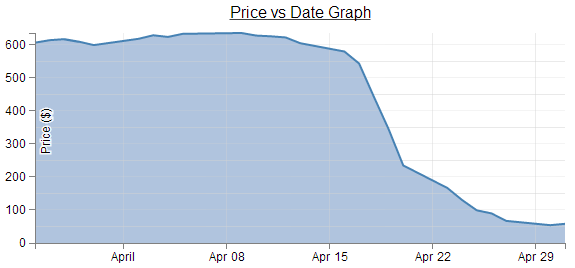
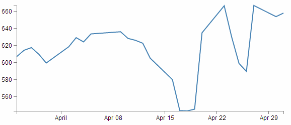
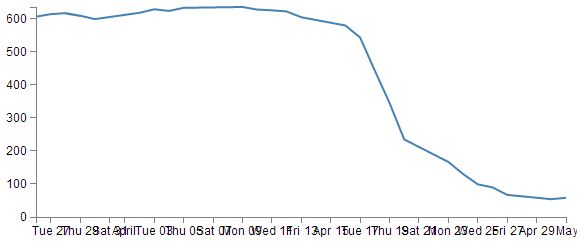
Here’s what the basic graph looks like;

And here’s the code that makes it happen;
<!DOCTYPE html>
<meta charset="utf-8">
<style> /* set the CSS */

body { font: 12px Arial;}

path {
    stroke: steelblue;
    stroke-width: 2;
    fill: none;
}

.axis path,
.axis line {
    fill: none;
    stroke: grey;
    stroke-width: 1;
    shape-rendering: crispEdges;
}

</style>
<body>

<!-- load the d3.js library -->
<script src="http://d3js.org/d3.v3.min.js"></script>

<script>

// Set the dimensions of the canvas / graph
var margin = {top: 30, right: 20, bottom: 30, left: 50},
    width = 600 - margin.left - margin.right,
    height = 270 - margin.top - margin.bottom;

// Parse the date / time
var parseDate = d3.time.format("%d-%b-%y").parse;

// Set the ranges
var x = d3.time.scale().range([0, width]);
var y = d3.scale.linear().range([height, 0]);

// Define the axes
var xAxis = d3.svg.axis().scale(x)
    .orient("bottom").ticks(5);

var yAxis = d3.svg.axis().scale(y)
    .orient("left").ticks(5);

// Define the line
var valueline = d3.svg.line()
    .x(function(d) { return x(d.date); })
    .y(function(d) { return y(d.close); });

// Adds the svg canvas
var svg = d3.select("body")
    .append("svg")
        .attr("width", width + margin.left + margin.right)
        .attr("height", height + margin.top + margin.bottom)
    .append("g")
        .attr("transform",
              "translate(" + margin.left + "," + margin.top + ")");

// Get the data
d3.csv("data/data.csv", function(error, data) {
    data.forEach(function(d) {
        d.date = parseDate(d.date);
        d.close = +d.close;
    });

    // Scale the range of the data
    x.domain(d3.extent(data, function(d) { return d.date; }));
    y.domain([0, d3.max(data, function(d) { return d.close; })]);

    // Add the valueline path.
    svg.append("path")
        .attr("class", "line")
        .attr("d", valueline(data));

    // Add the X Axis
    svg.append("g")
        .attr("class", "x axis")
        .attr("transform", "translate(0," + height + ")")
        .call(xAxis);

    // Add the Y Axis
    svg.append("g")
        .attr("class", "y axis")
        .call(yAxis);

});

</script>
</body>
The full code for this example can be found on github, in the appendices of this book or in the code samples bundled with this book (simple-graph.html and data.csv). A live example can be found on bl.ocks.org
Once we’ve finished explaining these parts, we’ll start looking at what we need to add in and adjust so that we can incorporate other useful functions that are completely reusable in other diagrams as well.
The end point being something hideous like the following;
I say hideous since the graph is not intended to win any beauty prizes, but there are several components to it which some people may find useful (gridlines, area fill, axis label, drop shadow for text, title, text formatting).
So, we can break the file down into component parts. I’m going to play kind of fast and loose here, but never fear, it’ll all make sense.
HTML
Here’s the HTML portions of the code;
<!DOCTYPE html>
<meta charset="utf-8">
<style>

    The CSS is in here

</style>
<body>
<script src="http://d3js.org/d3.v3.min.js"></script>

<script>

    The D3 JavaScript code is here

</script>
</body>
Compare it with the full code. It kind of looks like a wrapping for the CSS and JavaScript. You can see that it really doesn’t boil down to much at all (that doesn’t mean it’s not important).
There are plenty of good options for adding additional HTML stuff into this very basic part for the file, but for what we’re going to be doing, we really don’t need to bother too much.
One thing probably worth mentioning is the line;
<script src="http://d3js.org/d3.v3.min.js"></script>
That’s the line that identifies the file that needs to be loaded to get D3 up and running. In this case the file is sourced from the official d3.js repository on the internet (that way we are using the most up to date version). The D3 file is actually called d3.v3.min.js which may come as a bit of a surprise. That tells us that this is version 3 of the d3.js file (the v3 part) which is an indication that it is separate from the v2 release, which was superseded in late 2012. The other point to note is that this version of d3.js is the minimised version (hence min). This means that any extraneous information has been removed from the file to make it quicker to load.
Later when doing things like implementing integration with bootstrap (a pretty layout framework) we will be doing a great deal more, but for now, that’s the basics done.
The two parts that we left out are the CSS and the D3 JavaScript.
CSS
The CSS is as follows;
body { font: 12px Arial;}

path {
    stroke: steelblue;
    stroke-width: 2;
    fill: none;
}

.axis path,
.axis line {
    fill: none;
    stroke: grey;
    stroke-width: 1;
    shape-rendering: crispEdges;
}
Cascading Style Sheets give you control over the look / feel / presentation of web content. The idea is to define a set of properties to objects in the web page.
They are made up of ‘rules’. Each rule has a ‘selector’ and a ‘declaration’ and each declaration has a property and a value (or a group of properties and values).
For instance in the example code for this web page we have the following rule;
body { font: 12px Arial;}
body is the selector. This tells you that on the web page, this rule will apply to the ‘body’ of the page. This actually applies to all the portions of the web page that are contained in the ‘body’ portion of the HTML code (everything between <body> and </body> in the HTML bit).
{ font: 12px Arial;} is the declaration portion of the rule. It only has the one declaration which is the bit that is in between the curly braces.
So font: 12px Arial; is the declaration. The property is font: and the value is 12px Arial;. This tells the web page that the font that appears in the body of the web page will be in 12 px Arial.
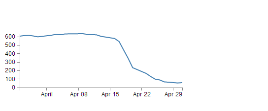
Sure enough if we look at the axes of the graph…

We see that the font might actually be 12px Arial!
Let’s try a test. I will change the Rule to the following;
body { font: 16px Arial;}
and the result is…

Ahh…. 16px of goodness!
And now we change it to…
body { font: 16px times;}
and we get…

Hmm… Times font…. I think we can safely say that this has had the desired effect.
So what else is there?
What about the bit that’s like;
path {
    stroke: steelblue;
    stroke-width: 2;
    fill: none;
}
Well, the whole thing is one rule, ‘path’ is the selector. In this case, ‘path’ is referring to a line in the D3 drawing nomenclature.
For that selector there are three declarations. They give values for the properties of ‘stroke’ (in this case colour), ‘stroke-width’ (the width of the line) and ‘fill’ (we can fill a path with a block of colour).
So let’s change things :-)
path {
    stroke: red;
    stroke-width: 5;
    fill: yes;
}
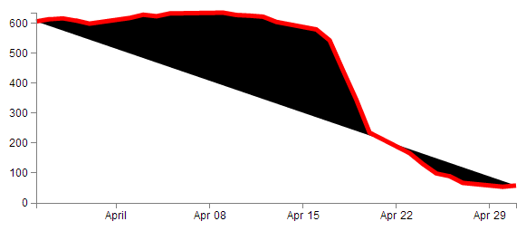
Wow! The line is now red, it looks about 5 pixels wide and it’s tried to fill the area (roughly defined by the curve) with a black colour.
It ain’t pretty, but it certainly did change. In fact if we go;
fill: blue;
We’ll get…
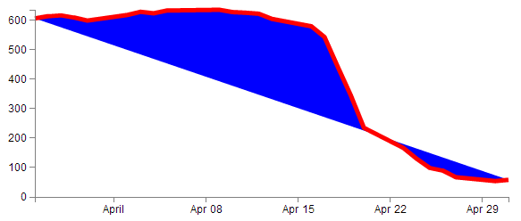
So the ‘fill’ property looks pretty flexible. And so does CSS.
D3 JavaScript
The D3 JavaScript part of the code is as follows;
var margin = {top: 30, right: 20, bottom: 30, left: 50},
    width = 600 - margin.left - margin.right,
    height = 270 - margin.top - margin.bottom;

var parseDate = d3.time.format("%d-%b-%y").parse;

var x = d3.time.scale().range([0, width]);
var y = d3.scale.linear().range([height, 0]);

var xAxis = d3.svg.axis().scale(x)
    .orient("bottom").ticks(5);

var yAxis = d3.svg.axis().scale(y)
    .orient("left").ticks(5);

var valueline = d3.svg.line()
    .x(function(d) { return x(d.date); })
    .y(function(d) { return y(d.close); });

var svg = d3.select("body")
    .append("svg")
        .attr("width", width + margin.left + margin.right)
        .attr("height", height + margin.top + margin.bottom)
    .append("g")
        .attr("transform",
              "translate(" + margin.left + "," + margin.top + ")");

// Get the data
d3.csv("data.csv", function(error, data) {
    data.forEach(function(d) {
        d.date = parseDate(d.date);
        d.close = +d.close;
    });

    // Scale the range of the data
    x.domain(d3.extent(data, function(d) { return d.date; }));
    y.domain([0, d3.max(data, function(d) { return d.close; })]);

    svg.append("path")		// Add the valueline path.
        .attr("class", "line")
        .attr("d", valueline(data));

    svg.append("g")			// Add the X Axis
        .attr("class", "x axis")
        .attr("transform", "translate(0," + height + ")")
        .call(xAxis);

    svg.append("g")			// Add the Y Axis
        .attr("class", "y axis")
        .call(yAxis);

});
Again there’s quite a bit of detail in the code, but it’s not so long that you can’t work out what’s doing what.
Let’s examine the blocks bit by bit to get a feel for it.
Setting up the margins and the graph area.
The part of the code responsible for defining the canvas (or the area where the graph and associated bits and pieces is placed ) is this part.
var margin = {top: 30, right: 20, bottom: 30, left: 50},
    width = 600 - margin.left - margin.right,
    height = 270 - margin.top - margin.bottom;
This is really (really) well explained on Mike Bostock’s page on margin conventions here http://bl.ocks.org/3019563, but at the risk of confusing you here’s my crude take on it.
The first line defines the four margins which surround the block where the graph (as an object) is positioned.
var margin = {top: 30, right: 20, bottom: 30, left: 50},
So there will be a border of 30 pixels at the top, 20 at the right and 30 and 50 at the bottom and left respectively. Now the cool thing about how these are set up is that they use an array to define everything. That means if you want to do calculations in the JavaScript later, you don’t need to put the numbers in, you just use the variable that has been set up. In this case margin.right = 20!
So when we go to the next line;
width = 600 - margin.left - margin.right,
the width of the inner block of the canvas where the graph will be drawn is 600 pixels – margin.left – margin.right or 600-50-20 or 530 pixels wide. Of course now you have another variable ‘width’ that we can use later in the code.
Obviously the same treatment is given to height.
Another cool thing about all of this is that just because you appear to have defined separate areas for the graph and the margins, the whole area in there is available for use. It just makes it really useful to have areas designated for the axis labels and graph labels without having to juggle them and the graph proper at the same time.
So, let’s have a play and change some values.
var margin = {top: 80, right: 20, bottom: 80, left: 50},
    width = 400 - margin.left - margin.right,
    height = 270 - margin.top – margin.bottom;
Here we’ve made the graph narrower (400 pixels) but retained the left / right margins and increased the top bottom margins while maintaining the overall height of the canvas. The really cool thing that you can tell from this is that while we shrank the dimensions of the area that we had to draw the graph in, it was still able to dynamically adapt the axes and line to fit properly. That is the really cool part of this whole business. D3 is running in the background looking after the drawing of the objects, while you get to concentrate on how the data looks without too much maths!
Getting the Data
We’re going to jump forward a little bit here to the bit of the JavaScript code that loads the data for the graph.
I’m going to go out of the sequence of the code here, because if you know what the data is that you’re using, it will make explaining some of the other functions that are coming up much easier.
The section that grabs the data is this bit.
d3.csv("data.csv", function(error, data) {
    data.forEach(function(d) {
        d.date = parseDate(d.date);
        d.close = +d.close;
    });
In fact it’s a combination of a few bits and another piece that isn’t shown!, But let’s take it one step at a time :-)
There’s lots of different ways that we can get data into our web page to turn into graphics. And the method that you’ll want to use will probably depend more on the format that the data is in than the mechanism you want to use for importing.
For instance, if it’s only a few points of data we could include the information directly in the JavaScript.
That would make it look something like;
var data = [
    {date:"1-May-12",close:"58.13"},
    {date:"30-Apr-12",close:"53.98"},
    {date:"27-Apr-12",close:"67.00"},
    {date:"26-Apr-12",close:"89.70"},
    {date:"25-Apr-12",close:"99.00"}
];
The format of the data shown above is called JSON (JavaScript Object Notation) and it’s a great way to include data since it’s easy for humans to read what’s in there and it’s easy for computers to parse the data out. For a brief overview of JSON there is a separate section in the “Assorted Tips and Tricks Chapter” that may assist.
But if you’ve got a fair bit of data or if the data you want to include is dynamic and could be changing from one moment to the next, you’ll want to load it from an external source. That’s when we call on D3’s ‘Request’ functions.
The different types of data that can be requested by D3 are;
- text: A plain old piece of text that has options to be encoded in a particular way (see the D3 API).
- json: This is the afore mentioned JavaScript Object Notation.
- xml: Extensible Markup Language is a language that is widely used for encoding documents in a human readable forrm.
- html: HyperText Markup Language is the language used for displaying web pages.
- csv: Comma Separated Values is a widely used format for storing data where plain text information is separated by (wait for it) commas.
- tsv: Tab Separated Values is a widely used format for storing data where plain text information is separated by a tab-stop character.
Details on these ingestion methods and the formats for the requests are well explained on the D3 Wiki page. In this particular script we will look at the csv request method.
Back to our request…
d3.csv("data.csv", function(error, data) {
    data.forEach(function(d) {
        d.date = parseDate(d.date);
        d.close = +d.close;
    });
The first line of that piece of code invokes the d3.csv request (d3.csv) and then the function is pointed to the data file that should be loaded (data.csv). This is referred to as the ‘url’ (unique resource locator) of the file. In this case the file is stored locally (in the same directory as the simple-graph.html file), but the url could just as easily point to a file somewhere on the Internet.
The format of the data in the data.csv file looks a bit like this;
date,close
1-May-12,58.13
30-Apr-12,53.98
27-Apr-12,67.00
26-Apr-12,89.70
25-Apr-12,99.00
(although the file is longer (about 26 data points)). The ‘date’ and the ‘close’ heading labels are separated by a comma as are each subsequent date and number. Hence the ‘comma separated values’ :-).
The next part is part of the coolness of JavaScript. With the request made and the file requested, the script is told to carry out a function on the data (which will now be called ‘data’).
function(error, data) {
There are actually more things that get acted on as part of the function call, but the one we will consider here is contained in the following lines;
    data.forEach(function(d) {
        d.date = parseDate(d.date);
        d.close = +d.close;
    });
This block of code simply ensures that all the numeric values that are pulled out of the csv file are set and formatted correctly. The first line sets the data variable that is being dealt with (called slightly confusingly ‘data’) and tells the block of code that, for each group within the ‘data’ array it should carry out a function on it. That function is designated ‘d’.
data.forEach(function(d) {
The information in the array can be considered as being stored in rows. Each row consists of two values: one value for ‘date’ and another value for ‘close’.
The function is pulling out values of ‘date’ and ‘close’ one row at a time.
Each time it gets a value of ‘date’ and ‘close’ it carries out the following operations;
d.date = parseDate(d.date);
For this specific value of date being looked at (d.date), d3.js changes it into a date format that is processed via a separate function ‘parseDate’. (The ‘parseDate’ function is defined in a separate part of the script, and we will examine that later.) For the moment, be satisfied that it takes the raw date information from the csv file in a specific row and converts it into a format that D3 can then process. That value is then re-saved in the same variable space.
The next line then sets the ‘close’ variable to a numeric value (if it isn’t already) using the ‘+’ operator.
d.close = +d.close;
So, at the end of that section of code, we have gone out and picked up a file with data in it of a particular type (comma separated values) and ensured that it is formatted in a way that the rest of the script can use correctly.
Now, the astute amongst you will have noticed that in the first line of that block of code (d3.csv("data.csv", function(error, data) {) we opened a normal bracket ( ( ) and a curly bracket ( { ), but we never closed them. That’s because they stay open until the very end of the file. That means that all those blocks that occur after the d3.csv bit are referenced to the ‘data’ array. Or put another way, it uses ‘data’ to draw stuff!
But anyway, let’s get back to figuring what the code is doing by jumping back to the end of the margins block.
Formatting the Date / Time.
One of the glorious things about the World is that we all do things a bit differently. One of those things is how we refer to dates and time.
In my neck of the woods, it’s customary to write the date as day - month – year. E.g 23-12-2012. But in the United States the more common format would be 12-23-2012. Likewise, the data may be in formats that name the months or weekdays (E.g. January, Tuesday) or combine dates and time together (E.g. 2012-12-23 15:45:32). So, if we were to attempt to try to load in some data and to try and get D3 to recognise it as date / time information, we really need to tell it what format the date / time is in.
Time for a little demonstration (see what I did there).
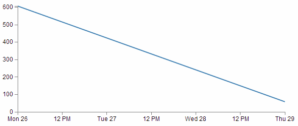
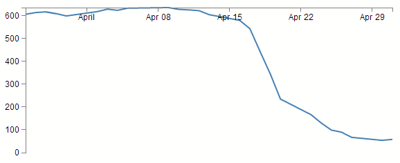
We will change our data.csv file so that it only includes two points. The first one and the last one with a separation of a month and a bit.
date,close
1-May-12,58.13
26-Mar-12,606.98
The graph now looks like this;
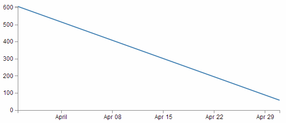
Nothing too surprising here, a very simple graph (note the time scale on the x axis).
Now we will change the later date in the data.csv file so that it is a lot closer to the starting date;
date,close
29-Mar-12,58.13
26-Mar-12,606.98
So, just a three day difference. Let’s see what happens.
Ahh…. Not only did we not have to make any changes to our JavaScript code, but it was able to recognise the dates were closer and fill in the intervening gaps with appropriate time / day values. Now, one more time for giggles.
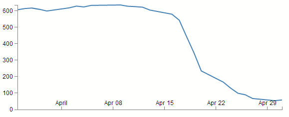
This time we’ll stretch the interval out by a few years.
date,close
29-Mar-21,58.13
26-Mar-12,606.98
and the result is…
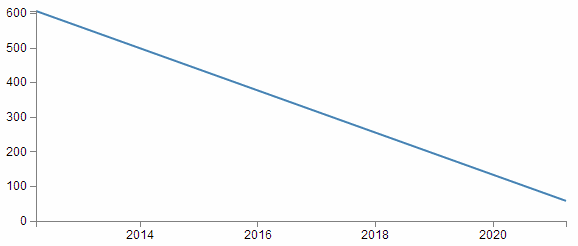
Hopefully that’s enough encouragement to impress upon you that formatting the time is a REALLY good thing to get right. Trust me, it will never fail to impress :-).
Back to formatting.
The line in the JavaScript that parses the time is the following;
var parseDate = d3.time.format("%d-%b-%y").parse;
This line is used when the data.forEach(function(d) portion of the code (that we looked at a couple of pages back) used d.date = parseDate(d.date) as a way to take a date in a specific format and to get it recognised by D3. In effect it said “take this value that is supposedly a date and make it into a value I can work with”.
The function used is the d3.time.format(specifier) function where the specifier in this case is the mysterious combination of characters %d-%b-%y. The good news is that these are just a combination of directives specific for the type of date we are presenting.
The % signs are used as prefixes to each separate format type and the ‘-’ (minus) signs are literals for the actual ‘-’ (minus) signs that appear in the date to be parsed.
The d refers to a zero-padded day of the month as a decimal number [01,31].
The b refers to an abbreviated month name.
And the y refers to the year (without the centuries) as a decimal number.
If we look at a subset of the data from the data.csv file we see that indeed, the dates therein are formatted in this way.
1-May-12,58.13
30-Apr-12,53.98
27-Apr-12,67.00
26-Apr-12,89.70
25-Apr-12,99.00
That’s all well and good, but what if your data isn’t formatted exactly like that?
Good news. There are multiple different formatters for different ways of telling time and you get to pick and choose which one you want. Check out the Time Formatting page on the D3 Wiki for a the authoritative list and some great detail, but the following is the list of currently available formatters (from the d3 wiki);
- %a - abbreviated weekday name.
- %A - full weekday name.
- %b - abbreviated month name.
- %B - full month name.
- %c - date and time, as “%a %b %e %H:%M:%S %Y”.
- %d - zero-padded day of the month as a decimal number [01,31].
- %e - space-padded day of the month as a decimal number [ 1,31].
- %H - hour (24-hour clock) as a decimal number [00,23].
- %I - hour (12-hour clock) as a decimal number [01,12].
- %j - day of the year as a decimal number [001,366].
- %m - month as a decimal number [01,12].
- %M - minute as a decimal number [00,59].
- %p - either AM or PM.
- %S - second as a decimal number [00,61].
- %U - week number of the year (Sunday as the first day of the week) as a decimal number [00,53].
- %w - weekday as a decimal number [0(Sunday),6].
- %W - week number of the year (Monday as the first day of the week) as a decimal number [00,53].
- %x - date, as “%m/%d/%y”.
- %X - time, as “%H:%M:%S”.
- %y - year without century as a decimal number [00,99].
- %Y - year with century as a decimal number.
- %Z - time zone offset, such as “-0700”.
- There is also a a literal “%” character that can be presented by using double % signs.
As an example, if you wanted to input date / time formatted as a generic MySQL ‘YYYY-MM-DD HH:MM:SS’ TIMESTAMP format the D3 parse script would look like;
parseDate = d3.time.format("%Y-%m-%d %H:%M:%S").parse;
Setting Scales Domains and Ranges
This is another example where, if you set it up right, D3 will look after you forever.
From our basic web page we have now moved to the section that includes the following lines;
var x = d3.time.scale().range([0, width]);
var y = d3.scale.linear().range([height, 0]);
The purpose of these portions of the script is to ensure that the data we ingest fits onto our graph correctly. Since we have two different types of data (date/time and numeric values) they need to be treated separately (but they do essentially the same job). To examine this whole concept of scales, domains and ranges properly, we will also move slightly out of sequence and (in conjunction with the earlier scale statements) take a look at the lines of script that occur later and set the domain. They are as follows;
    x.domain(d3.extent(data, function(d) { return d.date; }));
    y.domain([0, d3.max(data, function(d) { return d.close; })]);
The idea of scaling is to take the values of data that we have and to fit them into the space we have available.
If we have data that goes from 53.98 to 636.23 (as the data we have for ‘close’ in our csv file does), but we have a graph that is 210 pixels high (height = 270 - margin.top – margin.bottom;) we clearly need to make an adjustment.
Not only that. Even though our data goes from 53.98 to 636.23, that would look slightly misleading on the graph and it should really go from 0 to a bit over 636.23. It sound’s really complicated, but let’s simple it up a bit.
First we make sure that any quantity we specify on the x axis fits onto our graph.
var x = d3.time.scale().range([0, width]);
Here we set our variable that will tell D3 where to draw something on the x axis. By using the d3.time.scale() function we make sure that D3 knows to treat the values as date / time entities (with all their ingrained peculiarities). Then we specify the range that those values will cover (.range) and we specify the range as being from 0 to the width of our graphing area (See! Setting those variables for margins and widths are starting to pay off now!).
Then we do the same for the Y axis.
var y = d3.scale.linear().range([height, 0]);
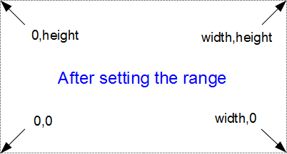
There’s a different function call (d3.scale.linear()) but the .range setting is still there. In the interests of drawing a (semi) pretty picture to try and explain, hopefully this will assist;
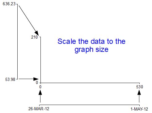
I know, I know, it’s a little misleading because nowhere have we actually said to D3 this is our data from 53.98 to 636.23. All we’ve said is when we get the data, we’ll be scaling it into this space.
Now hang on, what’s going on with the [height, 0] part in y axis scale statement? The astute amongst you will note that for the time scale we set the range as [0, width] but for this one ([height, 0]) the values look backwards.
Well spotted.
This is all to do with how the screen is laid out and referenced. Take a look at the following diagram showing how the coordinates for drawing on your screen work;
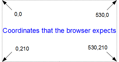
The top left hand of the screen is the origin or 0,0 point and as we go left or down the corresponding x and y values increase to the full values defined by height and width.
That’s good enough for the time values on the x axis that will start at lower values and increase, but for the values on the y axis we’re trying to go against the flow. We want the low values to be at the bottom and the high values to be at the top.
No problem. We just tell D3 via the statement y = d3.scale.linear().range([height, 0]); that the larger values (height) are at the low end of the screen (at the top) and the low values are at the bottom (as you most probably will have guessed by this stage, the .range statement uses the format .range([closer_to_the_origin, further_from_the_origin]). So when we put the height variable first, that is now associated at the top of the screen.
We’ve scaled our data to the graph size and ensured that the range of values is set appropriately. What’s with the domain part that was in this section’s title?
Come on, you remember this little piece of script don’t you?
    x.domain(d3.extent(data, function(d) { return d.date; }));
    y.domain([0, d3.max(data, function(d) { return d.close; })]);
While it exists in a separate part of the file from the scale / range part, it is certainly linked.
That’s because there’s something missing from what we have been describing so far with the set up of the data ranges for the graphs. We haven’t actually told D3 what the range of the data is. That’s also the reason this part of the script occurs where it does. It is within the portion where the data.csv file has been loaded as ‘data’ and it’s therefore ready to use it.
So, the .domain function is designed to let D3 know what the scope of the data will be. This is what is then passed to the scale function.
Looking at the first part that is setting up the x axis values, it is saying that the domain for the x axis values will be determined by the d3.extent function which in turn is acting on a separate function which looks through all the ‘date’ values that occur in the ‘data’ array. In this case the .extent function returns the minimum and maximum value in the given array.
-
function(d) { return d.date; }returns all the ‘date’ values in ‘data’. This is then passed to… - The
.extentfunction that finds the maximum and minimum values in the array and then… - The
.domainfunction which returns those maximum and minimum values to D3 as the range for the x axis.
Pretty neat really. At first you might think it was overly complex, but breaking the function down into these components allows additional functionality with differing scales, values and quantities. In short, don’t sweat it. It’s a good thing.
The x axis values are dates; so the domain for them is basically from the 26th of March 2012 till 1st of May 2012. The y axis is done slightly differently
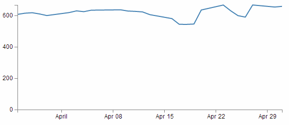
y.domain([0, d3.max(data, function(d) { return d.close; })]);
Because the range of values desired on the y axis goes from 0 to the maximum in the data range, that’s exactly what we tell D3. The ‘0’ in the .domain function is the starting point and the finishing point is found by employing a separate function that sorts through all the ‘close’ values in the ‘data’ array and returns the largest one. Therefore the domain is from 0 to 636.23.
Let’s try a small experiment. Let’s change the y axis domain to use the .extent function (the same way the x axis does) to see what it produces.
The JavaScript for the y domain will be;
y.domain(d3.extent(data, function(d) { return d.close; }));
You can see apart from a quick copy paste of the internals, all I had to change was the reference to ‘close’ rather than ‘date’.
And the result is…
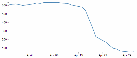
Look at that! The starting point for the y axis looks like it’s pretty much on the 53.98 mark and the graph itself certainly touches the x axis where the data would indicate it should.
Now, I’m not really advocating making a graph like this since I think it looks a bit nasty (and a casual observer might be fooled into thinking that the x axis was at 0). However, this would be a useful thing to do if the data was concentrated in a narrow range of values that are quite distant from zero.
For instance, if I change the data.csv file so that the values are represented like the following;
Then it kind of loses the ability to distinguish between values around the median of the data.
But, if I put in our magic .extent function for the y axis and redraw the graph…
How about that?
The same data as the previous graph, but with one simple piece of the script changed and D3 takes care of the details.
Setting up the Axes
Now we come to our next piece of code;
var xAxis = d3.svg.axis().scale(x)
    .orient("bottom").ticks(5);

var yAxis = d3.svg.axis().scale(y)
    .orient("left").ticks(5);
I’ve included both the x and y axes because they carry out the formatting in very similar ways. It’s worth noting that this is not the point where the axes get drawn. That occurs later in the piece where the data.csv file has been loaded as ‘data’.
D3 has it’s own axis component that aims to take the fuss out of setting up and displaying the axes. So it includes a number of configurable options.
Looking first at the x axis;
var xAxis = d3.svg.axis().scale(x)
    .orient("bottom").ticks(5);
The axis function is called with d3.svg.axis(). Then the scale is set using the x values that we set up in the scales, ranges and domains section using .scale(x). Then a curious thing happens, we tell the graph to orientate itself to the bottom of the graph .orient("bottom"). If I tell you that “bottom” is the default setting, then you could be forgiven for thinking that technically, we don’t need to specify this since it will go there anyway, but it does give us an opportunity to change it to "top" to see what happens;
Well, I hope you didn’t see that coming, because I didn’t. It transpires that what we’re talking about is the orientation of the values and ticks about the axis line itself. Ahh… Ok. Useful if your x axis is at the top of your graph, but for this one? Not so useful.
The next part (.ticks(5)) sets the number of ticks on the axis. Hopefully you just did a quick count across the bottom of the previous graph and went “Yep, five ticks. Spot on”. Well done if you did, but there’s a little bit of a sneaky trick up D3’s sleeve with the number of ticks on a graph axis.
For instance, here’s what the graph looks like when the .ticks(5) value is changed to .ticks(4).
Eh? Hang on. Isn’t that some kind of mistake? There are still five ticks. Yep, sure is! But wait… we can keep dropping the ticks value till we get to two and it will still be the same. At .ticks(2) though, we finally see a change.
How about that? At first glance that just doesn’t seem right, then you have a bit of a think about it and you go “Hmm… When there were 5 ticks, they were separated by a week each, and that stayed that way till we got to a point where it could show a separation of a month.”.
D3 is making a command decision for you as to how your ticks should be best displayed. This is great for simple graphs and indeed for the vast majority of graphs. Like all things related to D3, if you really need to do something bespoke, it will let you if you understand enough code.
The following is the list of time intervals that D3 will consider when setting automatic ticks on a time based axis;
- 1-, 5-, 15and 30-second.
- 1-, 5-, 15and 30-minute.
- 1-, 3-, 6and 12-hour.
- 1 and 2-day.
- 1-week.
- 1 and 3-month.
- 1-year.
Just for giggles have a think about what value of ticks you will need to increase to until you get D3 to show more than five ticks.
Hopefully you won’t sneak a glance at the following graph before you come up with the right answer.
Yikes! The answer is 10! And then when it does, the number of ticks is so great that they jumble all over each other. Not looking to good there. However, you could rotate the text (or perhaps slant it) and it could still fit in (that must be the topic of a future how-to). You could also make the graph longer if you wanted, but of course that is probably going to create other layout problems. Try to think about your data and presentation as a single entity.
The code that formats the y axis is pretty similar;
var yAxis = d3.svg.axis().scale(y)
    .orient("left").ticks(5);
We can change the orientation to "right" if we want, but it won’t be winning any beauty prizes.
Nope. Not a pretty sight.
What about the number of ticks? Well this scale is quite different to the x axis. Formatting the dates using logical separators (weeks, months) was tricky, but with standard numbers, it should be a little easier. In fact, there’s a fair chance that you’ve already had a look at the y axis and seen that there are 6 ticks there when the script is asking for 5 :-)
We can lower the tick number to 4 and we get a logical result.
We need to raise the count to 10 before we get more than 6.
Adding data to the line function
We’re getting towards the end of our journey through the script now. The next step is to get the information from the array ‘data’ and to place it in a new array that consists of a set of coordinates that we are going to plot.
var valueline = d3.svg.line()
    .x(function(d) { return x(d.date); })
    .y(function(d) { return y(d.close); });
I’m aware that the statement above may be somewhat ambiguous. You would be justified in thinking that we already had the data stored and ready to go. But that’s not strictly correct.
What we have is data in a raw format, we have added pieces of code that will allow the data to be adjusted for scale and range to fit in the area that we want to draw, but we haven’t actually taken our raw data and adjusted it for our desired coordinates. That’s what the code above does.
The main function that gets used here is the d3.svg.line() function. This function uses accessor functions to store the appropriate information in the right area and in the case above they use the x and y accessors (that would be the bits that are .x and .y). The d3.svg.line() function is called a ‘path generator’ and this is an indication that it can carry out some pretty clever things on its own accord. But in essence its job is to assign a set of coordinates in a form that can be used to draw a line.
Each time this line function is called on, it will go through the data and will assign coordinates to ‘date’ and ‘close’ pairs using the ‘x’ and ‘y’ functions that we set up earlier (which of course are responsible for scaling and setting the correct range / domain).
Of course, it doesn’t get the data all by itself, we still need to actually call the valueline function with ‘data’ as the source to act on. But never fear, that’s coming up soon.
Adding the SVG Canvas.
As the title states, the next piece of script forms and adds the canvas that D3 will then use to draw on.
var svg = d3.select("body")
    .append("svg")
        .attr("width", width + margin.left + margin.right)
        .attr("height", height + margin.top + margin.bottom)
    .append("g")
        .attr("transform",
              "translate(" + margin.left + "," + margin.top + ")");
So what exactly does that all mean?
Well D3 needs to be able to have a space defined for it to draw things. When you define the space it’s going to use, you can also give the space you’re going to use an identifying name and attributes.
In the example we’re using here, we are ‘appending’ an SVG element (a canvas that we are going to draw things on) to the <body> element of the HTML page.
We also add an element ‘g’ that is referenced to the top left corner of the actual graph area on the canvas. ‘g’ is actually a grouping element in the sense that it is normally used for grouping together several related elements. So in this case those grouped elements will have a common reference.
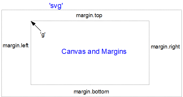
(the image above is definitely not to scale, but I hope you get the general idea)
Interesting things to note about the code. The .attr(“stuff in here”) parts are attributes of the appended elements they are part of.
For instance;
    .append("svg")
        .attr("width", width + margin.left + margin.right)
        .attr("height", height + margin.top + margin.bottom)
tells us that the ‘svg’ element has a “width” of width + margin.left + margin.right and the “height” of height + margin.top + margin.bottom.
Likewise…
    .append("g")
        .attr("transform",
              "translate(" + margin.left + "," + margin.top + ")");
tells us that the element “g” has been transformed by moving(translating) to the point margin.left, margin.top. Or to the top left of the graph space proper. This way when we tell something to be drawn on our canvas, we can use the reference point “g” to make sure everything is in the right place.
Actually Drawing Something!
Up until now we have spent a lot of time defining, loading and setting up. Good news! We’re about to finally draw something!
We jump lightly over some of the code that we have already explained and land on the part that draws the line.
    svg.append("path")		     // Add the valueline path.
        .attr("d", valueline(data));
This area occurs in the part of the code that has the data loaded and ready for action.
The svg.append("path") portion adds a new path element . A path element represents a shape that can be manipulated in lots of different ways (see more here: http://www.w3.org/TR/SVG/paths.html). In this case it inherits the ‘path’ styles from the CSS section and on the following line (.attr("d", valueline(data));) we add the attribute “d”.
This is an attributer that stands for ‘path data’ and sure enough the valueline(data) portion of the script passes the ‘valueline’ array (with its x and y coordinates) to the path element. This then creates a svg element which is a path going from one set of ‘valueline’ coordinates to another.
Then we get to draw in the axes;
    svg.append("g")                // Add the X Axis
        .attr("class", "x axis")
        .attr("transform", "translate(0," + height + ")")
        .call(xAxis);

    svg.append("g")               // Add the Y Axis
        .attr("class", "y axis")
        .call(yAxis);
We have covered the formatting of the axis components earlier. So this part is actually just about getting those components drawn onto our canvas.
So both axes start by being appended to the “g” group. Then each has its own classes applied for styling via CSS. If you recall from earlier, they look a little like this;
.axis path,
.axis line {
    fill: none;
    stroke: grey;
    stroke-width: 1;
    shape-rendering: crispEdges;
}
Feel free to mess about with these to change the appearance of your axes.
On the x axis, we have a transform statement (.attr("transform", "translate(0," + height + ")")). If you recall, our point of origin for drawing is in the top left hand corner. Therefore if we want our x axis to be on the bottom of the graph, we need to move (transform) it to the bottom by a set amount. The set amount in this case is the height of the graph proper (height). So, for the point of demonstration we will remove the transform line and see what happens;
Yep, pretty much as anticipated.
The last part of the two sections of script ( .call(xAxis); and .call(yAxis); ) call the x and y axis functions and initiate the drawing action.
Wrap Up
Well that’s it. In theory, you should now be a complete D3 ninja.
OK, perhaps a slight exaggeration. In fact there is a strong possibility that the information I have laid out here is at best borderline useful and at worst laden with evil practices and gross inaccuracies.
But look on the bright side. Irrespective of the nastiness of the way that any of it was accomplished or the inelegance of the code, if the picture drawn on the screen is pretty, you can walk away with a smile. :-)
This section concludes a very basic description of one type of a graphic that can be built with D3. We will look at adding value to it in subsequent chapters.
I’ve said it before and I’ll say it again. This is not a how-to for learning D3. This is how I have managed to muddle through in a bumbling way to try and achieve what I wanted to do. If some small part of it helps you. All good. Those with a smattering of knowledge of any of the topics I have butchered above (or below) are fully justified in feeling a large degree of righteous indignation. To those I say, please feel free to amend where practical and possible, but please bear in mind this was written from the point of view of someone with no experience in the topic and therefore try to keep any instructions at a level where a new entrant can step in.