Bullet Charts
Introduction to bullet chart structure
One of the first D3.js examples I ever came across (back when Protovis was the thing to use) was one with bullet charts (or bullet graphs).
It struck me straight away as an elegant way to represent data by providing direct information and context.

The Bullet Graph Design Specification was laid down by Stephen Frew as part of his work with Perceptual Edge.
Using his specification we can break down the components of the chart as follows.
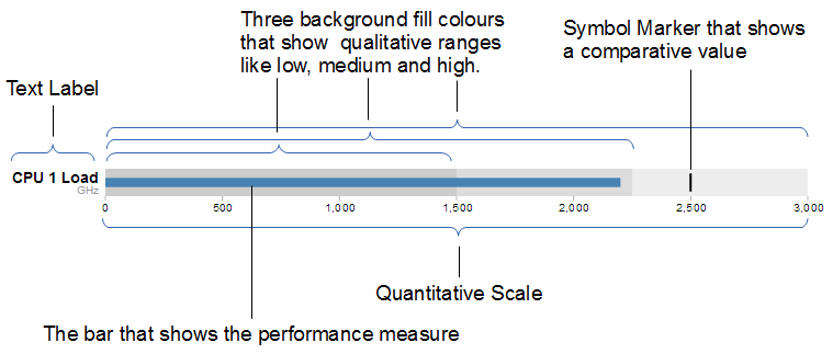
Text label: Identifies the performance measure being represented.
Quantitative scale: A scale that is an analogue of the scale on the x axis of a two dimensional xy graph.
Performance measure: The primary data being displayed. In this case the frequency of operation of a CPU.
Comparative marker: A reference symbol designating a measurement such as the previous day’s high value (or similar).
Qualitative ranges: These represent ranges such as low, medium and high or bad, satisfactory and good. Ideally there would be no fewer than two and no more than 5 of these (for the purposes of readability).
Understanding the specification for the chart is useful, because it’s also reflected in the way that the data for the chart is structured.
For instance, If we take the current example, the data can be presented (in JSON) as follows;
[
  {
    "title":"CPU 1 Load",
    "subtitle":"GHz",
    "ranges":[1500,2250,3000],
    "measures":[2200],
    "markers":[2500]
  }
]
Here we an see all the components for the chart laid out and it’s these values that we will load into our D3 script to display.
D3.js code for bullet charts
We’ll move through the explanation of the code in a similar process to the other examples in the book. Where there are areas that we have covered before, I will gloss over some details on the understanding that you will have already seen them explained in an earlier section (most likely the basic line graph example).
Here is the full code;
<!DOCTYPE html>
<meta charset="utf-8">
<style>
body {
  font-family: "Helvetica Neue", Helvetica, Arial, sans-serif;
  margin: auto;
  padding-top: 40px;
  position: relative;
  width: 800px;
}

button {
  position: absolute;
  right: 40px;
  top: 10px;
}

.bullet { font: 10px sans-serif; }
.bullet .marker { stroke: #000; stroke-width: 2px; }
.bullet .tick line { stroke: #666; stroke-width: .5px; }
.bullet .range.s0 { fill: #eee; }
.bullet .range.s1 { fill: #ddd; }
.bullet .range.s2 { fill: #ccc; }
.bullet .measure.s0 { fill: steelblue; }
.bullet .title { font-size: 14px; font-weight: bold; }
.bullet .subtitle { fill: #999; }
</style>
<button>Update</button>
<script type="text/javascript" src="d3/d3.v3.js"></script>
<script src="js/bullet.js"></script>
<script>
var margin = {top: 5, right: 40, bottom: 20, left: 120},
    width = 800 - margin.left - margin.right,
    height = 50 - margin.top - margin.bottom;

var chart = d3.bullet()
    .width(width)
    .height(height);

d3.json("bullet-data.json", function(error, data) {
  var svg = d3.select("body").selectAll("svg")
      .data(data)
    .enter().append("svg")
      .attr("class", "bullet")
      .attr("width", width + margin.left + margin.right)
      .attr("height", height + margin.top + margin.bottom)
    .append("g")
      .attr("transform", "translate(" + margin.left + "," + margin.top + ")")
      .call(chart);

  var title = svg.append("g")
      .style("text-anchor", "end")
      .attr("transform", "translate(-6," + height / 2 + ")");

  title.append("text")
      .attr("class", "title")
      .text(function(d) { return d.title; });

  title.append("text")
      .attr("class", "subtitle")
      .attr("dy", "1em")
      .text(function(d) { return d.subtitle; });

  d3.selectAll("button").on("click", function() {
    svg.datum(randomize).call(chart.duration(1000));
  });
});

function randomize(d) {
  if (!d.randomizer) d.randomizer = randomizer(d);
  d.markers = d.markers.map(d.randomizer);
  d.measures = d.measures.map(d.randomizer);
  return d;
}

function randomizer(d) {
  var k = d3.max(d.ranges) * .2;
  return function(d) {
    return Math.max(0, d + k * (Math.random() - .5));
  };
}
</script>
</body>
This code is a derivative of one of Mike Bostock’s blocks here. The full code for this graph can also be found on github or in the code samples bundled with this book (bullet-simple.html, bullet.js and bullet-data.json). A live example can be found on bl.ocks.org.
The first block of our code is the start of the file and sets up our HTML.
<!DOCTYPE html>
<meta charset="utf-8">
<style>
This leads into our style declarations.
body {
  font-family: "Helvetica Neue", Helvetica, Arial, sans-serif;
  margin: auto;
  padding-top: 40px;
  position: relative;
  width: 800px;
}

button {
  position: absolute;
  right: 40px;
  top: 10px;
}

.bullet { font: 10px sans-serif; }
.bullet .marker { stroke: #000; stroke-width: 2px; }
.bullet .tick line { stroke: #666; stroke-width: .5px; }
.bullet .range.s0 { fill: #eee; }
.bullet .range.s1 { fill: #ddd; }
.bullet .range.s2 { fill: #ccc; }
.bullet .measure.s0 { fill: steelblue; }
.bullet .title { font-size: 14px; font-weight: bold; }
.bullet .subtitle { fill: #999; }
We declare the (general) styling for the chart page in the first instance and then the button. Then we move on to the more interesting styling for the bullet charts.
The first line .bullet { font: 10px sans-serif; } sets the font size.
The second line sets the colour and width of the symbol marker. So if we were to change it to…
.bullet .marker { stroke: red; stroke-width: 10px; }
… the result is…

The next three lines set the colours for the fill of the qualitative ranges.
.bullet .range.s0 { fill: #eee; }
.bullet .range.s1 { fill: #ddd; }
.bullet .range.s2 { fill: #ccc; }
You can have more or fewer ranges set here, but to use them you also need the appropriate values in your data file. We will explore how to change this later.
The next line designates the colour for the value being measured.
.bullet .measure.s0 { fill: steelblue; }
Like the qualitative ranges, we can have more of them, but in my personal opinion, it starts to get a bit confusing.
The final two lines lay out the styling for the label.
The next block of code loads the JavaScript files.
</style>
<button>Update</button>
<script src="http://d3js.org/d3.v3.min.js"></script>
<script src="bullet.js"></script>
<script>
In this case it’s d3 and bullet.js. We need to load bullet.js as a separate file since it exists outside the code base of the d3.js ‘kernel’.
Then we get into the JavaScript. The first thing we do is define the size of the area that we’ll be working in.
var margin = {top: 5, right: 40, bottom: 20, left: 120},
    width = 800 - margin.left - margin.right,
    height = 50 - margin.top - margin.bottom;
Then we define the chart size using the variables that we have just set up.
var chart = d3.bullet()
    .width(width)
    .height(height);
The other important thing that occurs while setting up the chart is that we use the d3.bullet function call to do it. The d3.bullet function is the part that resides in the bullet.js file that we loaded earlier. The internal workings of bullet.js are a window into just how developers are able to craft extra code to allow additional functionality for d3.js.
Then we load our JSON data with our values that we want to display.
d3.json("bullet-data.json", function(error, data) {
The next block of code is the most important IMHO, since this is where the chart is drawn.
var svg = d3.select("body").selectAll("svg")
    .data(data)
  .enter().append("svg")
    .attr("class", "bullet")
    .attr("width", width + margin.left + margin.right)
    .attr("height", height + margin.top + margin.bottom)
  .append("g")
    .attr("transform", "translate(" + margin.left + "," + margin.top + ")")
    .call(chart);
However, to look at it you can be forgiven for wondering if it’s doing anything at all.
We use our .select and .selectAll statements to designate where the chart will go (d3.select("body").selectAll("svg")) and then load the data as data (.data(data)).
We add in a svg element (.enter().append("svg")) and assign the styling from our css section (.attr("class", "bullet")).
Then we set the size of the svg container for an individual bullet chart using .attr("width", width + margin.left + margin.right) and .attr("height", height + margin.top + margin.bottom).
We then group all the elements that make up each individual bullet chart with .append("g") before placing the group in the right place with .attr("transform", "translate(" + margin.left + "," + margin.top + ")").
Then we wave the magic wand and call the chart function with .call(chart); which will take all the information from our data file ( like the ranges, measures and markers values) and use the bullet.js script to create a chart.
The reason I made the comment about the process looking like magic is that the vast majority of the heavy lifting is done by the bullet.js file. Because it’s abstracted away from the immediate code that we’re writing, it looks simplistic, but like all good things, there needs to be a lot of complexity to make a process look simple.
We then add the titles.
  var title = svg.append("g")
      .style("text-anchor", "end")
      .attr("transform", "translate(-6," + height / 2 + ")");

  title.append("text")
      .attr("class", "title")
      .text(function(d) { return d.title; });

  title.append("text")
      .attr("class", "subtitle")
      .attr("dy", "1em")
      .text(function(d) { return d.subtitle; });
We do this in stages. First we create a variable title which will append objects to the grouped element created above (var title = svg.append("g")). We apply a style (.style("text-anchor", "end")) and transform to the objects (.attr("transform", "translate(-6," + height / 2 + ")");).
Then we append the title and subtitle data (from our JSON file) to our chart with a modicum of styling and placement.
Then we add a button and functions which do the job of applying random data to our variables every time it’s pressed.
  d3.selectAll("button").on("click", function() {
    svg.datum(randomize).call(chart.duration(1000));
  });
});

function randomize(d) {
  if (!d.randomizer) d.randomizer = randomizer(d);
  d.markers = d.markers.map(d.randomizer);
  d.measures = d.measures.map(d.randomizer);
  return d;
}

function randomizer(d) {
  var k = d3.max(d.ranges) * .2;
  return function(d) {
    return Math.max(0, d + k * (Math.random() - .5));
  };
}
I’m not going to delve into the working of the randomize function, because it exists simply to demonstrate the dynamic nature of the chart and not really how the chart is drawn.
However, I will be going through a process later to ensure that we can update the data and the chart automatically which will hopefully be more orientated to practical applications.
That’s it! Now we’ll go through how you can use the data to change aspects of the chart and what parts of the code need to be adjusted to work with those changes.
Adapting and changing bullet chart components
This section explores some of the simple changes that can be made to bullet charts that may not necessarily be obvious.
Understand your data
The first point to note is that understanding the data loaded from the JSON file is a key to knowing what your chart is going to do.
We’ll start by looking at our data in a way that hopefully makes the most sense.
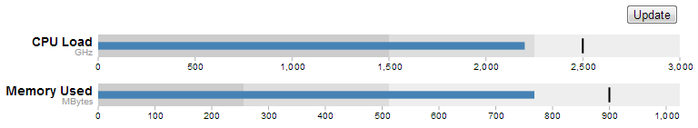
You may be faced with data for a bullet chart that’s in a format as follows;
[
{"title":"CPU Load","subtitle":"GHz","ranges":[1500,2250,3000],"measures":
[2200],"markers":[2500]},
{"title":"Memory Used","subtitle":"MBytes","ranges":[256,512,1024],"measures":
[768],"markers":[900]}
]
This is perfectly valid data, but we’ll find it slightly easier to understand if we show it like this…
[
  {
    "title":"CPU Load",
    "subtitle":"GHz",
    "ranges":[1500,2250,3000],
    "measures":[2200],
    "markers":[2500]
  },
  {
    "title":"Memory Used",
    "subtitle":"MBytes",
    "ranges":[256,512,1024],
    "measures":[768],
    "markers":[900]
  }
]
The data is exactly the same (in terms of content) but I find it a lot easier to comprehend what’s going on with the second example.
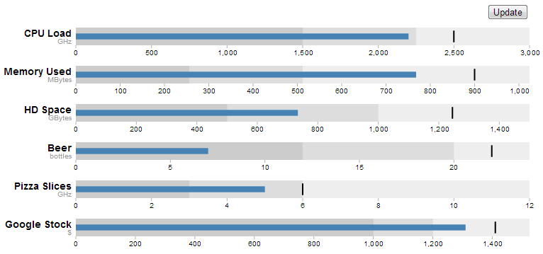
Add as many individual charts as you want.
The example data in the file is an array of two groups. Each group represents the information required to generate one bullet chart. Therefore the example data above will create the following charts;
You don’t need to make any changes to your code in order to add more individual charts. You just need to add more data groups to your JSON file. The following example uses exactly the same code, but with several extra groups of data.
Add more ranges and measures
Returning to our single chart example, you can see from the JSON data that there are three specified ranges and one measure.
[
  {
    "title":"CPU 1 Load",
    "subtitle":"GHz",
    "ranges":[1500,2250,3000],
    "measures":[2200],
    "markers":[2500]
  }
]
The same was true for the css in the JavaScript code. Three ranges and one measure
.bullet { font: 10px sans-serif; }
.bullet .marker { stroke: #000; stroke-width: 2px; }
.bullet .tick line { stroke: #666; stroke-width: .5px; }
.bullet .range.s0 { fill: #eee; }
.bullet .range.s1 { fill: #ddd; }
.bullet .range.s2 { fill: #ccc; }
.bullet .measure.s0 { fill: steelblue; }
.bullet .title { font-size: 14px; font-weight: bold; }
.bullet .subtitle { fill: #999; }
By matching the css for the .bullet style with the data you can add more or fewer of both. For example here’s example data, css and a chart with five ranges and two measures.
[
  {
    "title":"CPU 1 Load",
    "subtitle":"GHz",
    "ranges":[500,1000,1500,2250,3000],
    "measures":[1250, 2200],
    "markers":[2650]
  }
]
.bullet { font: 10px sans-serif; }
.bullet .marker { stroke: lightgreen; stroke-width: 5px; }
.bullet .tick line { stroke: #666; stroke-width: .5px; }
.bullet .range.s0 { fill: navy; }
.bullet .range.s1 { fill: mediumblue; }
.bullet .range.s2 { fill: dodgerblue; }
.bullet .range.s3 { fill: aqua; }
.bullet .range.s4 { fill: lightblue; }
.bullet .measure.s0 { fill: red; }
.bullet .measure.s1 { fill: pink; }
.bullet .title { font-size: 14px; font-weight: bold; }
.bullet .subtitle { fill: #999; }

First of all. Yes, I know the colours are gaudy. Hopefully they stand out. Don’t abuse your own graphs in this hideous way.
More importantly though, you can now get a better idea of how to align the range and measure values in the JSON file with the .range and .measure styles in the css.
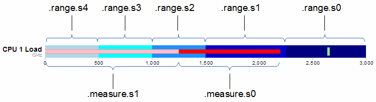
The diagram shows that the .range and .measure bars are numbered from the right. (for example the ‘navy’ colour showing the range up to 3000 GHz is designated .range.s0. At first this convention of numbering from the right confused me. I imagined that the smallest range should be .range.s0 and this should be on the left. Then I realised that the numbering related to the layer of the range. So this would make .range.s0 go from 0 to 3000. Then the second layer would be .range.s1 which would go on top of .range.s0 from 0 to 2250, thereby covering most of .range.s0 except for the part that exceeded .range.s1. Which is exactly what we see with successively higher layers having higher numbers. The same is true for the .measure numbers and layers.
Updating a bullet chart automatically
Displaying static data is a good start for a bullet chart, but if you have data that’s changing dynamically, you need to be able to re-load the information and display it automatically.
To adapt our code to this purpose we will first remove the parts that added the button.
Remove this portion from the css section;
button {
  position: absolute;
  right: 40px;
  top: 10px;
}
Then remove this line that added the button in the html section;
<button>Update</button>
All we need to do now is change the section that called the original json file from;
d3.json("bullet-data.json", function(error, data) {
… to …
d3.json("bullet-data2.json", function(error, data) {
So that we’re dealing with a different json file (there’s no need to go messing around with our original data).
Change the section that used to call the function to randomise the data with the button click from…
  d3.selectAll("button").on("click", function() {
    svg.datum(randomize).call(chart.duration(1000));
  });
… to …
  setInterval(function() {
		updateData();
	}, 1000);
This new piece of code simply sets up a repeating function that calls another function (updateData) every 1000ms.
The final change is to replace the original functions that randomised the data…
function randomize(d) {
  if (!d.randomizer) d.randomizer = randomizer(d);
  d.markers = d.markers.map(d.randomizer);
  d.measures = d.measures.map(d.randomizer);
  return d;
}

function randomizer(d) {
  var k = d3.max(d.ranges) * .2;
  return function(d) {
    return Math.max(0, d + k * (Math.random() - .5));
  };
}
… with our new function that updates the data …
function updateData() {
	d3.json("bullet-data2.json", function(error, data) {
		d3.select("body").selectAll("svg")
			.datum(function (d, i) {
				d.ranges = data[i].ranges;
				d.measures = data[i].measures;
				d.markers = data[i].markers;
				return d;
			})
			.call(chart.duration(1000));
	});
}
This new function (updateData) reads in our json file again, selects all the svg elements then updates all the .ranges, .measures and .markers data with whatever was in the file. Then it calls the chart function that updates the bullet charts.
All the code components for this script can be found on github or in the code samples bundled with this book (bullet-auto.html and bullet-data2.json). A live example can be found on bl.ocks.org (although it won’t update since the data file can’t be updated online).