D3.js Examples Explained
I’ve decided to include an examples chapter because I have occasionally come across things that I wanted to do with data or a technique that didn’t necessarily fall into a specific category or where I had something that I wanted to do that went beyond an exercise that I would want to turn into a simple description.
In other words I think that this will be a place where I can put random graphics that I have made up that don’t necessarily fall into a logical category but which I think would be worth recording.
In many cases these examples will combine a range of techniques that have been explained in the book and in some cases they may include new material that perhaps I would have struggled to explain.
Whatever the case, I will try to explain the examples as best I can and to include a full code listing for each and a link to an electronic version wherever possible.
Dynamically retrieve historical stock records via YQL
Purpose
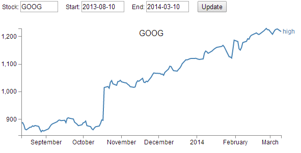
This page was developed to be an attempt to integrate the ability to download time range data from the Yahoo! Developer Network via a YQL query and to be able to edit that query and dynamically adjust the output graph.
It doesn’t hurt that the data is pretty interesting (who isn’t fascinated by the rise and fall of stock prices?).
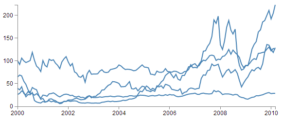
The following is a picture of the resulting graph;
The code
The following is the full code for the example. A live version is available online at bl.ocks.org or GitHub. It is also available as the file ‘yql-dynamic-stock-line.html’ as a separate download with D3 Tips and Tricks. A a copy of most the files that appear in the book can be downloaded (in a zip file) when you download the book from Leanpub.
<!DOCTYPE html>
<meta charset="utf-8">
<style> /* set the CSS */
body { font: 12px Arial;}
path {
stroke: steelblue;
stroke-width: 2;
fill: none;
}
text.shadow {
stroke: white;
stroke-width: 2.5px;
opacity: 0.9;
}
.axis path,
.axis line {
fill: none;
stroke: grey;
stroke-width: 1;
shape-rendering: crispEdges;
}
</style>
<body>
<!-- set inputs for the query -->
<div id="new_input">
   
Stock: <input type="text" name="stock" id="stock" value="YHOO"
style="width: 70px;">
   
Start: <input type="text" name="start" id="start" value="2013-08-10"
style="width: 80px;">
   
End: <input type="text" name="end" id="end" value="2014-03-10"
style="width: 80px;">
   
<input name="updateButton"
type="button"
value="Update"
onclick="updateData()" />
</div>
<!-- load the d3.js library -->
<script src="http://d3js.org/d3.v3.min.js"></script>
<script>
// Set the dimensions of the graph
var margin = {top: 30, right: 40, bottom: 30, left: 50},
width = 600 - margin.left - margin.right,
height = 270 - margin.top - margin.bottom;
// Parse the date / time
var parseDate = d3.time.format("%Y-%m-%d").parse;
// Set the ranges
var x = d3.time.scale().range([0, width]);
var y = d3.scale.linear().range([height, 0]);
var xAxis = d3.svg.axis().scale(x)
.orient("bottom").ticks(5);
var yAxis = d3.svg.axis().scale(y)
.orient("left").ticks(5);
var valueline = d3.svg.line()
.x(function(d) { return x(d.date); })
.y(function(d) { return y(d.high); });
var svg = d3.select("body")
.append("svg")
.attr("width", width + margin.left + margin.right)
.attr("height", height + margin.top + margin.bottom)
.append("g")
.attr("transform", "translate("
+ margin.left
+ "," + margin.top + ")");
var stock = document.getElementById('stock').value;
var start = document.getElementById('start').value;
var end = document.getElementById('end').value;
var inputURL = "http://query.yahooapis.com/v1/public/yql"+
    "?q=select%20*%20from%20yahoo.finance.historicaldata%20"+
    "where%20symbol%20%3D%20%22"
    +stock+"%22%20and%20startDate%20%3D%20%22"
    +start+"%22%20and%20endDate%20%3D%20%22"
    +end+"%22&format=json&env=store%3A%2F%2F"
    +"datatables.org%2Falltableswithkeys";
// Get the data
d3.json(inputURL, function(error, data){
    data.query.results.quote.forEach(function(d) {
        d.date = parseDate(d.Date);
        d.high = +d.High;
        d.low = +d.Low;
    });
// Scale the range of the data
x.domain(d3.extent(data.query.results.quote, function(d) {
return d.date; }));
y.domain([
d3.min(data.query.results.quote, function(d) { return d.low; }),
d3.max(data.query.results.quote, function(d) { return d.high; })
]);
svg.append("path") // Add the valueline path.
.attr("class", "line")
.attr("d", valueline(data.query.results.quote));
svg.append("g") // Add the X Axis
.attr("class", "x axis")
.attr("transform", "translate(0," + height + ")")
.call(xAxis);
svg.append("g") // Add the Y Axis
.attr("class", "y axis")
.call(yAxis);
svg.append("text") // Add the label
.attr("class", "label")
.attr("transform", "translate(" + (width+3) + ","
+ y(data.query.results.quote[0].high) + ")")
.attr("dy", ".35em")
.attr("text-anchor", "start")
.style("fill", "steelblue")
.text("high");
svg.append("text") // Add the title shadow
.attr("x", (width / 2))
.attr("y", margin.top / 2)
.attr("text-anchor", "middle")
.attr("class", "shadow")
.style("font-size", "16px")
.text(stock);
svg.append("text") // Add the title
.attr("class", "stock")
.attr("x", (width / 2))
.attr("y", margin.top / 2)
.attr("text-anchor", "middle")
.style("font-size", "16px")
.text(stock);
});
// ** Update data section (Called from the onclick)
function updateData() {
var stock = document.getElementById('stock').value;
var start = document.getElementById('start').value;
var end = document.getElementById('end').value;
var inputURL = "http://query.yahooapis.com/v1/public/yql"+
"?q=select%20*%20from%20yahoo.finance.historicaldata%20"+
"where%20symbol%20%3D%20%22"
+stock+"%22%20and%20startDate%20%3D%20%22"
+start+"%22%20and%20endDate%20%3D%20%22"
+end+"%22&format=json&env=store%3A%2F%2F"
+"datatables.org%2Falltableswithkeys";
// Get the data again
d3.json(inputURL, function(error, data){
data.query.results.quote.forEach(function(d) {
d.date = parseDate(d.Date);
d.high = +d.High;
d.low = +d.Low;
});
// Scale the range of the data
x.domain(d3.extent(data.query.results.quote, function(d) {
return d.date; }));
y.domain([
d3.min(data.query.results.quote, function(d) {
return d.low; }),
d3.max(data.query.results.quote, function(d) {
return d.high; })
]);
// Select the section we want to apply our changes to
var svg = d3.select("body").transition();
// Make the changes
svg.select(".line") // change the line
.duration(750)
.attr("d", valueline(data.query.results.quote));
svg.select(".label") // change the label text
.duration(750)
.attr("transform", "translate(" + (width+3) + ","
+ y(data.query.results.quote[0].high) + ")");
svg.select(".shadow") // change the title shadow
.duration(750)
.text(stock);
svg.select(".stock") // change the title
.duration(750)
.text(stock);
svg.select(".x.axis") // change the x axis
.duration(750)
.call(xAxis);
svg.select(".y.axis") // change the y axis
.duration(750)
.call(yAxis);
});
}
</script>
</body>
The description
Firstly, I have not included any form of validation or sanitising of the input fields. If you were to build something that was being used in a serious way, that would be essential.
Secondly, there are limits on what the YQL query will return. I have found that there appears to be a limit on the date range allowed (although I’m not sure what that limit is) and there is of course a limit to what the Yahoo! Developer Network will support for different end use cases. If you want to use the data for commercial reasons or if your use is heavy, you will need to contact them to arrange for some form of agreement to use the data appropriately.
To use the graph all you need to do is enter a valid ticker symbol and a start / end date range where the date is formatted as yyyy/mm/dd. As I noted earlier, there appears to be a range limit, so feel free to experiment a bit to work it out if necessary to your use.

The section to get the input fields was something new to me as normally I would use bootstrap.js with it’s wealth of form input options. But the following section in the HTLM portion was neat enough to get the required input.
<div id="new_input">
   
Stock: <input type="text" name="stock" id="stock" value="YHOO"
style="width: 70px;">
   
Start: <input type="text" name="start" id="start" value="2013-08-10"
style="width: 80px;">
   
End: <input type="text" name="end" id="end" value="2014-03-10"
style="width: 80px;">
   
<input name="updateButton"
type="button"
value="Update"
onclick="updateData()" />
</div>
Of course it needs to be coupled with a JavaScript section to allow it to use the inputted fields in the query but that was also nice and easy with the following section of code;
var stock = document.getElementById('stock').value;
var start = document.getElementById('start').value;
var end = document.getElementById('end').value;
The HTML portion includes the onclick="updateData()" code that allows the JavaScript updateData function to be called that reloads new data from the Yahoo! Developer Network and updates the d3.js objects.
This particular file uses the ‘load everything first’ then ‘update everything that needs updating’ model that was followed in the earlier chapter on creating a line graph that loads data dynamically.
The YQL query is declared as a variable in the following section;
var inputURL = "http://query.yahooapis.com/v1/public/yql"+
"?q=select%20*%20from%20yahoo.finance.historicaldata%20"+
"where%20symbol%20%3D%20%22"
+stock+"%22%20and%20startDate%20%3D%20%22"
+start+"%22%20and%20endDate%20%3D%20%22"
+end+"%22&format=json&env=store%3A%2F%2F"
+"datatables.org%2Falltableswithkeys";
It has had line feeds deliberately introduced to make formatting on the pages of the book easier (otherwise the publishing process introduces additional characters). In it you can see the addition of the variables that allow the query to be executed (stock, start and end).
Immediately after loading the data we run it through a forEach loop that goes to the location in the JSON hierarchy where the High, Low and Date values are stored and it ensures that the high and low values are correctly recognises as numbers and formats the date.
data.query.results.quote.forEach(function(d) {
d.date = parseDate(d.Date);
d.high = +d.High;
d.low = +d.Low;
});
This is quite interesting because it provides a peek at the structure of the JSON. This is a pretty important piece of information because without the structure, it is not possible to correctly address the data you want. I’m not sure what the best method would be for determining the structure of the returned data, but I simply use a console.log(data) call after the data is loaded while I am developing the file and this allows me to explore and note the structure.
The following screen-shot illustrates the method;
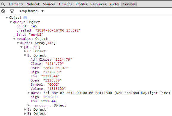
You should be able to discern the .query.results.quote pathway that leads to the High, Low and Date values.
The remainder of the code is a repetition of examples explained in the remainder of the book. Most especially in the simple line graph area.
Linux Processes via Interactive Tree diagram
Purpose
This page was developed to play with the idea of visualizing the relationship between processes running on a Linux server. To my shame, I never twigged that since the processes were ordered in a hierarchy they would therefore make an excellent tree diagram. I am therefore indebted to a friend for pointing out the obvious (as he often needs to do :-)).
Ultimately I have grand visions of this type of display being used to illustrate excessive memory or CPU usage when fault conditions occur, but for the purposes of simply showing the relationships, this example is suitable.
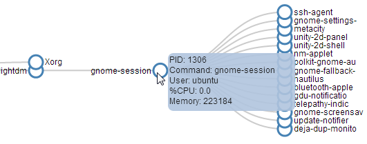
There are obviously a lot of processes running on a Linux server, so it was necessary to make the diagram interactive to allow branches to collapse where required for clarity. Indeed, there are a few of the tree diagram features which are covered separately in the chapter on tree diagrams which are combined here (interactive nodes, loading from an external source and making the tree interactive). Additionally, there is a great deal of data about each node that is available when running the ps command. I have chosen to show some of these in a tool tip that will appear when hovered over a node.
The tree is fairly large, so the following is a section of the tree with tool tip in action
The Code
The following is the full code for the example. A live version is available online at bl.ocks.org or GitHub. It is also available as the files ‘process-tree.html’ and ‘ps.csv’ as separate downloads with the book D3 Tips and Tricks. A a copy of most the files that appear in the book can be downloaded (in a zip file) when you download the book from Leanpub.
<!DOCTYPE html>
<html lang="en">
  <head>
    <meta charset="utf-8">

    <title>Linux Process Tree</title>

    <style>

  div.tooltip {
    position: absolute;
    text-align: left;
    width: 180px;
    height: 80px;
    padding: 2px;
    font: 12px sans-serif;
    background: lightsteelblue;
    border: 0px;
    border-radius: 8px;
    pointer-events: none;
  }

  .node circle {
    fill: #fff;
    stroke: steelblue;
    stroke-width: 3px;
  }

  .node text { font: 12px sans-serif; }

  .link {
    fill: none;
    stroke: #ccc;
    stroke-width: 2px;
  }

    </style>

  </head>

  <body>

<!-- load the d3.js library -->
<script src="http://d3js.org/d3.v3.min.js"></script>

<script>

// ************** Generate the tree diagram   *****************
var margin = {top: 20, right: 120, bottom: 20, left: 120},
  width = 1200 - margin.right - margin.left,
  height = 900 - margin.top - margin.bottom;

var i = 0;
  duration = 750;

var tree = d3.layout.tree()
  .size([height, width]);

var diagonal = d3.svg.diagonal()
  .projection(function(d) { return [d.y, d.x]; });

var svg = d3.select("body").append("svg")
  .attr("width", width + margin.right + margin.left)
  .attr("height", height + margin.top + margin.bottom)
  .append("g")
  .attr("transform", "translate(" + margin.left + "," +
                                    margin.top + ")");

// load the external data
d3.csv("ps.csv", function(error, data) {

  // *********** Convert flat data into a nice tree ***************
  // create a name: node map
  var dataMap = data.reduce(function(map, node) {
    map[node.name] = node;
    return map;
  }, {});

  // create the tree array
  var treeData = [];
  data.forEach(function(node) {
    // add to parent
    var parent = dataMap[node.parent];
    if (parent) {
      // create child array if it doesn't exist
      (parent.children || (parent.children = []))
        // add node to child array
        .push(node);
    } else {
      // parent is null or missing
      treeData.push(node);
    }
  });

  root = treeData[0];
  root.x0 = height / 2;
  root.y0 = 0;

  update(root);
});

d3.select(self.frameElement).style("height", "500px");

function update(source) {

  // Compute the new tree layout.
  var nodes = tree.nodes(root).reverse(),
    links = tree.links(nodes);

  // Normalize for fixed-depth.
  nodes.forEach(function(d) { d.y = d.depth * 180; });

  // Update the nodes…
  var node = svg.selectAll("g.node")
    .data(nodes, function(d) { return d.id || (d.id = ++i); });

  // Enter any new nodes at the parent's previous position.
  var nodeEnter = node.enter().append("g")
    .attr("class", "node")
    .attr("transform", function(d) {
      return "translate(" + source.y0 + "," + source.x0 + ")"; })
    .on("click", click)
      // add tool tip for ps -eo pid,ppid,pcpu,size,comm,ruser,s
      .on("mouseover", function(d) {
        div.transition()
          .duration(200)
          .style("opacity", .9);
        div .html(
            "PID: " + d.name + "<br/>" +
            "Command: " + d.COMMAND + "<br/>" +
            "User: " + d.RUSER + "<br/>" +
            "%CPU: " + d.CPU + "<br/>" +
            "Memory: " + d.SIZE
            )
          .style("left", (d3.event.pageX) + "px")
          .style("top", (d3.event.pageY - 28) + "px");
        })
      .on("mouseout", function(d) {
        div.transition()
          .duration(500)
          .style("opacity", 0);
        });

  nodeEnter.append("circle")
    .attr("r", 1e-6)
    .style("fill", function(d) {
      return d._children ? "lightsteelblue" : "#fff"; });

  nodeEnter.append("text")
    .attr("x", function(d) {
      return d.children || d._children ? -13 : 13; })
    .attr("dy", ".35em")
    .attr("text-anchor", function(d) {
      return d.children || d._children ? "end" : "start"; })
    .text(function(d) { return d.COMMAND; })
    .style("fill-opacity", 1e-6);

// add the tool tip
  var div = d3.select("body").append("div")
    .attr("class", "tooltip")
    .style("opacity", 0);

  // Transition nodes to their new position.
  var nodeUpdate = node.transition()
    .duration(duration)
    .attr("transform", function(d) {
        return "translate(" + d.y + "," + d.x + ")";
      });

  nodeUpdate.select("circle")
    .attr("r", 10)
    .style("fill", function(d) {
	  return d._children ? "lightsteelblue" : "#fff"; });

  nodeUpdate.select("text")
    .style("fill-opacity", 1);

  // Transition exiting nodes to the parent's new position.
  var nodeExit = node.exit().transition()
    .duration(duration)
    .attr("transform", function(d) { return "translate(" + source.y +
                                             "," + source.x + ")"; })
    .remove();

  nodeExit.select("circle")
    .attr("r", 1e-6);

  nodeExit.select("text")
    .style("fill-opacity", 1e-6);

  // Update the links…
  var link = svg.selectAll("path.link")
    .data(links, function(d) { return d.target.id; });

  // Enter any new links at the parent's previous position.
  link.enter().insert("path", "g")
    .attr("class", "link")
    .attr("d", function(d) {
      var o = {x: source.x0, y: source.y0};
      return diagonal({source: o, target: o});
    });

  // Transition links to their new position.
  link.transition()
    .duration(duration)
    .attr("d", diagonal);

  // Transition exiting nodes to the parent's new position.
  link.exit().transition()
    .duration(duration)
    .attr("d", function(d) {
      var o = {x: source.x, y: source.y};
      return diagonal({source: o, target: o});
    })
    .remove();

  // Stash the old positions for transition.
  nodes.forEach(function(d) {
  d.x0 = d.x;
  d.y0 = d.y;
  });
}

// Toggle children on click.
function click(d) {
  if (d.children) {
    d._children = d.children;
    d.children = null;
  } else {
    d.children = d._children;
    d._children = null;
  }
  update(d);
}

</script>

  </body>
</html>
Description
I will describe both the code for the example and the csv file that accompanies it since (in this case) the data that generates the tree is not gathered entirely automatically and has some manual intervention applied to make it suitable for purpose.
The csv file (ps.csv) was generated by running the command…
ps -eo pid,ppid,pcpu,size,comm,ruser,s
…and converting the resultant output to a csv file.
name,parent,CPU,SIZE,COMMAND,RUSER,S
0, ,0,0,start,nul,u
1,0,0.0,1140,init,root,S
2,0,0.0,0,kthreadd,root,S
3,2,0.0,0,ksoftirqd/0,root,S
5,2,0.0,0,kworker/0:0H,root,S
6,2,0.0,0,kworker/u2:0,root,S
7,2,0.0,0,migration/0,root,S
8,2,0.0,0,rcu_bh,root,S
9,2,0.0,0,rcuob/0,root,S
10,2,0.0,0,rcu_sched,root,S
...
The column names I have specifically asked for with the command are;
- pid: Process ID - The unique numeric identifier assigned to the process
- ppid: Parent Process ID - Indicates the decimal value of the parent process ID
- pcpu: Percentage of CPU - Time used (total CPU time divided by length of time the process has been running)
- size: Size - Memory size in kilobytes
- comm: Command -Indicates the short name of the command being executed
- ruser: Real User ID - The textual user ID
- s: State - Process state with possible values:
- R Running
- S Sleeping (may be interrupted)
- D Sleeping (may not be interrupted) used to indicate process is handling input/output
- T Stopped or being traced
- Z Zombie or “hung” process
I manually added the ‘start’ line (0, ,0,0,start,nul,u) to include the root node and removed the ‘%’ sign from the ‘%CPU’ label (which is produces when running ‘ps’) to reduce chance of errors.
In theory the process of formatting the data file could be automated (indeed, there may be a much better way to gather and include it!).
The code is essentially an amalgam of four components which have been covered separately in earlier sections of the book;
- Tree code where the data is loaded from an external source
- Tree code where the data is converted into a hierarchy from a flat file
- Tree code to allow the diagram to collapse and expand.
- Tool tips as an HTML object.
The loading of the data from an external source occurs in this portion of the code;
// load the external data
d3.csv("ps.csv", function(error, data) {

  // *********** Convert flat data into a nice tree ***************
  // create a name: node map
  var dataMap = data.reduce(function(map, node) {
    map[node.name] = node;
    return map;
  }, {});

  // create the tree array
  var treeData = [];
  data.forEach(function(node) {
    // add to parent
    var parent = dataMap[node.parent];
    if (parent) {
      // create child array if it doesn't exist
      (parent.children || (parent.children = []))
        // add node to child array
        .push(node);
    } else {
      // parent is null or missing
      treeData.push(node);
    }
  });

  root = treeData[0];
  root.x0 = height / 2;
  root.y0 = 0;

  update(root);
});
In reality the loading process is just the wrapping part of that code segment as the inner portion is the section that takes the flat data and creates the hierarchical treeData.
The function update is the main section that allows the tree to expand and collapse (along with the click function). I won’t repeat that code here as it is quite lengthy and probably unnecessary (as it appears only a few pages previously). The only difference between the update function here and the one that is used in the example in the tree chapter is that we include a portion of code that allows us to include some of the details of each process in a tool tip;
  // Enter any new nodes at the parent's previous position.
  var nodeEnter = node.enter().append("g")
    .attr("class", "node")
    .attr("transform", function(d) {
      return "translate(" + source.y0 + "," + source.x0 + ")"; })
    .on("click", click)
      // add tool tip for ps -eo pid,ppid,pcpu,size,comm,ruser,s
      .on("mouseover", function(d) {
        div.transition()
          .duration(200)
          .style("opacity", .9);
        div.html(
            "PID: " + d.name + "<br/>" +
            "Command: " + d.COMMAND + "<br/>" +
            "User: " + d.RUSER + "<br/>" +
            "%CPU: " + d.CPU + "<br/>" +
            "Memory: " + d.SIZE
            )
          .style("left", (d3.event.pageX) + "px")
          .style("top", (d3.event.pageY - 28) + "px");
        })
      .on("mouseout", function(d) {
        div.transition()
          .duration(500)
          .style("opacity", 0);
        });
We use the mouseover and mouseout calls to find out when the cursor is over a portion of a node (and this includes the text part as well as the circle) and print out the name of the process (which is the Process ID (PID)), the command name (a nice textual equivalent of the PID) the user that the process is run by along with the CPU use and memory used.
The tree is pretty large, so depending on your use it might want to expand or perhaps contract. It could be drawn radially perhaps and there is certainly scope for encoding information about memory and CPU usage in the associated colouring of the nodes / links.
I would recommend visiting the demo page on bl.ocks.org to get a good look at the result, as no picture in a book will be able to capture it sufficiently :-)
Multi-line graph with automatic legend and toggling show / hide lines.
Purpose
Creating a multi-line graph is a pretty handy thing to be able to do and we worked through an example earlier in the book as an extension of our simple graph. In that example we used a csv file that had the data arranged with each lines values in a separate column.
date,close,open
1-May-12,68.13,34.12
30-Apr-12,63.98,45.56
27-Apr-12,67.00,67.89
26-Apr-12,89.70,78.54
25-Apr-12,99.00,89.23
24-Apr-12,130.28,99.23
23-Apr-12,166.70,101.34
This is a common way to have data stored, but if you are retrieving information from a database, you may not have the luxury of having it laid out in columns. It may be presented in a more linear fashion where each lines values are stores on a unique row with the identifier for the line on the same row. For instance, the data above could just as easily be presented as follows;
price,date,value
close,1-May-12,68.13
close,30-Apr-12,63.98
close,27-Apr-12,67.00
close,26-Apr-12,89.70
close,25-Apr-12,99.00
close,24-Apr-12,130.28
close,23-Apr-12,166.70
open,1-May-12,34.12
open,30-Apr-12,45.56
open,27-Apr-12,67.89
open,26-Apr-12,78.54
open,25-Apr-12,89.23
open,24-Apr-12,99.23
open,23-Apr-12,101.34
In this case, we would need to ‘pivot’ the data to produce the same multi-column representation as the original format. This is not always easy, but it can be achieved using the d3 nest function which we will examine.
As well as this we will want to automatically encode the lines to make them different colours and to add a legend with the line name and the colour of the appropriate line.
Finally, because we will build a graph script that can cope with any number of lines (within reason), we will need to be able to show / hide the individual lines to try and clarify the graph if it gets too cluttered.
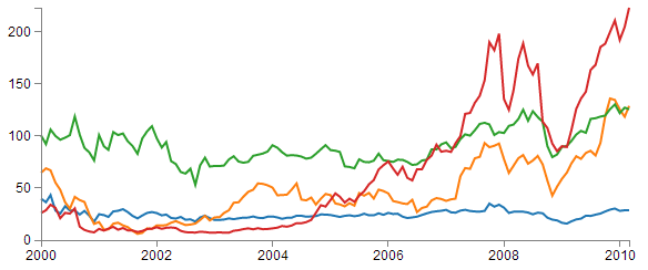
All of these features have been covered individually in the book, so what we’re going to do is combine them in a way that presents us with an elegant multi-line graph that looks a bit like this;
The Code
The following is the code for the initial example which is a slight derivative of the original simple graph. A live version is available online at bl.ocks.org or GitHub. It is also available as the files ‘super-multi-lines.html’ and ‘stocks.csv’ as a download with the book D3 Tips and Tricks (in a zip file) when you download the book from Leanpub.
<!DOCTYPE html>
<meta charset="utf-8">
<style> /* set the CSS */

body { font: 12px Arial;}

path {
    stroke: steelblue;
    stroke-width: 2;
    fill: none;
}

.axis path,
.axis line {
    fill: none;
    stroke: grey;
    stroke-width: 1;
    shape-rendering: crispEdges;
}

</style>
<body>

<!-- load the d3.js library -->
<script src="http://d3js.org/d3.v3.min.js"></script>

<script>

// Set the dimensions of the canvas / graph
var margin = {top: 30, right: 20, bottom: 30, left: 50},
    width = 600 - margin.left - margin.right,
    height = 270 - margin.top - margin.bottom;

// Parse the date / time
var parseDate = d3.time.format("%b %Y").parse;

// Set the ranges
var x = d3.time.scale().range([0, width]);
var y = d3.scale.linear().range([height, 0]);

// Define the axes
var xAxis = d3.svg.axis().scale(x)
    .orient("bottom").ticks(5);

var yAxis = d3.svg.axis().scale(y)
    .orient("left").ticks(5);

// Define the line
var priceline = d3.svg.line()
    .x(function(d) { return x(d.date); })
    .y(function(d) { return y(d.price); });

// Adds the svg canvas
var svg = d3.select("body")
    .append("svg")
        .attr("width", width + margin.left + margin.right)
        .attr("height", height + margin.top + margin.bottom)
    .append("g")
        .attr("transform",
              "translate(" + margin.left + "," + margin.top + ")");

// Get the data
d3.csv("stocks.csv", function(error, data) {
    data.forEach(function(d) {
		d.date = parseDate(d.date);
		d.price = +d.price;
    });

    // Scale the range of the data
    x.domain(d3.extent(data, function(d) { return d.date; }));
    y.domain([0, d3.max(data, function(d) { return d.price; })]);

    // Nest the entries by symbol
    var dataNest = d3.nest()
        .key(function(d) {return d.symbol;})
        .entries(data);

    // Loop through each symbol / key
    dataNest.forEach(function(d) {

        svg.append("path")
            .attr("class", "line")
            .attr("d", priceline(d.values));

    });

    // Add the X Axis
    svg.append("g")
        .attr("class", "x axis")
        .attr("transform", "translate(0," + height + ")")
        .call(xAxis);

    // Add the Y Axis
    svg.append("g")
        .attr("class", "y axis")
        .call(yAxis);

});

</script>
</body>
Description
Nesting the data
The example code above differs from the simple graph in two main ways.
Firstly, the script loads the file stocks.csv which was used by Mike Bostock in his small multiples example. This means that the variable names used are different (price for the value of the stocks, symbol for the name of the stock and good old date for the date) and we have to adjust the parseDate function to parse a modified date value.
Secondly we add the code blocks to take the stocks.csv information that we load as data and we apply the d3.nest function to it and draw each line.
The following code nest’s the data
    var dataNest = d3.nest()
        .key(function(d) {return d.symbol;})
        .entries(data);
We declare our new array’s name as dataNest and we initiate the nest function;
var dataNest = d3.nest()
We assign the key for our new array as symbol. A ‘key’ is like a way of saying “This is the thing we will be grouping on”. In other words our resultant array will have a single entry for each unique symbol or stock which will itself be an array of dates and values.
.key(function(d) {return d.symbol;})
Then we tell the nest function which data array we will be using for our source of data.
}).entries(data);
Then we use the nested data to loop through our stocks and draw the lines
    dataNest.forEach(function(d) {

        svg.append("path")
            .attr("class", "line")
            .attr("d", priceline(d.values));

    });
The forEach function being applied to dataNest means that it will take each of the keys that we have just declared with the d3.nest (each stock) and use the values for each stock to append a line using its values.
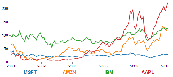
The end result looks like the following;
You would be justified in thinking that this is more than a little confusing. Clearly while we have been successful in making each stock draw a corresponding line, unless we can tell them apart, the graph is pretty useless.
Applying the colours
Making sure that the colours that are applied to our lines (and ultimately our legend text) is unique from line to line is actually pretty easy.
The code that we will implement for this change is available online at bl.ocks.org or GitHub. It is also available as the files ‘super-multi-colours.html’ and ‘stocks.csv’ as a download with the book D3 Tips and Tricks (in a zip file) when you download the book from Leanpub.
The changes that we will make to our code are captured in the following code snippet.
    var color = d3.scale.category10();

    // Loop through each symbol / key
    dataNest.forEach(function(d) {

        svg.append("path")
            .attr("class", "line")
            .style("stroke", function() {
                return d.color = color(d.key); })
            .attr("d", priceline(d.values));

    });
Firstly we need to declare an ordinal scale for our colours with var color = d3.scale.category10();. This is a set of categorical colours (10 of them in this case) that can be invoked which are a nice mix of difference from each other and pleasant on the eye.
We then use the colour scale to assign a unique stroke (line colour) for each unique key (symbol) in our dataset.
    .style("stroke", function() {
        return d.color = color(d.key); })
It seems easy when it’s implemented, but in all reality, it is the product of some very clever thinking behind the scenes when designing d3.js and even picking the colours that are used. The end result is a far more usable graph of the stock prices.
Of course now we’re faced with the problem of not knowing which line represents which stock price. Time for a legend.
Adding the legend
If we think about the process of adding a legend to our graph, what we’re trying to achieve is to take every unique data series we have (stock) and add a relevant label showing which colour relates to which stock. At the same time, we need to arrange the labels in such a way that they are presented in a manner that is not offensive to the eye. In the example I will go through I have chosen to arrange them neatly spaced along the bottom of the graph. so that the final result looks like the following;
Bear in mind that the end result will align the legend completely automatically. If there are three stocks it will be equally spaced, if it is six stocks they will be equally spaced. The following is a reasonable mechanism to facilitate this, but if the labels for the data values are of radically different lengths, the final result will looks ‘odd’ likewise, if there are a LOT of data values, the legend will start to get crowded.
The code that we will implement for this change is available online at bl.ocks.org or GitHub. It is also available as the files ‘super-multi-legend.html’ and ‘stocks.csv’ as a download with the book D3 Tips and Tricks (in a zip file) when you download the book from Leanpub.
There are three broad categories of changes that we will want to make to our current code;
- Declare a style for the legend font
- Change the area and margins for the graph to accommodate the additional text
- Add the text
Declaring the style for the legend text is as easy as making an appropriate entry in the <style> section of the code. For this example I have chosen the following;
.legend {
    font-size: 16px;
    font-weight: bold;
    text-anchor: middle;
}
To change the area and margins of the graph we can make the following small changes to the code.
var margin = {top: 30, right: 20, bottom: 70, left: 50},
    width = 600 - margin.left - margin.right,
    height = 300 - margin.top - margin.bottom;
The bottom margin is now 70 pixels high and the overall space for the area that the graph (including the margins) covers is increased to 300 pixels.
To add the legend text is slightly more work, but only slightly more. The following code incorporates the changes and I have placed commented out asterisks to the end of the lines that have been added
    legendSpace = width/dataNest.length; // spacing for legend // ******

    // Loop through each symbol / key
    dataNest.forEach(function(d,i) {                           // ******

        svg.append("path")
            .attr("class", "line")
            .style("stroke", function() { // Add the colours dynamically
                return d.color = color(d.key); })
            .attr("d", priceline(d.values));

        // Add the Legend
        svg.append("text")                                    // *******
            .attr("x", (legendSpace/2)+i*legendSpace) // spacing // ****
            .attr("y", height + (margin.bottom/2)+ 5)         // *******
            .attr("class", "legend")    // style the legend   // *******
            .style("fill", function() { // dynamic colours    // *******
                return d.color = color(d.key); })             // *******
            .text(d.key);                                     // *******

    });
The first added line finds the spacing between each legend label by dividing the width of the graph area by the number of symbols (key’s or stocks).
legendSpace = width/dataNest.length;
Then there is a small and subtle change that might other wise go unnoticed, but is nonetheless significant. We add an i to the forEach function;
dataNest.forEach(function(d,i) {
This might not seem like much of a big deal, but declaring i allows us to access the index of the returned data. This means that each unique key (stock or symbol) has a unique number. In our example those numbers would be from 0 to 3 (MSFT = 0, AMZN = 1, IBM = 2 and AAPL = 3 (this is the order in which the stocks appear in our csv file)).
Now we get to adding our text. Again, this is a fairly simple exercise which is following the route that we have taken several times already in the book but using some of our prepared values.
        svg.append("text")
            .attr("x", (legendSpace/2)+i*legendSpace)
            .attr("y", height + (margin.bottom/2)+ 5)
            .attr("class", "legend")
            .style("fill", function() {
                return d.color = color(d.key); })
            .text(d.key);
The horizontal spacing for the labels is achieved by setting each label to the position set by the index associated with the label and the space available on the graph. To make it work out nicely we add half a legendSpace at the start (legendSpace/2) and then add the product of the index (i) and legendSpace (i*legendSpace).
We position the legend vertically so that it is in the middle of the bottom margin (height + (margin.bottom/2)+ 5).
And we apply the same colour function to the text as we did to the lines earlier;
            .style("fill", function() {
                return d.color = color(d.key); })
The final result is a neat and tidy legend at the bottom of the graph;
If you’re looking for an exercise to test your skills you could adapt the code to show the legend to the right of the graph. And if you wanted to go one better, you could arrange the order of the legend to reflect the final numeric value on the right of the graph (I.e in this case AAPL would be on the top and MSFT on the bottom).
Making it interactive
The last step we’ll take in this example is to provide ourselves with a bit of control over how the graph looks. Even with the multiple colours, the graph could still be said to be ‘busy’. To clean it up or at least to provide the ability to more clearly display the data that a user wants to see we will add code that will allow us to click on a legend label and this will toggle the corresponding graph line on or off.
This is a progression from the example of how to show / hide an element by clicking on another element that was introduced in he ‘Assorted tips and tricks’ chapter.
The only changes to our code that need to be implemented are in the forEach section below. I have left some comments with asterisks in the code below to illustrate lines that are added.
    dataNest.forEach(function(d,i) {

        svg.append("path")
            .attr("class", "line")
            .style("stroke", function() {
                return d.color = color(d.key); })
            .attr("id", 'tag'+d.key.replace(/\s+/g, '')) // assign ID **
            .attr("d", priceline(d.values));

        // Add the Legend
        svg.append("text")
            .attr("x", (legendSpace/2)+i*legendSpace)
            .attr("y", height + (margin.bottom/2)+ 5)
            .attr("class", "legend")
            .style("fill", function() {
                return d.color = color(d.key); })
            .on("click", function(){                     // ************
                // Determine if current line is visible
                var active   = d.active ? false : true,  // ************
                newOpacity = active ? 0 : 1;             // ************
                // Hide or show the elements based on the ID
                d3.select("#tag"+d.key.replace(/\s+/g, '')) // *********
                    .transition().duration(100)          // ************
                    .style("opacity", newOpacity);       // ************
                // Update whether or not the elements are active
                d.active = active;                       // ************
                })                                       // ************
            .text(d.key);

    });
The full code for the complete working example is available online at bl.ocks.org or GitHub. It is also available as the files ‘super-multi.html’ and ‘stocks.csv’ as a download with the book D3 Tips and Tricks (in a zip file) when you download the book from Leanpub.
The first piece of code that we need to add assign an id to each legend text label.
.attr("id", 'tag'+d.key.replace(/\s+/g, ''))
Being able to use our key value as the id means that each label will have a unique identifier. “What’s with adding the 'tag' piece of text to the id?” I hear you ask. Good question. If our key starts with a number we could strike trouble (in fact I’m sure there are plenty of other ways we could strike trouble too, but this was one I came accross). As well as that we include a little regular expression goodness to strip any spaces out of the key with .replace(/\s+/g, '').
Then we use the .on("click", function(){ call carry out some actions on the label if it is clicked on. We toggle the .active descriptor for our element with var active = d.active ? false : true,. Then we set the value of newOpacity to either 0 or 1 depending on whether active is false or true.
From here we can select our label using its unique id and adjust it’s opacity to either 0 (transparent) or 1 (opaque);
        d3.select("#tag"+d.key.replace(/\s+/g, ''))
            .transition().duration(100)
            .style("opacity", newOpacity);
Just because we can, we also add in a transition statement so that the change in transparency doesn’t occur in a flash (100 milli seconds in fact (.duration(100))).
Lastly we update our d.active variable to whatever the active state is so that it can toggle correctly the next time it is clicked on.
Since it’s kind of difficult to represent interactivity in a book, head on over to the live example on bl.ocks.org to see the toggling awesomeness that could be yours!
My Favourite tooltip method for a line graph.
Purpose
Tooltips are a fabulous way to include an interactive element on a graph and a great mechanism for including additional, focussed information to the user.
There are quite a number of different ways to implement tooltips (one of which you can find in the ‘Adding tooltips’ section of the ‘Assorted Tips and Tricks’ chapter of D3 Tips and Tricks) and I would be very hesitant about proclaiming any one better than another. However, the one we will work through here is my favourite when using a line graph as I think it brings a ‘fuzzier’ mechanism for deciding when a tooltip is highlighted (you don’t have to be over an object to get information on it) which I like.
I believe that the original example for this was shown by Mike Bostock here, but I first came across the technique in an example by ‘gniemetz’. I liked ‘gniemetz’s example enough to adapt a similar example which I will explain below.
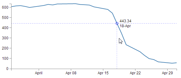
The idea with this technique is to set an area the size of the graph that will be used to determine when a tooltip will be displayed. So that when the mouse enters that area, the display style that allows elements to be shown or hidden. This then tells the script to show the tooltip and the location of the mouse determines which point will have the tooltip. In the example below we can see that the mouse cursor is some distance away from the point that is being highlighted, but it is in line (in the vertical axis) with the highlighted point (in fact we will use some clever maths to determine which date point (or point on the x axis) is the one that will be used to generate the tooltip.
To begin this explanation we’ll start with a simple example that will just project a circle on the point where the tooltip will appear. Once we’ve worked out how that works we can add whatever we want and I will explain what is going on in the more complex example.
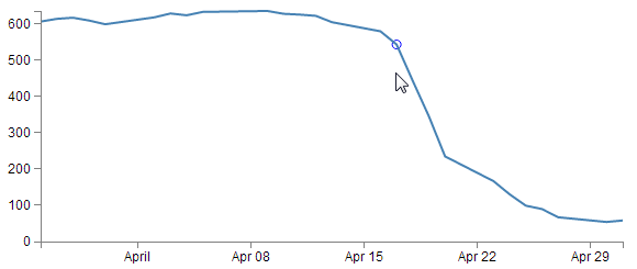
As mentioned, we will start with a simple example that adds a circle on the point where we will place our tooltip. It will look a bit like this;
The Code
The full code for this simple example is available online at bl.ocks.org or GitHub. It is also available as the files ‘best-tooltip-simple.html’ and ‘atad.csv’ as a download with the book D3 Tips and Tricks (in a zip file) when you download the book from Leanpub.
I have placed commented out asterisks besides the lines that have been added or altered from the simple graph example that we started out with at the beginning of the book so that it’s easy to see what has changed.
<!DOCTYPE html>
<meta charset="utf-8">
<style> /* set the CSS */

body { font: 12px Arial;}

path {
    stroke: steelblue;
    stroke-width: 2;
    fill: none;
}

.axis path,
.axis line {
    fill: none;
    stroke: grey;
    stroke-width: 1;
    shape-rendering: crispEdges;
}

</style>
<body>

<!-- load the d3.js library -->
<script src="http://d3js.org/d3.v3.min.js"></script>

<script>

// Set the dimensions of the canvas / graph
var margin = {top: 30, right: 20, bottom: 30, left: 50},
    width = 600 - margin.left - margin.right,
    height = 270 - margin.top - margin.bottom;

// Parse the date / time
var parseDate = d3.time.format("%d-%b-%y").parse;
    bisectDate = d3.bisector(function(d) { return d.date; }).left; // **

// Set the ranges
var x = d3.time.scale().range([0, width]);
var y = d3.scale.linear().range([height, 0]);

// Define the axes
var xAxis = d3.svg.axis().scale(x)
    .orient("bottom").ticks(5);

var yAxis = d3.svg.axis().scale(y)
    .orient("left").ticks(5);

// Define the line
var valueline = d3.svg.line()
    .x(function(d) { return x(d.date); })
    .y(function(d) { return y(d.close); });

// Adds the svg canvas
var svg = d3.select("body")
    .append("svg")
        .attr("width", width + margin.left + margin.right)
        .attr("height", height + margin.top + margin.bottom)
    .append("g")
        .attr("transform",
              "translate(" + margin.left + "," + margin.top + ")");

var lineSvg = svg.append("g");                             // **********

var focus = svg.append("g")                                // **********
    .style("display", "none");                             // **********

// Get the data
d3.csv("atad.csv", function(error, data) {                 // **********
    data.forEach(function(d) {
        d.date = parseDate(d.date);
        d.close = +d.close;
    });

    // Scale the range of the data
    x.domain(d3.extent(data, function(d) { return d.date; }));
    y.domain([0, d3.max(data, function(d) { return d.close; })]);

    // Add the valueline path.
    lineSvg.append("path")                                 // **********
        .attr("class", "line")
        .attr("d", valueline(data));

    // Add the X Axis
    svg.append("g")
        .attr("class", "x axis")
        .attr("transform", "translate(0," + height + ")")
        .call(xAxis);

    // Add the Y Axis
    svg.append("g")
        .attr("class", "y axis")
        .call(yAxis);

    // append the circle at the intersection               // **********
    focus.append("circle")                                 // **********
        .attr("class", "y")                                // **********
        .style("fill", "none")                             // **********
        .style("stroke", "blue")                           // **********
        .attr("r", 4);                                     // **********

    // append the rectangle to capture mouse               // **********
    svg.append("rect")                                     // **********
        .attr("width", width)                              // **********
        .attr("height", height)                            // **********
        .style("fill", "none")                             // **********
        .style("pointer-events", "all")                    // **********
        .on("mouseover", function() { focus.style("display", null); })
        .on("mouseout", function() { focus.style("display", "none"); })
        .on("mousemove", mousemove);                       // **********

    function mousemove() {                                 // **********
        var x0 = x.invert(d3.mouse(this)[0]),              // **********
            i = bisectDate(data, x0, 1),                   // **********
            d0 = data[i - 1],                              // **********
            d1 = data[i],                                  // **********
            d = x0 - d0.date > d1.date - x0 ? d1 : d0;     // **********

        focus.select("circle.y")                           // **********
            .attr("transform",                             // **********
                  "translate(" + x(d.date) + "," +         // **********
                                 y(d.close) + ")");        // **********
    }                                                      // **********

});

</script>
</body>
Description
You should be able to tell from the asterisks in the code above that there aren’t too many changes and appart from a few at the start and middle, the majority are contained in a large block towards the end.
Starting with our first change
bisectDate = d3.bisector(function(d) { return d.date; }).left;
This is our function that will be called later in the code that returns a value in our array of data that corresponds to the horizontal position of the mouse pointer. Specifically it returns the date that falls to the left of the mouse cursor.
The d3.bisector is an ‘array method’ that can use an accessor or comparator function to divide an array of objects. In this case our array of date values. In the code I have used the d3.bisector as an accessor, because I believe that it’s simpler to do so for the point of explanation, but the downside is that I had to have my dates ordered in ascending order which is why I load a slightly different csv file later (atad.csv).
If your eyes glazed over slightly reading the previous paragraph, don’t let that put you off. Like with so many things, just relax and let d3.js do the magic and remember that d3.bisector can find a value in an ordered array.
The next block of changes declares a couple of functions that we will use to add our elements to our graph;
var lineSvg = svg.append("g");

var focus = svg.append("g")
    .style("display", "none");
We will use lineSvg to add our line for the line graph and focus will add our tooltip elements. it is possible to avoid using lineSvg, but this way of declaring the functions means that we can control which elements are on top of which on the screen. For instance, it would be a pretty sad affair if our tooltip was appearing under the line of the line graph (hard to read).
As we saw earlier, our data is being sourced from a different csv file (atad.csv).
d3.csv("atad.csv", function(error, data) {
This is because we need to have it in a compatible order (ascending) to allow our bisector function to operate correctly. So while the line may look the same as the simple graph version, the data is ordered in reverse (some may say that this is the way the original data should have been presented all along, but I suppose we can’t always second guess the data we get).
We then make a small change to the script that appended the line to the graph and instead of using svg.append… we use our newly declared lineSvg.
    lineSvg.append("path")
        .attr("class", "line")
        .attr("d", valueline(data));
The final, larger block of code can be broken into 4 logical sections;
- Adding the circle to the graph
- Set the area that we use to capture our mouse movements
- The clever maths that determines which date will be highlighted
- Move the circle to the appropriate position
Adding the circle to the graph
Adding the circle to the graph is actually fairly simple;
    focus.append("circle")
        .attr("class", "y")
        .style("fill", "none")
        .style("stroke", "blue")
        .attr("r", 4);
If you’ve followed any of the other examples in D3 Tips and Tricks there shouldn’t be any surprises here (well, perhaps assigning a class to the circle (y) could count as mildly unusual).
Except for one small thing….
We don’t place it anywhere on the graph! There is no x y coordinates and no translation of position. Nothing! Never fear. All we want to do at this stage is to create the element. In a few blocks of code time we will move the circle.
Set the area to capture the mouse movements
As we briefly covered earlier, the thing that makes this particular tooltip technique different is that we don’t hover over an element to highlight the tooltip. Instead we move the mouse into an area which is relevant to the tooltip and it appears.
And its all thanks to the following code;
    svg.append("rect")
        .attr("width", width)
        .attr("height", height)
        .style("fill", "none")
        .style("pointer-events", "all")
        .on("mouseover", function() { focus.style("display", null); })
        .on("mouseout", function() { focus.style("display", "none"); })
        .on("mousemove", mousemove);
Here we’re adding a rectangle to the graph (svg.append("rect")) with the same height and width as our graph area (.attr("width", width) and .attr("height", height)) and we’re making sure that there’s no colour (fill) in it (.style("fill", "none")). Nothing too weird about all that.
Then we make sure that if any mouse events occur within the area that we capture them (.style("pointer-events", "all")). This is when things start to get interesting.
The first pointer event that we want to work with is mouseover;
.on("mouseover", function() { focus.style("display", null); })
This line of code tells the script that when the mouse moves over the area of the rectangle of the area of the graph the display properties of the focus elements (remember that we appended our circle to focus earlier) are set to null. This might sound like a bit of a strange thing to do, since what we want to do is to make sure that when the mouse moves over the graph we want the focus elements to be displayed. but by setting the display style to null the default value for display is enacted and this is inline which allows the elements to be rendered as normal. So why not use inline instead of null? Good question. I’ve tried it and it works without problem, but the original example that Mike Bostock used had the setting at null and I’ll make the assumption that Mike knows something that I don’t know about when to use null and when to use inline for a display style (maybe some browser incompatibility issues?).
The reverse of making our focus element display display everything is being able to make it stop displaying everything. This is what happens in the next line;
.on("mouseout", function() { focus.style("display", "none"); })
Here, where the mouse moves off the area, the display properties for the focus element are turned off.
Lastly for this block, we need to capture the actions of the mouse as it moves on the graph area and move our tooltips as required. This is accomplished with the final line in the block…
.on("mousemove", mousemove);
… where if the mouse moves we call the mousemove function.
Determining which date will be highlighted
Once the mousemove function is called is carries out the last two steps in our code. The first of which is the clever maths that determines which point in our graph has the tooltip applied to it.
		var x0 = x.invert(d3.mouse(this)[0]),
		    i = bisectDate(data, x0, 1),
		    d0 = data[i - 1],
		    d1 = data[i],
		    d = x0 - d0.date > d1.date - x0 ? d1 : d0;
The first line of this block is a dozy;
var x0 = x.invert(d3.mouse(this)[0]),
If we break it down the d3.mouse(this)[0] portion returns the x position on the screen of the mouse (d3.mouse(this)[1] would return the y position). Then the x.invert function is reversing the process that we use to map the domain (date) to range (position on screen). So it takes the position on the screen and converts it into an equivalent date!
Then we use our bisectDate function that we declared earlier to find the index of our data array that is close to the mouse cursor.
i = bisectDate(data, x0, 1),
It takes our data array and the date corresponding to the position of or mouse cursor and returns the index number of the data array which has a date that is higher than the cursor position.
Then we declare arrays that are subsets of our data array;
		    d0 = data[i - 1],
		    d1 = data[i],
d0 is the combination of date and close that is in the data array at the index to the left of the cursor and d1 is the combination of date and close that is in the data array at the index to the right of the cursor. In other words we now have two variables that know the value and date above and below the date that corresponds to the position of the cursor.
The final line in this segment declares a new array d that is represents the date and close combination that is closest to the cursor.
d = x0 - d0.date > d1.date - x0 ? d1 : d0;
It is using the magic JavaScript short hand for an if statement that is essentially saying if the distance between the mouse cursor and the date and close combination on the left is greater than the distance between the mouse cursor and the date and close combination on the right then d is an array of the date and close on the right of the cursor (d1). Otherwise d is an array of the date and close on the left of the cursor (d0).
This could be regarded as a fairly complicated little piece of code, but if you take the time to understand it, you will be surprised how elegant it appears. As we’ve seen before though, if you just want to believe that the d3.js magic is happening, that’s fine.
Move the circle to the appropriate position
The final block of code that we’ll check out takes the closest date / close combination that we’ve just worked out and moves the circle to that position;
		focus.select("circle.y")
		    .attr("transform",
		          "translate(" + x(d.date) + "," +
		                         y(d.close) + ")");
This is a pretty easy bit of code to follow. We select the circle (using the class y that we assigned to it earlier) and then move it using translate to the date / close position that we had just worked out was the closest.
Of course this is provision of the coordinates to the circle that we noticed was missing earlier in the code when we were appending it to the graph.
And there we have it. A simple circle positioned at the closest point to the mouse cursor when the cursor hovers over the graph.
If we hadn’t mentioned it earlier you might be thinking that this could possibly be the most complicated method for making most basic (read lame) tooltip ever. But you know there’s more right? Right….? Read on.
Complex version
You’ve read to this point, so that’s a sign that you’re still interested. In that case, I recommend that you take a moment to check out the live example of the graph that I’m going to describe.
Here’s a graph that when you move your mouse over it shows the closest intersection point on the graph with lines that extend the full width of the graph (great for comparing the level across the graph) and down to the x axis (to get a rough feel for the date). As well as this there is a subtle circle around the data point in question (as already explained in the previous section) and the actual date and value represented at the intersection point. As if that wasn’t enough there is a nice little drop shadow effect under the text so that no matter what the background is you can read it. Nice.
The full code for this example is available online at bl.ocks.org or GitHub. It is also available as the files ‘best-tooltip-coolio.html’ and ‘atad.csv’ as a download with the book D3 Tips and Tricks (in a zip file) when you download the book from Leanpub.
Code / Explanation
Because the date at the tooltip needs to be formatted in a particular way we need to declare this appropriately;
formatDate = d3.time.format("%d-%b"),
Other than that everything is pretty normal until we get to the part where we start adding elements to our focus group (you remember we had the circle before? Now we’re adding additional elements.).
   // append the x line
    focus.append("line")
        .attr("class", "x")
        .style("stroke", "blue")
        .style("stroke-dasharray", "3,3")
        .style("opacity", 0.5)
        .attr("y1", 0)
        .attr("y2", height);

    // append the y line
    focus.append("line")
        .attr("class", "y")
        .style("stroke", "blue")
        .style("stroke-dasharray", "3,3")
        .style("opacity", 0.5)
        .attr("x1", width)
        .attr("x2", width);

    // append the circle at the intersection
    focus.append("circle")
        .attr("class", "y")
        .style("fill", "none")
        .style("stroke", "blue")
        .attr("r", 4);

    // place the value at the intersection
    focus.append("text")
        .attr("class", "y1")
        .style("stroke", "white")
        .style("stroke-width", "3.5px")
        .style("opacity", 0.8)
        .attr("dx", 8)
        .attr("dy", "-.3em");
    focus.append("text")
        .attr("class", "y2")
        .attr("dx", 8)
        .attr("dy", "-.3em");

    // place the date at the intersection
    focus.append("text")
        .attr("class", "y3")
        .style("stroke", "white")
        .style("stroke-width", "3.5px")
        .style("opacity", 0.8)
        .attr("dx", 8)
        .attr("dy", "1em");
    focus.append("text")
        .attr("class", "y4")
        .attr("dx", 8)
        .attr("dy", "1em");
Here you can see we’re adding the x (horizontal) line and the y (vertical) line as well as the date and text values. Notice on the text values, there is a white drop shadow added first and then the text over the top. Another thing to note is that just like the position information, we don’t actually put the text in here, this is simple a ‘placeholder’ for the element.
Then all we need to do is move all the new elements to the correct position and add the changing text where appropriate;
		focus.select("circle.y")
		    .attr("transform",
		          "translate(" + x(d.date) + "," +
		                         y(d.close) + ")");

		focus.select("text.y1")
		    .attr("transform",
		          "translate(" + x(d.date) + "," +
		                         y(d.close) + ")")
		    .text(d.close);

		focus.select("text.y2")
		    .attr("transform",
		          "translate(" + x(d.date) + "," +
		                         y(d.close) + ")")
		    .text(d.close);

		focus.select("text.y3")
		    .attr("transform",
		          "translate(" + x(d.date) + "," +
		                         y(d.close) + ")")
		    .text(formatDate(d.date));

		focus.select("text.y4")
		    .attr("transform",
		          "translate(" + x(d.date) + "," +
		                         y(d.close) + ")")
		    .text(formatDate(d.date));

		focus.select(".x")
		    .attr("transform",
		          "translate(" + x(d.date) + "," +
		                         y(d.close) + ")")
		               .attr("y2", height - y(d.close));

		focus.select(".y")
		    .attr("transform",
		          "translate(" + width * -1 + "," +
		                         y(d.close) + ")")
		               .attr("x2", width + width);
There’s no big surprises here. Just an extension of what we accomplished with the circle earlier. The only part that looks semi-interesting is some of the application of the positioning of the x and y lines and this is more because of the points at which the lines start and finish.
Now this is unlikely to be the end solution for most people, but at least there are plenty of examples of different elements in there to play with and experiment on.
Enjoy!
Exploring Event Data by Combination Scatter Plot and Interactive Line Graphs
Purpose
In the process of implementing a method of measuring and displaying the passage of a cat through a cat-door (as described in the book ‘Raspberry Pi: Measure, Record, Explore’) I built a graph that showed events indicated by both date and time on separate axes. It was then that I figured that this would be useful for exploring event data or data that exists as a series of date/time stamps that signify a particular ‘thing as having occurred. In the cat door example it was the use of the door by the cat, but this is applicable to a huge range of data sets.
One that I thought of straight away was the dates and times that people downloaded this book. Leanpub has an API for accessing the history of book activity and I was able to download it and store it in a database for examination.
Ultimately what I developed was a scatter plot that shows the date of the events on the X axis and the time of the events on the Y axis. This was augmented by two line graphs that showed the accumulated sums of each axis on their respective sides.
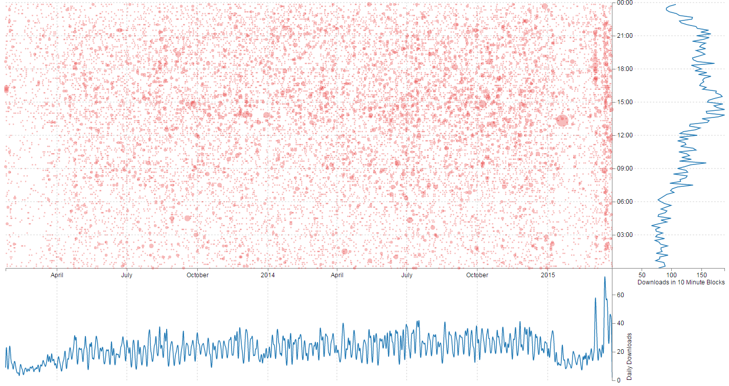
The full code for this example is available online at bl.ocks.org or GitHub. It is also available as the files ‘book-downloads.html’ and ‘downloads.zip’ (which contains downloads.json (it’s zipped up because otherwise it’s a bit too large for Leanpub)) as a download with the book D3 Tips and Tricks (in a zip file) when you download the book from Leanpub.
To make the information slightly more accessible when the user hovers their mouse over the scatter plot there is an intersection of the position extrapolated to show the relationship to the other graphs and it presents the appropriate value of date, time and number downloaded by date and time.
This graph is a relatively complex combination of a range of different techniques presented in the book, including wrangling and nesting of data, combination of multiple graphs and the use of mouse movement to display tooltips and additional data.
The Code
The code is extremely lengthy, so in lieu of placing it in the book it can be found on bl.ocks.org or Github. It is liberally commented to assist readers and I will describe particular sections of the code below and hopefully that will help more where required.
Wrangling the data
The graph uses four sets of data.
- The raw event data (an array called
events) - The scatter plot data (an array called
data) - The date graph data (an array called
dataDate) - The time graph data (an array called
dataTime)
The raw event data is ingested from an external JSON file using the standard d3.json call.
The data itself is simply a collection of dates.
{"dtg":"2013-01-24 09:10:59"},
{"dtg":"2013-01-24 09:17:37"},
{"dtg":"2013-01-24 09:48:48"},
{"dtg":"2013-01-24 15:01:59"},
{"dtg":"2013-01-24 18:11:44"},
{"dtg":"2013-01-24 18:47:05"},
{"dtg":"2013-01-24 18:47:23"},
{"dtg":"2013-01-24 19:55:53"},
{"dtg":"2013-01-24 22:37:39"},
{"dtg":"2013-01-25 01:22:48"},
{"dtg":"2013-01-25 06:37:38"},
{"dtg":"2013-01-25 08:28:20"},
Each date represents the time that a book was downloaded.
Once loaded we run a forEach over the file to put it in a format for manipulation into the remaining three data sets.
    // parse and format all the event data
    events.forEach(function(d) {
        d.dtg = d.dtg.slice(0,-4)+'0:00'; // get the 10 minute block
        dtgSplit = d.dtg.split(" ");      // split on the space
        d.date = dtgSplit[0];             // get the date seperatly
        d.time = dtgSplit[1];             // format the time
        d.number_downloaded = 1;          // Number of downloads
    });
The first thing we do is to slice off the last four characters of the dtg string and replace them with 0:00. This leave us with a set of dtg values that are only represented by the 10 minute window in which they were downloaded.
We then split the dtg string on the space that separates the date and the time and we designate one half date and the other half time.
Lastly we represent the number of books downloaded for each event as 1 (this helps us sum them up later).
Using the events data we create the data-set for the scatter plot (data) by nesting the information on the 10 minute dtg value of date/time and by summing the number of downloads;
    var data = d3.nest()
        .key(function(d) { return d.dtg;})
        .rollup(function(d) {
            return d3.sum(d,function(g) {return g.number_downloaded; });
            })
        .entries(events);
We carry out a similar process for the date…
    var dataDate = d3.nest()
        .key(function(d) { return d.date;})
        .rollup(function(d) {
            return d3.sum(d,function(g) {return g.number_downloaded; });
            })
        .entries(events);
… and the time;
    var dataTime = d3.nest()
        .key(function(d) { return d.time;})
        .sortKeys(d3.ascending)
        .rollup(function(d) {
            return d3.sum(d,function(g) {return g.number_downloaded; });
            })
        .entries(events);
Sizing Everything Up
The size of the graph is determined by a number of fixed variables which are fairly self explanatory;
-
scatterplotHeight(which is also the height of the time graph) dateGraphHeighttimeGraphWidth
But we need to let the width of the scatter plot (and the date graph) be a function of the number of days that have been collected. This variable is handled by;
scatterplotWidth
This set-up is handled in the following block of code;
    var oneDay = 24*60*60*1000; // hours*minutes*seconds*milliseconds
    var dateStart = d3.min(data, function(d) { return d.date; });
    var dateFinish = d3.max(data, function(d) { return d.date; });
    var numberDays = Math.round(Math.abs((dateStart.getTime() -
                               dateFinish.getTime())/(oneDay)));

    var margin = {top: 20, right: 20, bottom: 20, left: 50},
        scatterplotHeight = 520,
        scatterplotWidth = numberDays * 1.5,
        dateGraphHeight = 220,
        timeGraphWidth = 220;
The overall size of the graphic (height and width) is therefore a combination of these variables;
    var height = scatterplotHeight + dateGraphHeight,
        width = scatterplotWidth + timeGraphWidth;
The Scatter Plot
There is no real surprise with the scatter plot itself. The only thing slightly unusual is the use of a time scale for both the X and Y axes;
    var x = d3.time.scale().range([0, scatterplotWidth]);
    var y = d3.time.scale().range([0, scatterplotHeight]);
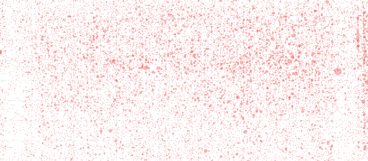
When the circles are drawn, the size of the circle is determined by the radius, which is the number of downloads multiplied by 1.5. I know that this is a bit of a visualization ‘no-no’ because the area of the circle should be representative of the number, not the radius, but I tried it both ways and to my simple way of viewing the data, the radius adjustment provided the best comparison.
    svg.selectAll(".dot")
        .data(data)
      .enter().append("circle")
        .attr("class", "dot")
        .attr("r", function(d) { return d.number_downloaded*1.5; })
        .style("opacity", 0.3)
        .style("fill", "#e31a1c" )
        .attr("cx", function(d) { return x(d.date); })
        .attr("cy", function(d) { return y(d.time); });
I know that this is a topic of some academic debate, and it is fascinating, so here are both results for comparison;

Date and Time Graphs
Both of these graphs are fairly routine. The time graph has the X and Y axes reversed from what would be ordinarily expected, but otherwise not much else to write home about.
Mouse Movement Information Display
This portion of the graph is an expansion of the ‘Favourite tool tip’ method from the previous section in this chapter. We expand the number of elements to update dynamically to about 10. All of which are designated with their own class.
We append the rectangle to capture the mouse movement over the scatterplot;
    svg.append("rect")
        .attr("width", scatterplotWidth)
        .attr("height", scatterplotHeight)
        .style("fill", "none")
        .style("pointer-events", "all")
        .on("mouseover", function() { focus.style("display", null); })
        .on("mouseout", function() { focus.style("display", "none"); })
        .on("mousemove", mousemove);
We capture the position of the mouse and convert it to figures we can use to compare to our data;
    function mousemove() {
        var xpos = d3.mouse(this)[0],
            x0 = x.invert(xpos),
            y0 = d3.mouse(this)[1],
            y1 = y.invert(y0),
            date1 = d3.mouse(this)[0];
And then we place our dynamic text and lines with our focus.select statements.
Labelling
The last order of business is to place some labels.
The location of labelling in this example is an interesting problem in itself. I’m personally torn between the desire to maintain simplicity and to ensure clarity. Hopefully what I have is enough to satisfy both requirements, but as always, each user and requirement will differ, so label as desired.
If there are additional parts of the code that you would like explained, please feel free to get in touch.
Difference Chart: Science vs Style.
Dear readers, please forgive me for including this example in D3 Tips and Tricks. While it demonstrates a really cool graphing technique, I have chosen to apply it to a topic that has a potential to raise a couple of sets of eyebrows in the form of Messrs Roger Peng and Jeff Leek. Both work at the Johns Hopkins Bloomberg School of Public Health where Roger is an Associate Professor of Biostatistics, and Jeff is an Associate Professor of Biostatistics and Oncology.
While both are doing amazing work to improve peoples health and well-being (amongst other things), both are also authors of highly successful books published by Leanpub. In particular Roger has written R Programming for Data Science and Exploratory Data Analysis with R while Jeff has penned The Elements of Data Analytic Style. As we could anticipate, there is a possibility that there is something of a competitive element to publishing for both gentlemen as they see the the number of downloads of their books climb ever higher.
While I would hate to promote an increase to these tensions, The opportunity was too attractive given that I had access to some data on the number of downloads that each of the books had been achieving and I really wanted to write about difference charts using d3.js (and the method of sourcing the data for the book Raspberry Pi: Measure, Record, Explore).
So at the risk of providing some form of offence to these fine gentlemen or inciting an increased rivalry, I have forged ahead and hopefully the worst that will happen is that someone interested in d3.js will also find some interesting reading in R Programming for Data Science, Exploratory Data Analysis with R or The Elements of Data Analytic Style. Ultimately we should be left with a graph that will look something like this;
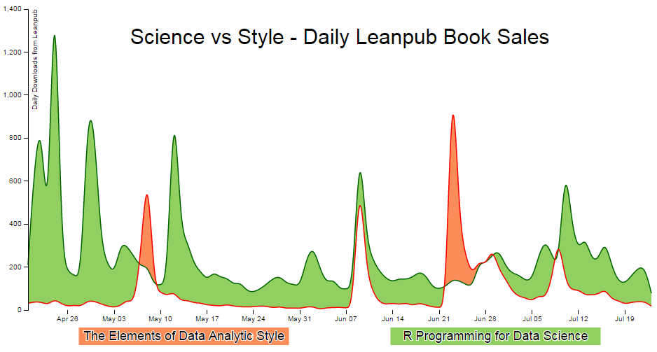
Purpose
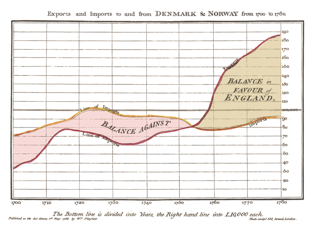
A difference chart is a variation on a bivariate area chart. This is a line chart that includes two lines that are interlinked by filling the space between the lines. A difference chart as demonstrated in the example here by Mike Bostock is able to highlight the differences between the lines by filling the area between them with different colours depending on which line is the greater value.
As Mike points out in his example, this technique harks back at least as far as William Playfair when he was describing the time series of exports and imports of Denmark and Norway in 1786.
All that remains is for us to work out how d3.js can help us out by doing the job programmatically. The example that I use here is based on that of Mike Bostock’s, with the addition of a few niceties in the form of a legend, a title, and some minor changes.
We will start with a simple example of the code and we will add blocks to finally arrive at the example with Legends and title.
The Code
The following is the code for the simple difference chart. A live version is available online at bl.ocks.org or GitHub. It is also available as the files ‘diff-basic.html’ and ‘downloads.csv’ as a download with the book D3 Tips and Tricks (in a zip file) when you download the book from Leanpub.
<!DOCTYPE html>
<meta charset="utf-8">
<style>

body { font: 10px sans-serif;}

text.shadow {
  stroke: white;
  stroke-width: 2px;
  opacity: 0.9;
}

.axis path,
.axis line {
  fill: none;
  stroke: #000;
  shape-rendering: crispEdges;
}

.x.axis path { display: none; }

.area.above { fill: rgb(252,141,89); }
.area.below { fill: rgb(145,207,96); }

.line {
  fill: none;
  stroke: #000;
  stroke-width: 1.5px;
}

</style>
<body>
<script src="http://d3js.org/d3.v3.min.js"></script>
<script>

var title = "Science vs Style - Daily Leanpub Book Sales";

var margin = {top: 20, right: 20, bottom: 50, left: 50},
    width = 960 - margin.left - margin.right,
    height = 500 - margin.top - margin.bottom;

var parsedtg = d3.time.format("%Y-%m-%d").parse;

var x = d3.time.scale().range([0, width]);
var y = d3.scale.linear().range([height, 0]);

var xAxis = d3.svg.axis().scale(x).orient("bottom");
var yAxis = d3.svg.axis().scale(y).orient("left");

var lineScience = d3.svg.area()
    .interpolate("basis")
    .x(function(d) { return x(d.dtg); })
    .y(function(d) { return y(d["Science"]); });

var lineStyle = d3.svg.area()
    .interpolate("basis")
    .x(function(d) { return x(d.dtg); })
    .y(function(d) { return y(d["Style"]); });

var area = d3.svg.area()
    .interpolate("basis")
    .x(function(d) { return x(d.dtg); })
    .y1(function(d) { return y(d["Science"]); });

var svg = d3.select("body").append("svg")
    .attr("width", width + margin.left + margin.right)
    .attr("height", height + margin.top + margin.bottom)
  .append("g")
    .attr("transform",
        "translate(" + margin.left + "," + margin.top + ")");

d3.csv("downloads.csv", function(error, dataNest) {

  dataNest.forEach(function(d) {
      d.dtg = parsedtg(d.date_entered);
      d.downloaded = +d.downloaded;
  });

  var data = d3.nest()
      .key(function(d) {return d.dtg;})
      .entries(dataNest);

  data.forEach(function(d) {
      d.dtg = d.values[0]['dtg'];
      d["Science"] = d.values[0]['downloaded'];
      d["Style"] = d.values[1]['downloaded'];
  });

  for(i=data.length-1;i>0;i--) {
          data[i].Science   = data[i].Science  -data[(i-1)].Science ;
          data[i].Style     = data[i].Style    -data[(i-1)].Style ;
   }

  data.shift(); // Removes the first element in the array

    x.domain(d3.extent(data, function(d) { return d.dtg; }));
    y.domain([
//      d3.min(data, function(d) {
//          return Math.min(d["Science"], d["Style"]); }),
//      d3.max(data, function(d) {
//          return Math.max(d["Science"], d["Style"]); })
      0,1400
    ]);

    svg.datum(data);

    svg.append("clipPath")
        .attr("id", "clip-above")
      .append("path")
        .attr("d", area.y0(0));

    svg.append("clipPath")
        .attr("id", "clip-below")
      .append("path")
        .attr("d", area.y0(height));

    svg.append("path")
        .attr("class", "area above")
        .attr("clip-path", "url(#clip-above)")
        .attr("d", area.y0(function(d) { return y(d["Style"]); }));

    svg.append("path")
        .attr("class", "area below")
        .attr("clip-path", "url(#clip-below)")
        .attr("d", area.y0(function(d) { return y(d["Style"]); }));

    svg.append("path")
        .attr("class", "line")
        .style("stroke", "darkgreen")
        .attr("d", lineScience);

    svg.append("path")
        .attr("class", "line")
        .style("stroke", "red")
        .attr("d", lineStyle);

    svg.append("g")
        .attr("class", "x axis")
        .attr("transform", "translate(0," + height + ")")
        .call(xAxis);

    svg.append("g")
        .attr("class", "y axis")
        .call(yAxis);

});

</script>
</body>
A sample of the associated csv file (downloads.csv) is formatted as follows;
date_entered,downloaded,book_name
2015-04-19,5481,R Programming for Data Science
2015-04-19,23751,The Elements of Data Analytic Style
2015-04-20,5691,R Programming for Data Science
2015-04-20,23782,The Elements of Data Analytic Style
2015-04-21,6379,R Programming for Data Science
2015-04-21,23820,The Elements of Data Analytic Style
2015-04-22,7281,R Programming for Data Science
2015-04-22,23857,The Elements of Data Analytic Style
2015-04-23,7554,R Programming for Data Science
2015-04-23,23881,The Elements of Data Analytic Style
2015-04-24,9331,R Programming for Data Science
2015-04-24,23932,The Elements of Data Analytic Style
Description
The graph has some portions that are common to the simple line graph example.
We start the HTML file, load some styling for the upcoming elements, set up the margins, time formatting scales, ranges and axes.
Because the graph is composed of two lines we need to declare two separate line functions;
var lineScience = d3.svg.area()
    .interpolate("basis")
    .x(function(d) { return x(d.dtg); })
    .y(function(d) { return y(d["Science"]); });

var lineStyle = d3.svg.area()
    .interpolate("basis")
    .x(function(d) { return x(d.dtg); })
    .y(function(d) { return y(d["Style"]); });
To fill an area we declare an area function using one of the lines as the baseline (y1) and when it comes time to fill the area later in the script we declare y0 separately to define the area to be filled as an intersection of two paths.
var area = d3.svg.area()
    .interpolate("basis")
    .x(function(d) { return x(d.dtg); })
    .y1(function(d) { return y(d["Science"]); });
In this instance we are using the green ‘Science’ line as the y1 line.
The svg area is then set up using the height, width and margin values and we load our csv files with our number of downloads for each book. We then carry out a standard forEach to ensure that the time and numerical values are formatted correctly.
Nesting the data
The data that we are starting with is formatted in a way that we could reasonably expect data to be available in this instance where a value is saved for distinct elements on an element by element basis. This style of recording data makes it easy to add new elements into the data stream or a database rather than relying on having them as discrete columns.
date_entered,downloaded,book_name
2015-04-19,5481,R Programming for Data Science
2015-04-19,23751,The Elements of Data Analytic Style
2015-04-20,5691,R Programming for Data Science
2015-04-20,23782,The Elements of Data Analytic Style
2015-04-21,6379,R Programming for Data Science
2015-04-21,23820,The Elements of Data Analytic Style
In this case, we will need to ‘pivot’ the data to produce a multi-column representation where we have a single row for each date, and the number of downloads for each book as separate columns as follows;
date_entered,R Programming for Data Science,The Elements of Data Analytic Sty\
le
2015-04-19,5481,23751
2015-04-20,5691,23782
2015-04-21,6379,23820
This can be achieved using the d3 nest function.
  var data = d3.nest()
      .key(function(d) {return d.dtg;})
      .entries(dataNest);
We declare our new array’s name as data and we initiate the nest function;
var data = d3.nest()
We assign the key for our new array as dtg. A ‘key’ is like a way of saying “This is the thing we will be grouping on”. In other words our resultant array will have a single entry for each unique date (dtg) which will have the values of the number of downloaded books associated with it.
.key(function(d) {return d.dtg;})
Then we tell the nest function which data array we will be using for our source of data.
}).entries(dataNest);
Wrangle the data
Once we have our pivoted data we can format it in a way that will suit the code for the visualisation. This involves storing the values for the ‘Science’ and ‘Style’ variables as part of a named index.
  data.forEach(function(d) {
      d.dtg = d.values[0]['dtg'];
      d["Science"] = d.values[0]['downloaded'];
      d["Style"] = d.values[1]['downloaded'];
  });
We then loop through the ‘Science’ and ‘Style’ array to convert the incrementing value of the total number of downloads into a value of the number that have been downloaded each day;
  for(i=data.length-1;i>0;i--) {
          data[i].Science   = data[i].Science  -data[(i-1)].Science ;
          data[i].Style     = data[i].Style    -data[(i-1)].Style ;
   }
Finally because we are adjusting from total downloaded to daily values we are left with an orphan value that we need to remove from the front of the array;
data.shift();
Cheating with the domain
The observant d3.js reader will have noticed that the setting of the y domain has a large section commented out;
    x.domain(d3.extent(data, function(d) { return d.dtg; }));
    y.domain([
//      d3.min(data, function(d) {
//          return Math.min(d["Science"], d["Style"]); }),
//      d3.max(data, function(d) {
//          return Math.max(d["Science"], d["Style"]); })
      0,1400
    ]);
That’s because I want to be able to provide an ideal way for the graph to represent the data in an appropriate range, but because we are using the basis smoothing modifier, and the data is ‘peaky’, there is a tendency for the y scale to be fairy broad and the resultant graph looks a little lost;
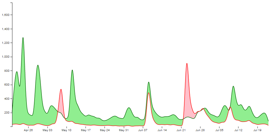
Alternatively, we could remove the smoothing and let the true data be shown;
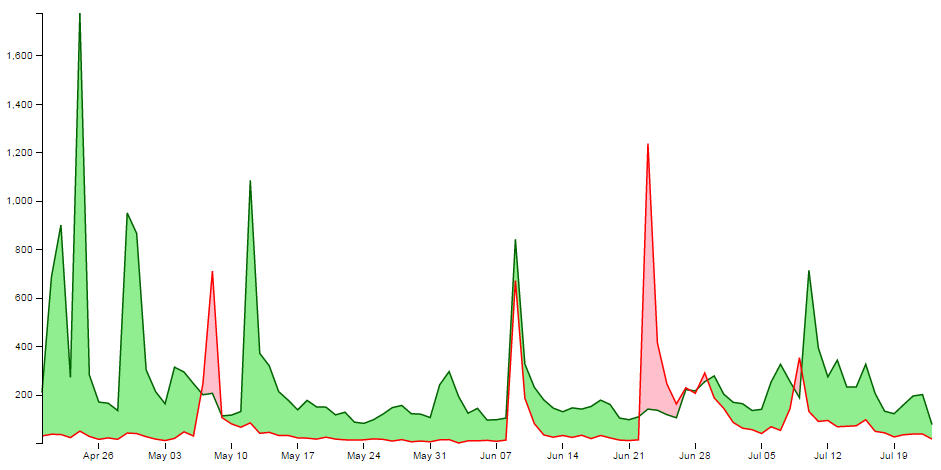
It should be argued that this is a truer representation of the data, but in this case I feel comfortable sacrificing accuracy for aesthetics (what have I become?).
Therefore, the domain for the y axis is set manually to between 0 and 1400, but feel free to remove that at the point when you introduce your own data :-).
data vs datum
One small line gets its own section. That line is;
svg.datum(data);
A casual d3.js user could be forgiven for thinking that this doesn’t seem too fearsome a line, but it has hidden depths.
As Mike Bostock explains here, if we want to bind data to elements as a group we would be *.data, but if we want to bind that data to individual elements, we should use *.datum.
It’s a function of how the data is stored. If there is an expectation that the data will be dynamic then data is the way to go since it has the feature of preparing enter and exit selections. If the data is static (it won’t be changing) then datum is the way to go.
In our case we are assigning data to individual elements and as a result we will be using datum.
Setting up the clipPaths
The clipPath operator is used to define an area that is used to create a shape by intersecting one area with another.
In our case we are going to set up two clip paths. One is the area above the green ‘Science’ line (which we defined earlier as being the y1 component of an area selection);
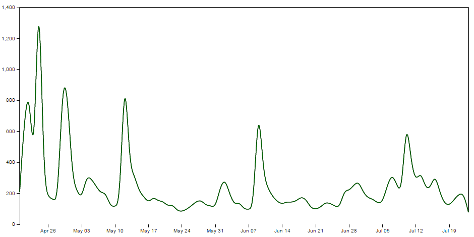
This is declared via this portion of the code;
    svg.append("clipPath")
        .attr("id", "clip-above")
      .append("path")
        .attr("d", area.y0(0));
Then we set up the clip path that will exist for the area below the green ‘Science’ line ;
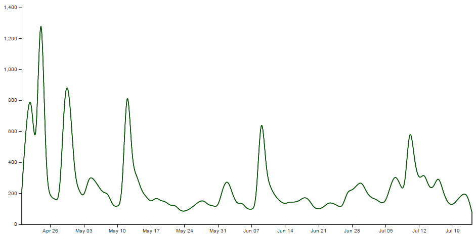
This is declared via this portion of the code;
    svg.append("clipPath")
        .attr("id", "clip-below")
      .append("path")
        .attr("d", area.y0(height));
Each of these paths has an ‘id’ which can be subsequently used by the following code.
Clipping and adding the areas
Now we come to clipping our shape and filling it with the appropriate colour.
We do this by having a shape that represents the area between the two lines and applying our clip path for the values above and below our reference line (the green ‘Science’ line). Where the two intersect, we fill it with the appropriate colour. The code to fill the area above the reference line is as follows;
    svg.append("path")
        .attr("class", "area above")
        .attr("clip-path", "url(#clip-above)")
        .attr("d", area.y0(function(d) { return y(d["Style"]); }));
Here we have two lines that are defining the shape between the two science and style lines;
    svg.append("path")
        ....
        ....
        .attr("d", area.y0(function(d) { return y(d["Style"]); }));
If we were to look at the shape that this produces it would look as follows (greyed out for highlighting);
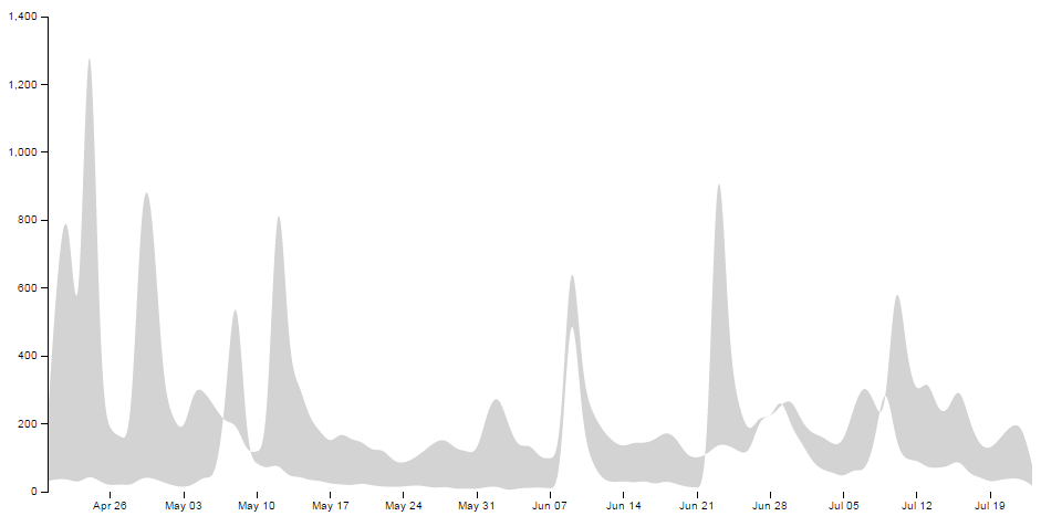
We apply a class to the shape so that is filled with the colour that we want;
.attr("class", "area above")
.. and apply the clip path so that only the areas that intersect the two shapes are filled with the appropriate colour;
.attr("clip-path", "url(#clip-above)")
Here the intersection of those two shapes is shown as pink;
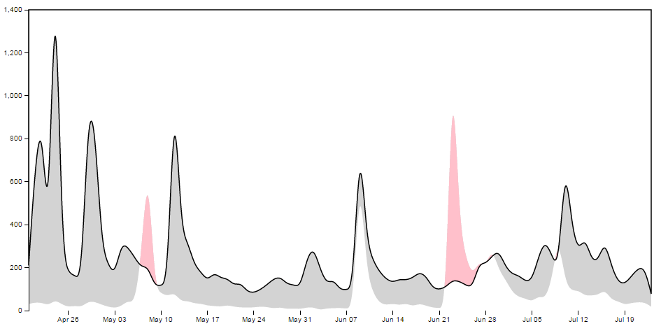
Then we do the same for the area below;
    svg.append("path")
        .attr("class", "area below")
        .attr("clip-path", "url(#clip-below)")
        .attr("d", area.y0(function(d) { return y(d["Style"]); }));
With the corresponding areas showing the intersection of the two shapes coloured differently;
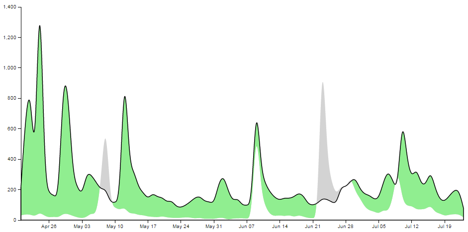
Draw the lines and the axes
The final part of our basic difference chart is to draw in the lines over the top so that they are highlighted and to add in the axes;
    svg.append("path")
        .attr("class", "line")
        .style("stroke", "darkgreen")
        .attr("d", lineScience);

    svg.append("path")
        .attr("class", "line")
        .style("stroke", "red")
        .attr("d", lineStyle);

    svg.append("g")
        .attr("class", "x axis")
        .attr("transform", "translate(0," + height + ")")
        .call(xAxis);

    svg.append("g")
        .attr("class", "y axis")
        .call(yAxis);
Et viola! we have our difference chart!
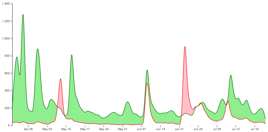
As mentioned earlier, the code for the simple difference chart is available online at bl.ocks.org or GitHub. It is also available as the files ‘diff-basic.html’ and ‘downloads.csv’ as a download with the book D3 Tips and Tricks (in a zip file) when you download the book from Leanpub.
Adding a bit more to our difference chart.
The chart itself is a thing of beauty, but given the subject matter (it’s describing two books after all) we should include a bit more information on what it is we’re looking at and provide some links so that a fascinated viewer of the graphs can read the books!
Add a Y axis label
Because it’s not immediately obvious what we’re looking at on the Y axis we should add in a nice subtle label on the Y axis;
    svg.append("g")
        .attr("class", "y axis")
        .call(yAxis)
      .append("text")
        .attr("transform", "rotate(-90)")
        .attr("y", 6)
        .attr("dy", ".71em")
        .style("text-anchor", "end")
        .text("Daily Downloads from Leanpub");
Add a title
Every graph should have a title. The following code adds this to the top(ish) centre of the chart and provides a white drop-shadow for readability;
    // ******* Title Block ********
    svg.append("text") // Title shadow
      .attr("x", (width / 2))
      .attr("y", 50 )
      .attr("text-anchor", "middle")
      .style("font-size", "30px")
      .attr("class", "shadow")
      .text(title);

    svg.append("text") // Title
      .attr("x", (width / 2))
      .attr("y", 50 )
      .attr("text-anchor", "middle")
      .style("font-size", "30px")
      .style("stroke", "none")
      .text(title);
Adding the legend
A respectable legend in this case should provide visual context of what it is describing in relation to the graph (by way of colour) and should actually name the book. We can also go a little bit further and provide a link to the books in the legend so that potential readers can access them easily.
Firstly the rectangles filled with the right colour, sized appropriately and arranged just right;
    var block = 300;   // rectangle width and position

    svg.append("rect") // Style Legend Rectangle
      .attr("x", ((width / 2)/2)-(block/2))
      .attr("y", height+(margin.bottom/2) )
      .attr("width", block)
      .attr("height", "25")
      .attr("class", "area above");

    svg.append("rect") // Science Legend Rectangle
      .attr("x", ((width / 2)/2)+(width / 2)-(block/2))
      .attr("y", height+(margin.bottom/2) )
      .attr("width", block)
      .attr("height", "25")
      .attr("class", "area below");
Then we add the text (with a drop-shadow) and a link;
    svg.append("text") // Style Legend Text shadow
      .attr("x", ((width / 2)/2))
      .attr("y", height+(margin.bottom/2) + 5)
      .attr("dy", ".71em")
      .attr("text-anchor", "middle")
      .style("font-size", "18px")
      .attr("class", "shadow")
      .text("The Elements of Data Analytic Style");

    svg.append("text") // Science Legend Text shadow
      .attr("x", ((width / 2)/2)+(width / 2))
      .attr("y", height+(margin.bottom/2) + 5)
      .attr("dy", ".71em")
      .attr("text-anchor", "middle")
      .style("font-size", "18px")
      .attr("class", "shadow")
      .text("R Programming for Data Science");

    svg.append("a")
      .attr("xlink:href", "https://leanpub.com/datastyle")
      .append("text") // Style Legend Text
      .attr("x", ((width / 2)/2))
      .attr("y", height+(margin.bottom/2) + 5)
      .attr("dy", ".71em")
      .attr("text-anchor", "middle")
      .style("font-size", "18px")
      .style("stroke", "none")
      .text("The Elements of Data Analytic Style");

    svg.append("a")
      .attr("xlink:href", "https://leanpub.com/rprogramming")
      .append("text") // Science Legend Text
      .attr("x", ((width / 2)/2)+(width / 2))
      .attr("y", height+(margin.bottom/2) + 5)
      .attr("dy", ".71em")
      .attr("text-anchor", "middle")
      .style("font-size", "18px")
      .style("stroke", "none")
      .text("R Programming for Data Science");
I’ll be the first to admit that this could be done more efficiently with some styling via css, but then it would leave nothing for the reader to try :-).
Link the areas
As a last touch we can include the links to the respective books in the shading for the graph itself;
    svg.append("a")
      .attr("xlink:href", "https://leanpub.com/datastyle")
      .append("path")
        .attr("class", "area above")
        .attr("clip-path", "url(#clip-above)")
        .attr("d", area.y0(function(d) { return y(d["Style"]); }));

    svg.append("a")
      .attr("xlink:href", "https://leanpub.com/rprogramming")
      .append("path")
        .attr("class", "area below")
        .attr("clip-path", "url(#clip-below)")
        .attr("d", area.y0(function(d) { return y(d["Style"]); }));
Perhaps not strictly required, but a nice touch none the less.
The final result
And here it is;
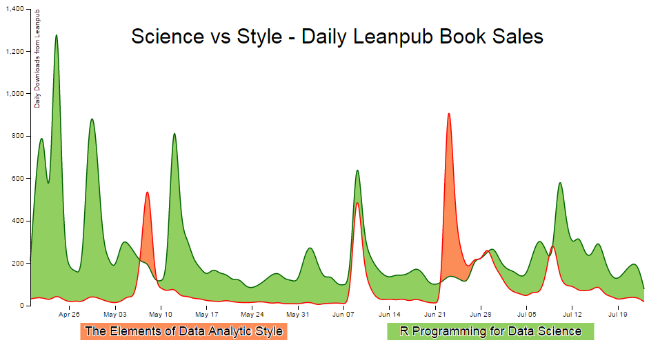
The code for the full difference chart is available online at bl.ocks.org or GitHub. It is also available as the files ‘diff-full.html’ and ‘downloads.csv’ as a download with the book D3 Tips and Tricks (in a zip file) when you download the book from Leanpub.