Assorted Tips and Tricks
Change a line chart into a scatter plot
Confession time.
I didn’t actually intend to add in a section with a scatter plot in it for its own sake because I thought it would be;
- tricky
- not useful
- all of the above
I was wrong on all counts.
All you need to do is take the simple graph example file and slot the following block in between the ‘Add the valueline path’ and the ‘add the x axis’ blocks.
    svg.selectAll("dot")
        .data(data)
    .enter().append("circle")
        .attr("r", 3.5)
        .attr("cx", function(d) { return x(d.date); })
        .attr("cy", function(d) { return y(d.close); });
And you will get…
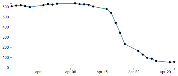
The full code for this graph can also be found on github or in the code samples bundled with this book (simple-scatterplot.html and data.csv). A live example can be found on bl.ocks.org.
I deliberately put the dots after the line in the drawing section, because I thought they would look better, but you could put the block of code before the line drawing block to get the following effect;
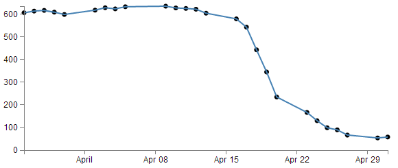
(just trying to reinforce the concept that ‘order’ matters when drawing objects :-)).
You could of course just remove the line block all together…
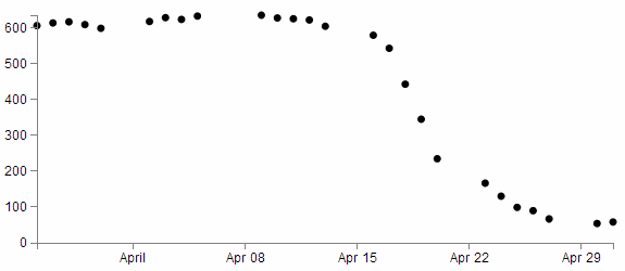
But in my humble opinion it loses something.
So what do the individual lines in the scatter plot block of JavaScript do?
The first line (svg.selectAll("dot")) essentially provides a suitable grouping label for the svg circle elements that will be added. The next line associates the range of data that we have to the group of elements we are about to add in.
Then we add a circle for each data point (.enter().append("circle")) with a radius of 3.5 pixels (.attr("r", 3.5)) and appropriate x (.attr("cx", function(d) { return x(d.date); })) and y (.attr("cy", function(d) { return y(d.close); });) coordinates.
There is lots more that we could be doing with this piece of code (check out the scatter plot example) including varying the colour or size or opacity of the circles depending on the data and all sorts of really neat things, but for the mean time, there we go. Scatter plot!
Adding tooltips.
Tooltips have a marvellous duality. They are on one hand a pretty darned useful thing that aids in giving context and information where required and on the other hand, if done with a bit of care, they can look very stylish :-).
Technically, they represent a slight move from what we have been playing with so far into a mildly more complex arena of ‘transitions’ and ‘events’. You can take this one of two ways. Either accept that it just works and implement it as shown, or you will know what’s going on and feel free to deride my efforts as those of a rank amateur :-).
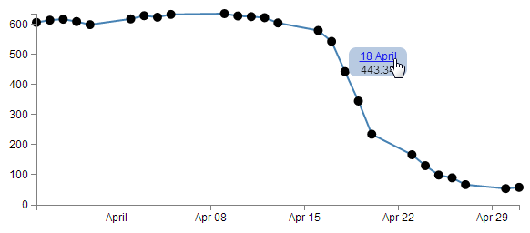
Just in case there is some confusion, a tooltip (one word or two?) is a discrete piece of information that will pop into view when the mouse hovers over somewhere specific. Most of us have seen and used them, but I suppose we all tend to call them different things such as ‘infotip’, ‘hint’ or ‘hover box’ I don’t know if there’s a right name for them, but here’s an example of what we’re trying to achieve;
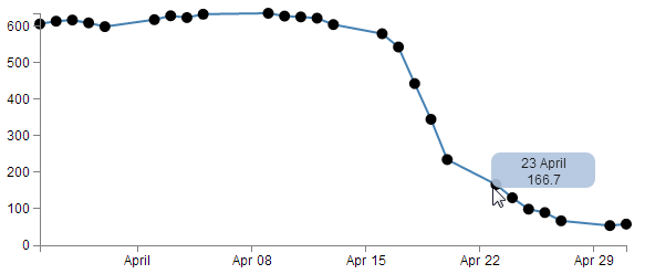
You can see the mouse has hovered over one of the scatter plot circles and a tip has appeared that provides the user with the exact date and value for that point.
Now, you may also notice that there’s a certain degree of ‘fancy’ here as the information is bound by a rectangular shape with rounded corners and a slight opacity. The other piece of ‘fancy’ which you don’t see in a PDF (or whatever format this distinguished tome will be published in on its 33rd reprint in the year 2034), is that when these tool tips appear and disappear, they do so in an elegant fade-in, fade-out way. Purty.
Now, before we get started describing how the code goes together, let’s take a quick look at the two technique specifics that I mentioned earlier, ‘transitions’ and ‘events’.
Transitions
From the main d3.js web page (d3js.org) transitions are described as gradually interpolating styles and attributes over time. So what I take that to mean is that if you want to change an object, you can do so be simply specifying the attribute / style end point that you want it to end up with and the time you want it to take and go!
Of course, it’s not quite that simple, but luckily, smarter people than I have done some fantastic work describing different aspects of transitions so please see the following for a more complete description of the topic;
- Mike Bostock’s Bar chart tutorial
- Christophe Viau’s ‘Try D3 Now!’ tutorial
Hopefully observing the mouseover and mouseout transitions in the tooltips example will whet your appetite for more!
Events
The other technique is related to mouse ‘events’. This describes the browser watching for when ‘something’ happens with the mouse on the screen and when it does, it takes a specified action. A (probably non-comprehensive) list of the types of events are the following;
- mousedown: Triggered by an element when a mouse button is pressed down over it
- mouseup: Triggered by an element when a mouse button is released over it
- mouseover: Triggered by an element when the mouse comes over it
- mouseout: Triggered by an element when the mouse goes out of it
- mousemove: Triggered by an element on every mouse move over it.
- click: Triggered by a mouse click: mousedown and then mouseup over an element
- contextmenu: Triggered by a right-button mouse click over an element.
- dblclick: Triggered by two clicks within a short time over an element
How many of these are valid to use within d3 I’m not sure, but I’m willing to bet that there are probably more than those here as well. Please go to http://javascript.info/tutorial/mouse-events for a far better description of the topic if required.
Get tipping
So, bolstered with a couple of new concepts to consider, let’s see how they are enacted in practice.
The full code for this graph can also be found on github or in the code samples bundled with this book (simple-tooltips.html and data.csv). A live example can be found on bl.ocks.org.
If we start with our simple-scatter plot graph there are 4 areas in it that we will want to modify (it may be easier to check the tooltips.html file in the example files in the downloads section on d3noob.org).
The first area is the CSS. The following code should be added just before the </style> tag;
div.tooltip {
    position: absolute;
    text-align: center;
    width: 60px;
    height: 28px;
    padding: 2px;
    font: 12px sans-serif;
    background: lightsteelblue;
    border: 0px;
    border-radius: 8px;
    pointer-events: none;
}
These styles are defining how our tooltip will appear . Most of them are fairly straight forward. The position of the tooltip is done in absolute measurements, not relative. The text is centre aligned, the height, width and colour of the rectangle is 28px, 60px and lightsteelblue respectively. The ‘padding’ is an interesting feature that provides a neat way to grow a shape by a fixed amount from a specified size.
We set the border to 0px so that it doesn’t show up and a neat style (attribute?) called border-radius provides the nice rounded corners on the rectangle.
Lastly, but by no means least, the ‘pointer-events: none’ line is in place to instruct the mouse event to go “through” the element and target whatever is “underneath” that element instead (Read more here). That means that even if the tooltip partly obscures the circle, the code will still act as if the mouse is over only the circle.
The second addition is a simple one-liner that should (for forms sake) be placed under the ‘parseData’ variable declaration;
var formatTime = d3.time.format("%e %B");
This line formats the date when it appears in our tooltip. Without it, the time would default to a disturbingly long combination of temporal details. In the case here we have declared that we want to see the day of the month (%e) and the full month name(%B).
The third block of code is the function declaration for ‘div’.
var div = d3.select("body").append("div")
    .attr("class", "tooltip")
    .style("opacity", 0);
We can place that just after the ‘valueline’ definition in the JavaScript. Again there’s not too much here that’s surprising. We tell it to attach ‘div’ to the body element, we set the class to the tooltip class (from the CSS) and we set the opacity to zero. It might sound strange to have the opacity set to zero, but remember, that’s the natural state of a tooltip. It will live unseen until it’s moment of revelation arrives and it pops up!
The final block of code is slightly more complex and could be described as a mutant version of the neat little bit of code that we used to do the drawing of the dots for the scatter plot. That’s because the tooltips are all about the scatter plot circles. Without a circle to ‘mouseover’, the tooltip never appears :-).
So here’s the code that includes the scatter plot drawing (it’s included since it’s pretty much integral);
    svg.selectAll("dot")
        .data(data)
    .enter().append("circle")
        .attr("r", 5)
        .attr("cx", function(d) { return x(d.date); })
        .attr("cy", function(d) { return y(d.close); })
        .on("mouseover", function(d) {
            div.transition()
                .duration(200)
                .style("opacity", .9);
            div	.html(formatTime(d.date) + "<br/>"  + d.close)
                .style("left", (d3.event.pageX) + "px")
                .style("top", (d3.event.pageY - 28) + "px");
            })
        .on("mouseout", function(d) {
            div.transition()
                .duration(500)
                .style("opacity", 0);
        });
The first six lines of the code are a repeat of the scatter plot drawing script. The only changes are that we’ve increased the radius of the circle from 3.5 to 5 (just to make it easier to mouse over the object) and we’ve removed the semicolon from the cy attribute line since the code now has to carry on.
So the additions are broken into two areas that correspond to the two events. mouseover and mouseout. When the mouse moves over any of the circles in the scatter plot, the mouseover code is executed on the div element. When the mouse is moved off the circle a different set of instructions are executed.
on.mouseover
The .on("mouseover" line initiates the introduction of the tooltip. Then we declare the element we will be introducing (‘div’) and that we will be applying a transition to its introduction (.transition()). The next two lines describe the transition. It will take 200 milliseconds (.duration(200)) and will result in changing the element’s opacity to .9 (.style("opacity", .9);). Given that the natural state of our tooltip is an opacity of 0, this make sense for something appearing, but it doesn’t go all the way to a solid object and it retains a slight transparency just to make it look less permanent.
The following three lines format our tooltip. The first one adds an html element that contains our x and y information (the date and the d.close value). Now this is done in a slightly strange way. Other tooltips that I have seen have used a ‘.text’ element instead of a ‘.html’ one, but I have used ‘.html’ in this case because I wanted to include the line break tag <br/> to separate the date and value. I’m sure there are other ways to do it, but this worked for me. The other interesting part of this line is that this is where we call our time formatting function that we described earlier. The next two lines position the tooltip on the screen and to do this they grab the x and y coordinates of the mouse when the event takes place (with the d3.event.pageX and d3.event.pageY snippets) and apply a correction in the case of the y coordinate to raise the tooltip up by the same amount as its height (28 pixels).
on.mouseout
The .on("mouseout" section is slightly simpler in that it doesn’t have to do any fancy text / html / coordinate stuff. All it has to do is to fade out the ‘div’ element. And that is done by simply reversing the opacity back to 0 and setting the duration for the transition to 500 milliseconds (being slightly longer than the fade-in makes it look slightly cooler IMHO).
Right, there you go. As a description it’s ended up being a bit of a wall of text I’m afraid. But hopefully between the explanation and the example code you will get the idea. Please take the time to fiddle with the settings described here to find the ones that work for you and in the process you will reinforce some of the principles that help D3 do its thing.
Including an HTML link in a tool tip
There was an interesting question on d3noob.org about adding an HTML link to a tooltip. While the person asking the question had the problem pretty much solved already, I thought it might be useful for others.
The premise is that you want to add a tool tip to your visualization using the method described here, but you also want to include an HTML link in the tooltip that will link somewhere else. This might look a little like the following;
In the image above the date has been turned into a link. In this case the link goes to google.com, but that can obviously be configurable.
The full code for this example can be found on github or in the code samples bundled with this book (tooltips-link.html and data.csv). A working example can be found on bl.ocks.org.
There are a few changes that we would want to make to our original tooltip code to implement this feature.
First of all, we’ll add the link to the date element. Adding an HTML link can be as simple as wrapping the ‘thing’ to be used as a link in <a> tags with an appropriate URL to go to.
The following adaptation of the code that prints the information into our tooltip code does just that;
    div .html(
        '<a href= "http://google.com">' + // The first <a> tag
        formatTime(d.date) +
        "</a>" +                          // closing </a> tag
        "<br/>"  + d.close)
        .style("left", (d3.event.pageX) + "px")
        .style("top", (d3.event.pageY - 28) + "px");
<a href= "http://google.com"> places our first <a> tag and declares the URL and the second tag follows after the date.
The second change we will want to make is to ensure that the tooltip stays in place long enough for us to actually click on the link. The problem being solved here is that our original code relies on the mouse being over the dot on the graph to display the tooltip. if the tooltip is displayed and the cursor moves to press the link, it will move off the dot on the graph and the tooltip vanishes (Nice!).
To solve the problem we can leave the tooltip in place adjacent to a dot while the mouse roams freely over the graph until the next time it reaches a dot and then the previous tooltip vanishes and a new one appears. The best way to appreciate this difference is to check out the live example on bl.ocks.org.
The code is as follows (you may notice that this also includes the link as described above);
    .on("mouseover", function(d) {
        div.transition()
            .duration(500)
            .style("opacity", 0);
        div.transition()
            .duration(200)
            .style("opacity", .9);
        div .html(
            '<a href= "http://google.com">' + // The first <a> tag
            formatTime(d.date) +
            "</a>" +                          // closing </a> tag
            "<br/>"  + d.close)
            .style("left", (d3.event.pageX) + "px")
            .style("top", (d3.event.pageY - 28) + "px");
        });
We have removed the .on("mouseout" portion and moved the function that it used to carry out to the start of the .on("mouseover" portion. That way the first thing that occurs when the mouse cursor moves over a dot is that it removes the previous tooltip and then it places the new one.
The last change we need to make is to remove from the <style> section the line that told the mouse to ignore the tooltip;
/* pointer-events: none; This line needs to be removed */
In this case I have just commented it out so that it’s a bit more obvious that it gets removed.
Moar Links!
One link is interesting, but let’s face it, we didn’t go to all the trouble of putting a link into a tool tip to just go to one location. Now we shift it up a gear and start linking to different places depending on our data. At the same time (and because someone asked) we will make the link open in a new tab!
The changes to the script are fairly minor, but one fairly large change is the need to have links to go to. For this example I have added a range of links to visit to our csv file so it now looks like this;
date,close,link
1-May-12,58.13,http://bl.ocks.org/d3noob/c37cb8e630aaef7df30d
30-Apr-12,53.98,http://bl.ocks.org/d3noob/11313583
27-Apr-12,67.00,http://bl.ocks.org/d3noob/11306153
26-Apr-12,89.70,http://bl.ocks.org/d3noob/11137963
25-Apr-12,99.00,http://bl.ocks.org/d3noob/10633856
24-Apr-12,130.28,http://bl.ocks.org/d3noob/10633704
23-Apr-12,166.70,http://bl.ocks.org/d3noob/10633421
20-Apr-12,234.98,http://bl.ocks.org/d3noob/10633192
19-Apr-12,345.44,http://bl.ocks.org/d3noob/10632804
18-Apr-12,443.34,http://bl.ocks.org/d3noob/9692795
17-Apr-12,543.70,http://bl.ocks.org/d3noob/9267535
16-Apr-12,580.13,http://bl.ocks.org/d3noob/9211665
13-Apr-12,605.23,http://bl.ocks.org/d3noob/9167301
12-Apr-12,622.77,http://bl.ocks.org/d3noob/8603837
11-Apr-12,626.20,http://bl.ocks.org/d3noob/8375092
10-Apr-12,628.44,http://bl.ocks.org/d3noob/8329447
9-Apr-12,636.23,http://bl.ocks.org/d3noob/8329404
5-Apr-12,633.68,http://bl.ocks.org/d3noob/8150631
4-Apr-12,624.31,http://bl.ocks.org/d3noob/8273682
3-Apr-12,629.32,http://bl.ocks.org/d3noob/7845954
2-Apr-12,618.63,http://bl.ocks.org/d3noob/6584483
30-Mar-12,599.55,http://bl.ocks.org/d3noob/5893649
29-Mar-12,609.86,http://bl.ocks.org/d3noob/6077996
28-Mar-12,617.62,http://bl.ocks.org/d3noob/5193723
27-Mar-12,614.48,http://bl.ocks.org/d3noob/5141528
26-Mar-12,606.98,http://bl.ocks.org/d3noob/5028304
The code change is to the piece of JavaScript where we add the HTML. This is what we end up with;
    div .html(
        '<a href= "'+d.link+'" target="_blank">' + //with a link
        formatTime(d.date) +
        "</a>" +
        "<br/>"  + d.close)
        .style("left", (d3.event.pageX) + "px")
        .style("top", (d3.event.pageY - 28) + "px");
We’ve replaced the URL http://google.com with the variable for our link column d.link and we’ve also added in the target="_blank" statement so that our link opens in a new tab.
The full code for this multi link example can be found on github or in the code samples bundled with this book (tooltips-link-multi.html and datatips.csv). A working example can be found on bl.ocks.org.
Hopefully that helps people with a similar desire to include links in their tooltips. Many thanks to the reader who suggested it :-).
What are the predefined, named colours?
Throughout this document I generally use colours defined by name. This is mainly because I can, and not for any other reason. In fact there several different ways to define colours used in D3 / JavaScript / CSS and HTML. I have no idea what the limitations for use are and / or how their use in different browsers impacts on correct representation. But I do know that they’re used widely.
There seems to be several different standards for what constitute an authoritative list of named colours. After a cursory search I was able to find a great list on about.com and there are some nice representations on Wikipedia.
The overriding point of all this is that there’s more than one way to define colours in your graphs.
It means that considering…
.style("fill", "steelblue")
and…
.style("fill", "#4682b4")
and…
.style("fill", "rgb(70,130,180)")
All three alternatives result in the same colour being applied.
For a long time I didn’t actually have the images of the colours represented here in D3 Tips and Tricks, but like all things, one day I thought ‘Hey, I could just write a simple script that placed them on the screen’. So here they are :-).
I have tried to group them as ‘like’ colours per the entry in Wikipedia.


You can also see a live page with the script that produces the rectangles at bl.ocks.org.
Selecting / filtering a subset of objects
OK, Imagine a scenario where you want to select (or should we say filter) a particular range of objects from a larger set.
For example, what if we wanted to use our scatter plot example to show the line as normal, but we are particularly interested in the points where the values of the points fall below 400. And when it does we want them highlighted with a circle as we have done with all the points previously.
So that we end up with something that looks a little like this…
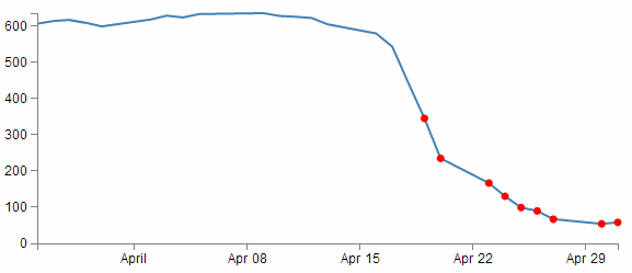
Err… Yes, for those among you who are of the observant persuasion, I have deliberately coloured them red as well (red for DANGER!).
This is a fairly simple example, but serves to illustrate the principle adequately. From our simple scatter plot example we only need to add in two lines to the block of code that draws the circles as follows;
    svg.selectAll("dot")
        .data(data)
    .enter().append("circle")
    .filter(function(d) { return d.close < 400 })    // <== This line
        .style("fill", "red")                        // <== and this one
        .attr("r", 3.5)
        .attr("cx", function(d) { return x(d.date); })
        .attr("cy", function(d) { return y(d.close); });
The full code for this example can be found on github or in the code samples bundled with this book (filter-selection.html and data.csv). A working example can be found on bl.ocks.org.
The first added line uses the .filter function to act on the data points and according to the arguments passed to it in this case, only return those where the value of d.close is less than 400 (return d.close < 400).
The second added line is our line that simply colours the circles red (.style("fill", "red")).
That’s all there is to it. Pretty simple, but the filter function can be very powerful when used wisely.
I’ve placed a copy of the file for selecting / filtering into the downloads section on d3noob.org with the general examples as filter-selection.html.
Select items with an IF statement.
The filtering – selection section above is a good way to adapt what you see on a graph, but so is a more familiar friend… The ‘if’ statement.
An if statement will act to carry out a task in a particular way dependant on a condition that you specify.
Starting with the simple scatter plot example all we have to do is include the if statement in the block of code that draws the circles. Here’s the entire block with the additions highlighted;
    svg.selectAll("dot")
        .data(data)
    .enter().append("circle")
        .attr("r", 3.5)
        .style("fill", function(d) {            // <== Add these
            if (d.close <= 400) {return "red"}  // <== Add these
            else 	{ return "black" }          // <== Add these
        ;})                                     // <== Add these
        .attr("cx", function(d) { return x(d.date); })
        .attr("cy", function(d) { return y(d.close); });
Our first added line introduces the style modifier and the rest of the code acts to provide a return for the ‘fill’ attribute.
The second line introduces our if statement. There’s very little difference using if statements between languages. Just look out for maintaining the correct syntax and you should be fine. In this case we’re asking if the value of d.close is less than or equal to 400 and if it is it will return the "red" statement for our fill.
The third line covers our rear and make sure that if the colour isn’t going to be red, it’s going to be black. The last line just closes the style and function statements.
The result?
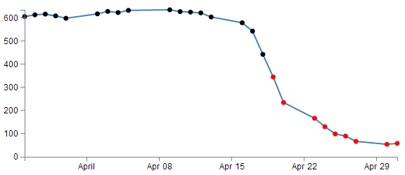
Aww….. nice.
The full code for this example can be found on github or in the code samples bundled with this book (if-selection.html and data.csv). A working example can be found on bl.ocks.org.
Could it be any cooler? I’m glad you asked.
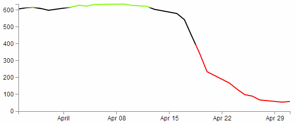
What if we wanted to have all the points where close was less than 400 red and all those where close was greater than 620 green? Oh yeah! Now we’re talking.
So with one small change to the if statement;
        .style("fill", function(d) {
            if (d.close <= 400) {return "red"}
            else if (d.close >= 620) {return "lawngreen"} // <== Right here
            else { return "black" }
        ;})
Check it out…
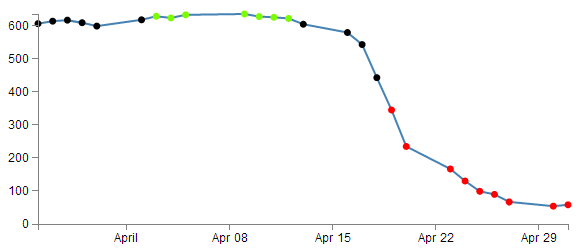
Nice.
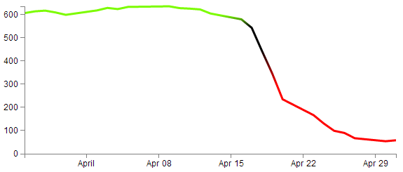
Applying a colour gradient to a line based on value.
I just know that you were impressed with the changing dots in a scatter plot based on the value. But could we go one better?
How about we try to reproduce the same effect but by varying the colour of the plotted line. This is a neat feature and a useful example of the flexibility of d3.js and SVG in general. I used the appropriate bits of code from Mike Bostock’s Threshold Encoding example. And I should take the opportunity to heartily recommend browsing through his collection of examples on bl.ocks.org. For those who prefer to see the code in it’s fullest, there is an example as an appendix (Graph with Area Gradient) that can assist (although it is for a later example that uses a gradient in a similar way (don’t worry we’ll get to it in a few pages)).
Here then is a plotted line that is red below 400, green above 620 and black in between.
How cool is that?
Enough beating around the bush, how is the magic line produced?
Starting with our simple line graph, there are only two blocks of code to go in. One is CSS in the <style> area and the second is a tricky little piece of code that deals with gradients.
The full code for this example can be found on github or in the code samples bundled with this book (line-colour-gradient-graph.html and data.csv). A working example can be found on bl.ocks.org.
So, first the CSS.
.line {
    fill: none;
    stroke: url(#line-gradient);
    stroke-width: 2px;
}
This block can go in the <style> area towards the end.
There’s the fairly standard fill of none and a stroke width of 2 pixels, but the stroke: url(#line-gradient); is something different.
In this case the stroke (the colour of the line) is being determined at a link within the page which is set by the anchor #line-gradient. We will see shortly that this is in our second block of code, so the colour is being defined in a separate portion of the script.
And now the JavaScript gradient code;
    svg.append("linearGradient")
        .attr("id", "line-gradient")
        .attr("gradientUnits", "userSpaceOnUse")
        .attr("x1", 0).attr("y1", y(0))
        .attr("x2", 0).attr("y2", y(1000))
    .selectAll("stop")
        .data([
            {offset: "0%", color: "red"},
            {offset: "40%", color: "red"},
            {offset: "40%", color: "black"},
            {offset: "62%", color: "black"},
            {offset: "62%", color: "lawngreen"},
            {offset: "100%", color: "lawngreen"}
        ])
    .enter().append("stop")
        .attr("offset", function(d) { return d.offset; })
        .attr("stop-color", function(d) { return d.color; });
There’s our anchor on the second line!
But let’s not get ahead of ourselves. This block should be placed after the x and y domains are set, but before the line is drawn.
So, our first line adds our linear gradient. Gradients consist of continuously smooth colour transitions along a vector from one colour to another We can have a linear one or a radial one and depending on which you select, there are a few options to define. There is some great information on gradients at http://www.w3.org/TR/SVG/pservers.html (more than I ever thought existed).
The second line (.attr("id", "line-gradient")) sets our anchor for the CSS that we saw earlier.
The third fourth and fifth lines define the bounds of the area over which the gradient will act. Since the coordinates x1, y1, x2, y2 will describe an area. The values for y1 (0) and y2 (1000) are used more for convenience to align with our data (which has a maximum value around 630 or so). For more information on the gradientUnits attribute I found this page useful https://developer.mozilla.org/en-US/docs/SVG/Attribute/gradientUnits. We’ll come back to the coordinates in a moment.
The next block selects all the ‘stop’ elements for the gradients. These stop elements define where on the range covered by our coordinates the colours start and stop. These have to be defined as either percentages or numbers (where the numbers are really just percentages in disguise (i.e. 45% =0.45)).
The best way to consider the stop elements is in conjunction with the gradientUnits. The image following may help.
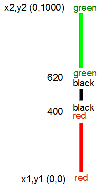
In this case our coordinates describe a vertical line from 0 to 1000. Our colours transition from red (0) to red (400) at which point they change to black (400) and this will continue until it gets to black (620). Then this changes to green (620) and from there, any value above that will be green.
So after defining the stop elements, we enter and append the elements to the gradient (.enter().append("stop")) with attributes for offset and colour that we defined in the stop elements area.
Now, that IS cool, but by now, I hope that you have picked that a gradient function really does mean a gradient, and not just a straight change from one colour to another.
So, let’s try changing the stop element offsets to the following (and making the stroke-width slightly larger to see more clearly what’s going on);
        .data([
            {offset: "0%", color: "red"},
            {offset: "30%", color: "red"},
            {offset: "45%", color: "black"},
            {offset: "55%", color: "black"},
            {offset: "60%", color: "lawngreen"},
            {offset: "100%", color: "lawngreen"}
        ])
And here we go…
Ahh… A real gradient.
I have tended to find that I need to have a good think about how I set the offsets and bounds when doing this sort of thing since it can get quite complicated quite quickly :-)
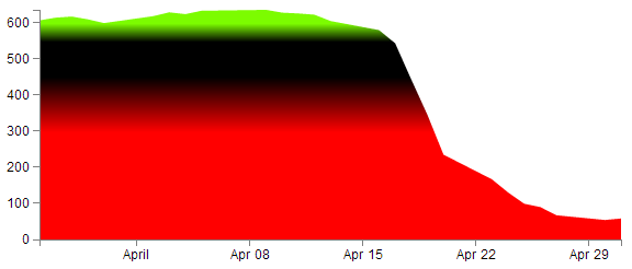
Applying a colour gradient to an area fill.
The previous example of a varying gradient on a line is neat, but hopefully you’re already thinking “Hang on, can’t that same thing be applied to an area fill?”.
Damn! You’re catching on.
To do this there’s only a few things we need to change;
First of all the CSS for the line needs to be amended to refer to the area. So this…
.line {
    fill: none;
    stroke: url(#line-gradient);
    stroke-width: 2px;
}
…gets changed to this…
.area {
    fill: url(#area-gradient);
    stroke-width: 0px;
}
We’ve defined the styles for the area this time, but instead of the stroke being defined by the separate script, now it’s the area. While we’ve changed the url name, it’s actually the same piece of code, with a different id (because it seemed wrong to be talking about an area when the label said line). We’ve also set the stroke width to zero, because we don’t want any lines around our filled area.
Now we want to take the block of code that defined our line…
var	valueline = d3.svg.line()
    .x(function(d) { return x(d.date); })
    .y(function(d) { return y(d.close); });
… and we need to replace it with the standard block that defined an area fill.
var	area = d3.svg.area()
    .x(function(d) { return x(d.date); })
    .y0(height)
    .y1(function(d) { return y(d.close); });
So we’re not going to be drawing a line at all. Just the area fill.
Next, as I mentioned earlier, we change the id for the linearGradient block from "line-gradient" to "area-gradient"
.attr("id", "area-gradient")
And lastly, we remove the block of code that drew the line and replace it with a block that draws an area. So change this….
    svg.append("path")
        .attr("class", "line")
        .attr("d", valueline(data));
… to this;
    svg.append("path")
        .datum(data)
        .attr("class", "area")
        .attr("d", area);
And then sit back and marvel at your creation;
The full code for this example can be found on github or in the code samples bundled with this book (area-colour-gradient-graph.html and data.csv). A working example can be found on bl.ocks.org.
For a slightly ‘nicer’ looking example, you could check out a variation of one of Mike Bostocks originals here; http://bl.ocks.org/4433087.
Show / hide an element by clicking on another element
This is a trick that I found I wanted to impliment in order to present a graph with a range of lines and to then provide the reader with the facility to click on the associated legend to toggle the visibility of the lines off and on as required.
The example we’ll follow is our friend from earlier, a slightly modified example of the graph with two lines.
In this example we will be able to click on either of the two titles at the bottom of the graph (‘Blue Line’ or ‘Red Line’) and have it toggle the respective line and Y axis.
The code
The code for the example is available online at bl.ocks.org or GitHub. It is also available as the file ‘show-hide.html’ as a separate download with D3 Tips and Tricks. A copy of most the files that appear in the book can be downloaded (in a zip file) when you download the book from Leanpub.
There are two main parts to implementing this technique. Firstly we have to label the element (or elements) that we wish to show / hide and then we have to give the object that will get clicked on the attribute that allows it to recognise a mouse click and the code that it subsequently uses to show / hide our labelled element.
Labelling the element that is to be switched on and off is dreadfully easy. It simply involves including an id attribute to an element that identifies it uniquely.
svg.append("path")
    .attr("class", "line")
    .attr("id", "blueLine")
    .attr("d", valueline(data));
In the example above we have applied the id blueLine to the path that draws the blue line on our graph.
The second part is a little trickier. The following is the portion of JavaScript that places our text label under the graph. The only part of it that is unusual is the .on("click", function() section of the code.
svg.append("text")
    .attr("x", 0)
    .attr("y", height + margin.top + 10)
    .attr("class", "legend")
    .style("fill", "steelblue")
    .on("click", function(){
        // Determine if current line is visible
        var active   = blueLine.active ? false : true,
          newOpacity = active ? 0 : 1;
        // Hide or show the elements
        d3.select("#blueLine").style("opacity", newOpacity);
        d3.select("#blueAxis").style("opacity", newOpacity);
        // Update whether or not the elements are active
        blueLine.active = active;
When we click on our ‘Blue Line’ text element the .on("click", function() section executes.
We’re using a short-hand version of the if statement a couple of times here. Firstly we check to see if the variable blueLine.active is true or false and if it’s true it gets set to false and if it’s false it gets set to true (not at all confusing).
        var active   = blueLine.active ? false : true,
          newOpacity = active ? 0 : 1;
Then after toggling this variable we set the value of newOpacity to either 0 or 1 depending on whether active is false or true (the second short-hand JavaScript if statement).
We can then select our identifiers that we have declared using the id attributes in the earlier pieces of code and modify their opacity to either 0 (off) or 1 (on)
        d3.select("#blueLine").style("opacity", newOpacity);
        d3.select("#blueAxis").style("opacity", newOpacity);
Lastly we update our blueLine.active variable to whatever the active state is so that it can toggle correctly the next time it is clicked on.
blueLine.active = active;
Quite a neat piece of code. Kudos to Max Leiserson for providing the example on which it is largely based in an answer to a question on Stack Overflow.
Export an image from a d3.js page as a SVG or bitmap
At some point you will want to take your lovingly crafted D3 graphical masterpiece and put it in a (close your eyes if you’re squeamish) Power Point presentation or Word document or export it for sharing in some other way.
There could be many reasons for wanting to do this and some may be more complicated than I will be willing to explore, but for the occasional conversion of images I have found what I regard as a fairly easy process.
Before we begin our exporting odyssey, let’s cover a little bit of housekeeping and describe the difference between a vector graphic (in this case specifically Scalable Vector Graphics) and a bitmap. Please skip ahead if you’re comfortable with the terms.
Bitmaps
A bitmap (or raster) image is one that is composed of lots of discrete individual dots (let’s call them pixels) which, when joined together (and zoomed out a bit) give the impression of an image. If we use the example of the force layout example we developed, and look at a screen shot (and it’s important to remember that this is a screen shot) of the image we see a picture that looks fairly benign.
However, as we enlarge the image by doubling it’s size (x 2) we begin to see some rough edges appear.
And if we enlarge it by doubling again (x 4) , it starts to look decidedly rough.
Doubling again (x 8), starts to show the pixels pretty clearly.
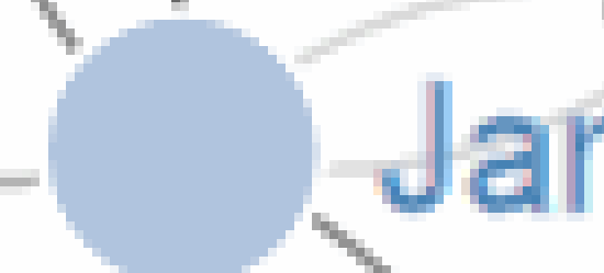
Doubling again for the last time (x 16) and the pixels are plainly evident.

Bitmaps can be saved in a wide range of formats depending on users requirements including compression, colour depth, transparency and a host of other attributes. Typically they can be identified by the file suffix .jpg, .png or .bmp (and there are an equally large number of other suffixes).
This will be the type of format that most people will be familiar with for images and their ubiquity with the advent of digital cameras almost makes it redundant to describe them.
However, there is another type of image and it is even more important to d3.js users.
Vector Graphics (Specifically SVG)
Scalable Vector Graphics (SVG) use a technique of drawing an image that relies more on a description of an image than the final representation that a user sees. Instead of arranging individual pixels, an image is created by describing the way the image is created.
For instance, drawing a line would be accomplished by defining two sets of coordinates and specifying a line of a particular width and colour be drawn between the points.
This might sound a little long winded, and it does create a sense of abstraction, but it is a far more powerful mechanism for drawing as there is no loss of detail with increasing scale. Changes to the image can be simply carried out by adjusting the coordinates, colour description, line width or curve diameter. If this all sounds a little familiar, you have definitely been paying attention, because this is the heart of the way that d3.js draws images in a browser. It uses a combination of coordinates, shapes and attributes to create vector images in a web page.
As a demonstration of the difference, here is the same original picture which I have saved as a SVG image.
Enlarged by doubling it’s size (x 2) everything looks smooth.
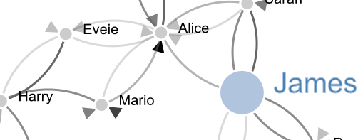
If we enlarge it by doubling again (x 4) , it still looks good.

Doubling again (x 8) and we can see that the text ‘James’ is actually composed of a fill colour and a border.

Doubling again for the last time (x 16) everything still retains it’s clear sharp edges.

Let’s get exporting!
We’ll use a three stage process for exporting our image (assuming the desired end result is a bitmap) and usefully, the first stage will result in us having a vector image as well!
The sequence will go as follows:
- Copy the image from the web page and save it as a SVG file
- Open the SVG image in a program designed to use vector images and edit it if required.
- Export that image as a bitmap
Copying the image off the web page
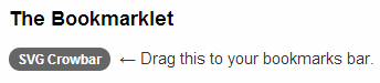
Getting the image out of a web page is made easy by using ‘SVG Crowbar’. This is a “A Chrome-specific bookmarklet that extracts SVG nodes and accompanying styles from an HTML document and downloads them as an SVG file”. What that means is that once you drag the bookmarklet from the web page to your bookmarks (You need to be using Google Chrome, and I’m told that about 60% of the people who visit d3noob.org do) you’re ready to go.
Now when you have a web page open that’s displaying a D3 creation, all you need to do is click on the SVG Crowbar bookmark and you will be prompted for a location to save a svg image.
Really. It’s that simple.
Open the SVG Image and Edit
Obviously now that you have a SVG image, you need to be able to do something with it. My preferred software for this is Inkscape.
Inkscape is “An Open Source vector graphics editor, with capabilities similar to Illustrator, CorelDraw, or Xara X, using the W3C standard Scalable Vector Graphics (SVG) file format”.
It really is an extremely capable drawing program and it is capable of a lot more than the job we’re going to use it for, so you may find it has other uses that may be valuable.
Once installed, you can open the saved file directly into Inkscape.
While here you can edit the drawing to your hearts delight. I particularly recommend ungrouping the diagram and removing or adjusting individual elements if required.
Once you have finished editing, you are ready for the final step.
Saving as a bitmap
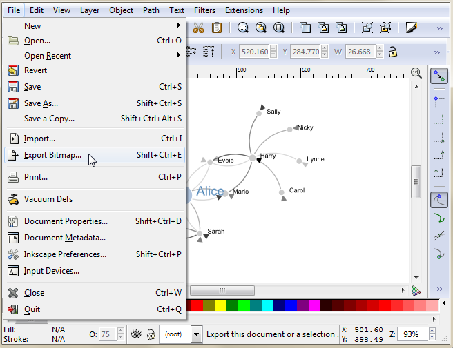
While still in Inkscape, go to the ‘File’, ‘Export Bitmap…’ menu.
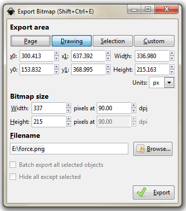
This will open a dialog box where you can select an appropriate resolution and location for your bitmap and then press the export button.
There you go.
It is worth knowing that the default settings here will export the diagram with a transparent background (using *.png) which will fit in nicely with a wide range of graphical end uses.
Using HTML inputs with d3.js
Part of the attraction of using technologies like d3.js is that it expands the scope of what is possible in a web page. At the same time, there are many different options for displaying content on a page and plenty of ways of interacting with it.
Some of the most basic of capabilities has been the use of HTML entities that allow the entry of data on a page. This can take a range of different forms (pun intended) and the <input> tag is one of the most basic.
What is an HTML input?
An HTML input is an element in HTML that allows a web page to input data. There are a range of different input types (with varying degrees of compatibility with browsers) and they are typically utilised inside a <form> element.
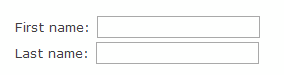
For example the following code allows a web page to place two fields on a web page so that a user can enter their first and last names in separate boxes;
<form>
  First name: <input type="text" name="firstname"><br>
  Last name: <input type="text" name="lastname">
</form>
The page would then display the following;
The range of input types is large and includes;
- text: A simple text field that a user can enter information into.
- radio: Buttons that let a user select only one of a limited number of choices.
- button: A clickable button that can activate JavaScript.
- range: A slider control for setting a number whose exact value is not important.
- number: A field for entering a number or toggling a number up and down.
… and many more. To check out others and get further background, it would be worth while visiting the Mozilla developer pages or w3schools.com.
While d3.js has the power to control and manipulate a web page to an extreme extent, sometimes it’s desirable to use a simple process to get a result. The following explanations will demonstrate a simple use case linking an HTML input with a d3.js element and will go on to provide examples of using multiple inputs, affecting multiple elements and using different input types. The examples are deliberately kept simple. They are intended to demonstrate functionality and to provide a starting position for you to go forward :-).
Using a range input with d3.js
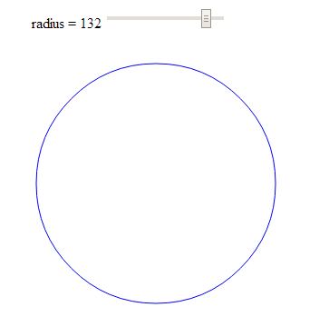
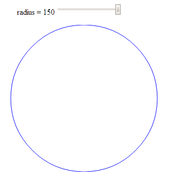
The first example we will follow will use a range input to adjust the radius of a circle.
The code
The following is the full code for the example. A live version is available online at bl.ocks.org or GitHub. It is also available as the file ‘input-radius.html’ as a separate download with D3 Tips and Tricks. A copy of most the files that appear in the book can be downloaded (in a zip file) when you download the book from Leanpub.
<!DOCTYPE html>
<meta charset="utf-8">
<title>Input test (circle)</title>

<p>
  <label for="nRadius"
         style="display: inline-block; width: 240px; text-align: right">
         radius = <span id="nRadius-value">…</span>
  </label>
  <input type="range" min="1" max="150" id="nRadius">
</p>

<script src="http://d3js.org/d3.v3.min.js"></script>
<script>

var width = 600;
var height = 300;

var holder = d3.select("body")
      .append("svg")
      .attr("width", width)
      .attr("height", height);

// draw the circle
holder.append("circle")
  .attr("cx", 300)
  .attr("cy", 150)
  .style("fill", "none")
  .style("stroke", "blue")
  .attr("r", 120);

// when the input range changes update the circle
d3.select("#nRadius").on("input", function() {
  update(+this.value);
});

// Initial starting radius of the circle
update(120);

// update the elements
function update(nRadius) {

  // adjust the text on the range slider
  d3.select("#nRadius-value").text(nRadius);
  d3.select("#nRadius").property("value", nRadius);

  // update the circle radius
  holder.selectAll("circle")
    .attr("r", nRadius);
}

</script>
The explanation
As with the other examples in the book I will not go over some of the simpler lines of code that are covered in greater detail in earlier sections of the book and will concentrate on those sections that contain new concepts, code or look like they might need expanding :-).
The first section is the portion that sets out the html range input;
<p>
  <label for="nRadius"
         style="display: inline-block; width: 240px; text-align: right">
         radius = <span id="nRadius-value">…</span>
  </label>
  <input type="range" min="1" max="150" id="nRadius">
</p>
The entire block is enclosed in a paragraph (<p>) tag so that is appears on a single line. It can be broken down into the label that occurs before the input slider which is given the id nRadius-value and the input proper.
The for attribute of the label tag equals to the id attribute of the input element to bind them together. This allows us to update the text later as the slider is moved.
The input tag can include four attributes that specify restrictions on the operation of the slider;
-
max: specifies the maximum value allowed -
min: specifies the minimum value allowed -
step: specifies the number intervals as you move the slider -
value: Specifies the default value
The ids supplied for both the label and the input are important since they provide the reference for our d3.js script.
The first portion of our JavaScript is fairly routine if you’ve been following along with the rest of the book.
var width = 600;
var height = 300;

var holder = d3.select("body")
      .append("svg")
      .attr("width", width)
      .attr("height", height);

// draw the circle
holder.append("circle")
  .attr("cx", 300)
  .attr("cy", 150)
  .style("fill", "none")
  .style("stroke", "blue")
  .attr("r", 120);
We append an SVG element to the body of our page and then we append a circle with some particular styling to the SVG element.
Then things start to get more interesting…
d3.select("#nRadius").on("input", function() {
  update(+this.value);
});
We select our input using the id that we had declared earlier in the html (nRadius). Then we use the .on operator which adds what is called an ‘event listener’ to the element so that when there is a change in the element (in this case an adjustment of the slider of the input) a function is called (function()) that in turn calls the update function with the value from the input (+this.value). We haven’t seen the update function yet, but never fear, it’s coming.
We also call the update function with a specific value in the next line;
update(120);
This might seem slightly redundant, but unless the function gets a value, the text associated with the range input doesn’t get a reading and remains on ‘…’ until the slider is moved.
Lastly we have our update function;
function update(nRadius) {

  // adjust the text on the range slider
  d3.select("#nRadius-value").text(nRadius);
  d3.select("#nRadius").property("value", nRadius);

  // update the circle radius
  holder.selectAll("circle")
    .attr("r", nRadius);
}
The first part of the function selects the label associated with our input (with the id, nRadius-value) and applies the vaule that has been passed into the function (nRadius). The next line selects the input itself and applies the value to it (this would be the equivalent of having value="<number here>" as a property in the html).
Lastly, we select the circle element and apply the new radius value based on our input value nRadius (.attr("r", nRadius)).
And there we have it, a fully adjustable radius for our circle controlled with an HTML input.
Using more than one input
In this example we will use two separate inputs (range type) to adjust the height and width of a rectangle.
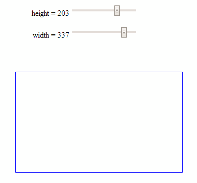
This is not too much of a stretch from the previous single input example with the radius of a circle, but it may be useful to reinforce the concept and illustrate something slightly different.
The code
The following is the full code for the example. A live version is available online at bl.ocks.org or GitHub. It is also available as the file ‘input-double.html’ as a separate download with D3 Tips and Tricks. A copy of most the files that appear in the book can be downloaded (in a zip file) when you download the book from Leanpub.
<!DOCTYPE html>
<meta charset="utf-8">
<title>Double Input Test</title>

<p>
  <label for="nHeight"
         style="display: inline-block; width: 240px; text-align: right">
         height = <span id="nHeight-value">…</span>
  </label>
  <input type="range" min="1" max="280" id="nHeight">
</p>

<p>
  <label for="nWidth"
         style="display: inline-block; width: 240px; text-align: right">
         width = <span id="nWidth-value">…</span>
  </label>
  <input type="range" min="1" max="400" id="nWidth">
</p>

<script src="http://d3js.org/d3.v3.min.js"></script>
<script>

var width = 600;
var height = 300;

var holder = d3.select("body")
      .append("svg")
      .attr("width", width)
      .attr("height", height);

// draw a rectangle
holder.append("rect")
    .attr("x", 300)
    .attr("y", 150)
    .style("fill", "none")
    .style("stroke", "blue")
    .attr("height", 150)
    .attr("width", 200);

// read a change in the height input
d3.select("#nHeight").on("input", function() {
  updateHeight(+this.value);
});

// read a change in the width input
d3.select("#nWidth").on("input", function() {
  updateWidth(+this.value);
});

// update the values
updateHeight(150);
updateWidth(100);

// Update the height attributes
function updateHeight(nHeight) {

  // adjust the text on the range slider
  d3.select("#nHeight-value").text(nHeight);
  d3.select("#nHeight").property("value", nHeight);

  // update the rectangle height
  holder.selectAll("rect")
    .attr("y", 150-(nHeight/2))
    .attr("height", nHeight);
}

// Update the width attributes
function updateWidth(nWidth) {

  // adjust the text on the range slider
  d3.select("#nWidth-value").text(nWidth);
  d3.select("#nWidth").property("value", nWidth);

  // update the rectangle width
  holder.selectAll("rect")
    .attr("x", 300-(nWidth/2))
    .attr("width", nWidth);
}

</script>
The explanation
For the sake of brevity, this explanation will simply concentrate on the differences between the previous single input example and this one.
The declarations for the inputs in the HTML at the start of the code are simply duplicates of each other in terms of function;
<p>
  <label for="nHeight"
         style="display: inline-block; width: 240px; text-align: right">
         height = <span id="nHeight-value">…</span>
  </label>
  <input type="range" min="1" max="280" id="nHeight">
</p>

<p>
  <label for="nWidth"
         style="display: inline-block; width: 240px; text-align: right">
         width = <span id="nWidth-value">…</span>
  </label>
  <input type="range" min="1" max="400" id="nWidth">
</p>
The only significant difference is the declaration of the id’s for each input and it’s respective label.
The JavaScript selection of the inputs is more duplication;
d3.select("#nHeight").on("input", function() {
  updateHeight(+this.value);
});

d3.select("#nWidth").on("input", function() {
  updateWidth(+this.value);
});
Again the only substantive difference is the use of the appropriate id values.
The updating of the width and height is done via two different functions;
function updateHeight(nHeight) {

  // adjust the text on the range slider
  d3.select("#nHeight-value").text(nHeight);
  d3.select("#nHeight").property("value", nHeight);

  // update the rectangle height
  holder.selectAll("rect")
    .attr("y", 150-(nHeight/2))
    .attr("height", nHeight);
}

// Update the width attributes
function updateWidth(nWidth) {

  // adjust the text on the range slider
  d3.select("#nWidth-value").text(nWidth);
  d3.select("#nWidth").property("value", nWidth);

  // update the rectangle width
  holder.selectAll("rect")
    .attr("x", 300-(nWidth/2))
    .attr("width", nWidth);
}
The rectangle is selected using a common rect designator, so multiple rectangles could be controlled. But each function controls only a specific attribute (height or width).
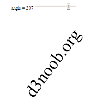
Rotate text with an input
This example is really just a derivative of the adjustment of a single attribute of an element.
I happen to think it’s just a little bit ‘neater’ because it includes text, but in reality, it’s just another attribute that can be adjusted.
Here we let our range input adjust the rotation of a piece of text.
The explanation
We’ll dispense with the full code listing since it’s just a regurgitation of the adjusting of the radius of the circle example, but the code for the example is available online at bl.ocks.org or GitHub. It is also available as the file ‘input-text-rotate.html’ as a separate download with D3 Tips and Tricks. A copy of most the files that appear in the book can be downloaded (in a zip file) when you download the book from Leanpub.
The only, thing of even a slight difference (other than some naming conventions) is the initial drawing of the text…
holder.append("text")
  .style("fill", "black")
  .style("font-size", "56px")
  .attr("dy", ".35em")
  .attr("text-anchor", "middle")
  .attr("transform", "translate(300,150) rotate(0)")
  .text("d3noob.org");
… and the update function;
function update(nAngle) {

  // adjust the text on the range slider
  d3.select("#nAngle-value").text(nAngle);
  d3.select("#nAngle").property("value", nAngle);

  // rotate the text
  holder.select("text")
    .attr("transform", "translate(300,150) rotate("+nAngle+")");
}
Use a number input with d3.js
There are obviously different inputs that can be selected. The following example still rotates our text, but uses a number type of input to do it;
<p>
  <label for="nValue"
         style="display: inline-block; width: 240px; text-align: right">
         angle = <span id="nValue-value"></span>
  </label>
  <input type="number" min="0" max="360" step="5" value="0" id="nValue">
</p>
we have set the step value to speed things up a bit when rotating, but it’s completely optional.
The input itself can be adjusted up or down using a mouse click or have a number typed into the input box.
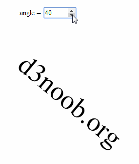
This type of input is slightly different from the range type since it isn’t fully supported under Firefox and as a result when I was testing it the arrow keys for going up and down weren’t present.
The full code for the example is available online at bl.ocks.org or GitHub. It is also available as the file ‘input-number-text.html’ as a separate download with D3 Tips and Tricks. A copy of most the files that appear in the book can be downloaded (in a zip file) when you download the book from Leanpub.
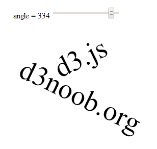
Change more than one element with an input
The final example looking at using HTML inputs with d3.js incorporates a single input acting or two different elements. This might seem self evident, but if you’re as unfamiliar with HTML as I am (it’s embarrassing I know, but what can you do?) it may be of assistance.
The end result is to produce a single slider as a range input that rotates two separate text objects in different directions simultaneously.
The code
The following is the full code for the example. A live version is available online at bl.ocks.org or GitHub. It is also available as the file ‘input-text-rotate-2.html’ as a separate download with D3 Tips and Tricks. A copy of most the files that appear in the book can be downloaded (in a zip file) when you download the book from Leanpub.
<!DOCTYPE html>
<meta charset="utf-8">
<title>Input test</title>

<p>
  <label for="nAngle"
         style="display: inline-block; width: 240px; text-align: right">
         angle = <span id="nAngle-value">…</span>
  </label>
  <input type="range" min="0" max="360" id="nAngle">
</p>

<script src="http://d3js.org/d3.v3.min.js"></script>
<script>

var width = 600;
var height = 300;

var holder = d3.select("body")
      .append("svg")
      .attr("width", width)
      .attr("height", height);

// draw d3.js text
holder.append("text")
  .attr("class", "d3js")
  .style("fill", "black")
  .style("font-size", "56px")
  .attr("dy", ".35em")
  .attr("text-anchor", "middle")
  .attr("transform", "translate(300,55) rotate(0)")
  .text("d3.js");

// draw d3noob.org text
holder.append("text")
  .attr("class", "d3noob")
  .style("fill", "black")
  .style("font-size", "56px")
  .attr("dy", ".35em")
  .attr("text-anchor", "middle")
  .attr("transform", "translate(300,130) rotate(0)")
  .text("d3noob.org");

// when the input range changes update the rectangle
d3.select("#nAngle").on("input", function() {
  update(+this.value);
});

// Initial starting height of the rectangle
update(0);

// update the elements
function update(nAngle) {

// adjust the range text
  d3.select("#nAngle-value").text(nAngle);
  d3.select("#nAngle").property("value", nAngle);

  // adjust d3.js text
  holder.select("text.d3js")
    .attr("transform", "translate(300,55) rotate("+nAngle+")");

  // adjust d3noob.org text
  holder.select("text.d3noob")
    .attr("transform", "translate(300,130) rotate("+(360 - nAngle)+")");
}

</script>
The explanation
The explanation for this example differes from the others in the way that the d3.js elements (the two pieces of text) are initially appended and then updated.
When they are initially drawn…
holder.append("text")
  .attr("class", "d3js")
  .style("fill", "black")
  .style("font-size", "56px")
  .attr("dy", ".35em")
  .attr("text-anchor", "middle")
  .attr("transform", "translate(300,55) rotate(0)")
  .text("d3.js");

holder.append("text")
  .attr("class", "d3noob")
  .style("fill", "black")
  .style("font-size", "56px")
  .attr("dy", ".35em")
  .attr("text-anchor", "middle")
  .attr("transform", "translate(300,130) rotate(0)")
  .text("d3noob.org");
… both elements are declared with a class attribute that serves as a reference for the future updating. Here, the text ‘d3.js’ is given a class name of d3js and the text ‘d3noob.org’ is given a class name of d3noob.
Then when we call the update function each of the two text elements is adjusted seperately by selecting each based on the class name that was applied in the initial setup;
function update(nAngle) {

// adjust the range text
  d3.select("#nAngle-value").text(nAngle);
  d3.select("#nAngle").property("value", nAngle);

  // adjust d3.js text
  holder.select("text.d3js")
    .attr("transform", "translate(300,55) rotate("+nAngle+")");

  // adjust d3noob.org text
  holder.select("text.d3noob")
    .attr("transform", "translate(300,130) rotate("+(360 - nAngle)+")");
}
So the ‘d3.js’ text is selected using text.d3js and ‘d3noob.org’ is selected using text.d3noob. That’s a pretty neat trick and a good lesson for applying specific transformations to specific objects.
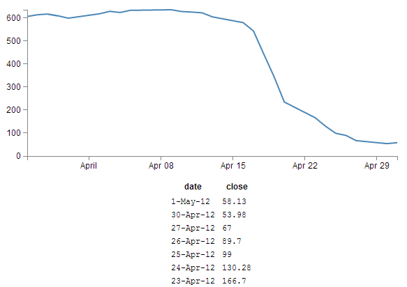
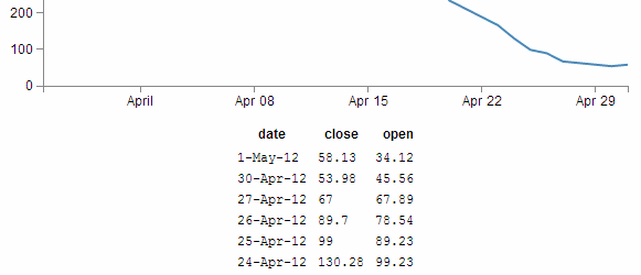
Add an HTML table to your graph
So graphs and graphics are D3’s bread and butter you’d think. Hmm…
Well yes and no.
Yes D3 has extraordinary powers for presenting and manipulating images in a web page. But if you’ve read through the entirety of the d3.js main site (haven’t we all) you will recall that D3 actually stands for Data Driven Documents. It’s not necessarily about the pretty pictures and the swirling cascade of colour. It’s about generating something in a web browser based on data.
This transitions nicely into consideration of adding a table of information that can accompany your graph (it could just as easily (or easier) stand alone, but for the sake of continuity, we’ll use the graph).
What we’ll do is add the data that we’ve used to make our graph under the graph itself. To make sure that it’s all nicely aligned, we’ll place it in a table.
It should end up looking a little like this (and this has been cropped slightly at the bottom to avoid expanding the page with rows of numbers / dates).
The code was drawn from an example provided by Shawn Allen on Google Groups. In fact, the post itself is an excellent one if you are considering creating a table straight from a csv file.
HTML Tables
Tables are made up of rows, columns and data (that goes in each cell). All you need to do to successfully place a table on a web page is to lay out the rows and columns in a logical sequence using the appropriate HTML tags and you’re away.
For example here’s the total HTML code for a web page to display a simple table;
<!DOCTYPE html>
<body>
    <table border="1">
        <tr>
            <th>Header 1</th>
            <th>Header 2</th>
        </tr>
        <tr>
            <td>row 1, cell 1</td>
            <td>row 1, cell 2</td>
        </tr>
        <tr>
            <td>row 2, cell 1</td>
            <td>row 2, cell 2</td>
        </tr>
    </table>
</body>
This will result in a table that looks a little like this in a web browser;
| Header 1 | Header 2 |
| row 1, cell 1 | row 1, cell 2 |
| row 2, cell 1 | row 2, cell 2 |
The entire table itself is enclosed in <table> tags. Each row is enclosed in <tr> tags. Each row has two items which equate to the two columns. Each piece of data for each cell is enclosed in a <td> tag except for the first row, which is a header and therefore has a special tag <th> that denotes it as a header making it bold and centred. For the sake of ease of viewing we have told the table to place a border around each cell and we do this in the first <table> tag with the border="1" statement (although in this book view it may be absent).
There are three main things you need to do to the basic line graph to get your table to display.
- Add some CSS
- Add some table building d3.js code
- Make a small but cunning change…
There is a copy of the code and the data file for this example at github and in the code samples bundled with this book (simple-graph-plus-table.html and data.csv). A live example can be found on bl.ocks.org.
First the CSS
This just helps the table with formatting and making sure the individual cells are spaced appropriately;
td, th {
    padding: 1px 4px;
}
This sets a padding of 1 px around each cell and 4 px between each column.
I’ve placed this portion of CSS at the end of our <style> section.
Now the d3.js code
Oki doki… Hopefully you have a loose understanding of the html layout of a table as explained above, but if not you can always go with the ‘it just works’ approach.
Here’s what we should add into our simple graph example;
function tabulate(data, columns) {
    var table = d3.select("body").append("table")
            .attr("style", "margin-left: 250px"),
        thead = table.append("thead"),
        tbody = table.append("tbody");

    // append the header row
    thead.append("tr")
        .selectAll("th")
        .data(columns)
        .enter()
        .append("th")
            .text(function(column) { return column; });

    // create a row for each object in the data
    var rows = tbody.selectAll("tr")
        .data(data)
        .enter()
        .append("tr");

    // create a cell in each row for each column
    var cells = rows.selectAll("td")
        .data(function(row) {
            return columns.map(function(column) {
                return {column: column, value: row[column]};
            });
        })
        .enter()
        .append("td")
        .attr("style", "font-family: Courier")
            .html(function(d) { return d.value; });

    return table;
}

// render the table
 var peopleTable = tabulate(data, ["date", "close"]);
And we should take care to add it into the code at the end of the portion where we’ve finished drawing the graph, but before the enclosing curly and regular brackets that complete the portion of the graph that has loaded our data.csv file. This is because we want our new piece of code to have access to that data and if we place it after those brackets it won’t know what data to display.
So, right about here;
        // Add the Y Axis
        svg.append("g")
            .attr("class", "y axis")
            .call(yAxis);
                                 // <= Add the code right here!
});
Now, we’re going to break with tradition a bit here and examine what our current state of code produces. Then we’re going to explain something different. THEN we’re going to come back and explain the code…
Check it out…
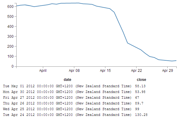
Not quite as we has originally envisaged?
Indeed, the date has taken it upon itself to expand from a relatively modest format of day-abbreviated month-two digit year (30-Apr-12) to a behemoth of a thing (Mon Apr 30 2012 00:00:00 GMT+1200 (New Zealand Standard Time)) that we certainly didn’t intend, let alone have in our data.csv file.
What’s going on here?
Well, To be perfectly frank, I’m not entirely sure. But this is what I’m going to propose. The JavaScript code recognises and deals with the ‘date’ variable as being a date/time. So that when we proceed to display the variable on the screen, the browser says, “this is a date / time formatted piece of data, therefore it must be formatted in the following way”. I had a play with a few ideas to correct it via an HTML formatting instruction, but drew a blank and then I stumbled on another way to solve the problem. Hence the third small but cunning change to our original code.
A small but cunning change…
So… Our table has decided to develop a mind of it’s own and format the date time as it sees fit. Well fair enough (I for one welcome our web time formatting overlords). So how do we convince it to display the values in their natural form?
Well, one solution that we could employ is to not tell the JavaScript that our date value in the data is actually time. In that condition, the code should treat the values as an ordinary string and print it directly as it appears.
The good news is that this is pretty easy to do. Where originally we had a block of data that consisted of date and close, all at different times, we will now add a new variable called date1 which will be the variable that we convert to a time and draw the graph with. Leaving date to be the text string that will be printed in our table.
How to do it?
It’s actually remarkably easy. Just change the following lines in the basic line graph code to amend date to date1 and you’re good to go.
.x(function(d) { return x(d.date1); })
d.date1 = parseDate(d.date);
x.domain(d3.extent(data, function(d) { return d.date1; }));
The middle line is probably the most significant, since this is the point where we declare date1, assign a time format and bring a new column of data into being. The others simply refer to the data.
So we’ll make those small changes and now we can return to explain the d3.js code…
Explaining the d3.js code (reloaded).
So back we come to explain what is going on in the d3.js code that we presented a page or two back. Obviously it’s a fairly large chunk, and we can first break it down into two chunks. The first chunk we’ll look at is in fact the last part of the code that look like this;
// render the table
 var peopleTable = tabulate(data, ["date", "close"]);
This portion simply calls the tabulate function using the date and close columns of our data array. Simply add or remove whichever columns you want to appear in your table (so long as they are in your data.csv file) and they will be in your table. The tabulate function makes up all of the other part of the added code.
So we come to the first block of the tabulate function;
function tabulate(data, columns) {
    var table = d3.select("body").append("table")
            .attr("style", "margin-left: 250px"),
        thead = table.append("thead"),
        tbody = table.append("tbody");
Here the tabulate function is declared (function tabulate) and the variables that the function will be using are specified ((data, columns)). In our case data is of course our data array and columns refers to ["date", "close"].
The next line appends the table to the body of the web page (so it will occur just under the graph in this case). The I do something just slightly sneaky. The line .attr("style", "margin-left: 250px"), is actually not the code that was used to produce the table with the huge date/ time formatted info on. I deliberately used .attr("style", "margin-left: 0px"), for the huge date / time table since it’s job is to indent the table by a specified amount from the left hand side of the page. And since the huge date time values would have pushed the table severely to the right, I cheated and used 0 instead of 250. For the purposes of the final example where the date / time values are formatted as expected, 250 is a good value.
The next two lines declare the functions we will use to add in the header cells (since they use the <th> tags for content) and the cells for the main body of the table (they use <td>).
The next block of code adds in the header row;
    thead.append("tr")
        .selectAll("th")
        .data(columns)
        .enter()
        .append("th")
            .text(function(column) { return column; });
Here we first append a row tag (<tr>), then we gather all the columns that we have in our function (remember they were ["date", "close"] and add them to our row using header tags (<th>).
The next block of code assigns the row variable to return (append) a row tag (<tr>) whenever it’s called …
    var rows = tbody.selectAll("tr")
        .data(data)
        .enter()
        .append("tr");
… and it is in the following block of code…
    var cells = rows.selectAll("td")
        .data(function(row) {
            return columns.map(function(column) {
                return {column: column, value: row[column]};
            });
        })
        .enter()
        .append("td")
        .attr("style", "font-family: Courier")
            .html(function(d) { return d.value; });
… where we select each row that we’ve added (var cells = rows.selectAll("td")). Then the following five lines works out from the intersection of the row and column which piece of data we’re looking at for each cell.
Then the last four lines take that piece of data (d.value) and wrap it in table data tags (<td>) and place it in the correct cell as HTML.
It’s a very neat piece of code and I struggle to get my head around it, but that doesn’t mean that I can’t appreciate the cleverness of it :-).
Wrap up
So there we have it. Hopefully enough to explain what is going on and perhaps also enough to convince ourselves that D3 is indeed more than just pretty pictures. It’s all about the Data Driven Documents.
This file has been saved as table-plus-graph.html and has been added into the downloads section on d3noob.org with the general examples files.
More table madness: sorting, prettifying and adding columns
When we last left our tables they were happily producing a faithful list of the data points that we had in our graph.
But what if we wanted more?
From the original contributors that bought you tables (Shawn Allen on Google Groups) and some neat additions from Christophe Viau comes extra coolness that I didn’t include in the previous example :-).
There is a copy of the code and the data file for this example at github and in the code samples bundled with this book (simple-graph-plus-table-plus-addins.html and data2.csv). A live example can be found on bl.ocks.org.
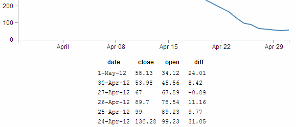
Add another column of information:
Firstly, lets add another column of data to our table. To do this we want to have something extra in our csv file to use, so let’s resurrect our old friend data2.csv that we used for the graph with two lines previously. All we have to do to make this a reality is change the reference that loads data.csv to data2.csv here;
d3.csv("data2.csv", function(error, data) {
From here (and as promised in the previous chapter), it’s just a matter of adding in the extra column you want (in this case it’s the open column) like so;
var peopleTable = tabulate(data, ["date", "close", "open"]);
So can we go further?
You know we can…
In the section where we get our data and format it, lets add another column to our array in the form of a difference between the close value and the open value (and we’ll call it diff).
d3.csv("data2.csv", function(error, data) {
        data.forEach(function(d) {
                d.date1 = parseDate(d.date);
                d.close = +d.close;
                d.open = +d.open;  //  <= added this for tidy house keeping
                d.diff = Math.round(( d.close - d.open ) * 100 ) / 100;
        });
(the Math.round function is to make sure we get a reasonable figure to display, otherwise it tends to get carried away with decimal places)
So now we add in our new column (diff) to be tabulated;
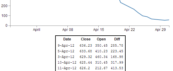
var peopleTable = tabulate(data, ["date", "close", "open", "diff"]);
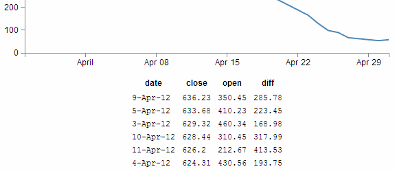
Sorting on a column
So now with our four columns of awesome data, it turns out that we’re really interested in the ones that have the highest close values. So we can sort on the close column by adding the following lines directly after the line where we declare the peopleTable function (which I will include in the code snipped below for reference).
var peopleTable = tabulate(data, ["date", "close", "open", "diff"]);

peopleTable.selectAll("tbody tr")
        .sort(function(a, b) {
                return d3.descending(a.close, b.close);
        });
Which works magnificently;
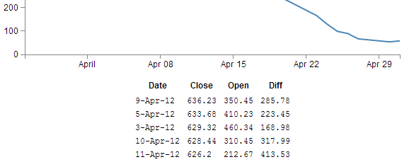
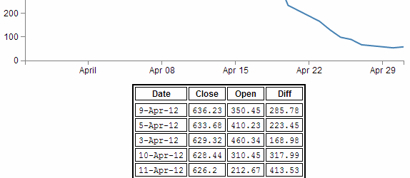
Prettifying (actually just capitalising the header for each column)
Just a little snippet that capitalises the headers for each row to make them look slightly more authoritative.
Add the following lines of code directly below the block that you just added for sorting the table;
 peopleTable.selectAll("thead th")
        .text(function(column) {
                return column.charAt(0).toUpperCase() + column.substr(1);
        });
This is quite a tidy little piece of script. You can see it selecting the headers (selectAll("thead th")), then the first character in each header (column.charAt(0)), changing it to upper-case (.toUpperCase()) and adding it back to the rest of the string (+ column.substr(1)).
With the ultimate result…
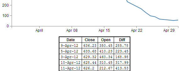
Add borders
Sure our table looks nice and neatly arranged, but would a border look better?
Well, here’s one way to do it;
All we need to do is add a border style to our table by adding in this line here;
function tabulate(data, columns) {
    var table = d3.select("body").append("table")
            .attr("style", "margin-left: 200px") // <= Remove the comma
            .style("border", "2px black solid"), // <= Add this line in
        thead = table.append("thead"),
        tbody = table.append("tbody");
(don’t forget to move the comma from the end of the margin-left line)
And the result is a tidy black border.
OK, so what about the individual cells?
No problem.
If we remember back to our CSS that we added in, we’ll just tell each cell that we want a 1 pixel border buy amending the CSS for our table to this;
td, th {
    padding: 1px 4px;
    border: 1px black solid;
}
So now each cell has a slightly more subtle border like this;
Yikes! Not quite as subtle as I would have expected. I suppose it’s another example of the code actually doing what you asked it to do. No problem, border-collapse to the rescue. Add the following line into here;
function tabulate(data, columns) {
    var table = d3.select("body").append("table")
            .attr("style", "margin-left: 200px")
            .style("border-collapse", "collapse")   // <= Add this line in.
            .style("border", "2px black solid"),
        thead = table.append("thead"),
        tbody = table.append("tbody");
How does that look?
Ahh…. Much more refined.
Adding web links to d3.js objects
The idea with this tip / trick is to be able to add a ‘link’ to an object so that when you click on it, it takes you to a web page that we will pre-define.
We are going to generate a simple rectangle with some text and look at linking from the rectangle and the text separately and with some fanciness at the end :-).
The end result will be something that looks a little like this;
(Notice the little pointing finger at the bottom that would indicate that there actually is a link there.)
The code that we will use as a starting point is this simple example that draws a green rectangle and overlays some text on it;
<!DOCTYPE html>
<meta charset="utf-8">

<body>

<!-- load the d3.js library -->
<script src="http://d3js.org/d3.v3.min.js"></script>

<script>

var width = 449;
var height = 249;
var word = "gongoozler";

var holder = d3.select("body")
      .append("svg")
      .attr("width", width)
      .attr("height", height);

// draw a rectangle
holder.append("rect")
    .attr("x", 100)
    .attr("y", 50)
    .attr("height", 100)
    .attr("width", 200)
    .style("fill", "lightgreen")
    .attr("rx", 10)
    .attr("ry", 10);

// draw text on the screen
holder.append("text")
    .attr("x", 200)
    .attr("y", 100)
    .style("fill", "black")
    .style("font-size", "20px")
    .attr("dy", ".35em")
    .attr("text-anchor", "middle")
    .text(word);

</script>

</body>
There’s nothing too spectacular about the file. There’s a little bit of styling and tweaking of attributes, but nothing too extreme. The only slightly ‘odd’ part would be defining the word that is printed out as a variable (var word = "gongoozler";) and then adding it as a variable (.text(word);) instead of just putting the word directly in there (which we could do like this .text("gongoozler");). We’re going to do this deliberately to explore additional options for making our links a little more dynamic.
It’s all about the ‘a’ and the ‘xlink’
The <a> tag in an HTML file defines a hyperlink. Items bounded by an <a> tag will become a link to another web address. So what we will do is create an <a> tag and then append our d3.js, svg object to it.
Of course as well as including a link, we need to tell it where to go. We do this by setting the xlink:href attribute for our tag to point to a specific page. Xlink is short for XML Linking Language and it is used to create hyperlinks in XML documents. In our case we will be defining the link that we will want our user to go to.
Adding in the links
The following is the adjusted code for our rectangle that adds in the <a> tag with the xlink:href attribute.
holder.append("a")
    .attr("xlink:href", "http://en.wikipedia.org")
    .append("rect")
    .attr("x", 100)
    .attr("y", 50)
    .attr("height", 100)
    .attr("width", 200)
    .style("fill", "lightgreen")
    .attr("rx", 10)
    .attr("ry", 10);
It’s important to append the link before the object (otherwise it won’t work) but other than that, it’s a pretty simple job.
The only fly in the ointment is that while we now have a rectangle that links to Wikipedia, if we hover our mouse over the text, we lose our link (since we haven’t told the text to link anywhere).
We can remedy that by doing exactly the same thing with the text element;
holder.append("a")
    .attr("xlink:href", "http://en.wikipedia.org/wiki/"+word)
    .append("text")
    .attr("x", 200)
    .attr("y", 100)
    .style("fill", "black")
    .style("font-size", "20px")
    .attr("dy", ".35em")
    .attr("text-anchor", "middle")
    .text(word);
The only slight difference here is that we have used the address for Wikipedia as our base and added the variable for our word to the end of it so that the resulting web address takes us to Wikipedia and the specific page for the word ‘gongoozler’. Hopefully this will indicate that if we had a set of variables in an array we would make our links a little more dynamic.
Making the mouse pointer ignore an object
So in theory we’re done, but in practice this has been a slightly crude method for adding what should be a single link to two objects when we should be able to accomplish it by defining the link once.
What we could do as an alternative to linking both the rectangle and the text using two separate links is to make the mouse ignore the text and have it rely solely on the rectangle. We can do this using the pointer-events style when drawing our text. By setting it to none we are instructing our mouse to ignore any potential interaction with the text when it hovers over it and instead the pointer will register the link on the rectangle below it.
The code for the text therefore becomes…
holder.append("text")
    .attr("x", 200)
    .attr("y", 100)
    .style("fill", "black")
    .style("font-size", "20px")
    .attr("dy", ".35em")
    .attr("text-anchor", "middle")
    .style("pointer-events", "none")
    .text(word);
And as you can see from the image below, the pointer will happily ignore the text while reading the link from the rectangle.
The complete code for this example is available in the appendices and a live version can be found on bl.ocks.org and GitHub. The code is also in the downloadable files available from Leanpub with the book in a file called ‘xlink-rect&pointerevents.html’.
Understanding JavaScript Object Notation (JSON)
One of the most useful things you might want to learn when understanding how to present your data with D3 is how to structure your data so that it is easy to use.
As explained earlier in the book, there are several different types of data that can be requested by D3 including text, Extensible Markup Language (xml), HyperText Markup Language (html), Comma Separated Values (csv), Tab Separated Values (tsv) and JavaScript Object Notation (json).
Comma separated values and tab separated values are fairly well understood forms of data. They are expressed as rows and columns of information that are separated using a known character. While these forms of data are simple to understand, it is not easy to incorporate a hierarchy structure to the data, and when you try, it isn’t natural and makes managing the data difficult.
JavaScript Object Notation (JSON) presents a different mechanism for storing data. A light weight description could read “JSON is a text-based open standard designed to present human-readable data. It is derived from the JavaScript scripting language, but it is language and platform independent.”
Unfortunately, when I first started using JSON, I struggled with the concept of how it was structured, in spite of some fine descriptions on the web (start with http://www.json.org/ in my humble opinion). So the following is how I came to think of and understand JSON.
In the following steps we’ll go through a process that (hopefully) demonstrates that we can transform identifiers that would represent the closing price for a stock of 58.3 on 2013-03-14 into more traditional x,y coordinates.
I think of data as having an identifier and a value.
identifier: value
If a point on a graph is located at the x,y coordinates 150,25 then the identifier ‘x’ has a value 150.
"x": 150
If the x axis was a time-line, the true value for ‘x’ could be “2013-03-14”.
"x": "2013-03-14"
This example might look similar to those seen by users of d3.js, since if we’re using date / time format we can let D3 sort out the messy parts like what coordinates to provide for the screen.
And there’s no reason why we couldn’t give the ‘x’ identifier a more human readable label such as “date”. So our data would look like;
"date": "2013-03-14"
This is only one part of our original x,y = 150,25 data set. The same way that the x value represented a position on the x axis that was really a date, the y value represents a position on the y axis that is really another number. It only gets converted to 25 when we need to plot a position on a graph at 150,25. If the ‘y’ component represents the closing price of a stock we could take the same principles used to transform…
"x": 150
… into …
"date": "2013-03-14"
… to change ….
"y": 25
… into …
"close": 58.3
This might sound slightly confusing, so try to think of it this way. We want to plot a point on a graph at 150,25, but the data that this position is derived from is really “2013-03-14”, 58.3. D3 can look after all the scaling and determination of the range so that the point gets plotted at 150,25 and our originating data can now be represented as;
"date": "2013-03-14", "close": 58.3
This represents two separate pieces of data. Each of which has an identifier (“date” or “close”) and a value (“2013-03-14” and 58.3)
If we wanted to have a series of these data points that represented several days of closing prices, we would store them as an array of identifiers and values similar to this;
{ "date": "2013-03-14", close: 58.13 },
{ "date": "2013-03-15", close: 53.98 },
{ "date": "2013-03-16", close: 67.00 },
{ "date": "2013-03-17", close: 89.70 },
{ "date": "2013-03-18", close: 99.00 }
Each of the individual elements of the array is enclosed in curly brackets and separated by commas.
Now that we have an array, we can apply the same rules to it as we did the the item that had a single value. We can give it an identifier all of its own. In this case we will call it “data”. Now we can use our identifier: value analogy to use “data” as the identifier and the array as the value.
{ "data": [
  { "date": "2013-03-14", close: 58.13 },
  { "date": "2013-03-15", close: 53.98 },
  { "date": "2013-03-16", close: 67.00 },
  { "date": "2013-03-17", close: 89.70 },
  { "date": "2013-03-18", close: 99.00 }
] }
The array has been enclosed in square brackets to designate it as an array and the entire identifier: value sequence has been encapsulated with curly braces (much the same way that the subset “date”, “close” values were enclosed with curly braces.
If we try to convey the same principle in a more graphical format, we could show our initial identifier and value for the x component like so;
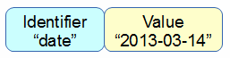
The we can add our additional component for the y value;
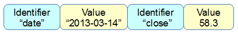
We can then add several of these combinations together in an array;
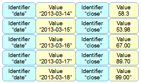
Then the array becomes a value for another identifier “data”;
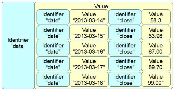
More complex JSON files will have multiple levels of identifiers and values arranged in complex hierarchies which can be difficult to interpret. However, laying out the data in a logical way in a text file is an excellent way to start to make sense of the data.
Using the Yahoo Query Language (YQL) to get data.
One of the things that I find frustrating is difficulty getting data to play with. Often I will find myself thinking “It would be neat to see if this technique works” but then I spend a couple of hours looking for data that will be appropriate.
Another difficulty is that access to dynamic data is also problematic. D3.js really shines when displaying information that is changing and interactive. Finding data that is changing and which you can interact with is not easy.
Then, when you do come across a web site that has an interesting data set, accessing that data becomes programmatically difficult because of restrictions in accessing information that crosses domains. A solution to this problem (and there are a few) is to have a data set that is in a domain that permits Cross-Origin Resource Sharing (CORS). These are not as common as you might hope as it presents security concerns that need to be addressed.
One resource that I have come across is particularly useful for solving the problems outlined above is the Yahoo! Developer Network which operates a service where you can write a query in an SQL type fashion that will return data in json (or others) format. This query can be formed into an http request so that you can simply paste a generated URL directly into your browsers URL bar and it will return the requested data. Better than that, because it supports CORS (and because d3.js can manage a CORS request without breaking a sweat) all you need to do is put the URL into you code (as a d3.json call for example) and you will be up and running.
In the ‘Examples’ chapter there will be several examples that use YQL queries to retrieve data as is is a great resource.
YQL by example
I will use an example of looking for current weather information for Wellington New Zealand from the Weather Underground (wunderground).
In this example, we’re interested in retrieving a JSON ‘blob’ that contains data on the weather conditions (temperature, wind speed / direction, humidity etc) for a specific location.
Start at the page for the console (http://developer.yahoo.com/yql/console/). On the left there is a range of data ‘topics that you can choose from. We will want to access one of the community tables, so select ‘Show Community Tables’ and scroll down the list until you find ‘wunderground’ and ‘wunderground.currentobservation’
This will bring up a query in the console that is looking for the current weather from San Francisco International airport.
For our example we want to be a bit more specific, so we replace the ‘SFO’ ‘location’ with ‘Wellington, New Zealand’.
If you then click on the ‘Test’ button the query will run and results will be presented in the box below it;
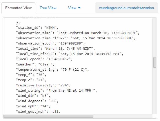
If that looks like the results you were expecting, fantastic!
The next gem from YQL is the REST query that is automatically generated at the bottom of the page;
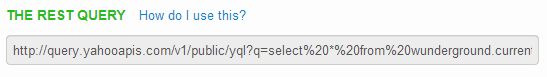
If you select this query and past it in your URL bar, you will have the JSON data returned into your browser.
At this point it might seem a bit confusing, and if you’re unfamiliar with how JSON based data sets are structured it will DEFINITELY be confusing (You will need to do some research to get up to speed there). My advice is to first understand a bit about JSON and then examine the output from the REST query in the developer console on your browser (this is a fairly long topic in itself, so I will not cover it here sorry). Additionally check out the ‘Examples’ chapter for real world usage.
If you are comfortable with understanding how the data can be encoded, it is then just a matter of including the REST query in your call when selecting data using d3.json and you will be away.
Please check out the examples I will include in the ‘Examples’ chapter for a deeper look at the use of the data with d3.js (This will also help with understanding the JSON structure).
Using Plunker for development and hosting your D3 creations.
Recently Mike Bostock recommended ‘Plunker’ (http://plnkr.co/) as a tool for saving work online for collaboration and sharing. Although I had a quick look, I didn’t quite ‘get it’ and although it looked like something that I should be interested in, I (foolishly) moved on to other things.
Quite frankly I should have persevered.
Plunker is awesome.
So what can it do for you?
Well, in short, this gives you a place to put your graphs on the web without the hassle of needing a web server as well as allowing others to view and collaborate! There are some limitations to hosting graphs in this environment, but there’s no denying that for ease of use and visibility to the outside world, it’s outstanding!
Time for an example. I’ll try to go through the process of implementing the simple graph example on Plunker.
So it’s as simple as going to http://plnkr.co/edit/
What you’re seeing here is an area where you can place your entire HTML code. So let’s replace the 11 lines of the place holder code with the simple graph example (just copy and paste it in there over the top of the current 11 lines);
Now, there are two important things we have to do before it will work.
- We need to tell he script where to find d3.js
- We need to make our data accessible
Helping the script find d3.js is nice and easy. Just replace this line in your plunk;
<script type="text/javascript" src="d3/d3.v3.js"></script>
…with this line…
<script src="http://d3js.org/d3.v3.min.js"></script>
That will allow your plunk to use the version of d3.js that is hosted on d3js.org (it uses the minimised version (which is why it has the ‘min’ in it), but never fear, it’s still d3, just distilled to enhance the flavour :-)).
Making our data available is only slightly more difficult.
In experimenting with Plunker, I found that there appears to be something ‘odd’ about accessing tab separated values (in the data.tsv file), however, D3 to the rescue! We can simply use Comma Separated Values (csv) instead.
We will host our data.csv file on plunker as well and there is built in functionality to let us do it.
In the top left hand corner, beside the ‘FILES’ note, there is a ‘+NEW…’ section. Clicking on this will allow you to create another file that will exist with your plunk for its use, so let’s do that.
This will open a dialogue box that will ask you to name your new file.
Enter the name data.csv.
Now another file has appeared under the ‘Files’ heading called data.csv. Click on it.
This now shows us a blank file called data.csv, so now open up your data.csv file in whatever editor you’re using (I don’t think a spreadsheet program is going to be a good idea since I doubt that it will maintain the information in a textual form as we’re wanting it to do. So it’s Geany for me). Copy the contents of your local data.csv file and paste it into the new plunker data.csv file.
So now we have our data in there we need to tell our JavaScript where it is. So go back to the ‘index.html’ file (which is our simple graph code) and edit the line which finds the data.tsv file from this
d3.tsv("data/data.tsv", function(error, data) {
… to this …
d3.csv("data.csv", function(error, data) {
Because we’re using relative addressing, and plunker stores the files for the graphing script and the data side by side, we just removed the portion of the address that told our original code to look in the ‘data’ directory and told it to look in the current directory. And that should be that!
Now if you look on the right hand side of the screen, there is a little eye icon. If you click on it, it opens up a preview window of your file in action and viola!
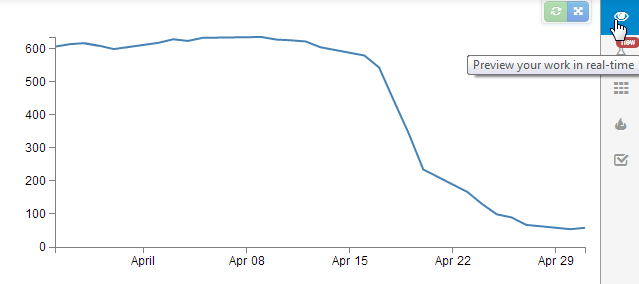
If the graph doesn’t appear, go through the steps outlined above and just check that the edits are made correctly. Unfortunately I haven’t found a nice mechanism for troubleshooting inside Plunker yet (not like using F12 on Chrome).
But wait! There’s more!
If you now click on the ‘Save’ button at the top of the screen, you will get some new button options.
One of them is the orange one for showing off your work.
If you click on this, it will present you with several different options.
The first one is a link that will give others the option to collaborate on the script.
The second is a link that will allow others to preview the work; http://embed.plnkr.co/QSCkG8Rf2qFgrCqq7Vfn
The last will allow you to embed your graph in a separate web page somewhere. Which I’ve tested with blogger and seems to work really well! (see image below).
So, I’m impressed, Nice work by Plunker and it’s creator Geoff Goodman.