Dashboards
A dashboard is at the heart and soul of a monitoring system. There are plenty of other seriously important aspects, but as human beings, we have a considerable talent for considering a great deal of information quickly from an image. The key with doing that effectively is to present the information in a way that is logical and provides clarity to the data.
Overview
One of Grafana’s significant strengths is its ability to be able to present data in a flexible way. The support for adding different ways of illustrating metrics and for customising the look and feel of those visualisations is one of the defining advantages to using Grafana and a reason for its popularity.
In this section we will look at the individual panels that are used to build dashboards and how they might be employed for best effect.
New Panel
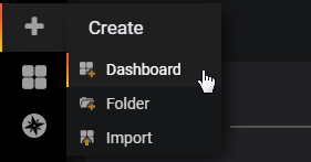
To start the process of creating our own dashboard we need to use the create menu from the left hand side of the screen (it’s a plus (‘+’) sign).
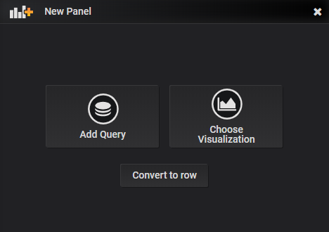
That will then give us the potion of starting the process of sorting out our data and then worrying about the visualisation method or choosing the visualisation method and then assigning the data. Both methods are valid for different situations, but for the sake of demonstrating different options for maximum effect, let’s take a look at the visualisation options. From the new panel window choose ‘Add Query’
Each panel has up to four different configuration options depending on the visualisation type selected
- Query: Where our data source can be specified and adapted for our use
- Visualization: Where we select from the range of panel options
- General: For applying a custom title to the panel and linking to other panels
- Alerts: where we can set up alerts for notifications
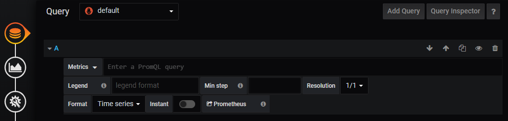
Query Options
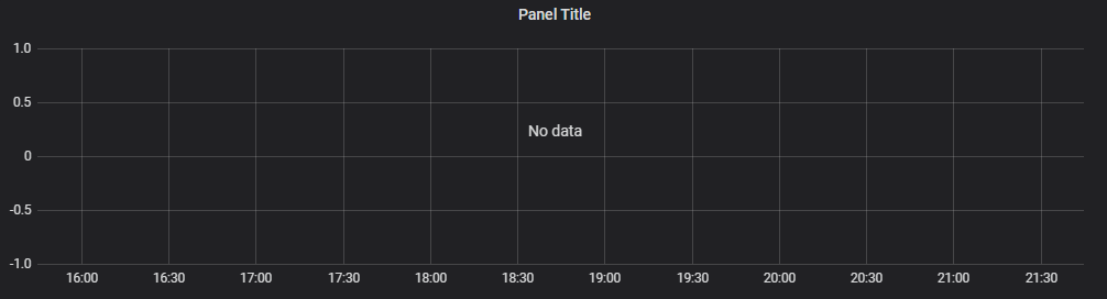
If we start from the ‘Query’ section, there will be a default graph type placed on the screen for the sake of having something there that will show some graphical goodness.
Our query options are shown directly underneath and represent our doorway to our data sources
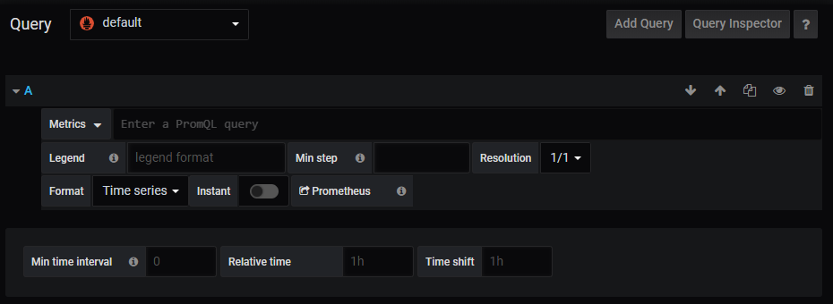
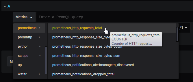
The default source in this case is Prometheus and it has already been selected.
We can add several different queries to a panel which is why there is an ‘A’ at the start of the options. Directly under this is our ‘Metrics’ drop-down menu. To put something interesting on the screen, select ‘metrics > prometheus > prometheus_http_requests_total’.
This will (depending on how long our instance of Prometheus and Grafana have been running) show some nice looking lines in our default panel above our query.
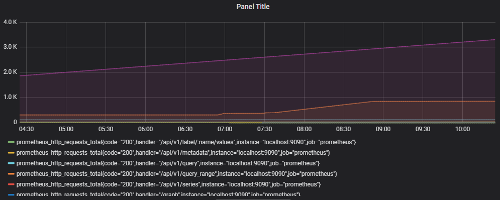
This graph is showing us the number of http requests that have been accumulating. This in turn has been broken down according to the code, handler, instance and job which we can see under the graph.
Now, this additional information is one of the strengths of Grafana. By asking for a particular metric, we have a number of data series that can be used in comparison. Alternatively, we might want to narrow down what we see via our query.
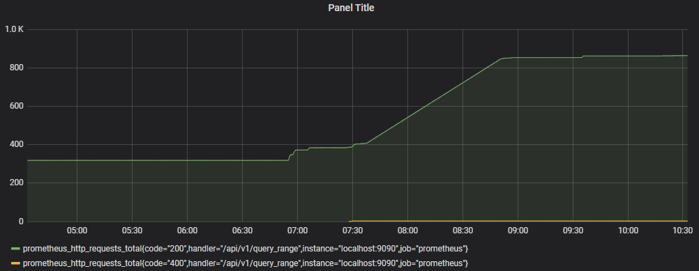
For example, if we wanted to just see http requests that were associated with the ‘/api/v1/query_range’ handler we would change our query from;
… to …
We will notice as we type in the curly brackets in the query box, Grafana helps out by showing the options we have to select from.
This then leaves us with a graph with only two lines on it;
If we wanted to go further, we could filter by an additional label by separating our ‘handler’ qualifier from an additional one with a comma. Eg;
The query options are very powerful for selecting, adapting and filtering the information that we want to see.
Visualization Options
Selecting ‘Visualization’ will start the process of creating a panel by choosing the type of graphical display. The default that will come up is the traditional ‘Graph’.
Under this is the range of current (as of version 6.6.0) visualisation options.
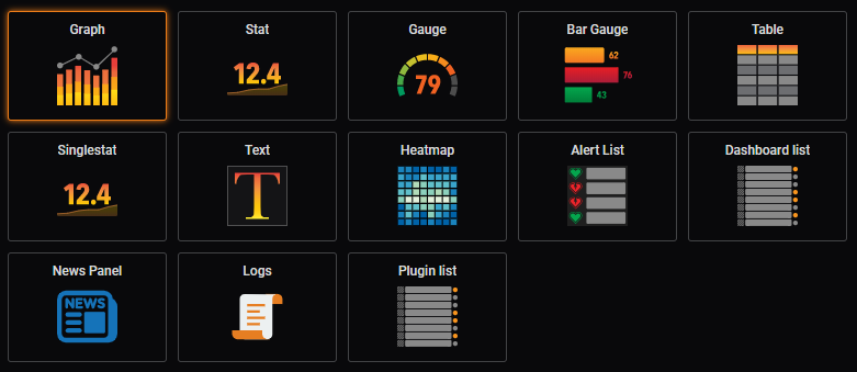
They represent;
- Graph: A traditional line / bar / scatterplot graph.
- Stat: Displays a single reading and includes a sparkline
- Gauge: A single gauge with thresholds
- Bar Gauge: A space efficient gauge using horizontal or vertical bars
- Table: Shows multiple data points aligned in a tabular form
- Singlestat: Displays a single reading from a metric
- Text: For displaying textural information
- Heatmap: Can represent histograms over time
- Alert List: Shows dashboard alerts
- Dashboard List: Provides links to other dashboards
- News Panel: Shows RSS feeds
- Logs: Show lines from logs.
- Plugin List: Shows the installed plugins for our Grafana instance
Graph
As we discussed earlier, the ‘Graph’ panel is the default starting point when selecting ‘Choose Visualisation’ from the panel menu. I think that it’s fair to say that there’s a good reason for that. Time series data is well suited to this form of display and the Graph panel provides plenty of options for customisation.
To get a feel for the different Graph options we need to load some data via the query menu (I know that this seems like perhaps we should have selected ‘Add Query’ first, but how else would we have looked at all the pretty panel option icons?)
Click on the ‘Metrics’ menu and select something appropriately interesting looking. In my case I’ve picked ‘Weather -> weather_outside_temperature_C’
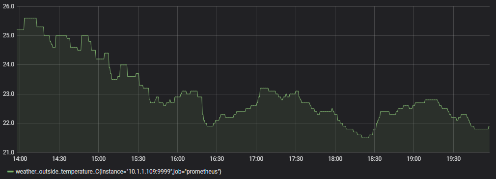
And there is our graph! It really is pretty easy.
Take a moment to experiment with the query options under the graph.
Now go back to the Visualisation menu. With some data we can now see the impact of experimenting with the controls for changing the appearance of the graphs.
Look at the ‘Draw Modes’. This will allow us to transform between the line graph that we already have to bars or points.
In the ‘Axes’ section change the ‘Mode’ for the ‘X-Axis’ from ‘Time’ to ‘Histogram’ to ‘Series’ this provides options for binning data depending on different dimensions.
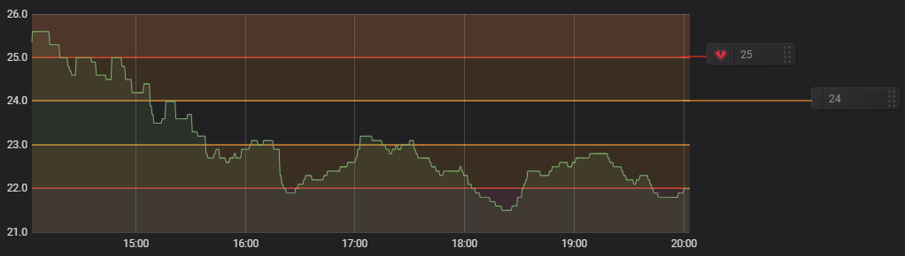
Also have a look at the ‘Thresholds & Time Regions’ section. Here we can provide some useful context for the audience as to what expected operational limits might be.
The example below has set thresholds for acceptable, operation. Above 24 is a warning, above 25 is critical. Below 23 is also a warning and below 22 is critical.
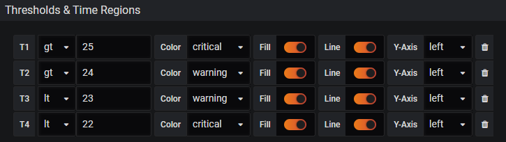
Sure, it’s contrived in our example, but it illustrates the usefulness of the option.
Stat
The ‘Stat’ panel is intended to replace the ‘Singlestat’ panel. The reason for this is that it has been built with integrated features that tie in the overall infrastructure for Grafana and maintains a common option design.
It is primarily designed to display a single statistic from a series. This could be a maximum, minimum, average or sum of values, or indeed the latest value available.
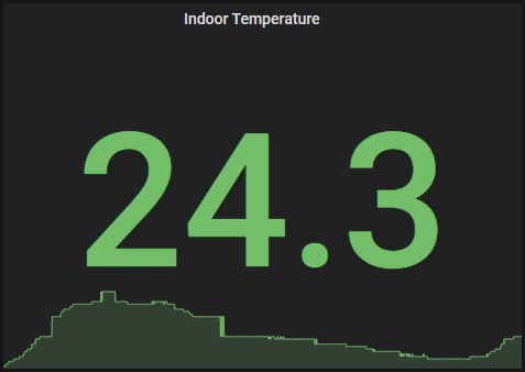
We will demonstrate useful features of the visualisation type by adding a stat panel to display temperature.
To make a start I have selected a data source query that shows inside temperature from a weather station.
From here select the ‘Stat’ visualisation type.
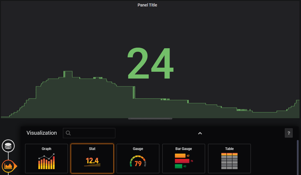
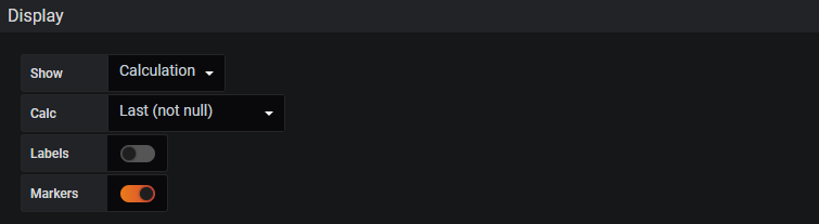
Automatically we can see that our display shows a prominent value for our panel and a representative ‘sparkline’ as an indication of the metrics change over time.
We can see from the ‘Display’ options that the value presented is the mean of the metrics. If we wanted to show some other option there we could select something like min, max or latest (i.e, what it the temperature now). I’m more interested in the current temperature, so will select ‘Last’.
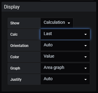
From the ‘Display’ options we can also turn off the background graph if desired as well as several other features.
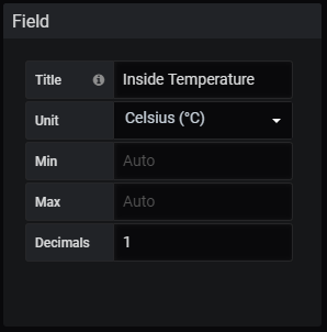
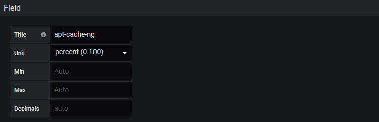
The Field option will allow us to add units to our value and to get a little more granularity by showing how many decimal places we want to show.
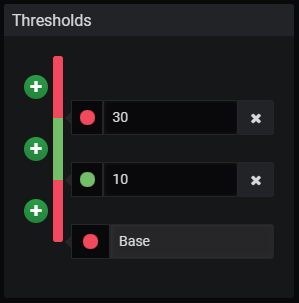
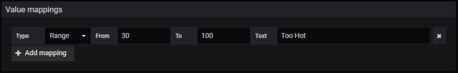
Thresholds are a great way to provide more context for our visualisation. In this instance I’d like to show the figure as red if the temperature is below 10 degrees or above 30 degrees
As an alternative to the thresholds, we could use value mapping to convert any temperature above 30 degrees to the text ‘Too Hot’ using the ‘Value mappings’ option;
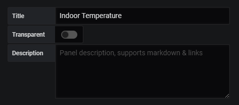
From the ‘General options tab / icon we can change the title of our panel to something appropriate.
Save our dashboard and we’re done!
Gauge
The gauge visualization is a form of singlestat with the addition of a visualisation of the value presented in context with expected limits.
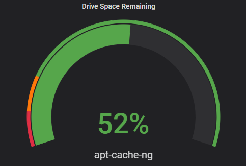
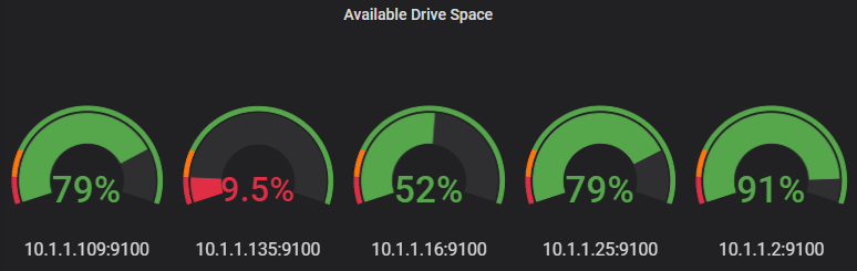
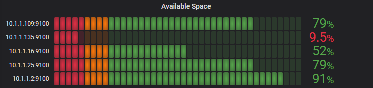
In the gauge example above we are presented with the amount of drive space remaining on the apt-cache-ng server where there are limits set to denote warning and critical values.
The example is derives from the metrics sourced from the node_exporter exporter on a server.
In this case, because we want to present a percentage of free space we need to know what the amount of space available is and the amount of space free.
Luckily, node_exporter has just those metrics available as node_filesystem_size_bytes and node_filesystem_avail_bytes. So while the visualisation type will be gauge, the first thing we really want to do is to establish our query.
In the query menu option area, we will be using a query that will take the form of 100 * (available space / total space)
This will look something like the following (it should be one contiguous line, but I have placed it across different lines here to prevent random line-breaks);
100*(
  node_filesystem_avail_bytes{fstype="ext4",instance="10.1.1.16:9100"}
  /
  node_filesystem_size_bytes{fstype="ext4",instance="10.1.1.16:9100"}
)
As astute readers you will also have noticed that I have narrowed down the returned data so that is only includes one device (via the IP address) and only for one file system type (ext4). This will return only a single graph of our desired server. Alternatively, by removing the ‘instance-"10.1.1.19:9100"’ we can show the remaining space in all the servers that we are monitoring;
In the ‘Visualization’ options area, we will want to make sure that we display the last reading;
We will also provide a title to our gauge so that we know what the reading is associated with and we will assign it a unit of ‘percent’.
Finally we will set some thresholds that will provide a clear indication when the percentage of available storage has fallen below levels that we might deem acceptable.
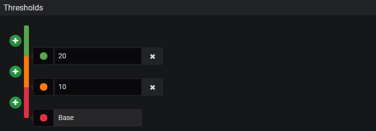
Above we can see that anywhere from our base value (which for the units of percentage is 0) to 10% will be red. Between 10 and 20 we will represent it as orange and between 20 and 100 (again, the percentage units help out) we will have green.
Bar Gauge
The bar gauge is almost a duplication of the gauge visualisation, with the exception that there are some different options available to represent the bars.
In the same way that we represented multiple gauges in the ‘Gauge’ example, our bar gauge will show an arguably more compact variation of the same principle. The example is the default ‘Retro LCD’ mode.
Alternative modes are gradient;
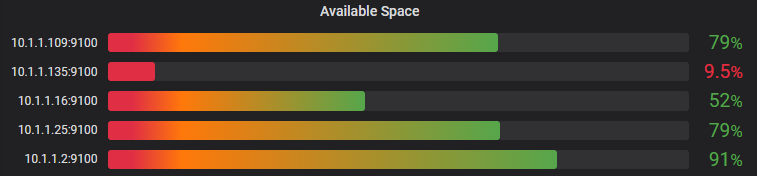
… and ‘Basic’
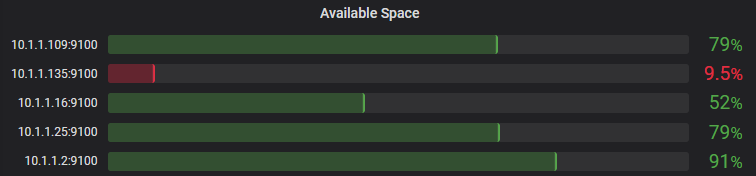
Any one of which would be acceptable.
Table
The ‘Table’ panel allows for the visualisation of time series information and log / event date in a table format. This allows for a better view of the exact value of data points in a series at the expense of providing a view of larger amounts of data or trends over longer periods of time.
Individual cells for the table can be coloured depending on the value of the displayed metric.
Singlestat
The ‘Singlestat’ visualisation is a legacy version of the ‘Stat’ visualisation. They are able to produce pretty much the same display, but go about it in slightly different way. The good folks at Grafana have said that the ‘Stat’ visualization is the way forward, so opt for that.
Text
The ‘Text’ panel allows us to add fixed textural information that can be useful for dashboard users.
Heatmap
‘Heatmap’s as implemented in Grafana provide the facility to view changes in a histogram over time.
Dashboard List
The ‘Dashboard List’ panel is an area that provides the ability to display links to other dashboards. The displayed list can be in the form of dashboards that have been ‘starred’ as a favourite or recently viewed. It can also employ a search element.
News Panel
We can add our favourite RSS feeds as a panel. There may be problems satisfying CORS restriuctions, in which case it is possible to use a proxy.
For example, if the BBC feed at http://feeds.bbci.co.uk/news/world/rss.xml didn’t work we can add a proxy to the front such as https://cors-anywhere.herokuapp.com/http://feeds.bbci.co.uk/news/world/rss.xml
Logs
A ‘Logs’ panel can display log entries from data sources such as Elastic, Influx, and Loki. It is possible to use the queries tab to filter the logs shown or to include multiple queries and have then merged.
General
If we go down to the ‘General’ menu we can see the option to change the title of our graph.
Alerting
If you quickly click along the list of different visualisation types, you will notice that the ‘Graph’ panel has one particular difference to all the others. The menu options down the left hand side include one option that is unique. The ‘Alert’ option.
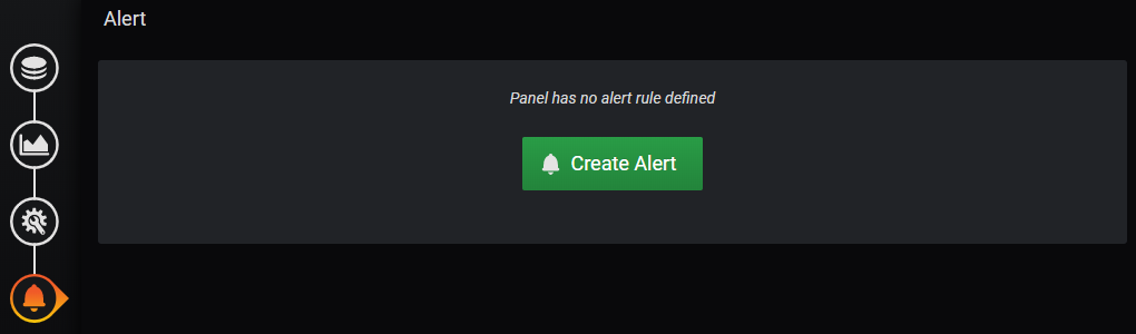
Alerts allow us to set limits on our graphs such that when they are exceeded, we can send out notifications (we could for instance have one that indicated a drop in temperature that sent an alert to let you know to cover up delicate seedlings or an increase in used disk space that indicated a problem on a computer.
Looking at a graph of data that represents the depth of water in a water tank, let’s step through the process of initiating an alert if the water depth goes below 1m.
First we would click on the ‘Create Alert’ button.
This then allows us to set up our rule and the conditions under which it can alert.
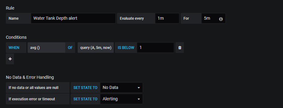
The image above shows that the water depth will be every minute for 5 minutes. That means that Grafana will look for the condition every minute. If our condition is violated for 5 consecutive minutes it will have been adjudged as having met the threshold for sending a notification.
Under that we can see the condition being set as the average of the readings in the last 5 minutes being less than 1 metre.
Now we’ll need to do a bit of behind the scene configuration
To enable email notifications we will edit a config file. It will be in different places or even named differently depending on how you installed Grafana. If we had done so via a deb or rpm package it would be at /etc/grafana/grafana.ini. However, as we installed it as a pre-prepared binary it is in the grafana directory in our home directory and in this case as it is a pretty clean stock install I’m going to use the defaults.ini file.
Open the file and in the ini file change the SMTP area change the settings to something like the following using your username and password details. The below settings are for a Gmail notification and as such others will differ. For a Gmail account, to make life a little easier (and less secure -Beware! - ) you will want to set your account to allow less secure apps and to disable 2 factor authentication.
#################################### SMTP / Emailing #####################[smtp]enabled = truehost = smtp.gmail.com:587user = somepiuser# If password contains # or ; wrap it in triple quotes. """#password;"""password ="""mypassword"""cert_file =key_file =skip_verify = falsefrom_address = admin@grafana.localhostfrom_name = Grafanaehlo_identity =[emails]welcome_email_on_sign_up = falsetemplates_pattern = emails/*.html
For this to take effect we need to restart Grafana;
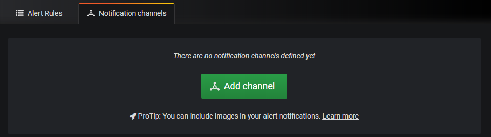
Now we want to set up a new notification channel.
From our alerting menu (look for the ‘bell’ icon), select ‘Add Channel’;
Now we can configure our notification channel. In the case below we are sending an email to the address that is blurred out and the name of the channel is ‘Gmail Alert’
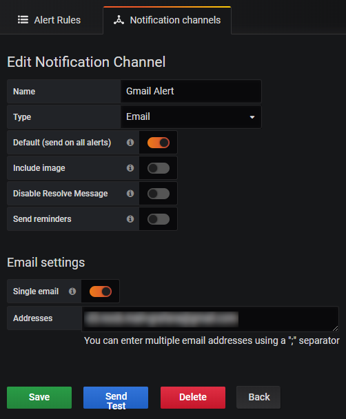
It’s a good idea to test that it works and you can do that from here using the ‘Send Test’ button.
If things don’t go well for the test, check out syslog (/var/log/syslog) for clues to the error.
Then we can set the notification in our graph panel.
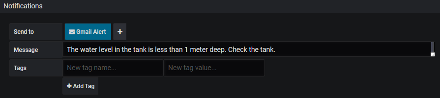
We can see that our ‘Gmail Alert’ notification is selected. We have also set a message to be sent to tell us that the water is too low.