Residuals, variation, diagnostics
Watch this video before beginning
Residuals
Recall from Chapter 6 that the vertical distances between the observed data points and the fitted regression line are called residuals. We can generalize this idea to the vertical distances between the observed data and the fitted surface in multivariable settings.
To be specific, recall our linear model, which was specified as \(Y_i = \sum_{k=1}^p X_{ki} \beta_j + \epsilon_{i}\). Throughout this lecture, we’ll also assume that \(\epsilon_i \stackrel{iid}{\sim} N(0, \sigma^2)\), even though this assumption isn’t necessary for the definition of the residuals.
We define the residuals as:
This definition is identical (\(Y_i - \hat Y_i\)) to our definition in the linear regression case. The residuals are the vertical distances between the observed data points and the fitted regression surface. Just like in linear regression, our estimate of residual variation is basically the average of the squared residuals. Specifically, \(\hat \sigma^2 = \frac{\sum_{i=1}^n e_i^2}{n-p}\). Just like the before, we divide by \(n-p\) rather than \(n\) so that the estimate is unbiased, \(E[\hat \sigma^2] = \sigma^2\).
Obtaining and plotting residuals in R is particularly easy. The function resid will return the residuals of a model
fit with lm. Some useful plots, including a residual plot, can be performed with the plot function on the output
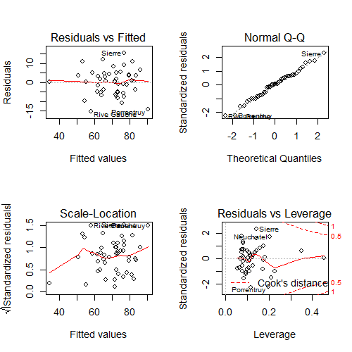
of a lm fit. Consider the swiss dataset from previous chapters.
(swiss); par(mfrow = c(2, 2))
fit <- lm(Fertility ~ . , data = swiss); plot(fit)

plot on the swiss dataset.Consider the upper left hand plot of the residuals (\(e_i\)) versus the fitted values (\(\hat Y_i\)). Often, a horizontal reference line at 0 is drawn since (whenever an intercept is included) the residuals must sum to 0 and so will lie above and below the zero. Just like in our previous residual plots, one should look for any systematic patterns or large outlying observations.
Note that this is one of many residual plots that one may be interested in
performing. For example, one might want to look at plots of residuals by
individual predictors or, as is done by plot, versus leverage (defined
later in this chapter).
Influential, high leverage and outlying points
As previously mentioned, it is a good idea to check our data for outliers. We may want to refer back to these points to see if we can ascertain how they became outliers, such as a misrecording. In addition, we may want to fit the models with and without those points included in order to ascertain their influence on the model fit and inferential goals.
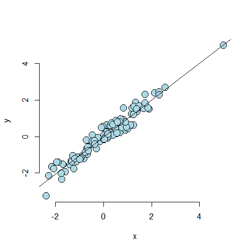
Outliers can results for a variety of reasons. They can be real, but inconvenient, data. They could arise from spurious processes like processing or recording errors. They can have varying degrees of influence on our model. Thus, calling a point an outlier is vague and we need a more precise language to discuss points that fall outside of our cloud of data. The plot below is useful for understanding different sorts of outliers.
The lower left hand point is not an outlier having neither leverage nor influence on our fitted model. The upper left hand point is an outlier in the Y direction, but not in the X. It will have little impact on our fitted model, since there’s lots of X points nearby to counteract its effect. This point is said to have low leverage and influence. The upper right hand point is outside of the range of X values and Y values, but conforms nicely to the regression relationship. This point has little effect on the fitted model. It has high leverage, but chooses not to exert it, and thus has low influence. The lower right hand point is outside of the range of X values, but not the Y values. However, it does not conform to the relationship of the remainder of the points at all. This outlier has high leverage and influence.
From this discussion you can maybe guess at the formal definition of two important terms: leverage and influence. Leverage discusses how outside of the norm a point’s X values are from the cloud of other X values. A point with high leverage has the opportunity to dramatically impact the regression model. Whether or not it does so depends on how closely it conforms to the fit.
The other concept, influence, is a measure of how much impact a point has on the regression fit. The most direct way to measure influence is fit the model with the point included and excluded.
Residuals, Leverage and Influence measures
Watch this video before beginning.
Now that we understand the three concepts of residuals, leverage and influence, we present a laundry list
of probes. Do ?influence.measures to see the full suite of influence measures in stats.
First consider residuals. We already know if fit is the output of
lm (as in fit = lm(y ~ x1 + x2)), then resid(fit) returns the
ordinary residuals. A problem, though, is that these are defined as
\(Y_i - \hat Y_i \) and thus have the units of the outcome. This
isn’t great for comparing residual values across different analyses
with different experiments. So, some efforts to standardize residuals
have been made. Two of the most common are:
-
rstandard- residuals divided by their standard deviations -
rstudent- residuals divided by their standard deviations, where the ith data point was deleted in the calculation of the standard deviation for the residual to follow a t distribution
Both of these endeavor to create T-like (as in Student’s T distribution)
statistics so that one can threshold residuals using T cutoffs. This is
why these sorts of residuals are called studentized. The rstudent
residuals are exactly T distributed while the rstandard is not. The
rstandard residuals are sometimes called internally standardized while the
rstudent are called externally. The distinction between the residuals
is mostly for establishing probability based cutoffs. Instead, we recommend
looking at the residuals as a collective and using the cutoffs loosely.
Under this way of thinking,
the distinctions over which of these two kinds of standardization are used
is more academic than practical.
A common use for residuals is to diagnose normality of the errors. This is often done by plotting the residual quantiles versus normal quantiles. This is called a residual QQ plot. Your residuals should fall roughly on a line if plotted in a normal QQ plot. There is of course noise and a perfect fit would not be expected even if the model held.
Leverage is largely measured by one quantity, so called hat diagonals, which can be obtained in R by the function hatvalues. The
hat values are necessarily between 0 and 1 with larger values indicating
greater (potential for) leverage.
After leverage, there are quite a few ways to probe for influence. These are:
-
dffits- change in the predicted response when the \(i^{th}\) point is deleted in fitting the model. -
dfbetas- change in individual coefficients when the \(i^{th}\) point is deleted in fitting the model. -
cooks.distance- overall change in the coefficients when the \(i^{th}\) point is deleted.
In other words, the dffits check for influence in the fitted values,
dfbetas check for influence in the coefficients individually and cooks.distance checks for influence in the coefficients as a collective.
Finally, there’s a residual measure that’s also an influence measure.
Particularly, consider resid(fit) / (1 - hatvalues(fit)) where fit is the linear model fit. This is the so-called PRESS residuals. These
are the residual error from leave one out cross validation. That is, the difference in the response and the predicted response at data point \(i\), where it was not included in the model fitting.
How do I use all of these things?
First of all, be wary of simplistic rules for diagnostic plots and measures. The use of these tools is context specific. It’s better to understand what they are trying to accomplish and use them judiciously. Not all diagnostics measures have meaningful absolute scales. You can look at them relative to the values across the data. Even for the ones with known exact distributions to establish cutoffs, those distributions (like the externally studentized residual) have degrees of freedom that depend on the sample size, so a single threshold can’t be used across all settings.
A better way to think about these tool is as diagnostics, like a physician diagnosing a health issue. These tools probe your data in different ways to diagnose different problems. Some examples include:
- Patterns in your residual plots generally indicate some poor aspect of model fit.
- Heteroskedasticity (non constant variance).
- Missing model terms.
- Temporal patterns (plot residuals versus collection order).
- Residual QQ plots investigate normality of the errors.
- Leverage measures (hat values) can be useful for diagnosing data entry errors and points that have a high potential for influence.
- Influence measures get to the bottom line, ‘how does deleting or including this point impact a particular aspect of the model’.
Let’s do some experiments to see how these measure hold up.
Simulation examples
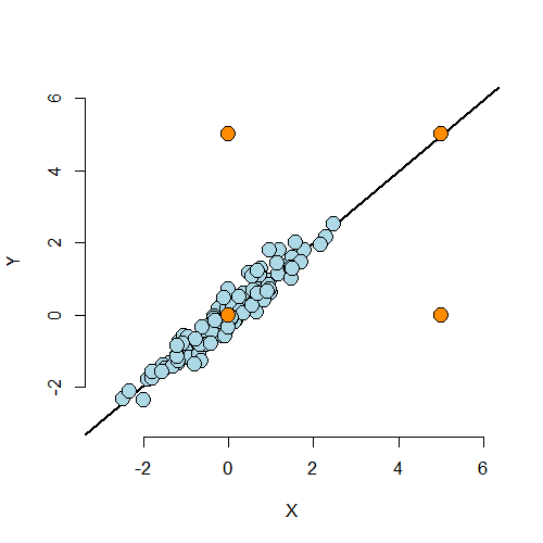
Case 1
In what follows, we’re going to try several simulation settings and see the values of some
on the residuals, influence measures and leverage. In our first
case, we simulate 100 points. The 101st point, c(10, 10),
has created a strong regression relationship where there shouldn’t be one.
Note we prepend this point at the beginning of the Y and X vectors.
<- 100; x <- c(10, rnorm(n)); y <- c(10, c(rnorm(n)))
plot(x, y, frame = FALSE, cex = 2, pch = 21, bg = "lightblue", col = "black")
abline(lm(y ~ x))
<div class=”rimage center”><img src=”fig/unnamed-chunk-3.png” title=”plot of chunk unnamed-chunk-3” alt=”plot of chunk unnamed-chunk-3” class=”plot” /></div>
First, let’s look at the dfbetas. Note the dfbetas are 101 by 2 dimensional, since there’s a dfbeta
for both the intercept and the slope. Let’s just output the first 10 for the slope.
> fit <- lm(y ~ x)
> round(dfbetas(fit)[1 : 10, 2], 3)
     1      2      3      4      5      6      7      8      9     10
 6.007 -0.019 -0.007  0.014 -0.002 -0.083 -0.034 -0.045 -0.112 -0.008
Clearly the first point has a much, much larger dfbeta for the slope than
the other points. That is, the slope changes dramatically from when we include
this point to not including it. Try it out with Cook’s distance and the
dffits. Let’s look at leverage.
round(hatvalues(fit)[1 : 10], 3)
    1     2     3     4     5     6     7     8     9    10
0.445 0.010 0.011 0.011 0.030 0.017 0.012 0.033 0.021 0.010
Again, this point has a much higher leverage value than that of
the other points. By having a large leverage value and
dfbeta, we’re seeing that this point has a high potential for influence, and
decided to exert it.
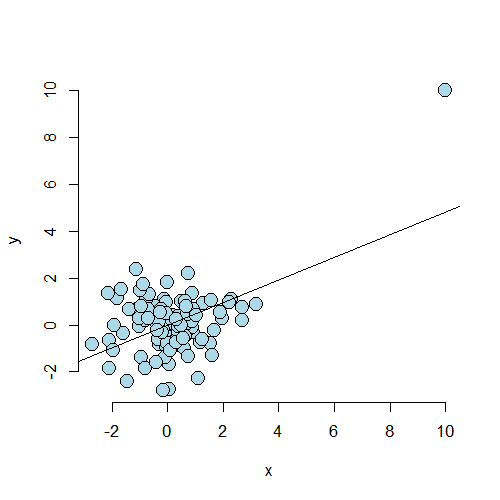
Case 2
Consider a second case where the point lies on a natural line defined by the data, but is well outside of the cloud of X values. Since the code is so similar, I don’t show it. But, as always, it can be found in the github repo for the courses.
Now let’s consider the dfbetas and the leverage for the
first 10 observations.
> round(dfbetas(fit2)[1 : 10, 2], 3)
     1      2      3      4      5      6      7      8      9     10
-0.072 -0.041 -0.007  0.012  0.008 -0.187  0.017  0.100 -0.059  0.035
> round(hatvalues(fit2)[1 : 10], 3)
    1     2     3     4     5     6     7     8     9    10
0.164 0.011 0.014 0.012 0.010 0.030 0.017 0.017 0.013 0.021
As we would expect, the dfbeta value for the first point is well with
the range of the other points. The leverage is much larger than the others.
In this case, the point has high leverage, but chooses not to exert it as influence.
Play around with more simulation examples to get a feeling for what these measures do. This will help more than anything in understanding their value.
Example described by Stefanski
Watch this video before beginning.
We end with a really fun example from Stefanski in TAS 2007 volume 61. This paper illustrates how a residual plot can unveil hidden treasures that would be nearly impossible to detect with other kinds of plots. He has several examples on his website and we go through one. First, let’s read in the data and do a scatterplot matrix.
<- read.table('http://www4.stat.ncsu.edu/~stefanski/NSF_Supported/Hidden_Images/\orly_owl_files/orly_owl_Lin_4p_5_flat.txt', header = FALSE)
pairs(dat)
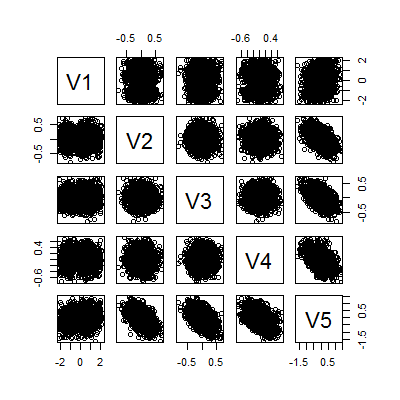
It looks like a big mess of nothing. We can fit a model and get that all of the variables are highly significant
> summary(lm(V1 ~ . -1, data = dat))$coef
   Estimate Std. Error t value  Pr(>|t|)
V2   0.9856    0.12798   7.701 1.989e-14
V3   0.9715    0.12664   7.671 2.500e-14
V4   0.8606    0.11958   7.197 8.301e-13
V5   0.9267    0.08328  11.127 4.778e-28
Can we call it a day? Let’s check a residual plot.
<- lm(V1 ~ . - 1, data = dat); plot(predict(fit), resid(fit), pch = '.')
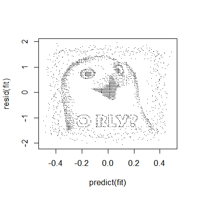
There appears to be a pattern. The moral of the story here is that residual plots can really hone in on systematic patterns in the data that are completely non-apparent from other plots.
Back to the Swiss data
swiss datasetExercises
- Load the dataset
Seatbeltsas part of thedatasetspackage viadata(Seatbelts). Useas.data.frameto convert the object to a dataframe. Fit a linear model of driver deaths withkms,PetrolPriceandlawas predictors. - Refer to question 1. Directly estimate the residual variation via the function
resid. Compare with R’s residual variance estimate. Watch a video solution. - Refer to question 1. Perform an analysis of diagnostic measures including, dffits, dfbetas, influence and hat diagonals. Watch a video solution.
LocalWords: shouldn prepend lang rnorm cex pch bg Stefanski TAS scatterplot LocalWords: dat lm V1 coef V2 989e V3 500e V4 301e V5 778e resid swiss