Introduction
Before beginning
This book is designed as a companion to the Regression Models Coursera class as part of the Data Science Specialization, a ten course program offered by three faculty, Jeff Leek, Roger Peng and Brian Caffo, at the Johns Hopkins University Department of Biostatistics.
The videos associated with this book can be watched in full here, though the relevant links to specific videos are placed at the appropriate locations throughout.
Before beginning, we assume that you have a working knowledge of the R programming language. If not, there is a wonderful Coursera class by Roger Peng, that can be found here. In addition, students should know the basics of frequentist statistical inference. There is a Coursera class here and a LeanPub book here.
The entirety of the book is on GitHub here.
Please submit pull requests if you find errata! In addition the course notes can be found
also on GitHub here.
While most code is in the book, all of the code for every figure and analysis in the
book is in the R markdown files (.Rmd) for the respective lectures.
Finally, we should mention swirl (statistics with interactive R programming).
swirl is an intelligent tutoring system developed by Nick Carchedi, with contributions
by Sean Kross and Bill and Gina Croft. It offers a way to learn R in R.
Download swirl here. There’s a swirl
module for this course!.
Try it out, it’s probably the most effective way to learn.
Regression models
Watch this video before beginning
Regression models are the workhorse of data science. They are the most well described, practical and theoretically understood models in statistics. A data scientist well versed in regression models will be able to solve an incredible array of problems.
Perhaps the key insight for regression models is that they produce highly interpretable model fits. This is unlike machine learning algorithms, which often sacrifice interpretability for improved prediction performance or automation. These are, of course, valuable attributes in their own rights. However, the benefit of simplicity, parsimony and interpretability offered by regression models (and their close generalizations) should make them a first tool of choice for any practical problem.
Motivating examples
Francis Galton’s height data
Francis Galton, the 19th century polymath, can be credited with discovering regression. In his landmark paper Regression Toward Mediocrity in Hereditary Stature he compared the heights of parents and their children. He was particularly interested in the idea that the children of tall parents tended to be tall also, but a little shorter than their parents. Children of short parents tended to be short, but not quite as short as their parents. He referred to this as “regression to mediocrity” (or regression to the mean). In quantifying regression to the mean, he invented what we would call regression.
It is perhaps surprising that Galton’s specific work on height is still relevant today. In fact this European Journal of Human Genetics manuscript compares Galton’s prediction models versus those using modern high throughput genomic technology (spoiler alert, Galton wins).
Some questions from Galton’s data come to mind. How would one fit a model that relates parent and child heights? How would one predict a child’s height based on their parents? How would we quantify regression to the mean? In this class, we’ll answer all of these questions plus many more.
Simply Statistics versus Kobe Bryant
Simply Statistics is a blog by Jeff Leek, Roger Peng and Rafael Irizarry. It is one of the most widely read statistics blogs, written by three of the top statisticians in academics. Rafa wrote a (somewhat tongue in cheek) post regarding ball hogging among NBA basketball players. (By the way, your author has played basketball with Rafael, who is quite good, but certainly doesn’t pass up shots; glass houses and whatnot.)
Here’s some key sentences:
- “Data supports the claim that if Kobe stops ball hogging the Lakers will win more”
- “Linear regression suggests that an increase of 1% in % of shots taken by Kobe results in a drop of 1.16 points (+/- 0.22) in score differential.”
In this book we will cover how to create summary statements like this using regression model building. Note the nice interpretability of the linear regression model. With this model Rafa numerically relates the impact of more shots taken on score differential.
Summary notes: questions for this book
Regression models are incredibly handy statistical tools. One can use them to answer all sorts of questions. Consider three of the most common tasks for regression models:
- Prediction e.g.: to use the parent’s heights to predict children’s heights.
- Modeling e.g.: to try to find a parsimonious, easily described mean relationship between parental and child heights.
- Covariation e.g.: to investigate the variation in child heights that appears unrelated to parental heights (residual variation) and to quantify what impact genotype information has beyond parental height in explaining child height.
An important aspect, especially in questions 2 and 3 is assessing modeling assumptions. For example, it is important to figure out how/whether and what assumptions are needed to generalize findings beyond the data in question. Presumably, if we find a relationship between parental and child heights, we’d like to extend that knowledge beyond the data used to build the model. This requires assumptions. In this book, we’ll cover the main assumptions necessary.
Exploratory analysis of Galton’s Data
Watch this video before beginning
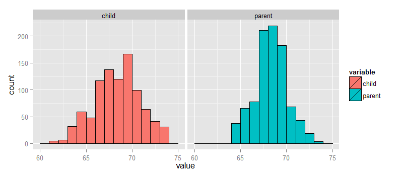
Let’s look at the data first. This data was created by Francis Galton in 1885. Galton was a statistician who invented the term and concepts of regression and correlation, founded the journal Biometrika, and was the cousin of Charles Darwin.
You may need to run install.packages("UsingR") if the UsingR library is
not installed. Let’s look at the marginal (parents disregarding children and
children disregarding parents) distributions first.
The parental distribution is all heterosexual couples. The parental average was corrected
for gender via multiplying female heights by 1.08. Remember, Galton didn’t have
regression to help figure out a better way to do this correction!
library(UsingR); data(galton); library(reshape); long <- melt(galton)
g <- ggplot(long, aes(x = value, fill = variable))
g <- g + geom_histogram(colour = "black", binwidth=1)
g <- g + facet_grid(. ~ variable)
g
galton datasetFinding the middle via least squares
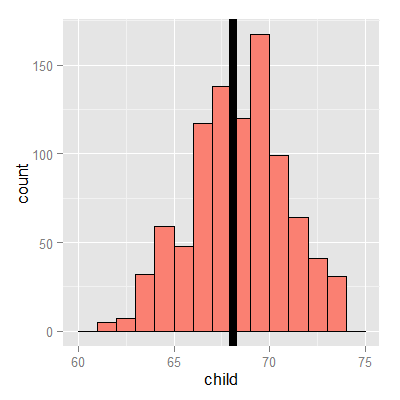
Consider only the children’s heights. How could one describe the “middle”? Consider one definition. Let \(Y_i\) be the height of child \(i\) for \(i = 1, \ldots, n = 928\), then define the middle as the value of \(\mu\) that minimizes
This is physical center of mass of the histogram. You might have guessed that the answer \(\mu = \bar Y\). This is called the least squares estimate for \(\mu\). It is the point that minimizes the sum of the squared distances between the observed data and itself.
Note, if there was no variation in the data, every value of \(Y_i\) was the same, then there would be no error around the mean. Otherwise, our estimate has to balance the fact that our estimate of \(\mu\) isn’t going to predict every observation perfectly. Minimizing the average (or sum of the) squared errors seems like a reasonable strategy, though of course there are others. We could minimize the average absolute deviation between the data \(\mu\) (this leads to the median as the estimate instead of the mean). However, minimizing the squared error has many nice properties, so we’ll stick with that for this class.
Experiment
Let’s use RStudio’s manipulate to see what value of \(\mu\) minimizes the sum of the squared deviations. The code below allows you to create a slider to investigate estimates and their mean squared error.
library(manipulate)
myHist <- function(mu){
mse <- mean((galton$child - mu)^2)
g <- ggplot(galton, aes(x = child)) + geom_histogram(fill = "salmon", colour = "\black", binwidth=1)
g <- g + geom_vline(xintercept = mu, size = 3)
g <- g + ggtitle(paste("mu = ", mu, ", MSE = ", round(mse, 2), sep = ""))
g
}
manipulate(myHist(mu), mu = slider(62, 74, step = 0.5))
The least squares estimate is the empirical mean.
<- ggplot(galton, aes(x = child)) + geom_histogram(fill = "salmon", colour = "blac\k", binwidth=1)
g <- g + geom_vline(xintercept = mean(galton$child), size = 3)
g
The math (not required)
Watch this video before beginning
Why is the sample average the least squares estimate for \(\mu\)? It’s surprisingly easy to show. Perhaps more surprising is how generally these results can be extended.
Comparing children’s heights and their parent’s heights
Watch this video before beginning
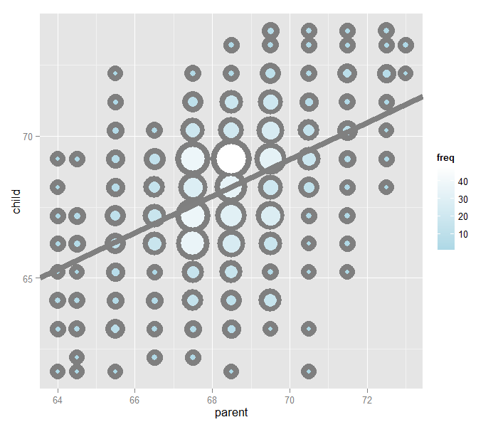
Looking at either the parents or children on their own isn’t interesting. We’re interested in how the relate to each other. Let’s plot the parent and child heights.
(galton, aes(x = parent, y = child)) + geom_point()
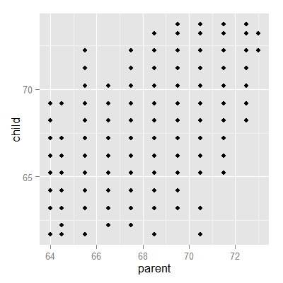
The overplotting is clearly hiding some data. Here you can get the code to make the size and color of the points be the frequency.
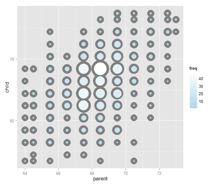
Regression through the origin
A line requires two parameters to be specified, the intercept and the slope. Let’s first focus on the slope. We want to find the slope of the line that best fits the data. However, we have to pick a good intercept. Let’s subtract the mean from both the parent and child heights so that their subsequent means are 0. Now let’s find the line that goes through the origin (has intercept 0) by picking the best slope.
Suppose that \(X_i\) are the parent heights with the mean subtracted. Consider picking the slope \(\beta\) that minimizes
Each \(X_i \beta\) is the vertical height of a line through the origin at point \(X_i\). Thus, \(Y_i - X_i \beta\) is the vertical distance between the line at each observed \(X_i\) point (parental height) and the \(Y_i\) (child height).
Our goal is exactly to use the origin as a pivot point and pick the line that minimizes the sum of the squared vertical distances of the points to the line. Use RStudio’s manipulate function to experiment. Subtract the means so that the origin is the mean of the parent and children heights.
library(dplyr)
y <- galton$child - mean(galton$child)
x <- galton$parent - mean(galton$parent)
freqData <- as.data.frame(table(x, y))
names(freqData) <- c("child", "parent", "freq")
freqData$child <- as.numeric(as.character(freqData$child))
freqData$parent <- as.numeric(as.character(freqData$parent))
myPlot <- function(beta){
    g <- ggplot(filter(freqData, freq > 0), aes(x = parent, y = child))
    g <- g  + scale_size(range = c(2, 20), guide = "none" )
    g <- g + geom_point(colour="grey50", aes(size = freq+20), show.legend = FALSE)
    g <- g + geom_point(aes(colour=freq, size = freq))
    g <- g + scale_colour_gradient(low = "lightblue", high="white")
    g <- g + geom_abline(intercept = 0, slope = beta, size = 3)
    mse <- mean( (y - beta * x) ^2 )
    g <- g + ggtitle(paste("beta = ", beta, "mse = ", round(mse, 3)))
    g
}
manipulate(myPlot(beta), beta = slider(0.6, 1.2, step = 0.02))
The solution
In the next few lectures we’ll talk about why this is the solution. But, rather than leave you hanging, here it is:
> lm(I(child - mean(child))~ I(parent - mean(parent)) - 1, data = galton)
Call:
lm(formula = I(child - mean(child)) ~ I(parent - mean(parent)) -
    1, data = galton)

Coefficients:
I(parent - mean(parent))
                   0.646
Let’s plot the best fitting line. In the subsequent chapter we will learn all about creating, interpreting and performing inference on such mode fits. (Note that I shifted the origin back to the means of the original data.) The results suggest that for every 1 inch increase in the parents’ height, we estimate a 0.646 inch increase in the child’s height.
Exercises
- Consider the dataset given by
x=c(0.725,0.429,-0.372 ,0.863). What value ofmuminimizessum((x - mu)^2)? Watch a video solution. - Reconsider the previous question. Suppose that weights were given,
w = c(2, 2, 1, 1)so that we wanted to minimizesum(w * (x - mu) ^ 2)formu. What value would we obtain? Watch a video solution. - Take the Galton dataset and obtain the regression through the origin slope estimate where the centered parental height is the outcome and the child’s height is the predictor. Watch a video solution.