Multivariable examples and tricks
Watch this video before beginning.
In this chapter we cover a few examples of multivariate regression in order to get a hands on sense of the basics.
Data set for discussion
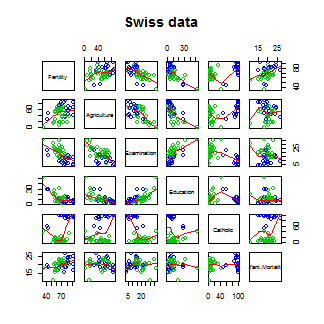
We’ll start with the Swiss dataset that is part of the
datasets package. This can be loaded in R with:
> require(datasets); data(swiss); ?swiss
Standardized fertility measure and socio-economic indicators for each of 47 French-speaking provinces of Switzerland at about 1888.
A data frame with 47 observations on 6 variables, each of which is in percent, i.e., in [0, 100].
[,1]   Fertility          a common standardized fertility measure
[,2]   Agriculture        percent of males involved in agriculture as occupation
[,3]	 Examination        percent draftees receiving highest on army examination
[,4]	 Education          percent education beyond primary school for draftees
[,5]	 Catholic           percent catholic (as opposed to protestant)
[,6]	 Infant.Mortality   live births who live less than 1 year
All variables but Fertility give percentages of the population.
Let’s see the result of calling lm on this data set.
> summary(lm(Fertility ~ . , data = swiss))
                 Estimate Std. Error t value  Pr(>|t|)
(Intercept)       66.9152   10.70604   6.250 1.906e-07
Agriculture       -0.1721    0.07030  -2.448 1.873e-02
Examination       -0.2580    0.25388  -1.016 3.155e-01
Education         -0.8709    0.18303  -4.758 2.431e-05
Catholic           0.1041    0.03526   2.953 5.190e-03
Infant.Mortality   1.0770    0.38172   2.822 7.336e-03
Agriculture is expressed in percentages (0 - 100), representing the percentage
of the male population involved in agriculture.
The regression slope estimate for this variable is -0.1721. We interpret
this coefficient as follows:
Our model estimates an expected 0.17 decrease in standardized fertility for every 1% increase in percentage of males involved in agriculture, holding the remaining variables constant.
Note that the the t-test for \(H_0: \beta_{Agri} = 0\) versus
\(H_a: \beta_{Agri} \neq 0\) is significant since 0.0187 is less
that typical benchmarks (0.05, for example). Note that, by default, R is
reporting the P-value for the two sided test. If you want the one sided test,
calculate it directly using the T-statistic and the degrees of freedom.
(You can figure it out from the two sided P-value, but it’s easy to get tripped
up with signs.)
Interestingly, the unadjusted estimate is
summary(lm(Fertility ~ Agriculture, data = swiss))$coefficients
            Estimate Std. Error t value  Pr(>|t|)
(Intercept)  60.3044    4.25126  14.185 3.216e-18
Agriculture   0.1942    0.07671   2.532 1.492e-02
Notice that the sign of the slope estimate reversed! This is an example of so-called “Simpson’s Paradox”. This purported paradox (which is actually not a paradox at all) simply points out that unadjusted and adjusted effects can be the reverse of each other. Or in other words, the apparent relationship between X and Y may change if we account for Z. Let’s explore multivariate adjustment and sign reversals with simulation.
Simulation study
Below we simulate 100 random variables with a linear relationship between X1, X2 and Y. Notably, we generate X1 as a linear function of X2. In this simulation, X1 has a negative adjusted effect on Y while X2 has a positive adjusted effect (adjusted referring to the effect including both variables). However, X1 is related to X2. Notice our unadjusted effect of X1 is of the opposite sign (and way off), while the adjusted one is about right. What’s happening? Our unadjusted model is picking up the effect X2 as it’s represented in X1. Play around with the generating coefficients to see how you can make the estimated relationships very different than the generating ones. More than anything, this illustrates that multivariate modeling is hard stuff.
> n = 100; x2 <- 1 : n; x1 = .01 * x2 + runif(n, -.1, .1); y = -x1 + x2 + rnorm(n, s\
d = .01)
> summary(lm(y ~ x1))$coef

            Estimate Std. Error t value  Pr(>|t|)
(Intercept)    1.454      1.079   1.348 1.807e-01
x1            96.793      1.862  51.985 3.707e-73
>summary(lm(y ~ x1 + x2))$coef
             Estimate Std. Error  t value   Pr(>|t|)
(Intercept)  0.001933  0.0017709    1.092  2.777e-01
x1          -1.020506  0.0163560  -62.393  4.211e-80
x2           1.000133  0.0001643 6085.554 1.544e-272
To confirm what’s going on, let’s look at some plots. In the left panel, we plot Y versus X1. Notice the positive relationship. However, if we look at X2 (the color) notice that it clearly goes up with Y as well. If we adjust both the X1 and Y variable by taking the residual after having regressed X2, we get the actual correct relationship between X1 and Y.
Back to this data set
In our data set, the sign reverses itself with the inclusion of Examination and Education. However, the percent of males in the province working in agriculture is negatively related to educational attainment (correlation of -0.6395) and Education and Examination (correlation of 0.6984) are obviously measuring similar things.
So, given now that we know including correlated variables with our variable of interest into our regression relationship can drastically change things we have to ask: “Is the positive marginal an artifact for not having accounted for, say, Education level? (Education does have a stronger effect, by the way.)” At the minimum, anyone claiming that provinces that are more agricultural have higher fertility rates would immediately be open to criticism that the real effect is due to Education levels.
You might think then, why don’t I just always include all variables that I have into my regression model to avoid incorrectly adjusted effects? Of course, it’s not this easy and there’s negative consequences to including variables unnecessarily. We’ll talk more about model building and the process of choosing which variables to include or not in the next chapter.
What if we include a completely unnecessary variable?
Next chapter we’ll discuss working with a collection of correlated predictors. But you might wonder, what happens if you include a predictor that’s completely unnecessary. Let’s try some computer experiments with our fertility data. In the code below, z adds no new linear information, since it’s a linear combination of variables already included. R just drops terms that are linear combination of other terms.
> z <- swiss$Agriculture + swiss$Education
lm(Fertility ~ . + z, data = swiss)\
> Call:
lm(formula = Fertility ~ . + z, data = swiss)

Coefficients:
     (Intercept)       Agriculture       Examination         Education          Cath\
olic
          66.915            -0.172            -0.258            -0.871             0\
.104
Infant.Mortality                 z
           1.077                NA
This is a fundamental point of multivariate regression: regression models fit the linear space of the regressors. Therefore, any linear reorganization of the regressors will result in an equivalent fit, with different covariates of course. However, the percentage of the variance explained in the response will be constant. It is only through adding variables that are not perfectly explained by the existing ones that one can explain more variation in the response. So, for example, models with covariates i) X and Z, ii) X+Z and X-Z and iii) 2X and 4Z will all explain the same amount of variation in Y. A third variable, W say, will only explain more variation in Y if it’s not perfectly explained by X and Z. R lets you know when you’ve done this by putting redundant variables as having NA coefficients.
Dummy variables are smart
It is interesting to note that models with factor variables as predictors are simply special cases of regression models. As an example, consider the linear model:
where each \(X_{i1}\) is binary so that it is a 1 if measurement \(i\) is in a group and 0 otherwise. As an example, consider a variable as treated versus not in a clinical trial. Or, in a more data science context, consider an A/B test comparing two ad campaigns where Y is the click through rate.
Refer back to our model. For people in the group, {$$}E[Y_i] = \beta_0 + \beta_1{/$$}, and for people not in the group, {$$}E[Y_i] = \beta_0{/$$}. The least squares fits work out to be {$$}\hat \beta_0 + \hat \beta_1{/$$} as the mean for those in the group and {$$}\hat \beta_0{/$$} as the mean for those not in the group. The variable \(\beta_1\) is interpreted as the increase or decrease in the mean comparing those in the group to those not. The T-test for that coefficient is exactly the two group T test with a common variance.
Finally, note including a binary variable that is 1 for those not in the group would be redundant, it would create three parameters to describe two means. Moreover, we know from the last section that including redundant variables will result in R just setting one of them to NA. We know that the intercept column is a column of ones, the group variable is one for those in the group while a variable for those not in the group would just be the subtraction of these two. Thus, it’s linearly redundant and unnecessary.
More than two levels
Consider a multilevel factor level. For didactic reasons, let’s say a three level factor. As an example consider a variable for US political party affiliation: Republican, Democrat, Independent/other. Let’s use the model:
Here the variable \(X_{i1}\) is 1 for Republicans and 0 otherwise, the variable \(X_{i2}\) is 1 for Democrats and 0 otherwise. As before, we don’t need an \(X_{i3}\) for Independent/Other, since it would be redundant.
So now consider the implications of more model. If person \(i\) is Republican then \(E[Y_i] = \beta_0 +\beta_1\). On the other hand, If person \(i\) is Democrat then \(E[Y_i] = \beta_0 + \beta_2\). Finally, if \(i\) is Independent/Other \(E[Y_i] = \beta_0\).
So, we can interpret our coefficients as follows. \(\beta_1\) compares the mean for Republicans to that of Independents/Others. \(\beta_2\) compares the mean for Democrats to that of Independents/Others. \(\beta_1 - \beta_2\) compares the mean for Republicans to that of Democrats. Notice the coefficients are all comparisons to the category that we left out, Independents/Others. If one category is an obvious reference category, chose that one to leave out. In R, if our variable is a factor variable, it will create the dummy variables for us and pick one of the levels to be the reference level. Let’s go through an example to see.
Insect Sprays
Let’s consider a model with factors. Consider the InsectSprays dataset in R. The data
models the number of dead insects from different pesticides. Since it’s not clear from the documentation,
let’s assume (probably accurately)
that these were annoying bad insects, like fleas, mosquitoes or cockroaches, and not good ones like butterflies
or ladybugs. After getting over that mental hurdle, let’s plot the data.
require(datasets);data(InsectSprays); require(stats); require(ggplot2)
g = ggplot(data = InsectSprays, aes(y = count, x = spray, fill  = spray))
g = g + geom_violin(colour = "black", size = 2)
g = g + xlab("Type of spray") + ylab("Insect count")
g
Here’s the plot. There are probably better ways to model this data, but let’s use a linear model just to illustrate factor variables.
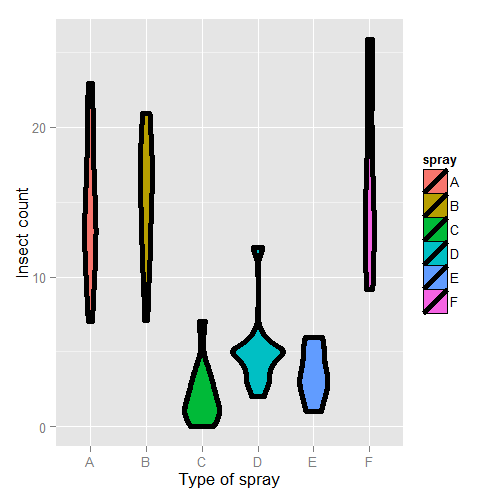
First, let’s set Spray A as the reference (the default, since it has the lowest alphanumeric factor level).
> summary(lm(count ~ spray, data = InsectSprays))$coef
            Estimate Std. Error t value  Pr(>|t|)
(Intercept)  14.5000      1.132 12.8074 1.471e-19
sprayB        0.8333      1.601  0.5205 6.045e-01
sprayC      -12.4167      1.601 -7.7550 7.267e-11
sprayD       -9.5833      1.601 -5.9854 9.817e-08
sprayE      -11.0000      1.601 -6.8702 2.754e-09
sprayF        2.1667      1.601  1.3532 1.806e-01
Therefore, 0.8333 is the estimated mean comparing Spray B to Spray A (as B - A), -12.4167 compares Spray C to Spray A (as C - A) and so on. The inferential statistics: standard errors, t value and P-value all correspond to those comparisons. The intercept, 14.5, is the mean for Spray A. So, its inferential statistics are testing whether or not the mean for Spray A is zero. As is often the case, this test isn’t terribly informative and often yields extremely small statistics (since we know the spray kills some bugs). The estimated mean for Spray B is its effect plus the intercept (14.5 + 0.8333); the estimated mean for Spray C is 14.5 - 12.4167 (its effect plus the intercept) and so on for the rest of the factor levels.
Let’s hard code the factor levels so we can directly see what’s going on. Remember, we simply leave out the dummy variable for the reference level.
> summary(lm(count ~
             I(1 * (spray == 'B')) + I(1 * (spray == 'C')) +
             I(1 * (spray == 'D')) + I(1 * (spray == 'E')) +
             I(1 * (spray == 'F'))
           , data = InsectSprays))$coef
                      Estimate Std. Error t value  Pr(>|t|)
(Intercept)            14.5000      1.132 12.8074 1.471e-19
I(1 * (spray == "B"))   0.8333      1.601  0.5205 6.045e-01
I(1 * (spray == "C")) -12.4167      1.601 -7.7550 7.267e-11
I(1 * (spray == "D"))  -9.5833      1.601 -5.9854 9.817e-08
I(1 * (spray == "E")) -11.0000      1.601 -6.8702 2.754e-09
I(1 * (spray == "F"))   2.1667      1.601  1.3532 1.806e-01
Of course, it’s identical. You might further ask yourself, what would happen if I included a dummy variable for Spray A? Would the world implode? No, it just realizes that one of the dummy variables is redundant and drops it.
> summary(lm(count ~
   I(1 * (spray == 'B')) + I(1 * (spray == 'C')) +
   I(1 * (spray == 'D')) + I(1 * (spray == 'E')) +
   I(1 * (spray == 'F')) + I(1 * (spray == 'A')), data = InsectSprays))$coef

                      Estimate Std. Error t value  Pr(>|t|)
(Intercept)            14.5000      1.132 12.8074 1.471e-19
I(1 * (spray == "B"))   0.8333      1.601  0.5205 6.045e-01
I(1 * (spray == "C")) -12.4167      1.601 -7.7550 7.267e-11
I(1 * (spray == "D"))  -9.5833      1.601 -5.9854 9.817e-08
I(1 * (spray == "E")) -11.0000      1.601 -6.8702 2.754e-09
I(1 * (spray == "F"))   2.1667      1.601  1.3532 1.806e-01
However, if we drop the intercept, then the Spray A term is no longer redundant. Then each coefficient is the mean for that Spray.
> summary(lm(count ~ spray - 1, data = InsectSprays))$coef
       Estimate Std. Error t value  Pr(>|t|)

sprayA   14.500      1.132  12.807 1.471e-19
sprayB   15.333      1.132  13.543 1.002e-20
sprayC    2.083      1.132   1.840 7.024e-02
sprayD    4.917      1.132   4.343 4.953e-05
sprayE    3.500      1.132   3.091 2.917e-03
sprayF   16.667      1.132  14.721 1.573e-22
So, for example, 14.5 is the mean for Spray A (as we already knew), 15.33 is the mean for Spray B (14.5 + 0.8333 from our previous model formulation), 2.083 is the mean for Spray C (14.5 - 12.4167 from our previous model formulation) and so on. This is a nice trick if you want your model formulated in the terms of the group means, rather than the group comparisons relative to the reference group.
Also, if there are no other covariates, the estimated coefficients for this model are exactly the empirical means of the groups. We can use dplyr to check this really easily and grab the mean for each group.
> library(dplyr)
> summarise(group_by(InsectSprays, spray), mn = mean(count))
Source: local data frame [6 x 2]

  spray     mn
1     A 14.500
2     B 15.333
3     C  2.083
4     D  4.917
5     E  3.500
6     F 16.667
Often your lowest alphanumeric level isn’t the level that you’re most
interested in as a reference group. There’s an easy fix for that with
factor variables; use the relevel function. Here we give a simple
example. We created a variable spray2 that has Spray C as the reference
level.
> spray2 <- relevel(InsectSprays$spray, "C")
> summary(lm(count ~ spray2, data = InsectSprays))$coef
            Estimate Std. Error t value  Pr(>|t|)
(Intercept)    2.083      1.132  1.8401 7.024e-02
spray2A       12.417      1.601  7.7550 7.267e-11
spray2B       13.250      1.601  8.2755 8.510e-12
spray2D        2.833      1.601  1.7696 8.141e-02
spray2E        1.417      1.601  0.8848 3.795e-01
spray2F       14.583      1.601  9.1083 2.794e-13
Now the intercept is the mean for Spray C and all of the coefficients are interpreted with respect to Spray C. So, 12.417 is the comparison between Spray A and Spray C (as A - C) and so on.
Summary of dummy variables
If you haven’t seen this before, it might seem rather strange. However, it’s essential to understand how dummy variables are treated, as otherwise huge interpretation errors can be made. Here we give a brief bullet summary of dummy variables to help solidify this information.
- If we treat a variable as a factor, R includes an intercept and omits the alphabetically first level of the factor.
- The intercept is the estimated mean for the reference level.
- The intercept t-test tests for whether or not the mean for the reference level is 0.
- All other t-tests are for comparisons of the other levels versus the reference level.
- Other group means are obtained the intercept plus their coefficient.
- If we omit an intercept, then it includes terms for all levels of the factor.
- Group means are now the coefficients.
- Tests are tests of whether the groups are different than zero.
- If we want comparisons between two levels, neither of which is the reference level, we could refit the model with one of them as the reference level.
Other thoughts on this data
We don’t suggest that this is in anyway a thorough analysis of this data. For example, the data are counts which are bounded from below by 0. This clearly violates the assumption of normality of the errors. Also there are counts near zero, so both the actual assumption and the intent of this assumption are violated. Furthermore, the variance does not appear to be constant (look back at the violin plots). Perhaps taking logs of the counts would help. But, since there are 0 counts, maybe log(Count + 1). Also, we’ll cover Poisson GLMs for fitting count data.
Further analysis of the swiss dataset
Watch this video before beginning.
Let’s create some dummy variables in the swiss dataset to illustrate them in a more
multivariable context. Just to remind ourselves of the dataset, here’s the first few
rows.
> library(datasets); data(swiss)
> head(swiss)

          Fertility Agriculture Examination Education Catholic Infant.Mortality
Courtelary     80.2        17.0          15        12     9.96             22.2
Delemont       83.1        45.1           6         9    84.84             22.2
Franches-Mnt   92.5        39.7           5         5    93.40             20.2
Moutier        85.8        36.5          12         7    33.77             20.3
Neuveville     76.9        43.5          17        15     5.16             20.6
Porrentruy     76.1        35.3           9         7    90.57             26.6
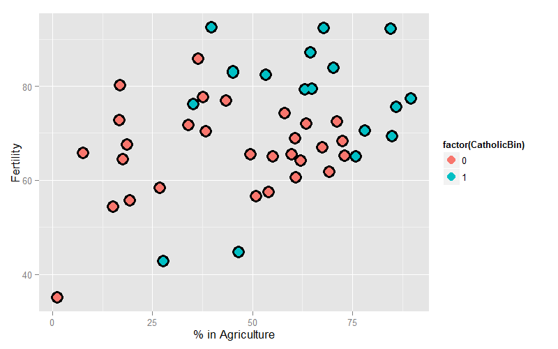
Let’s create a binary variable out of the variable Catholic to illustrate dummy variables in multivariable models. However, it should be noted that this isn’t patently absurd, since the variable is highly bimodal anyway. Let’s just split at majority Catholic or not:
> library(dplyr)
> swiss = mutate(swiss, CatholicBin = 1 * (Catholic > 50))
Since we’re interested in Agriculture as a variable and Fertility as an outcome, let’s plot those two color coded by the binary Catholic variable:
= ggplot(swiss, aes(x = Agriculture, y = Fertility, colour = factor(CatholicBin)))
g = g + geom_point(size = 6, colour = "black") + geom_point(size = 4)
g = g + xlab("% in Agriculture") + ylab("Fertility")
g
Our model is:
where \(Y_i\) is Fertility, \(X_{i1}\) is ‘Agriculture and
\(X_{i2}\) is CatholicBin. Let’s first fit the model with \(X_{i2}\)
removed.
> summary(lm(Fertility ~ Agriculture, data = swiss))$coef

            Estimate Std. Error t value  Pr(>|t|)
(Intercept)  60.3044    4.25126  14.185 3.216e-18
Agriculture   0.1942    0.07671   2.532 1.492e-02
This model just assumes one line through the data (linear regression). Now let’s add our second variable. Notice that the model is
when \(X_{i2} = 0\) and
when \(X_{i2} = 1\). Thus, the coefficient in front of the binary variable is the change in the intercept between non-Catholic and Catholic majority provinces. In other words, this model fits parallel lines for the two levels of the factor variable. If the factor variable had 4 levels, it would fit 4 parallel lines, where the coefficients for the factors are the change in the intercepts to the reference level.
## Parallel lines
summary(lm(Fertility ~ Agriculture + factor(CatholicBin), data = swiss))$coef

                     Estimate Std. Error t value  Pr(>|t|)
(Intercept)           60.8322     4.1059  14.816 1.032e-18
Agriculture            0.1242     0.0811   1.531 1.329e-01
factor(CatholicBin)1   7.8843     3.7484   2.103 4.118e-02
Thus, 7.8843 is the estimated change in the intercept in the expected relationship between Agriculture and Fertility going from a non-Catholic majority province to a Catholic majority.
Often, however, we want both a different intercept and slope. This is easily obtained with an interaction term
Now consider with \(X_{i2} = 0\), the model reduces to:
When \(X_{i2} = 1\) the model is
Thus, the coefficient in front of the main effect \(X_{i2}\), labeled \(\beta_2\) in our model, is the change in the intercept, while the coefficient in front of interaction term \(X_{i2}X_{i1}\), labeled \(\beta_3\) in our model, is the change in the slope. Let’s try it:
> summary(lm(Fertility ~ Agriculture * factor(CatholicBin), data = swiss))$coef

                                 Estimate Std. Error t value  Pr(>|t|)
(Intercept)                      62.04993    4.78916 12.9563 1.919e-16
Agriculture                       0.09612    0.09881  0.9727 3.361e-01
factor(CatholicBin)1              2.85770   10.62644  0.2689 7.893e-01
Agriculture:factor(CatholicBin)1  0.08914    0.17611  0.5061 6.153e-01
Thus, 2.8577 is the estimated change in the intercept of the linear relationship between Agriculture and Fertility going from non-Catholic majority to Catholic majority to Catholic majority provinces. The interaction term, 0.08914, is the estimate change in the slope. The estimated intercept in non-Catholic provinces is 62.04993 while the estimated intercept in Catholic provinces is 62.04993 + 2.85770. The estimated slope in non-Catholic majority provinces is 0.09612 while it is 0.09612 + 0.08914 for Catholic majority provinces. If the factor has more than two levels, all of the main effects are change in the intercepts from the reference level while all of the interaction terms are changes in slope (again compared to the reference level).
Homework exercise, plot both lines on the data to see the fit!
Exercises
- Do exercise 1 of the previous chapter if you have not already.
Load the dataset
Seatbeltsas part of thedatasetspackage viadata(Seatbelts). Useas.data.frameto convert the object to a dataframe. Fit a linear model of driver deaths withkmsandPetrolPriceas predictors. Interpret your results. - Repeat question 1 for the outcome being the log of the count of driver deaths. Interpret your coefficients. Watch a video solution.
- Refer to question 1. Add the dummy variable
lawand interpret the results. Repeat this question with a factor variable that you create calledlawFactorthat takes the levelsNoandYes. Change the reference level fromNotoYes. Watch a video solution. - Discretize the
PetrolPricevariable into four factor levels. Fit the linear model with this factor to see how R treats multiple level factor variables. Watch a video solution. - Perform the plot requested at the end of the last chapter.
B0;256;0c# Adjustment
Watch this video before beginning.
Adjustment, is the idea of putting regressors into a linear model to investigate the role of a third variable on the relationship between another two. Since it is often the case that a third variable can distort, or confound, the relationship between two others.
As an example, consider looking at lung cancer rates and breath mint usage. For the sake of completeness, imagine if you were looking at forced expiratory volume (a measure of lung function) and breath mint usage. If you found a statistically significant regression relationship, it wouldn’t be wise to rush off to the newspapers with the headline “Breath mint usage causes shortness of breath!”, for a variety of reasons. First off, even if the association is sound, you don’t know that it’s causal. But, more importantly in this case, the likely culprit is smoking habits. Smoking rates are likely related to both breath mint usage rates and lung function. How would you defend your finding against the accusation that it’s just variability in smoking habits?
If your finding held up among non-smokers and smokers analyzed separately, then you might have something. In other words, people wouldn’t even begin to believe this finding unless it held up while holding smoking status constant. That is the idea of adding a regression variable into a model as adjustment. The coefficient of interest is interpreted as the effect of the predictor on the response, holding the adjustment variable constant.
In this chapter, we’ll use simulation to investigate how adding a regressor into a model addresses the idea of adjustment.
Experiment 1
Let’s first generate some data. Consider the model
We’re interested in the relationship between our binary treatment, \(T\), and \(Y\). However, we’re concerned that the relationship may depend on the continuous variable, \(X\).
Let’s simulate some data.
<- 100; t <- rep(c(0, 1), c(n/2, n/2)); x <- c(runif(n/2), runif(n/2));
beta0 <- 0; beta1 <- 2; tau <- 1; sigma <- .2
y <- beta0 + x * beta1 + t * tau + rnorm(n, sd = sigma)
Let’s plot the data. Below I give the code for the first plot; the rest of the code for plots throughout this chapter is omitted. (However, you can see the course git repository for the rest of the code.)
(x, y, type = "n", frame = FALSE)
abline(lm(y ~ x), lwd = 2)
abline(h = mean(y[1 : (n/2)]), lwd = 3)
abline(h = mean(y[(n/2 + 1) : n]), lwd = 3)
fit <- lm(y ~ x + t)
abline(coef(fit)[1], coef(fit)[2], lwd = 3)
abline(coef(fit)[1] + coef(fit)[3], coef(fit)[2], lwd = 3)
points(x[1 : (n/2)], y[1 : (n/2)], pch = 21, col = "black", bg = "lightblue", cex = \
2)
points(x[(n/2 + 1) : n], y[(n/2 + 1) : n], pch = 21, col = "black", bg = "salmon", c\
ex = 2)
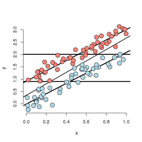
Looking at this plot, notice that the X variable is unrelated to treatment/group status (color). In addition, the X variable is clearly linearly related to Y, but the intercept of this relationship depends on group status. The treatment variable is also related to Y; especially look at the horizontal lines which connect the group means to the Y axis. The third line is the what you would get if you just fit X and ignored group. Furthermore, notice that the relationship between group status and Y is constant depending on X. In other words, both the apparent relationship and our estimated model have parallel lines. (Remember, our model, by not including an interaction term, did not allow for estimated non-parallel lines.)
Finally, notice that the estimated relationship between the group variable and the outcome doesn’t change much, regardless of whether X is accounted for or not. You can see this by comparing the distance between the horizontal lines and the distance between the intercepts of the fitted lines. The horizontal lines are the group averages (disregarding X). That the relationship doesn’t change much is ultimately a statement about balance. The nuisance variable (X) is well balanced between levels of the group variable. So, whether you account for X or not, you get about the same answer. Moreover, we have lots of data at every level of X to make a direct comparison of the group on Y. One way to try to achieve such balance with high probability is to randomize the group variable. This is especially useful, of course, when one doesn’t get to observe the nuisance covariate. Though be careful that as the number of unobserved covariates
Now let’s consider less ideal settings.
Experiment 2
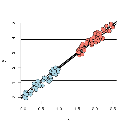
In this experiment, the X variable is highly related to group status. That is, if you know the X variable, you could very easily predict which group they belonged to. If we disregard X, there’s an apparent strong relationship between the group variable and Y. However, if we account for X, there’s basically none. In this case, the apparent effect of group on Y is entirely explained by X. Our regression model would likely have a strong significant effect if group was included by itself and this effect would vanish if X was included.
Further notice, there are no data to directly compare the groups at any particular value of X. (There’s no vertical overlap between the blue and red points.) Thus the adjusted effect is entirely based on the model, specifically the assumption of linearity. Try to draw curves on this plot assuming non-linear relationships outside of their cloud of points for the blue and red groups. You quickly will conclude that many relationships are possible that would differ from this model’s conclusions. Worse still, you have no data to check the assumptions. Of course, R will churn forward without any complaints fitting this model and reporting no significant difference between the groups.
It’s worth noting at this point, that our experiments just show how the data can arrive at different effects when X is included or not. In a real application, it may be the case that X should be included and maybe that it shouldn’t be.
For example, consider an example that I was working on a few years ago. Imagine if group was whether or not the subject was taking blood pressure medication and X was systolic blood pressure (ostensibly, the two variable giving the same information). It may not make sense to adjust for blood pressure when looking at blood pressure medication on the outcome.
On the other hand consider another setting I ran into. A colleague was studying chemical brain measurements of patients with a severe mental disorder versus controls post mortem. However, the time since death was highly related to the time the brain was stored since death, perhaps due to the differential patient sources of the two groups. The time since death was strongly related to the outcome we were studying. In this case, it is very hard to study the groups as they were so contaminated by this nuisance covariate.
Thus we arrive at the conclusion that whether or not to include a covariate is a complex process relying on both the statistics and a careful investigation into the subject matter being studied.
Experiment 3
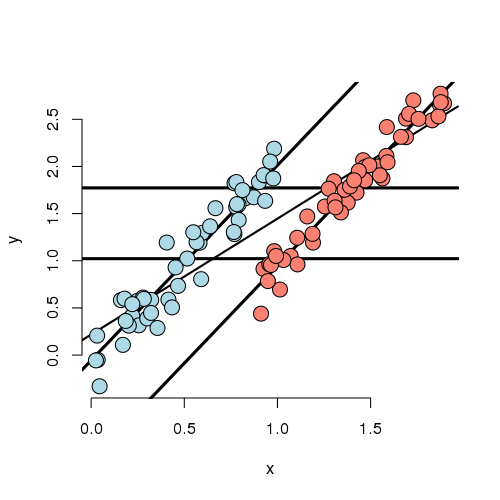
In this experiment, we simulated data where the marginal (ignoring X)
and conditional (using X) associations differ. First note that
if X is ignored, one would estimate a higher marginal mean for Y
of the red group over the blue group. However, if we look at the
intercept in the fitted model, the blue group has a higher
intercept. In other words, if you were to fit this linear
model as lm(Y ~ Group) you would get one answer and
lm(Y ~ Group + X) would give you the exact opposite answer,
and in both cases the group effect would be highly statistically
significant!
Also in this settings, there isn’t a lot of overlap between the groups for any given X. That means there isn’t a lot of direct evidence to compare the groups without relying heavily on the model. In other words, group status is related to X quite strongly (though not as strongly as in the previous example). The adjusted relationship suggest that the blue group is larger than the red group. However, the reversal of the effect comes as bigger X means more likely red and bigger X means higher Y.
Let’s concoct an example around a way this data could have occurred. Suppose that you’re comparing two ad campaigns (labeled blue and red). Y is the sales from the ad (suppose you can measure this) and X is time of day that the ad is shown. Ads shown later on in the day do better than ads shown earlier. However, the blue ad campaign tended to get run in the morning while the red one tended to get run in the evening. So, ignoring time of day leads to the erroneous conclusion that the the red ad did better. Again randomization of the ads to time slots would likely have eliminated this problem.
Experiment 4
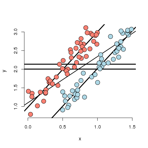
Now that you’ve gotten the hang of it. You can see how marginal and conditional associations can differ. Experiment 4 is a case where the marginal association is minimal yet the conditional association is large. In this case, by adding X to the model, the group effect became more statistically significant.
Experiment 5
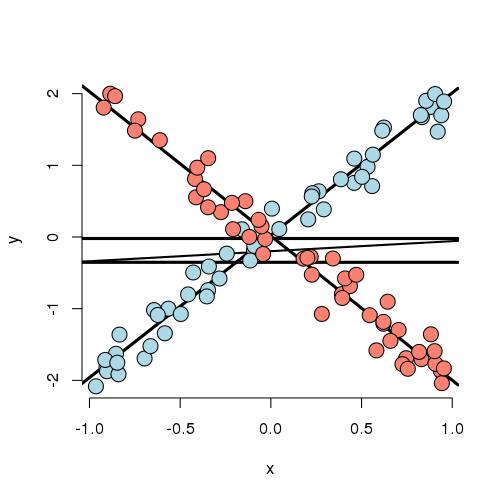
Let’s look at a weird one. In this case, the best fitting model has both a group main effect and interaction with X. The main point here is that there is no meaningful group effect, the effect of group depends on what level of X you’re at. At a small value of X, the red group is here and at a large value of X, the blue group is higher; at intermediate values, they’re the same. Thus, it makes no sense to talk about a group effect in this example; group and X are intrinsically linked in their impact on Y.
As an example, imagine if Y is health outcome, X is time and group is two medications. One makes you much better right away then much worse as time goes on and the other doesn’t do much at the start but steadily improves symptoms over time. Of course, most examples seen in practice aren’t that extreme. Still even with a slight departure in constant slopes, the meaning of a main group effect goes away.
Some final thoughts
Nothing we’ve discussed is intrinsic to having a discrete group and continuous X. One, the other, both or neither could be discrete. What this reinforces is that modeling multivariable relationships is hard. You should continue to play around with simulations to see how the inclusion or exclusion of another variable can change apparent relationships.
We should also caution that our discussion only dealt with associations. Establishing causal or truly mechanistic relationships requires quite a bit more thinking.
Exercises
- Load the dataset
Seatbeltsas part of thedatasetspackage viadata(Seatbelts). Useas.data.frameto convert the object to a dataframe. Fit a linear model of driver deaths withkmsandPetrolPriceas predictors. Interpret your results. - Compare the
kmscoefficient with and without the inclusion of thePetrolPricevariable in the model. Watch a video solution. - Compare the
PetrolPricecoefficient with and without the inclusion of thekmsvariable in the model.