Things we can do with the simple graph
The following headings in this section are intended to be a list of relatively simple ‘block’ type improvements that you can do to your graph to add functionality. The idea is to be able to use the simple graph that was used for the explanation of how D3 worked and just slot in code to add functionality (let’s hope it works for you :-)).
Setting up and configuring the Axes
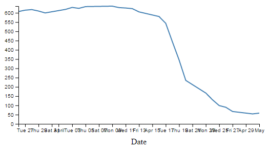
As referenced in the chapter where we initially developed our simple graph, the axes of that graph had no styling or configuration changes made to them at all. One of the results of this is that the font size, type, number of ticks and the way that the values are represented is very much at the default settings. This means that when we change our initial graph…
… and compress the margins or graph size we end up with axes that are not really suitable for the purpose;
Luckily, the D3 axis component has a wide range of configuration options and we can make changes simply via either the CSS styling or in the JavaScript code.
Change the text size
The first thing that we will change is the text size for the axes. The default size (built into D3) is 10px with the font type of sans-serif.
There are a couple of different ways that we could change the font size and either one is valid. The first way is to specify the font as a style when drawing an individual axis. To do this we simply add in a font style as follows;
  svg.append("g")
      .style("font", "14px times")
      .attr("transform", "translate(0," + height + ")")
      .call(d3.axisBottom(x));
This will increase the x axis font size to 14px and change the font type to ‘times’. Just like this;
There are a few things to notice here.
Firstly, we do indeed have a larger font and it appears to be of the type ‘times’. Yay!
Secondly, the y axis has remained as 10px sans-serif (which is to be expected since we only added the style to the x axis code block)
Lastly, the number of values represented on the x axis has meant that with the increase in font size there is some overlapping going on. We will deal with that shortly…
The addition of the styling for the x axis has been successful and in a situation where only one element on a page is being adjusted, this is a perfectly valid way to accomplish the task. However, in this case we should be interested in changing the font on both the x and y axes. We could do this by adding a duplicate style line to the y axis block, but we have a slightly better way of accomplishing the task by declaring the style in the HTML style block at the start of the code and then applying the same style to both blocks.
In the <style> ... </style> section at the start of the file add in the following line;
.axis { font: 14px sans-serif; }
This will set the font to 14px sans-serif (I prefer this to ‘times’) for anything that has the axis class applied to it. All we have to do then is to tell our x and y axes blocks to use the axis class as an attribute. We can do this as follows;
  // Add the X Axis
  svg.append("g")
      .attr("class", "axis")
      .attr("transform", "translate(0," + height + ")")
      .call(d3.axisBottom(x));

  // Add the Y Axis
  svg.append("g")
      .attr("class", "axis")
      .call(d3.axisLeft(y));
It could be argued that this doesn’t really conserve more code, but in my humble opinion it adds a more elegant way to alter styling in this case.
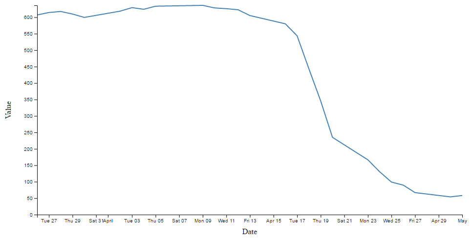
The end result now looks like the following;
Changing the number of ticks on an axis
Now we shall address the other problem that cropped up when we changed the size of the text. We have overlapping values on the x axis.
If I was to be brutally honest, I think that the number of values (ticks) on the graph is a bit too many. The format of the values (especially on the x axis) is too wide and this type of overlap was bound to happen eventually.
Good news. D3 has got us covered.
The axis component includes a function to specify the number of ticks on an axis. All we need to do is add in the function and the number of ticks like so;
  // Add the X Axis
  svg.append("g")
      .attr("class", "axis")
      .attr("transform", "translate(0," + height + ")")
      .call(d3.axisBottom(x)
              .ticks(5));
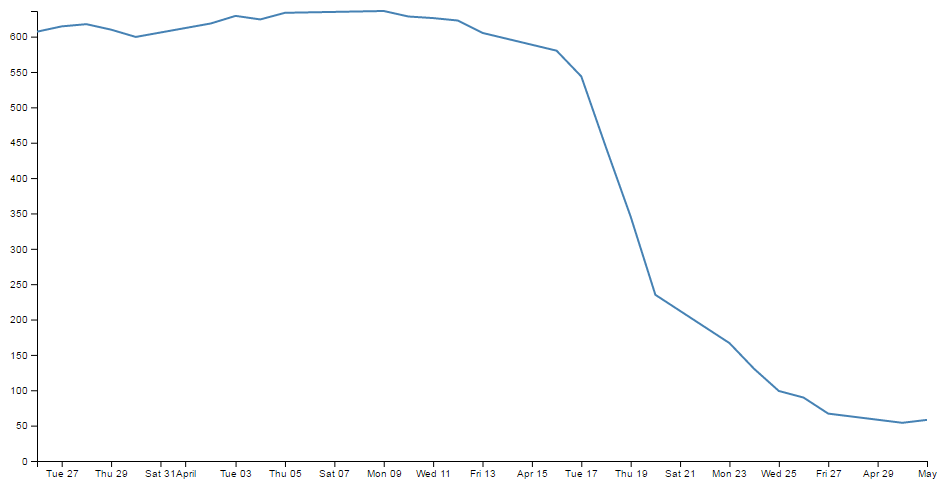
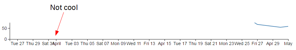
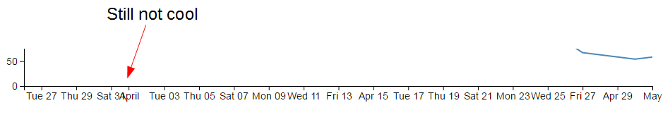
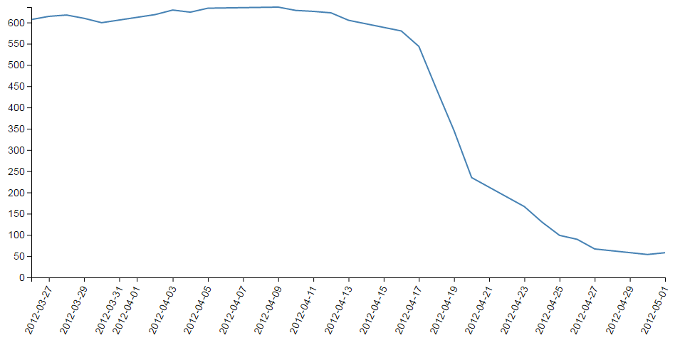
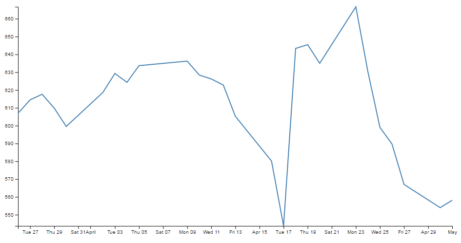
With the end result looking like this;

We can see that D3 has picked tick values that seem nice and logical. There’s one that starts on the 1st of April that’s just labelled ‘April’ and they go at a nice interval of one week for the subsequent ticks. Nice.
Hopefully you just did a quick count across the bottom of the previous graph and went “Yep, five ticks. Spot on”. Well done if you did, but there’s a little bit of a sneaky trick up D3’s sleeve with the number of ticks on a graph axis.
For instance, here’s what the graph looks like when the .ticks(5) value is changed to .ticks(4).
Eh? Hang on. Isn’t that some kind of mistake? There are still five ticks. Yep, sure is! But wait… we can keep dropping the ticks value till we get to two and it will still be the same. At .ticks(2) though, we finally see a change.

How about that? At first glance that just doesn’t seem right, then you have a bit of a think about it and you go “Hmm… When there were 5 ticks, they were separated by a week each, and that stayed that way till we got to a point where it could show a separation of a month”.
D3 is making a command decision for you as to how your ticks should be best displayed. This is great for simple graphs and indeed for the vast majority of graphs. Like all things related to D3, if you really need to do something bespoke, it will let you if you understand enough code.
The following is the list of time intervals that D3 will consider when setting automatic ticks on a time based axis;
- 1, 5, 15 and 30-second.
- 1, 5, 15 and 30-minute.
- 1, 3, 6 and 12-hour.
- 1 and 2-day.
- 1-week.
- 1 and 3-month.
- 1-year.
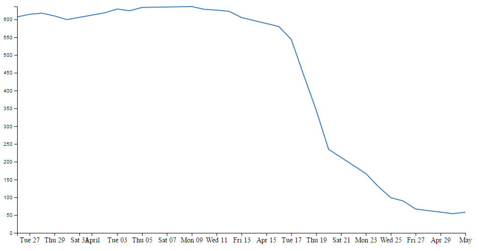
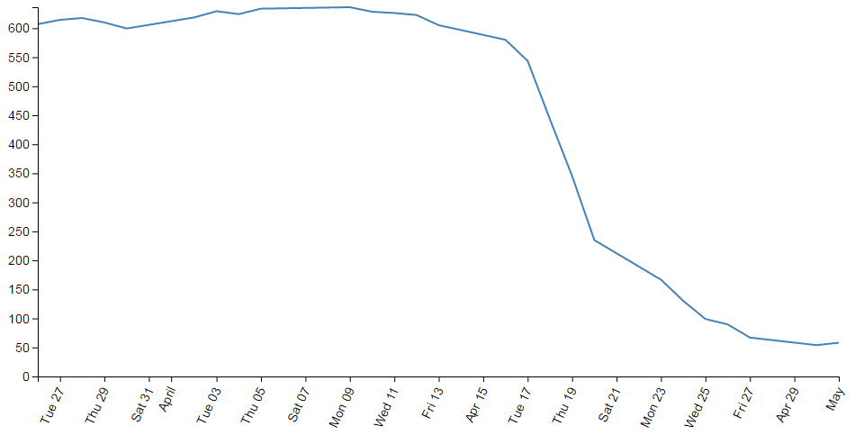
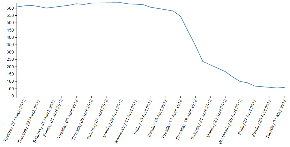
And yes. If you increase the number of ticks, you need to wait till you get to 10 before they change to an axis with interval of two days. And yes, the overlap is still there;
If we do a quick count we should also notice that we have 19 ticks!
The question should be asked. Can we specify our own intervals? Great question! Yes we can.
What we need to do is to use another D3 trick and specify an exact interval using the d3 time component. In our particular situation all we need to do is specify an interval inside the .ticks function. Specifically for an interval of 4 days for example we would use something like;
  // Add the X Axis
  svg.append("g")
      .attr("class", "axis")
      .attr("transform", "translate(0," + height + ")")
      .call(d3.axisBottom(x)
              .ticks(d3.timeDay.every(4)));
Here we use the timeDay unit of ‘days’ and specify an interval of 4 days.
The graph will subsequently appear as follows;
Intervals have a number of standard units (including UTC time) such as;
-
d3.timeMillisecond: Milliseconds -
d3.timeSecond: Seconds -
d3.timeMinute: Minutes -
d3.timeHour: Hours -
d3.timeDay: Days -
d3.timeWeek: This is an alias ford3.timeSundayfor a week -
d3.timeSunday: A week starting on Sunday -
d3.timeMonday: A week starting on Monday -
d3.timeTuesday: A week starting on Tuesday -
d3.timeWednesday: A week starting on Wednesday -
d3.timeThursday: A week starting on Thursday -
d3.timeFriday: A week starting on Friday -
d3.timeSaturday: A week starting on Saturday -
d3.timeMonth: Months starting on the 1st of the month -
d3.timeYear: Years Starting on the 1st day of the year
But what if we really wanted that two day separation of ticks without the overlap?
Rotating text labels for a graph axis
An answer to the problem of overlapping axis values might be to rotate the text to provide more space.
The answer I found most usable was provided by Aaron Ward on Google Groups.
The full code for this example can be found on github or in the code samples bundled with this book (simple-axis-rotated.html and data.csv). A working example can be found on bl.ocks.org.
The first substantive change would be a little housekeeping. Because we are going to be rotating the text at the bottom of the graph, we are going to need some extra space to fit in our labels. So we should change our bottom margin appropriately.
var margin = {top: 20, right: 20, bottom: 70, left: 50},
I found that 70 pixels was sufficient.
The remainder of our changes occur in the block that draws the x axis.
  // Add the X Axis
  svg.append("g")
      .attr("class", "axis")
      .attr("transform", "translate(0," + height + ")")
      .call(d3.axisBottom(x).ticks(10))
      .selectAll("text")
        .style("text-anchor", "end")
        .attr("dx", "-.8em")
        .attr("dy", ".15em")
        .attr("transform", "rotate(-65)");
It’s pretty standard until the .call(d3.axisBottom(x).ticks(10)) portion of the code. Here we remove the semicolon that was there so that the block continues with its function.
Then we select all the text elements that comprise the x axis with the .selectAll("text"). From this point onwards, we are operating on the text elements associated with the x axis. In effect; the following four ‘actions’ are applied to the text labels.
The .style("text-anchor", "end") line ensures that the text label has the end of the label ‘attached’ to the axis tick. This has the effect of making sure that the text rotates about the end of the date. This makes sure that the text all ends up at a uniform distance from the axis ticks.
The dx and dy attribute lines move the end of the text just far enough away from the axis tick so that they don’t crowd it and not too far away so that it appears disassociated. This took a little bit of fiddling to ‘look’ right and you will notice that I’ve used the ‘em’ units to get an adjustment if the size of the font differs.
The final action is kind of the money shot.
The transform attribute applies itself to each text label and rotates each line by -65 degrees. I selected -65 degrees just because it looked OK. There was no deeper reason.
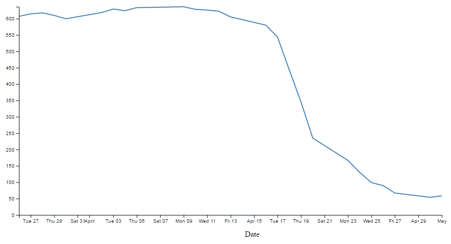
The end result then looks like the following;
This was a surprisingly difficult problem to find a solution to that I could easily understand (well done Aaron). That makes me think that there are some far deeper mysteries to it that I don’t fully appreciate that could trip this solution up. But in lieu of that, enjoy!
Formatting a date / time axis with specified values
OK then. We’ve been very clever in rotating our text, but you will notice that D3 has used its own good judgement as to what format the days / date will be represented as.
Not that there’s anything wrong with it, but what if we want to put a specific format of date / time nomenclature as axis labels?
No problem. D3 to the rescue again!
This is actually a pretty easy thing to do, but there are plenty of options for the formatting, so the only really tricky part is deciding what to put where.
But, before we start doing anything we are going to have to expand our bottom margin even more than we did with the rotate the axis labels feature.
var margin = {top: 20, right: 20, bottom: 100, left: 50},
That should see us right.
Now the simple part :-). Changing the format of the label is as simple as inserting the tickFormat command into the xAxis declaration and including a D3 time formatting function a little like this;
  svg.append("g")
      .attr("class", "axis")
      .attr("transform", "translate(0," + height + ")")
      .call(d3.axisBottom(x)
              .tickFormat(d3.timeFormat("%Y-%m-%d")))
      .selectAll("text")
        .style("text-anchor", "end")
        .attr("dx", "-.8em")
        .attr("dy", ".15em")
        .attr("transform", "rotate(-65)");
The timeFormat formatters are the same as those we used when parsing our time values when reading our data with the simple graph;
- %a - abbreviated weekday name.
- %A - full weekday name.
- %b - abbreviated month name.
- %B - full month name.
- %c - date and time, as “%a %b %e %H:%M:%S %Y”.
- %d - zero-padded day of the month as a decimal number [01,31].
- %e - space-padded day of the month as a decimal number [ 1,31].
- %H - hour (24-hour clock) as a decimal number [00,23].
- %I - hour (12-hour clock) as a decimal number [01,12].
- %j - day of the year as a decimal number [001,366].
- %m - month as a decimal number [01,12].
- %M - minute as a decimal number [00,59].
- %p - either AM or PM.
- %S - second as a decimal number [00,61].
- %U - week number of the year (Sunday as the first day of the week) as a decimal number [00,53].
- %w - weekday as a decimal number [0(Sunday),6].
- %W - week number of the year (Monday as the first day of the week) as a decimal number [00,53].
- %x - date, as “%m/%d/%y”.
- %X - time, as “%H:%M:%S”.
- %y - year without century as a decimal number [00,99].
- %Y - year with century as a decimal number.
- %Z - time zone offset, such as “-0700”.
- There is also a literal “%” character that can be presented by using double % signs.
So the format we have specified (%Y-%m-%d) will show the year with the century as a decimal number (%Y) followed by a hyphen, followed by a zero padded month as a decimal number (%m) followed by another hyphen and lastly the day as a zero padded day of the month (%d).
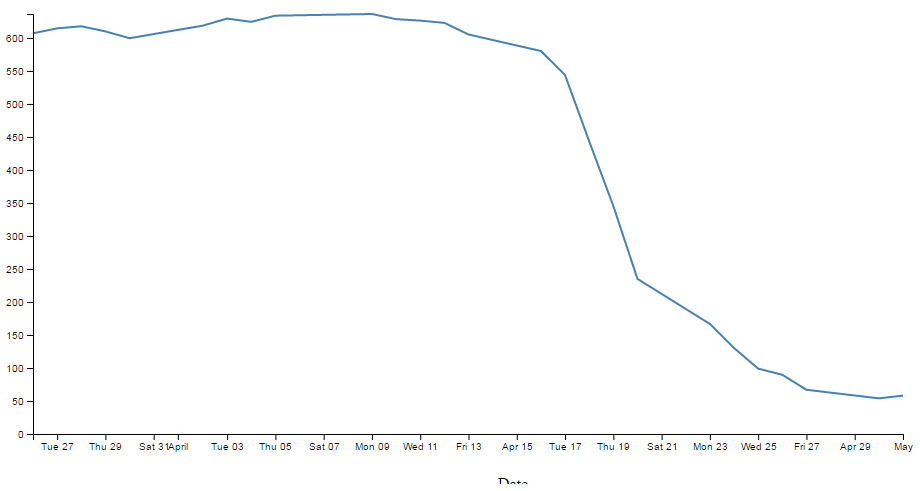
The end result looking a bit like this;
An example using this code can be found on github or in the code samples bundled with this book (simple-axis-rotated-formatted.html and data.csv). A working example can be found on bl.ocks.org. The example code also includes the rotating of the x axis text as described in the previous section.
So how about we try something a little out of the ordinary (extreme)?
How about the full weekday name (%A), the day (%d), the full month name (%B) and the year (%Y) as a four digit number?
  svg.append("g")
      .attr("class", "axis")
      .attr("transform", "translate(0," + height + ")")
      .call(d3.axisBottom(x)
              .tickFormat(d3.timeFormat("%A %d %B %Y")))
      .selectAll("text")
        .style("text-anchor", "end")
        .attr("dx", "-.8em")
        .attr("dy", ".15em")
        .attr("transform", "rotate(-65)");
We will also need some extra space for the bottom margin, so how about 170?
var margin = {top: 20, right: 20, bottom: 170, left: 50},
And….
Oh yeah… When axis ticks go bad…
But seriously, that does work as a pretty good example of the flexibility available.
Adding Axis Labels
What’s the first thing you get told at school when drawing a graph?
“Always label your axes!”
So, time to add a couple of labels!
We’ll start with our default code for our simple graph. The full code for this can be found on github or in the code samples bundled with this book (simple-graph.html and data.csv). A live example can be found on bl.ocks.org.
Preparation: Because we’re going to be adding labels to the bottom and left of the graph we need to increase the bottom and left margins. Changes like the following should suffice;
var margin = {top: 20, right: 20, bottom: 50, left: 70},
The x axis label
First things first (because they’re done slightly differently), the x axis. If we begin by describing what we want to achieve, it may make the process of implementing a solution a little more logical.
What we want to do is to add a simple piece of text under the x axis and in the centre of the total span. Wow, that does sound easy.
And it is, but there are different ways of accomplishing it, and I think I should take an opportunity to demonstrate them. Especially since one of those ways is a BAD idea.
Lets start with the bad idea first :-).
This is the code we’re going to add to the simple line graph script;
  // text label for the x axis
  svg.append("text")
      .attr("x", 480 )
      .attr("y",  475 )
      .style("text-anchor", "middle")
      .text("Date");
We will put it in between the blocks of script that add the x axis and the y axis.
  // Add the x Axis
  svg.append("g")
      .attr("transform", "translate(0," + height + ")")
      .call(d3.axisBottom(x));

  // PUT THE NEW CODE HERE!

  // Add the y Axis
  svg.append("g")
      .call(d3.axisLeft(y));
Before we describe what’s happening, let’s take a look at the result;
Well, it certainly did what it was asked to do. There’s a ‘Date’ label as advertised! (Yes, I know it’s not pretty.) Let’s describe the code and then work out why there’s a better way to do it.
  // text label for the x axis
  svg.append("text")
      .attr("x", 480 )
      .attr("y",  475 )
      .style("text-anchor", "middle")
      .text("Date");
The first line appends a “text” element to our svg element. There is a lot more to learn about “text” elements at the home of the World Wide Web Consortium (W3C).
The next two lines ( .attr("x", 480 ) and .attr("y", 475 ) ) set the attributes for the x and y coordinates to position the text on the svg.
The second last line (.style("text-anchor", "middle")) ensures that the text ‘style’ is such that the text is centre aligned and therefore remains nicely centred on the x, y coordinates that we send it to.
The final line (.text("Date");) adds the actual text that we are going to place.
That seems really simple and effective and it is. However, the bad part about it is that we have hard coded the location for the date into the code. This means if we change any of the physical aspects of the graph, we will end up having to re-calculate and edit our code. And we don’t want to do that.
Here’s an example. If I decide that I would prefer to decrease the height of the graph by editing the line here;
height = 500 - margin.top - margin.bottom;
and making the height 490 pixels;
height = 490 - margin.top - margin.bottom;
The result is as follows;
EVERYTHING about the graph has adjusted itself, except our nasty, hard coded ‘Date’ label which has been cruelly cut off. This is far from ideal and can be easily fixed by using the variables that we set up ever so carefully earlier.
So, instead of;
      .attr("x", 480 )
      .attr("y",  475 )
lets let our variables do the walking and use;
      .attr("x", width / 2 )
      .attr("y",  height + margin.top + 20)
So with this code we tell the script that the ‘Date’ label will always be halfway across the width of the graph (no matter how wide it is) and at the bottom of the graph with respect to its height plus the top margin and 20 pixels (as a fixed offset) (remember it uses a coordinates system that increases from the top down).
The end result of using variables is that if I go to an extreme of changing the height and width of my graph to;
    width = 560 - margin.left - margin.right,
    height = 300 - margin.top - margin.bottom;
We still finish up with an acceptable result;
Well, for the label position at least :-).
So the changes to using variables is just a useful lesson that variables rock and mean that you don’t have to worry about your graph staying in relative shape while you change the dimensions. The astute readers amongst you will have learned this lesson very early on in your programming careers, but it’s never a bad idea to make sure that users that are unfamiliar with the concept have an indicator of why it’s a good idea.
Now the third method that I mentioned at the start of our x axis odyssey. This is not mentioned because it’s any better or worse way to implement your script (The reason that I say this is because I’m not sure if it’s better or worse.) but because it’s sufficiently different to make it look confusing if you didn’t think of it in the first place.
So, we’ll take our marvellous coordinates code;
      .attr("x", width / 2 )
      .attr("y",  height + margin.top + 20))
And replace it with a single (longer) line;
      .attr("transform",
            "translate(" + (width/2) + " ," +
                           (height + margin.top + 20) + ")")
This uses the "transform" attribute to move (translate) the point to place the ‘Date’ label to exactly the same spot that we’ve been using for the other two examples (using variables of course).
The y axis label
So, that’s the x axis label. Time to do the y axis. The code we’re going to use looks like this;
  svg.append("text")
      .attr("transform", "rotate(-90)")
      .attr("y", 0 - margin.left)
      .attr("x",0 - (height / 2))
      .attr("dy", "1em")
      .style("text-anchor", "middle")
      .text("Value");
For the sake of neatness we will put the piece of code in a nice logical spot and this would be following the block of code that added the y axis (but before the closing curly bracket)
  // Add the y Axis
  svg.append("g")
      .call(d3.axisLeft(y));

  // PUT THE NEW CODE HERE!

});
And the result looks like this;
There we go, a label for the y axis that is nicely centred and (gasp!) rotated by 90 degrees! Woah, does the leetness never end! (No. No it does not.)
So, how do we get to this incredible result?
The first thing we do is the same as for the x axis and append a text element to our svg element (svg.append("text")).
Then things get interesting.
.attr("transform", "rotate(-90)")
Because that line rotates everything by -90 degrees. While it’s obvious that the text label ‘Value’ has been rotated by -90 degrees (from the picture), the following lines of code show that we also rotated our reference point (which can be a little confusing).
      .attr("y", 0 - margin.left)
      .attr("x",0 - (height / 2))
Let’s get graphical to illustrate how this works;
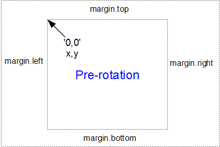
Here’s our starting position, with x,y in the 0,0 coordinate of the graph drawing area surrounded by the margins.
When we apply a -90 degrees transform we get the equivalent of this;
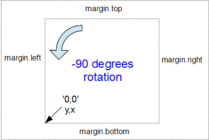
Here the 0,0 coordinate has been shifted by -90 degrees and the x,y designations are flipped so that we now need to tell the script that we’re moving a ‘y’ coordinate when we would have otherwise been moving ‘x’.
Hence, when the script runs…
.attr("y", 0 - margin.left)
… we can see that this is moving the x position to the left from the new 0 coordinate by the margin.left value.
Likewise when the script runs…
.attr("x",0 - (height / 2))
… this is actually moving the y position from the new 0 coordinate halfway up the height of the graph area.
Right, we’re not quite done yet. The following line has the effect of shifting the text slightly to the right.
.attr("dy", "1em")
Firstly the reason we do this is that our previous translation of coordinates means that when we place our text label it sits exactly on the line of 0 – margin.left. But in this case that takes the text to the other side of the line, so it actually sits just outside the boundary of the svg element.
The "dy" attribute is another coordinate adjustment move, but this time a relative adjustment and the “1em” is a unit of measure that equals exactly one unit of the currently specified text point size. So what ends up happening is that the ‘Value’ label gets shifted to the right by exactly the height of the text, which neatly places it exactly on the edge of the canvas.
The two final lines of this part of the script are the same as for the x axis. They make sure the reference point is aligned to the centre of the text (.style("text-anchor", "middle")) and then it prints the text (.text("Value");). There, that wasn’t too painful.
The full code for this example can be found on github or in the code samples bundled with this book (axis-labels.html and data.csv). A live example can be found on bl.ocks.org.
How to add a title to your graph
If you’ve read through the adding the axis labels section most of this will come as no surprise.
What we want to do to add a title to the graph is to add a text element (just a few words) that will appear above the graph and centred left to right.
We’ll start with our default code for our simple graph. The full code for this can be found on github or in the code samples bundled with this book (simple-graph.html and data.csv). A live example can be found on bl.ocks.org.
Preparation: Because we’re going to be adding a title to the top of the graph we need to increase the top margin. Changes like the following should suffice;
var margin = {top: 40, right: 20, bottom: 50, left: 70},
To add the title this is the code we’re going to add to the simple line graph script;
  // add a title
  svg.append("text")
      .attr("x", (width / 2))
      .attr("y", 0 - (margin.top / 2))
      .attr("text-anchor", "middle")
      .style("font-size", "20px")
      .style("text-decoration", "underline")
      .text("Value vs Date Graph");
And the end result will look like this;
A nice logical place to put the block of code would be towards the end of the JavaScript. In fact I would put it as the last element we add. So here;
  // add the Y Axis
  svg.append("g")
      .call(d3.axisLeft(y));

  // PUT THE NEW CODE HERE!

});
Now since the vast majority of the code for this block is a regurgitation of the axis labels code, I don’t want to revisit that and bloat up this document even more, so I will direct you back to that section if you need to refresh yourself on any particular line. But….. There are a couple of new ones in there which could benefit from a little explanation.
Both of them are style descriptors and as such their job is to apply a very specific style to this element.
        .style("font-size", "20px")
        .style("text-decoration", "underline")
What they do is pretty self explanatory. Make the text a specific size and underline it. But what is perhaps slightly more interesting is that we have this declaration in the JavaScript code and not in the CSS portion of the file.
Change a line chart into a scatter plot
Confession time.
I didn’t actually intend to add in a section with a scatter plot in it because I thought it would be;
- tricky
- not useful
- all of the above
I was wrong on all counts.
All you need to do is take the simple graph example file. The full code for this can be found on github or in the code samples bundled with this book (simple-graph.html and data.csv). A live example can be found on bl.ocks.org.
We then slot the following block in between the ‘Add the valueline path’ and the ‘add the x axis’ blocks.
  // Add the scatterplot
  svg.selectAll("dot")
      .data(data)
    .enter().append("circle")
      .attr("r", 5)
      .attr("cx", function(d) { return x(d.date); })
      .attr("cy", function(d) { return y(d.close); });
And you will get…
The full code for this graph can also be found on github or in the code samples bundled with this book (scatterplot.html and data.csv). A live example can be found on bl.ocks.org.
I deliberately put the dots after the line in the drawing section, because I thought they would look better, but you could put the block of code before the line drawing block to get the following effect;
(just trying to reinforce the concept that ‘order’ matters when drawing objects :-)).
You could of course just remove the line block all together…
But in my humble opinion it loses something.
So what do the individual lines in the scatter plot block of JavaScript do?
The first line (svg.selectAll("dot")) essentially provides a suitable grouping label for the svg circle elements that will be added. The next line associates the range of data that we have to the group of elements we are about to add in.
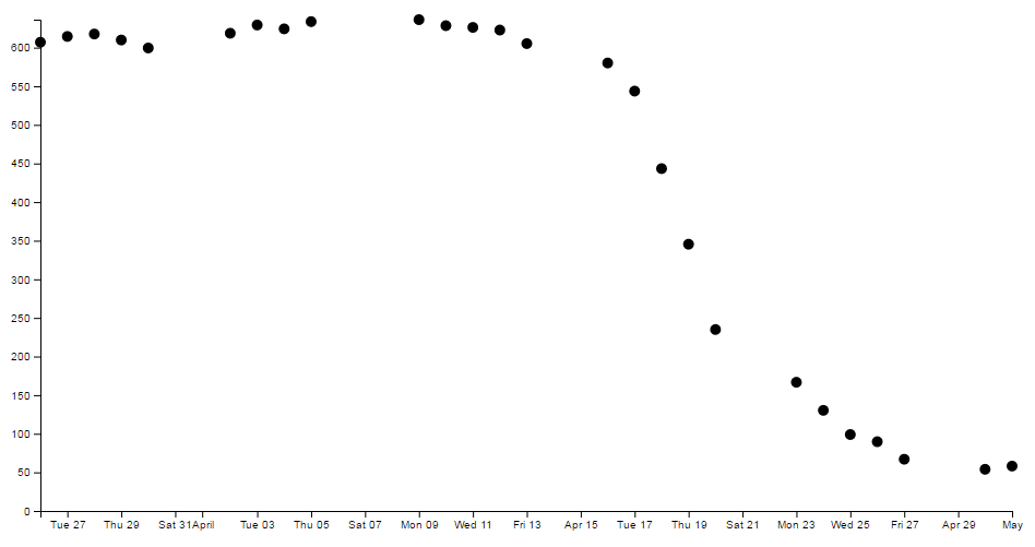
Then we add a circle for each data point (.enter().append("circle")) with a radius of 5 pixels (.attr("r", 5)) and appropriate x (.attr("cx", function(d) { return x(d.date); })) and y (.attr("cy", function(d) { return y(d.close); });) coordinates.
There is lots more that we could be doing with this piece of code (check out the scatter plot example) including varying the colour or size or opacity of the circles depending on the data and all sorts of really neat things, but for the mean time, there we go. Scatter plot!
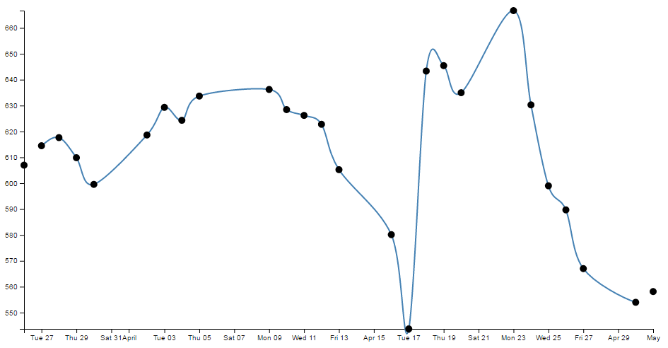
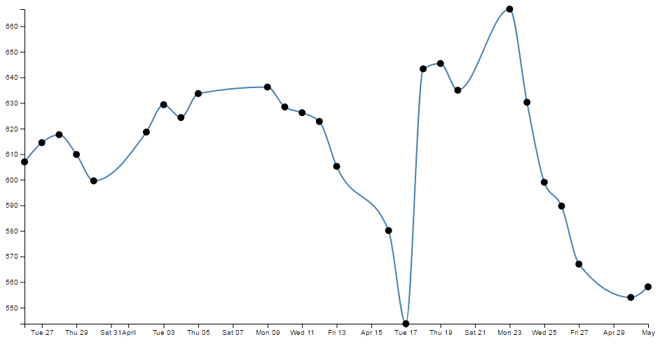
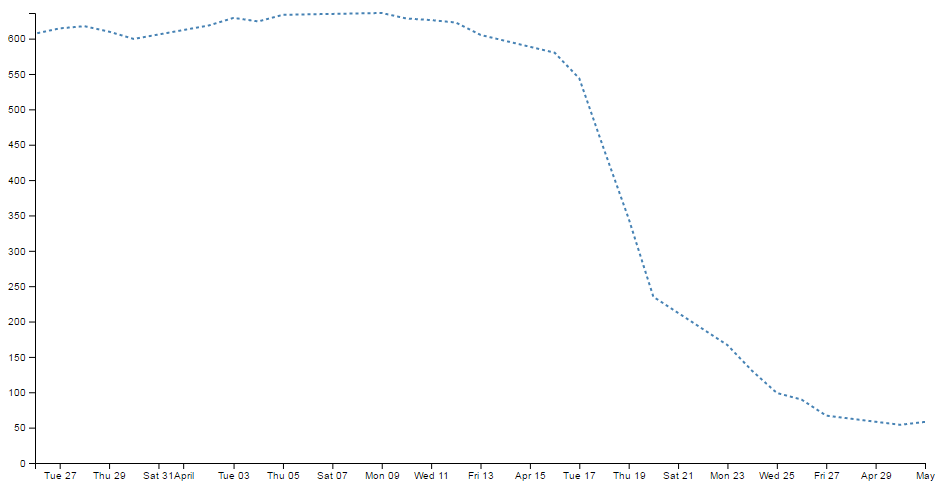
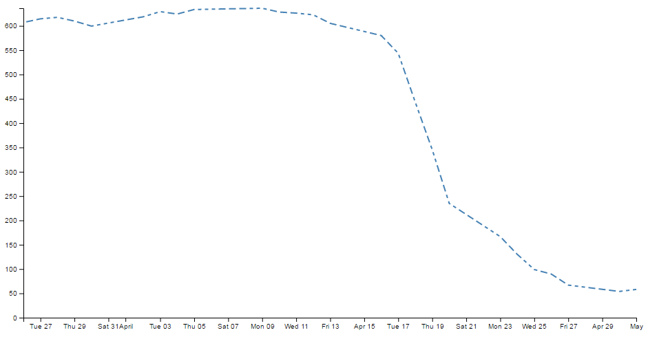
Smoothing out graph lines
When you draw a line graph, what you’re doing is taking two (or more) sets of coordinates and connecting them with a line (or lines). I know that sounds simplistic, but bear with me. When you connect these points, you’re telling the viewer of the graph that in between the individual points, you expect the value to vary in keeping with the points that the line passes through. So in a way, you’re trying to interpret the change in values that are not shown.
Now this is not strictly true for all graph types, but it does hold for a lot of line graphs.
So… when connecting these known coordinates together, you want to make the best estimate of how the values would be represented. In this respect, sometimes a straight line between points is not the best representation.
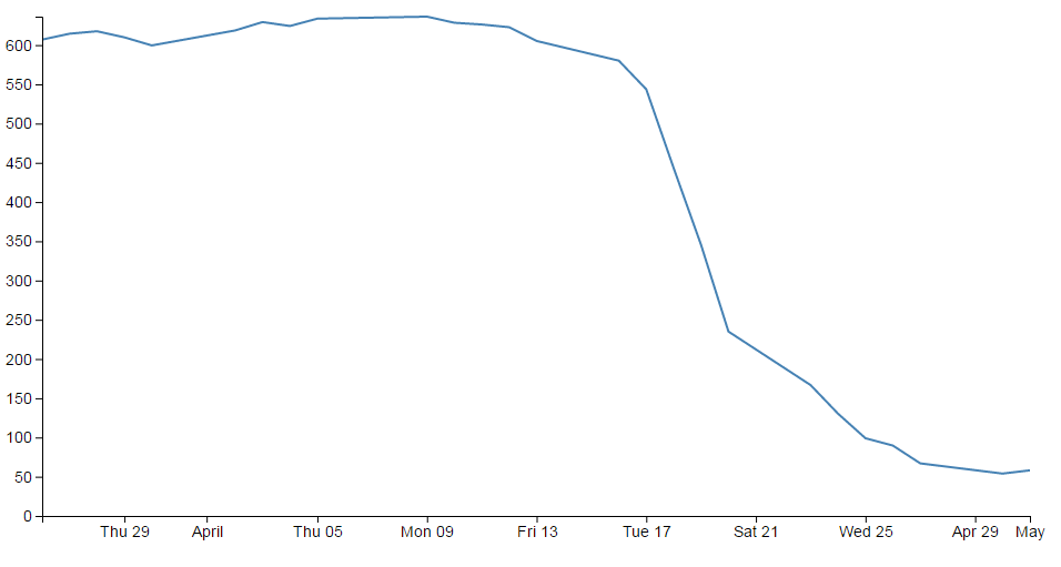
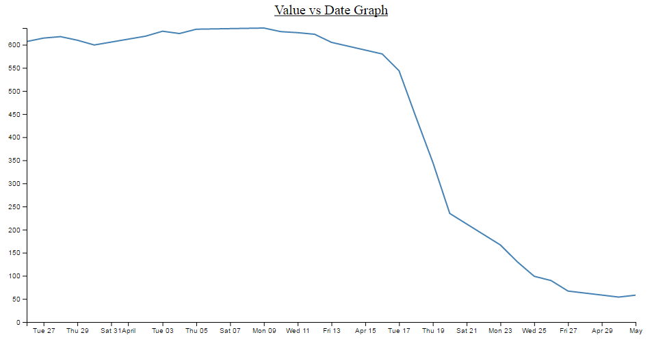
For instance. Earlier, when demonstrating the extent function for graphing we showed a graph of the varying values with the y axis showing a narrow range.
The resulting variation of the graph shows a fair amount of extremes and you could be forgiven for thinking that if this represented a smoothly flowing analog system of some kind then some of those sharp peaks and troughs would not be a true representation of how the system or figures varied.
So how should it look? Ahh… The $64,000 question. I don’t know :-). You will have a better idea since you are the person who will know your data best. However, what I do know is that D3 has some tricks up its sleeve to help.
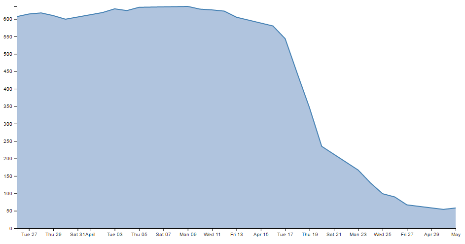
We can easily change what we see above into;
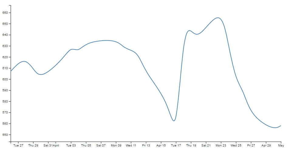
How about that? And the massive amount of code required to carry out what must be a ridiculously difficult set of calculations?
.curve(d3.curveBasis);
So where does this neat piece of code go? Here;
// define the line
var valueline = d3.line()
    .curve(d3.curveBasis)	 		// <=== THERE IT IS!
    .x(function(d) { return x(d.date); })
    .y(function(d) { return y(d.close); });
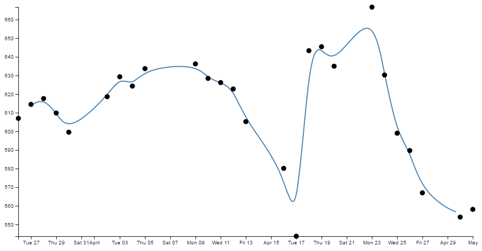
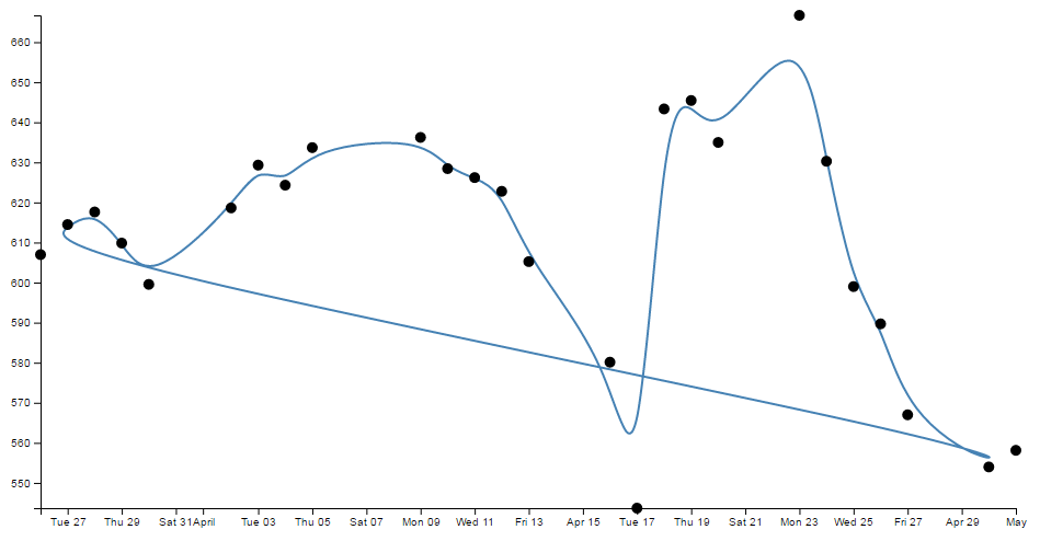
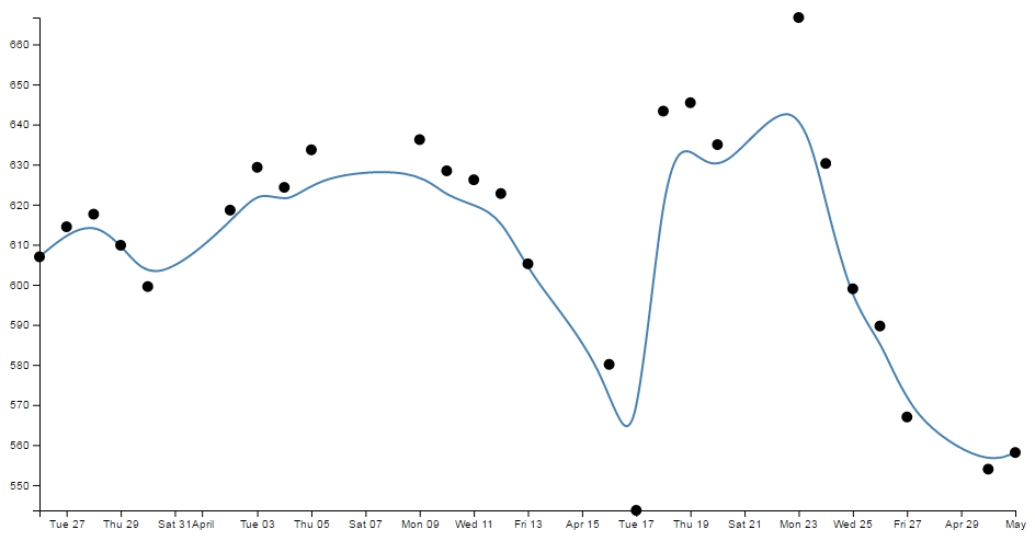
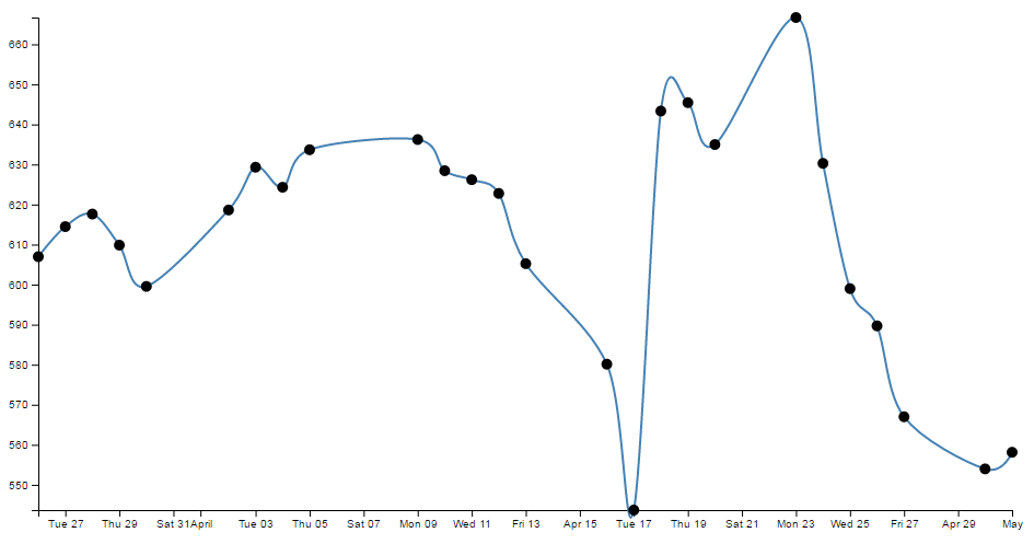
So is that it? Nooooo…….. There’s more! This is one form of interpolation effect that can be applied to your data, but there is a range and depending on your data you can select the one that is appropriate.
Here’s the list of available options and for more about them head on over to the D3 wiki.
- linear (
d3.curveLinear) – Normal line (jagged). - linear-closed (
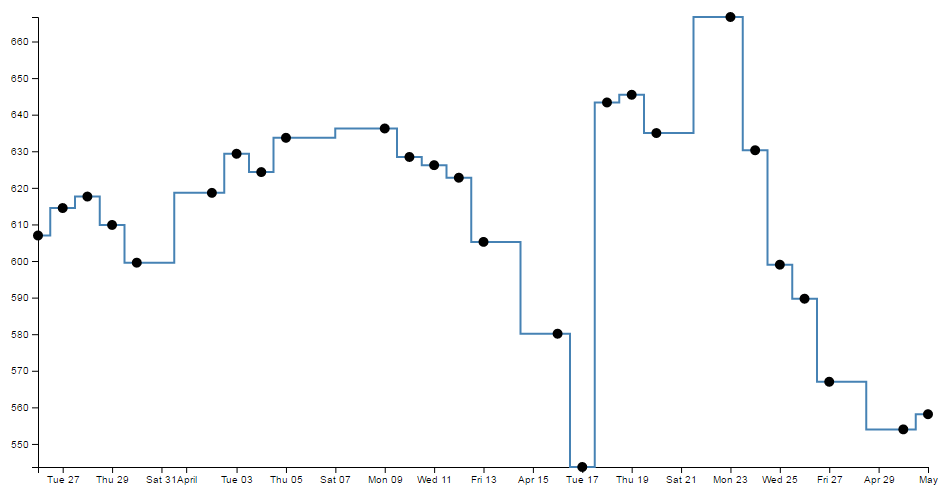
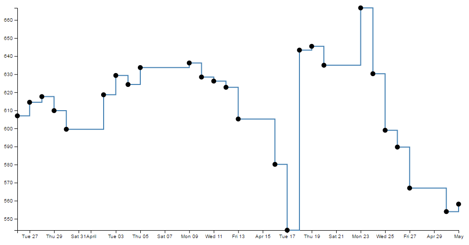
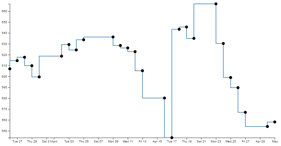
d3.curveLinearClosed) – A normal line (jagged) families of curves available with the start and the end closed in a loop. - step (
d3.curveStep)- a stepping graph alternating between vertical and horizontal segments. The y values change at the mid point of the adjacent x values - step-before (
d3.curveStepBefore) - a stepping graph alternating between vertical and horizontal segments. The y values change before the x value. - step-after (
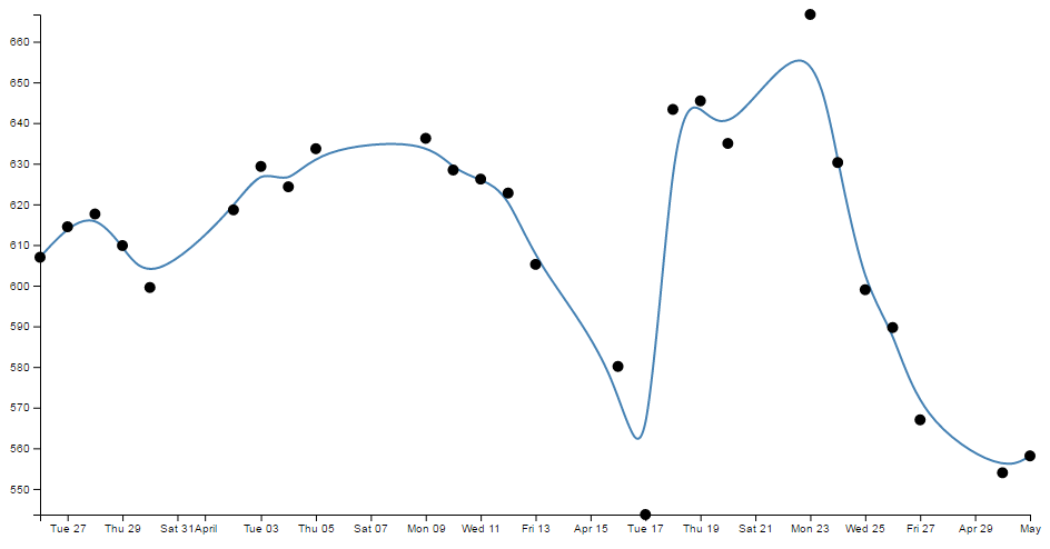
d3.curveStepAfter) - a stepping graph alternating between horizontal and vertical segments. The y values change after the x value. - basis (
d3.curveBasis) - a B-spline, with control point duplication on the ends (that’s the one above). - basis-open (
d3.curveBasisOpen) - an open B-spline; may not intersect the start or end. - basis-closed (
d3.curveBasisClosed) - a closed B-spline, with the start and the end closed in a loop. - bundle (
d3.curveBundle) - equivalent to basis, except a separate tension parameter is used to straighten the spline. This could be really cool with varying tension. - cardinal (
d3.curveCardinal) - a Cardinal spline, with control point duplication on the ends. It looks slightly more ‘jagged’ than basis. - cardinal-open (
d3.curveCardinalOpen) - an open Cardinal spline; may not intersect the start or end, but will intersect other control points. So kind of shorter than ‘cardinal’. - cardinal-closed (
d3.curveCardinalClosed) - a closed Cardinal spline, looped back on itself. - monotone (
d3.curveMonotoneX) - cubic interpolation that makes the graph only slightly smoother. - catmull-Rom (
d3.curveCatmullRom) - New for v4 - a cubic Catmull–Rom spline - catmull-Rom-closed (
d3.curveCatmullRomClosed) - New for v4 - a closed cubic Catmull–Rom spline - catmull-Rom-open (
d3.curveCatmullRomOpen) - New for v4 - an open cubic Catmull–Rom spline
Because in the course of writing this I took an opportunity to play with each of them, I was pleasantly surprised to see some of the effects and it seems like a shame to deprive the reader of the same joy :-). So at the risk of deforesting the planet (so I hope you are reading this in electronic format) here is each of the above interpolation types applied to the same data.
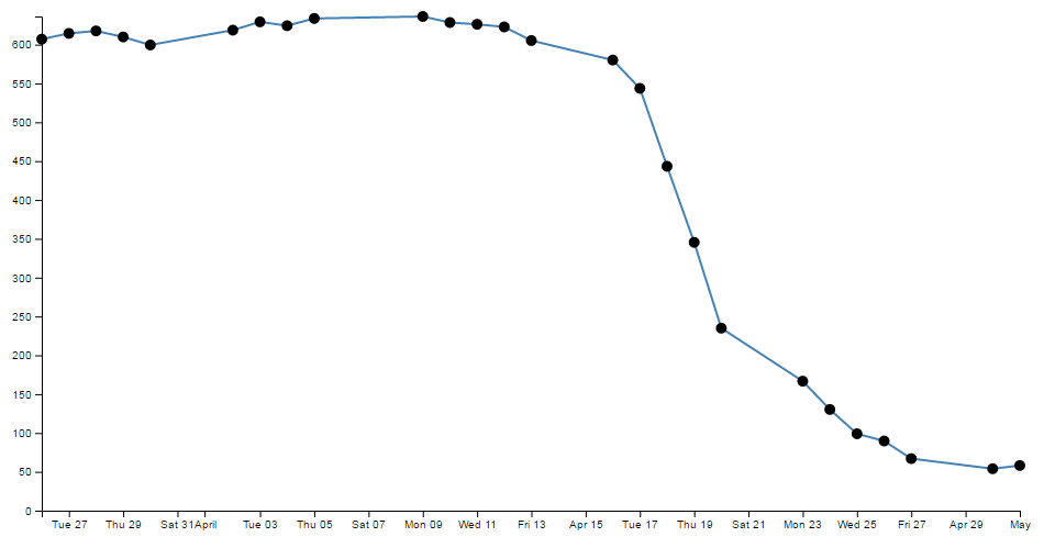
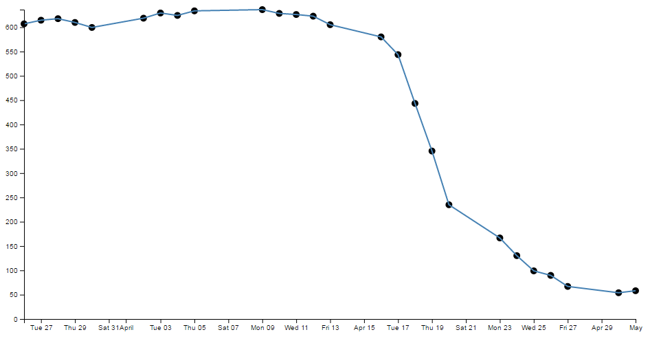
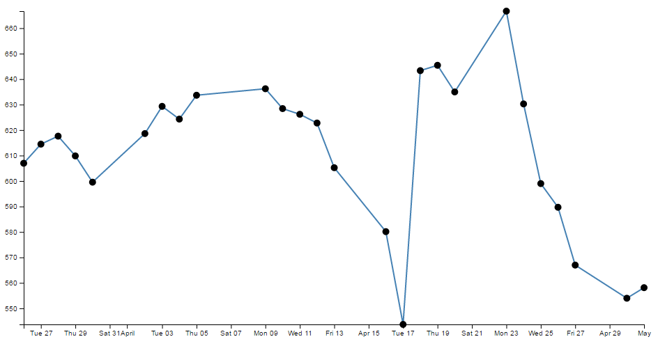
This is also an opportunity to add some reader feedback awesomeness. Many thanks to ‘enjalot’ for the great suggestion to plot the points of the data as separate circles on the graphs. Since the process of interpolation has the effect of ‘interpreting’ the trends of the data to the extent that in some cases, the lines don’t intersect the actual data much at all.
Each of the following shows the smoothing curve and the data that is used to plot the graph (as a scatterplot).


Just in case you’re in the mood for another example, feel free to check out the bl.ock here which shows all of the basic forms of the curve types (I didn’t include the open and closed versions or ‘bundle’ since it is the equivalent of ‘basis’). The full code for this can also be found in the code samples bundled with this book (interpolate.html and data-3.csv). A live example can be found on bl.ocks.org.
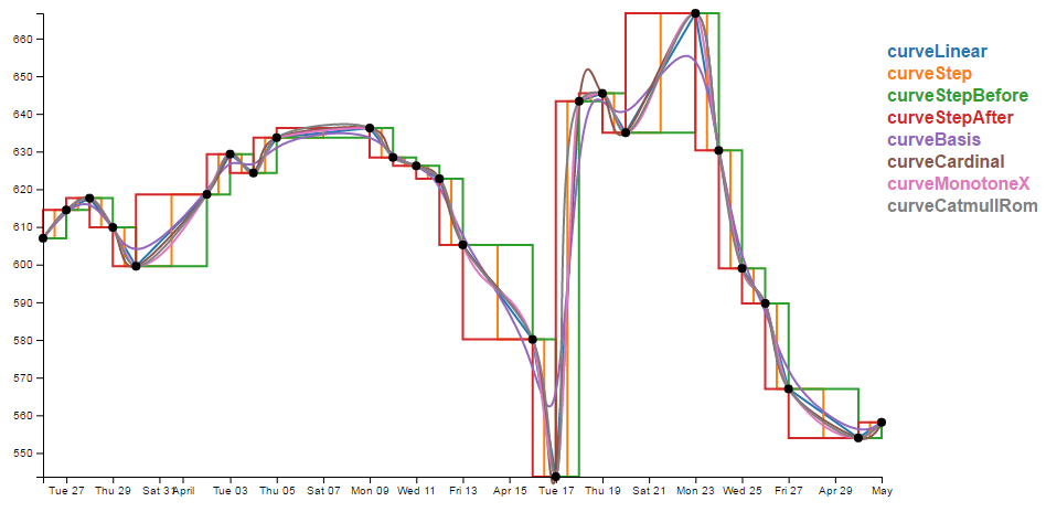
So, over to you to decide which format of interpolation is going to suit your data best:-).
Make a dashed line
Dashed lines totally rock!
One of the best parts about it is that they’re so simple to do!
Literally one line!!!!
So lets imagine that we want to make the line on our simple graph dashed. All we have to do is insert the following line in our JavaScript code here;
  // Add the valueline path.
  svg.append("path")
      .data([data])
      .attr("class", "line")
      .style("stroke-dasharray", ("3, 3"))  // <== This line here!!
      .attr("d", valueline);
And our graph ends up like this;
Hey! It’s dashtastic!
So how does it work?
Well, obviously "stroke-dasharray" is a style for the path element, but the magic is in the numbers.
Essentially they describe the on length and off length of the line. So "3, 3" translates to 3 pixels (or whatever they are) on and 3 pixels off. Then it repeats. Simple eh?
So, experiment time :-)
What would the following represent?
"5, 5, 5, 5, 5, 5, 10, 5, 10, 5, 10, 5"
Try not to cheat…
Ahh yes, Mr. Morse would be proud.
And you can put them anywhere. Here are our axes perverted with dashes;
  // Add the X Axis
  svg.append("g")
      .attr("transform", "translate(0," + height + ")")
      .style("stroke-dasharray", ("3, 3"))
      .call(d3.axisBottom(x));

  // Add the Y Axis
  svg.append("g")
      .style("stroke-dasharray", ("3, 3"))
      .call(d3.axisLeft(y));

Well… I suppose you can have too much of a good thing. With great power comes great responsibility. Use your dash skills wisely and only for good.
Filling an area under the graph
Lines are all very well and good, but that’s not the whole story for graphs. Sometimes you’ve just got to go with a fill.
Filling an area with a solid colour isn’t too hard. I mean we did it by mistake back a few pages when we were trying to draw a line.
But to do it in a nice coherent way is fairly straight forward.
It takes three sections of code in much the same way that we drew our grid lines earlier;
- One in the CSS section to define what style the area will have.
- One to define the functions that generate the area. And…
- One to draw the area.
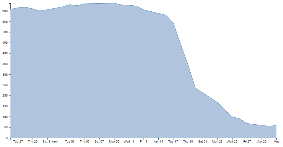
The end result will looks a bit like this;
While we’ll start with our default code for our simple graph, the full code for this area graph can be found on github or in the code samples bundled with this book (area.html and data.csv). A live example can be found on bl.ocks.org.
CSS for an area fill
This is pretty straight forward and only consists of one rule;
.area {
  fill: lightsteelblue;
}
Put it at the bottom of your <style> section.
The style (fill: lightsteelblue;) sets the colour of our fill (and in this case we have chosen a lighter shade of the same colour as our line to match it).
Define the area function
We need a function that will tell the area what space to fill. This is accessed from the d3.area function
The code that we will use is as follows;
// define the area
var area = d3.area()
    .x(function(d) { return x(d.date); })
    .y0(height)
    .y1(function(d) { return y(d.close); });
I have placed it in between the range variable definitions and the line definitions here;
// set the ranges
var x = d3.scaleTime().range([0, width]);
var y = d3.scaleLinear().range([height, 0]);

                         <==== Put the new code here!

// define the line
var valueline = d3.line()
    .x(function(d) { return x(d.date); })
    .y(function(d) { return y(d.close); });
So the only changes to the code are the addition of the y0 line and the renaming of the y line y1.
Here’s a picture that might help explain;
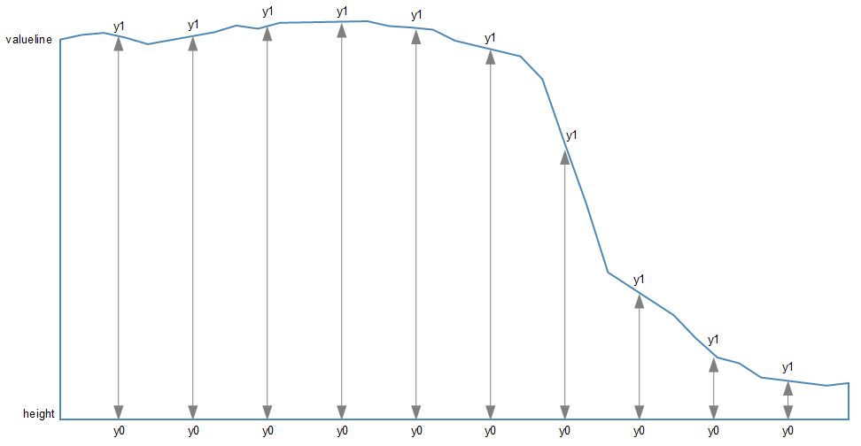
As should be apparent, the top line (y1) follows the valueline line and the bottom line is at the constant ‘height’ value. Everything in between these lines is what gets filled. The function in this section describes the area.
Draw the area
Now to the money maker.
The final section of code in the area filling odyssey is as follows;
  // add the area
    svg.append("path")
       .data([data])
       .attr("class", "area")
       .attr("d", area);
We should place this block directly after the domain functions but before the drawing of the valueline path;
  // scale the range of the data
  x.domain(d3.extent(data, function(d) { return d.date; }));
  y.domain([0, d3.max(data, function(d) { return d.close; })]);

                                //   <== Area drawing code here!

  // add the valueline path.
  svg.append("path")
      .data([data])
      .attr("class", "line")
      .attr("d", valueline);
This is actually a pretty good idea to put it there since the various bits and pieces that are drawn in the graph are done so one after the other. This means that the filled area comes first, then the valueline is layered on top and then the axes come last. This is a pretty good sequence since if there are areas where two or more elements overlap, it might cause the graph to look ‘wrong’.
For instance, here is the graph drawn with the area added last.
You should be able to notice that part of the valueline line has been obscured and the line for the y axis where it coincides with the area is obscured also.
Looking at the code we are adding here, the first line appends a path element (svg.append("path")) much like the script that draws the line.
The second line (.data([data])) declares the data we will be utilising for describing the area and the third line (.attr("class", "area")) makes sure that the style we apply to it is as defined in the CSS section (under ‘area’).
The final line (.attr("d", area);) declares “d” as the attributer for path data and calls the ‘area’ function to do the drawing.
And that’s it!
Filling an area above the line
Pop Quiz:
How would you go about filling the area ABOVE the graph?
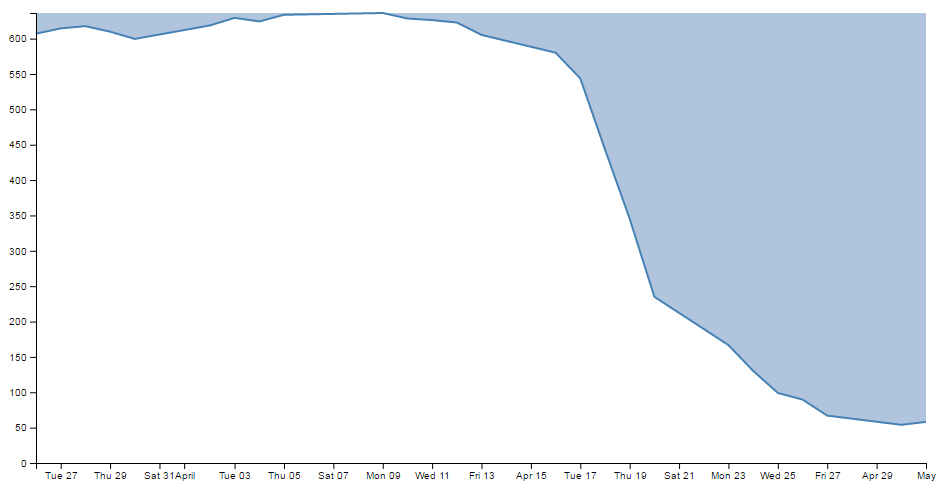
In this instance, you could fill the lower area as has been demonstrated here, and with a small change you can fill another area with a solid colour above another line.
How is this incredible feat achieved?
Well, remember the code that defined the area?
// define the area
var area = d3.area()
    .x(function(d) { return x(d.date); })
    .y0(height)
    .y1(function(d) { return y(d.close); });
All we have to do is tell it that instead of setting the y0 constant value to the height of the graph (remember, this is the bottom of the graph) we will set it to the constant value that is at the top of the graph. In other words zero (0).
.y0(0)
That’s it.
Now, I’m not going to go over the process of drawing two lines and filling each in different directions to demonstrate the example I described, but this provides a germ of an idea that you might be able to flesh out :-)
Adding a drop shadow to allow text to stand out on graphics.
I’ve deliberately positioned this particular tip to follow the ‘filling an area’ description because it provides an opportunity to demonstrate the principle to slightly better effect.
While we’ll start with our code for our area graph, the full code for the graph with shadowy text can be found on github or in the code samples bundled with this book (shadow.html and data.csv). A live example can be found on bl.ocks.org.
There have been several opportunities where I have wanted to place text overlaid on graphs for convenience sake only to have it look overly messy as the text interferes with the graph.
Anyway, what we’ll do is leave the area fill in place and place the title back on the graph, but position the title so that it lays on top of the fill like so;

The additional code for the title is the following and appears just after the drawing of the axes.
  svg.append("text")
      .attr("x", (width / 2))
      .attr("y", 25 )
      .attr("text-anchor", "middle")
      .style("font-size", "24px")
      .style("text-decoration", "underline")
      .text("Value vs Date Graph");
(the only change from the previous title example is the ‘y’ attribute which has been hard coded to 25 to place it inconveniently on the filled area and the size of the font)
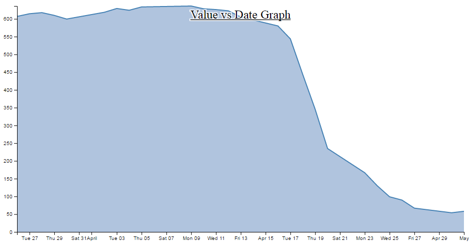
So, what we want to end up with is something like the following…
In my humble opinion, it’s just enough to make the text acceptable :-).
The method that I’ll describe to carry this out is designed so that the drop shadow effect can be applied to any text elements in the graph, not the isolated example that we will use here. In order to implement this marvel of utility we will need to make changes in two areas. One in the CSS where we will define a style for white shadowy backgrounds and the second to draw it.
CSS for white shadowy background
The code to add to the CSS section is as follows;
text.shadow {
  stroke: white;
  stroke-width: 4px;
  opacity: 0.8;
}
The first line designates that the style applies to text with a ‘shadow’ label. The stroke is set to white. The width of the line is set to 4px and it is made to be slightly see-through. So by setting the line that surrounds the text to be thick, white and see-through gives it a slightly ‘cloudy’ effect. If we remove the black text from over the top we get a slightly better look;

Of course if you want to have a play with any of these settings, you should have a go and see what works best for your graph.
Drawing the white shadowy background.
Now that we’ve set the style for our background, we need to draw it in.
The code for this should be extremely familiar;
  svg.append("text")
      .attr("x", (width / 2))
      .attr("y", 25 )
      .attr("text-anchor", "middle")
      .style("font-size", "24px")
      .style("text-decoration", "underline")
      .attr("class", "shadow")			// <=== Here's the different line
      .text("Value vs Date Graph");
That’s because it’s identical to the piece of code that was used to draw the title except for the one line that is indicated above. The reason that it’s identical is that what we are doing is placing a white shadow on the graph and then the text on top of it, if it deviated by a significant amount it will just look silly. Of course a slight amount could look effective, in which case adjust the ‘x’ or ‘y’ attributes.
One of the things I pointed out in the previous paragraph was extremely important. That’s the bit that tells you that we needed to place the shadow before we placed the black text. For the same reason that we placed the area fill on first in the area fill example, If black text goes on before the shadow, it will look pretty silly. So place this block of code just before the block that draws the title.
So the line that has been added in is the one that tells D3 that the text that is being drawn will have the white cloudy effect. And at the risk of repeating myself, if you have several text elements that could benefit from this effect, once you have the CSS code in place, all you need to do is duplicate the block that adds the text and add in that single line and voila!
Adding grid lines to a graph
Grid lines are an important feature for some graphs as they allow the eye to associate three analogue scales (the x and y axis and the displayed line).
There is currently a tendency to use graphs without grid lines online as it gives the appearance of a ‘cleaner’ interface, but they are still widely used and a necessary component for graphing.
This is what we’re going to draw;

While we’ll start with our default code for our simple graph, the full code for the graph with grid lines can be found on github or in the code samples bundled with this book (grid.html and data.csv). A live example can be found on bl.ocks.org.
How to build grid lines?
We’re going to use the axis function to generate two more axis elements (one for x and one for y) but for these ones instead of drawing the main lines and the labels, we’re just going to draw the tick lines. Really long tick lines (I’m considering calling them long cat lines).
To create them we have to add in 3 separate blocks of code.
- One in the CSS section to define what style the grid lines will have.
- One to define the functions that generate the grid lines. And…
- One to draw the lines.
The grid line CSS
This is the total styling that we need to add for the tick lines;
.grid line {
  stroke: lightgrey;
  stroke-opacity: 0.7;
  shape-rendering: crispEdges;
}

.grid path {
  stroke-width: 0;
}
Just add this block of code at the end of the current CSS that is in the simple graph template (just before the </style> tag).
The CSS here is done in two parts.
The first portion sets the line colour (stroke), the opacity (transparency) of the lines and make sure that the lines are narrow (crispEdges).
  stroke: lightgrey;
  stroke-opacity: 0.7;
  shape-rendering: crispEdges;
The colour is pretty standard, but in using the opacity style we give ourselves the opportunity to use a good shade of colour (if grey actually is a colour) and to juggle the degree to which it stands out a little better.
The second part is the stroke width.
stroke-width: 0;
Now it might seem a little weird to be setting the stroke width to zero, but if you don’t (and we remove the style) this is what happens;
If you look closely (compare with the previous picture if necessary) the grid lines for the top and right edges have turned black. The stroke width style is obviously adding in new axis lines and we’re not interested in them at the moment. Therefore, if we set the stroke width to zero, we get rid of the problem.
Define the grid line functions
We will need to define two functions to generate the grid lines and they look a little like this;
// gridlines in x axis function
function make_x_gridlines() {
    return d3.axisBottom(x)
        .ticks(5)
}

// gridlines in y axis function
function make_y_gridlines() {
    return d3.axisLeft(y)
        .ticks(5)
}
Each function will carry out its configuration when called from the later part of the script (the drawing part).
A good spot to place the code is just before we load the data with the d3.csv
        //   <== Put the functions here!

// Get the data
d3.csv("data.csv", function(error, data) {
  if (error) throw error;
Both functions are almost identical. They give the function a name (make_x_gridlines and make_y_gridlines) which will be used later when the piece of code that draws the lines calls out to them.
Both functions also show which parameters will be fed back to the drawing process when called. Both make sure they use the d3.axis function and then they set individual attributes which make sense.
They make sure they’ve got the right axes (with the x and y variables in the function).
They set the orientation of the axes to match the incumbent axes (d3.axisBottom(x) and d3.axisLeft(y)).
And they set the number of ticks to match the number of ticks in the main axis (.ticks(5) and .ticks(5)). You have the opportunity here to do something slightly different if you want. For instance, think back to when we were setting up the axis for the basic graph and we messed about, seeing how many ticks we could get to appear. If we increase the number of ticks that appear in the grid (lets say to .ticks(30) and .ticks(10))) we get the following;

So the grid lines can now show divisions of 20 on the y axis and per 2 days on the x axis :-)
Draw the lines
The final block of code we need is the bit that draws the lines.
  // add the X gridlines
  svg.append("g")
      .attr("class", "grid")
      .attr("transform", "translate(0," + height + ")")
      .call(make_x_gridlines()
          .tickSize(-height)
          .tickFormat("")
      )

  // add the Y gridlines
  svg.append("g")
      .attr("class", "grid")
      .call(make_y_gridlines()
          .tickSize(-width)
          .tickFormat("")
      )
The first two lines of both the x and y axis grid lines code above should be pretty familiar by now. The first one appends the element to be drawn to the group “g”. the second line (.attr("class", "grid")) makes sure that the style information set out in the CSS is applied.
The x axis grid lines portion makes a slight deviation from conformity here to adjust its positioning to take into account the coordinates system .attr("transform", "translate(0," + height + ")").
Then both portions call their respective make axis functions (.call(make_x_gridlines() and .call(make_y_gridlines()).
Now comes the really interesting bit.
What you will see if you go to the D3 API wiki is that for the .tickSize function, the following is the format.
axis.tickSize([size])
So in our example we are setting our ticks to a length that corresponds to the full height or width of the graph. Which of course means that they extend across the graph and have the appearance of grid lines! What a neat trick.
The last thing that is included in the code to draw the grid lines is the instruction to suppress printing any label for the ticks;
.tickFormat("")
After all, that would become a bit confusing to have two sets of labels. Even if one was on top of the other. They do tend to become obvious if that occurs (they kind of bulk out a bit like bold text).
And that’s it. Grid lines!
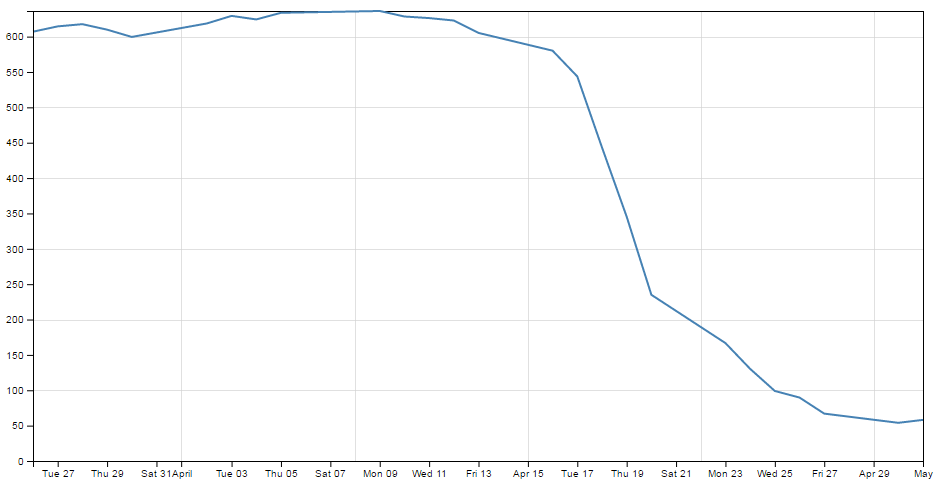
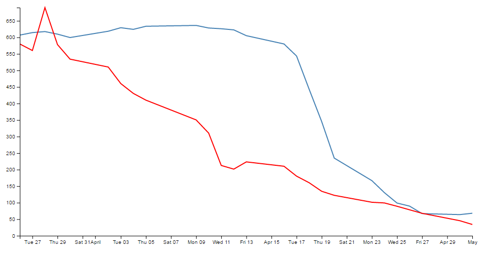
Adding more than one line to a graph
All right, we’re starting to get serious now. Two lines on a graph is a bit of a step into a different world in one respect. I mean that in the sense that there’s more than one way to carry out the task, and I tend to do it one way and not the other mainly because I don’t fully understand the other way :-(.
How are we going to do this? I think that the best way will be to make the executive decision that we have suddenly come across more data and that it is also in our data.csv file (which we’ll rename data2.csv just to highlight the difference between the two data sets). In fact it looks a little like this (apologies in advance for the big ugly block of data);
Three columns, date open and close. The first two are exactly what we have been dealing with all along and the last (open) is our new made up data. Each column is separated by a comma (hence .csv (comma separated values)), which is the format we’re currently using to import data.
We should save this as a new file so we don’t mess up our previous data, so (as mentioned earlier) let’s call it data2.csv.
There is a copy of this file and the sample code at github and in the code samples bundled with this book (multiple-lines.html and data2.csv). A live example can be found on bl.ocks.org.
We will build our new code using our simple graph template to start with, so the immediate consequence of this is that we need to edit the line that was looking for ‘data.csv’ to reflect the new name.
d3.csv("data2.csv", function(error, data) {
So when you browse to our new graph’s html file, we don’t see any changes. It still happily loads the new data, but because it hasn’t been told to do anything with it, nothing new happens.
What we need to do now it to essentially duplicate the code blocks that drew the first line for the second line.
The good news is that in the simplest way possible that’s just two code blocks. The first sets up the function that defines the new line;
// define the 2nd line
var valueline2 = d3.line()
    .x(function(d) { return x(d.date); })
    .y(function(d) { return y(d.open); });
You should notice that this block is identical to the block that sets up the function for the first line, except this one is called (imaginatively) valueline2 and instead of including the variable ‘close’ for our datapoint we are using our new variable (from the extra column in the csv file) ‘open’. We should put it directly after the block that sets up the function for valueline.
The second block draws our new line;
  // Add the valueline2 path.
  svg.append("path")
      .data([data])
      .attr("class", "line")
      .attr("d", valueline2);
Again, this is identical to the block that draws the first line, except this one is called valueline2. We should put it directly after the block that draws valueline.
After those three small changes, check out your new graph;
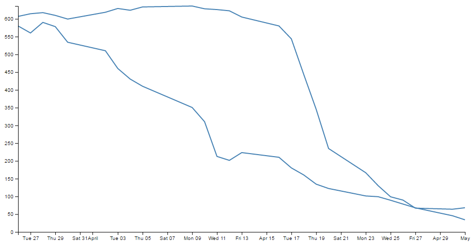
Hey! Two lines! Hmm…. Both being the same colour is a bit confusing. Good news. We can change the colour of the second line by inserting a line that adjusts its stroke (colour) very simply.
So here’s what our new drawing block looks like;
  // Add the valueline2 path.
  svg.append("path")
      .data([data])
      .attr("class", "line")
      .style("stroke", "red")
      .attr("d", valueline2);
And as if by magic, here’s our new graph;
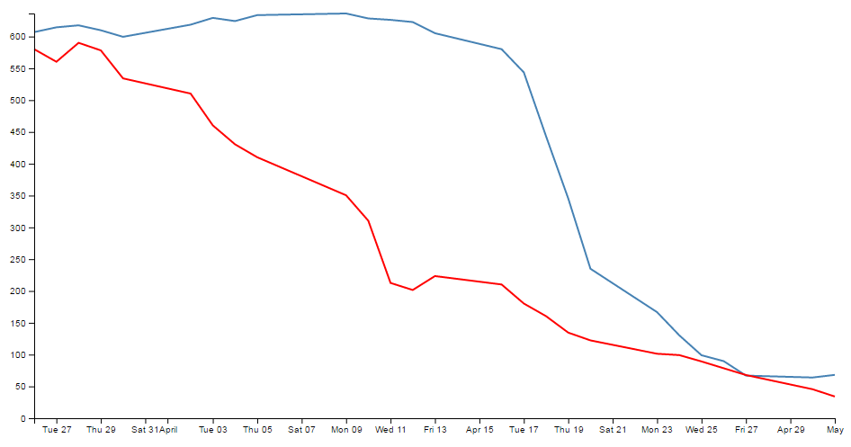
Wow. Right about now, we’re thinking ourselves pretty clever. But there are two places where we’re not doing things right. We took a simple way, but we took some short cuts that might bite us in the posterior.
The first mistake we made was not ensuring that our variable "d.open" is being treated as a number or a string. We’re fortunate in this case that it is, but this can’t always be assumed. So, this is an easy fix and we just need to put the following (indicated line) in our code;
  // format the data
  data.forEach(function(d) {
      d.date = parseTime(d.date);
      d.close = +d.close;
      d.open = +d.open;         //  <=== Add this line in!
  });
The second and potentially more fatal flaw is that nowhere in our code do we make allowance for our second set of data (the second line’s values) exceeding our first lines values.
That might not sound too normal straight away, but consider this. What if when we made up our data earlier, some of the new data exceeded our maximum value in our original data? As a means of demonstration, here’s what happens when our second line of data has values higher than the first lines;
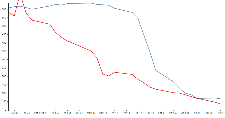
Ahh…. We’re not too clever now.
Good news though, we can fix it!
The problem comes about because when we set the domain for the y axis this is what we put in the code;
y.domain([0, d3.max(data, function(d) { return d.close; })]);
So that only considers d.close when establishing the domain. With d.open exceeding our domain, it just keeps drawing off the graph!
The good news is that ‘Bill’ has provided a solution for just this problem here;
All you need to replace the y.domain line with is this;
  y.domain([0, d3.max(data, function(d) {
	  return Math.max(d.close, d.open); })]);
It does much the same thing, but this time it returns the maximum of d.close and d.open (whichever is largest). Good work Bill.
If we put that code into the graph with the higher values for our second line we are now presented with this;
And it doesn’t matter which of the two sets of data is largest, the graph will always adjust :-)
You will also have noticed that our y axis has auto adjusted again to cope. Clever eh?
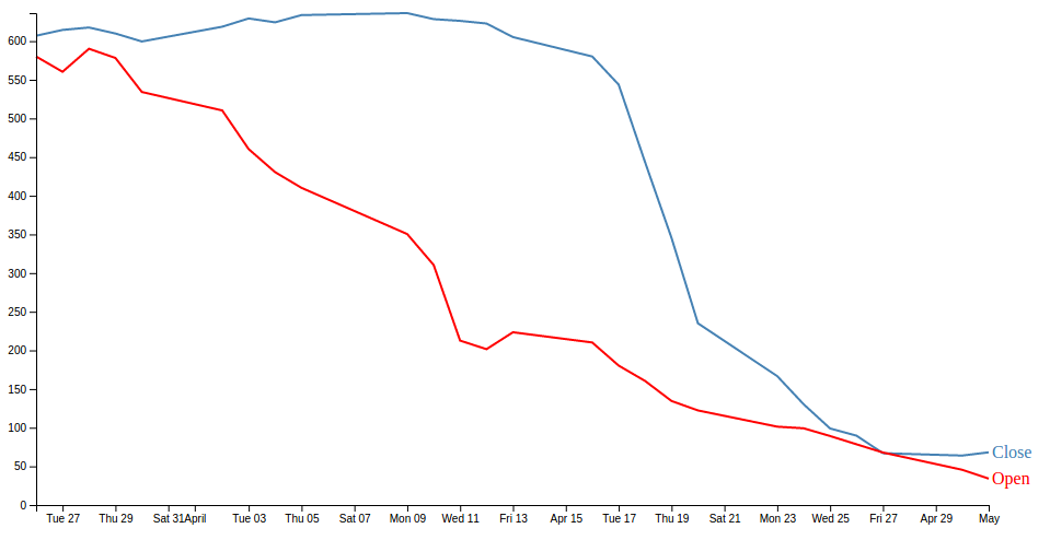
Labelling multiple lines on a graph
Our previous example of a graph with multiple lines is a thing of rare beauty, but which line relates to which set of data? We have data that defines values for open and close, but we don’t know which line is which.
In this section we will add labels to our lines so that we know what it what.
This section was inspired by a question from a reader (Arun b.s) of the d3noob.org blog where the question was asked “How can we put text at the end of each line on the graph?”.
The question was so good I realised that it had to be part of the book, so here you go :-).
It’s actually not too difficult. What we are trying to achieve is to find the position of the end of each line and to add a text label at that position so that the association of proximity denotes the linkage. Of course we’re going to go a little further and colour the text so that it’s really clear which label belongs with which line, but you get the idea.
Each line requires a single block of script to add the text. The block that adds the open label is as follows;
  svg.append("text")
      .attr("transform", "translate("+(width+3)+","+y(data[0].open)+")")
      .attr("dy", ".35em")
      .attr("text-anchor", "start")
      .style("fill", "red")
      .text("Open");
So firstly it appends a textual element to the svg object;
svg.append("text")
Then it finds the position of the end of the line;
.attr("transform", "translate("+(width+3)+","+y(data[0].open)+")")
To do this we use the transform and translate attribute and find the x position that equates to the end of the graph plus 3 pixels ((width+3)) (we add in the three pixels to create a small separation between the end of the line and the label). The y position is far more interesting. We need to find the position of the last point in our line for the open data. Because the data is in the form of an indexed array and because the data has the latest date at the start of the array, we only need to find the point at the 0 position of the array. This is data[0].open. But of course, we also need to adjust our data for our scale and range, so we transform it using the y function (in the same way that we do it for the valueline and valueline2 points. So the script to find the point on the screen in the y direction is y(data[0].open).
If our data was arranged with the last date at the end of our data we would have to find the final index point and we would use y(data[data.length-1].open)).
Then it’s just a matter of aligning and justifying our text correctly;
      .attr("dy", ".35em")
      .attr("text-anchor", "start")
Then colouring it the correct colour;
.style("fill", "red")
And adding out text;
.text("Open");
We put this block of code after the blocks that add in the axes so that they make sure they’re on top of anything else we draw. Of course we will want to add another (almost) duplicate of the block for the ‘close’ column.
The only other small change we want to make is to change the right margin for the graph that we set at the start of our script from 20 to 40 so that there is enough room to add our label without cutting it off.
After that you have a marvellously labelled multi-line graph!
The full code for this example can be found on github or in the code samples bundled with this book (dual-labels.html and data2.csv). A working example can be found on bl.ocks.org.
Now, I’d like to pretend that this is perfection, but it isn’t. If our lines end too close together, the labels will interfere with each other, so in the ideal world I would include a bit of fanciness to prevent that, but for the purposes of this exercise we can consider ourselves happy.
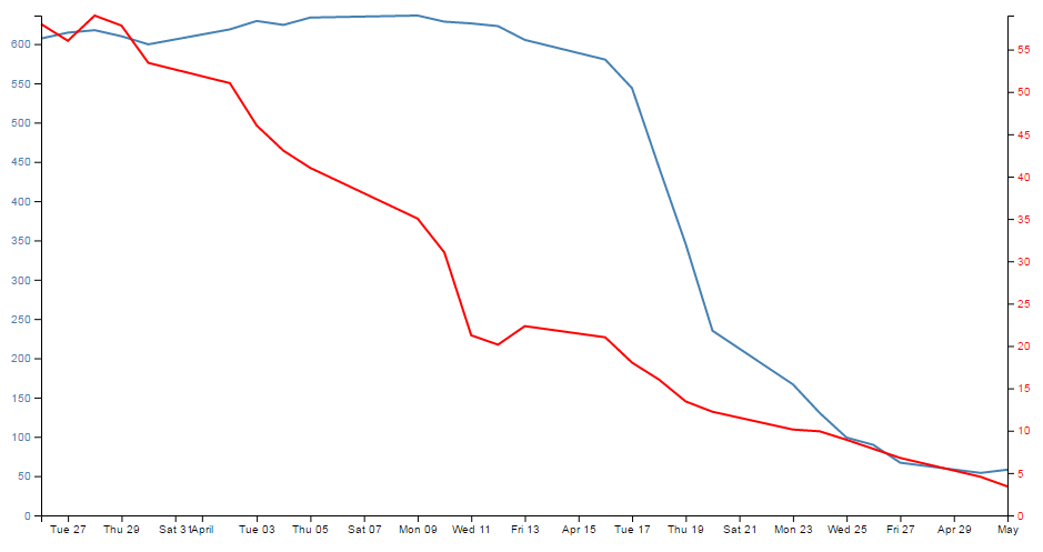
Multiple axes for a graph
Alrighty… Let’s imagine that we want to show our wonderful graph with two lines, much like we already have, but imagine that the data that the lines are made from is significantly different in magnitude from the original data (in the example below, the data for the second line has been reduced by approximately a factor of 10 from our original data).
Now this isn’t a problem in itself. D3 will still make a reasonable graph of the data, but because of the difference in range, the detail of the second line will be lost.
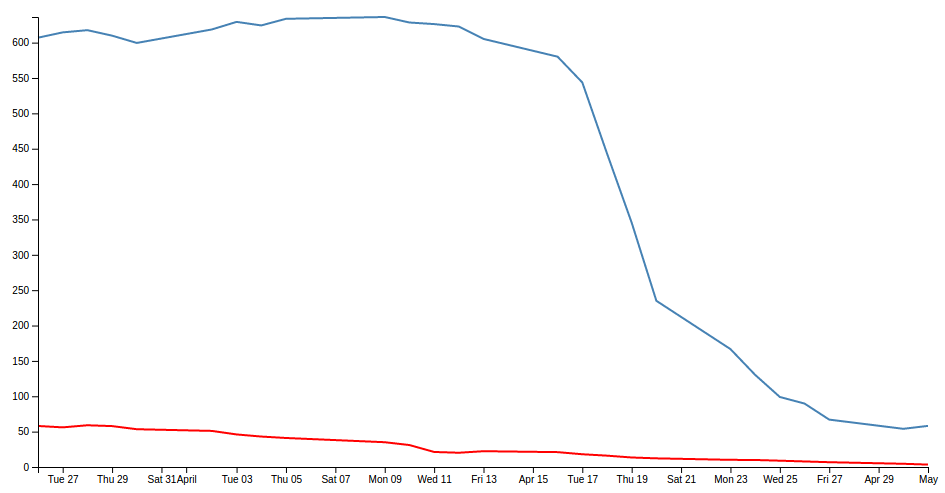
What I’m proposing is that we have a second y axis on the right hand side of the graph that relates to the red line.
The mechanism used is based on the great examples put forward by Ben Christensen here.
The full code for this example can be found on github or in the code samples bundled with this book (dual-axes.html and data4.csv). A working example can be found on bl.ocks.org.
First things first, there won’t be space on the right hand side of our graph to show the extra axis, so we should make our right hand margin a little larger.
var margin = {top: 20, right: 40, bottom: 30, left: 50},
I went for 40 and it seems to fit pretty well.
Then (and here’s where the main point of difference for this graph comes in) you want to amend the code to separate out the two scales for the two lines in the graph. This is actually a lot easier than it sounds, since it consists mainly of finding anywhere that mentions y and replacing it with y0 and then adding in a reciprocal piece of code for y1.
Let’s get started.
In order to colour the text on the two different y axes we will need to declare their styles in the <style> section at the start of the code. In the declaration shown below we are calling the two different classes ‘axisSteelBlue’ and ‘axisRed’. The style that we set for each is ‘fill’ since this is the style that will colour the text
.axisSteelBlue text{
  fill: steelblue;
}

.axisRed text{
  fill: red;
}
Then into the JavaScript and we want to change the variable declaration for y to y0 and add in y1.
// set the ranges
var x = d3.scaleTime().range([0, width]);
var y0 = d3.scaleLinear().range([height, 0]);
var y1 = d3.scaleLinear().range([height, 0]);
Now change our valueline declarations so that they refer to the y0 and y1 scales.
// define the 1st line
var valueline = d3.line()
    .x(function(d) { return x(d.date); })
    .y(function(d) { return y0(d.close); });

// define the 2nd line
var valueline2 = d3.line()
    .x(function(d) { return x(d.date); })
    .y(function(d) { return y1(d.open); });
There are a few different ways for the scaling to work, but we’ll stick with the fancy max method we used in the dual line example (although technically it’s not required).
  y0.domain([0, d3.max(data, function(d) {return Math.max(d.close);})]);
  y1.domain([0, d3.max(data, function(d) {return Math.max(d.open); })]);
Again, here’s the y0 and y1 changed and added and the maximums for d.close and d.open are separated out).
The final piece of the puzzle is to draw the new axis, but we also want to colour code the text in the axes to match the lines. We do this using the styling that we declared earlier
  // Add the Y0 Axis
  svg.append("g")
      .attr("class", "axisSteelBlue")
      .call(d3.axisLeft(y0));

  // Add the Y1 Axis
  svg.append("g")
      .attr("class", "axisRed")
      .attr("transform", "translate( " + width + ", 0 )")
      .call(d3.axisRight(y1));
In the above code you can see where we have added in a ‘style’ change for the axisLeft to make it ‘steelblue’ and a complementary change in the new section for axisRight to make that text red.
The yAxisRight section obviously needs to be added in, but the only significant difference is the transform / translate attribute that moves the axis to the right hand side of the graph.
And after all that, here’s the result…
Now, let’s not kid ourselves that it’s a thing of beauty, but we should console our aesthetic concerns with the warm glow of understanding how the function works :-).