Elements, Attributes and Styles
This chapter is intended to provide an overview of some of the simpler things that d3.js can do, but in a way that may help some understand a little more about how images can be added to a web page and how they can be manipulated.
Loosely speaking we will look at how objects (elements (like circles, rectangles, lines and even text)) can be declared and added to a page, how their attributes in relation to the page (position, size, shape, actions) can be changed and how their style (colour, width, transparency) can be applied.
As we go through the explanation of different changes that can be applied to different elements there will be a small amount of repetition where there is cross-over with related drawing features. Please be patient :-). The aim is to have each section as complete in its own right as practical.
The Framework
To be able to demonstrate how these three related aspects of drawing objects work we will have to use a small, simple script to draw them in your web browser.
We will just take a moment to explain the script that draws a circle.
Here’s the contents of the file in its entirety. I have imaginatively called it circle.html and you can find it in the code samples that can be downloaded with the book.
<!DOCTYPE html>
<meta charset="utf-8">

<body>

<!-- load the d3.js library -->
<script src="https://d3js.org/d3.v4.min.js"></script>

<script>

var holder = d3.select("body") // select the 'body' element
      .append("svg")           // append an SVG element to the body
      .attr("width", 449)      // make the SVG element 449 pixels wide
      .attr("height", 249);    // make the SVG element 249 pixels high

// draw a circle
holder.append("circle")        // attach a circle
    .attr("cx", 200)           // position the x-center
    .attr("cy", 100)           // position the y-center
    .attr("r", 50);            // set the radius

</script>

</body>
Please feel free to jump ahead slightly if you understand how a HTML file with JavaScript goes together :-).
The HTML part of the file can be thought of as a wrapper for the JavaScript that will draw our circle. These are the HTML parts here…
<!DOCTYPE html>
<meta charset="utf-8">

<body>

<!-- load the d3.js library -->
<script src="https://d3js.org/d3.v4.min.js"></script>

<script>

</script>

</body>
This portion of the file is built using HTML ‘tags’. These will set up the environment for the JavaScript.
The tags tell the web browser what sort of language is being used and the type of characters used to write the code…
<!DOCTYPE html>
<meta charset="utf-8">
Areas of the code are labelled.
Like the body…
<body>

In this area we can put the stuff that will be
displayed on our web page.

</body>
And the place where we put the JavaScript…
<script>

Our d3.js code will go here.

</script>
We even load an external file that contains JavaScript that will help run our code.
<!-- load the d3.js library -->
<script src="https://d3js.org/d3.v4.min.js"></script>
Yes, that’s the line that loads d3.js. Once it’s loaded we can use the instructions that it makes available to make other JavaScript code (in this case ours) work.
Then we have the JavaScript code that allows us to use the functions made possible by d3.js.
var holder = d3.select("body") // select the 'body' element
      .append("svg")           // append an SVG element to the body
      .attr("width", 449)      // make the SVG element 449 pixels wide
      .attr("height", 249);    // make the SVG element 249 pixels high

// draw a circle
holder.append("circle")        // attach a circle
    .attr("cx", 200)           // position the x-center
    .attr("cy", 100)           // position the y-center
    .attr("r", 50);            // set the radius
I’ve broken the code into two separate blocks to provide some clarity to their function. We could make it one block, but that wouldn’t necessarily make it easier to understand.
Firstly we add a ‘holder’ for our graphics on the web page. I’ve named it holder but we could just as easily named it anything we wanted.
var holder = d3.select("body") // select the 'body' element
      .append("svg")           // append an SVG element to the body
      .attr("width", 449)      // make the SVG element 449 pixels wide
      .attr("height", 249);    // make the SVG element 249 pixels high
The first thing we do when declaring our holder is to select the body element of our web page (Remember those <body> tags in the HTML part earlier?).
Then we append a Scalable Vector Graphic (SVG) object to the body and we make it 449 pixels wide and 249 pixels high.
The width and height are ‘attributes’ of the SVG object. That is to say they describe a property of the object.
The second block of our JavaScript finally draws our circle.
holder.append("circle")        // attach a circle
    .attr("cx", 200)           // position the x-center
    .attr("cy", 100)           // position the y-center
    .attr("r", 50);            // set the radius
The first line appends a new element (a circle) to our SVG ‘holder’.
The second and third lines declare the attribute of our circle that specify where the centre of the circle is. In this case it’s at the x/y position 200/100 (cx/cy).
The last line adds the radius attribute r. Here it is set to 50 pixels.
The three attributes cx, cy and r are all required when drawing a circle. There are other attributes we can put in there (and when we look at some of the upcoming elements, you should get a feel for them), but these are the minimum.
The purpose of describing this block of code that draws a circle isn’t to show you how to draw a circle. This has only been a way of showing you how the code in the following sections is laid out and how it works. The elements we are going to generate can be drawn with exactly the same file but with just the section that adds the circle altered.
For example if you were to change this block of code;
holder.append("circle")        // attach a circle
    .attr("cx", 200)           // position the x-center
    .attr("cy", 100)           // position the y-center
    .attr("r", 50);            // set the radius
For this block of code;
holder.append("rect")          // attach a circle
    .attr("x", 150)            // x position of the top-left corner
    .attr("y", 50)             // y position of the top-left corner
    .attr("width", 100)        // set the rectangle width
    .attr("height", 100);      // set the rectangle height
Instead of drawing a circle we would be drawing a rectangle.
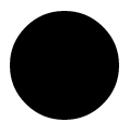
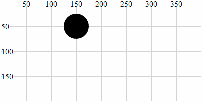
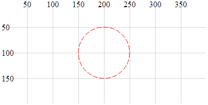
So this is what our circle will look like;
Because it will help a great deal to have a common frame of reference, I’m going to display the elements on a grid that looks a little like this;
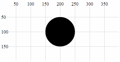
With the grid in place it’s far easier to see that the centre of our circle is indeed at the coordinates x = 200, y = 100 and that the radius is 50.
The circle is still somewhat plain, but bear with me because as we start to explore what we can do with styles and attributes we can add some variation to our elements.
With that explanation behind us we should begin our odyssey into the world of d3 elements.
Elements
We will begin by describing what we mean when we talk about an ‘element’.
There is considerable scope for confusion when talking about elements on a web page. Are we talking about HTML elements, SVG elements or something different?
In fact we are going to be describing a subset of SVG elements. Specifically a collection of common shapes and objects which include circles, ellipses, rectangles, lines, polylines, polygons, text and paths.
“Text?” I hear you say. “Doesn’t sound like a shape.” I suppose it depends on how you think of it. We can use text in different ways in d3, but for this particular exercise we can regard text as an SVG element.
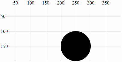
Circle
A circle is a simple SVG shape that is described by three required attributes.
-
cx: The position of the centre of the circle in the x direction (left / right) measured from the left side of the screen. -
cy: The position of the centre of the circle in the y direction (up / down) measured from the top of the screen. -
r: The radius of the circle from thecx,cyposition to the perimeter of the circle.
The following is an example of the code section required to draw a circle in conjunction with the HTML file outlined at the start of this chapter;
holder.append("circle")        // attach a circle
    .attr("cx", 200)           // position the x-center
    .attr("cy", 100)           // position the y-center
    .attr("r", 50);            // set the radius
This will produce a circle as follows;
The centre of the circle is at x = 200 and y = 100 and the radius is 50 pixels.
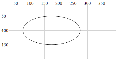
Ellipse
An ellipse is described by four required attributes;
-
cx: The position of the centre of the ellipse in the x direction (left / right) measured from the left side of the screen. -
cy: The position of the centre of the ellipse in the y direction (up / down) measured from the top of the screen. -
rx: The radius of the ellipse in the x dimension from thecx,cyposition to the perimeter of the ellipse. -
ry: The radius of the ellipse in the y dimension from thecx,cyposition to the perimeter of the ellipse.
The following is an example of the code section required to draw an ellipse in conjunction with the HTML file outlined at the start of this chapter;
holder.append("ellipse")       // attach an ellipse
    .attr("cx", 200)           // position the x-centre
    .attr("cy", 100)           // position the y-centre
    .attr("rx", 100)           // set the x radius
    .attr("ry", 50);           // set the y radius
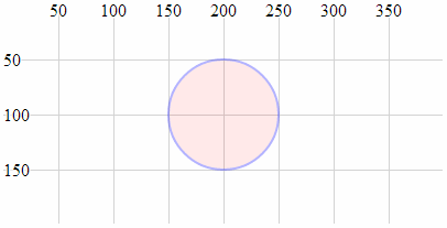
This will produce an ellipse as follows;
The centre of the ellipse is at x = 200 and y = 100 and the radius is 50 pixels vertically and 100 pixels horizontally.
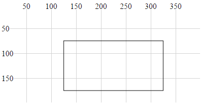
Rectangle
A rectangle is described by four required attributes and two optional ones;
-
x: The position on the x axis of the left hand side of the rectangle (required). -
y: The position on the y axis of the top of the rectangle (required). -
width: the width (in pixels) of the rectangle (required). -
height: the height (in pixels) of the rectangle (required). -
rx: The radius curve of the corner of the rectangle in the x dimension (optional). -
ry: The radius curve of the corner of the rectangle in the y dimension (optional).
The following is an example of the code section required to draw a rectangle (using only the required attributes) in conjunction with the HTML file outlined at the start of this chapter;
holder.append("rect")       // attach a rectangle
    .attr("x", 100)         // position the left of the rectangle
    .attr("y", 50)          // position the top of the rectangle
    .attr("height", 100)    // set the height
    .attr("width", 200);    // set the width
This will produce a rectangle as follows;
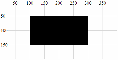
The top left corner of the rectangle is at 100, 50 and the rectangle is 200 pixels wide and 100 pixels high.
The following code section includes the optional attributes for the curved corners;
holder.append("rect")       // attach a rectangle
    .attr("x", 100)         // position the left of the rectangle
    .attr("y", 50)          // position the top of the rectangle
    .attr("height", 100)    // set the height
    .attr("width", 200)     // set the width
    .attr("rx", 10)         // set the x corner curve radius
    .attr("ry", 10);        // set the y corner curve radius
This will produce a rectangle (with curved corners) as follows;
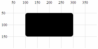
The corners are curved with radii in the x and y direction of 10 pixels.
Line
A line is a simple line between two points and is described by four required attributes.
-
x1: The x position of the first end of the line as measured from the left of the screen. -
y1: The y position of the first end of the line as measured from the top of the screen. -
x2: The x position of the second end of the line as measured from the left of the screen. -
y2: The y position of the second end of the line as measured from the top of the screen.
The following is an example of the code section required to draw a line in conjunction with the HTML file outlined at the start of this chapter. A notable addition to this code is the style declaration. In this case the line has no colour and this can be added with the stroke style which applies a colour to a line;
holder.append("line")          // attach a line
    .style("stroke", "black")  // colour the line
    .attr("x1", 100)     // x position of the first end of the line
    .attr("y1", 50)      // y position of the first end of the line
    .attr("x2", 300)     // x position of the second end of the line
    .attr("y2", 150);    // y position of the second end of the line
This will produce a line as follows;
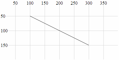
The line extends from the point 100,50 to 300,150.
Polyline
A polyline is a sequence of connected lines described with a single attribute, points.
-
points: Thepointsattribute is a list of x,y coordinates that are the locations of the connecting points of the polyline.
The following is an example of the code section required to draw a polyline in conjunction with the HTML file outlined at the start of this chapter. A notable addition to this code are the style declarations. In this case the line of the polyline has no colour and this can be added with the stroke style which applies the colour black to a line. Likewise the area that is bounded by the polyline will be automatically filled with black unless we explicitly tell the object not to. This is achieved in this example by addition of the fill style to none.
holder.append("polyline")      // attach a polyline
    .style("stroke", "black")  // colour the line
    .style("fill", "none")     // remove any fill colour
    .attr("points", "100,50, 200,150, 300,50");  // x,y points
This will produce a polyline as follows;
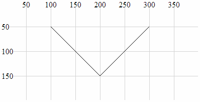
The polyline extends from the point 100,50 to 200,150 to 300,50.
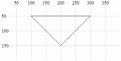
Polygon
A polygon is a sequence of connected lines which form a closed shape described with a single attribute, points.
-
points: Thepointsattribute is a list of x,y coordinates that are the locations of the connecting points of the polygon. The last point is in turn connected to the first point.
The following is an example of the code section required to draw a polygon in conjunction with the HTML file outlined at the start of this chapter. A notable addition to this code are the style declarations. In this case the line of the polygon has no colour and this can be added with the stroke style which applies the colour black to a line. Likewise the area that is bounded by the polygon will be automatically filled with black unless we explicitly tell the object not to. This is achieved in this example by addition of the fill style to none.
holder.append("polygon")       // attach a polygon
    .style("stroke", "black")  // colour the line
    .style("fill", "none")     // remove any fill colour
    .attr("points", "100,50, 200,150, 300,50");  // x,y points
This will produce a polygon as follows;
The polygon extends from the point 100,50 to 200,150 to 300,50 and then back to 100,50.
Path
A path is an outline of an SVG shape which is described with a ‘mini-language’ inside a single attribute.
-
d: This attribute is a list of instructions that allow a shape to be drawn in a complex way using a ‘mini-language’ of commands. These commands are written in a shorthand of single letters such asM-moveto,Z-closepath,L-lineto,C-curveto. These commands can be absolute (normally designated by capital letters) or relative (lower case).
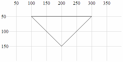
The following is an example of the code section required to draw a triangle in conjunction with the HTML file outlined at the start of this chapter. A notable addition to this code are the style declarations. In this case the line of the path has no colour and this can be added with the stroke style which applies the colour black to a line. Likewise the area that is bounded by the path will be automatically filled with black unless we explicitly tell the object not to. This is achieved in this example by addition of the fill style to none.
holder.append("path")          // attach a path
    .style("stroke", "black")  // colour the line
    .style("fill", "none")     // remove any fill colour
    .attr("d", "M 100,50, L 200,150, L 300,50 Z");  // path commands
This will produce a path as follows;
The path mini-language first moves (M) to 100,50 then draws a line (L) to 200,150 then draws another line (L) to 300,50 then closes the path (Z).
Clipped Path (AKA clipPath)
A clipPath is the path of a SVG shape that can be used in combination with another shape to remove any parts of the combined shape that doesn’t fall within the clipPath. That sounds slightly confusing, so we will break it down a bit to hopefully clarify the explanation.
Let’s imagine that we want to display the intersection of two shapes. What we will do is define our clipPath which will act as a ‘cookie cutter’ which can cut out the shape we want (we will choose an ellipse). Then we will draw our base shape (which is analogous to the dough) that we will use our cookie cutter on (our dough will be shaped as a rectangle). The intersection of the cookie cutter and the dough is our clipped path.
Our clipPath (cookie cutter) element is an ellipse;
Our shape that we will be clipping (the dough) is a rectangle;
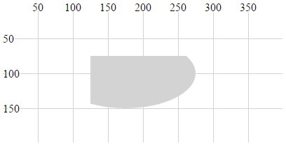
The intersection of the two is the clipped path (shaded grey);
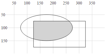
The graphic examples above are misleading in the sense that the two basic shapes are not actually displayed. All that results from the use of the clipPath is the region that is the intersection of the two.
The following is an example of the code section required to draw the clipped path in conjunction with the HTML file outlined at the start of this chapter. The clipPath element is given the ID ‘ellipse-clip’ and a specified size and location. Then when the rectangle is appended. the clipPath is specified as an attribute (via a URL) using clip-path.
// define the clipPath
holder.append("clipPath")       // define a clip path
	.attr("id", "ellipse-clip") // give the clipPath an ID
  .append("ellipse")            // shape it as an ellipse
	.attr("cx", 175)            // position the x-centre
	.attr("cy", 100)            // position the y-centre
	.attr("rx", 100)            // set the x radius
	.attr("ry", 50);            // set the y radius

// draw clipped path on the screen
holder.append("rect")       // attach a rectangle
    .attr("x", 125)         // position the left of the rectangle
    .attr("y", 75)          // position the top of the rectangle
    .attr("clip-path", "url(#ellipse-clip)") // clip the rectangle
    .style("fill", "lightgrey")   // fill the clipped path with grey
    .attr("height", 100)    // set the height
    .attr("width", 200);    // set the width
This will produce a path as follows;
An example of this in use can bee seen in the difference chart explanation later in the book.
Text
A text element is an SVG object which is shaped as text. It is described by two required attributes and three optional ones.
-
x: This attribute designates the anchor point location for the text in the x dimension (required). -
y: This attribute designates the anchor point location for the text in the y dimension (required). -
dx: This attribute designates the offset of the text from the anchor point in the x dimension (optional). There are several different sets of units that can be used to designated the offset of the text from an anchor point. These includeemwhich is a scalable unit (used in these examples),px(pixels),pt(points (kind of like pixels)) and5(percent (scalable and kind of likeem)) -
dy: This attribute designates the offset of the text from the anchor point in the y dimension (optional). -
text-anchor: This attribute controls the horizontal text alignment (optional). It has three values;start(left aligned),middle(centre aligned) andend(right aligned).
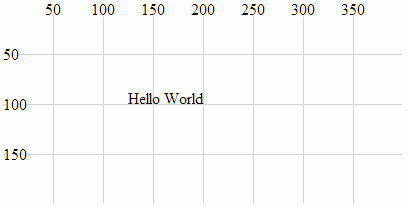
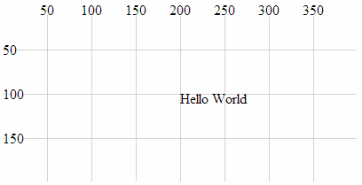
The following is an example of the code section required to draw the text “Hello World” in conjunction with the HTML file outlined at the start of this chapter. A notable addition to this code is the style declaration which applies a black fill to the text. Additionally there is the declaration .text which defines the text that will be displayed.
holder.append("text")         // append text
    .style("fill", "black")   // fill the text with the colour black
    .attr("x", 200)           // set x position of left side of text
    .attr("y", 100)           // set y position of bottom of text
    .text("Hello World");     // define the text to display
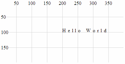
This will produce text as follows;
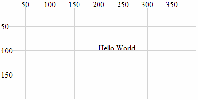
It can be seen from the image that the anchor point for the text is at 200,100 and that the text is positioned with this anchor point at the bottom, left of the text.
The following examples will demonstrate the various options for positioning and aligning text so that you can arrange it correctly.
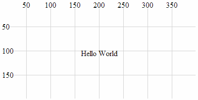
Anchor at the bottom, middle of the text:
holder.append("text")         // append text
    .style("fill", "black")   // fill the text with the colour black
    .attr("x", 200)           // set x position of left side of text
    .attr("y", 100)           // set y position of bottom of text
    .attr("text-anchor", "middle") // set anchor y justification
    .text("Hello World");          // define the text to display
This will produce text as follows;
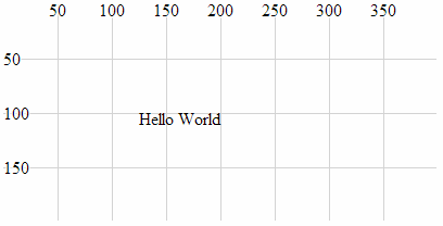
Anchor at the bottom, right of the text:
holder.append("text")         // append text
    .style("fill", "black")   // fill the text with the colour black
    .attr("x", 200)           // set x position of left side of text
    .attr("y", 100)           // set y position of bottom of text
    .attr("text-anchor", "end")  // set anchor y justification
    .text("Hello World");        // define the text to display
This will produce text as follows;
Anchor at the middle, left of the text:
holder.append("text")         // append text
    .style("fill", "black")   // fill the text with the colour black
    .attr("x", 200)           // set x position of left side of text
    .attr("y", 100)           // set y position of bottom of text
    .attr("dy", ".35em")           // set offset y position
    .attr("text-anchor", "start")  // set anchor y justification
    .text("Hello World");          // define the text to display
This will produce text as follows;
Anchor in the middle, centre of the text:
holder.append("text")         // append text
    .style("fill", "black")   // fill the text with the colour black
    .attr("x", 200)           // set x position of left side of text
    .attr("y", 100)           // set y position of bottom of text
    .attr("dy", ".35em")           // set offset y position
    .attr("text-anchor", "middle") // set anchor y justification
    .text("Hello World");          // define the text to display
This will produce text as follows;
Anchor in the middle, right of the text:
holder.append("text")         // append text
    .style("fill", "black")   // fill the text with the colour black
    .attr("x", 200)           // set x position of left side of text
    .attr("y", 100)           // set y position of bottom of text
    .attr("dy", ".35em")         // set offset y position
    .attr("text-anchor", "end")  // set anchor y justification
    .text("Hello World");        // define the text to display
This will produce text as follows;
Anchor at the top, left of the text:
holder.append("text")         // append text
    .style("fill", "black")   // fill the text with the colour black
    .attr("x", 200)           // set x position of left side of text
    .attr("y", 100)           // set y position of bottom of text
    .attr("dy", ".71em")           // set offset y position
    .attr("text-anchor", "start")  // set anchor y justification
    .text("Hello World");          // define the text to display
This will produce text as follows;
Anchor at the top, middle of the text:
holder.append("text")         // append text
    .style("fill", "black")   // fill the text with the colour black
    .attr("x", 200)           // set x position of left side of text
    .attr("y", 100)           // set y position of bottom of text
    .attr("dy", ".71em")            // set offset y position
    .attr("text-anchor", "middle")  // set anchor y justification
    .text("Hello World");           // define the text to display
This will produce text as follows;
Anchor at the top, right of the text:
holder.append("text")         // append text
    .style("fill", "black")   // fill the text with the colour black
    .attr("x", 200)           // set x position of left side of text
    .attr("y", 100)           // set y position of bottom of text
    .attr("dy", ".71em")          // set offset y position
    .attr("text-anchor", "end")   // set anchor y justification
    .text("Hello World");         // define the text to display
This will produce text as follows;
Attributes
At the start of writing this section I was faced with the question “What’s an attribute?”. But a reasonable answer has eluded me, so I will make the assumption that the answer will be something of a compromise :-). I like to think that an attribute of an element is something that is a characteristic of the object without defining it, and/or it may affect the object’s position or orientation on the page. There could be a strong argument to say that the following section on styles could be seen to cross-over into attributes and I agree. However, for the purposes of providing a description of the syntax and effects, I’m happy with the following list :-).
Because not all attributes are applicable to all elements, there will be a bit of variation in the type of shapes we deal with in the description below, but there won’t be any that are different to those that we’ve already looked at. There will be some repetition with recurring information from the elements section. This is intentional to hopefully allow each section to exist in its own right.
x, y
The x and y attributes are used to designate a position on the web page that is set from the top, left hand corner of the web page.
Using the x and y attributes places the anchor points for these elements at a specified location. Of the elements that we have examined thus far, the rectangle element and the text element have anchor points to allow them to be positioned.
For example the following is a code section required to draw a rectangle (using only the required attributes) in conjunction with the HTML file outlined at the start of this chapter;
holder.append("rect")       // attach a rectangle
    .attr("x", 100)         // position the left of the rectangle
    .attr("y", 50)          // position the top of the rectangle
    .attr("height", 100)    // set the height
    .attr("width", 200);    // set the width
This will produce a rectangle as follows;
x,y at 100,50The top left corner of the rectangle is specified using x and y at 100 and 50 respectively.
x1, x2, y1, y2
The x1, x2, y1 and y2 attributes are used to designate the position of two points on a web page that are set from the top, left hand corner of the web page. These two points are connected with a line as part of the line element.
The attributes are described as follows;
-
x1: The x position of the first end of the line as measured from the left of the screen. -
y1: The y position of the first end of the line as measured from the top of the screen. -
x2: The x position of the second end of the line as measured from the left of the screen. -
y2: The y position of the second end of the line as measured from the top of the screen.
The following is an example of the code section required to draw a line in conjunction with the HTML file outlined at the start of this chapter. The attributes connect the point 100,50 (x1, y1) with 300,150 (x2, y2);
holder.append("line")          // attach a line
    .style("stroke", "black")  // colour the line
    .attr("x1", 100)     // x1 position of the first end of the line
    .attr("y1", 50)      // y1 position of the first end of the line
    .attr("x2", 300)     // x2 position of the second end of the line
    .attr("y2", 150);    // y2 position of the second end of the line
This will produce a line as follows;
The line extends from the point 100,50 to 300,150.
points
The points attribute is used to set a series of points which are subsequently connected with a line and / or which may form the bounds of a shape. These are specifically associated with the polyline and polygon elements. Like the x, y and x1, x2, y1, y2 attributes, the coordinates are set from the top, left hand corner of the web page.
The data for the points is entered as a sequence of x,y points in the following format;
.attr("points", "100,50, 200,150, 300,50");
Where 100,50 is the first x,y point then 200,150 is the second.
The following is an example of the code section required to draw a polyline in conjunction with the HTML file outlined at the start of this chapter. The additional style declarations are included to illustrate the shape better. The points values can be compared with the subsequent image.
holder.append("polyline")      // attach a polyline
    .style("stroke", "black")  // colour the line
    .style("fill", "none")     // remove any fill colour
    .attr("points", "100,50, 200,150, 300,50");  // x,y points
This will produce a polyline as follows;
points attributeThe polyline extends from the point 100,50 to 200,150 to 300,50.
cx, cy
The cx, cy attributes are associated with the circle and ellipse elements and designate the centre of each shape. The coordinates are set from the top, left hand corner of the web page.
-
cx: The position of the centre of the element in the x axis measured from the left side of the screen. -
cy: The position of the centre of the element in the y axis measured from the top of the screen.
The following is an example of the code section required to draw an ellipse in conjunction with the HTML file outlined at the start of this chapter. In it the centre of the ellipse is set by cx, cy as 200, 100.
holder.append("ellipse")       // attach an ellipse
    .attr("cx", 200)           // position the x-centre
    .attr("cy", 100)           // position the y-centre
    .attr("rx", 100)           // set the x radius
    .attr("ry", 50);           // set the y radius
This will produce an ellipse as follows;
The centre of the ellipse is at x = 200 and y = 100 and the radius is 50 pixels vertically and 100 pixels horizontally.
r
The r attribute determines the radius of a circle element from the cx, cy position (the centre of the circle) to the perimeter of the circle.
The following is an example of the code section required to draw a circle in conjunction with the HTML file outlined at the start of this chapter;
holder.append("circle")        // attach a circle
    .attr("cx", 200)           // position the x-center
    .attr("cy", 100)           // position the y-center
    .attr("r", 50);            // set the radius
This will produce a circle with a radius of 50 pixels as follows;
The centre of the circle is at x = 200 and y = 100 and the radius is 50 pixels.
rx, ry
The rx, ry attributes are associated with the ellipse element and designate the radius in the x direction (rx) and the radius in the y direction (ry).
-
rx: The radius of the ellipse in the x direction from thecx,cyposition to the perimeter of the ellipse. -
ry: The radius of the ellipse in the y direction from thecx,cyposition to the perimeter of the ellipse.
The following is an example of the code section required to draw an ellipse in conjunction with the HTML file outlined at the start of this chapter. In it, the centre of the ellipse is set by cx, cy as 200, 100 and the radius in the x direction (rx) is 100 pixels and the radius in the y direction (ry) is 50 pixels.
holder.append("ellipse")       // attach an ellipse
    .attr("cx", 200)           // position the x-centre
    .attr("cy", 100)           // position the y-centre
    .attr("rx", 100)           // set the x radius
    .attr("ry", 50);           // set the y radius
This will produce an ellipse as follows;
The centre of the ellipse is at x = 200 and y = 100 and the radius is 50 pixels vertically and 100 pixels horizontally.
transform (translate(x,y), scale(k), rotate(a))
The transform attribute is a powerful one which allows us to change the properties of an element in several different ways.
-
translate: Where the element is moved by a relative value in the x,y direction. -
scale: Where the element’s attributes are increased or reduced by a specified factor. -
rotate: Where the element is rotated about its reference point by an angular value.
Without a degree of prior understanding, these transforms can appear to behave in unusual ways, but hopefully we’ll explain it sufficiently here so that you can appreciate the logic in the way they work.
transform (translate(x,y))
The transform-translate attribute will take an element’s position and adjust it based on a specified value(s) in the x,y directions.
The best way to illustrate this is with an example;
This is the code snippet from the HTML file outlined at the start of this chapter which draws a circle at the position 200,100 (cx,cy);
holder.append("circle")        // attach a circle
    .attr("cx", 200)           // position the x-center
    .attr("cy", 100)           // position the y-center
    .attr("r", 50);            // set the radius
This will produce a circle as follows;
If we add in a transform (translate(*x*,*y*)) attribute for values of x,y of 50,50 this will shift our circle by an additional 50 pixels in the x direction and 50 pixels in the y direction.
Here’s the code snippet that will draw our new circle;
holder.append("circle")        // attach a circle
    .attr("cx", 200)           // position the x-center
    .attr("cy", 100)           // position the y-center
    .attr("transform", "translate(50,50)") // translate the circle
    .attr("r", 50);            // set the radius
And here’s the resulting change;
The circle was positioned at the point 200,100 and then translated by 50 pixels in both axes to 250,150.
The original code snippet could in fact be written as follows;
holder.append("circle")        // attach a circle
    .attr("transform", "translate(200,100)") // translate the circle
    .attr("r", 50);            // set the radius
Since by default our starting position is 0,0 if we apply a translation of 200,100 we will end up at 200,100.
transform (scale(k))
The translate-scale attribute will take an element’s attributes and scale them by a factor k.
Originally I thought that this attribute would affect the size of the element, but it affects more than that! As with the transform-translate attribute, the best way to illustrate this is with an example;
The following code snippet (in conjunction with the HTML file outlined at the start of this chapter) which draws a circle at the position 150,50 with a radius of 25 pixels;
holder.append("circle")     // attach a circle
    .attr("cx", 150)        // position the x-centre
    .attr("cy", 50)         // position the y-centre
    .attr("r", 25);         // set the radius
This will produce a circle as follows;
If we now introduce a transform-scale attribute with a scale of 2 we will see all three of the other attributes (cx, cy and r) scaled by a factor of two to 300, 100 and 50 respectively.
Here is the code;
holder.append("circle")             // attach a circle
    .attr("cx", 150)                // position the x-centre
    .attr("cy", 50)                 // position the y-centre
    .attr("r", 25)                  // set the radius
    .attr("transform", "scale(2)"); // scale the circle attributes
Which will produce a circle as follows;
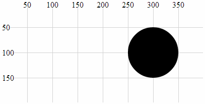
In this example we can see that the position (cx, cy) and the radius (r) have been scaled up by a factor of 2.
transform (rotate(a))
The translate-rotate attribute will rotate an element and its attributes by a declared angle in degrees.
The ability to rotate elements is obviously a valuable tool. The transform-rotate attribute does a great job of it, but the key to making sure that you know exactly what will happen to an object is to remember where the anchor point is for the object and to ensure that the associated attributes are set appropriately. As with the transform translate & scale attributes, the best way to illustrate this is with an example;
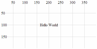
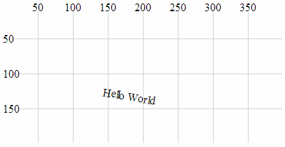
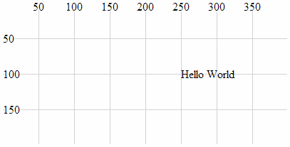
The following is the code snippet (in conjunction with the HTML file outlined at the start of this chapter) which draws the text “Hello World” at the position 200,100 with the anchor point being the the middle of the text;
holder.append("text")         // append text
    .style("fill", "black")   // fill the text with the colour black
    .attr("x", 200)           // set x position of left side of text
    .attr("y", 100)           // set y position of bottom of text
    .attr("dy", ".35em")           // set offset y position
    .attr("text-anchor", "middle") // set anchor y justification
    .text("Hello World");          // define the text to display
This will produce text as follows;
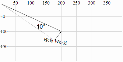
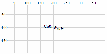
If we then apply a transform-rotate of 10 degrees as follows;
holder.append("text")         // append text
    .style("fill", "black")   // fill the text with the colour black
    .attr("x", 200)           // set x position of left side of text
    .attr("y", 100)           // set y position of bottom of text
    .attr("dy", ".35em")           // set offset y position
    .attr("text-anchor", "middle") // set anchor y justification
    .attr("transform", "rotate(10)")
    .text("Hello World");          // define the text to display
We will see the following on the screen;
Obviously the text has been rotated, but hopefully you’ll have noticed that it’s also been displaced. This is because the transform-rotate attribute has been applied to both the text element (which has been rotated by 10 degrees) and the x,y attributes. If you imagine the origin point for the element being at 0,0, the centre, middle of the text element has been rotated about the point 0,0 by 10 degrees (hopefully slightly better explained in the following picture).
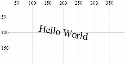
This could be seen as an impediment to getting things to move / change as you want to, but instead it’s an indication of a different way of doing things. The solution to this particular feature is to combine the transform-rotate with the transform-translate that we used earlier so that the code looks like this;
holder.append("text")         // append text
    .style("fill", "black")   // fill the text with the colour black
    .attr("dy", ".35em")           // set offset y position
    .attr("text-anchor", "middle") // set anchor y justification
    .attr("transform", "translate(200,100) rotate(10)")
    .text("Hello World");          // define the text to display
And the image on the page looks like this;
Which leads us to the final example which is a combination of all three aspects of the transform attribute.
holder.append("text")         // append text
    .style("fill", "black")   // fill the text with the colour black
    .attr("dy", ".35em")           // set offset y position
    .attr("text-anchor", "middle") // set anchor y justification
    .attr("transform", "translate(200,100) scale(2) rotate(10)")
    .text("Hello World");          // define the text to display
Here we have a text element translated to its position on the page, rotated by 10 degrees about the centre of the text and scaled by a factor of two.
width, height
width and height are required attributes of the rectangle element. width designates the width of the rectangle and height designates the height (If you’re wondering, I often struggle defining the obvious).
The following is an example of the code section required to draw a rectangle (using only the required attributes) in conjunction with the HTML file outlined at the start of this chapter;
holder.append("rect")       // attach a rectangle
    .attr("x", 100)         // position the left of the rectangle
    .attr("y", 50)          // position the top of the rectangle
    .attr("height", 100)    // set the height
    .attr("width", 200);    // set the width
This will produce a rectangle as follows;
The width of the triangle is 200 pixels and the height is 100 pixels.
text-anchor
The text-anchor attribute determines the justification of a text element
Text can have one of three text-anchor types;
-
startwhere the text is left justified. -
middlewhere the text is centre justified. -
endwhere the text is right justified.
The following is an example of code that will draw three separate lines of text with the three different text-anchor types in conjunction with the HTML file outlined at the start of this chapter;
holder.append("text")         // append text
    .style("fill", "black")   // fill the text with the colour black
    .attr("x", 200)           // set x position of left side of text
    .attr("y", 50)            // set y position of bottom of text
    .attr("text-anchor", "start") // set anchor y justification
    .text("Hello World - start"); // define the text to display

holder.append("text")         // append text
    .style("fill", "black")   // fill the text with the colour black
    .attr("x", 200)           // set x position of left side of text
    .attr("y", 100)           // set y position of bottom of text
    .attr("text-anchor", "middle") // set anchor y justification
    .text("Hello World - middle"); // define the text to display

holder.append("text")         // append text
    .style("fill", "black")   // fill the text with the colour black
    .attr("x", 200)           // set x position of left side of text
    .attr("y", 150)           // set y position of bottom of text
    .attr("text-anchor", "end") // set anchor y justification
    .text("Hello World - end"); // define the text to display
This will produce an output as follows;
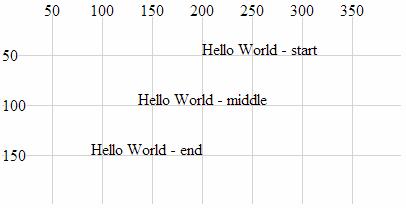
text-anchor Attributes
dx, dy
dx and dy are optional attributes that designate an offset of text elements from the anchor point in the x and y dimension . There are several different sets of units that can be used to designate the offset of the text from an anchor point. These include em which is a scalable unit, px (pixels), pt (points (kind of like pixels)) and % (percent (scalable and kind of like em))
We can demonstrate the offset effect by noting the difference in two examples.
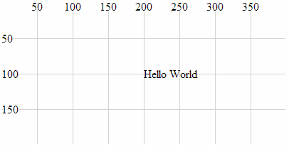
The first is a simple projection of SVG text that aligns the text “Hello World” above and to the right of the anchor point at 200,100 (It does this in conjunction with the HTML file outlined at the start of this chapter.).
holder.append("text")         // append text
    .style("fill", "black")   // fill the text with the colour black
    .attr("x", 200)           // set x position of left side of text
    .attr("y", 100)           // set y position of bottom of text
    .text("Hello World");     // define the text to display
Which produces the following on the page;
The second example introduces the dx attribute setting the offset to 50 pixels. This adds another 50 pixels to the x dimension. We also introduce the dy attribute with an offset of .35em. This scalable unit allows the text to be set as a factor of the size of the text. In this case .35em will add half the height of the text to the y dimension placing the text so that it is exactly in the middle (vertically) of the 100 pixel line on the y dimension.
holder.append("text")         // append text
    .style("fill", "black")   // fill the text with the colour black
    .attr("x", 200)           // set x position of left side of text
    .attr("y", 100)           // set y position of bottom of text
    .attr("dx", "50px")       // set offset x position
    .attr("dy", ".35em")      // set offset y position
    .text("Hello World");     // define the text to display
Which produces the following on the page;
The text has been moved 50 pixels to the right and half the height of the text down the page.
textLength
The textLength attribute adjusts the length of the text to fit a specified value.
The following is a code snippet that prints the text “Hello World” above and to the right of the anchor point at 200,100 (It does this in conjunction with the HTML file outlined at the start of this chapter.). The addition of the textLength attribute declaration in the code stretches the “Hello World” out so that it fills 150 pixels.
holder.append("text")          // append text
    .style("fill", "black")    // fill the text with the colour black
    .attr("x", 200)            // set x position of left side of text
    .attr("y", 100)            // set y position of bottom of text
    .attr("textLength", "150") // set text length
    .text("Hello World");      // define the text to display
Which produces the following on the page;
It is worth noting that while the text has been spread out, the individual letters remain un-stretched. Only the letter and word spacing has been adjusted. However, using the lengthAdjust attribute can change this.
lengthAdjust
The lengthAdjust attribute allows the textLength attribute to have the spacing of a text element controlled to be either spacing or spacingAndGlyphs;
-
spacing: In this option the letters remain the same size, but the spacing between the letters and words are adjusted. -
spacingAndGlyphs: In this option the text is stretched or squeezed to fit.
The attribute can be best illustrated via an example. The following code snippet (which works in conjunction with the HTML file outlined at the start of this chapter) shows three versions of the text element. The top line is the standard text. The middle line is the textLength set to 150 and the lengthAdjust set to spacing (which is the default). The bottom line is the textLength set to 150 and the lengthAdjust set to spacingAndGlyphs.
holder.append("text")          // append text
    .style("fill", "black")    // fill the text with the colour black
    .attr("x", 200)            // set x position of left side of text
    .attr("y", 50)             // set y position of bottom of text
    .text("Hello World");      // define the text to display

holder.append("text")          // append text
    .style("fill", "black")    // fill the text with the colour black
    .attr("x", 200)            // set x position of left side of text
    .attr("y", 100)            // set y position of bottom of text
    .attr("textLength", "150") // set text length
    .attr("lengthAdjust", "spacing")
    .text("Hello World");      // define the text to display

holder.append("text")          // append text
    .style("fill", "black")    // fill the text with the colour black
    .attr("x", 200)            // set x position of left side of text
    .attr("y", 150)            // set y position of bottom of text
    .attr("textLength", "150") // set text length
    .attr("lengthAdjust", "spacingAndGlyphs")
    .text("Hello World");      // define the text to display
The image on the screen will look like the following;
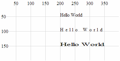
The image shows that the top line looks normal, the middle line has had the spaces increased to increase the length of the text and the bottom line has been stretched.
Styles
What’s a style?
Believe it or not, that’s as difficult a question to answer as “What’s an attribute?”. I like to think that an element can be selected and arranged on a web page with select and attr, but once it’s there, changes to how it looks are a matter for style. We will cover a range of qualities that neatly fit into this definition in the following section (such as fill, opacity and stroke-width) but there are also a range of unusual style declarations that many may not have come across (I certainly hadn’t before writing this).
The other important thing to mention about setting styles for elements is that there are different ways to accomplish the task. We’ll go through the process of describing different styles as they can be applied to individual elements in isolation, but there is a more powerful way to manage styles across a range of elements via Cascading Style Sheets (CSS) in the <style> section of a web page or even via an external style sheet. We will examine these possibilities at the end of the section.
Full disclosure: I have not figured out how to work some of the styles for d3.js I’m afraid that clip-path and mask have exceeded my skill-set and I will have to leave them for another day :-(. I found that there are several good examples that make use of these styles, but I have struggled (unsuccessfully) to present them in a simple example.
fill
The fill style will fill the element being presented with a specified colour.
By default, most elements will be filled with black (the majority of the examples used in this chapter make no fill declaration).
The following example (which works in conjunction with the HTML file outlined at the start of this chapter) shows the syntax for filling a simple circle with the colour red;
holder.append("circle") // attach a circle
.attr("cx", 200) // position the x-centre
.attr("cy", 100) // position the y-centre
.attr("r", 50) // set the radius
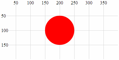
.style("fill", "red"); // set the fill colour
Which results in the following image;
As we saw with the polyline and polygon examples earlier in the chapter some shapes may need to have their fill colour turned off in some circumstances and this can be accomplished by declaring the colour to be none (.style("fill", "none");).
There are several different ways to define exactly what colour we want as a fill. The example above uses a ‘named colour code’ to declare the colour as “red” but we could also have defined it as rgb (.style("fill", "rgb(255,0,0)");) or in hexadecimal (.style("fill", "#f00");)
stroke
The stroke style applies a colour to lines.
By default many elements do not have a stroke colour set, so it’s a matter of declaring the colour with either a named colour code (“red”), an rgb value (“rgb(255,0,0)”) or the appropriate hex (“#f00”).
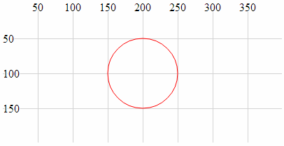
The following example (which works in conjunction with the HTML file outlined at the start of this chapter) shows the syntax for applying the colour red to a simple circle. The fill has been set to none to help the colour stand out.
holder.append("circle")        // attach a circle
    .attr("cx", 200)           // position the x-centre
    .attr("cy", 100)           // position the y-centre
    .attr("r", 50)             // set the radius
    .style("stroke", "red")    // set the line colour
    .style("fill", "none");    // set the fill colour
Which results in the following image;
opacity
The opacity style has the effect of varying an element’s transparency.
The valid range for opacity is from 0 (completely transparent) to 1 (solid colour). We should make the distinction at this point that opacity affects the entire element, whereas the following fill-opacity and stroke-opacity affect only the fill and stroke respectively.
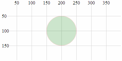
The following code snippet (which works in conjunction with the HTML file outlined at the start of this chapter) creates a green circle with a red border. The opacity value of .2 creates a degree of transparency which will show the grid lines underneath the element.
holder.append("circle")        // attach a circle
    .attr("cx", 200)           // position the x-centre
    .attr("cy", 100)           // position the y-centre
    .attr("r", 50)             // set the radius
    .style("opacity", .2)      // set the element opacity
    .style("stroke", "red")    // set the line colour
    .style("fill", "green");   // set the fill colour
Which results in the following image;
fill-opacity
The fill-opacity style changes the transparency of the fill of an element.
The valid range for fill-opacity is from 0 (completely transparent) to 1 (solid colour). We should make the distinction at this point that fill-opacity affects only the fill of an element, whereas opacity will affect the entire element.
The following code snippet (which works in conjunction with the HTML file outlined at the start of this chapter) creates a green circle with a red border. The opacity value of .2 creates a degree of transparency for the fill which will show the grid lines underneath.
holder.append("circle")        // attach a circle
    .attr("cx", 200)           // position the x-centre
    .attr("cy", 100)           // position the y-centre
    .attr("r", 50)             // set the radius
    .style("fill-opacity", .2) // set the fill opacity
    .style("stroke", "red")    // set the line colour
    .style("fill", "green");   // set the fill colour
Which results in the following image;
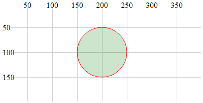
The distinction between this image and the one for the opacity style clearly shows the line around the outside of the object as still a solid (opaque) colour.
stroke-opacity
The stroke-opacity style changes the transparency of the stroke (line) of an element.
The valid range for stroke-opacity is from 0 (completely transparent) to 1 (solid colour). We should make the distinction at this point that stroke-opacity affects only the line or border of an element, whereas opacity will affect the entire element.
The following code snippet (which works in conjunction with the HTML file outlined at the start of this chapter) creates an empty circle with a red border. The opacity value of .2 creates a degree of transparency for the stroke which will show the grid lines underneath (or at least make it appear more ‘muted’).
holder.append("circle")          // attach a circle
    .attr("cx", 200)             // position the x-centre
    .attr("cy", 100)             // position the y-centre
    .attr("r", 50)               // set the radius
    .style("stroke-opacity", .2) // set the stroke opacity
    .style("stroke", "red")      // set the line colour
    .style("fill", "none");      // set the fill colour
Which results in the following image;
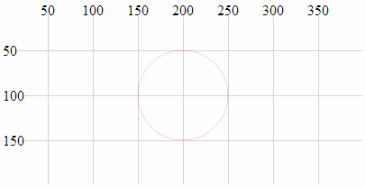
Although it is not necessarily easy to see in this example because the line is quite thin, the lines of the grid behind the circle will be showing through the line of the circle.
stroke-width
The stroke-width style adjusts the width of the line of an element.
The value specified when setting stroke-width is in pixels.
The following code snippet (which works in conjunction with the HTML file outlined at the start of this chapter) creates an empty circle with a red border. The stroke-width is set to 5 which equates to 5 pixels (it can also be specified as “5px”).
holder.append("circle")          // attach a circle
    .attr("cx", 200)             // position the x-centre
    .attr("cy", 100)             // position the y-centre
    .attr("r", 50)               // set the radius
    .style("stroke-width", 5)    // set the stroke width
    .style("stroke", "red")      // set the line colour
    .style("fill", "none");      // set the fill colour
Which results in the following image;
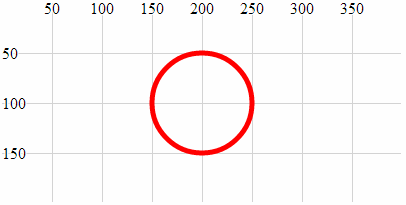
The width of the line that forms the border of the circle is now 5 pixels wide :-).
stroke-dasharray
The stroke-dasharray style allows us to form element lines with dashes instead of solid lines.
We have covered dashed lines in practical way in a previous section of the book (‘Make a Dashed Line’) but for the sake of completeness I will include dashed lines here as well.
We create a dashed line by specifying the length of a dash and then the length of a space. We can include a long list of dashes and spaces and once complete our line will simply repeat the pattern we have specified.
For example the following code snippet (which works in conjunction with the HTML file outlined at the start of this chapter) creates a line with a dash of 10 pixels followed by a space of 3 pixels;
holder.append("circle")       // attach a circle
    .attr("cx", 200)          // position the x-centre
    .attr("cy", 100)          // position the y-centre
    .attr("r", 50)            // set the radius
    .style("stroke-dasharray", ("10,3")) // make the stroke dashed
    .style("stroke", "red")   // set the line colour
    .style("fill", "none");   // set the fill colour
Which results in the following image;
More complex combinations of dashes and spaces are possible as are complex animation sequences that leverage the ability to move objects along a path (these are certainly more advanced examples).
stroke-linecap
The stroke-linecap style allows control of the shape of the ends of lines in d3.js.
There are three shape options;
-
buttwhere the line simply butts up to the starting or ending position and is cut off squarely. -
roundwhere the line is rounded in proportion to its width. -
squarewhere the line is squared off but extended in proportion to its width.
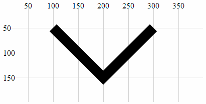
The following code snippet (which works in conjunction with the HTML file outlined at the start of this chapter) generates three lines showing each stroke-linecap style option. The top line uses butt. The middle line uses round and the bottom line uses square.
holder.append("line")                 // attach a line
    .style("stroke", "black")         // colour the line
    .style("stroke-width", 20)        // adjust line width
    .style("stroke-linecap", "butt")  // stroke-linecap type
    .attr("x1", 100)     // x position of the first end of the line
    .attr("y1", 50)      // y position of the first end of the line
    .attr("x2", 300)     // x position of the second end of the line
    .attr("y2", 50);     // y position of the second end of the line

holder.append("line")                  // attach a line
    .style("stroke", "black")          // colour the line
    .style("stroke-width", 20)         // adjust line width
    .style("stroke-linecap", "round")  // stroke-linecap type
    .attr("x1", 100)     // x position of the first end of the line
    .attr("y1", 100)     // y position of the first end of the line
    .attr("x2", 300)     // x position of the second end of the line
    .attr("y2", 100);    // y position of the second end of the line

holder.append("line")                   // attach a line
    .style("stroke", "black")           // colour the line
    .style("stroke-width", 20)          // adjust line width
    .style("stroke-linecap", "square")  // stroke-linecap type
    .attr("x1", 100)     // x position of the first end of the line
    .attr("y1", 150)     // y position of the first end of the line
    .attr("x2", 300)     // x position of the second end of the line
    .attr("y2", 150);    // y position of the second end of the line
Which results in the following image;
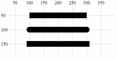
The shapes are quite distinct for each type and it is useful to note the degree to which the lines extend beyond their start and end points.
stroke-linejoin
The stroke-linejoin style specifies the shape of the join of two lines. This would be used on path, polyline and polygon elements (and possibly more).
There are three line join options;
-
miterwhere the join is squared off as would be expected at the join of two lines. -
roundwhere the outside portion of the join is rounded in proportion to its width. -
bevelwhere the join has a straight edged outer portion clipped off to provide a slightly more contoured effect while still being angular.
The following code snippet (which works in conjunction with the HTML file outlined at the start of this chapter) generates a poly line where the join has the connection shaped using the stroke-linejoin round style.
holder.append("polyline")       // attach a polyline
    .style("stroke", "black")   // colour the line
    .style("fill", "none")      // remove any fill colour
	.style("stroke-width", 20)  // colour the line
	.style("stroke-linejoin", "round")  // shape the line join
    .attr("points", "100,50, 200,150, 300,50");  // x,y points
Which results in the following image;
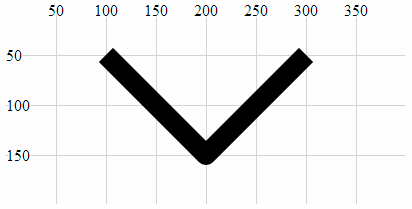
Note the curve on the outer of the join.
Changing the shape of the line join to bevel produces the following;
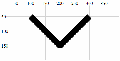
Here we can see the clipping of the outer portion of the join.
And using miter produces a standard connection;
This is the default setting for line joins and does not need to be added unless the line join type has already been set to a different default.
writing-mode
The writing-mode style changes the orientation of the text so that it prints out top to bottom. It has a single option “tb” that accomplishes this. It is relatively limited in scope compared to the equivalent for CSS, but for the purposes of generating some text it has a definite use.
The following code snippet (which works in conjunction with the HTML file outlined at the start of this chapter) creates a line of text that is now printed from top to bottom instead of left to right.
holder.append("text")            // append text
    .style("fill", "black")      // make the text black
    .style("writing-mode", "tb") // set the writing mode
    .attr("x", 200)         // set x position of left side of text
    .attr("y", 100)         // set y position of bottom of text
    .text("Hello World");   // define the text to display
Which results in the following image;
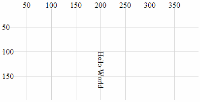
It is significant to note that while it looks like the text has been rotated about its anchor point, this actually isn’t the case since the anchor point should be at 200,100. Also, the glyph-orientation-vertical style (which follows) will allow the text to be orientated vertically which will be useful.
glyph-orientation-vertical
The glyph-orientation-vertical style changes the rotation of the individual glyphs (characters) in text and if used in conjunction with the writing-mode style (and set to 0) will allow the text to be displayed vertically with the letters orientated vertically as well.
The following code snippet (which works in conjunction with the HTML file outlined at the start of this chapter) creates a line of text that is now printed from top to bottom with letters orientated vertically.
holder.append("text")            // append text
    .style("fill", "black")      // make the text black
    .style("writing-mode", "tb") // set the writing mode
    .style("glyph-orientation-vertical", 0)
    .attr("x", 200)         // set x position of left side of text
    .attr("y", 25)          // set y position of bottom of text
    .text("Hello World");   // define the text to display
Which results in the following image;
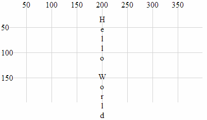
It is worth noting that the text spacing increases dramatically as the spacing for each letter relies on the normal distance between the bottom and top of a line of text.
Using styles in Cascading Style Sheets
Declaring styles on an element by element basis is an OK way to apply styles, but when our visualizations become more complex, this can be an inefficient use of code.
A smarter way to provide a common set of styles to elements is to declare them in the <style> section of our HTML document using Cascading Style Sheets (CSS). These will then be automatically applied to our elements.
We start with an example script that draws our three lines that have different styles of linecaps. Our previous example looked like the following (in conjunction with the HTML file outlined at the start of this chapter)
holder.append("line")                 // attach a line
    .style("stroke", "black")         // colour the line
    .style("stroke-width", 20)        // adjust line width
    .style("stroke-linecap", "butt")  // stroke-linecap type
    .attr("x1", 100)     // x position of the first end of the line
    .attr("y1", 50)      // y position of the first end of the line
    .attr("x2", 300)     // x position of the second end of the line
    .attr("y2", 50);     // y position of the second end of the line

holder.append("line")                  // attach a line
    .style("stroke", "black")          // colour the line
    .style("stroke-width", 20)         // adjust line width
    .style("stroke-linecap", "round")  // stroke-linecap type
    .attr("x1", 100)     // x position of the first end of the line
    .attr("y1", 100)     // y position of the first end of the line
    .attr("x2", 300)     // x position of the second end of the line
    .attr("y2", 100);    // y position of the second end of the line

holder.append("line")                   // attach a line
    .style("stroke", "black")           // colour the line
    .style("stroke-width", 20)          // adjust line width
    .style("stroke-linecap", "square")  // stroke-linecap type
    .attr("x1", 100)     // x position of the first end of the line
    .attr("y1", 150)     // y position of the first end of the line
    .attr("x2", 300)     // x position of the second end of the line
    .attr("y2", 150);    // y position of the second end of the line
Which resulted in the following image;
The block of code for each of the three lines contains three separate style declarations. Two of which are identical for all three blocks of code;
    .style("stroke", "black")         // colour the line
    .style("stroke-width", 20)        // adjust line width
To make these styles available from a common point, we declare them in the <style> section of our HTML file as follows;
<style>
line.linecap {
  stroke: black;
  stroke-width: 20;
}
</style>
The <style> tags simply tell our browser which part of the HTML file we are using to define our styles.
The line.linecap portion identifies the following styles as belonging to the line elements that are also identified as belonging to the ‘class’ linecap (We have used the linecap name as a convenience only and it could just as easily have been foobar.).
The two styles are enclosed within curly braces and are declared in the form <style-name>: <style-value>;. So for our example here, the stroke is black and its width is 20 pixels.
Then our example script can have the two styles removed from each of the blocks that draws the lines and in their place we add a new attribute class that assigns a class to the element (in this case the class linecap). Our new code will look like this;
holder.append("line")           // attach a line
    .style("stroke-linecap", "butt")  // stroke-linecap type
    .attr("class", "linecap")   // inherits styles from CSS
    .attr("x1", 100)     // x position of the first end of the line
    .attr("y1", 50)      // y position of the first end of the line
    .attr("x2", 300)     // x position of the second end of the line
    .attr("y2", 50);     // y position of the second end of the line

holder.append("line")           // attach a line
    .style("stroke-linecap", "round")  // stroke-linecap type
    .attr("class", "linecap")   // inherits styles from CSS
    .attr("x1", 100)     // x position of the first end of the line
    .attr("y1", 100)     // y position of the first end of the line
    .attr("x2", 300)     // x position of the second end of the line
    .attr("y2", 100);    // y position of the second end of the line

holder.append("line")           // attach a line
    .style("stroke-linecap", "square")  // stroke-linecap type
    .attr("class", "linecap")   // inherits styles from CSS
    .attr("x1", 100)     // x position of the first end of the line
    .attr("y1", 150)     // y position of the first end of the line
    .attr("x2", 300)     // x position of the second end of the line
    .attr("y2", 150);    // y position of the second end of the line
While this has only replaced two lines with one in our code, the potential for use in far more complex examples should be obvious. There is significantly more detail that can be gone into with regard to CSS, but that would be beyond my meagre abilities.