Bar Charts and Histograms
Yes! There is a difference! I know they look similar but for a bar charts, each column represents a group defined by a category and with a histogram, each column represents a group defined by a range.
Bar Chart
- Each column is positioned over a label that represents a categorical variable.
- The height of the column indicates the size of the group defined by the category.
Histogram
- Each column is positioned over a label that represents a quantitative variable.
- The column label can be a single value or a range of values.
Bar Charts
A bar chart is a visual representation using either horizontal or vertical bars to show comparisons between discrete categories. There are a number of variations of bar charts including stacked, grouped, horizontal and vertical.
We will work through a simple vertical bar chart that uses a value on the y axis and category in the form of a name on the x axis.
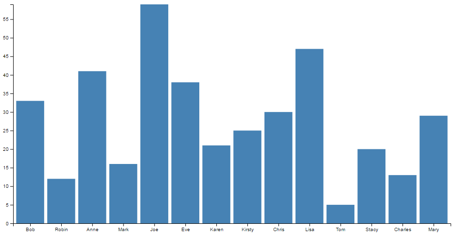
The end result will look like this;
The data
The data for this example will be sourced from an external (purely fictional) csv file named sales.csv. It consists of a column of names and ‘sales’ and its contents are as follows;
The code
The full code listing for the example we are going to work through is as follows;
<!DOCTYPE html>
<meta charset="utf-8">
<style> /* set the CSS */

.bar { fill: steelblue; }

</style>
<body>

<!-- load the d3.js library -->
<script src="//d3js.org/d3.v4.min.js"></script>
<script>

// set the dimensions and margins of the graph
var margin = {top: 20, right: 20, bottom: 30, left: 40},
    width = 960 - margin.left - margin.right,
    height = 500 - margin.top - margin.bottom;

// set the ranges
var x = d3.scaleBand()
          .range([0, width])
          .padding(0.1);
var y = d3.scaleLinear()
          .range([height, 0]);

// append the svg object to the body of the page
// append a 'group' element to 'svg'
// moves the 'group' element to the top left margin
var svg = d3.select("body").append("svg")
    .attr("width", width + margin.left + margin.right)
    .attr("height", height + margin.top + margin.bottom)
  .append("g")
    .attr("transform",
          "translate(" + margin.left + "," + margin.top + ")");

// get the data
d3.csv("sales.csv", function(error, data) {
  if (error) throw error;

  // format the data
  data.forEach(function(d) {
    d.sales = +d.sales;
  });

  // Scale the range of the data in the domains
  x.domain(data.map(function(d) { return d.salesperson; }));
  y.domain([0, d3.max(data, function(d) { return d.sales; })]);

  // append the rectangles for the bar chart
  svg.selectAll(".bar")
      .data(data)
    .enter().append("rect")
      .attr("class", "bar")
      .attr("x", function(d) { return x(d.salesperson); })
      .attr("width", x.bandwidth())
      .attr("y", function(d) { return y(d.sales); })
      .attr("height", function(d) { return height - y(d.sales); });

  // add the x Axis
  svg.append("g")
      .attr("transform", "translate(0," + height + ")")
      .call(d3.axisBottom(x));

  // add the y Axis
  svg.append("g")
      .call(d3.axisLeft(y));

});

</script>
</body>
The bar chart explained
In the course of describing the operation of the file I will gloss over the aspects of the structure of an HTML file which have already been described at the start of the book. Likewise, aspects of the JavaScript functions that have already been covered will only be briefly explained.
The start of the file deals with setting up the document’s head and body, loading the d3.javascript script and setting up the CSS in the <style> section.
The CSS section sets styling for the colour of the bars. In all reality we could have placed it as a style later in the code, but it’s nice to have something in the CSS area because you never know, we might want it later.
.bar { fill: steelblue; }
Then our JavaScript section starts and the first thing that happens is that we set the size of the area that we’re going to use for the chart and the margins;
// set the dimensions and margins of the graph
var margin = {top: 20, right: 20, bottom: 30, left: 40},
    width = 960 - margin.left - margin.right,
    height = 500 - margin.top - margin.bottom;
The next section of our code includes some of the functions that will be called from the main body of the code. This includes the functions to determine positioning in the x and y domains.
// set the ranges
var x = d3.scaleBand()
          .range([0, width])
          .padding(0.1);
var y = d3.scaleLinear()
          .range([height, 0]);
The band scale set up for the x domain is a neat function that allows the creation of a series of uniform bands that can be computed from the assigned range. For the purposes of our bar chart, these will be the equivalent of the bars. These bands and their properties (the spacing between them and other details) can be assigned for display purposes.
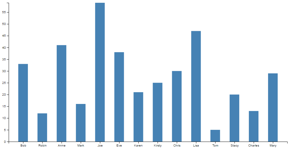
For example, in this case the padding is the space made available between bars. This is set to 0.1, or 1/10th of the width of the space available for each band. If we were to alter the padding to 0.5 (or half the width of the band) we would have the following;
For the full description of band scales, check out the D3 wiki.
The function to set the scaling in the y domain is the same as most of our other graph examples;
var y = d3.scaleLinear()
          .range([height, 0])
The next block of code selects the body on the web page and appends an svg object to it of the size that we have set up with our width, height and margins.
var svg = d3.select("body").append("svg")
    .attr("width", width + margin.left + margin.right)
    .attr("height", height + margin.top + margin.bottom)
  .append("g")
    .attr("transform",
          "translate(" + margin.left + "," + margin.top + ")")
It also adds a g element that provides a reference point for adding our axes.
Then we begin the main body of our JavaScript. We load our csv file and then loop through it making sure that the dates and numerical values are recognised correctly;
// get the data
d3.csv("sales.csv", function(error, data) {
  if (error) throw error;

  // format the data
  data.forEach(function(d) {
    d.sales = +d.sales;
  });
We then work through our x and y data and ensure that it is scaled to the domains we are working in;
  // Scale the range of the data in the domains
  x.domain(data.map(function(d) { return d.salesperson; }));
  y.domain([0, d3.max(data, function(d) { return d.sales; })]);
Then we add the bars to our chart;
  // append the rectangles for the bar chart
  svg.selectAll(".bar")
      .data(data)
    .enter().append("rect")
      .attr("class", "bar")
      .attr("x", function(d) { return x(d.salesperson); })
      .attr("width", x.bandwidth())
      .attr("y", function(d) { return y(d.sales); })
      .attr("height", function(d) { return height - y(d.sales); });
This block of code creates the bars (selectAll("bar")) and associates each of them with a data set (.data(data)).
We then append a rectangle (.append("rect")) with the colour assigned by our class (set in the <style> section) along with values for x/y position. The width of the bars is determined from our band scale function we assigned earlier and is found by retrieving the value via the .bandwidth() call. The height is as configured in our earlier code.
Finally we append our axes;
  // add the x Axis
  svg.append("g")
      .attr("transform", "translate(0," + height + ")")
      .call(d3.axisBottom(x));

  // add the y Axis
  svg.append("g")
      .call(d3.axisLeft(y));
The end result is our pretty looking bar chart;
Histograms
A histogram is a graphical representation of the distribution of numerical data. It is typically formed by creating ‘bins’ of a larger dataset that group the data into a range of values and count the number of pieces of data fall into each bin. Each bin is then represented as a bar showing the relationship between each range.
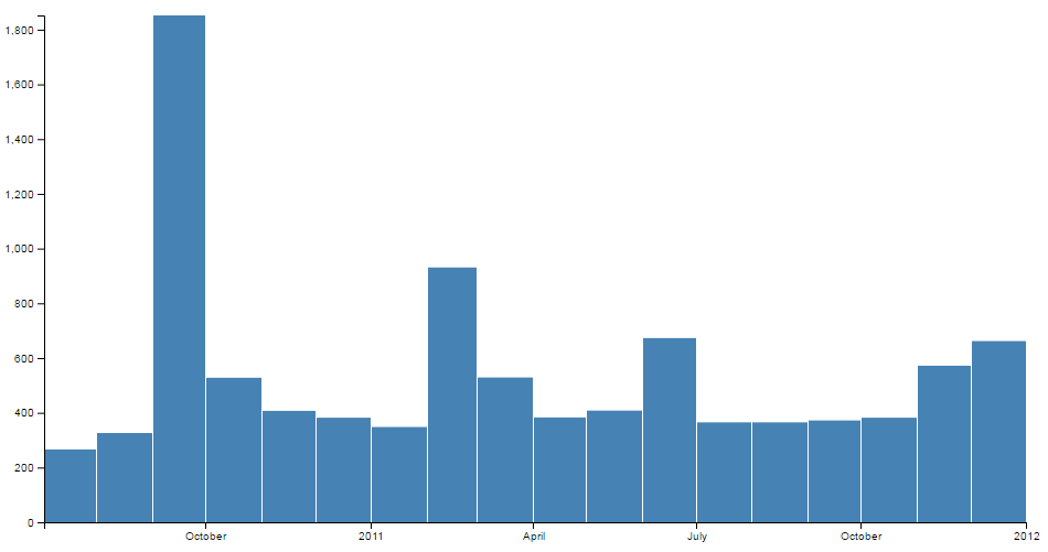
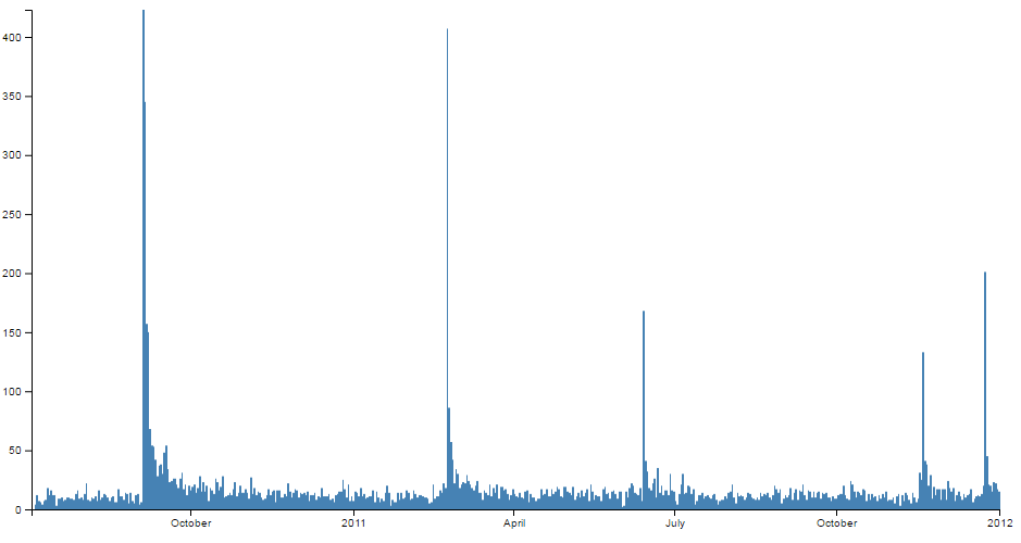
The example we will work through shows the frequency of earthquakes above magnitude 3 between July 2010 and January 2012 in Christchurch, New Zealand (A time of some significant seismic activity). Data was sourced from New Zealand’s Geonet site.
We can see that the data has been ‘binned’ by month and that between the 1st of September and the 1st of October there were over 1800 earthquakes registering over magnitude 3.
The data
The data for this example will be sourced from an external (purely fictional) csv file named sales.csv. It consists of a column of dates in day-month-year format (and magnitudes, which won’t be used in this graph) and its contents looks similar to the following;
The code
The full code listing for the example we are going to work through is as follows;
<!DOCTYPE html>
<meta charset="utf-8">
<style> /* set the CSS */

rect.bar { fill: steelblue; }

</style>
<body>

<!-- load the d3.js library -->
<script src="//d3js.org/d3.v4.min.js"></script>
<script>

// set the dimensions and margins of the graph
var margin = {top: 10, right: 30, bottom: 30, left: 40},
    width = 960 - margin.left - margin.right,
    height = 500 - margin.top - margin.bottom;

// parse the date / time
var parseDate = d3.timeParse("%d-%m-%Y");

// set the ranges
var x = d3.scaleTime()
          .domain([new Date(2010, 6, 3), new Date(2012, 0, 1)])
          .rangeRound([0, width]);
var y = d3.scaleLinear()
          .range([height, 0]);

// set the parameters for the histogram
var histogram = d3.histogram()
    .value(function(d) { return d.date; })
    .domain(x.domain())
    .thresholds(x.ticks(d3.timeMonth));

// append the svg object to the body of the page
// append a 'group' element to 'svg'
// moves the 'group' element to the top left margin
var svg = d3.select("body").append("svg")
    .attr("width", width + margin.left + margin.right)
    .attr("height", height + margin.top + margin.bottom)
  .append("g")
    .attr("transform",
          "translate(" + margin.left + "," + margin.top + ")");

// get the data
d3.csv("earthquakes.csv", function(error, data) {
  if (error) throw error;

  // format the data
  data.forEach(function(d) {
      d.date = parseDate(d.dtg);
  });

  // group the data for the bars
  var bins = histogram(data);

  // Scale the range of the data in the y domain
  y.domain([0, d3.max(bins, function(d) { return d.length; })]);

  // append the bar rectangles to the svg element
  svg.selectAll("rect")
      .data(bins)
    .enter().append("rect")
      .attr("class", "bar")
      .attr("x", 1)
      .attr("transform", function(d) {
		  return "translate(" + x(d.x0) + "," + y(d.length) + ")"; })
      .attr("width", function(d) { return x(d.x1) - x(d.x0) -1 ; })
      .attr("height", function(d) { return height - y(d.length); });

  // add the x Axis
  svg.append("g")
      .attr("transform", "translate(0," + height + ")")
      .call(d3.axisBottom(x));

  // add the y Axis
  svg.append("g")
      .call(d3.axisLeft(y));

});

</script>
</body>
The histogram explained
In the course of describing the operation of the file I will gloss over the aspects of the structure of an HTML file which have already been described at the start of the book. Likewise, aspects of the JavaScript functions that have already been covered will only be briefly explained.
The start of the file deals with setting up the document’s head and body, loading the d3.javascript script and setting up the CSS in the <style> section.
The CSS section sets styling for the colour of the rectangles that make up the bars. Similar to the Bar graph, we could have placed it as a style later in the code, but it’s nice to have something in the CSS area.
rect.bar { fill: steelblue; }
Then our JavaScript section starts and the first thing that happens is that we set the size of the area that we’re going to use for the chart and the margins;
// set the dimensions and margins of the graph
var margin = {top: 10, right: 30, bottom: 30, left: 40},
    width = 960 - margin.left - margin.right,
    height = 500 - margin.top - margin.bottom;
Then we declare the code that parses the time;
// parse the date / time
var parseDate = d3.timeParse("%d-%m-%Y");
Here we have it set to look for time that is formatted as day-month-year.
The next section of our code scales the ranges for x and y.
// set the ranges
var x = d3.scaleTime()
          .domain([new Date(2010, 6, 3), new Date(2012, 0, 1)])
          .rangeRound([0, width]);
var y = d3.scaleLinear()
          .range([height, 0]);
y is pretty standard, but for x we specify a time scale that has a domain that goes from one date to another. The date specified here is mildly artificial in the sense that I selected it to look good with the graph when I adjust the bins (you’ll see later), but a bit of experimentation will see you right. Lastly for the x range we get it to round itself to logical values using rangeRound.
Now we start to setup the function that will apply the D3 magic required to form our histogram with the code;
// set the parameters for the histogram
var histogram = d3.histogram()
    .value(function(d) { return d.date; })
    .domain(x.domain())
    .thresholds(x.ticks(d3.timeMonth));
The d3.histogram function allows us to form our data into ‘bins’ that form “discrete samples into continuous, non-overlapping intervals”. In other words in this case we are going to take a data set of close to 10,000 points and we are going to form them into bins corresponding to the months that they occurred in. The value that we’re going to bin will be the variable date and they will fit into the domain that we have already specified in the range section (via .domain(x.domain())). Lastly, we apply the thresholds that we are going to use for the bins which in this case is monthly via .thresholds(x.ticks(d3.timeMonth));.
We can very crudely change our histogram by simply changing that to .thresholds(x.ticks(d3.timeWeek)); to produce the following;
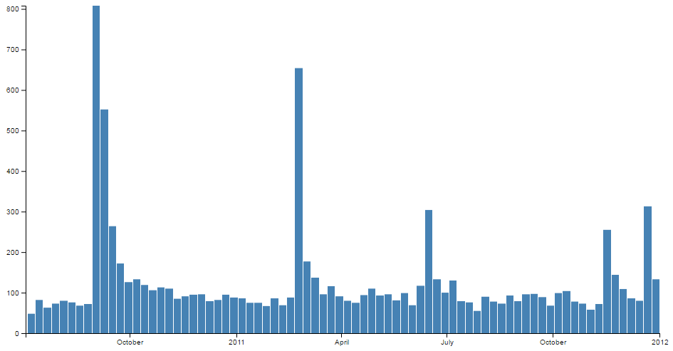
And we can go slightly more extreme by specifying a daily bin and produce the following;
(Although technically I cheated slightly with this version and I removed the padding between the bars to allow the data to be presented a bit more faithfully.)
The next block of code selects the body on the web page and appends an svg object to it of the size that we have set up with our width, height and margins.
var svg = d3.select("body").append("svg")
    .attr("width", width + margin.left + margin.right)
    .attr("height", height + margin.top + margin.bottom)
  .append("g")
    .attr("transform",
          "translate(" + margin.left + "," + margin.top + ")");
It also adds a g element that provides a reference point for adding our axes.
Then we begin the main body of our JavaScript. We load our csv file and then loop through it making sure that the dates converted into a time format correctly;
// get the data
d3.csv("earthquakes.csv", function(error, data) {
  if (error) throw error;

  // format the data
  data.forEach(function(d) {
      d.date = parseDate(d.dtg);
  });
Now that we have our data we can put it into the appropriate bins using the histogram function that we declared earlier;
  // group the data for the bars
  var bins = histogram(data);
At this point we have two data sets. The first is our array of information from our earthquakes.csv file which is called ‘data’. The second is an array of grouped data called ‘bins’. We use the ‘bins’ data to draw our histogram.
We then use our ‘bin’ data to ensure that the y domain is scaled to the longest bar in the ‘bins’ data set;
  // Scale the range of the data in the y domain
  y.domain([0, d3.max(bins, function(d) { return d.length; })]);
Then we add the bars to our chart;
  // append the bar rectangles to the svg element
  svg.selectAll("rect")
      .data(bins)
    .enter().append("rect")
      .attr("class", "bar")
      .attr("x", 1)
      .attr("transform", function(d) {
		  return "translate(" + x(d.x0) + "," + y(d.length) + ")"; })
      .attr("width", function(d) { return x(d.x1) - x(d.x0) -1 ; })
      .attr("height", function(d) { return height - y(d.length); });
This block of code selects all the rectangles (selectAll("rect")) and associates each of them with our binned data set (.data(bins)).
We then append the rectangles (.append("rect")) with the colour assigned by our class (set in the <style> section) and we offset all the bars by 1 to make sure that we have a nice symmetrical set of bars with a thin separation (.attr("x", 1)).
The transform function sets the starting point for where we begin drawing the rectangles and the height and width attributes set the height and width of the rectangles. If you really want to stop and look at the transform and height attributes you will notice that it seems a bit ‘odd’. That is because it draws the graph from the top of the screen down. The origin is at the top left of the screen remember and we are trying to represent bars that appear to extend upwards from a ‘0’ point (on the y axis) that exists at a distance ‘height’ from the top of the screen. Sound weird. It is a little, but at the very least it’s logical. You can do it in several different ways, some more confusing than this, and I think that this represents a good balance between code complexity and understandability.
It’s also useful to note that when our histogram function was creating our bins, it also associated some variables with each bin. x0 and x1 to denote the start and stop point for each bin in the x domain and length for the number of data points in each bin. You can see more details in the D3 wiki here.
Finally we append our axes;
  // add the x Axis
  svg.append("g")
      .attr("transform", "translate(0," + height + ")")
      .call(d3.axisBottom(x));

  // add the y Axis
  svg.append("g")
      .call(d3.axisLeft(y));
The end result is our sharp looking histogram;