Chapter 6 - UI Container Components by Example
In the first half of this book we’ve extensively discussed the attributes of a “high-quality” UI component. It should be reusable, portable, encapsulated, and have no direct outside dependencies. In other words, a good UI component should not know about anything beyond its element boundaries. Using AngularJS as our toolbox, we built an example component that adheres to the best practices discussed, and learned a lot about the AngularJS APIs and the declarative approach in the process.
However, this only gets us so far in the real world. The best selling book of all time has a saying, “…give a man a fish, and he eats for a day. Teach a man to fish, and he eats for a lifetime”. As is always the case with hot new web technologies, there’s the rush to publish books about it, and these books always end up “giving the man a fish” rather than teaching him or her to fish. Our goal is to teach the sport of fishing, and focus on the component development concepts that can be applied to situations well beyond the set of examples we cover in this chapter.
A good percentage of UI components and widgets are meant to be part of a group such as tab panels, carousel slides, and menu items. These components need to exist side by side with some kind of common containment and management; otherwise we end up in a situation where we are trying to herd cats on the web page.
This is where the use-case requires a container component such as a tab group, slide deck, or menu bar. All the major client side widget toolkits including jQueryUI, Extjs, Bootstrap.js, Dojo and more have container components. Often the behavior on the inner components are such that when clicking on one component to toggle the active state means that the other components must be toggled to a passive or disabled state such as hiding a tab panel when another tab is clicked.

Nav Bar, Dropdown, & Menu Item Components
Container components allow us to provide and ensure common styling and behavior at the next level up in the DOM hierarchy from a discreet UI component. When creating UI components in AngularJS that are meant to exist as part of a group, populating a container component with them allows us to use the container component as the central event bus for the individual components. This way AngularJS UI components can have minimal or no dependency on the $rootScope as the mediator since $rootScope is analogous to the window scope in the DOM.

|
Leave $rootScope alone Why do we want to minimize component dependency on the $rootScope? After all, there are many examples on the web in tech blogs, Stack Overflow or GitHub that show you how to attach event listeners, data, or even access $rootScope in view templates. But for precisely this reason, and the fact that AngularJS is rapidly becoming the most popular JavaScript toolkit since jQuery, is why we want to avoid coupling the proper functioning of our UI components with the $rootScope. Who knows who or what might be messing with it, especially given that most web developers have too much to do in too little time, and using the $rootScope rather than figuring out the proper way, is the path of least resistance. Note that while we used $rootScope for the button component example, this was purely to illustrate how to decouple dependency via the publish-subscribe pattern using AngularJS event listeners and handlers. In the real world, we would prefer attaching event listeners to the appropriate scope such as an application or component container scope. |
<< diagram of container scope or service as event bus vs. $rootScope >>
Container components can and should know exactly what exists and is happening within their element boundaries including full knowledge of their child components. However, as with any high quality component, the opposite is not the case. Container components, just like any other UI components should have zero knowledge of anything that exists at a higher level of the DOM or AngularJS controller hierarchy.
<< diagram ??? >>
This chapter focuses on six goals:
- Building robust UI component directives meant to exist along side instances of the same
- Building container components for the above
- Population of container components with child UI components
- Interaction between container components and children components
- Which AngularJS tools, methods, and conventions should be used for what and when
- Understanding why we choose to make an implementation a certain way compared to all of the alternative ways of accomplishing the same result. Every function and line of code in the examples to follow was written to adhere to a best practice. Nothing is arbitrary.
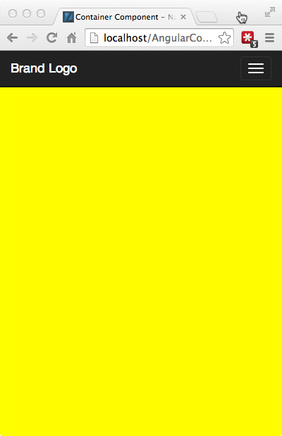
This is the chapter where everything we’ve discussed in previous chapters comes together. We will stretch the limits of the tools AngularJS provides us with as we create a global navigation header container. Our header will be fillable with either dropdown menus or individual menu item components. The dropdown menus will also be fillable with the same menu item components making them both container and contained components. In keeping with the DRY principal, the dropdowns and menu items will have the ability to exist outside of the container components we create for this example. All of the components we create will have both declarative and imperative methods of creation, rich and flexible APIs, and to top things off, rather than reinvent the wheel, we will borrow and extend existing functionality from the Bootstrap, AngularJS core, and Angular-UI projects.
Does this sound overwhelming? It should, so we will start with the most basic pieces of any web application- the business requirements and the data, and proceed in a logical fashion towards the more complex inter-component interactions.
Defining a Set of Navigation Components
As in the previous chapter’s example, we will again imagine that we are tasked with creating a set of container and contained components that would be suitable for use by many different teams throughout a large, enterprise organization.
Basic Requirements
- Must be viewport responsive - same code for desktop and mobile
- Must allow dynamic or runtime creation of menu labels, URLs, etc.
- Must be able to dynamically switch between minimal and maximal display states
- Have active and passive states for dropdowns and menu items
- Must allow for limited set of styling or color choices for the consumer
- Able to be included with the simplest HTML markup as possible, or rather only a limited knowledge of HTML is required to create a full featured navigation header
- Full set of API documentation and full unit test coverage
Nice-To-Haves
- For DRY purposes, UI components should be viable whether in or outside of a container component
- Ability to populate the Navigation Bar both declaratively with markup, and imperatively with JSON data in the same instance.
- Source code organized in a way that is easily upgradable to web components
Design Comps
In most organizations product or project managers will collaborate with UX (user experience) and visual designers to create wireframes and example images of how the engineering deliverables should like and behave. The following are the visuals from our imaginary design team:

Navigation Bar - Default State

Navigation Bar - Dropdown Open State

Navigation Bar - Dropdown Open - Menu Item Hover State
")
Navigation Bar - Minimal or Contents Hidden State (for less distraction while the user performs an important task)
Navigation Bar - Responsive / Mobile Contracted (left) and Expanded (right) States
 and Expanded (right) States")
Navigation Bar - Responsive / Mobile Contracted (left) and Expanded (right) States
If these images look like they are using Bootstrap “inverse” navigation header bar styling, it is because they are. As of this writing, Bootstrap 3.xx is the most widely used set of base styles for common HTML page components including navigation. But we are not endorsing Bootstrap because we use it as the styling base here. Some alternatives to Bootstrap for “responsive first” css frameworks include Foundation, InK, Zimit, and HTML KickStart among others. What we do endorse is using a CSS framework, along with a preprocessor like SASS or LESS, because it prevents engineering time waste in creating the same base functionality, provides a common language for UI engineering to communicate with visual and UX design teams, and provides presentable styling fallbacks for any components not covered by the organization’s style guides or pattern libraries.
Data Model
For the purposes of setting up the context of our real-world example, not only are we working with a set of images from an imaginary design team, but we are also working with an imaginary back-end or server-side engineering team that have provided us with the following example JSON data object that represents the data attributes and structure that our navigation bar component can expect to find on page load or after an AJAX call.
6.0 Example JSON Data Object from AJAX or Initial Page Load
// global header json
{"header":[
        /* This data object translates to a dropdown container component */
        {"Products":[
            /* This data object translates to a menu item component */
            {
                "text":"Scrum Manager",
                "url":"/products/scrum-manager"
            },{
                "text":"AppBeat",
                "url":"/products/app-beat"
            },{
                "text":"Solidify on Request",
                "url":"/products/sor"
            },{
                "text":"IQ Everywhere",
                "url":"/products/iq-anywhere"
            },{
                "text":"Service Everywhere",
                "url":"/products/service-everywhere"
            }
        ]},
        {"Pricing":[
            {
                "text":"Scrum Manager",
                "url":"/pricing/scrum-manager"
            },{
                "text":"AppBeat",
                "url":"/pricing/app-beat"
            },{
                "text":"Solidify on Request",
                "url":"/pricing/sor"
            },{
                "text":"IQ Everywhere",
                "url":"/pricing/iq-anywhere"
            },{
                "text":"Service Everywhere",
                "url":"/pricing/service-everywhere"
            }
        ]},
        {"Support":[
            {
                "text":"White Papers",
                "url":"/support/papers"
            },{
                "text":"Case Studies",
                "url":"/support/studies"
            },{
                "text":"Videos",
                "url":"/support/videos"
            },{
                "text":"Webinars",
                "url":"/support/webinars"
            },{
                "text":"Documentation",
                "url":""
            },{
                "text":"News & Reports",
                "url":"/learn/news"
            }
        ]},
        {"Company":[
            {
                "text":"Contact Us",
                "url":"/company/contact"
            },{
                "text":"Jobs",
                "url":"/company/jobs"
            },{
                "text":"Privacy Statement",
                "url":"/company/privacy"
            },{
                "text":"Terms of Use",
                "url":"/company/terms"
            }]
        }
]}
The items of note in the example data object are two levels of object arrays. The first level array represents data that will map to dropdown components in the navigation bar with the titles Product, Pricing, Support… The second level array represents the menu items that will populate each dropdown. The objects must be wrapped in arrays in order to guarantee order in JavaScript. Menu items in the above object include the minimum useful attributes: text label and URL. But they could also include attributes for special styles, states, alignment and other behavior.
Also, you may have noticed that the images contain some navigation bar items including an extra dropdown and a simple navigation link that are not found in the data object. These items have been added, not from data, but from custom HTML elements that we will create for designers that want to fill the navigation container via markup instead of data, a pretty nice bit of flexibility for our navigation bar component that requires some AngularJS trickery to accomplish.
Simple Markup and Markup API
Looking once again at the list of requirements for our deliverables, we see that one requirement is to allow inclusion and configuration of the global navigation bar and its contents with the simplest markup we can get away with. This topic doesn’t get much coverage in the greater AngularJS bogging universe, as that community is primarily experienced web developers.
However, in the context of large enterprise organizations that need to ensure a common corporate branding across all of it’s microsites, the ease or difficulty for individual business units to integrate the common styling and behavior makes a lot of difference in time needed to comply, the quality of the compliance, or whether there is any compliance at all beyond a corporate logo image. The difficulty is almost always compounded due to lack of competent web development skills across enterprise organizations.
As we’ve mentioned before, a direct result of excess time and technical difficulty in adhering to branding standards are microsites across business units of enterprise organizations the look and feel like they represent entirely different companies. This is very easy to notice if you browse different areas of almost any billion-dollar company.
Getting Declarative
So our goal is to encapsulate the branding look and feel in some very simple markup that can be easily consumed by groups with minimal technical aptitude beyond basic HTML.
6.1 Component Encapsulation via Custom Elements and Attributes
<!-- example component markup usage -->
<body>

    <!-- include the global nav header with JSON menus or no contents using our
         custom element / directive -->
    <uic-nav-bar></uic-nav-bar>
    <!-- same as above using custom attributes as configuration APIs to define
         fixed position when the user scrolls and an available theme to use -->
    <uic-nav-bar
        sticky="true"
        theme="default">
    </uic-nav-bar>
    <!-- navigation header with one dropdown menu component and one menu item
         component as children -->
    <uic-nav-bar>
        <!-- Custom element for a dropdown menu container with custom attributes
             for display text and alignment APIs -->
        <uic-dropdown-menu
            position="right"
            text="A Dropdown Title">
            <-- custom element and attributes representing a single menu item
                component and APIs link display text and URL -->
            <uic-menu-item
                text="First Item"
                url="http://david--shapiro.blogspot.com/">
            </uic-menu-item>
            <uic-menu-item
                text="Second Item"
                url="http://david--shapiro.blogspot.com/">
            </uic-menu-item>
            <uic-menu-item
                text="No Url"
                url="">
            </uic-menu-item>
        </uic-dropdown-menu>

        <-- a menu item component that is a child of the navigation bar
            component, and therefore appears directly on the navigation
            bar instead of in a dropdown container to illustrate robustness
            and versatility -->
        <uic-menu-item
            text="Link Only"
            url="http://david--shapiro.blogspot.com/">
        </uic-menu-item>
    </uic-nav-bar>
</body>
Notice how these custom elements and attributes we created via AngularJS directives are both very descriptive or and easy to understand for those without a PhD in computer science. After we construct the guts of our three components, anyone who includes this markup in a page is really including a lot of HTML, JavaScript, and CSS that they don’t need to understand or worry about. Not only that, but the few hours it will take us to code the components will allow the consumer to have a complete navigation header with only five minutes of work.
When we publish the APIs and downloads of the corporate branding styles and pattern library to our, the bar for corporate look and feel compliance will be significantly lowered, and the excuses for non-compliance removed.
From the perspective of the component developer, we now have two new UI components, a dropdown and a menu item, that can be used anywhere in the page or application whether in a navigation bar or not.

|
A History Tidbit - Web development veterans should notice that the custom presentational aspect of what we are doing is nothing new. The ability to define specialized elements, attributes, and contents was one of the ideas behind XML (extensible markup language), XSL (extensible style sheet language) and XSLT (style sheet transformations) many years ago. Given that one Internet year is roughly equivalent to one dog year, this would have been about 85-90 years ago. Despite a major push by technical evangelists to popularize the use of XML/XSL for presentation in the greater web community, effective use of XSLT did require significant programming ability; whereas, CSS was much simpler and more accessible by hobbyists. CSS eventually won out leaving XML to be used as a (now obsolete) data transmission and configuration language. Even those uses have largely been replaced by much more concise JSON and YML. |
One best practice we are borrowing from XML is the idea of name spacing. We are prefixing the component directives in our library with uic- for “user interface component”. It is strongly suggested to use a namespace to avoided naming clashes. Never prefix your components with already established prefixes like ng- or ui- since that means you have now effectively forked AngularJS or Angular-UI for your library- a maintenance nightmare. Although you may think of it as filling in the missing pieces of the core AngularJS directive offerings, calling your component ng-scroll, may cause breakage when the AngularJS team creates an ng-scroll.
|
|
BEST PRACTICE always name space your component directive libraries |
Building the UI Components
When planning and building out a hierarchical set of UI components, it almost always makes sense to start with the most granular and work up to the most general. Likewise, when building out a front-end application, it’s often easiest to start from both ends (data and view) and work towards the middle.
In this case, we will start with the navigation item component and template, then proceed to the drop down menu, and finally to the navigation header. Along the way, we will get the opportunity to get some advanced AngularJS under our belt including cannibalizing or extending existing directives from AngularJS core and Angular-UI teams, working with events, event listeners, transclusion, watches, directives requiring other directives, and creating some supporting directives and services.
The Menu Item Component
Below is the code for our menu item component, <uic-menu-item>. It is completely independent and self-contained except for the CSS.
6.2 Menu Item Directive
// As AngularJS and the example UI components built upon it are continuously
// evolving, please see the GitHub repo for the most up to date code:
// https://github.com/dgs700/angularjs-web-component-development
// example component markup usage, things to note in bold
// a simple menu item component directive
.directive('uicMenuItem', [function(){
    return {

    // replace custom element with html5 markup
    template: '<li ng-class="disablable">' +
    // note the use of ng-bind vs. {{}} to prevent any brief flash of the raw
    // template
    '<a ng-href="{{ url }}" ng-bind="text"'+
    ' ng-click="selected($event, this)"></a>' +
    '</li>',
    replace: true,
    // restrict usage to element only since we use attributes for APIs
    restrict: 'E',
    // new isolate scope
    scope: {
        // attibute API for menu item text
        text: '@',
         // attribute API for menu href URL
         url: '@'
     },
     controller: function($scope, $element, $attrs){
         // the default for the "disabled" API is enabled
         $scope.disablable = '';
         // called on ng-click
         $scope.selected = function($event, scope){
             // published API for selected event
             $scope.$emit('menu-item-selected', scope);
             // prevent the default browser behavior for an anchor element click
             // so that pre nav callbacks can execute and the proper parent
             // controller or service can handle the window location change
             $event.preventDefault();
             $event.stopPropagation();
             // optionally perform some other actions before navigation
         }
     },
     link: function(scope, iElement, iAttrs){
         // add the Bootstrap "disabled" class if there is no url
         if(!scope.url) scope.disablable = 'disabled';
     }
};
}])
So here we have the code that executes anytime AngularJS finds a match with <uic-menu-item> in the page markup. This is a relatively simple component directive that has no hard outside dependencies. It replaces the custom element with normal HTML markup, checks attribute values for display text and URL, sets class=”disabled” if not URL is provided, and emits a selected event when clicked. The template markup structure is generally compatible with Bootstrap styling, and default browser navigation behavior is prevented in favor of programmatic handling.
When it comes time to add the uicMenuItem component to our published component pallet we might add some API documentation like the following:
COMPONENT DIRECTIVE: uicMenuItem, <uic-menu-item>
DESCRIPTION:
A menu item component conforming to corporate branding and style standards that can include a URL and display text and be used to populate a uicDropdownMenu or uicNavBar container.
USAGE AS ELEMENT:
<uic-menu-item
    text="[string]" display title of dropdown
    url="[string]" URL for compiled anchor tag
>
</uic-menu-item>
ARGUMENTS:
| Param | Type | Details |
|---|---|---|
| text | string | display text |
| url | string |
EVENTS:
| Name | Type | Trigger | Args |
|---|---|---|---|
| ‘menu-item-selected’ | $emit() | click | Event Object |
Menu Item API Unit Test Coverage
Along with the menu item code, of course, comes the unit test coverage. The set up for the tests is almost identical to the set up for the smart button tests earlier, but we are including them this time as a refresher. The nice thing about Jasmine and most other unit test frameworks is that the code is mostly self-documenting, therefore, should be self-explanatory. The describe() and it() calls in bold, above should read in plain English to be consistent with the AngularJS practice of being as declarative and descriptive as possible.
6.3 Menu Item Unit Tests
describe('My MenuItem component directive', function () {
    var $compile, $rootScope, $scope, $element, element, $event;
    // manually initialize our component library module
    beforeEach(module('UIComponents'));
    // make the necessary angular utility methods available
    // to our tests
    beforeEach(inject(function (_$compile_, _$rootScope_) {
        $compile = _$compile_;
        $rootScope = _$rootScope_;
        // note that this is actually the PARENT scope of the directive
        $scope = $rootScope.$new();
    }));

    // create some HTML to simulate how a developer might include
    // our menu item component in their page that covers all of
    // the API options
    var tpl = '<uic-menu-item text="First Item" ' +
         'url="http://david--  shapiro.blogspot.com/"></uic-menu-item>';
    // manually compile and link our component directive
    function compileDirective(directiveTpl) {
        // use our default template if none provided
        if (!directiveTpl) directiveTpl = tpl;
        inject(function($compile) {
            // manually compile the template and inject the scope in
            $element = $compile(directiveTpl)($scope);
            // manually update all of the bindings
            $scope.$digest();
            // make the html output available to our tests
            element = $element.html();
        });
    }

    // test our component  APIs
    describe('Menu Item Component API coverage', function(){
        var scope;
        beforeEach(function(){
            compileDirective();
            // get access to the actual controller instance
            scope = $element.data('$scope').$$childHead;
            // create a fake event
            $event = $.Event( "click" );
        });
        it('should use the attr value (API) of "text" as the menu label',
            function(){
            expect(element).toContain("First Item");
        });
        it('should use the attr value (API) of "url" for the href url',
            function(){
            expect(element).toContain("http://david--shapiro.blogspot.com/");
        });
        it('should emit a "menu-item-selected" event (API) when selected',
          function(){
            spyOn(scope, '$emit');
            scope.selected($event, scope);
            expect(scope.$emit)
                .toHaveBeenCalledWith('menu-item-selected', scope);
        });
    });

    // template with no URL attribute
    var tplNoUrl = '<uic-menu-item text="First Item"></uic-menu-item>';
    describe('Menu Item Component other functionality', function(){
        var scope;
        beforeEach(function(){
            compileDirective(tplNoUrl);
        });
        it('should add a "disabled" class if there is no URL provided',
            function(){
            expect($element.hasClass('disabled')).toBeTruthy();
        });
    });
});
In our unit tests we want to be sure that every bit of functionality related to the published APIs is covered at a minimum. Given that the APIs should remain consistent over a period of time while other internal functionality might change, we have separated the test coverage above into two blocks, one for APIs and the other for anything else covering non-API core functionality. In this specific case, auto-disabling the component in the absence of a URL is not part of the published API, but is an important behavior that users would expect to remain consistent.
The Dropdown Component
Here is where the fun begins. Our menu item component has a single, simple purpose and has the same complexity as the smart button component example in the previous chapter. This sort of component directive is easy to code using the AngularJS docs and various AngularJS books and blogs as guides.
Code Challenges and Choices
Our dropdown component, on the other hand, is a bit more complex and presents some interesting coding challenges and choices:
- Is there existing code to build from given that this is a common component?
- How does one dropdown know to close when another is opened given that any component should not have knowledge outside of itself?
- How do we add the flexibility to accept either JSON data or markup as menu item contents?
- How do we give this component the ability to exist in containers other than a global navigation bar?
Development Strategy
Given that the dropdown component construction is going to require complexity far beyond coding a simple, stand-alone AngularJS directive we will use the following strategy as our approach:
- Locate any existing open source code we can use or extend in order to
- understand how others have approached this task
- not reinvent the entire wheel from scratch
- Assemble a template from Bootstrap HTML fragments for their version of a dropdown component in order to be Bootstrap style and class compatible
- Identify complex tasks and functionality that require more coding tools then the AngularJS directive definition object has to offer.
- Code supporting services and directives for the above first
- Complete the code for our dropdown component directive using the supporting tools we created
Reusing Existing Open Source Code
These days if we have a web programming challenge, the chances are that someone has already faced the same challenge and posted questions in places like StackOverflow or the Google AngularJS group, or has solved it and bragged about their clever solution in a blog somewhere. One thing I see all the time in young, brilliant, yet inexperienced web developers is the tendency to waste time creating their own solution to a problem that has already been solved many time over.
We only hear about the popular JavaScript toolkits and frameworks like AngularJS, jQuery, Dojo, Ember.js, and Backbone.js, but there are over a thousand JavaScript frameworks and toolkits out there in the wild that someone wasted time creating for some project or organization that approximates the existing functionality of the top frameworks at best. In fact, every large enterprise software company that I have consulted work for has created their own JavaScript framework at some time in the past. It is extremely rare that a JavaScript framework created within an organization is so novel and exceptional that it catches fire in the open source community- examples being AngularJS (Google), Backbone.js (Document Cloud), Bootstrap (Twitter), and YUI (Yahoo).
|
|
BEST PRACTICE don’t reinvent the wheel! |
Our search of the web has revealed that dropdown components have been implemented many times, and two of the best candidates for sourcing some usable code or patterns are Bootstrap for the HTML, class and styling structure, and the Angular-UI project which has a sub project, Angular-Bootstrap, that provides AngularJS native implementations for most Bootstrap components.
Where to Start?
Navigating to the JavaScript section of the Bootstrap documentation we see that Bootstrap defines a nice dropdown component:

Screen grab of a Bootstrap dropdown component from http://getbootstrap.com/javascript/#dropdowns
The dropdown in this screen grab looks pretty close to what we will need given some custom styling. Let’s take a look at the HTML behind it:

Screen grab of the HTML for Bootstrap dropdown component using Chrome dev tools
Looking at the HTML structure in Chrome Dev Tools, it looks like a very good starting point for our Directive template, so we will use the right-click “copy as HTML” to grab the <li> fragment and paste it into our IDE of choice.
6.4 Dropdown Directive Template
// html5 markup that replaces custom <uic-dropdown-menu> component element
var dropdownTpl =
    // the "namespaced" .uic-dropdown class can be used to provide
    // some encapsulation for the component css
      '<li class="uic-dropdown">'
    // directive to toggle display of dropdown
    + '  <a dropdown-toggle ng-bind-html="dropdownTitle">'
    +'<b class="caret"></b></a>'
    // this handles menu items supplied via JSON
    + '  <ul class="dropdown-menu" ng-if="jsonData">'
    // set .disabled class if no url provided
    + '    <li ng-repeat="item in menuItems" ng-class="disablable"
             ng-init="disablable=(item.url)?null:\'disabled\'">'
    + '      <a ng-href="{{ item.url }}" ng-bind="item.text"
               ng-click="selected($event, this)"></a>'
    + '    </li>'
    + '  </ul>'
    // this handles menu items supplied via markup
    + '  <ul class="dropdown-menu" ng-if="!jsonData" ng-transclude></ul>'
    + '</li>';
Listing 6.4 contains what will be our finished dropdown directive template. Given that the root element is a list item, <li>, it will need to be contained within an unordered list element, <ul>, for styling consistent with Bootstrap.css as a base that we override. Major omissions from the copied HTML fragment are the accessibility attributes, role, aria-*, and tabindex. For a production quality UI component library, these should always be present. Screen readers for the visually impaired have a tough time if they are not present, and if the work you are doing is for government clients or contractors, section 508 compliance may be a requirement. These attributes have been omitted from our example templates solely for the purpose of focusing on AngularJS functionality.
All of our AngularJS directives appear in bold, and these actually end up comprising the bulk of the template. So you can tell there is a lot going on here. For starters, the template has been manually in-lined as JavaScript. The example source file includes this along with the other dropdown directive and service blocks. In a true development and build environment we would prefer to maintain all templates of more than one line in separate AngularJS template files for ease of development, and in-line them as an intermediate build step. We will actually explore this and other build tasks in later chapters.
CSS Namespacing
Scanning through the template sequentially, the first item of note is the class name used on the root element, <li class=”uic-dropdown”>. We are using our library prefix, uic-, in order to provide a minor level of encapsulation for component specific styling. The emphasis is on minor because a single unique class name likely is not enough extra specificity to prevent unintended bleed through of global styles alone. It’s better than nothing, but less than using an id attribute to namespace. Singleton UI components, like the global navigation header we will discuss next, have the luxury of using id attributes for style name spacing since there will not be more than one in the page. Dropdowns, on the other hand, are almost guaranteed to be used more than once, restricting any name spacing to class names. In either case, a consistent and unique prefix should be used.
The next line of the template, <a dropdown-toggle ng-bind=”dropdownTitle”>, uses ngBind for the label text to display. We choose to do this, rather than using curly braces, should something interfere with fast processing of our directive code causing the dreaded FOUT (flash of unstyled text) usually associated with loading web fonts. It AngularJS, the FOUT includes the unevaluated $scope variable and braces.
Borrowed State Toggling Functionality
dropdownToggle is a directive whose source comes primarily from the Angular-Bootstrap directive which itself is an Angularized version of the dropdown.js (jQuery based) functionality from Bootstrap.
6.5 DropdownToggle Directive
// Credit to the Angular-UI team:
// Angular ui.bootstrap.dropdownToggle
// https://github.com/angular-ui/bootstrap
// helper directive for setting active/passive state on the
// necessary elements
.directive('dropdownToggle', function() {
    return {
        // keep to attributes since this is not a UI component
        restrict: 'A',
        // list of UI components to work for
        require: '?^uicDropdownMenu',
        link: function(scope, element, attrs, dropdownCtrl) {
            // render inert if no dropdown controller is injected
            if ( !dropdownCtrl ) {
                return;
            }
            // set the toggle element in the dropdown component
            dropdownCtrl.toggleElement = element;

            // click event listener for this directive
            var toggleDropdown = function(event) {
                // prevent the browser default behavior for anchor elements
                event.preventDefault();
                event.stopPropagation();
                // check that we are not disabed before toggling visibility
                if ( !element.hasClass('disabled') && !attrs.disabled ) {
                    // call toggle() on the correct component scope
                    scope.$apply(function() {
                        dropdownCtrl.toggle();
                    });
                }
            };
            // add click evt binding
            element.bind('click', toggleDropdown);
            // clean up click event binding
            scope.$on('$destroy', function() {
                element.unbind('click', toggleDropdown);
            });
        }
    };
});
This is an example of not reinventing the wheel. For good Karma, any code borrowed should always include proper credit. Minor changes are in bold.
This directive is meant to work as part of the dropdown UI component directive to listen for click events on the dropdown header and tell it to change state of the $scope.isOpen boolean to the opposite in response. One thing we have not had a chance to cover in practice yet is the require option of the directive definition object to expose functionality. require: ‘?^uicDropdownMenu’ is making the uicDropdownMenu directive an optional dependency since our dropdown will be useful in many other containers besides the global navigation header. We are also restricting use of this directive to attribute only in order to keep the template class name as uncluttered as possible. Other than that, the directive has the same functionality as the Angular-Bootstrap version.
This directive is a great example of a task that could be accomplished in many different ways using AngularJS. For example, we could have rolled similar functionality into the component directive using ngClick on the <a> element to trigger a toggle, but since a directive already exists we save time and debugging effort by using it. Often times when working with AngularJS you will need to weigh the pros and cons of two or more implementation options, and the skill to do this can only be gained through experience. It cannot be effectively taught in a book, class or video.
Moving on to the element, <ul>, in the dropdown template we see that there are two of these, and they use ngIf directives.
<ul class="dropdown-menu" ng-if="jsonData">
...
<ul class="dropdown-menu" ng-if="!jsonData" ng-transclude>
ngIf is different from ngShow or ngHide in that the latter are merely the “Angular way” of setting or removing display:none on the element. The elements are compiled, linked, and load any additional resources even if not part of DOM flow. This can be quite undesirable in certain situations. For example you have a form that shows and validates certain fields for this purpose, but shows and validates a slightly different set of fields for that purpose. Using ngShow and ngHide will not prevent the non-displayed fields from still being validated. ngIf, on the other hand, will only render an element in the DOM if it evaluates to true.
In our case, as you might be able to guess from the name of the argument, jsonData, one <ul> element is meant to contain menu items that originated from JSON data while the other <ul> element’s purpose is to contain menu item component directives transcluded from HTML markup, thus the ngTransclude directive on that one. You’ll notice that the contents of the first <ul> nearly match the markup in the MenuItem component template.
Dropdown Menu SlideToggle Directive
Another implementation choice we have made with these elements is to attach a directive as a class name, as opposed to the more typical use of element of attribute.
6.6 DropdownMenu Directive
// the angular version of $('.dropdown-menu').slideToggle(200)
.directive('dropdownMenu', function(){
    return {
        // match just classnames to stay consistent with other implementations
        restrict: 'C',
        link: function(scope, element, attr) {
            // set watch on new/old values of isOpen boolean
            // for component instance
            scope.$watch('isOpen', function( isOpen, wasOpen ){
                // if we detect that there has been a change for THIS instance
                if(isOpen !== wasOpen){
                    // stop any existing animation and start
                    // the opposite animation
                    element.stop().slideToggle(200);
                }
            });
        }
    };
})
The reason chosen for using the class name is for consistency with other dropdown component implementations including Bootstrap’s and Angular-Bootstrap’s that act on the class name, dropdown-menu, via jQuery.slideToggle() or ngAnimate CSS animations. I have to admit that CSS animations are not one of my strengths, and after spending about an hour trying to get a slide-up and slide-down effect that looked as good as slideToggle(), I gave up in favor of creating a directive that simply wraps jQuery.slideToggle() in the Angular fashion, which looks good in both the desktop and mobile dimensions. It likely has something to do with the fact that we are not able to work with fixed heights on these elements.
So the code in listing 6.6 is a great example of encapsulating an imperative jQuery action into some declarative AngularJS. The directive simply sets a watch on the element’s $scope.isOpen boolean value and if a change is detected, toggles the slide effect.
Getting back to the topic of using the class name for consistency, the purpose for that is so other developers who may fork this code, and who already have familiarity with Bootstrap will immediately know what is going on. In other words, it enhances maintainability. If we created a custom attribute name it would likely be more confusing since we must use the class name, .dropdown-menu, for matching CSS rules anyhow.
|
|
BEST PRACTICE if extending existing functionality, try to keep the naming consistent for ease of maintenance |
Moving on to the last set of elements in our template for the uicDropdownMenu component directive, we see a few more core AngularJS directives being employed.
<li ng-repeat="item in menuItems" ng-class="disablable"
          ng-init="disablable=(item.url)?null:\'disabled\'">
    <a ng-href="{{ item.url }}" ng-bind="item.text"
          ng-click="selected($event, this)"></a>
</li>
This block of template is for the <ul> element that handles menu item data supplied via JSON, thus the use of ngRepeat to iterate over the array of supplied menu objects and create an <li> element for each.
We also initialize via ngInit a scope variable, disablable, to insert the class name, “disabled”, should the menu item object not include a URL string. In other words, we gray the text color and make the element non-clickable. The AngularJS expression argument for ngInit is probably right on the edge of being too long, ugly and confusing for effective inclusion in the template. Any more complexity in this expression, and we would certainly want to locate it in the directive’s controller constructor instead. This is almost an example of where too much “declarativeness” can become counter productive, since as always, every line of code we write should be written with the expectation that someone else will have to maintain or extend this code in the future.
We are already familiar with the use of ngHref, ngBind, and ngClick=”select()” on the <a> element. These are used in exactly the same way as our MenuItem component directive.
Dropdown Service
So by now we have addressed and solved most of the requirements and issues for our dropdown menu UI component listed earlier, but we are saving the best for last. We still have not addressed how multiple dropdown menus can exist on the same page, either inside the global navigation bar container component, or in another container. How will one dropdown close upon another opening, whether inside or outside of a container component? We cannot use a container like our navigation bar to manage all of the dropdowns that may exist on the page since any container component should only have dominion over its children, and cannot know about the DOM world beyond it’s element borders. Likewise, we want to avoid polluting the $rootScope object with a major operation like this since it becomes very easy to step on someone else’s code or have ours stepped on.
As much as we would like to keep our UI component logic and presentation as “encapsulated” within the component directive as possible, this is a problem that clearly defies encapsulation of any sort. There is one tool left AngularJS provides that we can use to address this issue, and address it in a way that is injectable, testable, and allows our component code to retain its componentized integrity. If you are an AngularJS application developer, then you create these all the time, and you probably already guessed that it is the good old AngularJS service. Services are built specifically to exist as singletons at the root application level and handle specific functions or tasks that may be required by many UI components on a page. We use services when we need to interact with the non-AngularJS JavaScript world or we do not want to replicate the same logic every time a controller is instantiated. All of the core building blocks of an AngularJS application are contained in services including the logic for compiling templates, instantiating controllers, creating filters, making AJAX requests, console logging, and so on.
6.7 Dropdown Service
// because we have a tansclusion option for the dropdowns we cannot
// reliably track open menu status at the component scope level
// so we prefer to dedicate a service to this task rather than pollute
// the $rootScope
.service('uicDropdownService', ['$document', function($document){
    // currently displayed dropdown
    var openScope = null;
    // array of added dropdown scopes
    var dropdowns = [];
    // event handler for click evt
    function closeDropdown( evt ) {
        if (evt && evt.isDefaultPrevented()) {
            return;
        }
        openScope.$apply(function() {
            openScope.isOpen = false;
        });
    };
    // event handler for escape key
    function escapeKeyBind( evt ) {
        if ( evt.which === 27 ) {
            openScope.focusToggleElement();
            closeDropdown();
        }
    };
    // exposed service functions
    return {
        // called by linking fn of dropdown directive
        register: function(scope){
            dropdowns.push(scope);
        },
        // remove/unregister a dropdown scope
        remove: function(scope){
            for(var x = 0; x < dropdowns.length; x++){
                if(dropdowns[x] === scope){
                    dropdowns.splice(x, 1);
                    break;
                }
            }
        },
        // access dropdown array
        getDropdowns: function(){
            return dropdowns;
        },
        // access a single dropdown scope by $id
        getById: function(id){
            var x;
            for(x = 0; x < dropdowns.length; x++){
                if(id === dropdowns[x].$id) return dropdowns[x];
            }
            return false;
        },
        // open a particular dropdown and set close evt bindings
        open: function( dropdownScope ) {
            if ( !openScope ) {
                $document.bind('click', closeDropdown);
                $document.bind('keydown', escapeKeyBind);
            }
            if ( openScope && openScope !== dropdownScope ) {
                openScope.isOpen = false;
            }
            openScope = dropdownScope;
        },
        // close a particular dropdown and set close evt bindings
        close: function( dropdownScope ) {
            if ( openScope === dropdownScope ) {
                openScope = null;
                // cleanup to prevent memory leaks
                $document.unbind('click', closeDropdown);
                $document.unbind('keydown', escapeKeyBind);
            }
        }
    };
}])
For our purposes, using a service to hold references to all instantiated dropdown on the page and track their open or closed state makes perfect sense, and most of the needed functionality already exists in the Angular-Bootstrap dropdown service. All we have done above is borrow that functionality rather than reinventing the wheel once again, and added a few more useful functions of our own. All of the good stuff in listing 6.7 is in bold.
Scanning through the code for our dropdown service we see that we have some private variables, openScope which holds a reference to the one dropdown scope on the page that is expanded if any, and dropdowns which is an array of all dropdown component instances that have registered themselves with this service. We also have some private functions, closeDropdown() which toggles the $scope.isOpen boolean to false on the expanded dropdown, and escapeKeyBind() which handles key press events for the escape key only to close any expanded dropdown. The object returned by the service includes the public functions register(scope), getDropdowns(), getById(id), open(scope), and close(scope)through which the dropdown components may interact with the service.
The dropdown service also acts as a buffer for binding and removing events to the DOM document since this is where a click outside of any dropdown must be captured in order for any expanded dropdown to be closed. The $document.unbind() calls are especially important for preventing runaway memory leakage as the user interacts with the page.
Dropdown Menu Component Directive
By now we have run through the code and reasoning behind it for all the supporting directives and service for our dropdown menu UI component directive. We have finally arrived at the directive component itself.
6.8 Dropdown Menu Component Directive
// As AngularJS and the example UI components built upon it are continuously
// evolving, please see the GitHub repo for the most up to date code:
// https://github.com/dgs700/angularjs-web-component-development
// Primary dropdown component directive
// this is also technically a container component
.directive('uicDropdownMenu', [
    'uicDropdownService', function(uicDropdownService){
    return {
        // covered earlier
        template: dropdownTpl,
        // component directives should be elements only
        restrict: 'E',
        // replace custom tags with standard html5 markup
        replace: true,
        // allow page designer to include menu item elements
        transclude: true,
        // isolate scope
        scope: {
            url: '@'
        },
        controller: function($scope, $element, $attrs){
            //$scope.disablable = '';
            // persistent instance reference
            var that = this,
                // class that would set display: block
                // if CSS animations are to be used for slide effect
                closeClass = 'close',
                openClass = 'open';
            // supply the view-model with info from json if available
            // this only handles data from scopes generated by ng-repeat
            angular.forEach( $scope.$parent.menu,
                    function(menuItems, dropdownTitle){
                if(angular.isArray(menuItems)){
                    // uses ng-bind-html for template insertion
                    $scope.dropdownTitle = dropdownTitle
                        + '<b class="caret"></b>';
                    $scope.menuItems = menuItems;

                    // add a unique ID matching title string for future reference
                    $scope.uicId = dropdownTitle;
                }
            });
            // supply string value for dropdown title via attribute API
            if($attrs.text){
                $scope.uicId = $attrs.text;
                $scope.dropdownTitle = $scope.uicId + '<b class="caret"></b>';
            }
            // indicate if this component was created via data or markup
            // and hide the empty <ul> if needed
            if($scope.menuItems){
                $scope.jsonData = true;
            }
            // add angular element reference to controller instance
            // for later class toggling if desired
            this.init = function( element ) {
                that.$element = element;
            };
            // toggle the dropdown $scope.isOpen boolean
            this.toggle = function( open ) {
                $scope.isOpen = arguments.length ? !!open : !$scope.isOpen;
                return $scope.isOpen;
            };
            // set browser focus on active dropdown
            $scope.focusToggleElement = function() {
                if ( that.toggleElement ) {
                    that.toggleElement[0].focus();
                }
            };
            // event handler for menu item clicks
            $scope.selected = function($event, scope){
                $scope.$emit('menu-item-selected', scope);
                $event.preventDefault();
                $event.stopPropagation();
                // optionally perform some action before navigation
            }
            // all dropdowns need to watch the value of this expr
            // and set evt bindings and classes accordingly
            $scope.$watch('isOpen', function( isOpen, wasOpen ) {
                if ( isOpen ) {
                    $scope.focusToggleElement();
                    // tell our service we've been opened
                    uicDropdownService.open($scope);
                    // fire off an "opened" event (event API) for any listeners
                    //out there
                    $scope.$emit('dropdown-opened');
                } else {
                    // tell our service we've been closed
                    uicDropdownService.close($scope);
                    // fire a closed event (event API)
                    $scope.$emit('dropdown-closed');
                }
            });
            // listen for client side route changes
            $scope.$on('$locationChangeSuccess', function() {
                $scope.isOpen = false;
            });
            // listen for menu item selected events
            $scope.$on('menu-item-selected', function(evt, element) {
                // do something when a child menu item is selected
            });
        },
        link: function(scope, iElement, iAttrs, dropdownCtrl){
            dropdownCtrl.init( iElement );
            // add an element ref to scope for future manipulation
            scope.iElement = iElement;
            // add to tracked array of dropdown scopes
            uicDropdownService.register(scope);
        }
    };
}])
All of the key code is in bold. The $scope.$watch( currentValue, previousValue ) command is a great illustration of using manual AngularJS data-binding to save writing a ton of code. If a change is detected between the pre-digest and post-digest values of $scope.isOpen as a result of a click, the dropdown service is told to update the scope that is referenced by its openScope variable. There is no need to manually create variables to hold old values and new values, or functions specifically designed to compare the values. Handling such a task imperatively with jQuery would take, at best, dozens of lines of code.
Additionally, the triggering of $scope.$watch() fires the events, “dropdown-opened” and “dropdown-closed” to satisfy the event API’s that we publish for our dropdown component. Custom action events serve to make the overall implementation of the component more robust and useful to any container or page it resides in. Listeners for these events can perform related actions like expanding or contracting a section of the page or deactivating other components. If you scan all the code for our global navigation container, you’ll see that none of it listens for these events, but there’s a high probability that consumers of our component library will expect some sort of action callback events to be available as part of the API given that most quality widget libraries include them. This directive does set listeners (soft dependencies) for actions from it’s children, as well as, route changes from $routeProvider for premium functioning.
|
|
BEST PRACTICE Use custom action events! |
The controller code performs some tests to determine whether to set the key scope variables, dropdownTitle and menuItems, from JSON data or user supplied attribute API values. For component instances that do not instantiate MenuItems (JSON supplied data), we simulate some of the MenuItem component API functionality with $scope.selected(). There is also a controller instance function, this.toggle(), that gets called from the dropDownToggle helper directive which toggles the boolean value for $scope.isOpen. Finally, as part of the linking function, the component registers itself with the dropdownService.
Dropdown API Documentation
When it comes time to add the uicDropdownMenu container component to our published component pallet we might add some API documentation like the following:
COMPONENT DIRECTIVE: uicDropdownMenu, <uic-dropdown-menu>
USAGE AS ELEMENT:
<uic-dropdown-menu
    text="[string]" display title of dropdown
>
    Transclusion HTML, can include <uic-menu-item>
</uic-dropdown-menu >
ARGUMENTS:
| Param | Type | Details |
|---|---|---|
| text | string | display title, i.e. |
| “About Us” |
EVENTS:
| Name | Type | Trigger | Args |
|---|---|---|---|
| ‘dropdown-opened’ | $emit() | click, blur | Event Object |
| ‘dropdown-closed’ | $emit() | click, blur | Event Object |
| ‘menu-item-selected’ | $on() | N/A | Event Object, |
| TargetScope | |||
| ‘menu-item-selected’ | $emit() | click | Event Object |
Dropdown Menu Unit Test Coverage
At this point, our Dropdown UI container component plus dependencies is almost complete, with the exception of test coverage. So let’s make sure all of the dropdown UI component’s API methods, properties, events, and services have a corresponding unit test.
6.9 Dropdown Menu Directive and Service Unit Tests
// Unit test coverage for the Dropdown UI component
describe('My Dropdown component directive', function () {
    var $compile, $rootScope, $scope, $element, element, $event,
        $_uicDropdownService;
    // manually initialize our component library module
    beforeEach(module('uiComponents.dropdown'));
    // make the necessary angular utility methods available
    // to our tests
    beforeEach(inject(function (_$compile_, _$rootScope_) {
        $compile = _$compile_;
        $rootScope = _$rootScope_;
        // note that this is actually the PARENT scope of the directive
        $scope = $rootScope.$new();
    }));
    // create some HTML to simulate how a developer might include
    // our menu item component in their page that covers all of
    // the API options
    var tpl =
        '<uic-dropdown-menu text="Custom Dropdown">' +
        '  <uic-menu-item text="Second Item" url="http://google.com/">' +
        '  </uic-menu-item>' +
        '  <uic-menu-item text="No Url" url=""></uic-menu-item>' +
        '</uic-dropdown-menu>';
    // template whose contents will be generated
    // with JSON data
    var tplJson = '<uic-dropdown-menu></uic-dropdown-menu>';
    // some fake JSON
    var menu = {"Company":[
        {
            "text":"Contact Us",
            "url":"/company/contact"
        },{
            "text":"Jobs",
            "url":"/company/jobs"
        },{
            "text":"Privacy Statement",
            "url":"/company/privacy"
        },{
            "text":"Terms of Use",
            "url":"/company/terms"
        }]
    };
    // manually compile and link our component directive
    function compileDirective(directiveTpl) {
        // use our default template if none provided
        if (!directiveTpl) directiveTpl = tpl;
        inject(function($compile) {
            // manually compile the template and inject the scope in
            $element = $compile(directiveTpl)($scope);
            // manually update all of the bindings
            $scope.$digest();
            // make the html output available to our tests
            element = $element.html();
        });
    }
    // test our component  APIs
    describe('Dropdown Component markup API coverage', function(){
        var scope;
        beforeEach(function(){
            compileDirective();
            // get access to the actual controller instance
            scope = $element.data('$scope').$$childHead;
            // create a fake click event
            $event = $.Event( "click" );
        });
        it('should use the attr value (API) of "text" as for the label',
        function(){
            expect(element).toContain("Custom Dropdown");
        });
        it('should transclude the 2 menu item components (API)', function(){
            expect($element.find('li').length).toBe(2);
        });
        it('should toggle open state when clicked', function(){
            spyOn(scope, '$emit');
            scope.isOpen = false;
            // click on the dropdown to OPEN
            $element.find('a').trigger('click');
            expect(scope.isOpen).toBe(true);
            expect(scope.$emit).toHaveBeenCalledWith('dropdown-opened');
            // click on the dropdown to CLOSE
            $element.find('a').trigger('click');
            expect(scope.isOpen).toBe(false);
            expect(scope.$emit).toHaveBeenCalledWith('dropdown-closed');
        });
    });
    // test JSON constructed dropdowns
    describe('Dropdown Component JSON API coverage', function(){
        var scope;
        beforeEach(function(){
            $scope.$parent.menu = menu;
            compileDirective(tplJson);
            scope = $element.data('$scope').$$childHead;
        });
        it('should get its title text from the menu JSON obj key', function(){
            expect(scope.dropdownTitle).toEqual("Company");
        });
        it('should know that it is using JSON data for rendering', function(){
            expect(scope.jsonData).toBe(true);
        });
        it('should render the correct number of menu items (4)', function(){
            expect($element.find('li').length).toBe(4);
        });
        // coverage for other service methods not covered above
        describe('Dropdown Service methods', function(){
            // create another scope so there is more than one
            var anotherScope;
            // get an explicit reference to the dropdown service
            beforeEach(inject(function (uicDropdownService) {
                $_uicDropdownService = uicDropdownService;
                anotherScope = $element.data('$scope').$$childHead;
                $_uicDropdownService.register(anotherScope);
            }));
            it('should now have 2 registered dropdowns', function(){
                // covers .register() and .getDropdowns() methods
                expect($_uicDropdownService.getDropdowns().length).toBe(2);
            });
            it('should retrieve a dropdown by id', function(){
                var testScope = $_uicDropdownService.getById(anotherScope.$id);
                expect(testScope).toBe(anotherScope);
            });
        });
    });
});
Our DropdownSpec.js above is a bit more extensive than the menu item tests since this component is responsible for a lot more functionality. Most of the initial setup is the same, and the code lines of note are, as usual, in bold.
Custom HTML Tag Coverage
For the first set of tests we are creating one fake template that simulates the custom HTML markup a page developer would use if building a dropdown menu manually using our container component. For the second set of tests we have the same custom tag, <uic-dropdown-menu>, empty of custom <uic-menu-item> elements, and a fake JSON object that the component will use to populate itself.
Our first priority is to make sure the APIs we plan to publish have thorough coverage. So we include tests for the custom attribute, “text”, and the menu item contents (transclusion) API. Along with the compiled and linked directive template, we have also created a fake “click” event that we use to simulate toggling the dropdown menu’s open and closed states.
You’ll notice the test for toggling open and closed states is fairly long which is necessary to cover these actions from all angles including the events, “dropdown-open” and “dropdown-closed”, that should be emitted and the scope boolean property, isOpen, that should switch from false to true to false. We are also implicitly covering the exposed service methods, open and close, which actually toggles the isOpen variable for the dropdown scope.
JSON Data Coverage
Our second “describe” block contains the tests meant to cover the dropdown component in situations where it would automatically generate its contents of <uic-menu-item> components from supplied JSON data. So we test that the title string is correctly read, that scope.jsonData gets set to true, and that four <li> elements have been created that match the four menu item objects from the JSON object.
Nested describe() Blocks
We also take advantage of the fact that we already created a fake directive instance to cover some of the other exposed dropdown service methods including .getDropdowns(), .register(dropdown), and .getById(scope). We do this with a nested describe() block with an additional scope. We only use this scope to test the dropdowns array length since there really is only one scope to test at the dropdown menu level. In the next section when we create test coverage at the global navigation bar level we can complete the dropdown service test coverage since we will have multiple different dropdown scopes to work with.
Global Navigation Bar Container
We finally reach the top level of our example set of components and containers with our global navigation bar UI container component (NavBar). Our NavBar component builds on the concepts we covered in constructing the dropdown menu component. It’s actually somewhat simpler since this component is essentially a singleton in that there is only meant to be one instance of this in the page, so we do not have to devise a way to track and coordinate several of these for proper functioning and display.
An implementation that provides APIs that cover our business requirements from the beginning of this chapter should be fairly straightforward. However we do have a challenge concerning the requirement that the NavBar be able to contain child dropdowns and menu items that are generated from both page developer markup and JSON data objects that will require us to deviate a little from the stock AngularJS directive APIs. Additionally, given that the NavBar is likely to be a component in a single page application, populating it with dropdowns only on instantiation will not be enough. As application routing takes place (during runtime), a versatile NavBar should be able to add or delete menu dropdowns upon request from the router or application.
Business Requirements
Recall that our global NavBar component must have the following attributes and capabilities:
- Viewport responsive styles for desktop and mobile display
- API options for “minimal” and “maximal” content display states with the ability to switch during run-time to support single page apps
- API options for static (top of document) or sticky (top of viewport) positioning
- API method for including an optional CSS sub-theme class
- Easy content creation for non-technical page authors via custom HTML tags and attributes
- Programmatic content creation via JSON data objects
- Ability to include both static and JSON dropdowns in the same instance
- Ability to add or remove child dropdowns during runtime via an event API
uicNavbar Template
We will follow the same time-saving strategy in generating our container template as we did with the dropdown template by seeing what Bootstrap has to offer as a starting point. Browsing around Bootstrap’s GetStarted page, we see that there are some starter templates with navigation headers that look close to what we need. In fact, that one for the example carousel template looks like an ideal candidate. It has both individual menu items and a dropdown.

http://getbootstrap.com/examples/carousel/ example navigation header expanded

http://getbootstrap.com/examples/carousel/ example navigation header mobile
So lets open up our browser dev tools and take a look at the HTML structure:

HTML fragment from http://getbootstrap.com/examples/carousel/ navigation header
The advantage of doing this when working with Bootstrap derived CSS is that all the necessary class names are all already present including those necessary for responsive design. So we will start with this HTML fragment, replace the menu items and dropdowns with our custom dropdown element, and add a few more AngularJS directives for proper functioning and display. The end result will be our component template below:
6.10 Global Navigation Bar Container Template
// html5 markup that replaces custom <uic-nav-bar> component element
var navbarTpl =
'<nav id="uic-navbar" class="navbar navbar-inverse" ng-class="[position,theme]">'
+ '  <div class="container-fluid">'
+ '    <div class="navbar-header">'
+ '      <button class="navbar-toggle" type="button" '
+           'ng-click="isCollapsed = !isCollapsed">'
+ '        <span class="sr-only">Toggle navigation</span>'
+ '        <span class="icon-bar"></span>'
+ '        <span class="icon-bar"></span>'
+ '        <span class="icon-bar"></span>'
+ '      </button>'
+ '      <a class="navbar-brand" ng-href="{{ homeUrl }}">Brand Logo</a>'
+ '    </div>'
+ '    <div class="collapse navbar-collapse" collapse="isCollapsed">'
// this renders if menu json data is available
+ '      <ul class="nav navbar-nav" ng-hide="minimalHeader">'
+ '        <uic-dropdown-menu ng-repeat="menu in menus"></uic-dropdown-menu>'
+ '      </ul>'
// this renders if the designer includes markup for dropdowns
+ '      <ul class="nav navbar-nav" ng-hide="minimalHeader" uic-include></ul>'
+ '    </div>'
+ '  </div>'
+ '</nav>';
You’ll notice that most of the non-AngularJS HTML is the same. Running through our additions, the first item of note is the id name we are using, <nav id=”uic-navbar”. Given that our NavBar is a singleton component, we have the luxury of being able to use a unique id name with our namespace for stronger CSS encapsulation. Any special branding style rules can now be prefixed with #uic-navbar.
Next we have ng-class=”[position,theme]” which uses the array option for ngClass. The position and theme scope variables will be our CSS hooks for adding class names that would position the NavBar as either static (top of document) or fixed (top of viewport), and adding an optional sub-theme class for things like other brand colors depending on location within the entire site.
ng-click=”isCollapsed = !isCollapsed”> adds the collapse and expand click or touch functionality for the NavBar in its mobile state. This works with the div element that has the custom attribute collapse=”isCollapsed”. Next we have an anchor, <a> placeholder element with a dynamic home URL scope variable that would normally be used to wrap a branding logo.
Finally we arrive at the meat and potatoes of our new container component, two <ul> elements that will be filled with dropdown or menu item components via the two different API methods. The first that includes the custom element for our dropdown component, <uic-dropdown-menu>, along with an ngRepeat that iterates over a menus object, is what will ultimately be filled with dropdowns and menu items derived from JSON data. The second <ul> element has a special attribute directive, uic-include, needed to populate the container with the markup option for including dropdowns and menu items in the NavBar component to overcome an edge case situation for a partial transclusion that AngularJS core does not provide. We will explain further when we create the directive code for this below, and it will function as a special substitute for what we would normally want to do with ngTransclude. Both <ul> elements also have ng-hide=”minimalHeader”, which fulfills our API requirement of allowing the page or application to optionally hide the NavBar contents in special situations.
Supporting Services and Directives
Similar to our dropdown component, our NavBar component has some complexities that are best organized into their own functional components. The first concern is how best to manage situations where the dropdowns and menu items are representations of supplied JSON data objects. The norm in the AngularJS world is to wrap the various methods of data transmission, organization, and retrieval into “services” which is what we will do.
Our second concern is much the same in that we need to handle NavBar populations with dropdowns and menu items from page developer supplied markup, rather than via JSON data. The major difference is that the information comes from HTML custom element markup, and conceptually is more closely related with the V of MV*whatever. In the AngularJS world, the accepted container for this functionality is a directive. In 98% of most AngularJS situations we would solve this using ngTransclude, since it was designed just for that. But we have a bit of a wrinkle with ngTransclude’s default behavior of maintaining any transcluded DOM bindings to its original scope context. This won’t work for us because the isolate scope of our NavBar container component must be the common ancestor of all scopes bound to its child DOM elements including all dropdowns and menu items regardless of origin. This is necessary in order to maintain consistent, decoupled communication via $emit(), and $broadcast() to and from all dropdown components. What happens with a plain vanilla ngTransclude is the scope of the transcluded dropdown ends up being a sibling scope with that of the NavBar, and the NavBar is unable to use events to communicate like it can with the JSON generated dropdowns since those are child scopes.
Here is the code for our supporting service and directive:
6.11 Global Navigation Component Supporting Directive and Service
angular.module('uiComponents.navbar', ['uiComponents.dropdown'])
    // utility functions for nav bar population
    .service('uicNavBarService', [
        '$window', function($window){
            // functionality can expanded to include menu data via REST
            // check if a menus json object is available
            this.getMenus = function(){
                if($window.UIC && $window.UIC.header){
                    return $window.UIC.header;
                }else{
                    return false;
                }
            };
        }])

    // utility directive that replaces ngTransclude to bind the content
    // to a child scope of the directive rather than a sibling scope
    // which allows the container component complete control of its
    // contents
    .directive('uicInclude', function(){
        return {
            restrict: 'A',
            link: function(scope, iElement, iAttrs, ctrl, $transclude) {
                $transclude(scope, function(clone) {
                    iElement.append(clone);
                });
            }
        };
    })
The ‘uicNavBarService’ service is nothing special. For our purposes, it just looks for any menu JSON data that may have been bootstrapped with the page load. Conceptually it would be the logical container for additional methods of data retrieval and storage. For example, we could add functionality to retrieve data from a REST service, and we could add functionality to write out a JSON representation object of the current menu structure to local or session storage, as well as read it back in in order to maintain state should the user navigate elsewhere for a moment.
To address our transclusion scope issue, the solution ends up being quite simple. When a directive definition object (as we’ll see below) has transclude set to true, the associated ngTransclude directive in the directive template is placed at the template attach point for the original (pre-compiled) markup, and a $transclude function is injected into the linking function of the ngTransclude core directive. A complete clone of this markup, original scope bindings and all, is appended to that element.
If we take a look at the source code for ngTransclude, its really just a wrapper for jQuery.append():
restrict: 'A',
link: function(scope, iElement, iAttrs, ctrl, $transclude) {
    $transclude(function(clone) {
        iElement.append(clone);
    });
}
There’s a bit of an obscure AngularJS API option for the injected $transclude function that allows us to override the default scope with another if we include it as the first argument to the $transclude function. In our case, we want to override the default transcluded scope with our directive scope, so that resulting isolate scope of the compiled dropdown directive will be a child rather than a sibling scope of the NavBar. A good analogy would be what happens when a JavaScript closure is created. An extra context scope gets inserted into the context scope chain of the accessing object.
Luckily for us, the replacement scope we need is exactly the one that is injected into the directive linking function so all we have to do is include that scope reference as the optional first argument to the $transclude function as we have done in our uicInclude directive- basically the addition of a single word. If this seems exceptionally confusing, which it should, I suggest loading the example code available on the GitHub repo for this book into a Chrome browser with the Angular Batarang extension installed and enabled. Look at the scope hierarchy for the components while swapping uicInclude with ngTransclude in the NavBar template.
NavBar Container Component Code
Now that we’ve coded all of the supporting functionality for the NavBar component, we can create the code for the component itself. As an extra bonus, since we are including significant DOM rewriting capability during runtime as part of the required functionality, we get to make use of the rarely used $compile service in our directive.
6.12 Global Navigation UI Container Component Directive
// As AngularJS and the example UI components built upon it are continuously
// evolving, please see the GitHub repo for the most up to date code:
// https://github.com/dgs700/angularjs-web-component-development
// Navigation Bar Container Component
.directive('uicNavBar', [
    'uicDropdownService',
    'uicNavBarService',
    '$location',
    '$compile',
    function( uicDropdownService, uicNavBarService, $location, $compile){
        return {
            template: navbarTpl,
            restrict: 'E',
            // allow page designer to include dropdown elements
            transclude: true,
            replace: true,
            // isolate scope
            scope: {
                // attribute API for hiding dropdowns
                minimalHeader: '@minimal',
                homeUrl: '@'
            },
            controller: [
                '$scope',
                '$element',
                '$attrs', function($scope, $element, $attrs){
                 // make sure $element is updated to the compiled/linked version
                 var that = this;
                 this.init = function( element ) {
                     that.$element = element;
                 };
                // add a dropdown to the nav bar during runtime
                // i.e. upon hash navigation
                this.addDropdown = function(menuObj){
                    // create an isolate scope instance
                    var newScope = $scope.$root.$new();
                    // attach the json obj data at the same location
                    // as the dropdown controller would
                    newScope.$parent.menu = menuObj;
                    // manually compile and link a new dropdown component
                    var $el =
                  $compile('<uic-dropdown-menu></uic-dropdown-menu>')(newScope);
                    // attach the new dropdown to the end of the first child <ul>
                    // todo - add more control over DOM attach points
                    $element.find('ul').last().append( $el );
                };
                // remove a dropdown from the nav bar during runtime
                // i.e. upon hash navigation
                this.removeDropdown = function(dropdownId){
                    // get a reference to the target dropdown
                    var menuArray = $scope.registeredMenus.filter(function (el){
                        return el.uicId === dropdownId;
                    });
                    var dropdown = menuArray[0];
                    // remove and destroy it and all children
                    uicDropdownService.remove(dropdown);
                    dropdown.iElement.remove();
                    dropdown.$destroy();
                };
                // check for single or array of dropdowns to add
                // available on scope for additional invokation flexability
                $scope.addOrRemove = function(dropdowns, action){
                    action = action + 'Dropdown';
                    if(angular.isArray(dropdowns)){
                        angular.forEach(dropdowns, function(dropdown){
                            that[action](dropdown);
                        });
                    }else{
                        that[action](dropdowns);
                    }
                };
                // at the mobile width breakpoint
                // the Nav Bar items are not initially visible
                $scope.isCollapsed = true;
                // menu json data if available
                $scope.menus = uicNavBarService.getMenus();
                // keep track of added dropdowns
                // for container level manipulation if needed
                $scope.registeredMenus = [];
                // listen for minimize event
                $scope.$on('header-minimize', function(evt){
                    $scope.minimalHeader = true;
                });
                // listen for maximize event
                $scope.$on('header-maximize', function(evt){
                    $scope.minimalHeader = false;
                });
                // handle request to add dropdown(s)
                // obj = menu JSON obj or array of objs
                $scope.$on('add-nav-dropdowns', function(evt, obj){
                    $scope.addOrRemove(obj, 'add');
                });
                // handle request to remove dropdown(s)
                // ids = string or array of strings matching dd titles
                $scope.$on('remove-nav-dropdowns', function(evt, ids){
                    $scope.addOrRemove(ids, 'remove');
                });
                    // listen for dropdown open event
                $scope.$on('dropdown-opened', function(evt){
                    // perform an action when a child dropdown is opened
                    $log.log('dropdown-opened', evt.targetScope);
                });
                // listen for dropdown close event
                $scope.$on('dropdown-closed', function(evt){
                    // perform an action when a child dropdown is closed
                    $log.log('dropdown-closed', evt.targetScope);
                });
                // listen for menu item event
                $scope.$on('menu-item-selected', function(evt, scope){
                    // grab the url string from the menu iten scope
                    var url;
                    try{
                        url = scope.url || scope.item.url;
                        // handle navigation programatically
                        $location.path(url);
                    }catch(err){
                        //$console.log('no url')
                    }
                });
            }],
            link: function(scope, iElement, iAttrs, navCtrl, $transclude){
                // know who the tenants are
                // note that this link function executes *after*
                // the link functions of any inner components
                // at this point we could extend our NavBar component
                // functionality to rebuild menus based on new json or
                // disable individual menu items based on $location
                scope.registeredMenus = uicDropdownService.getDropdowns();
                // Attr API option for sticky vs fixed
                scope.position = (iAttrs.sticky == 'true')
                                      ? 'navbar-fixed-top'
                                      : 'navbar-static-top';
                // get theme css class from attr API if set
                scope.theme = (iAttrs.theme) ? iAttrs.theme : null;;
                // send compiled/linked element back to ctrl instance
                navCtrl.init( iElement );
            }
        };
    }]);
Our NavBar container component directive definition has quite a lot of logic and functionality necessary to cover all the APIs in our list of requirements, and the functionality included doesn’t come close to all of the possibilities for this kind of component in terms of styling, display, placement, transformations and contents. The real goal here is to represent a broad display of how a container component directive can accomplish tasks in different ways that can be generalized to any specialized container component.
Component Lifecycle APIs
Given all the different methods of including user accessible APIs including attributes, data, and events including destruction, the categorization of these in an understandable way can be challenging compared to REST or other server side APIs. AngularJS core directive APIs are mostly just attribute arguments. AngularJS service APIs are categorized as arguments, returns, methods, and events. This works well during app or component instantiation, but that doesn’t differentiate the lifecycle of the component all very well. So another useful way of categorizing client-side code APIs can be via page, application, and component lifecycle events including instantiation or configuration, runtime, and destruction. With AngularJS, the end of instantiation and beginning of runtime would be the point at which the entire directive-controller hierarchy has been compiled and linked with the DOM and code can be executed in an AngularJS .run() block. At this point it is also useful to remind that the innermost AngularJS directives complete their post-linking phase before the outer directives similar to the DOM event capture and bubble model.
Instantiation APIs
We cover four of the API requirements via custom HTML attribute including setting an initial minimal header display (menus hidden) via minimal=”true” and adding the home URL via home-url=”[URL]” in the isolate scope option of the directive definition. The styling theme and sticky classes are evaluated in the linking function since setting the correct value requires some if-else logic that the scope object is not set up to handle.
We also grab any bootstrapped menu JSON data using the NavBar service and populate the $scope.menus object which ngRepeat iterates over to instantiate dropdowns. So the API for the user is to populate window.UIC.header within script tags with the proper JSON on initial page load. Conversely, we grab any inner HTML supplied by the user which is presumed to be either dropdown or menu item custom elements and quasi-transclude them as the NavBar contents. So looking at this from a lifecycle perspective, our component configuration APIs include four custom attributes, a global data object, and custom inner HTML.
Other items to note that take place during NavBar instantiation include passing the instantiated jQuery element reference back to the NavBar controller from the linking function, and doing the same for all of the instantiated inner dropdowns to the NavBar scope instance. This is done to provide the controller and scope instance with the necessary information for some of the more powerful runtime event APIs
Runtime APIs
If all we wanted to do was configure and instantiate a static navigation header that had certain styling and contents upon page load we could easily get by with what Bootstrap has to offer. The real power of a framework like AngularJS comes into play after the page has loaded and rendered. AngularJS gives us many useful tools for bringing life to a page component during the time that the user is interacting with it. In any single page application that avoids full page reloads it is wasteful to have to completely remove and recreate page components. In the case of client-side page navigation, it is generally more efficient to modify the navigation component with only what needs to be added or removed, shown or hidden as the visitor moves around the application. So, naturally this is what the bulk of our source code lines in our NavBar directive definition are concerned with.
To handle a good example set of what one might want a navigation container component to do, we have included several $scope.$on() event listeners with the event names and arguments as the APIs that other components or the containing application can fire. The first two, “header-maximize” and “header-minimize” will do just what they say in order to show or hide the component contents. We have also added a couple empty event handlers for “dropdown-opened” and “dropdown-closed”. These would presumably be filled in with certain NavBar reactions to certain navigation areas chosen- the point being to again show how the container and contained components can communicate their state in a decoupled fashion.
We have also included a “menu-item-selected” listener that has an over simplified handler for changing the DOM location path variable. In a production version of this this type of component it would likely communicate with a client side router service to handle the real navigation since making direct changes at the page or application level should be avoided by inner UI components.
Saving the best for last, we have two event listeners that listen for requests to add or remove inner dropdown menus on the fly. Active management of a container component’s contents is the essence of why we bother to componentize and a DOM container element like a <nav>. An application level controller should know about it’s current location within the application navigation possibilities, and should be able to order the navigation UI component what menus and links to display based on the current app location. An example would be to add and remove dropdowns that an application thinks would be most relevant to a certain user on a certain part of the app. So our NavBar component provides “add-nav-dropdowns” and “remove-nav-dropdowns” listener APIs.
These event listeners call a multipurpose $scope.addOrRemove() function that examines the arguments for dropdown ids or objects and an action which in term forwards to appropriate private controller function for the actual handling. The purpose of the this function is to provide a layer of flexibility for the caller’s arguments while keeping things DRY.
If the code for the addDropdown() function looks similar to how we manually instantiate directives for unit tests, its because it is. In order to add dropdowns after the fact, we must create a new, isolate scope, thus the call to $scope.$root.$new() rather than just $scope.$new(). The latter would create a full child scope with access to values on the current scope- very bad. Next we attach the menu item data and invoke the $compile() service using the custom element markup for the dropdown components and link it to our newly created isolate scope all in one shot using the lovely functional JavaScript syntax val = fn()(). The return value is the jQuery or Angular.element() wrapped reference for the DOM fragment representing the new dropdown which is then appended to the last position of the last <ul> element in the current NavBar template. Recall that during NavBar instantiation we specifically passed the “linked” element reference back to the NavBar controller from the linking function allowing us access to the NavBar element instance from the controller.
The removeDropdown() function illustrates different but equally important AngularJS concepts. This function takes the unique access id (title string) assigned to a dropdown, returns its scope reference in the array of registered dropdowns, and calls uicDropdownService.remove() to unregister the dropdown. Additionally the jQuery command that detaches a fragment from the DOM and destroys its bindings, element.remove(), is called, and scope.destroy() is called to remove that scope plus all menu item child scopes and bindings. The main takeaway of this example is proper manual cleanup after runtime changes. Failure to remove bindings and other references to orphaned objects prevents JavaScript from allowing these objects to be garbage collected contributing to memory leakage. This is easy to overlook given that most day to day AngularJS operations include automatic binding removal. JavaScript is not Java.
NavBar API Documentation
When it comes time to add the uicNavBar container component to our published component pallet we might add some API documentation like the following:
COMPONENT DIRECTIVE: uicNavBar, <uic-nav-bar>
USAGE AS ELEMENT:
<uic-nav-bar
  minimal="[true|false]" show or hide menu and dropdown contents
  home-url="[URL string]" set URL of anchor tag that wraps the logo
  sticky="[true|false]" position the NavBar as fixed or static
  theme="[class name string]" optional theme CSS class name
>
  Transclusion HTML, can include <uic-dropdown-menu>, <uic-menu-item>
</uic-nav-bar>
ARGUMENTS:
| Param | Type | Details |
|---|---|---|
| minimal | boolean | hide or show contents |
| homeUrl | string | URL that wraps the |
| logo image | ||
| sticky | boolean | position at top of |
| viewport or page | ||
| theme | string | additional theme |
| class name | ||
| transclusion content | HTML fragment | any HTML including |
| menus, dropdowns |
EVENTS:
| Name | Type | Trigger | Args |
|---|---|---|---|
| ‘header-minimize’ | $on() | N/A | Event Object |
| ‘header-maximize’ | $on() | N/A | Event Object |
| ‘add-nav-dropdowns’ | $on() | N/A | Event Object, JSON |
| Data Object | |||
| ‘remove-nav-dropdowns’ | $on() | N/A | Event Object, ID |
| string | |||
| ‘dropdown-opened’ | $on() | N/A | Event Object |
| ‘dropdown-closed’ | $on() | N/A | Event Object |
| ‘menu-item-selected’ | $on() | N/A | Event Object, |
| TargetScope |
NavBar Unit Test Coverage
Our NavBar container component example is the most sophisticated component directive in terms of being able to manage and react to changes of its contents. The NavBar is currently managing two levels of menu component hierarchy including runtime dropdown insertions and removals. Naturally, the unit test coverage must be more involved as well, in order to prevent defect regressions as future additional functionality is added, and we have only scratched the surface as far as the possibilities go.
6.13 Global Navigation Container Unit Test Coverage
// As AngularJS and the example UI components built upon it are continuously
// evolving, please see the GitHub repo for the most up to date code:
// https://github.com/dgs700/angularjs-web-component-development
// Unit test coverage for the NavBar UI container
describe('My NavBar component directive', function () {
    var $compile, $rootScope, $scope, $element,
        element, $event, $_uicNavBarService, $log;

    // create some HTML to simulate how a developer might include
    // our menu item component in their page that covers all of
    // the API options
    var tpl =
        '<uic-nav-bar' +
        '  minimal="false"' +
        '  home-url="http://www.david-shapiro.net"' +
        '  sticky="true"' +
        '  theme="default">' +
        '  <uic-dropdown-menu' +
        '    text="Another DD"' +
        '    >' +
        '    <uic-menu-item' +
        '        text="First Item"' +
        '        url="http://david--shapiro.blogspot.com/"' +
        '    >' +
        '  </uic-dropdown-menu>' +
        '  <uic-menu-item' +
        '    text="Link Only"' +
        '    url="http://david--shapiro.blogspot.com/"' +
        '  ></uic-menu-item>' +
        '</uic-nav-bar>';
    // this tpl has some attr API values set to non-defaults
    var tpl2 =
        '<uic-nav-bar' +
        '  minimal="true"' +
        '  home-url="http://www.david-shapiro.net"' +
        '  sticky="false"' +
        '  theme="light-blue">' +
        '  <uic-dropdown-menu' +
        '    text="Another DD"' +
        '    >' +
        '    <uic-menu-item' +
        '        text="First Item"' +
        '        url="http://david--shapiro.blogspot.com/"' +
        '    >' +
        '  </uic-dropdown-menu>' +
        '  <uic-menu-item' +
        '    text="Link Only"' +
        '    url="http://david--shapiro.blogspot.com/"' +
        '  ></uic-menu-item>' +
        '</uic-nav-bar>';
    // tpl with no HTML contents for testing JSON population
    var tplJson =
        '<uic-nav-bar' +
        '  minimal="false"' +
        '  home-url="http://www.david-shapiro.net"' +
        '  sticky="true">' +
        '</uic-nav-bar>';

    // an array of dropdowns
    var header = [
        {"Products":[
            {
                "text":"Scrum Manager",
                "url":"/products/scrum-manager"
            },{
                "text":"AppBeat",
                "url":"/products/app-beat"
            },{
                "text":"Solidify on Request",
                "url":"/products/sor"
            },{
                "text":"IQ Everywhere",
                "url":"/products/iq-anywhere"
            },{
                "text":"Service Everywhere",
                "url":"/products/service-everywhere"
            }
        ]},
        {"Company":[
            {
                "text":"Contact Us",
                "url":"/company/contact"
            },{
                "text":"Jobs",
                "url":"/company/jobs"
            },{
                "text":"Privacy Statement",
                "url":"/company/privacy"
            },{
                "text":"Terms of Use",
                "url":"/company/terms"
            }]
        }
    ];
    // a single dropdown object
    var dropdown = {"About Us":[
        {
            "text":"Contact Us",
            "url":"/company/contact"
        },{
            "text":"Jobs",
            "url":"/company/jobs"
        },{
            "text":"Privacy Statement",
            "url":"/company/privacy"
        },{
            "text":"Terms of Use",
            "url":"/company/terms"
        }]
    };

    // manually initialize our component library module
    beforeEach(module('uiComponents.navbar'));
    // make the necessary angular utility methods available
    // to our tests
    beforeEach(inject(function (_$compile_, _$rootScope_, _$log_) {
        $compile = _$compile_;
        $rootScope = _$rootScope_;
        $log = _$log_;
        // note that this is actually the PARENT scope of the directive
        $scope = $rootScope.$new();
    }));
    // manually compile and link our component directive
    function compileDirective(directiveTpl) {
        // use our default template if none provided
        if (!directiveTpl) directiveTpl = tpl;
        inject(function($compile) {
            // manually compile the template and inject the scope in
            $element = $compile(directiveTpl)($scope);
            // manually update all of the bindings
            $scope.$digest();
            // make the html output available to our tests
            element = $element.html();
        });
    }

    describe('NavBar component configuration APIs', function () {
        describe('configuration defauts', function () {
            beforeEach(function () {
                compileDirective();
            });
            it('should show all contents if API attribute "minimal" is not true',
                function () {
                //.ng-hide will be set on hidden menu groups
                expect($element.find('ul.ng-hide').length).toBe(0);
            });
            it('should set the brand logo URL to the API attribute "home-url"',
                function () {
                expect($element.find('a.navbar-brand').attr('href'))
                    .toContain('www.david-shapiro.net');
            });
            it('should fix position the nav bar if API attr "sticky" is true',
                function () {
                // can only determine that the "navbar-fixed-top" class is set
                expect($element.hasClass('navbar-fixed-top')).toBe(true);
            });
            it('should contain dropdowns and menu components as inner html',
                function () {
                //there are 2 menu items and 1 dropdown in this test template
                expect($element.find('li.uic-menu-item').length).toBe(2);
                expect($element.find('li.uic-dropdown').length).toBe(1);
            });
        });

        describe('configuration API alternatives', function () {
            beforeEach(function () {
                // now we are using the second test template
                compileDirective(tpl2);
            });
            it('should hide all contents if API attribute "minimal" is true',
                function () {
                // the 2 <ul> elements should now have .ng-hide set
                expect($element.find('ul.ng-hide').length).toBe(2);
            });

            it('should static position the navbar if API attr "sticky" is falsy',
                function () {
                // can only determine that the "navbar-static-top" class is set
                expect($element.hasClass('navbar-static-top')).toBe(true);
            });
            it('should add a theme class if API attr "theme" equals "classname"',
                function () {
                // the "light-blue" attr val should be added as a class
                // on the root element
                expect($element.hasClass('light-blue')).toBe(true);
            });
        });

        describe('configuration API via JSON', function () {
            beforeEach(inject(function (uicNavBarService) {
                $_uicNavBarService = uicNavBarService;
                // manually add menu data to the nav bar service
                $_uicNavBarService.addMenus(header);
                compileDirective(tplJson);
            }));
            it('should contain dropdowns and menu components provided as JSON',
                function () {
                // there are 9 total menu items in the test data
                expect($element.find('li.uic-dropdown > ul > li')
                    .length).toBe(9);
            });
        });
    });

    describe('Runtime event APIs', function () {
        var scope;
        beforeEach(inject(function (uicNavBarService) {
            $_uicNavBarService = uicNavBarService;
            // manually add menu data to the nav bar service
            $_uicNavBarService.addMenus(header);
            compileDirective(tplJson);
            // get access to the actual controller instance
            scope = $element.isolateScope();
            // create a fake click event
            $event = $.Event( "click" );
        }));
        it('should hide contents on "header-minimize"', function () {
            // default state is to show all contents
            expect($element.find('ul.ng-hide').length).toBe(0);
            $rootScope.$broadcast('header-minimize');
            scope.$digest();
            // both template <ul>s should now have .ng-hide set
            expect($element.find('ul.ng-hide').length).toBe(2);
        });
        it('should show contents on "header-maximize"', function () {
            // first we need to explicitly hide contents since that
            // is not the default
            $rootScope.$broadcast('header-minimize');
            scope.$digest();
            expect($element.find('ul.ng-hide').length).toBe(2);
            // now broadcast the API event
            $rootScope.$broadcast('header-maximize');
            scope.$digest();
            //.ng-hide should now be removed
            expect($element.find('ul.ng-hide').length).toBe(0);
        });
        it('should add a dropdown on "add-nav-dropdowns"', function () {
            // upon initialization there should be 2 dropdowns with
            // 9 menu items total
            expect($element.find('li.uic-dropdown').length).toBe(2);
            expect($element.find('li.uic-dropdown > ul > li').length).toBe(9);
            // broadcast the API event with data
            $rootScope.$broadcast('add-nav-dropdowns', dropdown);
            scope.$digest();
            // now there should be 3 dropdowns and 13 menu items
            expect($element.find('li.uic-dropdown').length).toBe(3);
            expect($element.find('li.uic-dropdown > ul > li').length).toBe(13);
        });
        it('should remove a dropdown on "remove-nav-dropdowns"', function () {
            // upon initialization there should be 2 dropdowns with
            // 9 menu items total
            expect($element.find('li.uic-dropdown').length).toBe(2);
            expect($element.find('li.uic-dropdown > ul > li').length).toBe(9);
            // broadcast the API event with data
            $rootScope.$broadcast('remove-nav-dropdowns', 'Products');
            scope.$digest();
            // now there should be 1 dropdowns with 4 menu items
            expect($element.find('li.uic-dropdown').length).toBe(1);
            expect($element.find('li.uic-dropdown > ul > li').length).toBe(4);
        });
        it('should log dropdown-opened on "dropdown-opened"', function () {
            spyOn($log, 'log');
            // grab a reference to a dropdown and its scope
            var elem = $element.find('li.uic-dropdown > a');
            var targetScope = elem.isolateScope();
            // simulate opening it
            elem.trigger('click');
            // make sure the event handler gets the correct scope reference
            expect($log.log)
                .toHaveBeenCalledWith('dropdown-opened', targetScope);
        });
        it('should log dropdown-closed on "dropdown-closed"', function () {
            spyOn($log, 'log');
            // grab a reference to a different dropdown and its scope
            var elem = $element.find('li.uic-dropdown > a').last();
            var targetScope = elem.isolateScope();
            // open the dropdown
            elem.trigger('click');
            // then close it again
            elem.trigger('click');
            // make sure the event handler gets the correct scope reference
            expect($log.log)
                .toHaveBeenCalledWith('dropdown-closed', targetScope);
        });
        it('should log the URL on "menu-item-selected"', function () {
            spyOn($log, 'log');
            // get a menu item reference plus scope and url if any
            var menuItem = $element.find('li.uic-dropdown > ul > li');
            var itemScope = menuItem.scope();
            var url = itemScope.item.url;
            // manually $emit a menu-item-selected event
            itemScope.selected($event, itemScope);
            // only testing menu items w/ urls since those without should
            // be selectable anyhow
            if(url) expect($log.log).toHaveBeenCalledWith(url);
        });
    });
});
NavBar Unit Test Notes
As you can see, full API coverage requires a significant number of tests. Just as some of the event APIs are currently just stubs, so are the corresponding tests that look for a logged message. The point is that it is a best practice to develop the unit tests along side any code that implements a published API. As real production responses are added to the event callbacks, so should the test change accordingly.
|
|
BEST PRACTICE Develop API test coverage during development, not after. |
Also note that unit testing cannot be used to effectively determine if contents are actually hidden or not. All that can actually be determined is whether or not the CSS class, .ng-hide, has been add to or removed from the element in question. The same goes for other CSS styling classes. There is still the indeterminate dependency that the correct CSS rule is applied by the browser rendering engine. The point here is that the inclusion or exclusion of the class is the real concern at this level of testing. Correct visual display falls into the domain of integration testing.
When testing a hierarchical set of directives that have isolate scopes, some of which are manually created in the beforeEach() block, and others created automatically by a child directive, finding the correct scope to manipulate can be a challenge. In addition, being able to properly inspect the tested scopes can be difficult given that most of the default console output is truncated strings. A helpful hint for inspection is to run the tests via a configuration that uses Chrome and to click the big “Debug” button. This opens a second browser widow whose developer tools console will display the normal object hierarchy for any scope that is logged to console. Just be sure to close that window before the next test run or Karma will hang.
If the inspected scope does not have the expected properties, it is likely not the scope the compiled template was linked with. The next step is to grab the jQuery reference for the directive element and call $element.isolateScope() which will likely have the expected properties. Do not forget to call $scope.$digest() on the returned scope just to be sure all the bindings are up to date.
Another item to note is that for API events and calls that set a component state back to its default, the component must be set to some non-default state first which is why the events API tests require many more lines of code. For example, since the default for the NavBar is to display its contents, they must be explicitly hidden as part of the test in order for the test to be valid.
Finally, in wrapping up the comments on this set of API unit coverage tests, you may notice a lot of jQuery looking code snippets, which is fine. Actual AngularJS implementations discourage the use of jQuery coding style because it reduces the declarative nature of the source code, and adds unnecessary DOM coupling and event binding boilerplate. However, it is important to remember the purpose of the code that constructs the unit tests. The purpose is to build and configure the test scenarios for the components by hand (imperatively). This is unavoidable, and in your source code, AngularJS is doing this behind the scenes anyhow. The point here is not to obsess about writing your test code “the AngularJS way”. Use whatever means to create valid and reliable tests and move on. You may also notice that not every controller, link or scope function block has an associated unit test. There are many of the opinion that they should, which holds much more weight when covering integrated application source code. However, with discreet portable, reusable and publishable UI components, the primary concern is that API functioning and consistency is preserved while the internal implementations may change quite a bit, and this is where the focus and effort of unit test coverage should be.
Additional NavBar Development
Dropdowns and menu items only scratch the surface of the potential content UI components the NavBar might manage. In a full production version we could and should add a search component with type ahead and dropdown suggestions, and a sign-in / sign-up widget. Depending on the needs of a particular application we would likely need to add several more event and event handler APIs. The possibilities are numerous as long as they don’t venture into functionality that should be contained or managed by applications or other, more appropriate UI components.
Summery
The goals of chapter 6 were to follow a methodical strategy in building out a set of hierarchical container UI component directives in a manner that resembles the processes used in real world situations. We started with a hypothetical set of business requirements and designs, then followed time-saving strategies to quickly get to implementation start points by using existing open-source code and not reinventing the wheel.
Our implementation of the requirements included a working hierarchy of container and contained UI component directives including a menu item component with the versatility to exist within a dropdown component, a navigation bar component, or elsewhere since there are no outside dependencies, the dropdown component with the same versatility, and a navigation bar component with sophisticated content management capability. We did not stop with the working code, but included a full set of publishable API documentation and API unit test coverage that will significantly increase the maintainability of our code.
Given that one of the primary themes of this book is to understand web UI component architecture and implementation as applied in real-world scenarios, there are still steps that must happen in order to move our working component code off of our development laptops and to a place, packaged and ready, for our customers to download and start using.
In Chapter 7 we will set up an example automated build and delivery system for our components using some of the more popular open source tools among web UI developers including Grunt/Gulp, Travis CI (continuous integration), and Bower package management. We will also explore techniques for integrating our new AngularJS components into existing web applications built on older frameworks with the focus on replacing bloated and duplicate code from the inside out.