Templates
The Application Template
The application template is the default template that is rendered when
your application starts.
You should put your header, footer, and any other decorative content
here. Additionally, you should have at least one {{outlet}}:
a placeholder that the router will fill in with the appropriate template,
based on the current URL.
Here’s an example template:
1 <header>
2 <h1>Igor's Blog</h1>
3 </header>
4
5 <div>
6 {{outlet}}
7 </div>
8
9 <footer>
10 ©2013 Igor's Publishing, Inc.
11 </footer>
The header and footer will always be displayed on screen, but the
contents of the <div> will change depending on if the user is
currently at /posts or /posts/15, for example.
For more information about how outlets are filled in by the router, see Routing.
If you are keeping your templates in HTML, create a <script> tag
without a template name. Ember will use the template without a name as the application template and it will automatically be compiled and appended
to the screen.
1 <script type="text/x-handlebars">
2   <div>
3     {{outlet}}
4   </div>
5 </script>
If you’re using build tools to load your templates, make sure you name
the template application.
Handlebars Basics
Ember.js uses the Handlebars templating library to power your app’s user interface. Handlebars templates are just like regular HTML, but also give you the ability to embed expressions that change what is displayed.
We take Handlebars and extend it with many powerful features. It may help to think of your Handlebars templates as an HTML-like DSL for describing the user interface of your app. And, once you’ve told Ember.js to render a given template on the screen, you don’t need to write any additional code to make sure it keeps up-to-date.
If you’d prefer an indentation-based alternative to Handlebars syntax, try Emblem.js, but make sure you’re comfortable with Handlebars first!
Defining Templates
If you’re not using build tools, you can define your application’s main
template inside your HTML by putting it inside a <script> tag, like so:
1 <html>
2   <body>
3     <script type="text/x-handlebars">
4       Hello, <strong>{{firstName}} {{lastName}}</strong>!
5     </script>
6   </body>
7 </html>
This template will be compiled automatically and become your application template, which will be displayed on the page when your app loads.
You can also define templates by name that can be used later. For
example, you may want to define a reusable control that is used in many
different places in your user interface. To tell Ember.js to save the
template for later, instead of displaying it immediately, you can add
the data-template-name attribute:
1 <html>
2   <head>
3     <script type="text/x-handlebars" data-template-name="say-hello">
4       <div class="my-cool-control">{{name}}</div>
5     </script>
6   </head>
7 </html>
If you are using build tools to manage your application’s assets, most will know how to precompile Handlebars templates and make them available to Ember.js.
Handlebars Expressions
Each template has an associated controller: this is where the template finds the properties that it displays.
You can display a property from your controller by wrapping the property name in curly braces, like this:
1 Hello, <strong>{{firstName}} {{lastName}}</strong>!
This would look up the firstName and lastName properties from the
controller, insert them into the HTML described in the template, then
put them into the DOM.
By default, your top-most application template is bound to your ApplicationController:
1 App.ApplicationController = Ember.Controller.extend({
2   firstName: "Trek",
3   lastName: "Glowacki"
4 });
The above template and controller would combine to display the following rendered HTML:
1 Hello, <strong>Trek Glowacki</strong>!
These expressions (and the other Handlebars features you will learn about next) are bindings aware. That means that if the values used by your templates ever change, your HTML will be updated automatically.
As your application grows in size, it will have many templates, each bound to different controllers.
Conditionals
Sometimes you may only want to display part of your template if a property exists.
We can use the {{#if}} helper to conditionally render a block:
1 {{#if person}}
2   Welcome back, <b>{{person.firstName}} {{person.lastName}}</b>!
3 {{/if}}
Handlebars will not render the block if the argument passed evaluates to
false, undefined, null or [] (i.e., any “falsy” value).
If the expression evaluates to falsy, we can also display an alternate template
using {{else}}:
1 {{#if person}}
2   Welcome back, <b>{{person.firstName}} {{person.lastName}}</b>!
3 {{else}}
4   Please log in.
5 {{/if}}
To only render a block if a value is falsy, use {{#unless}}:
1 {{#unless hasPaid}}
2   You owe: ${{total}}
3 {{/unless}}
{{#if}} and {{#unless}} are examples of block expressions. These allow you
to invoke a helper with a portion of your template. Block expressions look like
normal expressions except that they contain a hash (#) before the helper name,
and require a closing expression.
Displaying a List of Items
If you need to enumerate over a list of objects, use Handlebars’ {{#each}} helper:
1 <ul>
2   {{#each people}}
3     <li>Hello, {{name}}!</li>
4   {{/each}}
5 </ul>
The template inside of the {{#each}} block will be repeated once for
each item in the array, with the context of the template set to the
current item.
The above example will print a list like this:
1 <ul>
2   <li>Hello, Yehuda!</li>
3   <li>Hello, Tom!</li>
4   <li>Hello, Trek!</li>
5 </ul>
Like everything in Handlebars, the {{#each}} helper is bindings-aware.
If your application adds a new item to the array, or removes an item,
the DOM will be updated without having to write any code.
There is an alternative form of {{#each}} that does not change the
scope of its inner template. This is useful for cases where you need to
access a property from the outer scope within the loop.
1 {{name}}'s Friends
2
3 <ul>
4   {{#each friend in friends}}
5     <li>{{name}}'s friend {{friend.name}}</li>
6   {{/each}}
7 </ul>
This would print a list like this:
1 Trek's Friends
2
3 <ul>
4   <li>Trek's friend Yehuda</li>
5   <li>Trek's friend Tom!</li>
6 </ul>
The {{#each}} helper can have a matching {{else}}.
The contents of this block will render if the collection is empty:
1 {{#each people}}
2   Hello, {{name}}!
3 {{else}}
4   Sorry, nobody is here.
5 {{/each}}
Changing Scope
Sometimes you may want to invoke a section of your template with a different context.
For example, instead of repeating a long path, like in this example:
1 Welcome back, <b>{{person.firstName}} {{person.lastName}}</b>!
We can use the {{#with}} helper to clean it up:
1 {{#with person}}
2   Welcome back, <b>{{firstName}} {{lastName}}</b>!
3 {{/with}}
{{#with}} changes the context of the block you pass to it. The
context, by default, is the template’s controller. By using the {{#with}}
helper, you can change the context of all of the Handlebars expressions
contained inside the block.
Note: it’s possible to store the context within a variable for nested usage using the “as” keyword:
1 {{#with person as user}}
2   {{#each book in books}}
3     {{user.firstName}} has read {{book.name}}!
4   {{/each}}
5 {{/with}}
Binding Element Attributes
In addition to normal text, you may also want to have your templates contain HTML elements whose attributes are bound to the controller.
For example, imagine your controller has a property that contains a URL to an image:
1 <div id="logo">
2   <img {{bind-attr src=logoUrl}} alt="Logo">
3 </div>
This generates the following HTML:
1 <div id="logo">
2   <img src="http://www.example.com/images/logo.png" alt="Logo">
3 </div>
If you use {{bind-attr}} with a Boolean value, it will add or remove
the specified attribute. For example, given this template:
1 <input type="checkbox" {{bind-attr disabled=isAdministrator}}>
If isAdministrator is true, Handlebars will produce the following
HTML element:
1 <input type="checkbox" disabled>
If isAdministrator is false, Handlebars will produce the following:
1 <input type="checkbox">
Adding data attributes
By default, view helpers do not accept data attributes. For example
1 {{#link-to "photos" data-toggle="dropdown"}}Photos{{/link-to}}
2
3 {{input type="text" data-toggle="tooltip" data-placement="bottom" title="Name"}}
renders the following HTML:
1 <a id="ember239" class="ember-view" href="#/photos">Photos</a>
2
3 <input id="ember257" class="ember-view ember-text-field" type="text" title="Name\
4 ">
There are two ways to enable support for data attributes. One way would be to add an
attribute binding on the view, e.g. Ember.LinkView or Ember.TextField for the specific attribute:
1 Ember.LinkView.reopen({
2   attributeBindings: ['data-toggle']
3 });
4
5 Ember.TextField.reopen({
6   attributeBindings: ['data-toggle', 'data-placement']
7 });
Now the same handlebars code above renders the following HTML:
1 <a id="ember240" class="ember-view" href="#/photos" data-toggle="dropdown">Photo\
2 s</a>
3
4 <input id="ember259" class="ember-view ember-text-field"
5        type="text" data-toggle="tooltip" data-placement="bottom" title="Name">
You can also automatically bind data attributes on the base view with the following:
 1 Ember.View.reopen({
 2   init: function() {
 3     this._super();
 4     var self = this;
 5
 6     // bind attributes beginning with 'data-'
 7     Em.keys(this).forEach(function(key) {
 8       if (key.substr(0, 5) === 'data-') {
 9         self.get('attributeBindings').pushObject(key);
10       }
11     });
12   }
13 });
Now you can add as many data-attributes as you want without having to specify them by name.
Binding Element Class Names
An HTML element’s class attribute can be bound like any other
attribute:
1 <div {{bind-attr class="priority"}}>
2   Warning!
3 </div>
If the controller’s priority property is "p4", this template will emit the following HTML:
1 <div class="p4">
2   Warning!
3 </div>
Binding to Boolean Values
If the value to which you bind is a Boolean, Ember.js will apply the dasherized version of the property name as a class:
1 <div {{bind-attr class="isUrgent"}}>
2   Warning!
3 </div>
If isUrgent is true, this emits the following HTML:
1 <div class="is-urgent">
2   Warning!
3 </div>
If isUrgent is false, no class name is added:
1 <div>
2   Warning!
3 </div>
If you want to explicitly provide a class name (instead of Ember.js dasherizing the property name), use the following syntax:
1 <div {{bind-attr class="isUrgent:urgent"}}>
2   Warning!
3 </div>
Instead of the dasherized name, this will produce:
1 <div class="urgent">
2   Warning!
3 </div>
You can also specify a class name to add when the property is false:
1 <div {{bind-attr class="isEnabled:enabled:disabled"}}>
2   Warning!
3 </div>
In this case, if the isEnabled property is true, the enabled
class will be added. If the property is false, the class disabled
will be added.
This syntax can also be used to add a class if a property is false
and remove it if the property is true, so this:
1 <div {{bind-attr class="isEnabled::disabled"}}>
2   Warning!
3 </div>
Will add the class disabled when isEnabled is false and add no
class if isEnabled is true.
Static Classes
If you need an element to have a combination of static and bound classes, you should include the static class in the list of bound properties, prefixed by a colon:
1 <div {{bind-attr class=":high-priority isUrgent"}}>
2   Warning!
3 </div>
This will add the literal high-priority class to the element:
1 <div class="high-priority is-urgent">
2   Warning!
3 </div>
Bound class names and static class names cannot be combined. The following example will not work:
1 <div class="high-priority" {{bind-attr class="isUrgent"}}>
2   Warning!
3 </div>
Binding Multiple Classes
Unlike other element attributes, you can bind multiple classes:
1 <div {{bind-attr class="isUrgent priority"}}>
2   Warning!
3 </div>
This works how you would expect, applying the rules described above in order:
1 <div class="is-urgent p4">
2   Warning!
3 </div>
Links
The {{link-to}} Helper
You create a link to a route using the {{link-to}} helper.
1 App.Router.map(function() {
2   this.resource("photos", function(){
3     this.route("edit", { path: "/:photo_id" });
4   });
5 });
1 {{! photos.handlebars }}
2
3 <ul>
4 {{#each photo in photos}}
5   <li>{{#link-to 'photos.edit' photo}}{{photo.title}}{{/link-to}}</li>
6 {{/each}}
7 </ul>
If the model for the photos template is a list of three photos, the
rendered HTML would look something like this:
1 <ul>
2   <li><a href="/photos/1">Happy Kittens</a></li>
3   <li><a href="/photos/2">Puppy Running</a></li>
4   <li><a href="/photos/3">Mountain Landscape</a></li>
5 </ul>
When the rendered link matches the current route, and the same
object instance is passed into the helper, then the link is given
class="active".
The {{link-to}} helper takes:
- The name of a route. In this example, it would be
index,photos, orphotos.edit. - At most one model for each dynamic segment.
By default, Ember.js will replace each segment with the value of the corresponding object’s
idproperty. If there is no model to pass to the helper, you can provide an explicit identifier value instead. The value will be filled into the dynamic segment of the route, and will make sure that themodelhook is triggered. - An optional title which will be bound to the
atitle attribute
1 {{! photos.handlebars }}
2
3 {{#link-to 'photo.edit' 1}}
4   First Photo Ever
5 {{/link-to}}
Example for Multiple Segments
If the route is nested, you can supply a model or an identifier for each dynamic segment.
1 App.Router.map(function() {
2   this.resource("photos", function(){
3     this.resource("photo", { path: "/:photo_id" }, function(){
4       this.route("comments");
5       this.route("comment", { path: "/comments/:comment_id" });
6     });
7   });
8 });
1 <!-- photoIndex.handlebars -->
2
3 <div class="photo">
4   {{body}}
5 </div>
6
7 <p>{{#link-to 'photo.comment' primaryComment}}Main Comment{{/link-to}}</p>
If you specify only one model, it will represent the innermost dynamic segment :comment_id.
The :photo_id segment will use the current photo.
Alternatively, you could pass both a photo and a comment to the helper:
1 <p>
2   {{#link-to 'photo.comment' 5 primaryComment}}
3     Main Comment for the Next Photo
4   {{/link-to}}
5 </p>
In the above example, the model hook for PhotoRoute will run with params.photo_id = 5. The model hook for
CommentRoute won’t run since you supplied a model object for the comment segment. The comment’s id will
populate the url according to CommentRoute’s serialize hook.
Using link-to as an inline helper
In addition to being used as a block expression, the link-to helper
can also be used in inline form by specifying the link text as the first
argument to the helper:
1 A link in {{#link-to 'index'}}Block Expression Form{{/link-to}},
2 and a link in {{link-to 'Inline Form' 'index'}}.
The output of the above would be:
1 A link in <a href='/'>Block Expression Form</a>,
2 and a link in <a href='/'>Inline Form</a>.
Adding additional attributes on a link
When generating a link you might want to set additional attributes for it. You can do this with additional
arguments to the link-to helper:
1 <p>
2   {{link-to 'Edit this photo' 'photo.edit' photo class="btn btn-primary"}}
3 </p>
Many of the common HTML properties you would want to use like class, and rel will work. When
adding class names, Ember will also apply the standard ember-view and possibly active class names.
Replacing history entries
The default behavior for link-to is to add entries to the browser’s history
when transitioning between the routes. However, to replace the current entry in
the browser’s history you can use the replace=true option:
1 <p>
2   {{#link-to 'photo.comment' 5 primaryComment replace=true}}
3     Main Comment for the Next Photo
4   {{/link-to}}
5 </p>
Actions
The {{action}} Helper
Your app will often need a way to let users interact with controls that change application state. For example, imagine that you have a template that shows a blog post, and supports expanding the post with additional information.
You can use the {{action}} helper to make an HTML element clickable.
When a user clicks the element, the named event will be sent to your
application.
 1 <!-- post.handlebars -->
 2
 3 <div class='intro'>
 4   {{intro}}
 5 </div>
 6
 7 {{#if isExpanded}}
 8   <div class='body'>{{body}}</div>
 9   <button {{action 'contract'}}>Contract</button>
10 {{else}}
11   <button {{action 'expand'}}>Show More...</button>
12 {{/if}}
 1 App.PostController = Ember.ObjectController.extend({
 2   // initial value
 3   isExpanded: false,
 4
 5   actions: {
 6     expand: function() {
 7       this.set('isExpanded', true);
 8     },
 9
10     contract: function() {
11       this.set('isExpanded', false);
12     }
13   }
14 });
Note that actions may be attached to any element of the DOM, but not all
respond to the click event. For example, if an action is attached to an a
link without an href attribute, or to a div, some browsers won’t execute
the associated function. If it’s really needed to define actions over such
elements, a CSS workaround exists to make them clickable, cursor: pointer.
For example:
1 [data-ember-action] {
2   cursor: pointer;
3 }
Action Bubbling
By default, the {{action}} helper triggers a method on the template’s
controller, as illustrated above.
If the controller does not implement a method with the same name as the action in its actions object, the action will be sent to the router, where the currently active leaf route will be given a chance to handle the action.
Routes and controllers that handle actions must place action handlers
inside an actions hash. Even if a route has a method with the same name
as the actions, it will not be triggered unless it is inside an actions hash.
In the case of a controller, while there is deprecated support for triggering
a method directly on the controller, it is strongly recommended that you
put your action handling methods inside an actions hash for forward
compatibility.
 1 App.PostRoute = Ember.Route.extend({
 2   actions: {
 3     expand: function() {
 4       this.controller.set('isExpanded', true);
 5     },
 6
 7     contract: function() {
 8       this.controller.set('isExpanded', false);
 9     }
10   }
11 });
As you can see in this example, the action handlers are called such
that when executed, this is the route, not the actions hash.
To continue bubbling the action, you must return true from the handler:
 1 App.PostRoute = Ember.Route.extend({
 2   actions: {
 3     expand: function() {
 4       this.controller.set('isExpanded', true);
 5     },
 6
 7     contract: function() {
 8       // ...
 9       if (actionShouldAlsoBeTriggeredOnParentRoute) {
10         return true;
11       }
12     }
13   }
14 });
If neither the template’s controller nor the currently active route
implements a handler, the action will continue to bubble to any parent
routes. Ultimately, if an ApplicationRoute is defined, it will have an
opportunity to handle the action.
When an action is triggered, but no matching action handler is implemented on the controller, the current route, or any of the current route’s ancestors, an error will be thrown.
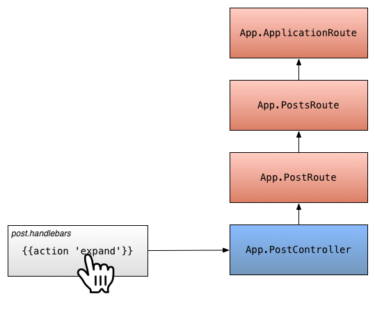
Action Bubbling
This allows you to create a button that has different behavior based on
where you are in the application. For example, you might want to have a
button in a sidebar that does one thing if you are somewhere inside of
the /posts route, and another thing if you are inside of the /about
route.
Action Parameters
You can optionally pass arguments to the action handler. Any values
passed to the {{action}} helper after the action name will be passed to
the handler as arguments.
For example, if the post argument was passed:
1 <p><button {{action "select" post}}>✓</button> {{post.title}}</p>
The controller’s select action handler would be called with a single argument
containing the post model:
1 App.PostController = Ember.ObjectController.extend({
2   actions: {
3     select: function(post) {
4       console.log(post.get('title'));
5     }
6   }
7 });
Specifying the Type of Event
By default, the {{action}} helper listens for click events and triggers
the action when the user clicks on the element.
You can specify an alternative event by using the on option.
1 <p>
2   <button {{action "select" post on="mouseUp"}}>✓</button>
3   {{post.title}}
4 </p>
You should use the normalized event names listed in the View guide.
In general, two-word event names (like keypress) become keyPress.
Specifying Whitelisted Modifier Keys
By default the {{action}} helper will ignore click events with
pressed modifier keys. You can supply an allowedKeys option
to specify which keys should not be ignored.
1 <script type="text/x-handlebars" data-template-name='a-template'>
2   <div {{action 'anActionName' allowedKeys="alt"}}>
3     click me
4   </div>
5 </script>
This way the {{action}} will fire when clicking with the alt key
pressed down.
Stopping Event Propagation
By default, the {{action}} helper allows events it handles to bubble
up to parent DOM nodes. If you want to stop propagation, you can disable
propagation to the parent node.
For example, if you have a ✗ button inside of a link, you will want to ensure that if the user clicks on the ✗, that the link is not clicked.
1 {{#link-to 'post'}}
2   Post
3   <button {{action 'close' bubbles=false}}>✗</button>
4 {{/link-to}}
Without bubbles=false, if the user clicked on the button, Ember.js
will trigger the action, and then the browser will propagate the click
to the link.
With bubbles=false, Ember.js will stop the browser from propagating
the event.
Specifying a Target
By default, the {{action}} helper will send the action to the view’s
target, which is generally the view’s controller. (Note: in the case of
an Ember.Component, the default target is the component itself.)
You can specify an alternative target by using the target option. This
is most commonly used to send actions to a view instead of a controller.
1 <p>
2   <button {{action "select" post target=view}}>✓</button>
3   {{post.title}}
4 </p>
You would handle this in an actions hash on your view.
1 App.PostsIndexView = Ember.View.extend({
2   actions: {
3     select: function(post) {
4       // do your business.
5     }
6   }
7 });
Note that actions sent to views in this way do not bubble up the currently rendered view hierarchy. If you want to handle the action in a parent view, use the following:
1 <p>
2   <button {{action "select" post target=view.parentView}}>✓</button>
3   {{post.title}}
4 </p>
Input Helpers
The {{input}} and {{textarea}} helpers in Ember.js are the easiest way to
create common form controls. The {{input}} helper wraps the built-in
Ember.TextField and Ember.Checkbox views, while {{textarea}} wraps
Ember.TextArea. Using these helpers, you can create these views with
declarations almost identical to how you’d create a traditional <input> or
<textarea> element.
Text fields
1 {{input value="http://www.facebook.com"}}
Will become:
1 <input type="text" value="http://www.facebook.com"/>
You can pass the following standard <input> attributes within the input
helper:
If these attributes are set to a quoted string, their values will be set directly on the element, as in the previous example. However, when left unquoted, these values will be bound to a property on the template’s current rendering context. For example:
1 {{input type="text" value=firstName disabled=entryNotAllowed size="50"}}
Will bind the disabled attribute to the value of entryNotAllowed in the
current context.
Actions
To dispatch an action on specific events, such as enter or key-press, use the following
1 {{input value=firstName action="updateFirstName" on="key-press"}}
Checkboxes
You can also use the {{input}} helper to create a checkbox by setting its
type:
1 {{input type="checkbox" name="isAdmin" checked=isAdmin}}
Checkboxes support the following properties:
checkeddisabledtabindexindeterminatenameautofocusform
Which can be bound or set as described in the previous section.
Text Areas
1 {{textarea value=name cols="80" rows="6"}}
Will bind the value of the text area to name on the current context.
{{textarea}} supports binding and/or setting the following properties:
valuenamerowscolsplaceholderdisabledmaxlengthtabindexselectionEndselectionStartselectionDirectionwrapreadonlyautofocusformspellcheckrequired
Extending Built-In Controls
See the Built-in Views section of these guides to learn how to further extend these views.
Development Helpers
Handlebars and Ember come with a few helpers that can make developing your templates a bit easier. These helpers make it simple to output variables into your browser’s console, or activate the debugger from your templates.
Logging
The {{log}} helper makes it easy to output variables or expressions in the
current rendering context into your browser’s console:
1 {{log 'Name is:' name}}
The {{log}} helper also accepts primitive types such as strings or numbers.
Adding a breakpoint
The {{debugger}} helper provides a handlebars equivalent to JavaScript’s
debugger keyword. It will halt execution inside the debugger helper and give
you the ability to inspect the current rendering context:
1 {{debugger}}
Just before the helper is invoked two useful variables are defined:
-
templateContextThe current context that variables are fetched from. This is likely a controller. -
typeOfTemplateContextA string describing what the templateContext is.
For example, if you are wondering why a specific variable isn’t displaying in
your template, you could use the {{debugger}} helper. When the breakpoint is
hit, you can use the templateContext in your console to lookup properties:
1 > templateContext.get('name')
2 "Bruce Lee"
Rendering with Helpers
Ember.js provides several helpers that allow you to render other views and templates in different ways.
The {{partial}} Helper
{{partial}} takes the template to be rendered as an argument, and renders that template in place.
{{partial}} does not change context or scope. It simply drops the given template into place with the current scope.
1 <script type="text/x-handlebars" data-template-name='_author'>
2   Written by {{author.firstName}} {{author.lastName}}
3 </script>
4
5 <script type="text/x-handlebars" data-template-name='post'>
6   <h1>{{title}}</h1>
7   <div>{{body}}</div>
8   {{partial "author"}}
9 </script>
1 <div>
2   <h1>Why You Should Use Ember.JS</h1>
3   <div>Because it's awesome!</div>
4   Written by Yehuda Katz
5 </div>
The partial’s data-template-name must start with an underscore (e.g. data-template-name='_author' or data-template-name='foo/_bar')
The {{view}} Helper
This helper works like the partial helper, except instead of providing a template to be rendered within the current template, you provide a view class. The view controls what template is rendered.
 1 App.AuthorView = Ember.View.extend({
 2   // We are setting templateName manually here to the default value
 3   templateName: "author",
 4
 5   // A fullName property should probably go on App.Author,
 6   // but we're doing it here for the example
 7   fullName: (function() {
 8     return this.get("author").get("firstName") + " " + this.get("author").get("l\
 9 astName");
10   }).property("firstName","lastName")
11 })
1 <script type="text/x-handlebars" data-template-name='author'>
2   Written by {{view.fullName}}
3 </script>
4
5 <script type="text/x-handlebars" data-template-name='post'>
6   <h1>{{title}}</h1>
7   <div>{{body}}</div>
8   {{view "author"}}
9 </script>
1 <div>
2   <h1>Why You Should Use Ember.JS</h1>
3   <div>Because it's awesome!</div>
4   Written by Yehuda Katz
5 </div>
When using {{partial "author"}}:
- No instance of App.AuthorView will be created
- The given template will be rendered
When using {{view "author"}}:
- An instance of App.AuthorView will be created
- It will be rendered here, using the template associated with that view (the default template being “author”)
For more information, see Inserting Views in Templates
The {{render}} Helper
{{render}} takes two parameters:
- The first parameter describes the context to be setup
- The optional second parameter is a model, which will be passed to the controller if provided
{{render}} does several things:
- When no model is provided it gets the singleton instance of the corresponding controller
- When a model is provided it gets a unique instance of the corresponding controller
- Renders the named template using this controller
- Sets the model of the corresponding controller
Modifying the post / author example slightly:
 1 <script type="text/x-handlebars" data-template-name='author'>
 2   Written by {{firstName}} {{lastName}}.
 3   Total Posts: {{postCount}}
 4 </script>
 5
 6 <script type="text/x-handlebars" data-template-name='post'>
 7   <h1>{{title}}</h1>
 8   <div>{{body}}</div>
 9   {{render "author" author}}
10 </script>
1 App.AuthorController = Ember.ObjectController.extend({
2   postCount: function() {
3     return this.get("model.posts.length");
4   }.property("model.posts.[]")
5 })
In this example, render will:
- Get an instance of App.AuthorView if that class exists, otherwise uses a default generated view
- Use the corresponding template (in this case the default of “author”)
- Get (or generate) the singleton instance of AuthorController
- Set the AuthorController’s model to the 2nd argument passed to render, here the author field on the post
- Render the template in place, with the context created in the previous steps.
{{render}} does not require the presence of a matching route.
{{render}} is similar to {{outlet}}. Both tell Ember.js to devote this portion of the page to something.
{{outlet}}: The router determines the route and sets up the appropriate controllers/views/models.
{{render}}: You specify (directly and indirectly) the appropriate controllers/views/models.
Note: {{render}} cannot be called multiple times for the same route when not specifying a model.
Comparison Table
General
Specific
Writing Helpers
Sometimes, you may use the same HTML in your application multiple times. In those cases, you can register a custom helper that can be invoked from any Handlebars template.
For example, imagine you are frequently wrapping certain values in a <span> tag with a custom class. You can register a helper from your JavaScript like this:
1 Ember.Handlebars.helper('highlight', function(value, options) {
2   var escaped = Handlebars.Utils.escapeExpression(value);
3   return new Ember.Handlebars.SafeString('<span class="highlight">' + escaped + \
4 '</span>');
5 });
If you return HTML from a helper, and you don’t want it to be escaped,
make sure to return a new SafeString. Make sure you first escape any
user data!
Anywhere in your Handlebars templates, you can now invoke this helper:
1 {{highlight name}}
and it will output the following:
1 <span class="highlight">Peter</span>
If the name property on the current context changes, Ember.js will
automatically execute the helper again and update the DOM with the new
value.
Dependencies
Imagine you want to render the full name of an App.Person. In this
case, you will want to update the output if the person itself changes,
or if the firstName or lastName properties change.
1 Ember.Handlebars.helper('fullName', function(person) {
2   return person.get('firstName') + ' ' + person.get('lastName');
3 }, 'firstName', 'lastName');
You would use the helper like this:
1 {{fullName person}}
Now, whenever the context’s person changes, or when any of the dependent keys change, the output will automatically update.
Both the path passed to the fullName helper and its dependent keys may
be full property paths (e.g. person.address.country).
Custom View Helpers
You may also find yourself rendering your view classes in multiple
places using the {{view}} helper. In this case, you can save yourself
some typing by registering a custom view helper.
For example, let’s say you have a view called App.CalendarView.
You can register a helper like this:
1 Ember.Handlebars.helper('calendar', App.CalendarView);
Using App.CalendarView in a template then becomes as simple as:
1 {{calendar}}
Which is functionally equivalent to, and accepts all the same arguments as:
1 {{view "calendar"}}