Chapter 1: Multiple Methods for Analyzing Hierarchical Data
1.1 Introduction
Many types of data encountered in ecology and evolution, or really any discipline, are hierarchical, meaning that they have a multi-level structure. An example would be a study of plant communities among multiple sites in which the data are collected from multiple plots within each site. Thus, the data are structured by plots within sites. Other examples might include multiple observations taken on the same individual, multiple individuals sampled in the same population, and multiple populations sampled of the same species. These types of hierarchies likely generate correlations in the data. For example, plant communities measured from different plots within the same site might be similar, because the plots (being in the same site) are more likely to share some feature, soil type for example, that is more similar between plots within the site than between plots among different sites. To be precise, the issue is not so much that plots within sites are more likely to be similar to each other. Instead, it is that we don’t know the cause of this difference. If we did, and if we included this information in a statistical model as a predictor (independent) variable, then the residual or unexplained variance would be independent among all plots, regardless of the site they are in. It is unknown correlation among residual errors that is the challenge for statistical methods. Of course, we will never know before we start an analysis whether we have all the information needed to explain any consistent similarities among plots from the same site. Therefore, we should always assume that the residual variation among plots within sites is correlated. I refer to this as the problem of “correlated data”, rather than “correlated residuals”, only because correlated data sounds better.
There are many different methods for analyzing correlated data. Here, I’m using “methods” to mean categories of models, such as Linear Models (LMs) versus Generalized Linear Models (GLMs). It might seem more natural to refer to different methods as different models (after all, they are called Linear Models, not Linear Methods). I’m going to use methods, though, because there are different models within methods; for example, two linear models could differ in the predictor variables they include.
This chapter describes nine different methods for analyzing the same dataset. Several of these methods are completely valid, and some give similar results. However, others are just wrong for the dataset. The point of this exercise is to discuss different ways to analyze correlated data, and different ways not to. The methods divide into two approaches. The first approach is to aggregate the data at the lower level of organization (e.g., aggregate plots within sites) and then to analyze the data at the higher level (e.g., analyze the site data). The second approach is to analyze all of the data at the lowest level (e.g., plots) while explicitly including its hierarchical structure (e.g., accounting for plots within sites). Here is a list of the methods used.
| Aggregated (site-level) data |
| Linear Models (LM) |
| Generalized Linear Models (GLM) |
| GLM with a “quasi-distribution” |
| Generalized Linear Mixed Models (GLMM) |
| Hierarchical (plot-level) data |
| LM |
| GLM |
| GLM with factor variables |
| GLMM |
| Linear Mixed Model (LMM) |
This list is not exhaustive, and there are several obvious possibilities that I’ve left out.
The goals for introducing these nine methods are twofold. First, I want to introduce and compare these methods. Some, but not all, are appropriate for correlated data, and showing how the appropriate methods succeed where the inappropriate ones fail is valuable. Second, the methods will be used in Chapter 2 to illustrate the properties of statistical models.
1.2 Take-homes
- Different statistical methods can give different results. This is not surprising. But sometimes different statistical methods give very similar results, even methods that you might not think are suitable for a given dataset. This might be surprising.
- Almost all statistical algorithms used for hypothesis testing are approximations. Very often, it is not clear how good these approximations are for datasets with small sample sizes, as are often found in ecological and evolutionary studies.
- If different methods give different results, then how do you decide which one to use? Actually, this isn’t a question I’m going to answer in this chapter; it is the topic of Chapter 2. The present chapter, though, should force you to face the question of deciding among methods.
1.3 Dataset
Chapter 1 uses a dataset that is modeled after data collected by Michael Hardy (Forest and Wildlife Ecology, UW-Madison). Because I don’t want to use his unpublished data, the dataset I’m using is a simulated version (you’ll see how in Chapter 2). What I like about the dataset is that it is very simple, yet not trivial to analyze.
The dataset consists of surveying ruffed grouse, a common game bird, at stations (plots) within roadside routes (sites) in Wisconsin, USA. In May, 2014, Michael and collaborators surveyed 50 roadway routes during a 18-day sampling period. Each route included up to eight stations spaced at 0.8 km intervals. At each station, one observer spent four minutes watching and listening for ruffed grouse. At the end of the observation period, wind speed was recorded, because the researchers suspected that wind speed would affect the chances of detecting a grouse. At each station, ruffed grouse were scored as either present or absent, because it was difficult to determine whether repeated observations were from the same or different birds (most of the time birds were just heard). To simplify things, we can assume that each observer was equally able to detect birds; in reality, this was tested by having different observers sample the same sites, but I’ve simplified the data to have only one sample per site. Finally, the distances between routes were much larger than the distances among stations within routes.
The question we will ask is whether there is a negative effect of wind speed during the observation period on the chances of detecting a ruffed grouse. The challenges for the analyses are twofold. First, the dataset is clearly hierarchical, with observations taken at stations within routes. It would not be surprising if the overall chances of observing ruffed grouse was greater in some routes than others. For example, some routes likely ran through better ruffed grouse habitat than others (although habitat characteristics were not recorded). Therefore, stations within routes might be more or less likely as a group to be scored as having ruffed grouse. Hence, the data from stations within routes are likely to be correlated. Second, the data at each station consist of only whether or not a ruffed grouse was observed. Thus, the response variable at the level of stations is binary.
Let’s read the data into R as a data.frame and take a look at them.
# read data
d <- read.csv(file="grouse_data.csv", header=T)

# STATION and ROUTE were uploaded as integers; this converts them to factors.
d$STATION <- as.factor(d$STATION)
d$ROUTE <- as.factor(d$ROUTE)

# To see the first 20 rows of data, you can use:
head(d, 20)
   ROUTE STATION    LAT    LONG     WIND GROUSE
1      1       1 561547 5080261 2.449490      0
2      1       2 562065 5079884 0.000000      0
3      1       3 562783 5079896 2.738613      1
4      1       4 563581 5079907 1.897367      0
5      1       5 563933 5080413 1.760682      0
6      1       6 564046 5081027 1.341641      0
7      1       7 564152 5081558 1.549193      0
8      2       1 568560 5107475 1.673320      0
9      2       2 569359 5107489 2.898275      0
10     2       3 569755 5107096 2.167948      0
11     2       4 570163 5107501 4.123106      0
12     2       5 570157 5108282 3.807887      0
13     2       6 569793 5108706 2.863564      0
14     2       7 568998 5108675 3.049590      0
15     2       8 568783 5108488 0.000000      0
16     3       1 572301 5098623 2.236068      0
17     3       2 571869 5099400 2.190890      0
18     3       3 571889 5099932 2.167948      1
19     3       4 571435 5098424 2.720294      0
20     3       5 571014 5098601 2.738613      0
The main thing to see in the data is that stations are nested within routes. The variable GROUSE is the presence or absence of ruffed grouse, scored as a binary 1 or 0, respectively. Finally, WIND was observed at the station level. This becomes important later on.
For both exploring the data and performing the route-level analyses, it is necessary to generate a data.frame that aggregates data from STATION within the same ROUTE:
# Combine all values for each ROUTE.
w <- data.frame(aggregate(cbind(d$GROUSE, d$WIND, d$LAT, d$LONG),
			by = list(d$ROUTE), FUN = mean))

# For clarity, I've added the column names.
names(w) <- c("ROUTE","MEAN_GROUSE","MEAN_WIND","LAT","LONG")

# Add the count of the number of GROUSE and STATIONS per ROUTE.
w$GROUSE <- aggregate(d$GROUSE, by = list(d$ROUTE), FUN = sum)[,2]
w$STATIONS <- aggregate(array(1, c(nrow(d), 1)),
			by = list(d$ROUTE), FUN = sum)[,2]

head(w)

  ROUTE MEAN_GROUSE MEAN_WIND      LAT    LONG GROUSE STATIONS
1     1   0.1428571  1.676712 563158.1 5080421      1        7
2     2   0.0000000  2.572961 569446.0 5107964      0        8
3     3   0.1428571  2.721621 571267.0 5098822      1        7
4     4   0.2500000  0.619327 558186.8 5097718      2        8
5     5   0.0000000  1.272595 539103.7 5083175      0        7
6     6   0.0000000  2.649876 569457.1 5094943      0        8
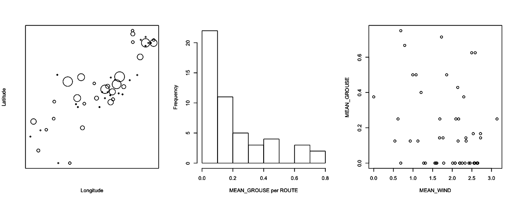
These data can be plotted in different ways, as illustrated in figure 1.1. The first thing to note is that there is a lot of route-to-route variation in the proportion of stations in which grouse were found. In the map of latitude versus longitude, it looks like there might be some spatial patterns, with nearby routes having either more or fewer grouse than more distant routes. I did check for spatial correlations in the real data, and they were very weak. In the present, simulated data, they are non-existent. As an aside, did it look to you like there was spatial autocorrelation? Many people have said so. I think this is just a reflection of how the human mind works: we are very good at seeing patterns, even when patterns don’t exist. The final thing from the figures is that there does seem to be a negative effect of MEAN_WIND on MEAN_GROUSE. It takes statistics, though, to tell whether the pattern is real, or whether it is just the product of how the human mind works.
1.4 Analyses of aggregated (site-level) data
The grouse data have a hierarchical structure of plots (STATIONS) nested within sites (ROUTES). The goal of the analyses is to determine whether the abundance of grouse depends on wind speed. These analyses can be performed by aggregating data among stations within routes, so that the data points consist of the number of stations within a route at which grouse were observed (from 0 to the number of stations in a route). Or the data can be analyzed at the level of stations, so that the data points are the presence or absence of grouse at each station. This section introduces the methods that aggregate the data so that each ROUTE is a data point, and the following section introduces methods that treat each STATION as a data point.
1.4.1 Linear Model (LM) at the route level
The simplest approach for the route-level analysis is to use a LM, or ordinary linear least-squares regression (OLS), given by the formula
Y = b0 + b1*x + e
where Y is the number (possibly transformed) of stations at which grouse are observed in a route, x is the predictor variable (MEAN_WIND), b0 and b1 are regression coefficients, and e is the error term. You might immediately cry that this model is inappropriate, because it assumes that the errors e are normally distributed. In fact, OLS gives pretty accurate P-values for the statistical significance of the regression coefficient b1 even if the residuals are not normally distributed, a fact I’ll return to in subsection 2.6.5. But statistical tests using OLS do require that the errors e be independently distributed and have the same variance. Since these data are route-level, we can assume that the errors are independent. But it is likely that the variances among routes will differ, for the following reason. Within a route, suppose there are n stations than can take values of 0 or 1 for the observation of grouse. This distribution is therefore binomial if we assume that the observations among stations within the same route are independent. (The problem of correlated errors discussed earlier involves observations from stations within versus among routes, which is different from here where the focus is on the stations within only one route, which can be independent.) If the probability of observing a grouse at a station is denoted p, then the mean of the binomial distribution of stations with grouse is n*p. Furthermore, the variance is n*p*(1 - p). This means that if you know the mean n*p, then you also know the variance, because you know n from how the data were collected. This dependence of the variance on the mean implies that if the mean of the proportion of stations with grouse depends on wind speed (b1 is not 0), then the variance of the errors e will also change with wind speed. This would violate the OLS assumption that the errors have the same variance; in other words, the errors are heteroscedastic. The classical way to try to make the error variances homogenous in LMs is to transform the response variable Y. Therefore, I have let Y be the arcsine-square-root transform of MEAN_GROUSE. Why arcsine-square-root transform? This theoretically should do the best job possible, as explained in standard mathematical statistics textbooks (e.g., Larsen and Marx 1981).
The LM is performed as:
# LM: Analyses at the ROUTE level using an arcsine-square-root transform
summary(lm(asin(sqrt(MEAN_GROUSE)) ~ MEAN_WIND, data=w))

Coefficients:
            Estimate Std. Error t value Pr(>|t|)
(Intercept)  0.59284    0.13332   4.447 5.15e-05 ***
MEAN_WIND   -0.13765    0.06647  -2.071   0.0438 *
I’ve only printed the main results of interest: the statistical significance of the effect of MEAN_WIND on MEAN_GROUSE. It is significant at the alpha-significance level of 0.05. In other words, if the model were correct, then under the null hypothesis H0:b1=0, the probability of estimating a slope with a magnitude greater than 0.13765 is 0.0438 (since this is a 2-tailed test, the test is for the slope to be either <-0.13765 or >0.13765). A possible problem is that the P-values for hypothesis testing do, strictly speaking, require that the sum of the residual errors be normally distributed. Since the errors are not normally distributed, the P-values are approximate, but with a sample size of 50 routes, the approximation will be very good. The important thing to realize is that for the P-values it is the distribution of the sum of residuals that needs to be normal, not the individual errors, and by the Central Limit Theorem the sums of the residuals will approach a normal distribution as the sample size increases. The rule of thumb is that 30 data points is enough for the sum of residuals to be very close to normal regardless of the actual distribution of the residuals provided they are independent and have the same variance.
1.4.2 Binomial Generalized Linear Model (GLM) at the route level
The LM does not directly account for the data being discrete, but instead assumes that the residuals (possibly after transformation) are normal. GLMs are designed specifically for data that follow non-normal distributions. For the route-level grouse data, the obvious choice for a distribution is the binomial. A binomial GLM for the route-level data assumes that the distribution of grouse observations among routes is
Z = b0 + b1*x
p = inv.logit(Z)
Y ~ binom(n, p)
where inv.logit is the inverse-logit function and Y ~ binom(n, p) means “Y is distributed according to a binomial distribution with parameters n (number of observations) and p (probability of occurrence in each observation)”. The idea of this GLM is to take the linear relationship Z = b0 + b1*x and force Z to be between 0 and 1 using the inv.logit function. The resulting p can be treated as an estimate of the probability of observing grouse at stations within routes, which follows a binomial distribution where n gives the number stations per route. In this formulation of the binomial GLM, I’ve used the logit function as the link function to make the values of p fall between 0 and 1. Other link functions are possible, such as the probit function (McCullagh and Nelder 1989).
GLMs are sometimes touted as solutions to the problems caused by the non-normality of non-normal data. For example, the binomial GLM might be viewed as solving the problem that the data come as counts and are integers. In fact, what GLMs are really doing is prescribing a specific relationship between the variance and the mean of the predicted value of a data point. This solves the problem of heteroscedasticity in the errors, because unlike the LM, the variances are allowed to be different. But they are only allowed to be different as prescribed by the distribution. Specifically, in the binomial GLM the variance in the number of grouse observations in route i is assumed to be ni*pi*(1 - pi), where i denotes the index i = 1, 2, …, n. So, rather than the LM approach of transforming data to try to get homogeneous variances of the residuals, GLMs incorporate the anticipated variances in the fitting process itself.
Implementing a binomial GLM for grouse observations within routes is done with the following code. For the binomial GLM, it is necessary to construct as array with two columns that contain, respectively, the successes (number of stations with GROUSE) and failures (number of stations without GROUSE). This accounts for the different numbers of STATIONS among ROUTES. I have called this array SUCCESS.
$SUCCESS <- cbind(w$GROUSE, w$STATIONS - w$GROUSE)
summary(glm(SUCCESS ~ MEAN_WIND, family = binomial, data=w))
Coefficients:
Estimate Std. Error z value Pr(>|z|)
(Intercept) -0.6716 0.3539 -1.897 0.05777 .
MEAN_WIND -0.4948 0.1872 -2.643 0.00822 **
---
Signif. codes: 0 '***' 0.001 '**' 0.01 '*' 0.05 '.' 0.1 ' ' 1
(Dispersion parameter for binomial family taken to be 1)
Now the P-value for MEAN_WIND is highly significant. I should point out, though, that this P-value, like that for the LM when the errors are not normally distributed, is an approximation. In particular, the glm() output in R uses a Wald test which assumes that the coefficient estimate divided by its estimated standard error (i.e., the z-value) is normally distributed; this is true only in the limit as the sample size gets very large, similar to the requirement for getting P-values from the LM when errors are not normal. Another way of obtaining a P-value for MEAN_WIND is to perform a Likelihood Ratio Test (LRT) comparing the full model containing MEAN_WIND and the reduced model without. Twice the difference in log likelihoods is approximately (as sample sizes get large) chi-square distributed. In the case of these data, the P-value from the LRT is similar but not identical to the P-value from the Wald test.
# Likelihood Ratio Test for b1.
mod.f <- glm(SUCCESS ~ MEAN_WIND, family = binomial, data=w)
mod.r <- glm(SUCCESS ~ 1, family = binomial, data=w)
deviance <- 2*(logLik(mod.f) - logLik(mod.r))
pchisq(deviance, df=1, lower.tail=F)
LRT.b1 <- c(dev = deviance, p.value=pchisq(deviance, df=1, lower.tail=F))
        dev     p.value
6.866375054 0.008783264
An immediate lesson from this is that there are multiple ways to approximate P-values, and they don’t give identical results. Whether or not to trust either of these P-values is discussed in Chapter 2 (and the answer is do not trust them).
1.4.3 Quasibinomial GLM at the route level
The binomial GLM makes the explicit assumption that the number of stations scored positive for grouse in each route follows a binomial distribution, so that if ni is the number of stations in route i and pi = inv.logit(b0 + b1*xi) is the expected chance of observing a grouse, then the mean and variance of the distribution are ni*pi and ni*pi*(1 - pi). This means that if ten routes have the same MEAN_WIND (xi), then the variance among them is expected to be ni*pi*(1 - pi). It is common in datasets like this, however, for there to be greater-than-binomial variances; this would occur if there were differences among routes that are not included in the model, such as differences in the quality of grouse habitat.
GLMs allow for greater-than-distributional variances by using “quasi-distributions”. These are not proper probability distributions, since they do not have probability distribution functions. Instead, they use a fudge factor q in the fitting process of the GLM. For the quasibinomial distribution, the variance is set to q*ni*pi*(1 - pi), so the variance is allowed to be greater than ni*pi*(1 - pi) by the amount determined by the fitted value of q. This somewhat ad hoc approach underscores my earlier comment that the main gain of GLMs over LMs is explicitly letting the variance be a function of the mean. In the binomial GLM, the variance is set to exactly (1 - pi) times the mean, while in the quasibinomial GLM, the variance is just proportional to the mean, with q*(1 - pi) being this proportion. When the variance is greater than the binomial variance ni*pi*(1 - pi), this is called overdispersion, and q is the dispersion parameter. Note that in the output of the binomial GLM in the last subsection, this dispersion parameter is taken to be 1.
The quasibinomial GLM gives:
summary(glm(SUCCESS ~ MEAN_WIND, family = quasibinomial, data=w))

Coefficients:
            Estimate Std. Error t value Pr(>|t|)
(Intercept)  -0.6716     0.5564  -1.207   0.2334
MEAN_WIND    -0.4948     0.2943  -1.681   0.0992 .
---
Signif. codes:  0 '***' 0.001 '**' 0.01 '*' 0.05 '.' 0.1 ' ' 1

(Dispersion parameter for quasibinomial family taken to be 2.471657)
The estimate of the dispersion parameter q is 2.47, which means that the estimated variances are 2.47 greater than expected in a binomial distribution. Acknowledging statistically that there are greater-than-binomial variances leads to a higher P-value for MEAN_WIND. This occurs because, when given the opportunity, the model estimates higher variances and consequently infers that the data contain less information about the true effect of MEAN_WIND on observing grouse. For approximating the P-value, the Wald test uses a t-value rather than a z-value, because the dispersion parameter is estimated. A LRT is not possible, because the quasibinomial is not a distribution, and therefore it has no likelihood. (More about likelihoods in Chapter 2.)
1.4.4 Logit normal-binomial GLMM at the route level
GLMMs give a second way to account for possible greater-than-binomial variances in the data. The GLMM below is set up to generate a logit normal-binomial distribution.
Z = b0 + b1*x + e
p = inv.logit(Z)
Y ~ binom(n, p)
e ~ norm(0, s2)
This is very similar to the binomial GLM, but it includes an “observation-level variance” term e which follows a normal distribution with estimated variance s2 (hence giving the name logit normal-binomial distribution). In this GLMM with an observation-level random effect, the number of levels of the random effect equals the number of data points. Therefore, the observation-level random effect is not associated with the hierarchical nature of the data; indeed, an observation-level random effect would not make sense for a LMM, because it would be exactly the same as the residual variance. It does make sense for a GLMM, however, because it allows the route-to-route variance to be greater than binomial. Since this is not a typical GLMM, I’ll leave explaining exactly what a mixed model (LMM or GLMM) is until returning to them with station-level data in section 1.5.
Fitting this model with glmer() in the lme4 package (Bates et al. 2015) is done with:
summary(glmer(SUCCESS ~ MEAN_WIND + (1 | ROUTE), data=w, family=binomial))
Random effects:
 Groups Name        Variance Std.Dev.
 ROUTE  (Intercept) 1.949    1.396
Number of obs: 50, groups:  ROUTE, 50

Fixed effects:
            Estimate Std. Error z value Pr(>|z|)
(Intercept)  -0.7696     0.7040  -1.093   0.2743
MEAN_WIND    -0.7204     0.3669  -1.963   0.0496 *
I’ve shown two parts of the output, the random effects and the fixed effects. The fixed effects are just b0 and b1, and we see that the effect of MEAN_WIND is significant at the alpha = 0.05 level, but barely. The random effect is the variance in the error term e. It is greater than zero, indicating greater-than-binomial variance in the data.
1.4.5 Simulation of overdispersion
Distribution-specific GLMs and GLMMs have an incredibly valuable attribute: they can be used to simulate discrete data that look like the real data. This isn’t true of the LM applied to the grouse data, because the simulated LM will give continuous values of the arcsine-square root transformed proportion of stations with grouse present. This also isn’t true of the quasibinomial GLM, since the quasibinomial is not a distribution and so can’t be simulated. But it is true of the logit normal-binomial GLMM. I’m going to take advantage of this attribute to show you overdispersion using the GLMM.
The simulation model looks exactly like the model we fit to the data:
<- 0
b1 <- 0
n <- 8
nsamples <- 1000
x <- rnorm(nsamples, mean=0, sd=1)
# This is set to 0 or 1 for the left and right panels of figure 1.2
sd.e <- 0
e <- rnorm(nsamples, mean=0, sd=sd.e)
Z <- b0 + b1 * x + e
p <- inv.logit(Z)
Y <- rbinom(nsamples, size=n, prob=p)
I have simulated 1000 samples (e.g., routes), so there are lots of them. Each sample is picked from a binomial distribution with n = 8 (stations within routes). The values of x are picked from a normal distribution with mean zero and standard deviation 1. The route-level variance e has standard deviation sd.e; when sd.e = 0 there is no variance among routes beyond that expected from a binomial distribution, and when sd.e = 1 there is greater-than-binomial variation among routes. I have initially set b1 = 0, so there is no effect of x. This is because I first want to see how the logit normal variance generated by e affects the variance of the distribution of Y. In particular, if Y is binomially distributed, then the variance of Y should be n*p*(1 - p), where p = inv.logit(b0).
Plots of Z and Y for the cases of sd.e = 0 and 1 show how the logit normal variance increases the variance of Y. In these plots, the red lines are the values of Z and n*p for sd.e = 0. When sd.e = 0, the variance in Y is very close to the expected value, n*p*(1 - p). When sd.e > 0, the variance in Y is greater.
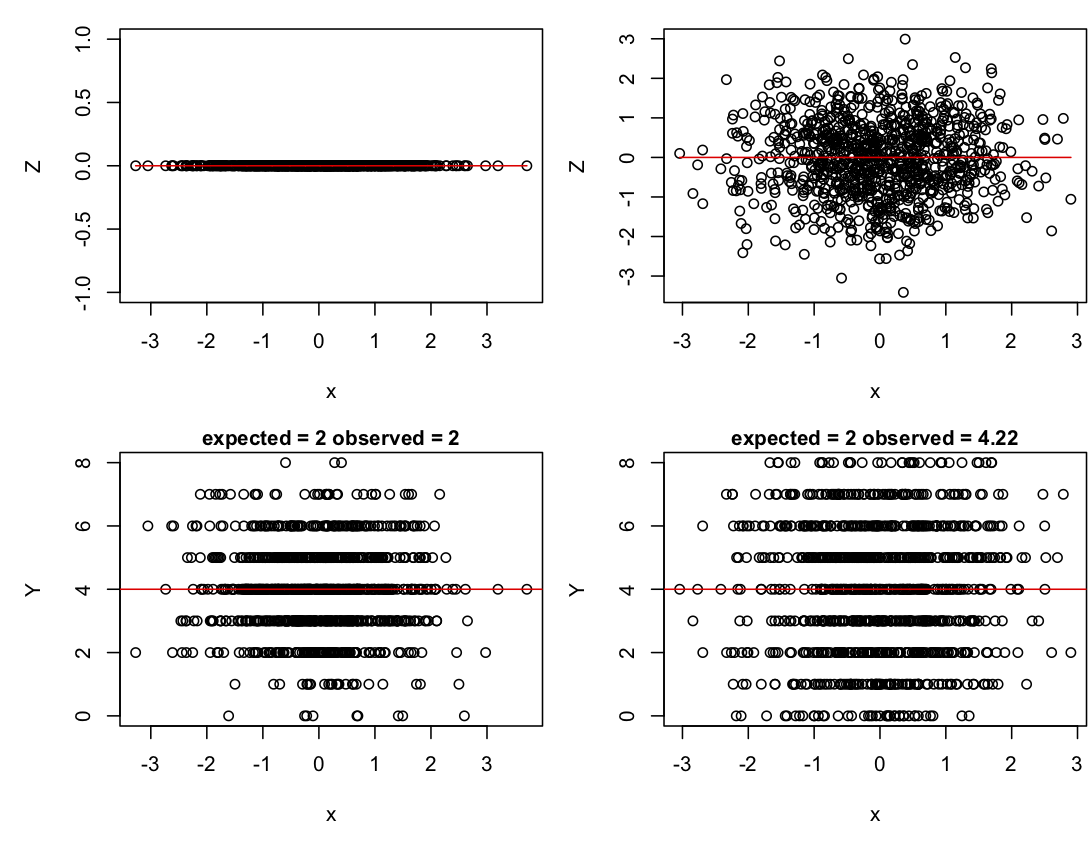
sd.e = 0 (left column) and sd.e = 1 (right column). The top panels give the distribution of Z, and the lower panels give the distribution of Y. Red lines give the values of b0 + b1*x (Z space) and n*inv.logit(b0 + b1*x) (data space).If in the code you change b0 while keeping sd.e = 0, you will find that the variance of Y changes too. The variance is greatest when b0 = 0 and decreases symmetrically for smaller and larger values of b0. Finally, if you let b1 = 1 with sd.e = 0, you can see how the variance around the value of p changes with x, being greatest around p = 0.5 and decreasing as p gets smaller or larger. These changes in the variance in Y with changes in the mean are a reason for using GLMs and GLMMs.
1.5 Analyses of hierarchical (plot-level) data
The big difference between route and station-level data is that the station-level data are hierarchical and contain correlations, with stations within the same route more likely to be similar than stations among routes. Ignoring correlated residuals typically leads to poor and dangerous behavior of statistical tests. The first two methods below ignore this correlation structure; I use them to show the effect of correlated residuals on hypothesis tests of b1. The other three methods account for correlations but treat the binary station-level data differently.
1.5.1 LM at the station level
A LM can be used to analyze the station-level data that looks very much like the LM used to analyze the route-level data (subsection 1.4.1); the difference is that the station-level data (data.frame d) are used rather than the data aggregated by routes (data.frame w). Also, the response variable Y is not transformed, because it only takes values of 0 and 1; a transformation would have no effect on the discrete nature of the observations. It might seem like a horrible mistake to use a LM that assumes continuous errors on binary data, but you should withhold judgment until Chapter 2.
summary(lm(GROUSE ~ WIND, data=d))

Coefficients:
            Estimate Std. Error t value Pr(>|t|)
(Intercept)  0.27925    0.04026   6.936 1.81e-11 ***
WIND        -0.05648    0.01859  -3.038  0.00255 **
The predictor variable is now WIND, rather than MEAN_WIND, since the wind speed is taken separately at each station. The resulting P-value for WIND is very low.
1.5.2 GLM at the station level
The station-level GLM is similar to the GLM for route-level data (subsection 1.4.2), but with data.frame d replacing data.frame w, and WIND replacing MEAN_WIND.
summary(glm(GROUSE ~ WIND, data=d, family = binomial))

Coefficients:
            Estimate Std. Error z value Pr(>|z|)
(Intercept)  -0.8879     0.2542  -3.493 0.000477 ***
WIND         -0.3881     0.1307  -2.969 0.002991 **
A difference in the syntax arises between this and the route-level GLM. In the route-level GLM, the data are scored as successes and failures (the array w$SUCCESS), because the data are binomial counts, up to eight, of the number of stations at which a grouse was observed. In the station-level GLM, the data are the presence/absence of grouse at each station, and for binary data, successes and failures don’t need to be identified.
The P-value for WIND is similar to the value obtained from the station-level LM, but a little higher. This might seem surprising, since the GLM explicitly accounts for the binary nature of the data. Doesn’t accounting for this unavoidable “error” variance (the difference between observed and predicted values) reveal the true variation in the data and consequently lead to a more powerful statistical test? Apparently not. The reason is that what the GLM is really doing is accounting for the change in the variance with the change in the mean. For binary data, the variance is just p*(1 - p) since n = 1. The binomial GLM uses this relationship when fitting the data.
1.5.3 GLM with ROUTE as a factor
A traditional way to analyze the grouse data at the station level is to treat ROUTE as a factor which has 50 levels, with one factor for each route. Thus, the general model is
Z = b0 + b1*x + b2[factor]
p = inv.logit(Z)
Y ~ binom(n, p)
where the coefficients b2[factor] are estimated for each of the levels of the factor (ROUTE). This allows different routes to have different overall numbers of observed grouse, as we would expect if there were differences among routes. For the grouse data, 50 means must be estimated. The analysis is easy to do with the glm() function, although here I have also used the function Anova() from the car library (Fox and Weisberg 2011) because it gives a summary statistic for the overall effect of the factor ROUTE in the model, rather than reporting all 49 estimates of b2[factor] for the differences among routes. (The remaining route serves as the intercept, accounting for the total of 50 levels of the factor ROUTE.)
(glm(GROUSE ~ WIND + ROUTE, data=d, family=binomial))
Response: GROUSE
LR Chisq Df Pr(>Chisq)
WIND 3.85 1 0.04975 *
ROUTE 122.49 49 3.168e-08 ***
The factor ROUTE is highly significant, indicating that routes differ a lot in the numbers of grouse observed. We also saw this information in the high dispersion parameter from the quasibinomial route-level model (subsection 1.4.3) and the high observation-level variance (random effect) in the logit normal-binomial GLMM (section 1.4.4).
The P-value for WIND is much higher than it is for either of the two previous route-level models, implying that the inclusion of ROUTE as a factor absorbs a lot of the variation among routes in the number of grouse observed. This can increase the P-value of WIND by removing variation that was previous assigned to WIND in the station-level GLM without ROUTE as a factor. This might also be due to the high numbers of degrees of freedom (Df = 49 in the output above) taken up by ROUTE. This removal of degrees of freedom could weaken the statistical results for WIND; having a factor with 50 levels when there are only 372 data points is a little worrying, since this should decrease statistical power. It is possible to formulate a GLMM to overcome this possible shortcoming, which is the next method.
1.5.4 GLMM with ROUTE as a random effect
The GLMM version of the GLM with ROUTE as a factor looks very similar:
Z = b0 + b1*x + beta[factor]
p = inv.logit(Z)
Y ~ binom(n, p)
beta[factor] ~ norm(0, s2_b*V)
The difference is that rather than estimate a separate value of beta[factor] for each level of the factor, instead the model assumes that the effects associated for each level of the factor are drawn from a normal distribution with mean zero and variance s2_b. This means that, rather than estimate 49 different coefficients, instead the GLMM estimates a single variance parameter, s2_b. For the grouse data, the GLMM in effect moves the possible correlation among stations within routes from the regression parameters that are individually estimated (the fixed effects) to the variance term in the model (the random effects). This GLMM is similar to the logit normal-binomial GLMM with observation-level variance (subsection 1.4.4), except in the present case there is an accounting for the correlation among stations within routes.
The correlation among stations within routes is generated by the assumption that the level of the random effect beta[factor] is the same for all stations within the same route. To explain this in more detail, I need to use the covariance matrix of the random effect. This covariance matrix gives all of the pairwise covariances among observations. Thus, if there are n data points, the covariance matrix is n by n, containing the n2 pairwise covariances; the diagonal elements are the covariances of the observations with themselves, in other words, the variances. I will denote the covariance matrix s2_b*V, where the scalar s2_b scales the magnitude of covariances contained in the matrix V. If the data are organized so that all stations within the same route are adjacent, then the GLMM with a random effect for route has a covariance matrix that is block-diagonal: the value of beta[factor] for all stations in the same route are the same, so they are perfectly correlated. Thus, for a simple case in which there are 3 routes and 4 stations per route, the V matrix would be
	1    1    1    1    0    0    0    0    0     0     0     0
	1    1    1    1    0    0    0    0    0     0     0     0
	1    1    1    1    0    0    0    0    0     0     0     0
	1    1    1    1    0    0    0    0    0     0     0     0
	0    0    0    0    1    1    1    1    0     0     0     0
	0    0    0    0    1    1    1    1    0     0     0     0
	0    0    0    0    1    1    1    1    0     0     0     0
	0    0    0    0    1    1    1    1    0     0     0     0
	0    0    0    0    0    0    0    0    1     1     1     1
	0    0    0    0    0    0    0    0    1     1     1     1
	0    0    0    0    0    0    0    0    1     1     1     1
	0    0    0    0    0    0    0    0    1     1     1     1
Implementing the GLMM with ROUTE as a random effect follows familiar syntax, with the new term (1|ROUTE) giving the nested structure of stations within routes:
summary(glmer(GROUSE ~ WIND + (1 | ROUTE), data=d, family=binomial))

Random effects:
 Groups Name        Variance Std.Dev.
 ROUTE  (Intercept) 2.014    1.419
Number of obs: 372, groups:  ROUTE, 50

Fixed effects:
            Estimate Std. Error z value Pr(>|z|)
(Intercept)  -1.2881     0.4242  -3.037  0.00239 **
WIND         -0.4595     0.1802  -2.550  0.01078 *
The non-zero variance of the random effect, ROUTE (i.e., s2_b), indicates that there is covariance in the observations among stations within the same route. Also, for this model the P-value for WIND is lower than the case of the GLM with ROUTE as a factor.
Since we have both the GLMM with ROUTE as a random effect and the GLM with ROUTE as a factor (subsection 1.5.3), we can compare their results. Although the GLMM estimates a variance in the random effects, it still produces estimates of the value of beta[factor] for each route. (For the algorithm used in the function glmer(), these values are computed while finding the ML parameter estimates.) The values of b2[factor] in the GLM are allowed to take on whatever values give the best fit to the number of stations with grouse observations per route. In contrast, the values of beta[factor] in the GLMM are assumed to be normally distributed which puts a constraint on their values.
![Fig. 1.3: Values of *b2[factor]*, the coefficients for each `ROUTE` estimated in the GLM with `ROUTE` as a factor (subsection 1.5.3) and values of *beta[factor]*, the random effects in the GLMM (subsection 1.5.4). For the GLMM, the red line gives the normal distribution whose variance *s2_b* was fit to the data.](/preview_site_images1/correlateddata/Fig_1_3.png)
ROUTE estimated in the GLM with ROUTE as a factor (subsection 1.5.3) and values of beta[factor], the random effects in the GLMM (subsection 1.5.4). For the GLMM, the red line gives the normal distribution whose variance s2_b was fit to the data.In the right panel of figure 1.3, the random effects beta[factor] from the GLMM are clustered around the mean (the intercept, b0). In contrast, in the left panel there are 22 values of b2[factor] from the GLM with values around -20. These values correspond to the 22 routes in which no grouse was observed. Not surprisingly, the best estimates for the expected number of grouse observed in these routes (i.e., values of b2[factor]) are small, limited only by the numerical precision of my computer (these values are passed through the inv.logit function and become very small). In contrast, the assumption that the random effects of the GLMM are normally distributed pulls the random effects towards the mean, a property referred to as shrinkage or partial pooling effects (Gelman and Hill 2007, Chapter 12). For this particular dataset and statistical question, this shrinkage is reasonable, because it is unlikely that the chances of observing a grouse on the routes where none was observed during the survey are truly zero.
Inclusion of these 22 routes does make a difference in the inference about WIND. If the 22 routes with no grouse observations are removed from the dataset, the GLMM estimate of the WIND coefficient is no longer statistically significant (P = 0.0816), which is similar to the GLM with ROUTE as a factor applied to the same dataset (P = 0.0966). Therefore, for the whole dataset with all routes, I suspect that the apparent loss of power in the GLM with ROUTE as a factor relative to the GLMM with ROUTE as a random effect is due to the fact that the latter model uses more of the information provided by the routes with no grouse observations; the GLMM doesn’t assume that all of the zeros are explained by ROUTE like the GLM does. Finally, note that the distribution of the random effects in the GLMM is not very normal, even though normality was assumed in the model (right panel of Fig. 1.3). This assumption was not strong enough to override the patterns in the data completely.
As a final point of clarification, I want to compare the station-level GLMM discussed above with the observation-level logit normal-binomial GLMM from subsection 1.4.4. The observation-level logit normal-binomial GLMM analyzes 50 data points (one for each route) assuming that the distributions of observations within routes are binomial. Thus, the observations are the grouse counts per route. The observation-level random effect gives a different, independent value of p for each route, with the number of values equal to the number of observations (leading to the descriptor “observation-level random effect”). Because these values are assumed to the independent, the covariance matrix is s2_e*I, where I is the 50-by-50 identity matrix. In the station-level GLMM with ROUTE as a random effect (discussed above), the data are not aggregated, so there are 372 data points. Therefore, the block-diagonal covariance matrix is 372-by-372 and contains the assumption that observations from stations within routes are correlated.
1.5.5 LMM with ROUTE as a random effect
Finally, I’ve applied a LMM to the station-level data:
Y = b0 + b1*x + beta[factor] + e
beta[factor] ~ norm(0, s2_b*V)
e ~ norm(0, s2_e*I)
The LMM is a linear model, so both the random effects beta[factor] and the error terms e have their own normal distributions. Whereas the covariance matrix for the residual error e includes the identity matrix I, the covariance matrix for the route random effect V is block-diagonal to account for the correlations among stations within the same route. To see the correlation structure, consider three cases involving station i and station j in the same route, and station k in a different route. The total covariance matrix for the model is s2_b*V + s2_e*I. To visualize this, assume s2_b = 1 and s2_e = 2. Then for the simple case of 3 routes each with 4 stations, the covariance matrix is
	3    1    1    1    0    0    0    0    0     0     0     0
	1    3    1    1    0    0    0    0    0     0     0     0
	1    1    3    1    0    0    0    0    0     0     0     0
	1    1    1    3    0    0    0    0    0     0     0     0
	0    0    0    0    3    1    1    1    0     0     0     0
	0    0    0    0    1    3    1    1    0     0     0     0
	0    0    0    0    1    1    3    1    0     0     0     0
	0    0    0    0    1    1    1    3    0     0     0     0
	0    0    0    0    0    0    0    0    3     1     1     1
	0    0    0    0    0    0    0    0    1     3     1     1
	0    0    0    0    0    0    0    0    1     1     3     1
	0    0    0    0    0    0    0    0    1     1     1     3
From this, the covariance between station i and station k is 0; the covariance between station i and station j is s2_b = 1; and the covariance between station i and itself (i.e., its variance) is s2_b + s2_e = 3.
Fitting the LMM to the grouse data:
summary(lmer(GROUSE ~ WIND + (1 | ROUTE), data=d))

Random effects:
 Groups   Name        Variance Std.Dev.
 ROUTE    (Intercept) 0.03096  0.1760
 Residual             0.11012  0.3318
Number of obs: 372, groups:  ROUTE, 50

Fixed effects:
             Estimate Std. Error        df t value Pr(>|t|)
(Intercept)   0.27452    0.04811 156.60000   5.706 5.62e-08 ***
WIND         -0.05037    0.01980 350.30000  -2.543   0.0114 *
The variances s2_b and s2_e are the random effects. The actual values don’t really have much meaning because this LMM was fit to binary data. Nonetheless, the P-value for the effect of WIND (P = 0.0114) is close to that from the GLMM (0.01078) which is designed for binary data. More about this in Chapter 2.
1.6 Reiteration of results
Where are we so far? We’ve discussed nine different methods and estimated the relationship between grouse observations and wind speed with each of them. Here is a summary of the results for the coefficient for WIND_MEAN in the route-level methods and WIND in the station-level methods.
| Aggregated data (site-level) | estimate | P-value |
| LM | -0.138 | 0.0436 |
| GLM(binomial) | -0.494 | 0.0082 |
| GLM(quasibinomial) | -0.495 | 0.0992 |
| GLMM | -0.720 | 0.0496 |
| Hierarchical data (plot-level) | ||
| LM | -0.056 | 0.0026 |
| GLM | -0.388 | 0.0030 |
| GLM(ROUTE as a factor) | -0.423 | 0.0534 |
| GLMM | -0.459 | 0.0108 |
| LMM | -0.050 | 0.0114 |
Some of the methods seem to be well-designed for the dataset, accounting for both the correlation of stations among routes and the binomial nature of the data: these are the route-level quasibinomial GLM and logit normal-binomial GLMM, and the station-level GLM with ROUTE as a factor and GLMM with ROUTE as a random effect. Some methods account for the correlation structure of the data but not its binomial nature: these are the route-level LM and the station-level LMM. The remaining methods don’t account for either the correlations or the binomial nature of the data.
Comparing the results for the significance of the effect of wind on grouse observations, it seems that, for this particular dataset and question, accounting for correlated data makes a big difference in the significance levels given by different methods for the effect of wind on grouse observations. In contrast, whether or not the data are treated as binomial doesn’t seem to make much difference to the P-values. There is a second pattern: in the complementary pairs of station-level and route-level methods (e.g., the LM for route-level data and the LMM for station-level data), the station-level methods have greater power to detect an effect of wind on grouse observations. You might think that this is because the station-level analyses use more data. This turns out that this is not really the explanation, but that is a topic for Chapter 2.
Finally, I’ve been focusing almost exclusively on the statistical significance of the regression coefficient for the effect of wind, rather than the estimated value itself. The table above shows that the analyses with LMs or LMM give estimates much lower than the GLMs and GLMMs. This is not surprising, since the estimates in the GLMs and GLMM are in terms of Z before it is logit-transformed into the probability p of observing a grouse. Therefore, the coefficients are measuring different things in LM and LMM versus GLM and GLMM models. The coefficients in the LM and LMM don’t have particularly useful interpretations; for example, fitting a LM to binary data Y will likely give predicted values of Y that are less than 0 or greater than 1. But even if the coefficients don’t have a useful meaning, statistical tests of whether they are zero (i.e., whether there is a relationship between the predictor variable and the response variable) still seem to be okay.
1.7 Summary
- Different methods can give different results. We have nine different conclusions about the effects of wind speed on grouse observations. Some methods gave highly significant associations and others gave weak or no statistically significant association. And this list of nine methods is not exhaustive.
- Almost all statistical methods used for hypothesis testing rely on approximations of one form or other. For example, even though a GLM might be designed for binomial data, the statistical tests on its coefficients are approximations; the tests are only going to give correct P-values in the limit as the sample size becomes infinite. Even though these approximations will often get better with larger sample sizes, it is generally not known how large is large enough not to worry about the accuracy of the approximations.
- The different methods gave different results, even though we analyzed a pretty simple dataset. It is likely that many of the analyses you have done on your own data would also give different results if you had analyzed them with different methods. What can be done about this? It is often recommended that you should use the best model based upon what you know about the data. Of course you should. But this doesn’t protect you against getting wrong results (as discussed in Ives 2015, and Warton et al. 2016). Chapter 2 is designed to give you the tools for this.
1.8 Exercises
- Develop and compare a LM fit to the station-level data treating route as a factor to the LMM treating route as a random effect (subsection 1.5.5). Do they give similar conclusions? Is the comparison between these LM and LMM similar to the comparison between the GLM treating route as a factor (subsection 1.5.3) and the GLMM treating route as a random effect (subsection 1.5.4)? Produce a figure like figure 1.2. Does this explain your answer in the same way figure 1.3 explains the difference between the GLM and GLMM?
1.9 References
Bates D., Maechler M., Bolker B., Walker S. 2015. Fitting linear mixed-effects models using lme4. Journal of Statistical Software, 67(1), 1-48.
Fox J. and Weisberg S. 2011. An {R} companion to applied regression, Second Edition. Sage, Thousand Oaks CA.
Gelman A., Hill J. 2007. Data analysis using regression and multilevel/hierarchical models. Cambridge University Press, New York, NY.
Ives A.R. 2015. For testing the significance of regression coefficients, go ahead and log-transform count data. Methods in Ecology and Evolution, 6:828-835.
Larsen R.J., Marx M.L. 1981. An introduction to mathematical statistics and its applications. Inc., Englewood Cliffs, N. J, Prentice-Hall.
McCullagh P., Nelder J. A. 1989. Generalized linear models. 2 edition. Chapman and Hall, London.
Warton D.I., Lyons M., Stoklosa J., Ives A.R. 2016. Three points to consider when choosing a LM or GLM test for count data. Methods in Ecology and Evolution, 7:882-890.