Layout
Layout in android is a View group type, which can contain views inside it. So basically it is a container, based on requirement. Anything that can be a view can be a child of Layout. A custom layout could also be created for custom requirement, as the Layouts are derived from ViewGroup class.
There are few types of Layouts available in Android, we would discuss all.
- Linear Layout
- Relative Layout
- Table Layout
- Frame Layout
Linear Layout
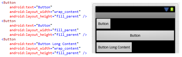
A Linear Layout could have children displaying either in horizontal or in vertical. Let’s have a layout example we would do for all the above layouts. We would have two EditText controls with describing TextView and a Button control to do something.
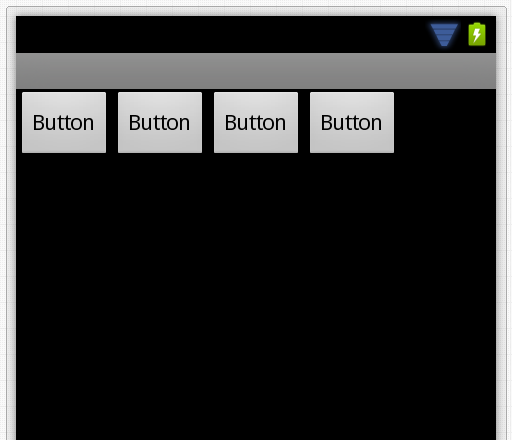
Linear Layout – Horizontal
As discussed above, a Linear Layout with orientation set as horizontal; places children views in horizontal order. Such as following.
The XML layout would be as below.
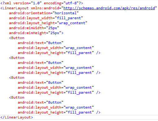
As you see in the above layout XML, Linear Layout has a property as Layout_Height as wrap_content. Basically we have four types by which we could set the width or height of the ViewGroup or the View.
- Fill Parent – Fills the parent
- Wrap Content – Wraps with the maximum allowed (Parent’s) width or height
- Match Parent – Same as Fill Parent but added with different OS version
- Unit Values
- DP – Density independent Pixels, based on physical density of the screen.
- SP – Scale independent Pixels, scaled by user’s font size. Recommended to use with fonts.
- DPI – Same as DP
- PX – Pixels, corresponds to actual pixels on the screen.
- IN – Inches, based on the physical size of the screen.
- MM – Millimetres, based on the physical size of the screen.
- PT – Points, 1/72 of the inch based on the physical size of the screen.
If we add few more buttons to the above layout, it would not scroll and the height would wrap.
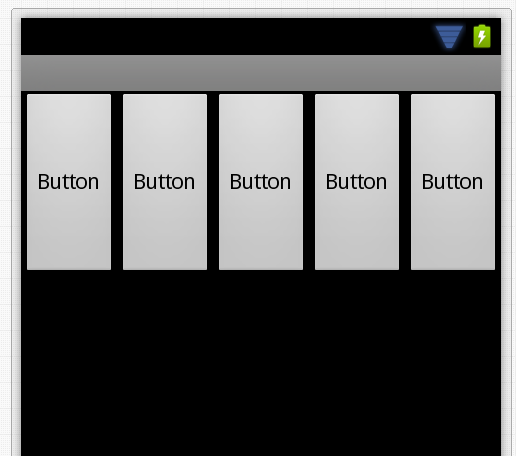
For the above layout, we have 8 buttons; but displayed 5 buttons, also we cannot scroll. We would see later, how to add scrolling to the layout.
Linear Layout – Vertical
A Linear Layout with orientation set as vertical; places children views in vertical order. Such as following:
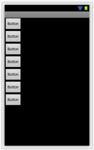
As you see in above image, the buttons are having Layout_Width property as Wrap_Content; that is the reason buttons are wrapped wherever content is finished. Let’s add few more buttons and with different Layout_Width setting.
If you look at above Layout and it’s button’s Layout_Width property changes with respect to the content; you would understand it properly. These properties are common property for View or ViewGroup.
Now a Vertical Linear Layout cannot scroll it’s content automatically. As mentioned earlier, we would discuss it in later chapter.
Relative Layout
A Relative Layout has always relationship with its children. You can also say that, children of Relative Layout are related to layout. This is one of the complicated layouts you would ever see. The reason is too many properties to set for child and parent to get what we want. The following are the properties.
- Relative to Parent Container
- Layout_AlignParentBottom – displays child at bottom of parent
- Layout_AlignParentLeft – displays child on the left side of the parent
- Layout_AlignParentRight – displays child on the right side of the parent
- Layout_AlignParentTop – displays child at the top of the parent
- Layout_CenterHorizontal – centers the child horizontally in the parent
- Layout_CenterInParent – centers the child both horizontally and vertically in the parent
- Layout_CenterVertical – centers the child vertically in the parent
- Relative to Other View
- Layout_Above – places the child above the view
- Layout_Below – places the child below the view
- Layout_ToLeftOf – places the element left of the view
- Layout_ToRightOf – places the element right of the view
- Align with Other View
- Layout_AlignBaseline – aligns baseline of the new view with the baseline of specified view
- Layout_AlignBottom – aligns bottom of the new view with the bottom of the specified view
- Layout_AlignLeft – aligns left of the new view with the left of the specified view
- Layout_AlignRight – aligns right of the new view with the right of the specified view
- Layout_AlignTop – aligns top of the new view with the top of the specified view
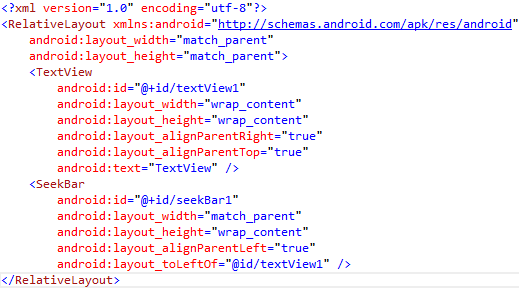
The following is a simple example where, a SeekBar control’s current Progress property would be displayed on the right side.
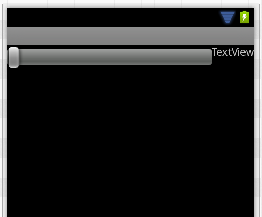
This would look similar to the following in design view.
As it is a complex layout to describe, we would use it wherever it’s useful and we would discuss the layout there.
Table Layout
This is one of the most used Layouts. As the name says the View is organised in Rows and Columns. However to have columns in the Row, we need to use a Table Row, which would contain the children. The number of children present in a TableRow, is exactly the number of Columns present in the Row. Also, it’s not obvious that; the number of columns present in first row would be same in the following Row. That’s the poor thing about it; each row’s column count is dependent on its children count.
The following design is made using a Table Layout.
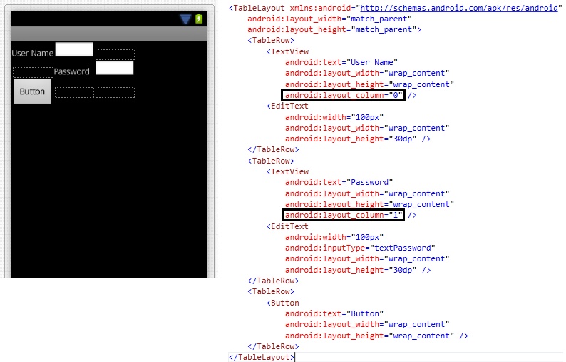
The above example shows that we can place elements in virtual columns. This is calculated based on the space available with respect to the maximum column assigned +1. So if we are assigning Layout_Column as 1 then it would be a 3 column row.
Now adjust the above view to look decent. The following changes are made.
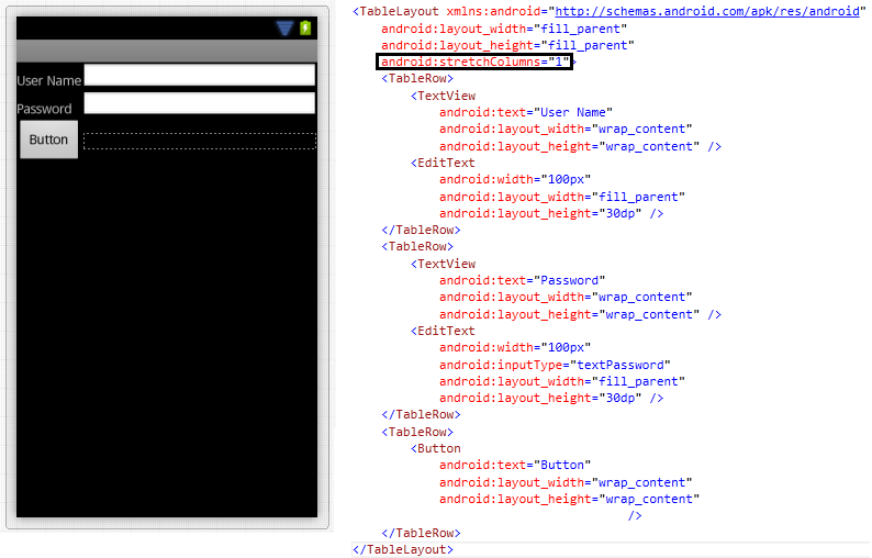
The StretchColumns property of the Table itself fixed the first two rows. Likewise we would be discussing more about these properties while we progress in this book.
Frame Layout
Each child view in Frame Layout starts from the Top Left of the Layout.
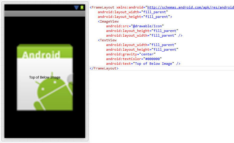
As you see in the above design, the ImageView and TextView are layered one after another. So basically, each starts displaying from the top left of the parent layout. It’s up to the designer to design it.
Using Android Styles in Layout
Android has also some inbuilt styles for Layouts. In some design scenarios, where we would require a fixed layout at the bottom of the screen. The fixed layout may contain a set of controls. In this post, we would see how we do that.
Here is a sample layout with LinearLayout (above the last LinearLayout).
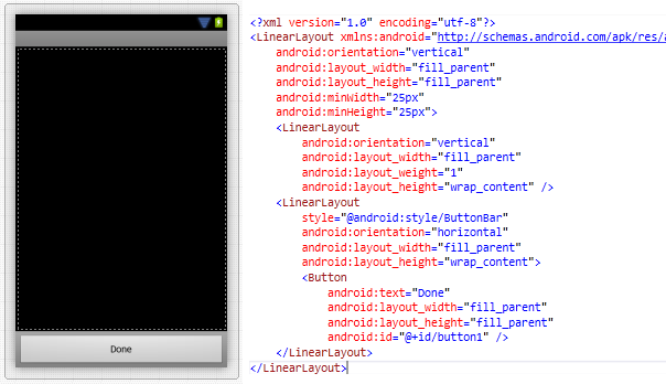
As you see in above image, the last control before the Fixed Layout, should have the above properties with values.
Now, the Linear Layout would become fixed at the bottom, once you apply the style of ButtonBar.
Now the Button inside it is the content of the fixed layout.
Conclusion
We have discussed the Layouts in Xamarin Android development. If you are a designer, you should be able to mix and match the Layouts to provide the perfect required design. Keep designing.