4. Shaping Elements
As already mentioned the Shape Script language is a bit C-like. So probably most people will not have much trouble to learn the syntax. Anyway it’s very limited. An EBNF syntax description can be found in the appendix.
Generally all keywords and even strings are case insensitive. So it does not matter whether you write LineTo rather than lineto in the above example. The auto-completion suggests the first variant in camel case which is definitely better to read.
4.1 The Main Shape
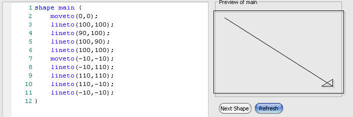
Or to talk Sparxian: shape main. As you already have seen, these two keywords introduce the body wrapped in curly brackets. The instructions inside will be executed each time a stereotyped element is shown on a diagram. As already mentioned each element has 100 units in width and depth (as opposed to height since the units increase downwards). Even shapes which appear oval (like Use Case) have that rectangular 100² units frame.
Now let’s see what can be done to actually draw something. Let’s start with the two methods LineTo and MoveTo used in the introductory example.
Simple Lines
There is not much to say:
MoveTo(x,y)- moves the graphic cursor to the specified coordinate. Initially in the script the cursor is located at (0|0).
LineTo(x,y)- draws a line from the current coordinate to the new
(x|y)and sets the current cursor to that position.
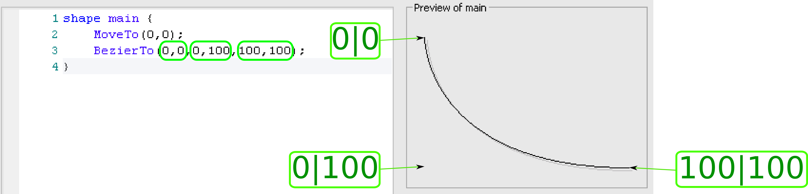
A somehow more advanced way to draw a line is a bezier curve.
BezierTo(xStart,yStart,xBend,yBend,xEnd,yEnd)- draws a line from
(xStart|yStart)to(xEnd|yEnd)bending it towards(xBend|yBend)
Other ways to get some rounded shapes are the Arc and ArcTo methods:
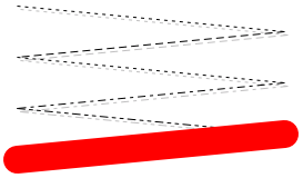
Arc(left,top,right,bottom,xStart,yStart,xEnd,yEnd)- will draw a partial ellipse (see
Ellipsebelow in the next chapter) with the bounding specified byleft, top, rightandbottom. But it is only drawn from the intersection of the line crossing the ellipse which is drawn from its center to(xStartX|yStart)to that of the intersection center/(xEnd|yEnd).
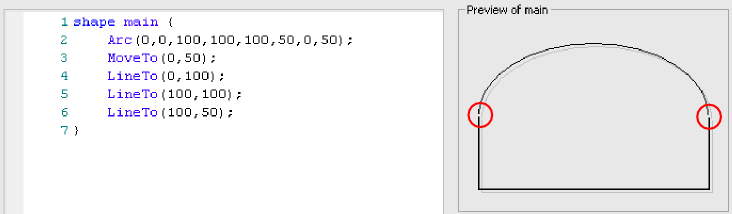
ArcTo(left,top,right,bottom,xStart,yStart,xEnd,yEnd)- will draw the same as
Arcexcept it will continue a straight line from the current pen position to the start of the arc and it will set the current pen position to the end of the arc (which is the counter-clockwise end)
Closed Lines
In contrast to the simple lines explained above the closed lines have an inside which can be filled with a solid color. There are different ways to create such a graphic element.
Rectangle(left,top,right,bottom)- will do as the name suggests where the edges are located at
left,top,rightandbottom.
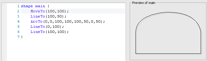
RoundRect(left,top,right,bottom,cornerWidth,cornerHeight)- is almost the same as
Rectanglebut it will have rounded edges. The rounding is not related to the internal 100² units[^square] but given in absolute pixels! That means it will not scale with the shape as you can see below with the two differently sized shapes.
Polygon(xCenter,yCenter,numberOfSides,radius,rotation)- will draw a polygon with
numberOfSidessides. The center will be at(xCenter|yCenter)and the radius (distance from center to an edge) isradius. Further the whole object will be rotatedrotationdegrees counter-clockwise. While all other parameters are integers,rotationis a float. Makes perfect sense to distinguish half a degree in 100² units. Ellipse(left,top,right,bottom)- draws an ellipse inside the specified boundaries. For good reasons there is no
Circlemethod as resizing the element on the diagram will in almost all cases distort it to an ellipse.
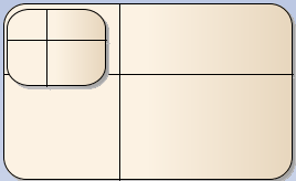
The following picture shows a number of example shapes.
The pentagon drawn in line 3 has the same radius as the (circular) ellipse drawn on line 2. The ellipses on line 4 and 5 mark the center and the right (and start-) margin of the pentagon.
A similar pentagon as on line 3 is drawn on line 7 except that it is rotated by 90 degrees counter-clockwise (and it is located at the right end of the shape).
Lines 8 and 9 show a triangle and a hexagon – hopefully self-explanatory.
There is also a way to draw non-regular shapes by specifying the edges and filling the contents.
StartPath()- introduces a sequences of
MoveToandLineTocommands describing the shape to be filled.
StartCloudPath(puffWidth,puffHeight,noise)- is almost the same as
StartPathbut it will make the shape cloudy. If you pass an empty parameter list EA will take some default values which mostly resemble a cloud. A value tuple of 40|20 forpuffWidth|puffHeightwill give a summer time cloud. Small values like 4|2 will result more in ripped paper shapes. Suppling zero asnoisewill result in absolutely regular fluffs. A value of about 1 will make it naturally irregular. All values can be supplied as float. Any integer will suffice however. EndPath()- tells that the path is ended and going to be filled.
FillAndStrokePath()- Will fill the inside of the previously specified path and draw a border line.
FillPath()- is almost the same except it does not draw the border line.
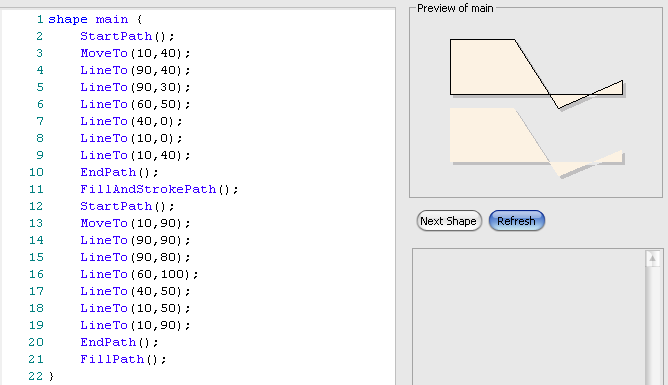
StrokePath()- is another quite useless method as it just draws the border. Something you would achieve when simply not using all that path-stuff.
Finally there is a way to draw the native shape which will normally be used inside control structures (as we will see later).
DrawNativeShape()- will draw exactly the shape as if no Shape Script were applied.
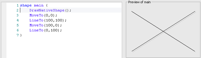
The example above shows the preview and how a class will appear in the diagram. Since the preview does not know anything about the element where the Shape Script will be applied it will not draw anything for DrawNativeShape.
Painting
All of the above methods use default fill, border and font colors and border style. These can be changed using the following methods.
SetFillColor(red,green,blue)- replaces the fill color for the methods described in the previous chapter. The parameters take the RGB values as integer in the range from 0 to 255.
SetFillColor(newColor)- is the same as the previous except that it takes a color object as parameter. Currently9 there are just three methods to deliver a color object:
GetUser***Color()(see below). You can not (yet?) define any color object in Shape Script.
SetFontColor(red,green,blue)- replaces the color for any text appearing in a shape.
SetFontColor(newColor)- is the same as the last method. Like for the above describe
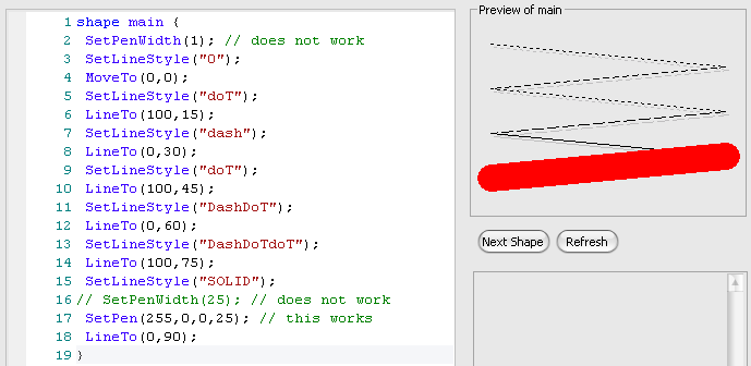
newColoryou can only use one of theGetUser***Color()methods. SetLineStyle( lineStyle)- sets the line style according to the
lineStylesupplied as string. The string itself is interpreted case insensitive. You need to choose from one of the valuessolid, dash, dot, dashdotordashdotdot. Choosing a different string value will result in an unpredictable line style
SetPen(red,green,blue)- replaces the color for border lines with the one supplied as RGB.
SetPen(red,green,blue,penWidth)- is the same as the previous one except that the additional parameter
penWidthwill set the width of the lines being drawn. The value for it must be between 1 (default thin line) and 5 (thickest line). SetPen(newColor)- see the remark about color objects above.
SetPen(newColor,penWidth)- ditto
SetPenColor(red,green,blue)- yet another way to say
SetPen(red,green,blue). SetPenColor(newColor)- I must not repeat myself, must I?
SetPenWidth(penWidth)- just like
SetPen(red,green,blue,penWidth)but without changing the color.
SetDefaultColors()- will reset any of the previously changed color attributes to the defaults.
GetUserFillColor()- returns a color object with the user defined color for use in one of the previously mentioned color parameters.
GetUserBorderColor()- ditto for the border
GetUserFontColor()- and for the font color.
GetUserPenSize()- returns the width (why be orthogonal?) of the pen as defined by the user. The only place where you can use this method is inside
SetPen/SetPenWidth.
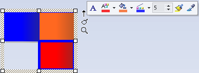
As you can see the colors shown in the painter for border, font and fill are used to color the three rectangles. Additionally the lower right rectangle is drawn with a thick border.
4.2 Text
Of course you need to be able to put some text inside a shape. The following methods can be used for that purpose. Note that any text goes into the whole active shape rectangle, which is shape main. So currently you will only be able to print text from top left to bottom right of the shape. We will see later how to place text at certain positions.
Print(text)- Renders the string
textat the current print position (which starts top left of the actual shape).
Println(text)- is the same except that it renders a new-line at the end of the supplied text string.
PrintWrapped(text)- actually the same as
Print. According to the help: Prints the specified text string, wrapped over multiple lines if the text is wider than its containing shape. Let’s see:
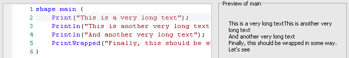
And the difference is —
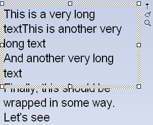
None. Both texts are wrapped inside the shape. Further the text protrudes the shape on the bottom. Regardless of which Print variant is used.
PrintIfDefined(propertyname,truePart,falsePart)- will print the string
truePartif the property is defined and has a not-empty value assigned. Else it will printfalsePart.
Strings
The above mentioned Print methods and some of the methods described in the following take a string parameter. Since Shape Script is very limited you can not manipulate strings. To overcome this in a certain extent you can let Shape Script replace strings by some meaningful contents. That is e.g. the name of the element in place or the contents of tagged values. The mechanism is very simple. Shape Script interprets hash-tags and replaces them textually. E.g. the hash-tag #name# will be replaced by the name of the element. There is quite a number of properties you can use instead of name which will be covered in detail later in chapter Properties.
4.3 Shape Attributes
Before going on with more sophisticated methods we need to look at shape attributes. Some of these have global influence on the shape while others influence the behavior of certain methods. The general format for an attribute assignment is
<attribute> = <value>- where
<attribute>is one of the names below and<value>is either a string (e.g."string"), and integer or a tuple (e.g.(0,5)). bottomAnchorOffset- is a tuple defining the offset for an embedded element related to the bottom of the element. E.g. a port will be (-7,-7) while a part will be (0,0). This offset is applied for embedded elements attached to the bottom of the parent element.
topAnchorOffset, leftAnchorOffset, rightAnchorOffset- are analogously attributes for the other edges.
dockable- is either
standardoroff.
editableField-
Defines a shape as an editable region of the element. Valid Values:
alias, name, noteandstereotype.
fixedAspectRatio- either
trueorfalse. In the first case the element will scale always proportionally in width and height. h_Align- Affects horizontal placement of printed text and sub-shapes (see next chapter) depending on the
layoutTypeattribute. Valid values:left, centerorright. v_Align- Affects vertical placement of printed text and sub-shapes (see next chapter) depending on the
layoutTypeattribute. Valid values:top, centerorbottom. layoutType- Determines how sub-shapes are sized and positioned. Valid values:
leftright, topdownorborder. noShadow- can be
trueorfalse. Set totrueif you want to turn of the shadow rendering. orientation- Applies to decoration shapes (see below) only, to determine where the decoration is positioned within the containing element glyph. Valid values:
NW, N, NE, E, SE, S, SWorW.
preferredHeight, preferredWidth- is used in sub-shapes (see next chapter) at
N/S(height) orE/W(width) orientation. The defined size is used to calculate the offset for the center shape. You can supply both values in a single shape. In that case only the relevant size will be evaluated. scaleable- Set to false to prevent rotation of the shape. This attribute is only applicable to the source and target shapes for line glyphs. Valid values: true or false (default = true)
4.4 Sub-Shapes
A so-called sub-shape is a rectangle placed inside10 of shape main. Its purpose is mainly to either place text blocks inside a shape and/or to repeat a certain graphic figure inside a shape. Each sub-shape has a limited width and a certain height. There are two variants of sub-shapes: local and global. Subsequently invoked sub-shapes will be stacked depending on the layoutType property:
topdown- The first sub-shape is placed on top of the main shape. The next one directly below the previous one.
leftright- Similarly but the sub-shapes join to their right edge.
border- when this value is set you can only use a sub-shape invocation with 2 parameters where the first is the name and the second is a compass orientation (
N, S, E, WorCENTER). According to the help the shape shall be placed in the according part.
Local sub-shapes have an additional offset you must specify which can be used to compensate the offset and place the sub-shapes arbitrarily inside the main shape11.
A sub-shape is defined by
shape <non-reserved-name> { <block> }- where
<non-reserved-name>is any string exceptmain,childelement,label,target,source,LeftTopLabel,MiddleTopLabel,RightTopLabel,LeftBottomLabel,MiddleBottomLabelandRightBottomLabel.<block>consists of any of the previously defined graphic methods like e.g.LineTo,Rectangle,Printand so on. Global ones appears at any top level in a Shape Script likeshape main. Local ones are declared insideshape main` at any statement position.
A global sub-shape is invoked inside shape main by calling
AddSubShape(shapeName,width,height)- where
shapeNameis the<non-reserved-name>of a sub-shape defined in the script. It must be supplied as a string. Thewidthtells how many units of the width forshape mainare being used.heightspecifies the height analogously. Placement of sub-shapes will be according tolayoutTypeas described above.
A local sub-shape has more parameters and is invoked inside shape main by calling
AddSubShape(shapeName,width,height,xOffset,yOffset)- where
shapeNameis the<non-reserved-name>of a sub-shape defined locally in the script. It must be supplied as a string. The defined shape will be placed insideshape mainaccording to the rules described for the global variant. Additionally, as said, the position will changed by addingxOffset|yOffset.
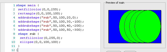
As you can see the stacking of the sub-shapes is compensated by the -100, -200 and -300 yOffset values. Since the x-coordinate always starts at zero the xOffset is actually always the x-coordinate where the shape starts.
Finally, as mentioned,
AddSubShape(shapeName,compass)- which is required for
layoutType = "border".
4.5 Compartments
In the rectangular UML element representation you can find compartments beneath the top compartment showing the name and a few other things. Usually those compartments show attributes and methods. But you can also list anything else inside those compartments. In Shape Script you can create compartments for child elements of an element. For the main element you can have a shape main section. In that case you need to call DrawNativeShape or you will not see any compartments. Now for each child element the Shape Script part shape ChildElement is being processed. Here you can assign a compartment name using SetCompartmentName which will be a grouping criterium. By calling AddCompartmentText you can add the name (and additional information) to the compartment.
shape ChildElement { <block> }- defines the script to be executed for any child element.
SetCompartmentName(name)- will group a subsequent
AppendCompartmentTextunder the specifiedname. The list of unique compartment names will appear AppendCompartmentText(text)- will add the supplied text under the according compartment.
To make an example we assume the following element structure where main contains two differently stereotyped elements.
The diagram representation if achieved with the following script12.
1 shape ChildElement { // add Child Compartments to the parent.
2   if(HasProperty("stereotype", "part")) {
3     SetCompartmentName("Parts");
4   }
5   else if(HasProperty("stereotype", "mystereotype")) {
6     SetCompartmentName("My Stereotype");
7   }
8   AppendCompartmentText("#NAMe#"); // case insensitive...
9 }
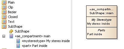
As you can see the compartments are listed according to the found stereotypes part and mystereotype and they appear in the middle of the rendered element. The names (being print using hash-tags) appear left aligned under each compartment.
4.6 Decoration
If you mainly use the rectangular notation for an element but want to show a fancy icon somewhere you can use
decoration <some-unused-name> { <block> }- where
<some-unused-name>is an arbitrary name. It is used at no place but should simply describe the shape in one word. However, the name must be unique amongst the declareddecorations.<block>is any graphical description as explained previously.
The default decoration will appear top-left of the shape (NW). If you want it to appear somewhere else you need to assign the orientation property inside to one of the valid compass values.
The following Shape Script
 1 decoration triangle {
 2   orientation = "center";
 3   // Draw a triangle for the decoration
 4   startpath();
 5   moveto(0,30);
 6   lineto(50,100);
 7   lineto(100,0);
 8   endpath();
 9   setfillcolor(153,204,255);
10   fillandstrokepath();
11 }
12
13 decoration a {
14   orientation = "NW";
15   setfillcolor(50, 100, 200);
16   rectangle(0,0,100,100);
17   print("test");
18 }
19 decoration b {
20   orientation = "N";
21   setfillcolor(50, 100, 200);
22   rectangle(0,0,100,100);
23 }
24 decoration c {
25   orientation = "NE";
26   setfillcolor(50, 100, 200);
27   rectangle(0,0,100,100);
28 }
29 decoration d {
30   orientation = "E";
31   setfillcolor(50, 100, 200);
32   rectangle(0,0,100,100);
33 }
34 decoration e {
35   orientation = "SE";
36   setfillcolor(50, 100, 200);
37   rectangle(0,0,100,100);
38 }
39 decoration f {
40   orientation = "S";
41   setfillcolor(50, 100, 200);
42   rectangle(0,0,100,100);
43 }
44 decoration g {
45   orientation = "SW";
46   setfillcolor(50, 100, 200);
47   rectangle(0,0,100,100);
48 }
49 decoration h {
50   orientation = "W";
51   setfillcolor(50, 100, 200);
52   rectangle(-50,-50,150,150);
53 }
displays as
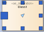
You can see that the 100² units are located at fixed positions inside the main shape (the picture shows an enlarged class element). They do not scale with the element. Also if you print text in decorations the font is that being used inside elements in general. There is only one font setting in Enterprise Architect for general use, one for an element in general and one per diagram use. You can not have multiple fonts in one displayed element.
4.7 Labels
It is possible to place labels along with an element oriented at major compass positions. To actually create a label you use
shape label { <block> }- which will contain the instructions to create the label. Usually you will use
Printstatements and/or graphic methods. SetOrigin(relativeTo,xOffset,yOffset)- will tell where to actually place the label.
relativeTomust be a string constant being one ofN, NE, E, SE, S, SW, W, NWorCENTER. TheOffsetvalues are measured in screen pixels and can be negative.
4.8 Miscellaneous
Here are a number of methods which will not group elsewhere:
DefSize(width,height)- sets the default size of the shape when it’s initially placed on a diagram or when
Alt-Zis used to set the default size. Both parameters define screen pixels. The default for a class element is about 100|80. DrawParentShape()- is similar to
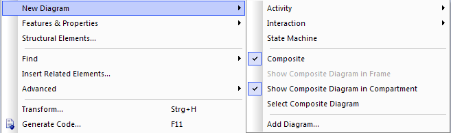
DrawNativeShape. This is used when referring to non-UML shapes defined in MDGs where it will use the shape of the element’s parent from which it is derived. For non-derived elements it will simply behave likeDrawNativeShape. DrawCompositeDiagram()- will enable the rendering of a possibly existing composite diagram.
Image(imageName,left,top,right,bottom)- will place a scaled image inside the units of the shape specified by
left, top, rightandbottom.