3. Creating a WPF application
3.1 Developer - designer workflow
When working on a WPF application there are two roles:
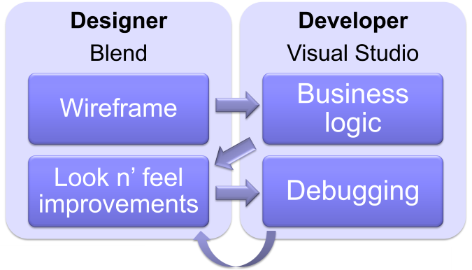
The designer is in charge of creating the wireframe and then high quality version of the user interface. The developer is in charge of coding the business logic, connecting with data and, well, um… debugging.
I’m talking about roles here. On a small team, the developers themselves could take the the designer role. On a large team however, it’s a good idea to have separate people in charge of those roles. Simply because a developer is not a designer. Though this book is going to teach you how to use the designer tools, you’ll realize that using a hammer doesn’t make you a craftsman. Designing nice user interfaces has its own learning curve.
In fact, I’ve been very impressed by the designer work on the large WPF projects I took part in. In a few days they were able to provide XAML files that made the application really appealing to the users. Without impacting business code.
3.2 Editors
Since there are two roles, there are two tools. Though you could use any of those tools in order to do all the work, each of them makes specific parts of the job faster and more convenient.
Visual Studio targets developers. Use it when adding controls, manually editing XAML, and writing the business logic.
Blend for Visual Studio targets designers. It is used when changing the appearance of controls and creating animations.
3.3 Adding a control
There are two ways to add a control to a screen[^screen]:
- drag and drop the control from the toolbox;
- simply add an XML element in the XAML file.
In case you manually add the XML element, its position and size depends on the container. We’ll talk about containers in the Layout chapter, but for now just be aware that the control will take all the screen size when added to a Grid, or remain at the top-left corner when added to a Canvas.
For instance, the following XAML code will display a Button control that spans the whole screen:
<Grid xmlns="...">
  <Button Content="Hello world" />
</Grid>
3.4 Simple controls
WPF provides relatively few controls. This is due to the fact that their appearance can be easily and completely revamped using pure XAML as we’ll see in the Change a control’s look chapter. Let’s review the basic ones.
Basic controls
There is almost no need to explain much about those controls. On the left, you can see their declaration in XAML; on the right, their default[^basicdefault] appearance.
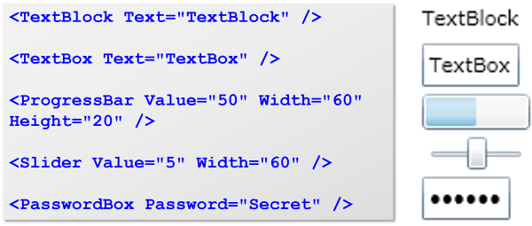
Those controls are symmetrical. While TextBlock and TextBox allow for a string to be displayed or input as their Text property, ProgressBar and Slider allow for a double to be displayed or input as their Value property.
Note that in order to display text, the TextBlock control should be preferred to the Label control. The Label control is a much more flexible content control, which means it can display much more than text. Since it can display anything, the Label control lacks properties like TextWrapping that enable long text to be wrapped, and can be found on the TextBlock control.
Multimedia controls
The Image control displays, well, any picture, and the MediaElement displays movies. Both share a common resizing behavior:
- they resize their content to fit the size assigned to the control;
- they provide a Stretch property that enables you to specify how the content is resized.
The most interesting values of the Stretch property are:
- Uniform (default): Image is resized proportionally, leaving transparent margins on the sides as needed.
- Fill: Image is resized proportionally, filling up the whole space assigned to the Image control.
The following code will display a picture resized to be 50 tall (width is automatically computed since it is not provided) and a movie with the same characteristics.
<Image Source="fleurs.jpg" Height="50" />

<MediaElement Source="ic09.wmv" Height="50" />
Drawing controls
The Ellipse, Rectangle and Path controls are basic shape drawing controls. They all share common properties:
- Fill: a Brush used to paint the inside of the control;
- Strike: a Brush used to paint the outline of the control;
- Stretch: how the control should resize its shape when resized, just like we saw for multimedia controls.
The Path control is very flexible: it enables you to provide a list of points and have them connected using segments or Bezier curves. Manually providing the points is too tedious so you have two options: draw the shape using Blend for Visual Studio or export the shape from a drawing or converter tool that generates XAML.
They are not container control so they can’t have a child, but who cares? Should you need to add text to them, you can place a TextBlock over them, grouping both in a Grid control so they have the same size.
Apart from placing them anywhere on a screen, you can use them inside templates in order to give outstanding new appearances to existing controls. More about that a little later.
Content controls
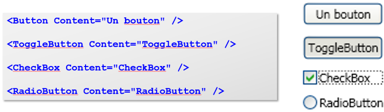
Content controls have a content that can be anything. For this, they expose a Content property. The following are content controls:
- Button
- Border
- ScrollViewer
- ViewBox
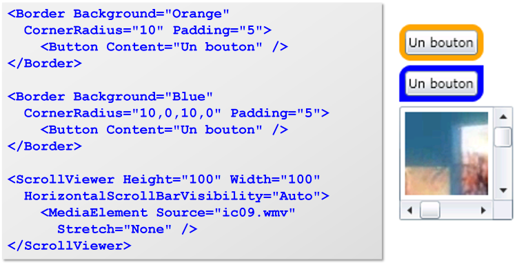
Here are some buttons. Again, their default appearance displayed on the right:
Note that the Content property is assigned using a Content attribute. That works well with simple content. When you need to assign more complex content, you can provide a child element to your content control instead of using the Content attribute. Here are two examples:
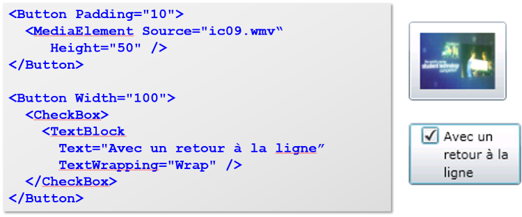
As I wrote, the content can be anything. Did you note how the example above adds a checkbox to a button? This simply wasn’t possible with frameworks like Windows Forms because the Button control didn’t have an EnableCheckBox property. Using WPF, you can simply combine controls in order to get the functionality you need. Plus you can also change their appearance, as we’ll see later.
That gives you a great deal of flexibility. For instance, you may add scrolling around any control by just wrapping it inside a ScrollViewer control. Or a border to any control by wrapping it inside a Border control: don’t look for a Border property on e.g. a TextBlock control: simply wrap it inside a Border control.
Here are examples of using the Border control and adding scrollbars to a movie using the ScrollViewer control.
Now is time to introduce one of my preferred WPF controls to you: ViewBox. I love the ViewBox control because it shows the flexibility of WPF. It is able to resize any content just as if it were a picture, and the content remains usable. That means you can quickly have any kind of screen resized to the available width and height. It will come in very handy in control templates and many parts of your application.
Here is how the ViewBox control works:
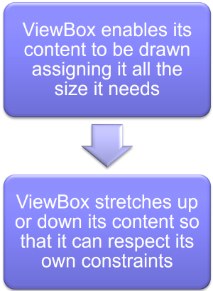
Now guess what? The ViewBox control has a Strech property that states how its content should be resized. And it behaves exactly like the Strech property of Image and MediaElement controls.
Let me show you simple uses of the ViewBox control together with their resulting display.
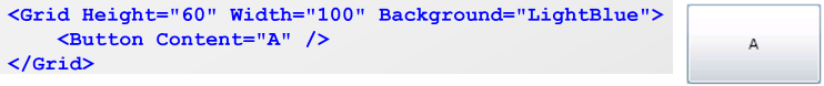
In the above example, there is no ViewBox control. As we’ll see later, a Grid control will stretch its content to fill in all of this space. So the Button control takes up all of the Grid control size.
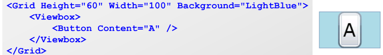
In that second example above, I just inserted a ViewBox control between the Grid control and the Button Control. The Button control is thus drawn using the size it needs (since there are no other constraints here, the size necessary to display its text), and then stretched up by the ViewBox control in order to fill all of the Grid control size. Note how the Button borders look thicker: all of the control was proportionally stretched.
Now, let me add just one attribute to the ViewBox control we used:
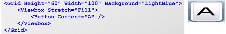
Notice the result? The Button control is distorted.
Best part is that since ViewBox is a content control it can be used in order to resize a full screen. Suppose you have the following screen:
<Grid xmlns="...">
  <Button Content="Hello world" ... />
  <ListBox ... />
  <DataGrid ... />
</Grid>
You can have that whole screen resize to any dimension just adding a ViewBox control:
<ViewBox xmlns="...">
  <Grid>
    <Button Content="Hello world" ... />
    <ListBox ... />
    <DataGrid ... />
  </Grid>
</ViewBox>
This method is quick to implement but has its drawbacks: it resizes all of the content. If you want some more complex resizing like providing more space to the ListBox control, you should use layout controls.
3.5 Navigation
Users are now used to navigating inside an application. Going back to the previous screen, and back again in the history, is likely to be part of your application’s requirements. WPF comes in with a navigation framework that may come handy, though you are free to use another one.
When using WPF navigation system, screens are Pages, and they are displayed within a single Frame control. Think of the Frame control as a Web browser and of the Pages as Web pages.

Pages are XAML files, and you can consider them just like Windows except they have no borders or window-related properties. They are a subclass of user controls, so you could also think of them as user controls. Anyway, in order to create a page you just add a Page element using Visual Studio, and get roughly the following XAML:
<Page x:Class="..." Title="...">
  <Grid>
      ...
  </Grid>
<Page>
You will create as many pages as your application needs screens, and then you’ll add a Frame control that will serve as the page browser. A natural place to put the Frame control is the MainWindow.xaml window that has been created by default. Next, you tell the Frame control which page to display using the Source property.
You get something like that (probably inside MainWindow.xaml):
<Frame Source="/Welcome.xaml">
<Frame>
This code would display the Welcome page. Now, you need a way for the user to move from one page to another. You can do so using XAML or C#.
NavigationService.Navigate(
  new Uri("/Payment.xaml", UriKind.Relative)
);
<Label>
  <Hyperlink NavigateUri="/Payment.xaml">
    Pay now
  </Hyperlink>
</Label>
3.6 It’s your turn to code: do-it-yourself
Now is your turn to grab the keyboard and code away. Oh, just let me explain you how that works, in case you’re not familiar with my Learn collection books.
About exercises in this book
All of the exercises are linked together: you’re going to build a small e-commerce application. You’ll allow users to browse through your products, add them to their basket, and you’ll also create a full back-end where the site administrators will be able to list, create, modify, and delete products.
In case you get stuck
You should be able to solve the exercise all by yourself. If you get stuck or don’t have a computer at hand (or you don’t have the prerequisites for that book, which is fine with me!), no problem. I’ll provide the solution for all of the exercises in this book, right after each of them.
3.7 Exercise - Create the application and contact page
I know, it’s basic, but you need to learn some more things before you can do more.
Beginner badge unlocked: let’s proceed to the next level.
3.8 Exercise solution
- Start Visual Studio.
- Click on the File / New / Project… menu entry.
- In the New Project dialog box, select the WPF Application template making sure that you select Templates / Visual C# / Windows on the left-hand side. In the Name zone at the bottom, type “BikeShop”. Click the OK button.
- Open the Solution Explorer clicking on the View / Solution Explorer menu entry.
- In the Solution Explorer, right-click the project (not the solution), and select Add / Page from the context menu.
- In the Add New Item dialog box, look for the Name zone at the bottom, and type “Contact”. Click the Add button.
- Open the Toolbox clicking on the View / Toolbox menu entry.
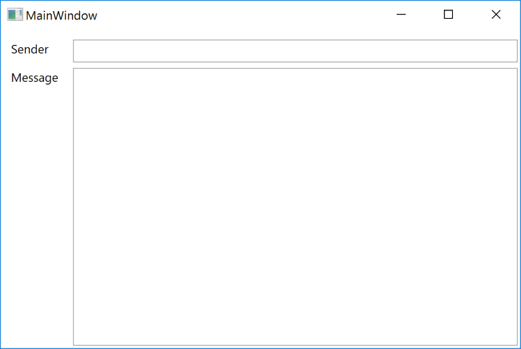
- Drag and drop two TextBlock controls and two TextBox controls from the toolbox to the design surface. Position them and resize them so that the screen looks as expected.
- Make sure that the Properties window is displayed clicking on the View / Properties Window menu entry.
- Click the first TextBlock control and change its Text property to Sender.
- Click the second TextBlock control and change its Text property to Message.
- Click the first TextBox control and change its Text property to be an empty string.
- Click the second TextBox control and change its Text property to be an empty string.
- In the Solution Explorer, double-click the MainWindow.xaml file.
- Inside the Grid element, add a Frame element. The MainWindow.xaml code should look like this:
<Window ...>
  <Grid>
    <Frame Source="/Contact.xaml" />
  </Grid>
</Window>
- Run the application (click on the Debug / Start Debugging menu entry).
- Close the application.