Angular
This chapter will walk you through the main concepts in Angular. We will start by looking at components, and then we move onto pipes, services, events and other concepts. By the end of the chapter you should have a basic understanding of the most important concepts in Angular.
The goal of this chapter is to get your feet wet without scaring you with a lot of details. Don’t worry, there will be a lot coming in later chapters.
Project Files
Running the Project Files
First, make sure that you have cloned the code repo somewhere on your machine:
1 cd ~/Desktop && git clone git@github.com:aminmeyghani/angular2-intro.git
In order to run the project files, you need to do two things:
- First, install the server dependencies and run the server in the root of the repo:
1cd angular2-intro && npm i && npm startAfter the dependencies are installed, it will open up the browser at port 8080.
- The next step is to install the dependencies for angular examples. Go to
project-files/angular-examplesand install the dependencies:1cd project-files/angular-examples && npm i
After following the steps above, you should be able to see the examples in the browser. For example, if you want to see the basic-component example, you can go to the following url:
1 http://localhost:8080/project-files/angular-examples/basic-component/index.html
Starter Project
There is a starter project in angular-examples/starter. You can make a copy of that folder if you want to work on something new. The steps for running the project is the same for all the projects:
- Install the dependencies for the dev server in the root of the repo with
npm i(needed once) - Start the dev server in the root of the repo with
npm start - Install the dependencies for angular examples:
cd project-files/angluar-examples && npm i(needed once) - Open your project in VSCode:
code project-files/angular-examples/starter- Close all chrome instances (quit out of Chrome)
- In VSCode start the build with
command + shift + band run the app by hitting F5 on the keyboard
- If you don’t want to use VSCode, you can use any other editor that you want. But make sure that you run the TypeScript compiler in the project folder:
cd project-files/angular-examples/starter && tsc -w.
Using the Docs
Angular API reference can be found at: https://angular.io/docs/ts/latest/api.
If you are looking for annotations or decorators, look for the keyword followed by metdata. For example, if you want to look up the Component decorator, you would look for: ComponentMetadata. Below are the common metadata class names:
ComponentMetadataDirectiveMetadataPipeMetadataInjectMetadataInjectableMetadata
TODO
Common Interfaces
OnInit
TODO
Common Enums
ChangeDetectionStrategy
TODO
Metadata Classes Cheatsheet
- Angular uses Metadata to decorate classes, methods and properties.
- The most notable Metadata is the
@componentMetadata. - Metadta classes are very convenient and they make it easy to work with components, services and the dependency injection system
Below is a list of Angular’s core Metadata classes categorized under directives/components, pipes and di.
Directive/component Meta-data
-
Component: used to define a component
- View: used to define the template for a component
- ViewChild: used to configure a view query
- ViewChildren: used to configure a view query
-
Directive: used to define a directive
- Attribute used to grab the value of an attribute on an element hosting a directive
- ContentChild: used to configure a content query
- ContentChildren: used to configure a content query
- Input: used to define the input to a directive/component
- Output: used to define the output events of a directive/component
- HostBinding: used to declare a host property binding
- HostListener: used to declare a host listener
Pipes
- Pipe: used to declare reusable pipe function
DI
- Inject: parameter metadata that specifies a dependency.
- Injectable: a marker metadata that marks a class as available to Injector for creation.
- Host: Specifies that an injector should retrieve a dependency from any injector until reaching the closest host.
- Optional: parameter metadata that marks a dependency as optional
- Self: Specifies that an Injector should retrieve a dependency only from itself.
- SkipSelf: Specifies that the dependency resolution should start from the parent injector.
- Query: Declares an injectable parameter to be a live list of directives or variable bindings from the content children of a directive.
-
ViewQuery: Similar to
QueryMetadata, but querying the component view, instead of the content children.
TODO
Component Basics
- Technically speaking components are directives that extend directives with views
- A component encapsulates a specific piece of functionality and components work together to deliver app’s functionality
- Generally speaking, every app has a root component that bootstraps the application. And when the app is bootstraped, Angular starts from the root component and resolves the sub trees of components
In this section we are going to write a simple HelloAngular component, compile it and run it in the browser. In addition, we will configure VSCode to build the TypeScript files as we go.
Note that there is a lot to talk about components. We are going dive into components a lot more in later chapters, but for now let’s just keep things simple.
The project files for this chapter are in angular2-intro/project-files/angular-examples/basic-component You can either follow along or just look at the final result
In order to run the project files, please refer to the Running the Project Files section.
Getting Started
Make a folder on your desktop called hello-angular and navigate to it:
1 mkdir ~/Desktop/hello-angular && cd $_Start npm in this folder with npm init and accept all the defaults.
After that, add the dependencies and devDependencies field to your package.json file:
 1 "dependencies": {
 2   "angular2": "^2.0.0-beta.1",
 3   "es6-promise": "^3.0.2",
 4   "es6-shim": "^0.33.3",
 5   "reflect-metadata": "0.1.2",
 6   "rxjs": "5.0.0-beta.0",
 7   "zone.js": "0.5.10"
 8 },
 9 "devDependencies": {
10   "systemjs": "^0.19.16"
11 }
your package.json file should look something like the follwoing:
 1 {
 2   "name": "hello-angular",
 3   "version": "1.0.0",
 4   "description": "",
 5   "main": "index.js",
 6   "scripts": {
 7     "test": "echo \"Error: no test specified\" && exit 1"
 8   },
 9   "author": "Amin Meyghani <meyghania@gmail.com> (http://github.com/aminmeyghani\
10 )",
11   "license": "ISC",
12   "dependencies": {
13     "angular2": "^2.0.0-beta.1",
14     "es6-promise": "^3.0.2",
15     "es6-shim": "^0.33.3",
16     "reflect-metadata": "0.1.2",
17     "rxjs": "5.0.0-beta.0",
18     "zone.js": "0.5.10"
19   },
20   "devDependencies": {
21     "systemjs": "^0.19.16"
22   }
23 }
Then run npm i to install the dependencies.
After all the dependencies are installed, start VSCode in this folder with code .
Then create a index.html file in the root of the project and put in the following:
index.html
 1 <html>
 2 <head>
 3   <title>Hello Angular</title>
 4
 5   <script src="/node_modules/angular2/bundles/angular2-polyfills.js"></script>
 6   <script src="/node_modules/systemjs/dist/system.src.js"></script>
 7   <script src="/node_modules/rxjs/bundles/Rx.js"></script>
 8   <script src="/node_modules/angular2/bundles/angular2.dev.js"></script>
 9
10   <!-- add systemjs settings later -->
11
12 </head>
13
14 <body>
15   <!-- add app stuff later -->
16 </body>
17
18 </html>
This loads all the necessary scripts that we need to run Angular in the browser.
Note
If you need to support older browsers, you need to include the es6-shims before everything else:
1 <script src="/node_modules/es6-shim/es6-shim.js"></script>
Making a Simple Component
Let’s start by making the main.ts file in the root of the project. In this file we are going to define the main component called HelloAngular and then bootstrap the app with it:
main.ts
 1 import {Component, OnInit} from 'angular2/core';
 2 import {bootstrap} from 'angular2/platform/browser';
 3
 4 @Component({
 5   selector: 'app',
 6   styles: [`h1 { line-height: 100vh; text-align: center }`],
 7   template: `<h1>{{ name }}</h1>`
 8 })
 9 class HelloAngular implements OnInit {
10   name: string;
11   constructor() { this.name = 'Hello Angular'; }
12   ngOnInit() { console.log('component linked'); }
13 }
14
15 bootstrap(HelloAngular, []);
- On line 1 we are importing the
componentmeta data (annotation) and theonInitinterface. - On line 2 we are loading the
bootstrapmethod that bootstraps the app given a component. - On line 4, we are defining a component using the
componentdecorator. The@componentis technically a class decorator because it precedes theHelloAngularclass definition. - On line 5, we are telling angular to look out for the
apptag. So when Angular looks at the html and comes across the<app></app>tag, it is going to load the template (on line 6) and instantiates the class for it (defined on line 9). - On line 9, we are defining a class called
HelloAngularthat defines the logic of the component. And for fun, we are implementing theOnInitinterface to log something to the console when the component is ready with its data. We will learn more about the lifeCycle hooks later. - Last but not least, we call the
bootstrapmethod with theHelloAngularclass as the first argument to bootstrap the app with theHelloAngularcomponent.
Compiling the Component
Now we need to compile the file to JavaScript. We can do it from the terminal, but let’s stick to VSCode. In order to that, we need to make two config files:
- First is the standard
tsconfig.jsonfile - And the
tasks.jsonfile for VSCode to do the compiling
Create the tsconfig.json file in the root of the project and put in the following:
tsconfig.json
 1 {
 2   "compilerOptions": {
 3     "target": "es5",
 4     "module": "system",
 5     "moduleResolution": "node",
 6     "sourceMap": true,
 7     "emitDecoratorMetadata": true,
 8     "experimentalDecorators": true,
 9     "removeComments": false,
10     "noImplicitAny": false,
11     "outDir": "output",
12     "watch": true
13   },
14   "exclude": [
15     "node_modules"
16   ]
17 }
Then create the tasks.json in the .vscode folder in the root of the project and put in the following:
.vscode/tasks.json
1 {
2   "version": "0.1.0",
3   "command": "tsc",
4   "showOutput": "silent",
5   "isShellCommand": true,
6   "problemMatcher": "$tsc"
7 }
- Now we can build the TypeScript files as we work. We just need to start the build task with
command + shift + bor using the prompt. If you want to use the prompt do the following:- Use
command + shift + pto open the prompt - Then, type
> run build taskand hit enter to start the build task.
- Use
- After you run the build task, you should see an
outputfile generated withmain.jsand the source maps in it. - The task is watching the files and compiling as you go. To stop the task, open the prompt and type:
1> terminate running task
Loading the Component
After compiling the component, we need to load it to the index.html file with Systemjs. Open the index.html file and replace <!-- add systemjs settings later --> with the following:
 1 <script>
 2   System.config({
 3     packages: {
 4       output: {
 5         format: 'register',
 6         defaultExtension: 'js'
 7       }
 8     }
 9   });
10   System.import('output/main')
11   .then(null, console.error.bind(console));
12 </script>
Now we can use our component in the body of the html:
1 <body>
2   <app>Loading ...</app>
3 </body>
It is finally time to serve the app. You can serve the app in the current directory using the live-server:
1 live-server .
If everything is wired up correctly, you should be able to see the following:
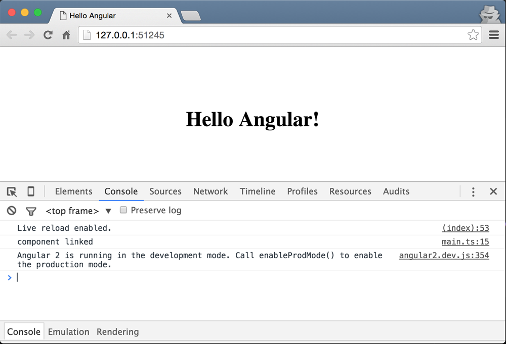
Debugging the component
You can connect chrome’s debugger to VSCode using the chrome debugger extension for Visual Studio Code. See the Debugging App from VSCode section in case you missed to install it. But, assuming that you have the extension installed, you can debug your app from VSCode. In order to do that, we need to create a launch.json file in the .vscode folder:
1 touch .vscode/launch.json
After you created the file, put in the following configuration in the file:
 1 {
 2   "version": "0.1.0",
 3   "configurations": [
 4     {
 5       "name": "Launch Chrome Debugger",
 6       "type": "chrome",
 7       "request": "launch",
 8       "url": "http://127.0.0.1:8080/",
 9       "sourceMaps": true,
10       "webRoot": "${workspaceRoot}",
11       "runtimeExecutable": "/Applications/Google Chrome.app/Contents/MacOS/Googl\
12 e Chrome",
13       "runtimeArgs": [
14         "--remote-debugging-port=9222",
15         "--incognito"
16       ]
17     }
18   ]
19 }
Before running the debugger:
- Make sure that all instances of chrome are closed. It makes it easier to run the debugger from VSCode itself.
- Make sure that the
runtimeExecutablepath is valid. This value would be different depending on your OS. - Make sure that the
urlvalue is valid as well. Theurlvalue has to match the path that you see when you run a server serving the files. - Set a breakpoint on a line in
main.tsfile and then run the debugger under the debugger tab.
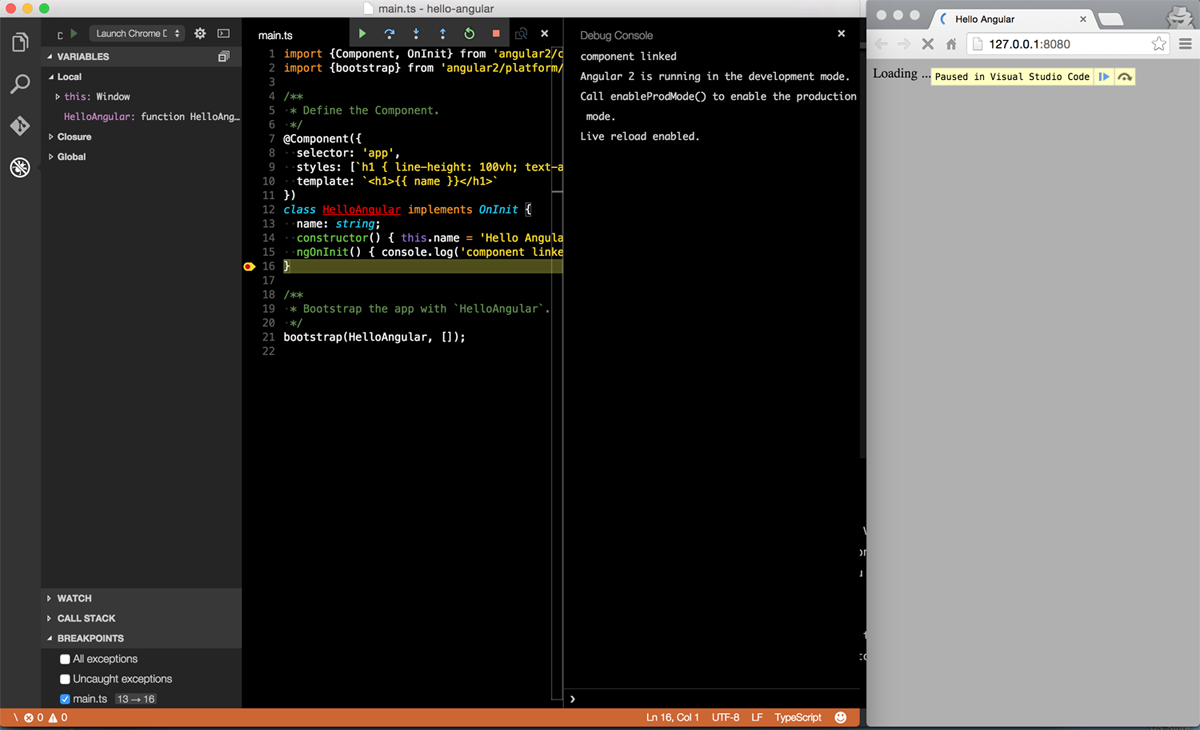
In order to run the debugger, select Launch Chrome Debugger in the dropdown under the debugger tab and either click on the play icon or hit F5 on the keyboard. After that, an instance of Chrome should be opened in incognito mode. In order to trigger the debugger just refresh the page and you should be able to see the debugger pausing in VSCode. If everything is set up correctly you should be able to see something like the following screenshot:
Component Inputs
- You can pass data to a component.
- You can either use the
inputsarray on a component or annotate an instance variable with theInputdecorator - Once you specify the inputs to your component, they become available in the
ngOnInitmethod - You can implement the
ngOnInitand access the input instance variables - You can use the
[propname]="data"to set thepropnameto whateverdataevaluates to - Note that if you set
[propname]="'data'",propnamewill be set to the literaldatastring
Project files
The project files for this section are in angular2-intro/project-files/angular-examples/component-input.
Getting Started
In order to demonstrate component inputs, we are going to create a user component and pass name, lastName, and userId to it. So our final html tag would look something like the following:
1 <user name="Tom" lastName="Johnson" uesrId="1"></user>
And the template for the component will be:
1 <h1>Hello, {{ name }} {{ lastName }}, id: {{ userId }}</h1>
which would output: Hello, Tom Johnson id: 1.
To get started, let’s define the User component:
1 @Component({
2   selector: 'user',
3   template: '<h1>Hello, {{ name }} {{ lastName }} id: {{ userId }}</h1>',
4   inputs: ['name', 'lastName', 'userId'] // <- specifying the inputs to the `Use\
5 r` component
6 })
7 class User {}
- On line 4 we are defining the inputs as an array of strings
Then, we are going to use the User component inside our app’s template:
1 @Component({
2   selector: 'app',
3   template: `<user name="Tom" lastName="Johnson" uesrId="1"></user>`
4 })
5 class Root {}
because we are using the User component in the app, we need to register it with the app by adding User class to the list of directives of the app component:
1 @Component({
2   selector: 'app',
3   template: `<user name="Tom" lastName="Johnson" userId="1"></user>`,
4   directives: [User] // <- register the component
5 })
6 class Root {}
and at the end we need to bootstrap the app:
1 bootstrap(Root, [])
Now, notice that instead of adding the inputs to the inputs array, we could have decorated the instance variables with the @Input decorator:
 1 import {Input} from 'angular2/core'; // <- importing the Input decorator
 2 @Component({
 3   selector: 'user',
 4   template: '<h1>Hello, {{ name }} {{ lastName }} id: {{ userId }}</h1>'
 5   // <- removing the inputs array.
 6 })
 7 class User {
 8   @Input() private name: string;
 9   @Input() private lastName: string;
10   @Input() private userId: number;
11 }
Binding Data to Properties
Now, let’s see how we can bind to a property from another component. For this example, we are going to continue with our User component and create a new component called Permission. Then we are going to use the the Permission component inside the User component and set the uid of Permission by the userId of the User.
The Permission component is defined as follows:
 1 @Component({
 2   selector: 'permission',
 3   template: '<h2> Restriction is: {{ restriction }}'
 4 })
 5 class Permission {
 6   @Input() private uid: string;
 7   private restriction: string;
 8   constructor() {
 9     this.restriction = 'none';
10   }
11   ngOnInit() {
12     this.restriction = this.uid === '1' ? 'admin' : 'normal';
13   }
14 }
- On line 6 we are defining
uidto be an input instance variable. It’s value is set from outside. - In the constructor we are setting a default value for the restriction.
- Then in the
ngOnInithook, we are evaluating the value ofrestrictionbased on the given id provided by other components, in this case theUsercomponent - In this silly example, if the passed id is
1, we will set therestrictiontoadmin, otherwise we set it tonormal.
then we are going to register the Permission component with the User component so that we can use it in the User template:
1 @Component({
2   selector: 'user',
3   ///...
4   directives: [Permission] // <-
5 })
6 class User {}
then we can update the User template to include the Permission:
 1 @Component({
 2   selector: 'user',
 3   template: `
 4   <h1>Hello, {{ name }} {{ lastName }}, id: {{ userId}}</h1>
 5   <div>
 6     <permission [uid]="userId"></permission>
 7   </div>
 8   `,
 9   inputs: ['name', 'lastName', 'userId'],
10   directives: [Permission]
11 })
12 class User {}
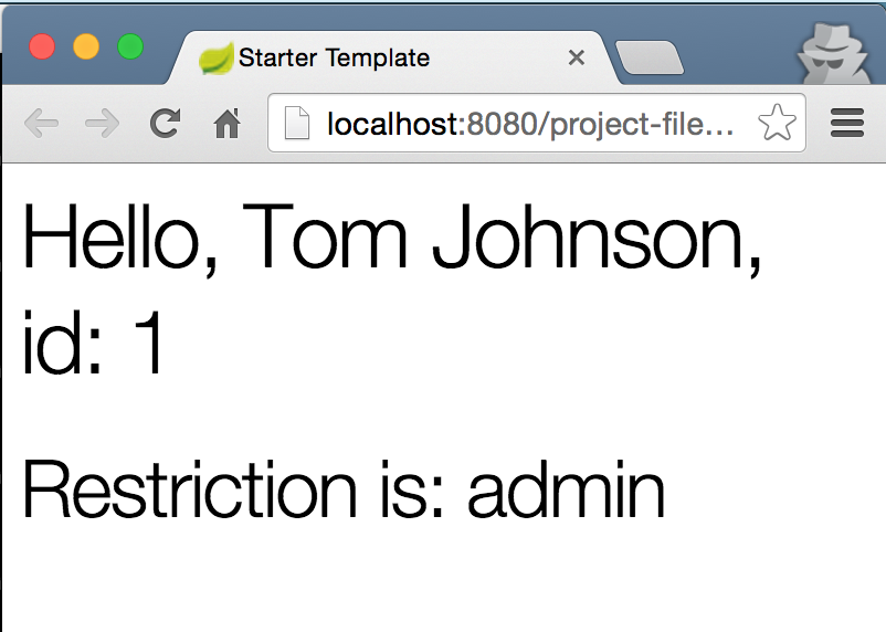
- Note that on line 6 we are setting the
uidofPermissionbyuserIdavailable from theUsercomponent.
If you run the app you should see the following printed to the page:
Binding to DOM Properties
In addition to custom properties, you can bind to DOM properties. Below are some examples:
Binding to style
We can bind to the style property of DOM nodes. In the example below, if the value of isDone is true, we set the style.textDecoration to line-through, otherwise we won’t set it to anything
1 <div [style.textDecoration]="isDone ? 'line-through' : ''"> Todo Item </div>
Binding to class
In addition to the style property, we can also bind to the class property. In the example below, we are setting the class name to “collapsed” if the isCollapsed value is true and expanded if the the value is false:
1 <div [className]="isCollapsed ? 'collapsed' : 'expanded'">Element</div>
Binding to ‘hidden’
You can bind to the hidden property of a DOM node and show or hide the element. In the example below, we are hiding the element if the isVisible value is true:
1 <div [hidden]="isVisible">To Hide element</div>
Binding to textContent
We can bind to the textContent property and set the text content of a node. In the example below, we are setting the text content by reading the value of an input:
1 <div [textContent]="textValue"></div>
2 <input type="text" #contentInput>
3 <button (click)="setTextContent()">Set Text Content</button>
Component Output/Events
- Events can be emitted from components. These events can be either custom or they could be DOM events
- The syntax is
(eventname)="fn()"whereeventnameis the name of the event andfnis the handler function - The handler function is called when the event is fired
- For example, if you want to handle a click event you can do:
(click)="handler()". In this case thehanderis called whenever the click event is fired off - You can use Angular’s
EventEmitterto fire off custom events
Custom Output Events
Project Files
The project files for this section are in angular2-intro/project-files/angular-examples/component-output-events.
Final Result
The goal of this section is to show you how to create a component that contains a button that when is clicked, calls a handler defined by the component’s class. The final html will look like the following:
1 <p>Value: {{ value }}</p>
2 <button (click)=addOne()>Add +</button>
That idea is very simple: every time we click on the button we want to increment the value by one. In addition to that, we want to be able to hook into a custom event and run the addOne method whenever the event is fired:
1 <p>Value: {{ value }}</p>
2 <span adder-auto (myevent)=addOne()>adding ...</span>
Getting Started
Let’s get started by defining our Adder component:
 1 @Component({
 2   selector: 'adder',
 3   template:`
 4   <p>Value: {{ value }}</p>
 5   <button (click)=addOne()>Add +</button>
 6   `
 7 })
 8 class Adder {
 9   private value: number;
10   constructor() {
11     this.value = 0;
12   }
13   addOne() {
14   this.value += 1;
15   console.log(this.value);
16   }
17 }
Now, we are just going to register Adder with our root component:
1 @Component({
2   selector: 'app',
3   directives: [Adder],
4   template: '<adder></adder>'
5 })
6 class App {}
after you bootstrap the app and run it you should be able to see a button that when clicked increments the value by one.
Using EventEmitter
Now, let’s see how we can use the EventEmitter to increment the value by one every time a custom event is fired every second. In order to achieve that, we are going to create an attribute directive called AdderAuto. Start by importing the Directive metadata class:
1 import {Directive} from 'angular2/core';
and then define the selector for the directive:
1 @Directive({
2   selector: '[adder-auto]'
3 })
-
selector: '[adder-auto]'means that angular will target any element that has theadder-autoattribute and will create an instance of the class. Now we need to define the class for our directive:
1 class AdderAuto {
2   // custom event definition
3 }
In this class we need to define a custom event output hook. We are going to call it myevent. The same way that you can hook into (click), we want to be able to use (myevent). To achieve that, we need to create an instance variable and decorate it with the Output decorator:
1 // -> importing `EventEmitter` and `Output` decorator.
2 import {EventEmitter, Output} from 'angular2/core';
3 class AdderAuto {
4   @Output() myevent: EventEmitter<string>;
5   constructor() {
6     this.myevent = new EventEmitter();
7   }
8 }
- If you notice,
myeventis of typeEventEmitterthat emit events of type string - In the constructor we are creating an instance of
EventEmitter. So now we can usemyeventto emit events - We can use
setIntervalto emit event from our custom event every second
1 class AdderAuto {
2   @Output() myevent: EventEmitter<string>;
3   constructor() {
4     this.myevent = new EventEmitter();
5     setInterval(()=> {this.myevent.emit('myevename')}, 1000);
6   }
7 }
Now we can register AdderAuto with the Adder component and run the addOne method every second:
1 @Component({
2   selector: 'adder',
3   ...
4   directives: [AdderAuto] // <- register `AdderAuto`
5 })
and then we can update the template:
1 <p>Value: {{ value }}</p>
2 <button (click)="addOne()">Add +</button>
3 <!-- using the event. -->
4 <h2>Using Emitter</h2>
5 <span adder-auto (myevent)="addOne($event)"> EVENT: </span>
- first we are adding the attribute directive
adder-autoon the span - second, we are using the
myeventhook and attachingaddOnehandler to it. This means that whenever themyeventevent is triggered, run theaddOnehandler.
The Adder component now looks like the following with the updated template:
 1 @Component({
 2   selector: 'adder',
 3   template:`
 4   <p>Value: {{ value }}</p>
 5   <button (click)="addOne()">Add +</button>
 6   <h2>Using Emitter</h2>
 7   <span adder-auto (myevent)="addOne($event)"> EVENT: </span>
 8   `,
 9   directives: [AdderAuto]
10 })
Now if you run the code, you should be able to see the number incrementing by one every second.
Binding to DOM Events
In addition to custom output events, we can bind to almost all of the native DOM events. Below you can find some common events with examples:
Inputs
-
keyup
1<inputtype="text"#inputField2(keyup)="setInputFieldValue2(inputField2.value\2)">3<pre>{{ keyupValue }}</pre> -
input
1<inputtype="text"#inputField(input)="setInputFieldValue(inputField.value)">2<pre>{{ inputValue }}</pre>
Mouse
-
click
1<button(click)="sayHello()">Say Hello!</button>2<pre>{{ hello }}</pre> -
dblclick
1<button(dblclick)="sayDoubleHello()">Say Hello!</button>2<pre>{{ doubleHello }}</pre> -
mousedown
1<button(mousedown)="sayDownHello()">Say Hello !</button>2<pre>{{ downHello }}</pre> -
mouseup
1<button(mouseup)="sayUpHello()">Say Hello !</button>2<pre>{{ upHello }}</pre> -
mouseenter
1<h2(mouseenter)="sayEnterHello()"(mouseleave)="clearEnterHello()">Mouseenter\2/leave</h2>3<pre>{{ enterHello }}</pre> -
mouseleave
1<h2(mouseenter)="sayEnterHello()"(mouseleave)="clearEnterHello()">Mouseenter\2/leave</h2>3<pre>{{ enterHello }}</pre>
Event Delegation/Bubbling
When an event is raised by an element, by default it bubbles up the html hierarchy. For example, if you have a table and attached a click handler to the table itself, you can catch the row that was clicked by only attaching a single handler. This method is useful when you are dealing with situations where you don’t want to attach event handlers to every elements, and you just want to attach one. Below is an example of event delegation, detecting the row that was clicked on the table:
 1 <pre>{{rowClicked}}</pre>
 2
 3 <table (click)="catchBubbledEvent($event)">
 4   <tr>
 5     <td>1</td>
 6   </tr>
 7   <tr>
 8     <td>2</td>
 9   </tr>
10   <tr>
11     <td>3</td>
12   </tr>
13   <tr>
14     <td>4</td>
15   </tr>
16 </table>
Notice how we have a single click handler only on the table itself. The $event is the bubbled event that we can catch to do interesting stuff with. In this case we are just reading the textContent from the target: event.target.textContent:
1 catchBubbledEvent(event) {
2   this.rowClicked = event.target.nodeName === 'TD' ? event.target.textContent : \
3 '';
4 }
In the method above we are checking if a td was clicked on. If so, we set the this.rowClicked to the td’s value, otherwise we set it to an empty string.
ViewChildren
- The children elements located inside of its template of a component are called
- Metadata classes:
@ViewChildren,@ViewChild
TODO
ContentChildren
- Elements used between the opening and closing tags of the host element of a given component
- Metadata classes:
@ContentChildren,@ContentChild
TODO
ViewProviders
TODO
Providers
TODO
Directives
- Directives and components hand-in-hand are the fundamental building blocks of any Angular app
- Directives are components without templates. Conversely, components are directives without templates
- Directives allow you to attach behavior to elements in the DOM
- A directive is defined using the
@directivedecorator - There are three types of directives in Angular:
- Structural
- Attribute
- Components
- Evey directive metadata, has the following options:
- selector
- host
- …
- The
selectorattribute uses a css selector to find the element. However, parent-child relationship selectors are not supported - You can use the following possible selectors:
element[attribute].classname:not().some-class:not(div)
- The
hostoption defines:- Property bindings
- Event handlers
- attributes
TODO(other decorator options)
Web Components Basics
Web Components are made up four specifications:
- Custom Elements: enabling custom html tags
- Shadow DOM: enabling isolation for custom elements
- HTML Templates: enabling to define html template fragments
- HTML Imports: enabling html fragment imports
Custom Elements
TODO
Shadow DOM
- Enables a node to express three subtrees:
- Light DOM: visible DOM notes inside the custom element tag/DOM supplied by the consumer
- Shadow DOM: private to the element and hidden from others and attached to the element’s shadow root
- Composed DOM: Rendered by the browser by distributing the light DOM into the Shadow DOM
- Logical DOM = Light DOM + Shadow DOM. The developer interacts with this layer
TODO
HTML Templates
TODO
HTML Imports
TODO
host
TODO
selector
TODO
Attribute Directives
- The Attribute directive changes the appearance or behavior of an element.
- Angular has several built-in attribute directives, namely
NgClassandNgStyle - It is a good idea to prefix your directives with a prefix. You cannot use the
ngprefix since it’s already used by Angular. - When you apply the attribute directive to an element, the element will be knownn as the host.
- For example, if you had a directive called
my-directiveand applied it in<div class="hello"> <span my-directive> ... </span> </div>, thespanwould be the host.
TODO (writing a custom attribute directive)
 1 @Directive({
 2   selector: '[simple-directive]',
 3   host: {
 4     '(mouseleave)': 'onMouseLeave()',
 5     '(click)': 'onClick()',
 6     '[hidden]': 'isHidden',
 7     '[class.done]': 'isDone',
 8     'role': 'button'
 9   }
10 })
11 class SimpleDirective implements OnInit {
12   @Input() private color: string
13   @Output() myevent: EventEmitter<string>;
14   private isHidden: boolean = false;
15   private isDone: boolean = false;
16   private defaultColor:string = 'magenta';
17   private elm: any;
18
19   constructor(private elmRef: ElementRef, private renderer: Renderer) {
20     this.elm = elmRef.nativeElement;
21     this.myevent = new EventEmitter();
22     setInterval(() => {this.myevent.emit('myevename')}, 1000);
23   }
24   ngOnInit() {
25     this.defaultColor = this.color || this.defaultColor;
26     this.setColor(this.color || this.defaultColor);
27   }
28   private setColor(color: string) {
29     this.renderer.setElementStyle(this.elm, 'color', color);
30   }
31   set setIsHidden(state) { this.isHidden = state; }
32   set setIsDone(state) { this.isDone = state; }
33
34   onMouseLeave() { this.setColor(this.defaultColor); }
35   onClick() { this.setColor('orange') }
36 }
selector TODO: details
host TODO: details
Input TODO: details
Output TODO: details
ElementRef TODO: details**
Renderer TODO: details**
Structural Directives
- The Structural directive changes the DOM layout by adding and removing DOM elements
- Angular has several built-in structural directives, namely
NgIf,NgSwitch, andNgFor - When working with structural directives, we should ask ourselves to think carefully about the consequences of adding and removing elements and of creating and destroying components
- Angular uses the html5
<template>tag to add or remove DOM elements - By default, Angular replaces
<template>with<script>tag if no behavior is attached - The
*before a directive name is a shorthand for including the directive content in the<template>tag - Below you can see the built-in
NgIfdirective with and without the asterisks*:
With *
1 <p *ngIf="condition"></p>
Without *
1 <template [ngIf]="condition">
2   <p></p>
3 </template>
Notice how the <p> tag is wrapped with a <template> and the condition is bound to the [ngIf] property of the directive
TODO (writing a custom structural directive)
 1 @Directive({
 2   selector: '[myUnless]'
 3 })
 4 class UnlessDirective {
 5
 6   constructor(
 7     private tRef: TemplateRef,
 8     private vContainer: ViewContainerRef
 9   ) { }
10
11   @Input() set myUnless(condition: boolean) {
12     if (!condition) {
13       this.vContainer.createEmbeddedView(this.tRef);
14     } else {
15       this.vContainer.clear();
16     }
17   }
18 }
TemplateRef: TODO: details
ViewContainerRef: TODO: details
@Input() set myUnless(condition: boolean) {}: TODO: details
Built-in Directives
Angular has a couple of useful built-in directives.
TODO(Note on directive names, docs and template usage)
NgClass
-
import {NgClass} from 'angular2/common';,directives: [NgClass] - Template Usage:
<div class="button" [ngClass]="{active: isActive, disabled: !isActive}"
Note that we are using ngClass in the template, but not NgClass
NgIf
Usage
1 <div *ngIf="isDone">{{ list }}</div>
or in long-hand form:
1 <template>
2   <div [ngIf]="isDone">{{ list }}</div>
3 </template>
Details
From the docs: “The ngIf directive does not hide the element. Using browser developer tools we can see that, when the condition is true, the top paragraph is in the DOM and the bottom disused paragraph is completely absent from the DOM! In its place are empty <script> tags. We could hide the unwanted paragraph by setting its css display style to none. The element would remain in the DOM while invisible. Instead we removed it with ngIf.
The difference matters. When we hide an element, the component’s behavior continues. It remains attached to its DOM element. It continues to listen to events. Angular keeps checking for changes that could affect data bindings. Whatever the component was doing it keeps doing.
Although invisible, the component — and all of its descendant components — tie up resources that might be more useful elsewhere. The performance and memory burden can be substantial and the user may not benefit at all.
On the positive side, showing the element again is very quick. The component’s previous state is preserved and ready to display. The component doesn’t re-initialize — an operation that could be expensive.
ngIf is different. Setting ngIf to false does affect the component’s resource consumption. Angular removes the element from DOM, stops change detection for the associated component, detaches it from DOM events (the attachments that it made) and destroys the component. The component can be garbage-collected (we hope) and free up memory.
Components often have child components which themselves have children. All of them are destroyed when ngIf destroys the common ancestor. This cleanup effort is usually a good thing.
Of course it isn’t always a good thing. It might be a bad thing if we need that particular component again soon.
The component’s state might be expensive to re-construct. When ngIf becomes true again, Angular recreates the component and its subtree. Angular runs every component’s initialization logic again. That could be expensive … as when a component re-fetches data that had been in memory just moments ago.”
NgSwitch
Usage
1 <div [ngSwitch]="status">
2   <template [ngSwitchWhen]="'inProgress'">In Progress</template>
3   <template [ngSwitchWhen]="'isDone'">Finished</template>
4   <template ngSwitchDefault>Unknown</template>
5 </div>
TODO
NgFor
Usage
1 <ul>
2    <li *ngFor="#item of items">{{ item }}</li>
3 </ul>
or in long-hand form:
1 <ul>
2   <template ngFor #item [ngForOf]="items">
3     <li>{{ item }}</li>
4   </template>
5 </ul>
TODO(Details)
Accessing Directives from Parents
TODO (access directives on parent elements)
Accessing Directives from Children
TODO (access directives on children and descendants)
Change Detection
- In Angular2 you can limit the change detection scope to components
- Using
chageDectionproperty we can choose a change detection strategy for a component - The
changeDetectionfield accept one of the following values:-
ChangeDetectionStrategy.Default: sets detector mode toCheckAlways -
ChangeDetectionStrategy.OnPush: sets detector mode toCheckOnce. This will limit change detection to the bindings affecting the component only -
ChangeDetectionStrategy.Detached: change detector sub tree is not a part of the main tree and should be skipped -
ChangeDetectionStrategy.CheckAlways: after calling detectChanges the mode of the change detector will remainCheckAlways -
ChangeDetectionStrategy.Checked: change detector should be skipped until its mode changes toCheckOnce -
ChangeDetectionStrategy.CheckOnce: after calling detectChanges the mode of the change detector will becomeChecked
-
- Having the ability to specify change detection strategy can reduce the number of checks and improve app’s performance
Pipes
- Pipes allow you to transform values in templates before they are outputed to the view.
- Pipes were formerly known as filters in Angular 1.x
- A pipe is defined using the
@pipeclass decorator - The pipe decorator takes name as a parameter defining the name of the pipe:
@pipe({ name: 'myPipe' }) - Every pipe class has a
transformmethod that transforms input to outputs:- The first parameter is the input to the pipe
- The second parameter is the list of arguments passed to the pipe
- Give the following pipe in a template:
{{ data | somePipe:1:'px'}}:-
datais the input to pipe – the first parameter of the transform method -
[1, 'px']is the arguments to the pipe – the second parameter of the transform method
-
- A pipe can be as simple as:
1@pipe({name: 'simplePipe'})2class MyPipe {3transform(input, args) { return input + 'px'; }4} - If you want to use a pipe, you need to register your pipe class with the components in the pipes array:
1@component({2selector: '...',3pipes: [MyPipe] // adding pipe to the array of pipes.4})5class MyComponent {} - Pipes can be chained:
input | pipe1 | pipe2 | pipe3input | pipe1 : output1output1 | pipe2: output2output2 | pipe3 : finalOutput
Basic Pipe
Let’s make a basic pipe called pixel that takes a value as the input and appends ‘px’ to the end of it. The project files for this section are in angular2-intro/project-files/angular-examples/pipes/basic-pipe.
Start by making a copy of the “starter” folder and call it “basic-pipe” and put it in project-files/angular-examples. Then, open the folder in VSCode: code project-files/angular-examples/basic-pipe and start the build with command + shift + b.
Then, create a file for the pipe and call it pixel.pipe.ts in the root of the project.
After that we need to do couple of things to define the pipe:
- Import the Pipe Class Metadata from angular core:
import {Pipe} from 'Angular/core' - Then create a class defining the Pipe:
1classPixelPipe{23} - Implement the
transformmethod in the class:1classPixelPipe{2transform(input) {3returninput+'px';4}5} - After implementing the method, we need to decorate the class and give the pipe a name that we want to use in our templates:
1@Pipe({name:'pixel'})//<-adding the decorator2class PixelPipe{3transform(input){4returninput+'px';5}6} - As the last step we are going to export the class by putting the
exportkeyword behind the class:1...2export class PixelPipe {3...4}
Now, your file should look like the following:
1 import {Pipe} from 'angular2/core';
2 @Pipe({name: 'pixel'}) // <- adding the decorator
3 export class PixelPipe {
4   transform(input) {
5     return input + 'px';
6   }
7 }
Now, let’s go back to the main.ts file and import our pipe:
1 import {Component} from 'angular2/core';
2 import {bootstrap} from 'angular2/platform/browser';
3 import {PixelPipe} from './pixel.pipe'; // <- importing pipe
After importing our pipe, we should register it with our component by adding it to the pipes array:
1 @Component({
2   selector: 'app',
3   templateUrl : 'templates/app.tpl.html',
4   pipes: [PixelPipe] // <- registering the pipe
5 })
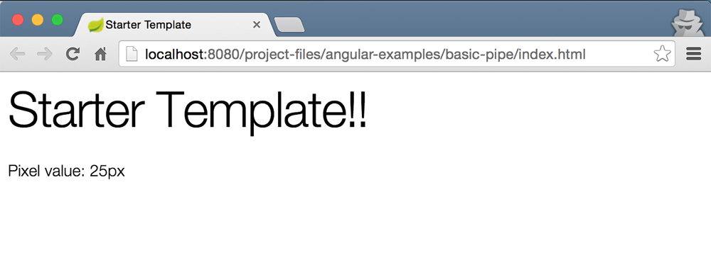
Now that we have registered the pipe, we can use it in our template in templates/app.tpl.html:
1 <h1>{{ name }}</h1>
2 <p>Pixel value: {{ 25 | pixel }}</p>
You should be all set now. You can set the url in your launch.json file and hit F5:
1 ...
2 "url": "http://localhost:8080/project-files/angular-examples/basic-pipe/index.ht\
3 ml",
4 ...
If your server is running you should be able to see the following output:
Chaining Pipes
Let’s continue where we left off with the “pixelPipe” and add another pipe called “round” that rounds down given values, that is:
1 25.3 | round | pixel -> 25px
The project files for this section are in angular2-intro/project-files/angular-examples/pipes/pipe-chaining.
We are going to add the “roundPipe” to our “basic-pipe” project. Let’s get started by adding the round.pipe.ts file in the root of the project:
1 import {Pipe} from 'angular2/core';
2 @Pipe({name: 'round'})
3 export class RoundPipe {
4   transform (input) {
5     return Math.floor(+input); // <- convert input to number and then floor it.
6   }
7 }
This Pipe is not complicated at all. We are just returning the floor of the input. We are also converting the input to number by putting a + before input.
Now, let’s import the pipe into our main.ts file:
1 import {Component} from 'angular2/core';
2 import {bootstrap} from 'angular2/platform/browser';
3 import {PixelPipe} from './pixel.pipe';
4 import {RoundPipe} from './round.pipe'; // <- importing `RoundPipe`
and then we have to add the pipe to the list of pipe array:
1 @Component({
2   selector: 'app',
3   templateUrl : 'templates/app.tpl.html',
4   pipes: [PixelPipe, RoundPipe] // <- registering the pipe
5 })
after that we are going to add the following to our templates/app.tpl.html file:
1 <p>Pixel value: {{ 34.4 | round | pixel }}</p>
After running the app you should see 34.px as the output on the page.
Pipes with Parameters
In this section we are going to extend our ‘pixel’ pipe to accept an optional parameter to set the unit. As a result, we are going to rename the ‘pixel’ pipe to ‘unit’ to make it more generic. This pipe will take the unit as an optional argument. If no argument is passed, it will default to ‘px’. That is:
1 25 | unit -> 25px
2 25 | unit:'em' -> 25em
3 34.5 | round | unit:'%' -> 34%
You can look at the project files in angular2-intro/project-files/angular-examples/pipes/pipe-unit.. AFter refactoring the name of the Pipe, we just need to change the implementation of the “UnitPipe”:
unit.pipe.ts
1 import {Pipe} from 'angular2/core';
2 @Pipe({name: 'unit'})
3 export class UnitPipe {
4   transform(input, args:string) {
5     const unit = args[0] || 'px';
6     return input + unit;
7   }
8 }
- On line 5, we are grabbing the first parameter that is passed in and setting it to the
unitvariable. And if the value is not set, we are setting ‘px’ as the default value. - And finally we are returning
input + unit.
That’s basically all we have to do. Note that you can pass multiple parameters separated by : and they all become available in the args array. So if you wanted to expand this pipe, this is how your template would look like:
1 {{ 25 | unit:'em':2}}
And the args array would be: ['em', 2].
Async Pipes
Async Pipes can be used for values that will be resolved after some asynchronous operation like getting a value after making a http call.
TODO
Built-in Pipes
In this section we are going to look at the pipes that Angular provides out of the box.
- AsyncPipe: used to work with asynchronous values
- CurrencyPipe: used to format a number as a local currency
- DatePipe: used to format a date object to a readable string
- DecimalPipe: used to format numbers
-
JsonPipe: calls
JSON.stringifyon the input and useful for debugging - LowerCasePipe: used to convert a string to lowercase letters
- PercentPipe: used to format a number as percentage
- SlicePipe: used to create a subset of list or string
- UpperCasePipe: used to transform a text to upper case
Date
1 {{ input | date:optionalFormat}}
-
input: a date object or a number (milliseconds since UTC epoch) -
optionalFormat: a string used to format the output. It specifies which components of date and time to include in the output
Using predefined formats
Usage Example: {{ input | date:'short'}}
+————–+—————————+
| Name | Example |
+==============+===========================+
| short | 9/3/2010, 12:05 PM |
+————–+—————————+
| shortDate | 9/3/2010 |
+————–+—————————+
| medium | Sep 3, 2010, 12:05:08 PM |
+————–+—————————+
| mediumDate | Sep 3, 2010 |
+————–+—————————+
| longDate | September 3, 2010 |
+————–+—————————+
| fullDate | Friday, September 3, 2010 |
+————–+—————————+
| shortTime | 12:05 PM |
+————–+—————————+
| mediumTime | 12:05:08 PM |
+————–+—————————+
Using Custom Formats
- Generally speaking every date object has a year, month, day, hour, minute, and second.
- Using a custom string, you can specify which component you would like to include in the output.
+——+—————–+—–+————-+————+——–+——–+ | Year | Month | Day | Weekday | Hour | Minute | Second | +======+=================+=====+=============+============+========+========+ | y | M, MMM, MMMM | d | EEE, EEEE | j, h, H | m | s | +——+—————–+—–+————-+————+——–+——–+ | 2016 | 1, Jan, January | 1 | Sun, Sunday | 1, 1 AM, 1 | 1 | 1 | +——+—————–+—–+————-+————+——–+——–+
Note that every single letter identifier can be used twice to denote a double digit numeric value. For example, yy will result in 15 for the year value. Below is a table just to be thorough:
Double Digit
+——+——-+—–+—————-+——–+——–+ | Year | Month | Day | Hour | Minute | Second | +======+=======+=====+================+========+========+ | yy | MM | dd | jj, hh, HH | mm | ss | +——+——-+—–+—————-+——–+——–+ | 16 | 01 | 01 | 01, 01 AM, 01 | 01 | 01 | +——+——-+—–+—————-+——–+——–+
Details for Month/Weekday/Hour are summarized in the tables below:
Month Details
+——-+———–+———–+ | M | MMM | MMMM | +=======+===========+===========+ | Digit | Abbr Name | Full Name | +——-+———–+———–+ | 1 | Jan | January | +——-+———–+———–+
Weekday Details
+———–+———–+ | EEE | EEEE | +===========+===========+ | Abbr Name | Full Name | +———–+———–+ | Sun | Sunday | +———–+———–+
Hour Details
+——-+————–+———-+ | j | h | H | +=======+==============+==========+ | Digit | Hour12 AM/PM | Military | +——-+————–+———-+ | 13 | 1 PM | 13 | +——-+————–+———-+
Slice
- The slice pipe is useful when you want a subset of a list or string. One of the common use cases are in when iterating over a list with
ngForfor example.
TODO
Decimal
- Used for formatting numbers given a decimal formatter
TODO
Percent
TODO
Currency
TODO
Async
TODO
Json
TODO
LowerCase
TODO
UpperCase
TODO
Dependency Injection
Dependency Injection is a coding pattern in which a class receives its dependencies from external sources rather than creating them itself. In order to achieve Dependency Injection we need a Dependency InjectionFramework to handle the dependencies for us. Using a DI framework, you simply ask for a class from the injector instead of worrying about the dependencies inside the class itself.
Angular has a standalone module that handles Dependency Injection. This framework can also be used in non-Angular applications to handle Dependency Injection.
TODO
Services and Providers
- A service is nothing more than a class in Angular 2. It remains nothing more than a class until we register it with the Angular injector.
- When you bootstrap your app, Angular creates an injector on the fly that can inject services and other dependencies throughout the app.
- You can register the service or the dependencies during when bootstrapping the app or when defining a component.
- If you have a class called
MyService, you can register it with the Injector and then you can inject it everywhere:1bootstrap(App, [MyService]); // second param is an array of providers - Providers is a way to specify what services are available inside the component in a hierarchical fashion.
- A provider can be a class, a value or a factory.
- Providers create the instances of the things that we ask the injector to inject.
-
[SomeService];is short for[provide(SomeService, {useClass:SomeService})];where the first param is the token, and the second is the definition object. - A simple object can be passed to the Injector to create a Value Provider:
1beforeEachProviders(()=>{2letsomeService={getData:()=>[]};3//using`useValue`insteadof`useClass`4return[provide(SomeSvc,{useValue:someService})];5}); - You can also use a factory as a provider.
- You can use a factory function that creates a properly configured Service:
1let myServiceFactory = (dx: DepX, dy: DepY) => {2return new MyService(dx, dy.value);3}45// provider definition object.6let myServiceDefinition = {7useFactory: myServiceFactory,8deps: [DepX, DepY]9};1011// create provider and bootstrap12let myServiceProvider = provide(MyService, myServiceDefinition);13bootstrap(AppComponent, [myServiceProvider, DepX, DepY]); - Defining object dependencies is simple. You can make a plain JavaScript object available for injection using a string-based token and the
@Injectdecorator:1varmyObj={};23bootstrap(AppComponent,[4provide('coolObjToken',{useValue:myObj})5]);67//andyoucaninjectittoacomponent89import{Inject}from'angular2/core'10constructor(dx:DepX,@Inject('coolObjToken')config)
Simple Service
In this section we are going to make a simple service and use it in our root component.
Project Files
The project files for this section are in angular2-intro/project-files/angular-examples/services/simple-service;
Getting Started
Let’s get started by creating a class, called StudentSvc that represents our service:
 1 class StudentSvc {
 2   private students: any[];
 3   constructor() {
 4     this.students = [
 5       {name: 'Tom', id: 1},
 6       {name: 'John', id: 2},
 7       {name: 'Kim', id: 3},
 8       {name: 'Liz', id: 4}
 9     ];
10   }
11   getAll() {
12     return this.students;
13   }
14 }
There is nothing special about this class. It’s just a class the has a method to return the list of all students. Now, we are going to make it special by decorating it with the Injectable decorator. But, first we need to import Injectable from Angular:
1 import {Injectable} from 'angular2/core';
After importing the Injectable metadata class, we can decorate our class:
 1 /**
 2  * Student service
 3  */
 4 @Injectable() // <- decorating with `Injectable`
 5 class StudentSvc {
 6   private students: any[];
 7   constructor() {
 8    // ...
 9   }
10   // ...
11 }
Now we have an injectable class and the injector would know how to create an instance of it when we need to inject it. And that’s what we are going to do next. We are going to add StudentSvc in the list of viewProviders of the root component:
1 @Component({
2   selector: 'app',
3   templateUrl : 'templates/app.tpl.html',
4   viewProviders: [StudentSvc] // <- registering the service
5 })
The last thing we need to do is to inject the service in the constructor of our root component:
1 class Root  {
2   private name: string;
3   private students: any[];
4   constructor (studentSvc: StudentSvc) { // <- injecting the service
5     this.name = 'Simple Service Demo';
6     this.students = studentSvc.getAll(); // <- calling the `getAll` method
7   }
8 }
- In the constructor, we are defining a variable to be of type
StudentSvc. By doing that the injector will create an instance from theStudentSvcto be used - And on line 6 we are calling the
getAllmethod from the service to get a list of all students.
Finally, we can verify that the getAll method is actually called by printing the students in the template:
app.tpl.html
1 <h1>{{ name }}</h1>
2
3 <ul>
4   <li *ngFor="#student of students">Name: {{ student.name }}, id: {{ student.id \
5 }}</li>
6 </ul>
and it would output:
1 Name: Tom, id: 1
2 Name: John, id: 2
3 Name: Kim, id: 3
4 Name: Liz, id: 4
Data and State Management
- Angular is flexible and doesn’t prescribe a recipe for managing data in your apps
- Since observables are integrated into Angular, you can take advantage of observables to manage data and state
- You ca use services to manage streams that emit models
- Components can subscribe to the streams maintained by services and render accordingly.
- For example, you can have a service for a Todo app that contains a stream of todos and a
ListComponentcan listen for todos and render when a new task is added. - You may have another component that listens for the user that has been assigned to a task provided by a service.
- For example, you can have a service for a Todo app that contains a stream of todos and a
- The steps for creating different parts of an app can be summarized in three steps:
- Defining a Model using a class
- Defining the service
- Defining the component
Observables
- Observables can help manage async data
- Observables are similar to Promises but with a lot of differences
- Observables emit multiple values over time as opposed to one
- Angular embraces observables using the RxJS library.
- Observables emit events and observers observe observables.
- An observer subscribes to events emitted from an observable.
- RxJS has an object called subject that can be used both as an observer or an observable. Subject can be imported from
RxJSvery easily:1import{Subject}from'rxjs/Subject'; - A subscription can be canceled by calling the
unsubscribemethod.
TODO
State Management with Observables
- There are several ways to manage state, one of them is using observables
- Observables can be used to represent the state of the app
- Changes in the state are represented as an observable
TODO
Http
- Using the
Httpclass, you can interact with API endpoints - Http is available as an injectable class
-
Httphas a request method that returns an Observable which will emit a single Response when a response is received. - You can inject
httpin the constructor of a class:constructor(http: Http) {...}
Getting Data from Server
In this section we are going to use the http class to get a list of students from a server by hitting /api/students
Project Files
The project files for this section are in angular2-intro/project-files/angular-examples/http/get-students
Getting Started
Before anything, let’s add the http.js file from Angular’s bundle. In your index.html file add the following to the head tag:
1 <script src="/node_modules/angular2/bundles/http.js"></script>
After that, we are going to make a service that handles getting data from the endpoint. We are going to call this StudentSvc:
1 @Injectable()
2 class StudentSvc {
3   constructor(private http: Http) {} /* Inject Http */
4   getStudents(): Observable<Response> {
5     return this.http.get('/api/students');
6   }
7 }
- On line 1, we are using the
Injectabledecorator to make our class injectable - In the constructor we are injecting the
Httpservice and making a reference to it in a private variablehttp - The
getStudentsmethod makes aGETcall to our local endpoint an returns anObservable
Now that we have the StudentSvc service, we can create a component and inject the StudentSvc to it:
1 @Component({
2   selector: 'app',
3   templateUrl :'templates/app.tpl.html',
4   providers: [StudentSvc] // <- adding to the list of providers
5 })
In addition to the StudentSvc, we also need to add HTTP_PROVIDERS in the providers array:
1 @Component({
2   selector: 'app',
3   templateUrl :'templates/app.tpl.html',
4   providers: [HTTP_PROVIDERS, StudentSvc] // <- adding `HTTP_PROVIDERS`
5 })
After adding the providers, we can define the component class:
1 @Component({...})
2 class HttpGetExample  {
3   private name: string;
4   private students: Observable<Response>;
5   constructor (studentSvc: StudentSvc) {
6     this.name = 'HTTP Get';
7     studentSvc.getStudents().subscribe(resp => this.students = resp.json());
8   }
9 }
If you notice, we are injecting the StudentSvc in the constructor and we are calling the getStudents method in the constructor. The getStudents returns an observable that we can subscribe to get the data out as they arrive. We also call the json method on each response to get the JSON data.
After getting the data, we can print the result in the view:
app.tpl.html
1 <h1>{{ name }}</h1>
2 <ul>
3   <li *ngFor="#student of students">
4     {{ student.name }}, {{ student.lastname }}
5   </li>
6 </ul>
Here we are using the built-in ngFor directive to loop through the array of students and print their name and last name to the page.
Working with Forms
Angular has convenient methods for working with forms, including validation.
TODO
Angular Router
Angular has a stand-alone module responsible for handling routing.
TODO
Unit Testing
Unit testing with Angular requires some set up. First, let’s gather all the libraries and modules that we need.
TODO