Plot the Relationship of Two or More Variables
Scatter Plot
A scatter plot shows the relationship between two continuous variables. Let’s
apply the function mk_scatterplot() to the data frame films to get a function for making scatter plots of any two continuous variables in films.
library(dplyr)
library(ezplot)
plt = mk_scatterplot(films)
For example, we can use plt() to draw a scatter plot of boxoffice vs.
budget. We’ll use log10 scale on both axes because the two variables are
heavily right-skewed.
= plt(xvar = "budget", yvar = "boxoffice", font_size = 8) %>%
add_labs(xlab="budget (in US Dollars)",
ylab="boxoffice (in US Dollars)",
title = "Boxoffice vs. Budget (1913-2014)",
caption = "Source: IMDB") %>%
scale_axis(axis = "y", scale = "log10") %>%
scale_axis(axis = "x", scale = "log10")
print(p)

There’s a clear positive linear trend between boxoffice and budget. What’s
the best line that summarizes this relationship? To find out the answer, we need
to run linear regression. Luckily, the function add_lm_line() does it
automatically. It adds to the plot the best fitting line, and displays its
equation by default. In addtion, it also shows the R-squared value and the
p-value associated with the coefficient estimate of x.
(p)
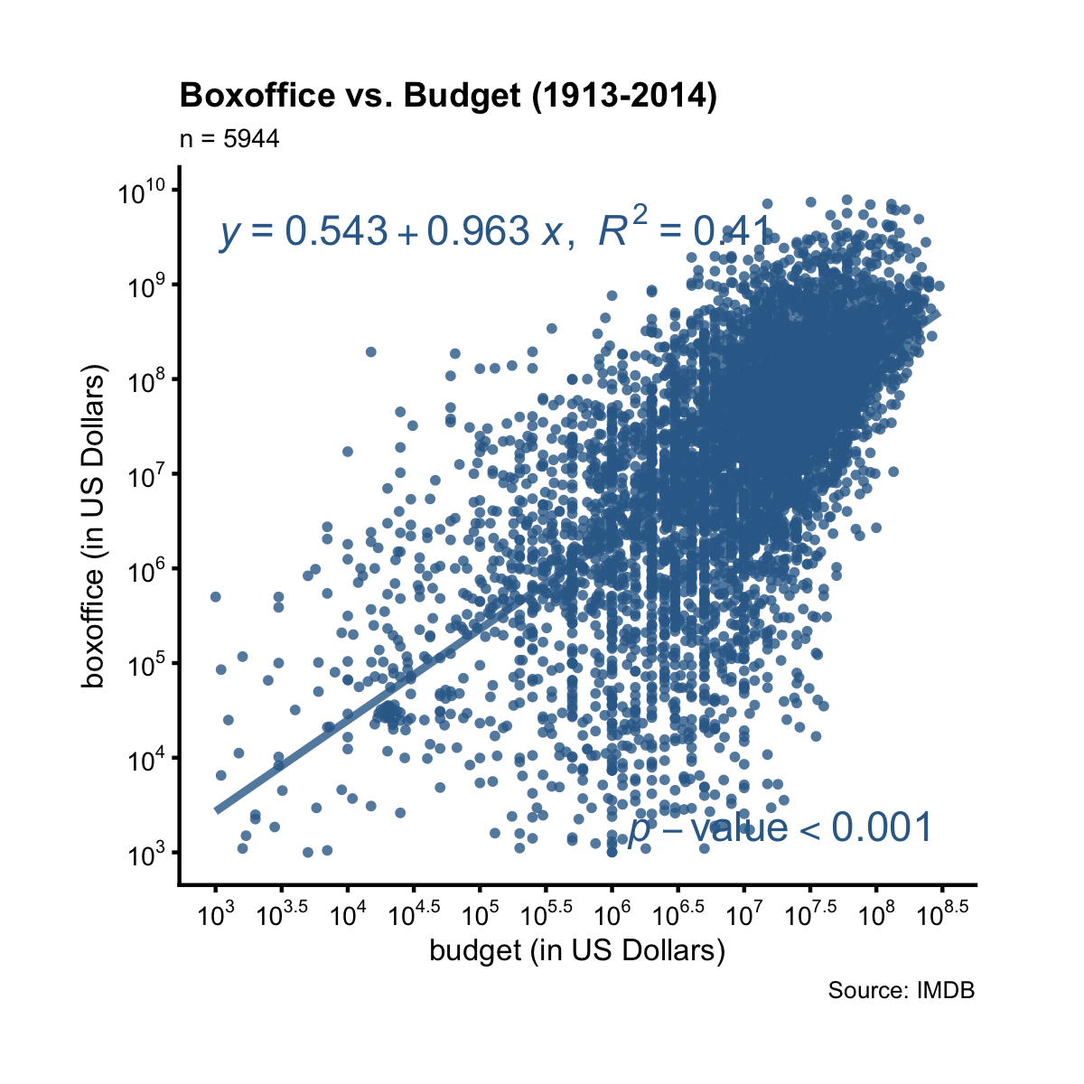
The tiny p-value implies the linear relationship is statistically significant. The R-squared value says that 41% of the variation in boxoffice can be explained by the variation in budget (both at log10 scale). Taking its squared root, we find the correlation between boxoffice and budget (both at log10 scale) is 0.61.
The function plt() can be re-used for other variables in the same data frame.
For example, we can draw a scatter plot of boxoffice vs. votes.
= plt("votes", "boxoffice", alpha = 0.2, jitter = T, font_size = 8) %>%
add_labs(xlab = "number of votes",
ylab = "boxoffice (in US Dollars)",
title = "Boxoffice vs. Votes (1913-2014)",
caption = "Source: IMDB") %>%
scale_axis(axis = "y", scale = "log10") %>%
scale_axis(axis = "x", scale = "log")
# add to the plot: best fitting line, its equation and R2, and p-val, and
# overwrite the default x and y position of the equation
add_lm_line(p, eq_tb_ypos = 0.95, eq_tb_xpos = 0.5)
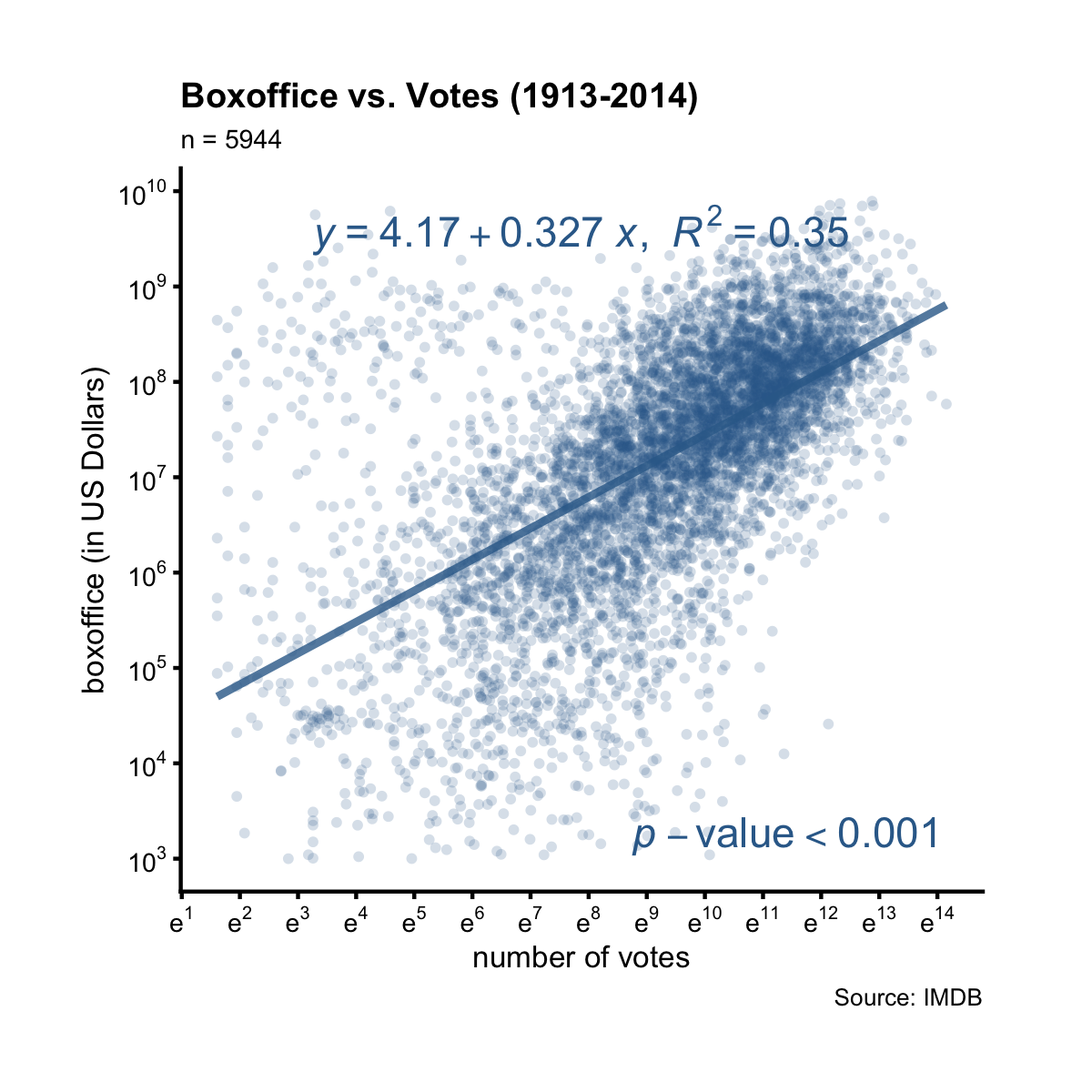
We see there’s also a clear linear relationship between boxoffice and votes at log10 scale. The R-squared value is the percent (35%) of variance in boxoffice that can be explained by the variance in votes, which translates to a correlation of 0.59. This correlation and the linear relationship is statistically significant by the tiny p-value.
Instead of the equation, we can show a table of quantities associated with the
best fitting line by setting show = "tb".
(p, show = "tb")
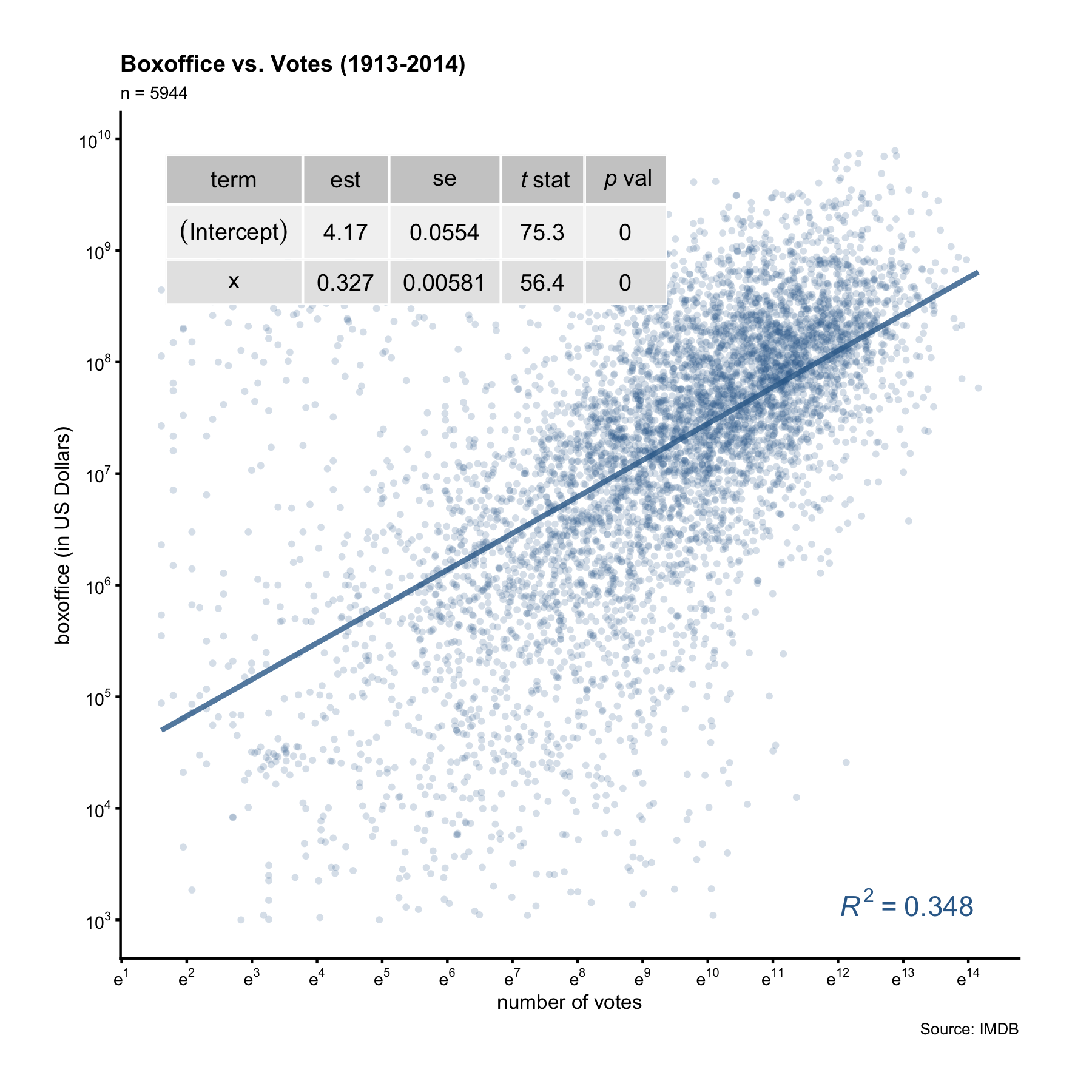
The table gives more information than the equation. In particular, it reports the standard errors of the coefficient estimates. We can thus calculate the margin of error and confidence interval of the x coefficient. For example, from the table display above we know the slope is 0.327 with a SE of 0.00581. The margin of error of the slope is thus 0.0114 (0.00581 * 1.96). This means that for every unit increase in log10(votes), we can expect an 0.327-unit increase in log10(boxoffice), give or take 0.0114-unit.
To summarize, setting show = "tb" inside add_lm_line() displays a table of
details such as standard errors and t-statistics; setting show = "eq" (default) displays the equation of the best fitting line without those details. When showing the equation, we can optionally supply a categorical variable name to colorby and this will color the data points by different groups. Consider this question: did action movies make money year after year? To find out, we’ll draw a scatter plot of bo_bt_ratio vs. year, setting colorby = "action", where action is a binary flag indicating if a film is an action film or not.
= plt("year", "bo_bt_ratio", colorby = "action",
legend_title = "Is action film?", legend_pos = "top",
alpha = 0.5, font_size = 8) %>%
add_labs(ylab = "boxoffice / budget",
title = "Boxoffice / Budget (1913-2014)")
p = p + ggplot2::geom_hline(yintercept = 1)
p = scale_axis(p, scale="log10")
add_lm_line(p, pv_r2_xpos = "left")
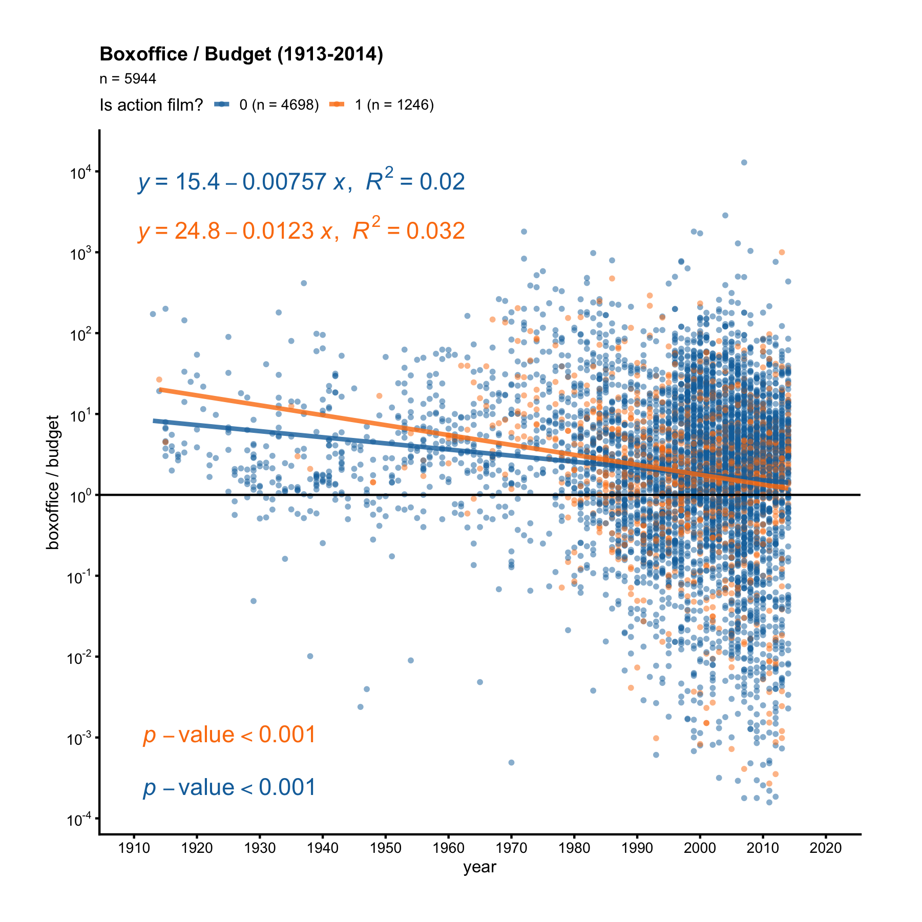
The orange dots are action films, while the blue dots are non-action films. First, notice there are more blue dots than orange dots. Second, the orange line has a steeper negative slope. If we pay attention to the orange dots before 1960, we’ll see all orange dots before 1960 are above the y = 1 line, meaning action films always made money before 1960. But non-action films weren’t as lucky. After 1960, some action films started losing money too.
Now it’s your turn. Make scatter plots to answer the following questions:
- Does drama make money year after year? What about comedy?
- Is it true the higher the
rating, the bigger the boxoffice/budget ratio (bo_bt_ratio)? What about when viewed separartely under romance vs. non-romance films? - Is it true the more
votesa film gets, the bigger its boxoffice/budget ratio? What about when viewed separartely under drama vs. non-drama films?