6. Case Studies and Quick Reference


In this chapter are some case studies from real-world situations to help illustrate the value of the techniques in the rest of the book. There is also a Quick Reference guide.
6.1 Case Studies
1 - Mobile-driven cloud application
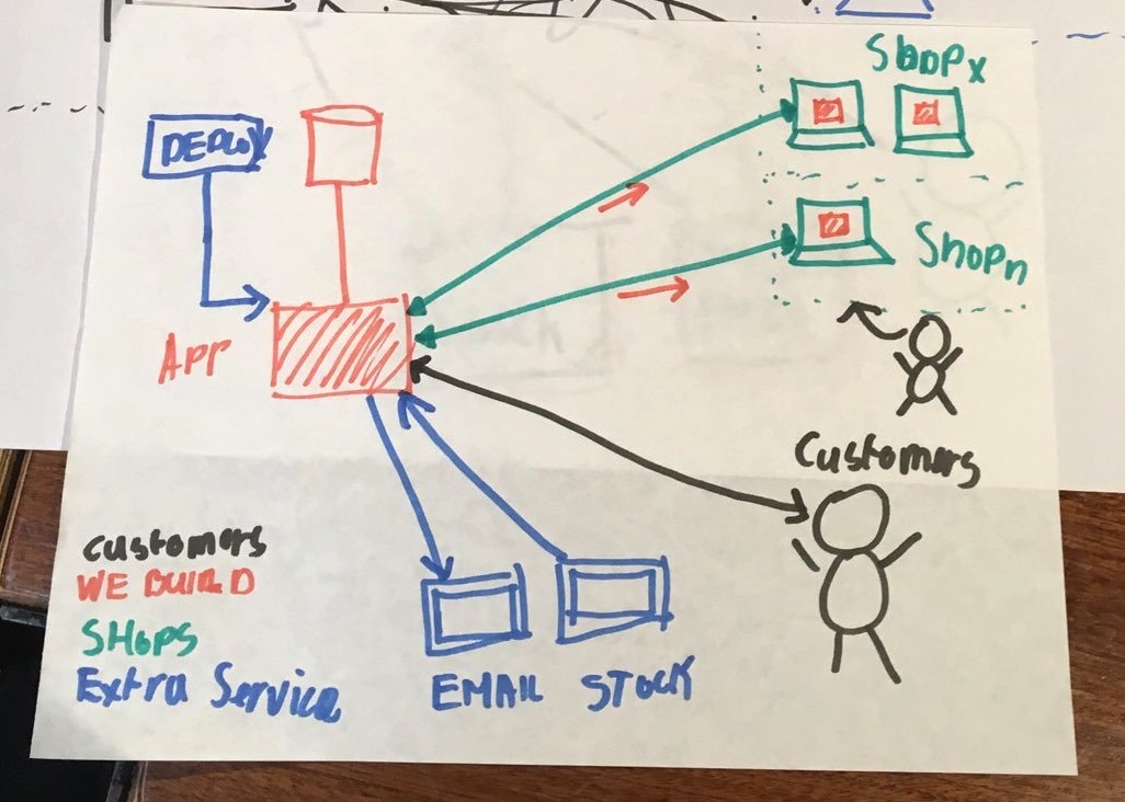
Consider a mobile-driven cloud-based software application - this could be something like an appointment booking system, an insurance quotation system, or perhaps a way to manage a stocks & shares portfolio. 1 The mobile application sends requests via the internet to a cloud-based central system which (after traffic filtering) routes the requests via some orchestration services to a core API. The API might generate additional requests to a external supplier and/or to a legacy system hosted “on-premise” (in a data centre).
Here is an initial sketch of the system before the Better Whiteboard Sketches techniques were applied (Figure 4.1):
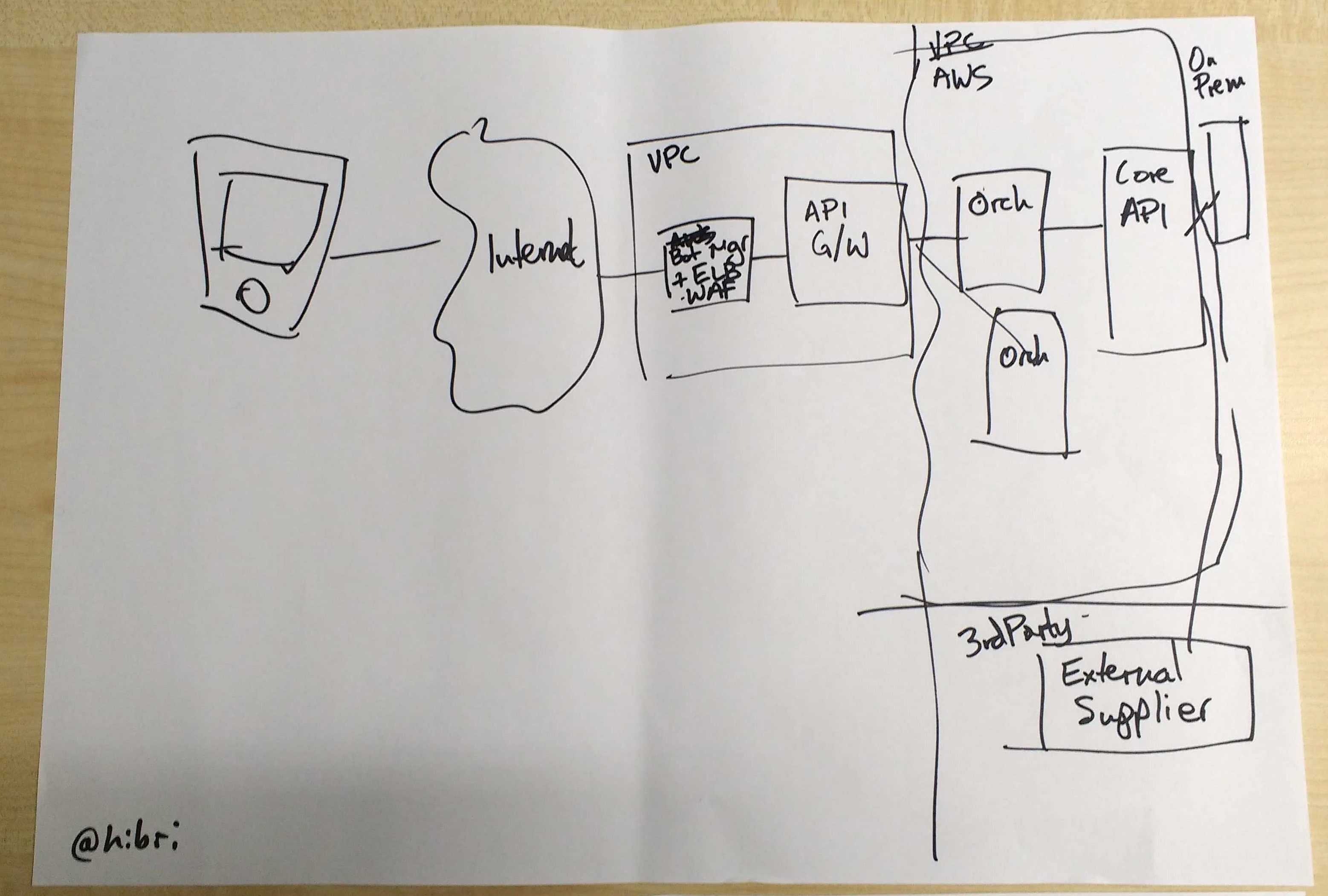
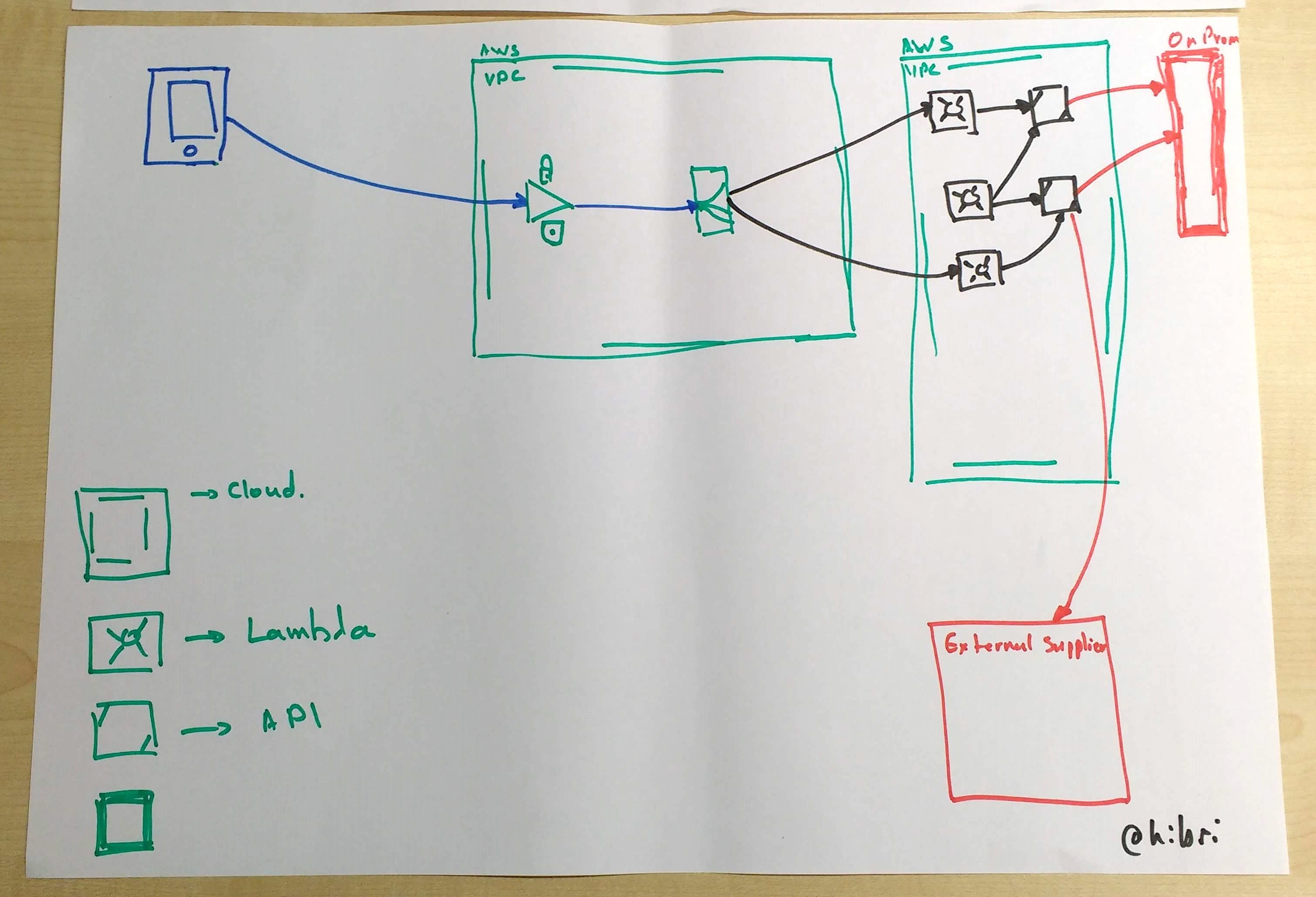
It is difficult to see immediately what some of the lines represent; the nature of the different boxes is also not very clear. Now let’s see how the sketch was improved through the Better Whiteboard Sketches techniques (Figure 4.2):
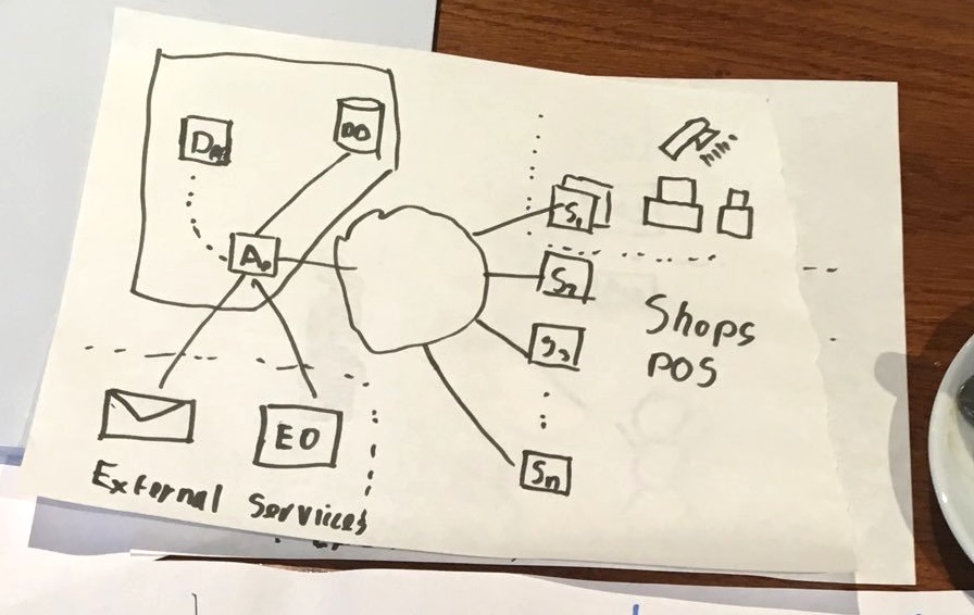
2 - Retail system with POS terminals
The software system for a large retailer includes a main sales application hosted in the cloud and also a smaller application deployed locally to Point-of-Sale (POS) systems in each retail store. Stock control and email services are provided by a separate supplier. 2
Figure 4.3 shows the initial sketch of the system before the Better Whiteboard Sketches techniques were applied. There is a nice use of broken lines to show some separation of different parts of the software, but other concepts are less easily distinguished:
After applying some techniques from Better Whiteboard Sketches, the resulting diagram was much clearer (Figure 4.4):
Hatching, double lines, colours, and a key/legend make the sketch much more understandable and memorable.
3 - Sketches for Team Topologies book
Matthew writes: “During 2018 and 2019 I co-authored the book Team Topologies with Manuel Pais 3 which looks at patterns for organisation dynamics and team interactions for modern software delivery. We wanted to ensure the diagrams were as legible and understandable as possible; even though the book would be printed in full colour, we wanted the diagrams to work well in monochrome [for the reasons given in Chapter 2]. I decided to use the techniques from the Better Whiteboard Sketches book to inform our approach to diagrams for the Team Topologies book.”
In the Team Topologies book, we needed to represent four core types of team typically needed for modern software delivery (Stream-aligned, Enabling, Complicated Subsystem, and Platform). How should these different kinds of team be shown in diagrams? Figure 4.5 shows an early version of a whiteboard sketch showing thes four team types:
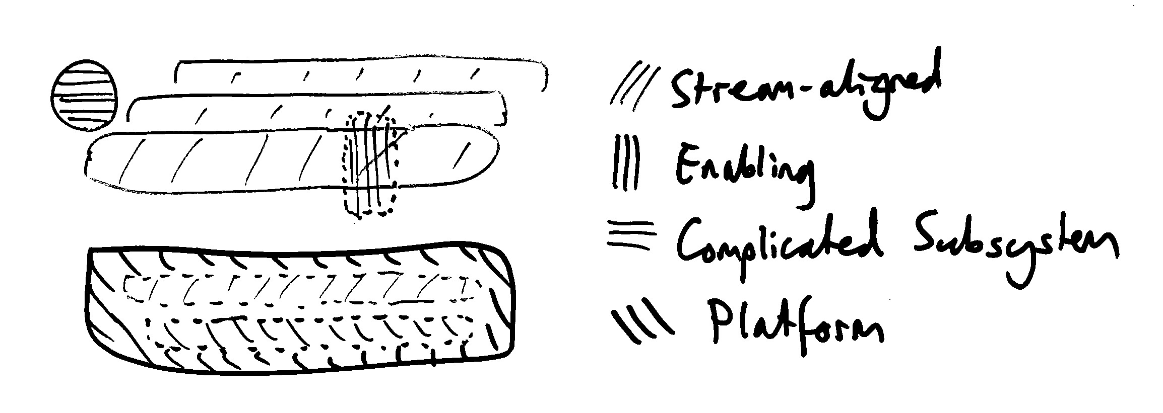
Initially, the four types of team were represented only with different types of hatching/shading and some differentiation in shapes. This was a reasonable first version, but the hatching all looked rather similar. We applied various techniques from Better Whiteboard Sketches (colour, different hatching, different shapes, and double lines) to better distinguish the different concepts. The whiteboard version evolved to the diagram in Figure 4.6:
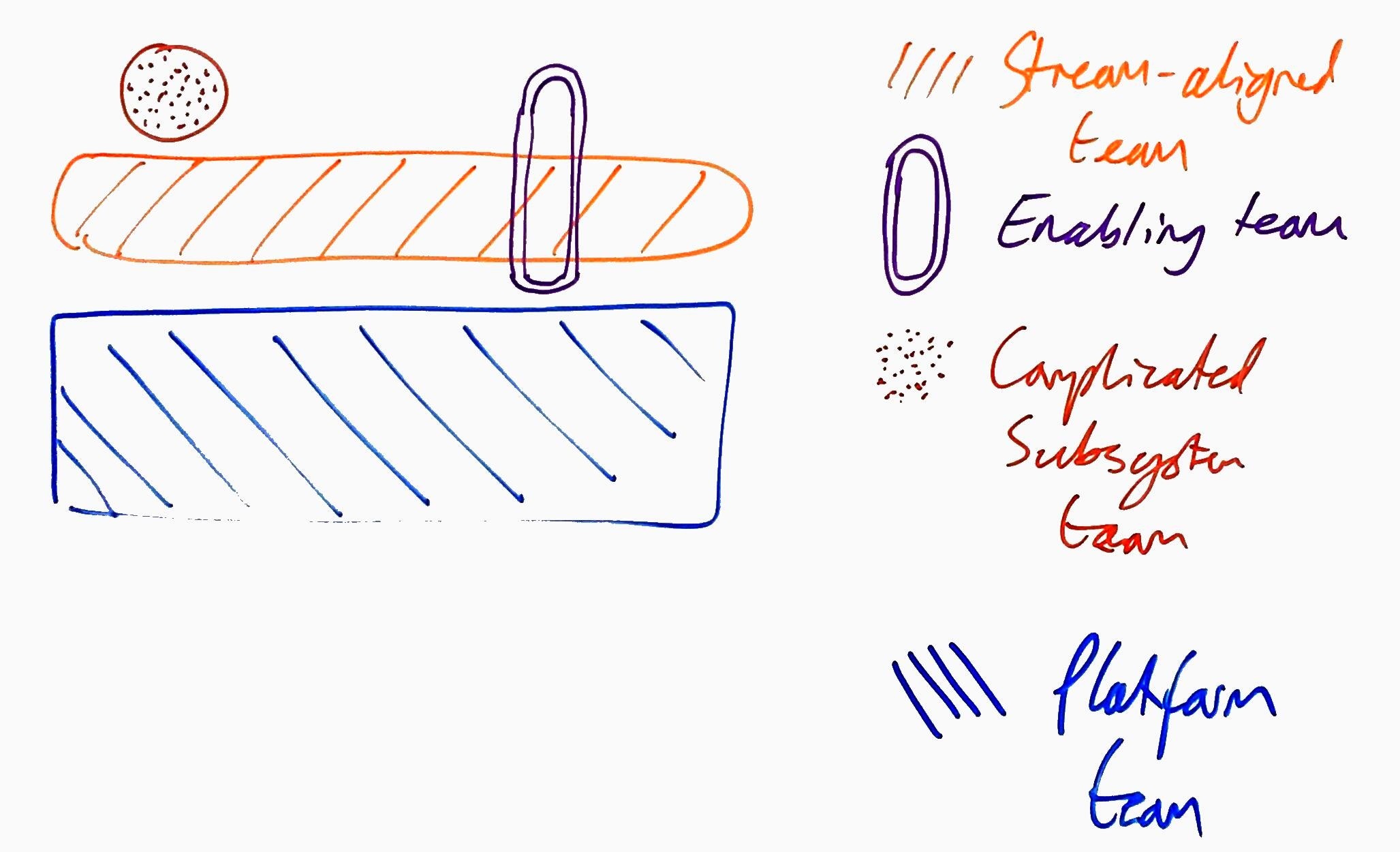
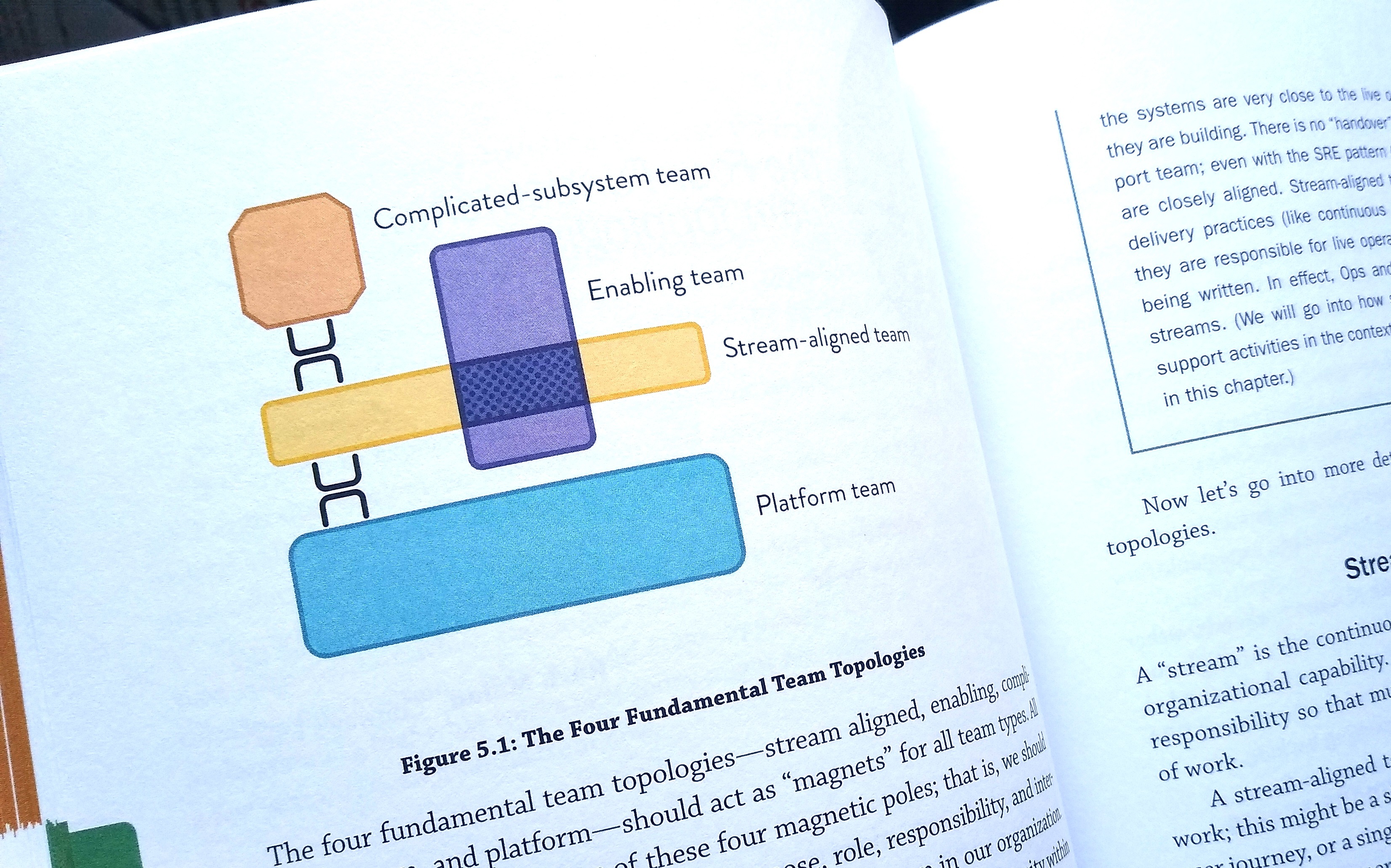
In the final printed versions of the diagrams, we have different shapes for the different types of team (octagon, vertical and horizontal rectangles), symbols and hatching for the team interactions, and colours that are not usually confused by people with colour vision deficiency (see Figure 4.7).
The early whiteboard sketches helped in discussions with the graphic designer and editors of the book because through the iteration of the whiteboard sketches concepts became clearer and the designer was better able to create print-ready versions.
6.2 Quick Reference